Iconically British – D&AD 2013

Here we feature Naeem Mitha’s D&AD entry for the Ted Baker brief from 2013. The brief was to imagine Ted Baker opening a store in a country and capitol of your choice and then create a roll out campaign to advertise the opening. Naeem chose Dubai and here is his creative twist.

Classic British Icons

Classic British Icons

Creatively applied to iconic Arabian Keffiyeh Head Scarf

Creatively applied to iconic Arabian Keffiyeh Head Scarf

Keffiyeh Head Scarf - Detail

Keffiyeh Head Scarf - Detail

Magazine Advertisement

Magazine Advertisement

Concept applied to a Persian Rug to create a Billboard Advertisement

Concept applied to a Persian Rug to create a Billboard Advertisement

Detail 1

Detail 1

Detail 2

Detail 2

In context

In context

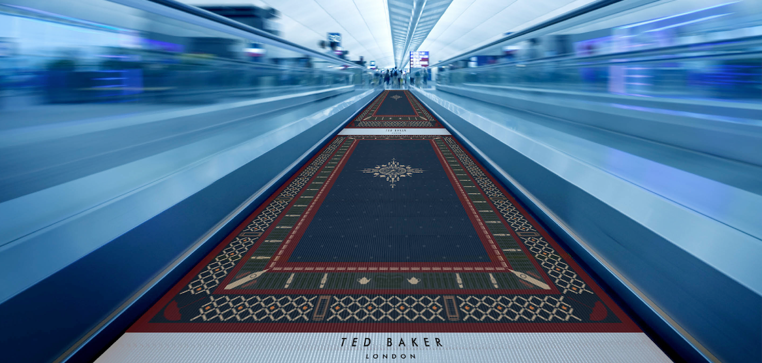
Design applied to airport travelator

Design applied to airport travelator

Pattern applied to a range of in store bags

Pattern applied to a range of in store bags

Digital touchpoints

Digital touchpoints

Store frontage - Design concept

Store frontage - Design concept

A great example applied pattern. A great example of a connection made. A great example of crafting to the highest degree and then a great example of how to apply an idea to a series of relevant touch points that bring the concept to life. Unfortunately it was not shortlisted for D&AD…but it deserved more in our humble opinion. A good idea is always a good idea!

Protecting Pubs

Here we feature another D&AD entry to the Monotype typography brief.

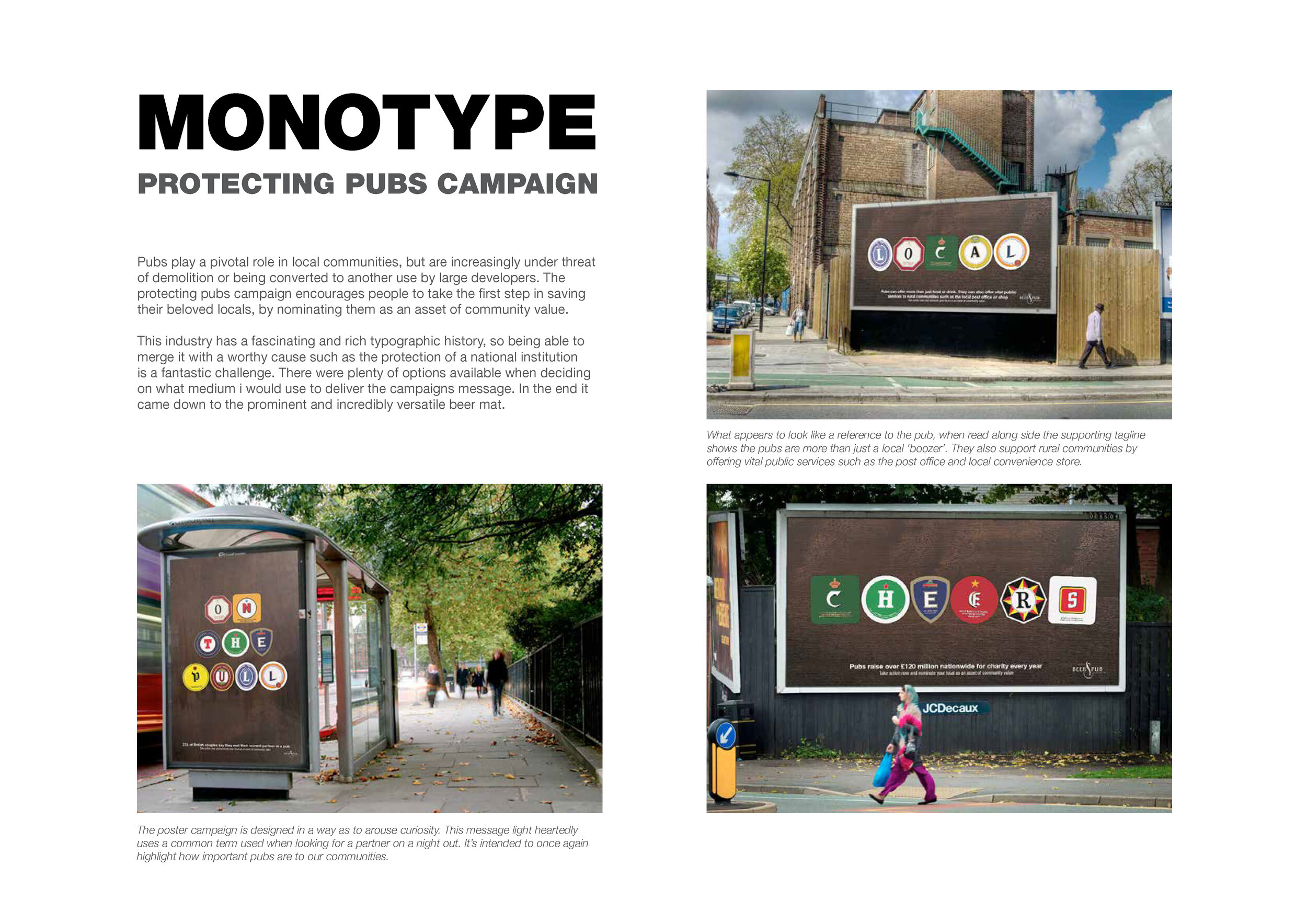
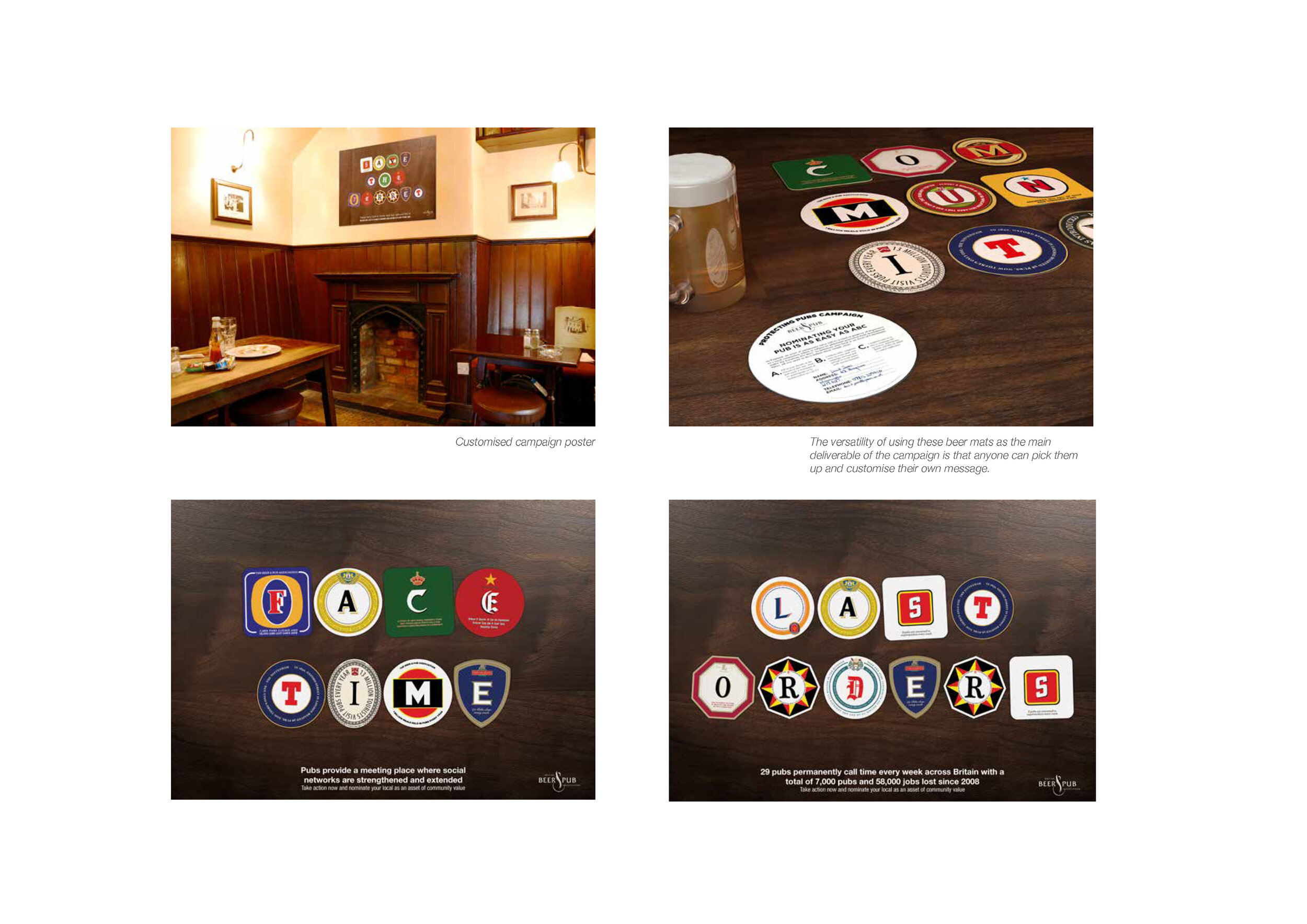
Pubs play a pivotal role in local communities, but are increasingly under threat of demolition or being converted to another use by large developers. The protecting pubs campaign designed by Neil Bennison encourages people to take the first step in saving their beloved locals, by nominating them as an asset of community value.

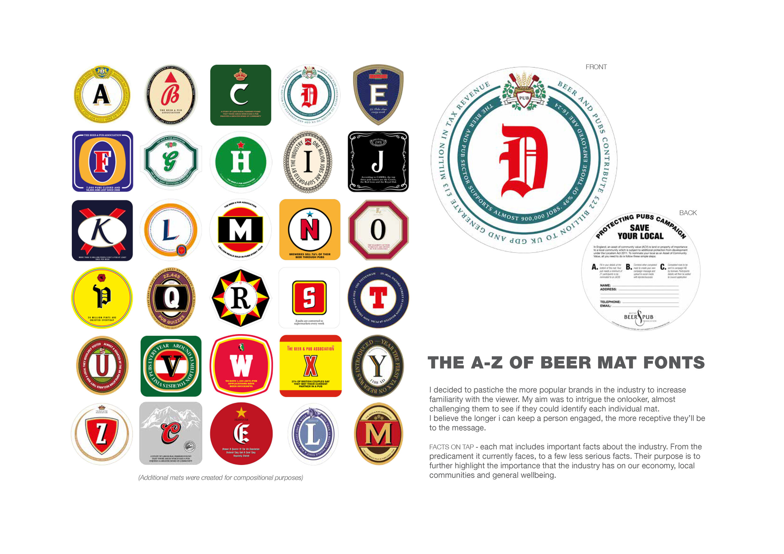
The pub industry has a rich typographic history, so being able to merge it with a worthy cause such as the protection of a national institution is a fantastic challenge. Using the versatility of a beer mat, a custom typeface was created which would underpin all messaging in the campaign.

THE CAMPAIGN

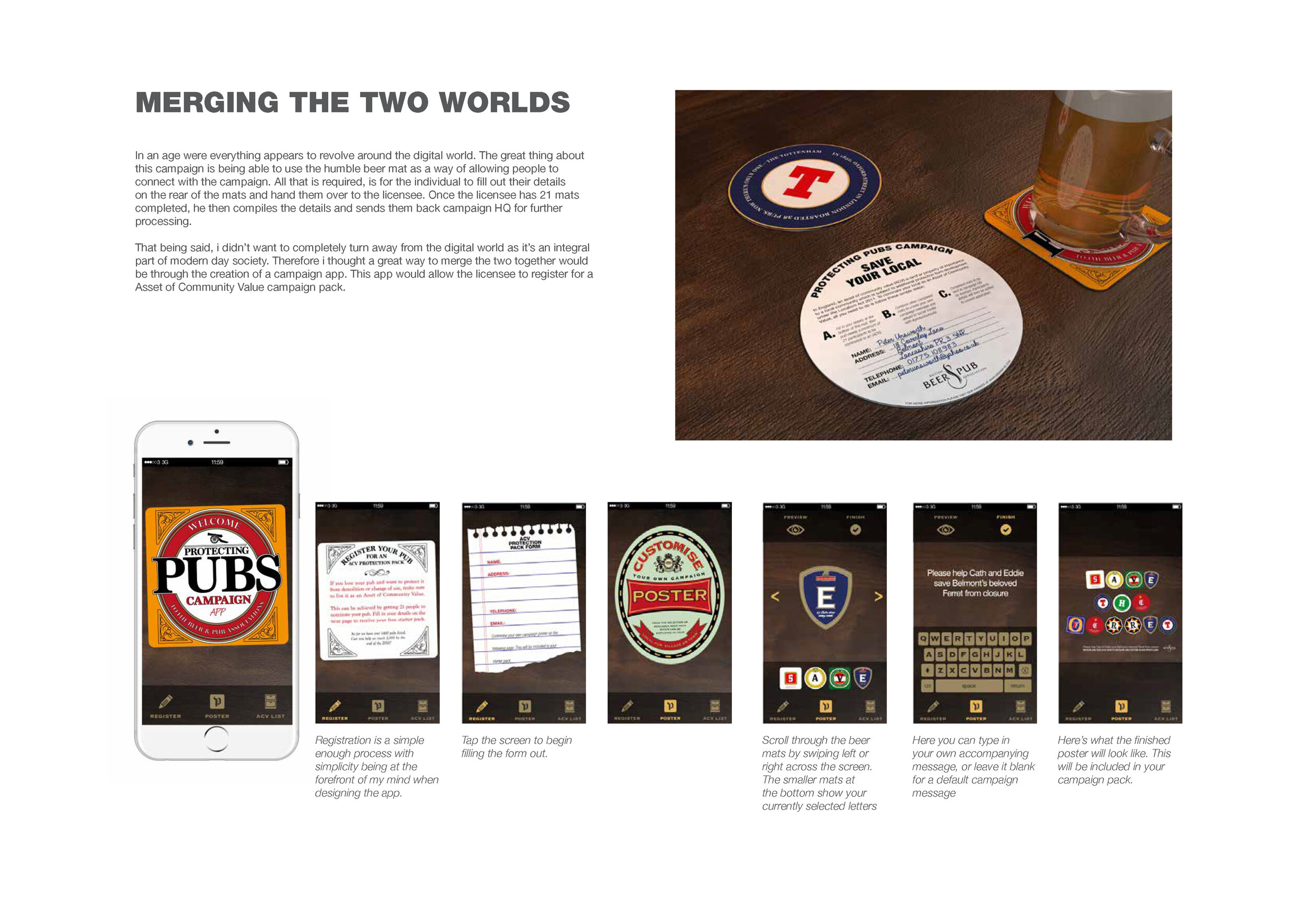
THE APP

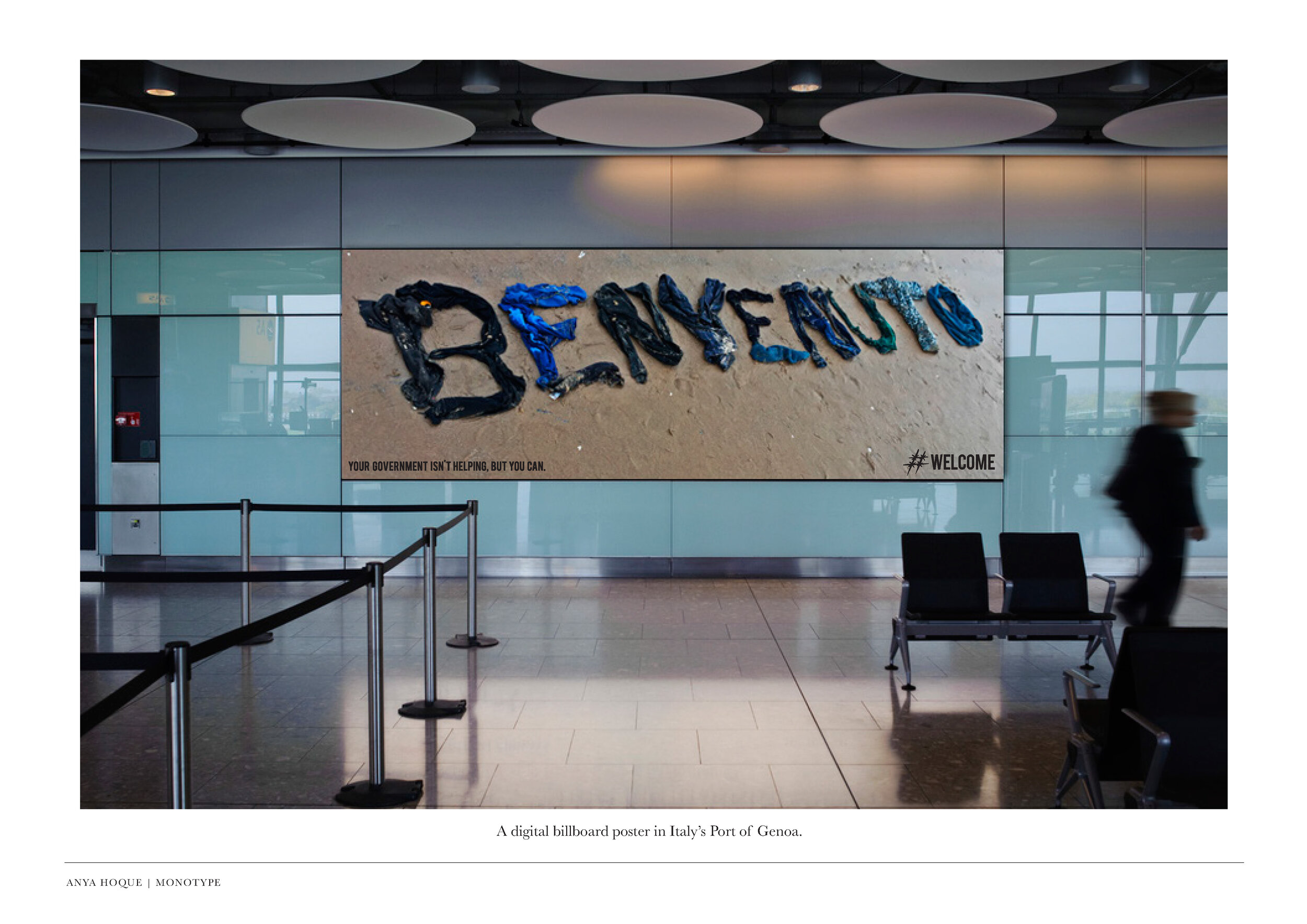
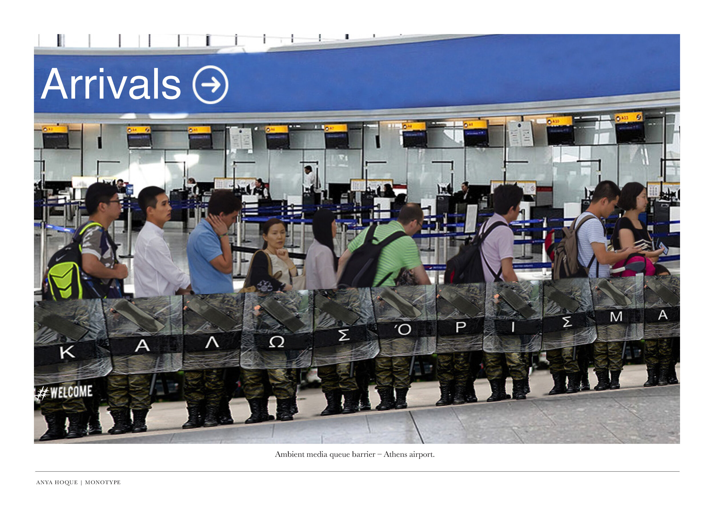
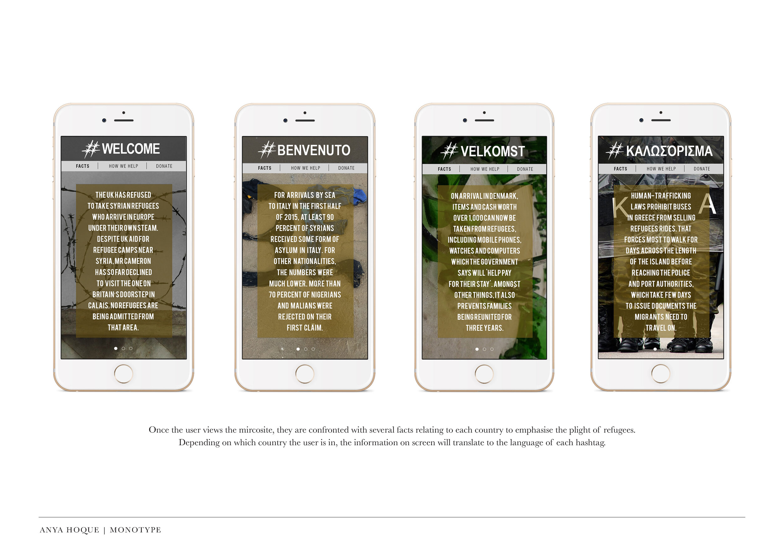
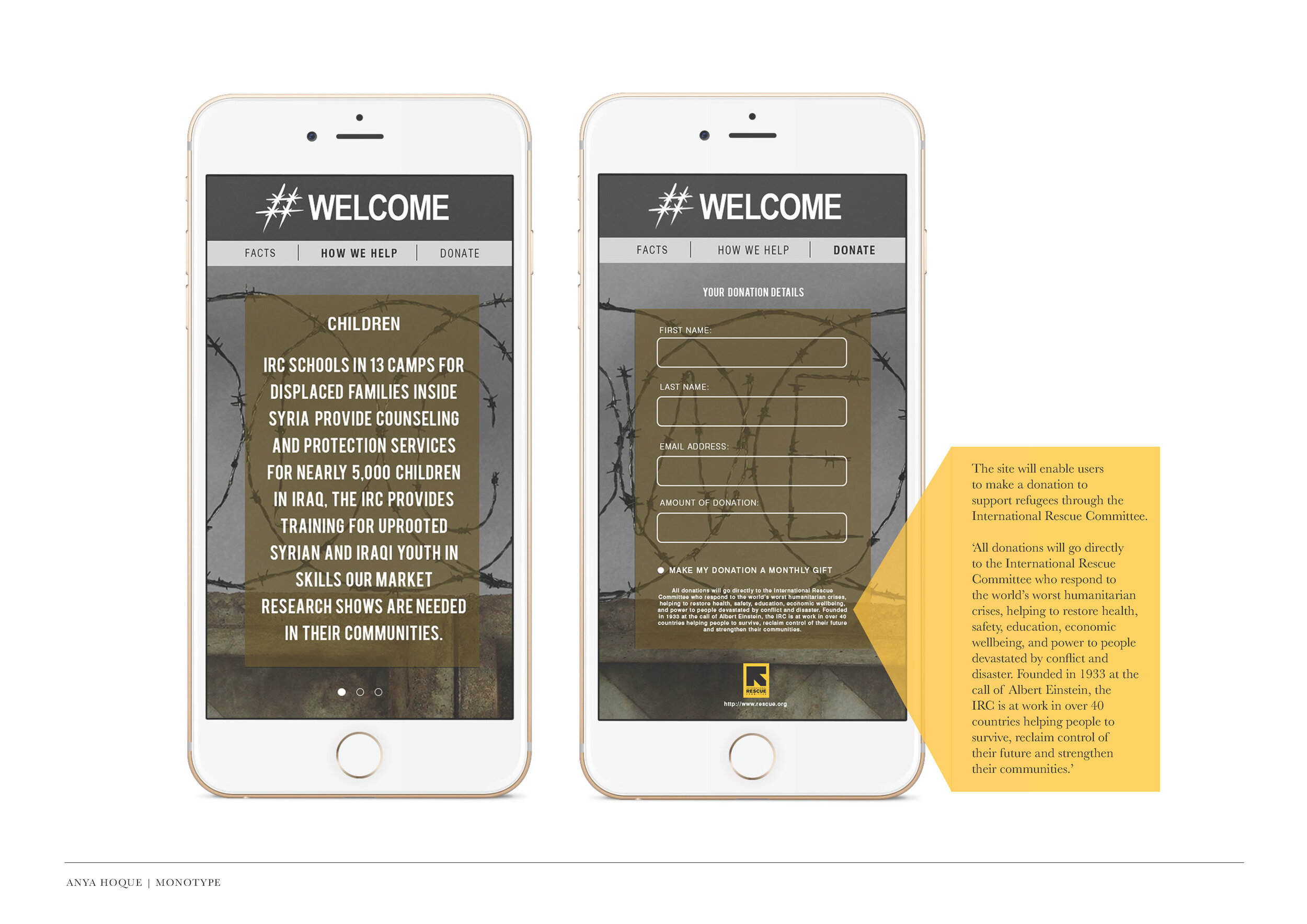
#WELCOME

As we’re currently off campus, we’re taking the time to trawl the archives, update and re-post where we can.

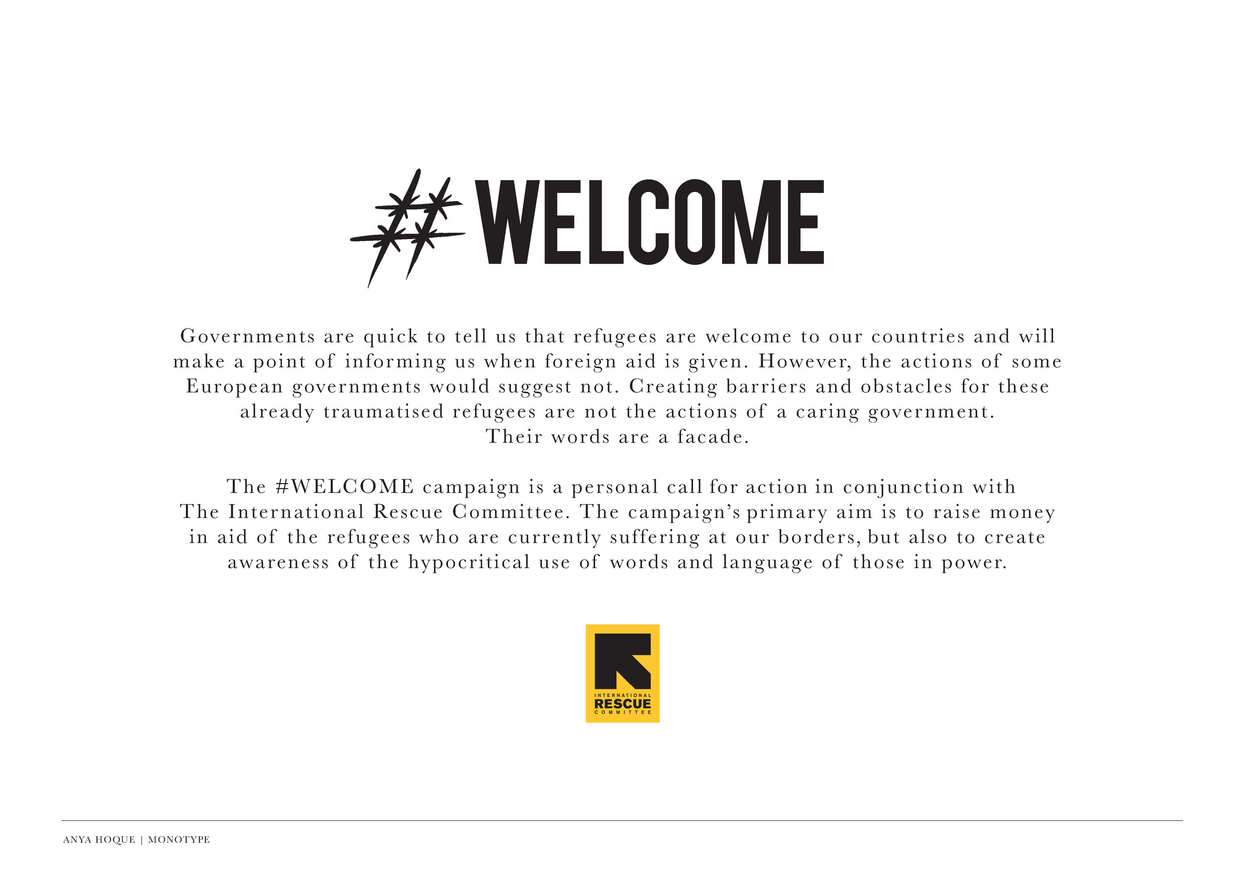
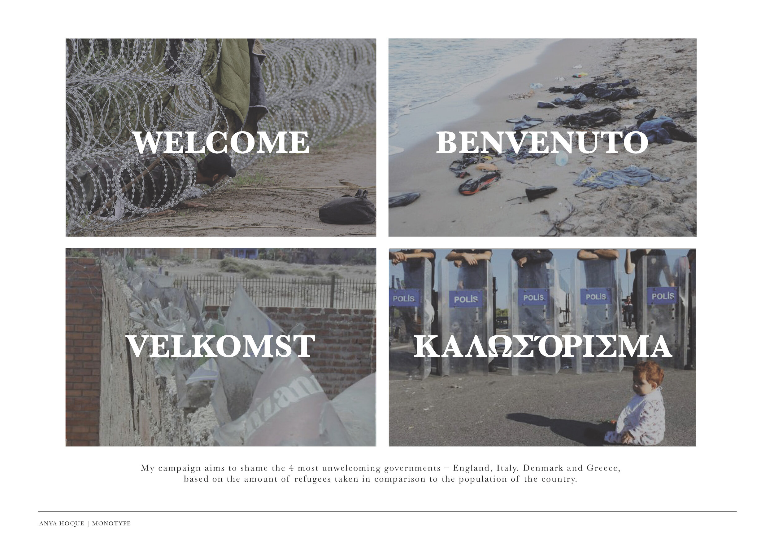
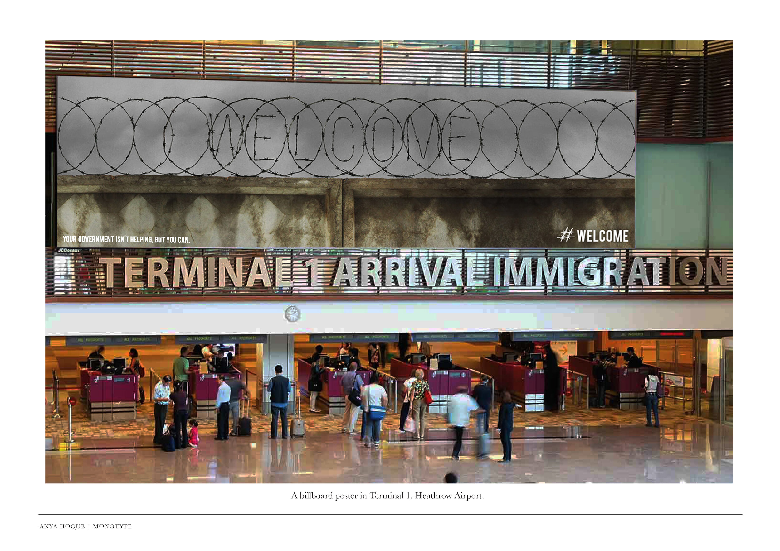
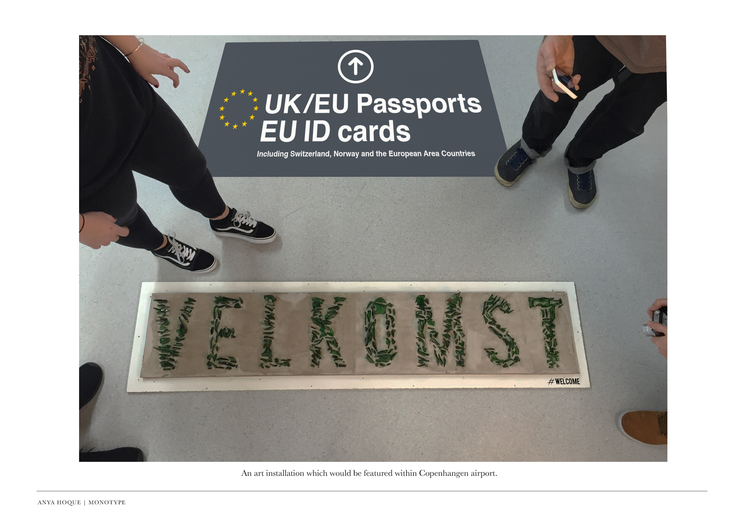
This project by Anya Hoque was for the D&AD Monotype brief, and was a response to the seemingly hypocritical welcome messages displayed by countries at their borders, and highlighted how unwelcoming these places actually feel. The video below demonstrates the level of commitment to the project.

Design Week – Exhibition Posters

Over the last four weeks graphic design first years have been tackling what staff thought might be a designer's dream brief…

  • Client: Design Museum

  • Brief: Name an upcoming exhibition and design the accompanying poster

  • Production: Two colour screen print only

The students chose a designer from outside the world of graphic design, and researched them through new channels such as Netflix and iPlayer, as well as the traditional channels of books and print. Distilling their gathered knowledge, the first task was based in copywriting and naming the exhibiton. Using the name(s) as a starting point, the second task was to create an image to counterbalance the copywriting and make a creative connection. The restriction of colours amplified the focus on the idea, and consideration to the overall layout and its impact.

Below are example colour proofs from the final crit which are yet to be screen printed, but are built around a strong proposition.


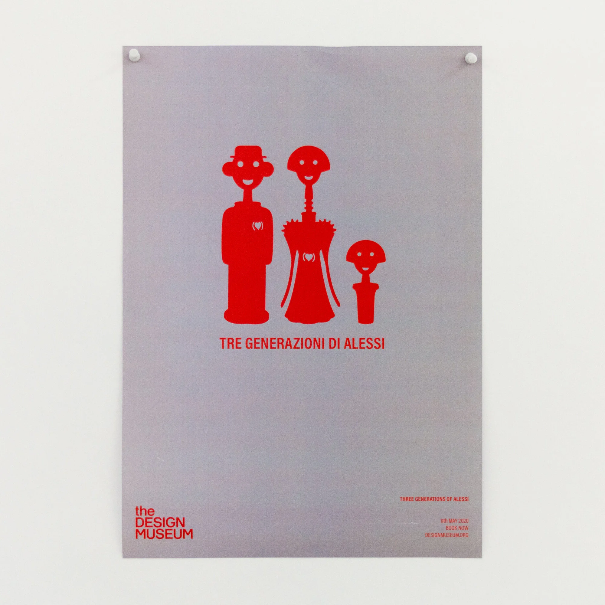
Alessi - Three Generations of Alessi

Alessi - Three Generations of Alessi


Robin Day - pioneer of the modern day

Robin Day - pioneer of the modern day


Dieter Rams - Less is Better

Dieter Rams - Less is Better


Ferrari - Rosso Corsa, celebrating the colour of Ferrari

Ferrari - Rosso Corsa, celebrating the colour of Ferrari


Habitat - Lighting up designer living

Habitat - Lighting up designer living


Jonathan Ive - iVe

Jonathan Ive - iVe


Christian Louboutin - A Closer Look

Christian Louboutin - A Closer Look


Paul Smith - One Man Brand

Paul Smith - One Man Brand


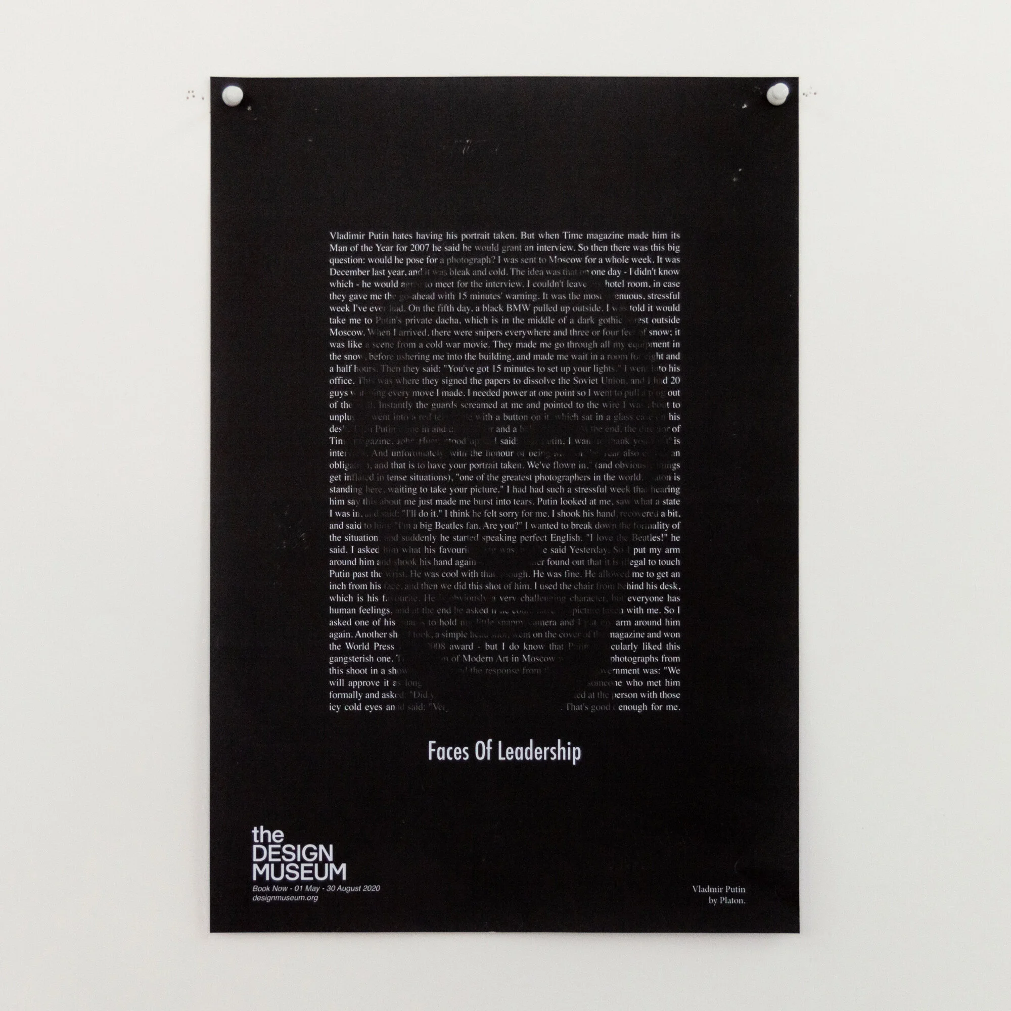
Platon - Faces of Power

Platon - Faces of Power


Platon - Shot in Black & White

Platon - Shot in Black & White

Resource Klaxon: Packaging Nets

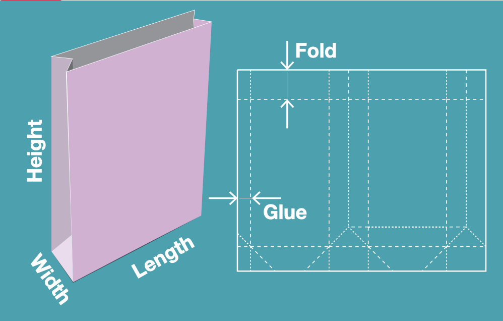
Templatemaker is a really useful site I happened across whilst researching custom packaging for the recently published Words of Wisdom.
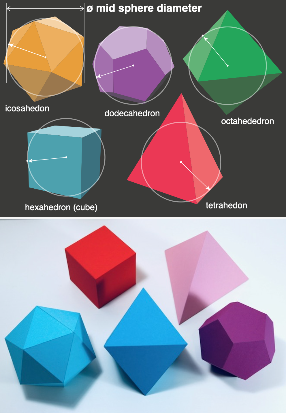
On it are a huge range of templates, from basic stuff like a matchbox, mail box, through to more complex items like spheres and a variety of polyhedra. If free vector nets aren’t enough, the really nice part is that you can input your specific dimensions and it will generate the net bespoke for your needs.

As ever, this kind of resource does not replace an idea. But if you do have an idea, then the template to produce it is more than likely available here.

As a final point the site is run and maintained by one good person in the Netherlands, so acknowledge any help you get and contribute where possible.

Templatemaker