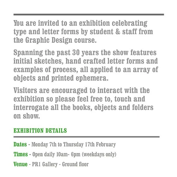
Exhibition - All you need is Type
/

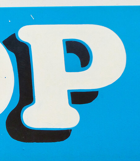
Here we feature a couple of projects from way back in 2006. If our memories serve us well, we think they are solutions to a D&AD typographic brief - Create a series of posters to advertise a Horror Film Festival in a town or city of your choice.
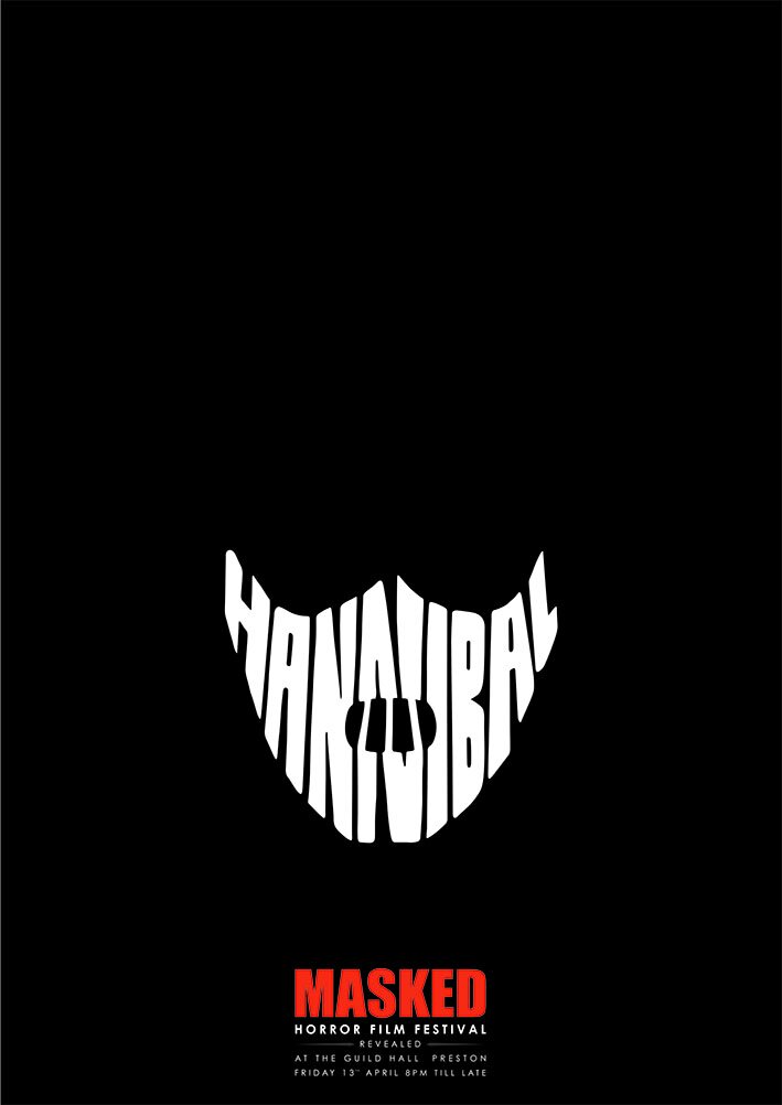


It’s that long ago we can’t actually remember who did the first solution? The second one was created by Rachel Simpson
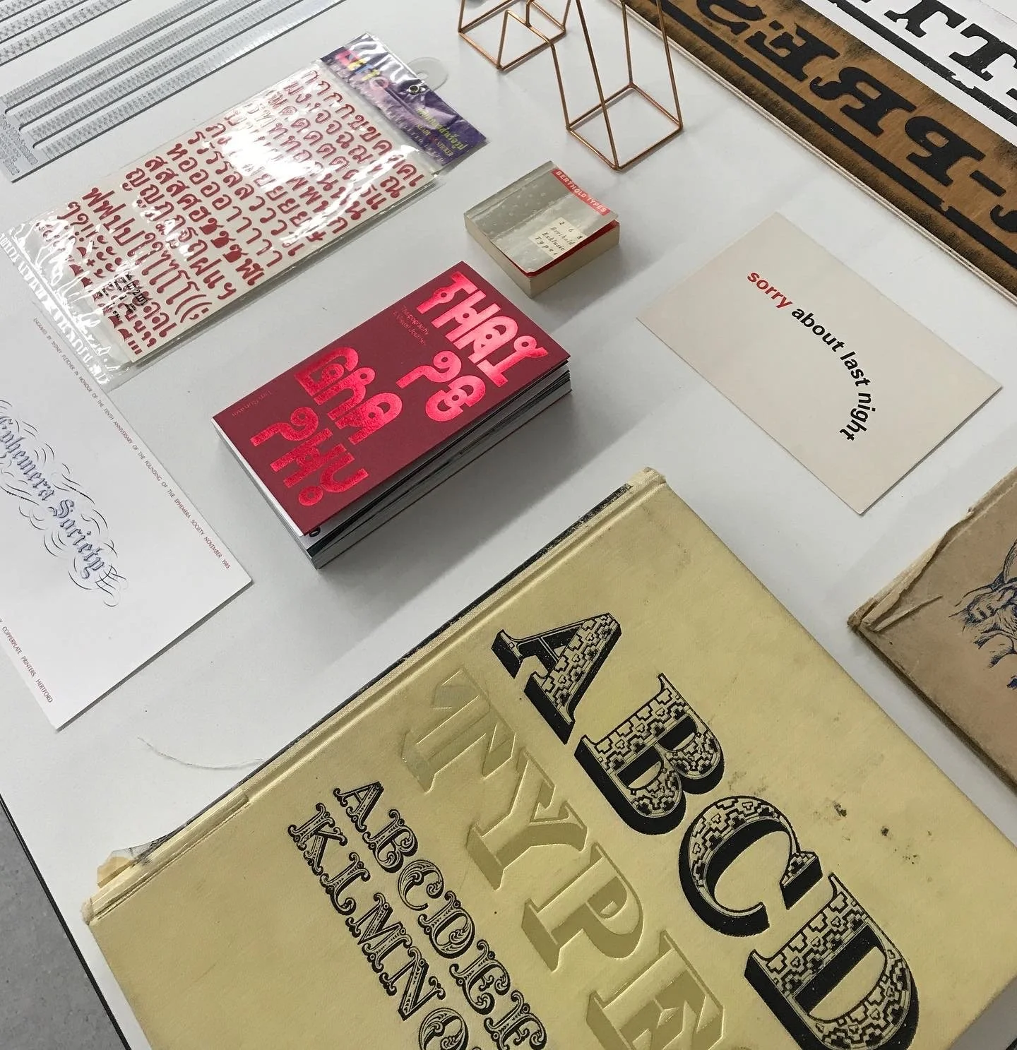
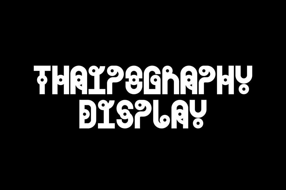
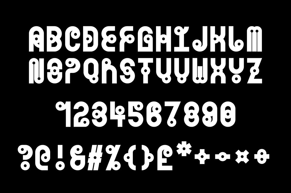
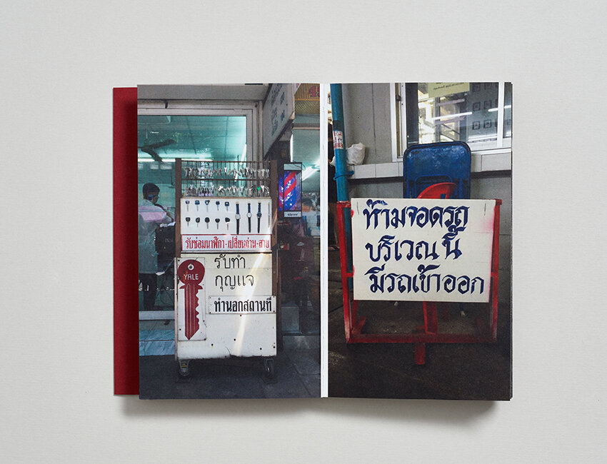
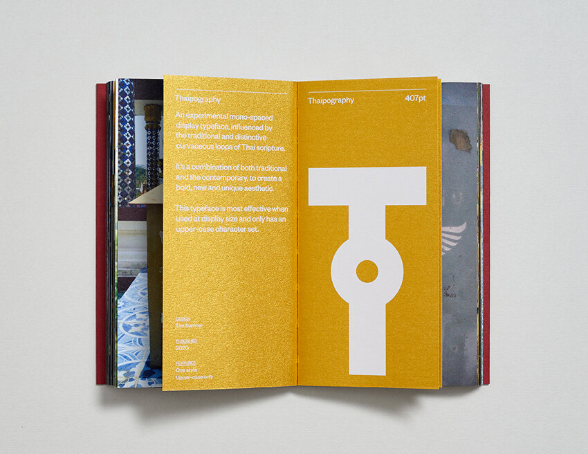
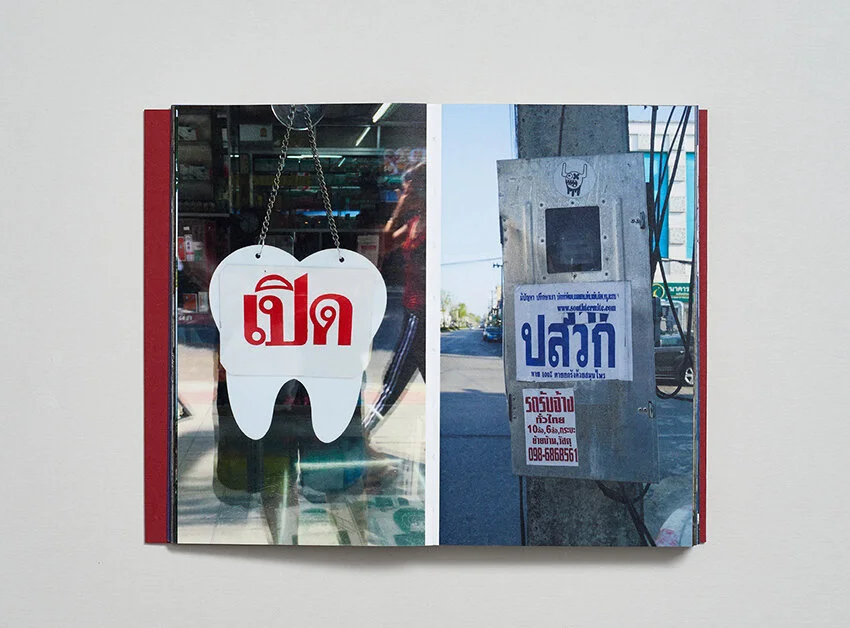
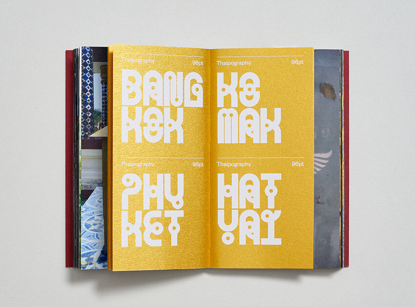
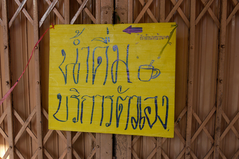
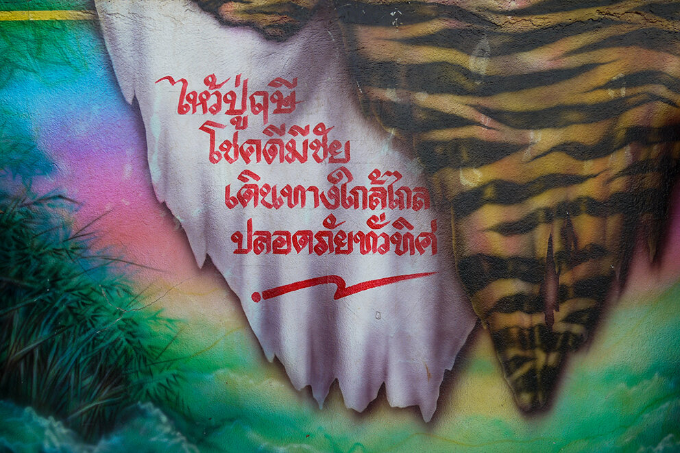
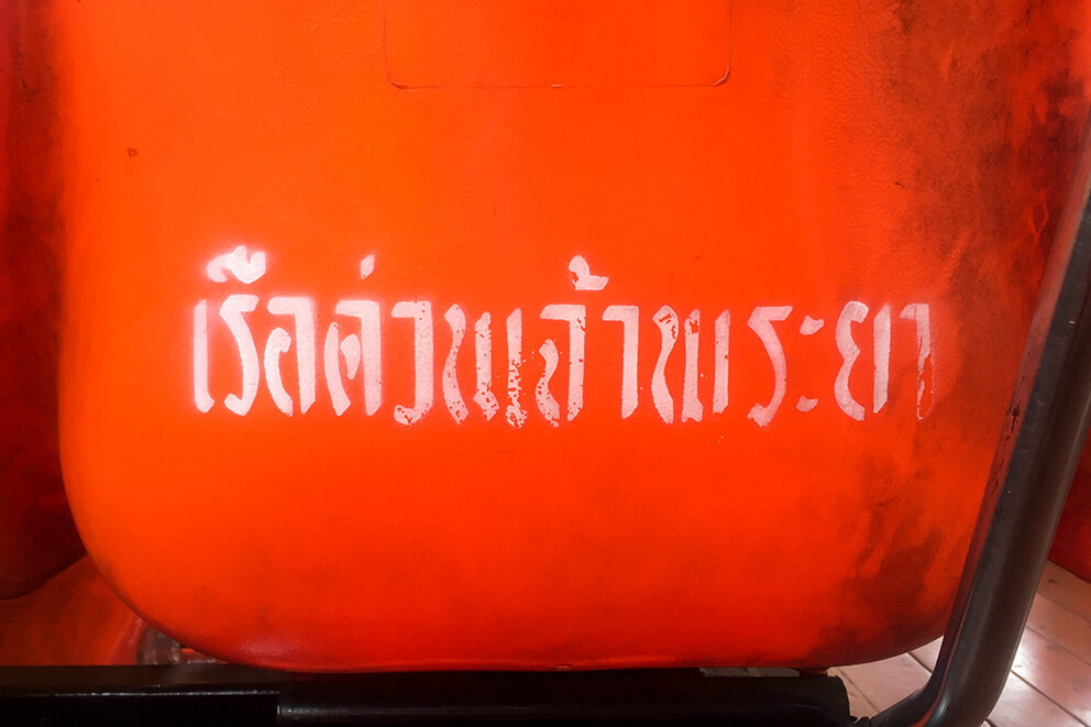
Here we feature a great typography project that has recently been sent to our offices by x Preston Graphics student Tim Sumner. This self published book was inspired by the typography that Tim encountered in Thailand on his globe trotting adventures.

Card board wraparound case

Front & back cover designs

Forward
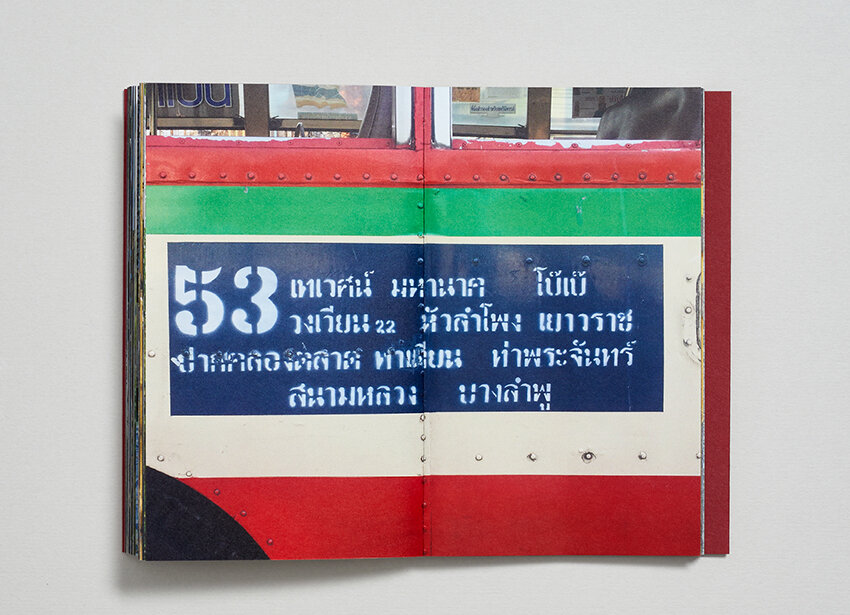
Slideshow

The typeface
For more on this project follow Tim here.
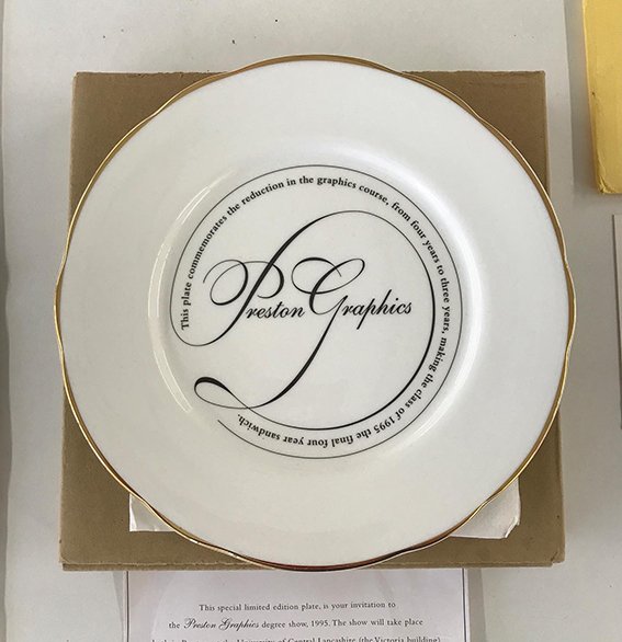
Here we feature a reflective post on the building of the stone circle that adorns the frontage of the Victoria Arts Building on the Preston Campus. Initially conceived and realised just over a decade ago, we thought it timely to post a short filmed retrospective.

Original sketches of the typography that sits on the top of the circle.
Please click on the image above - 30 minute film ‘the making of’


Here we feature a homespun free style alphabet created in Berol felt tips during lockdown.


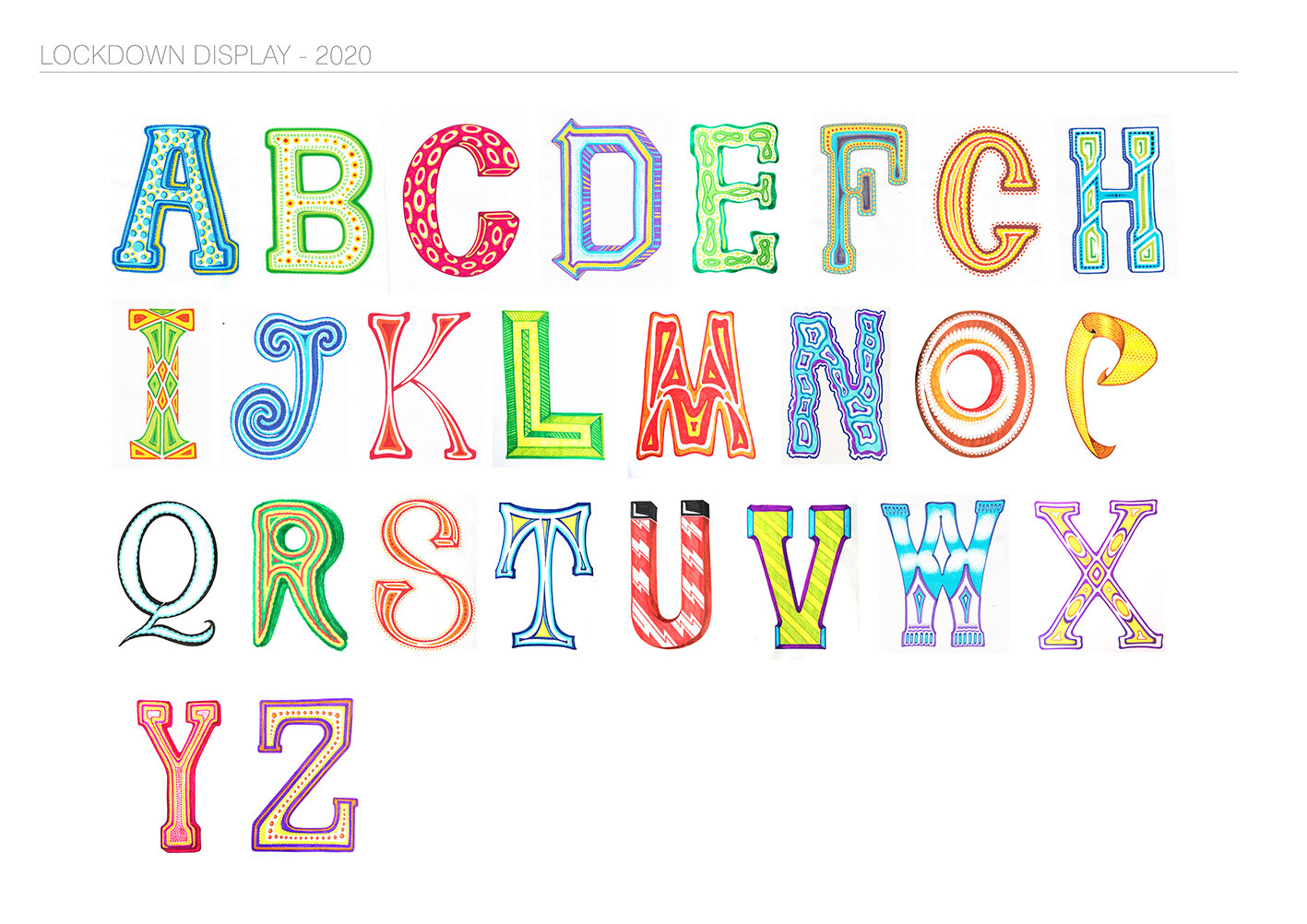
Full Alphabet
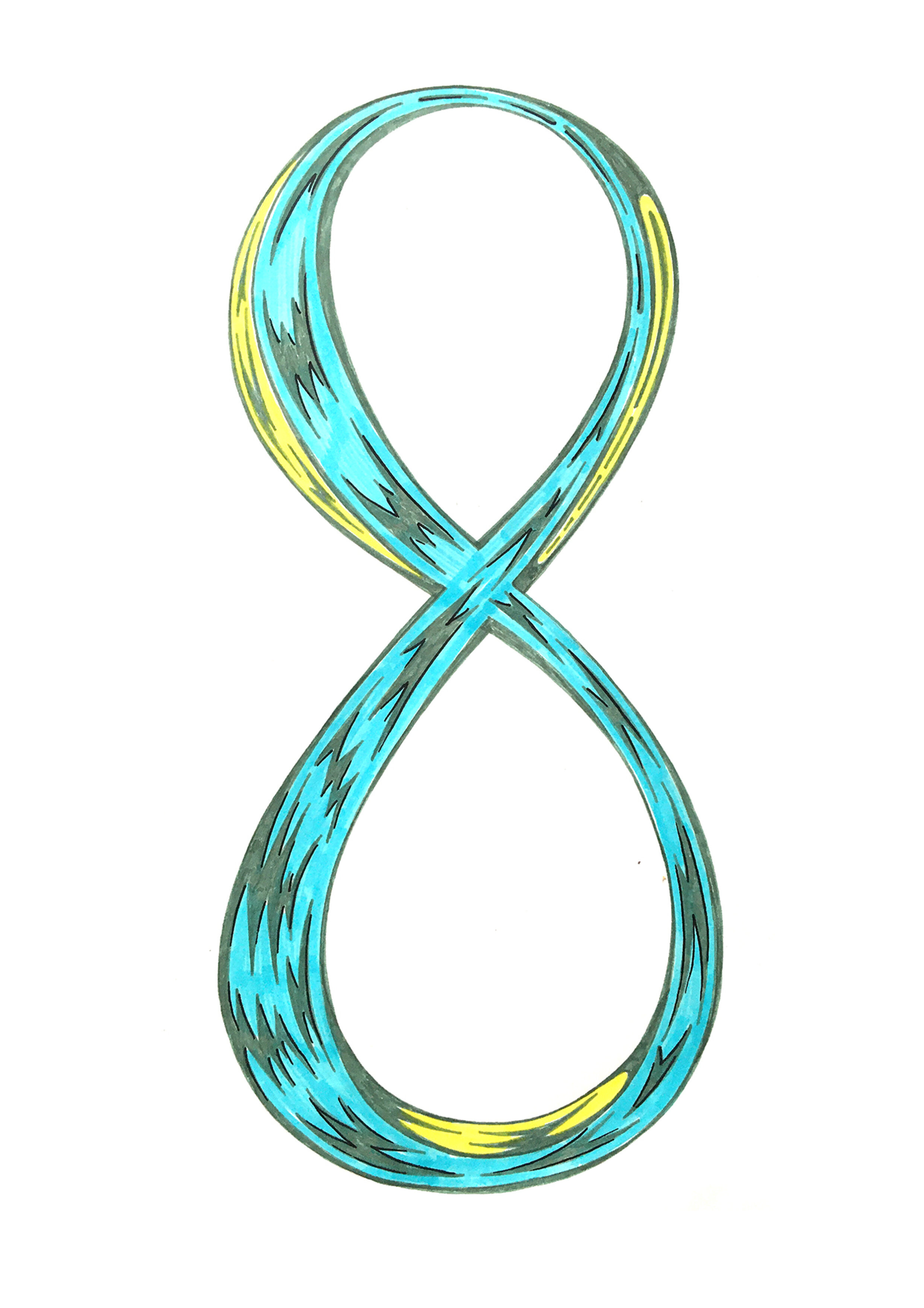
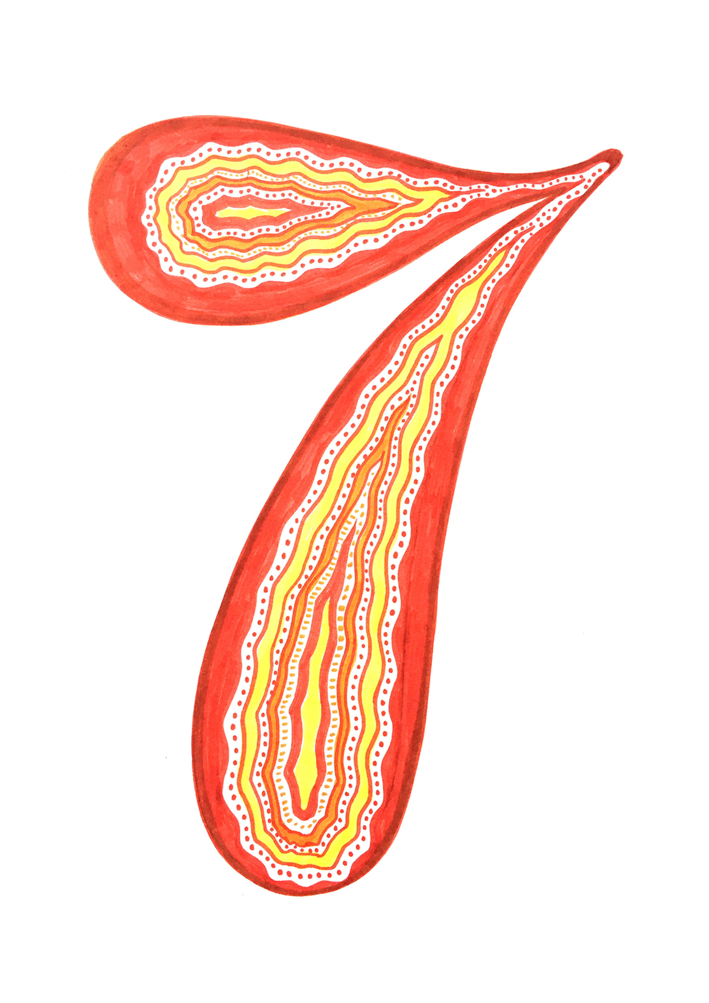
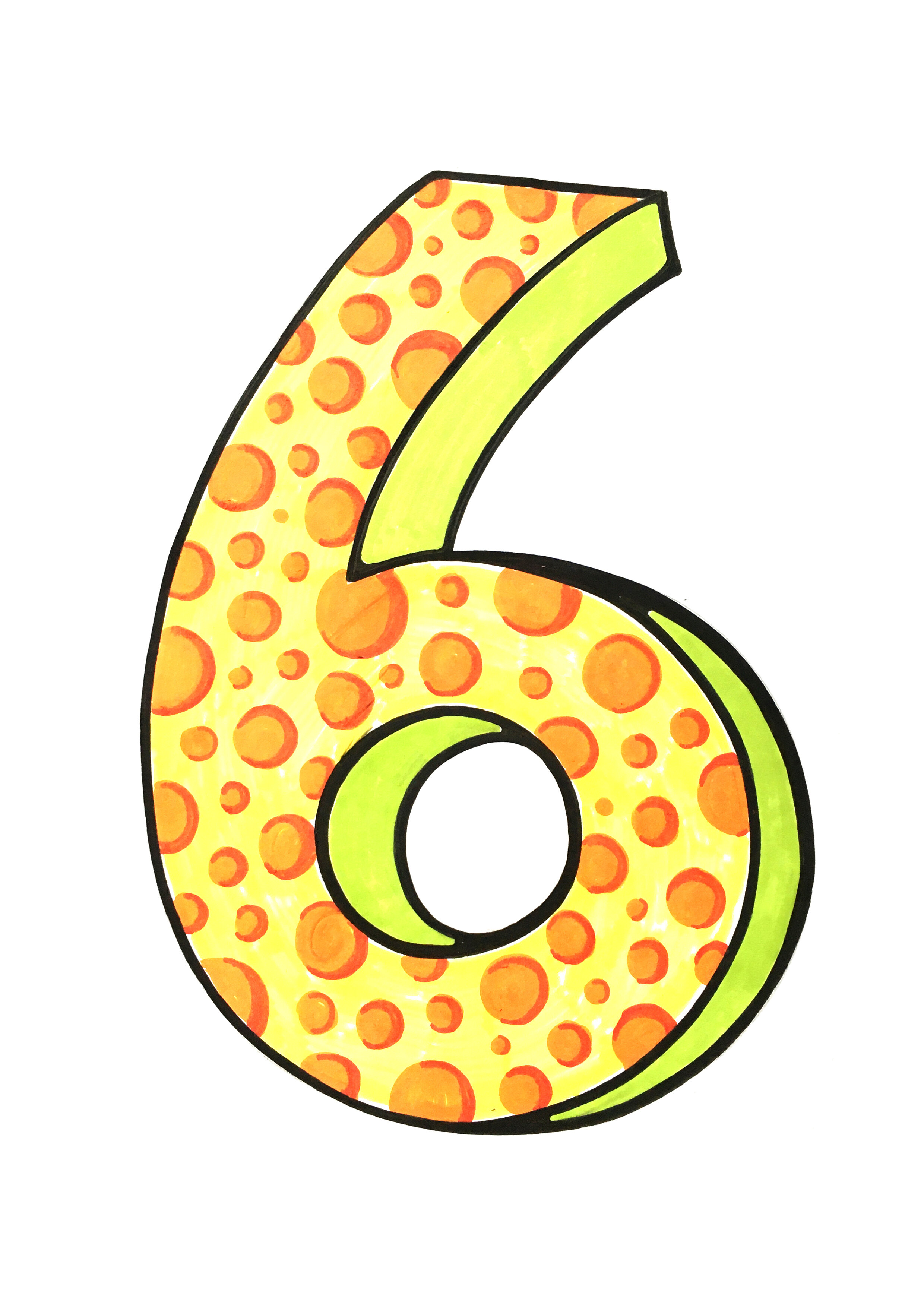

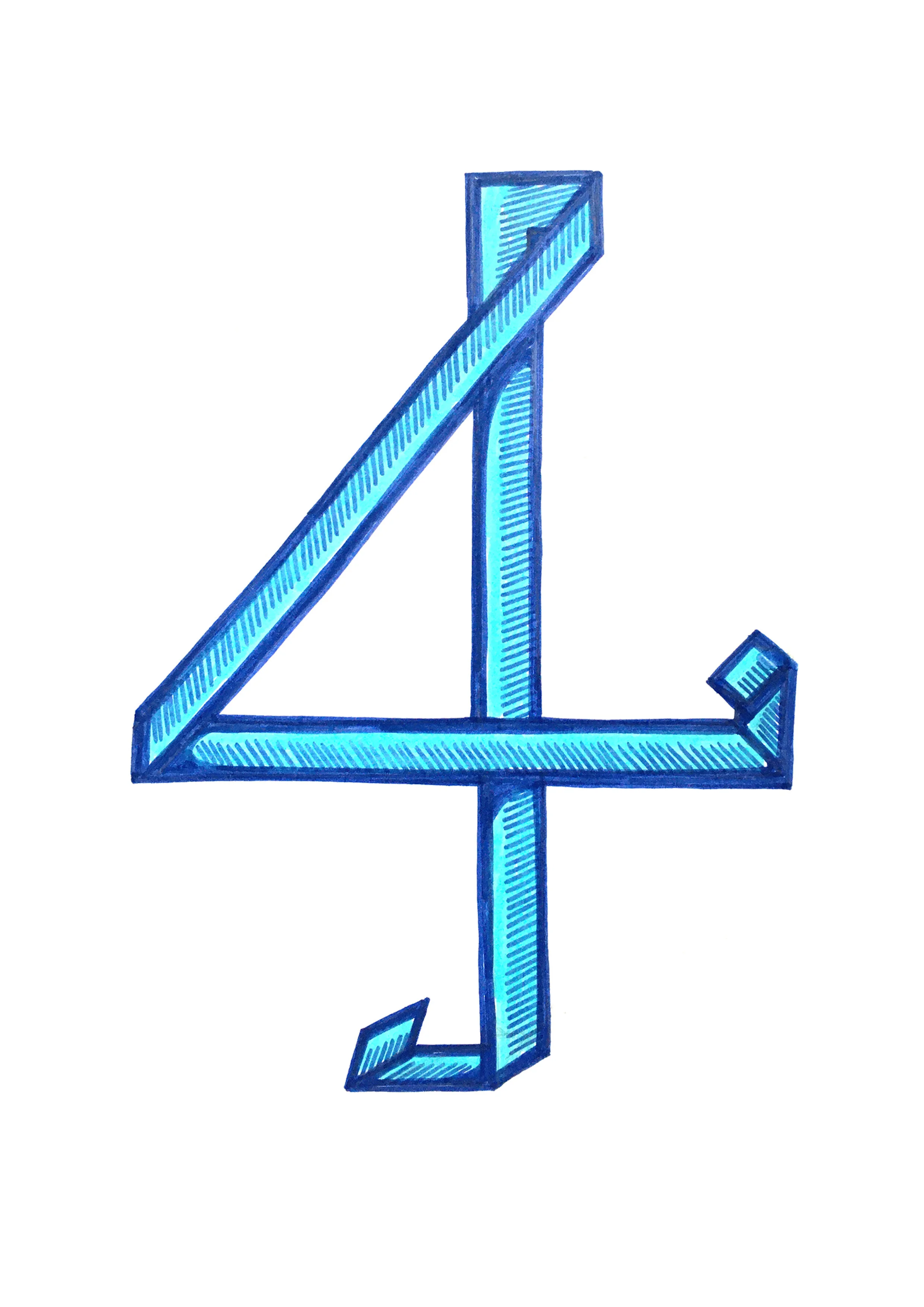
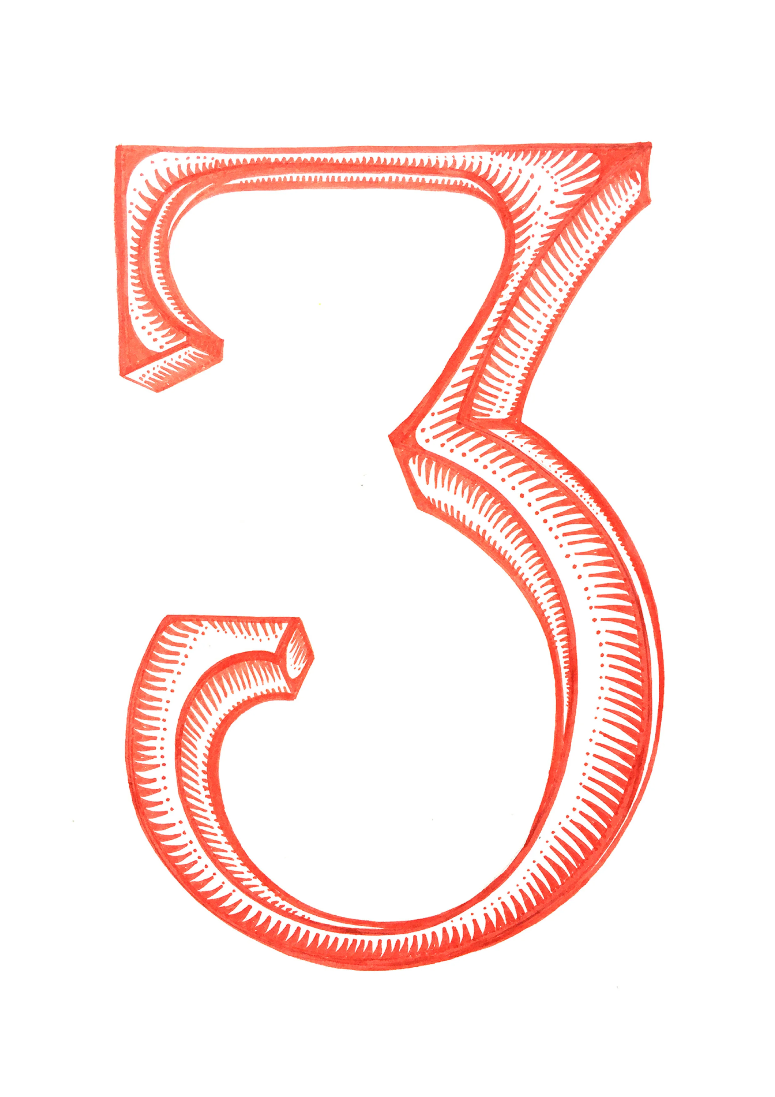
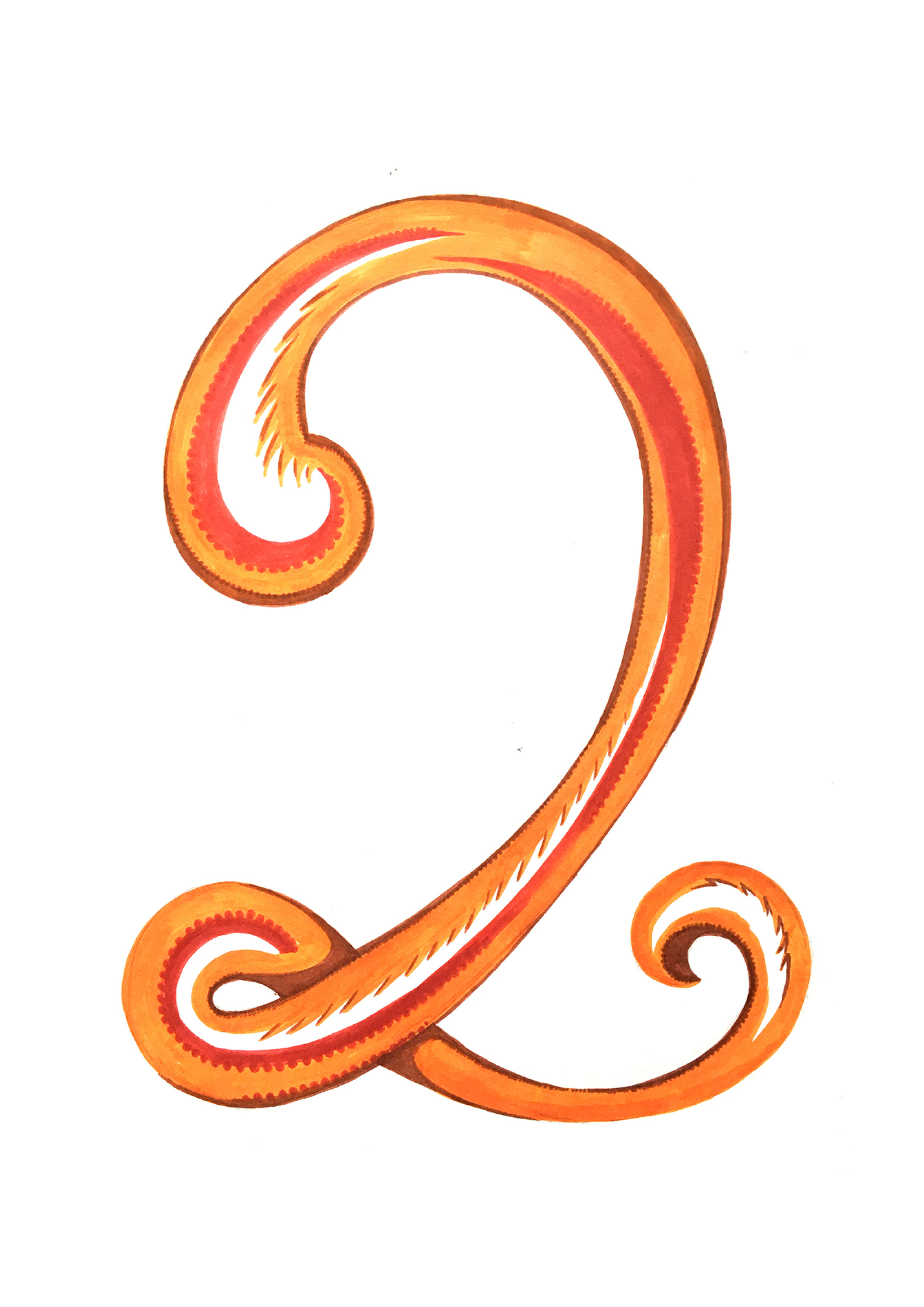
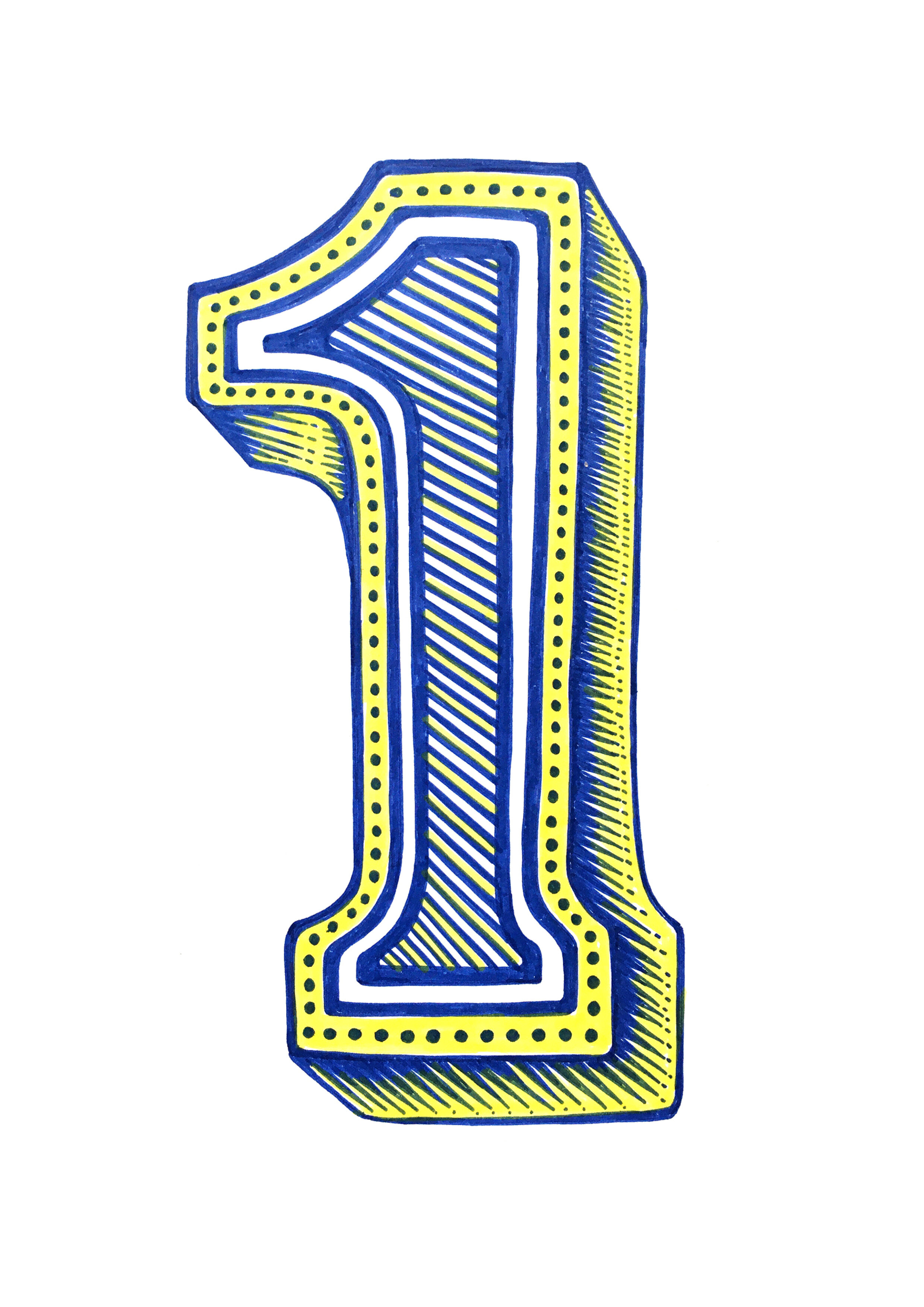
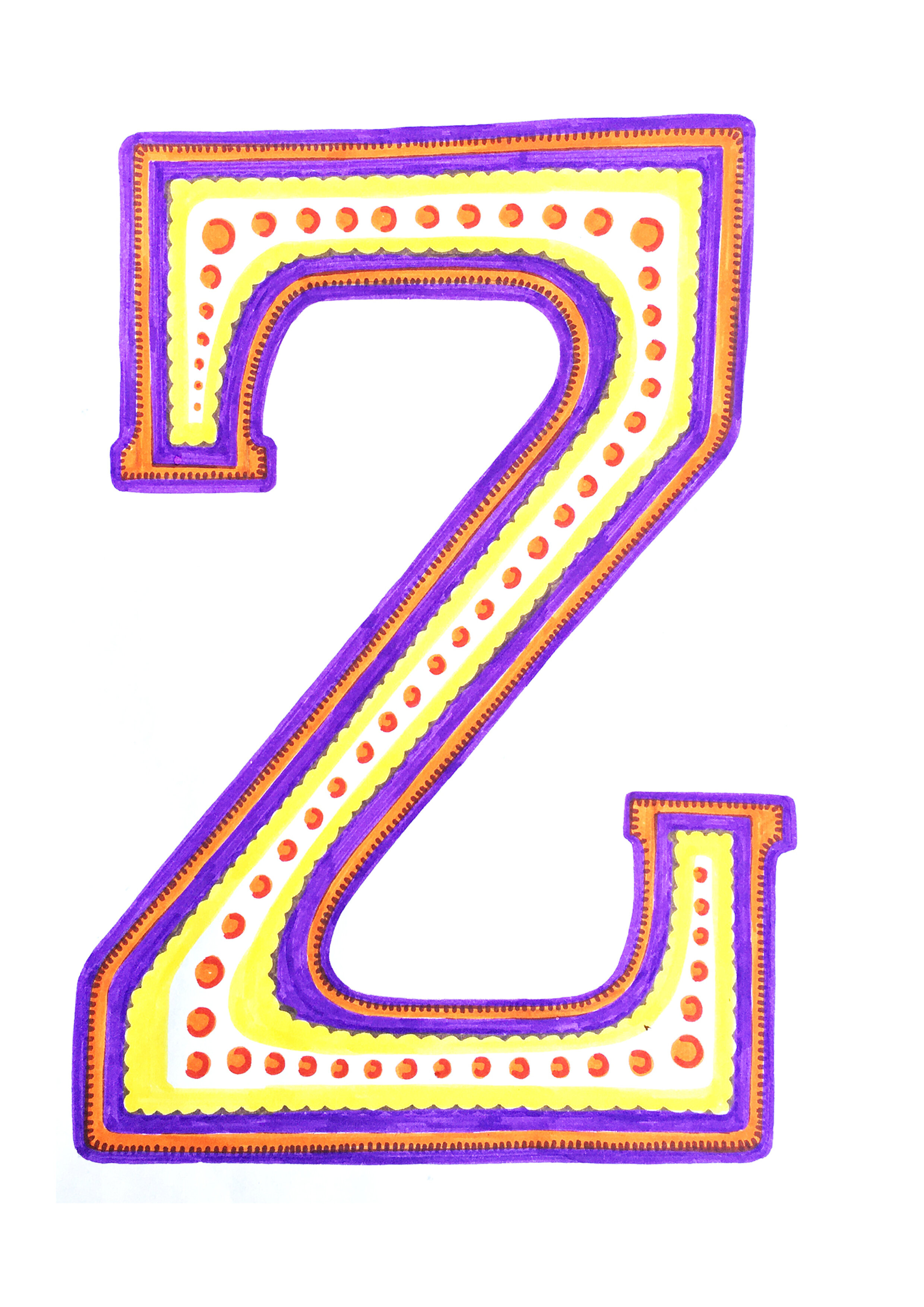
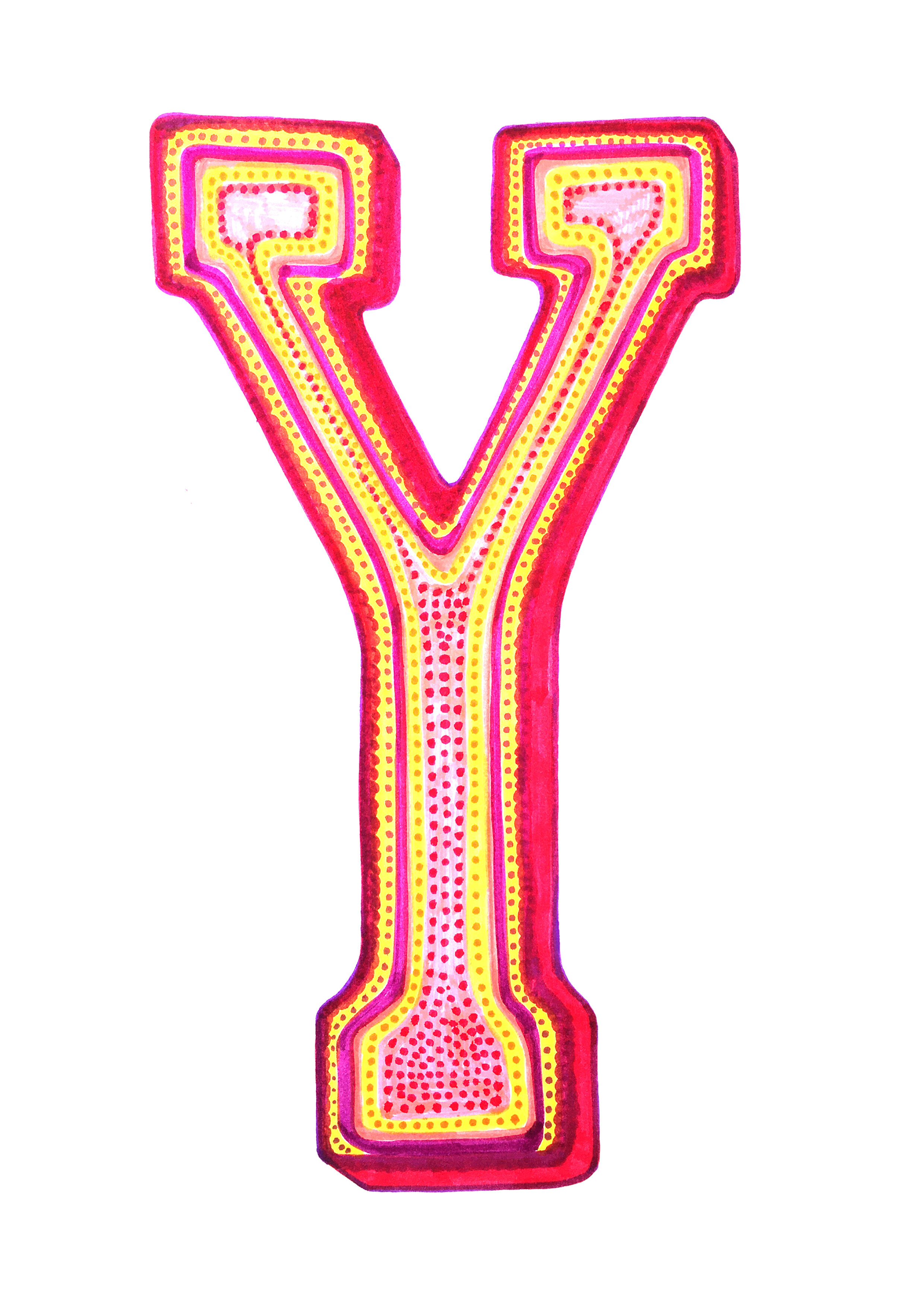
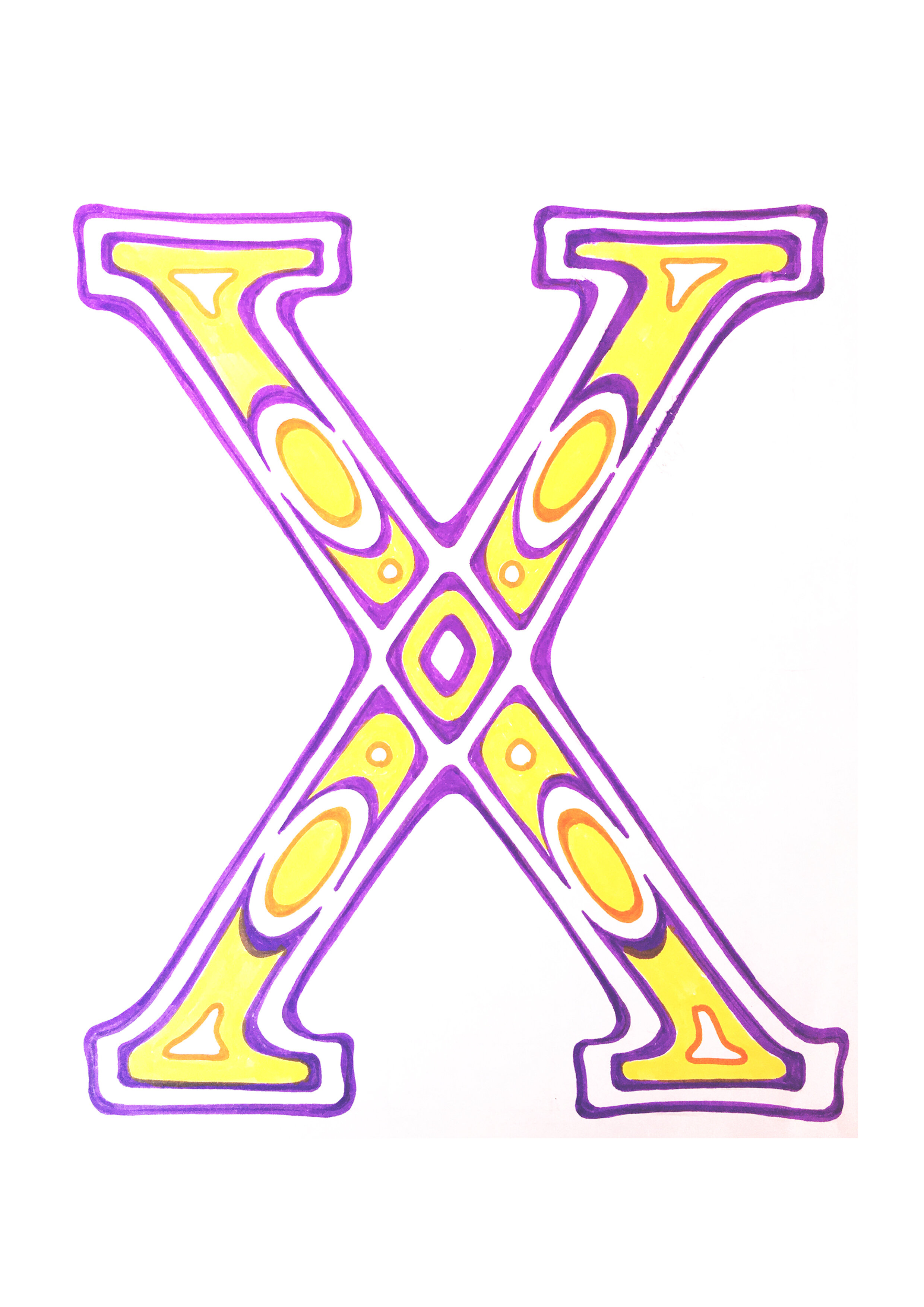

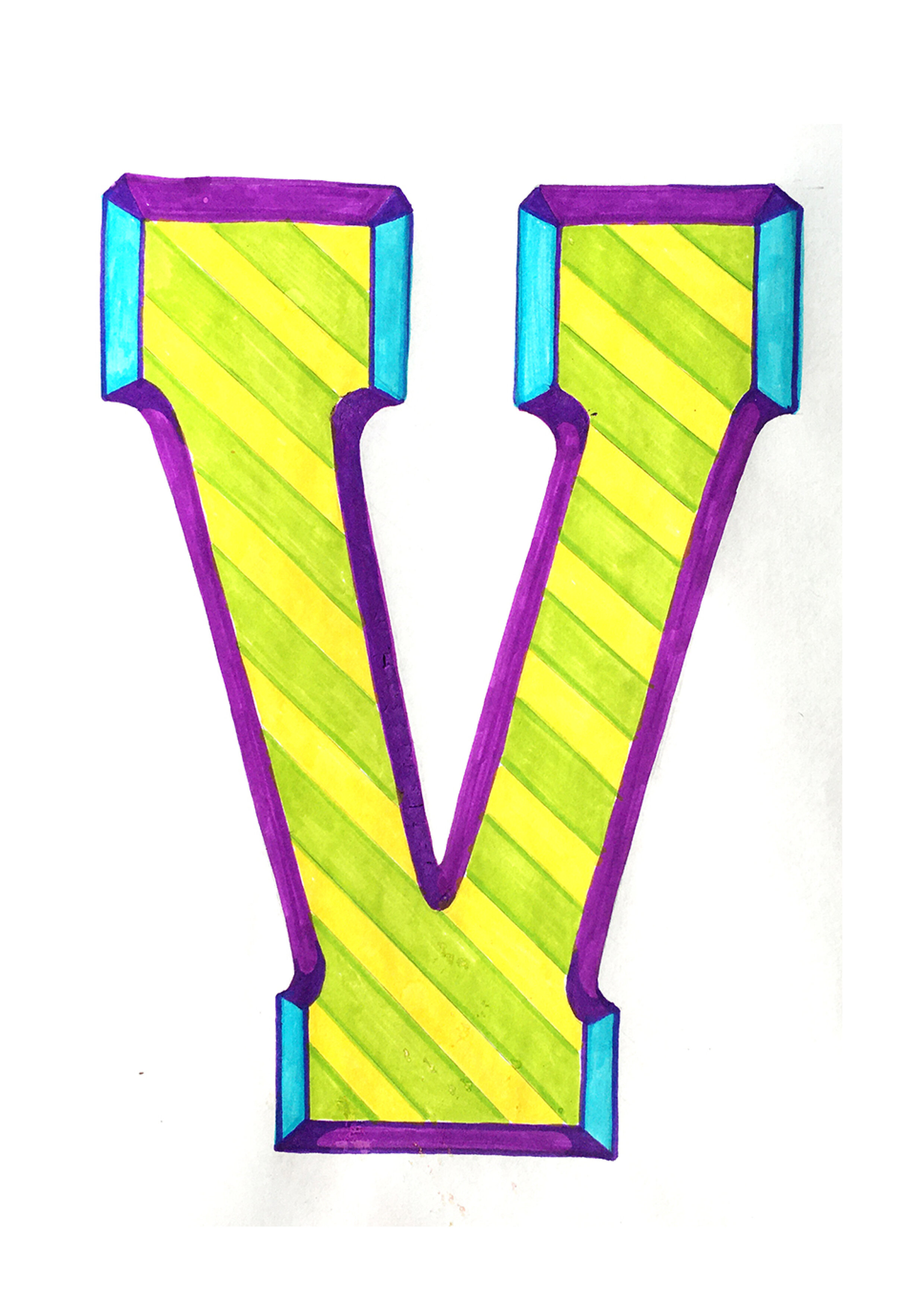
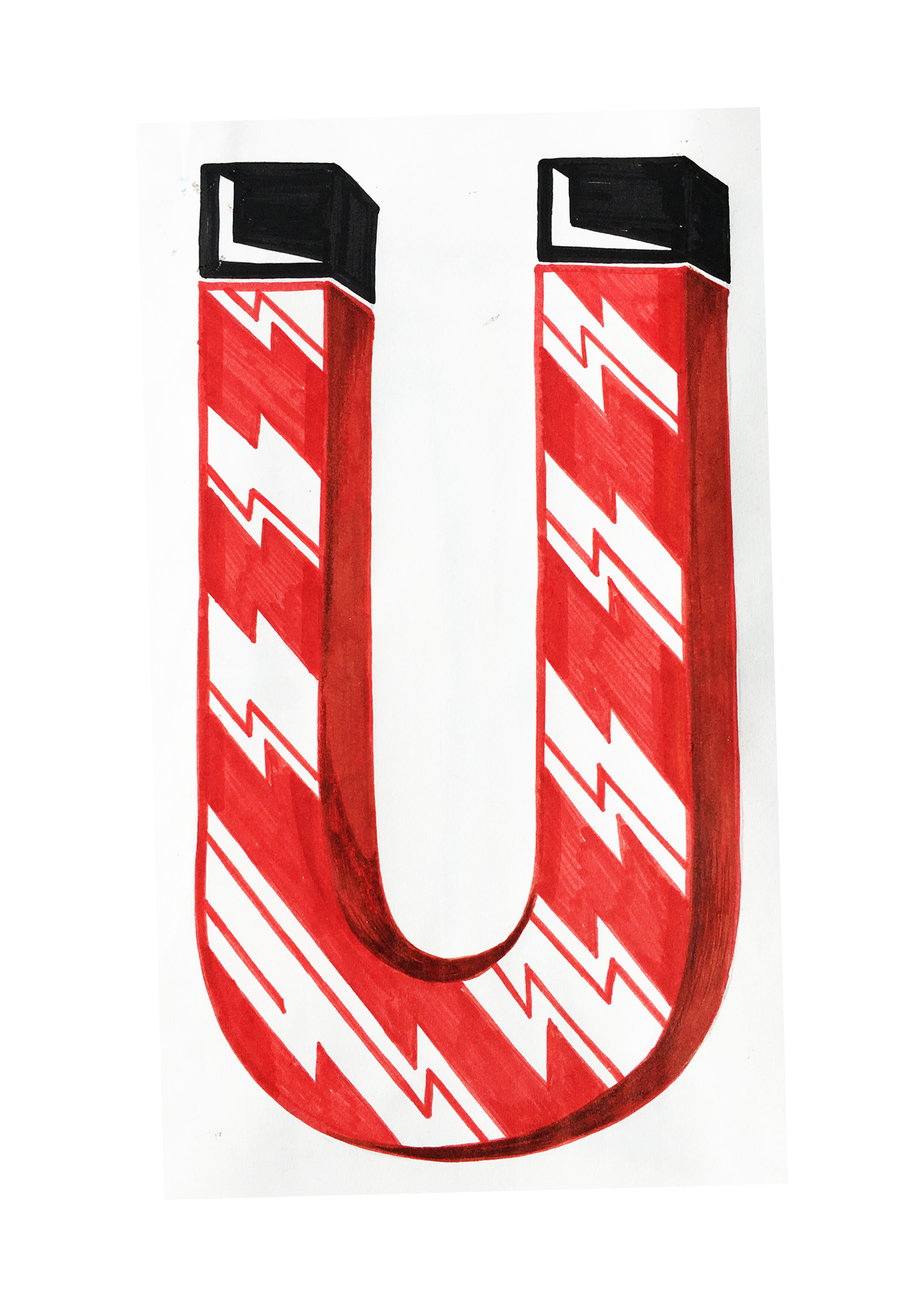
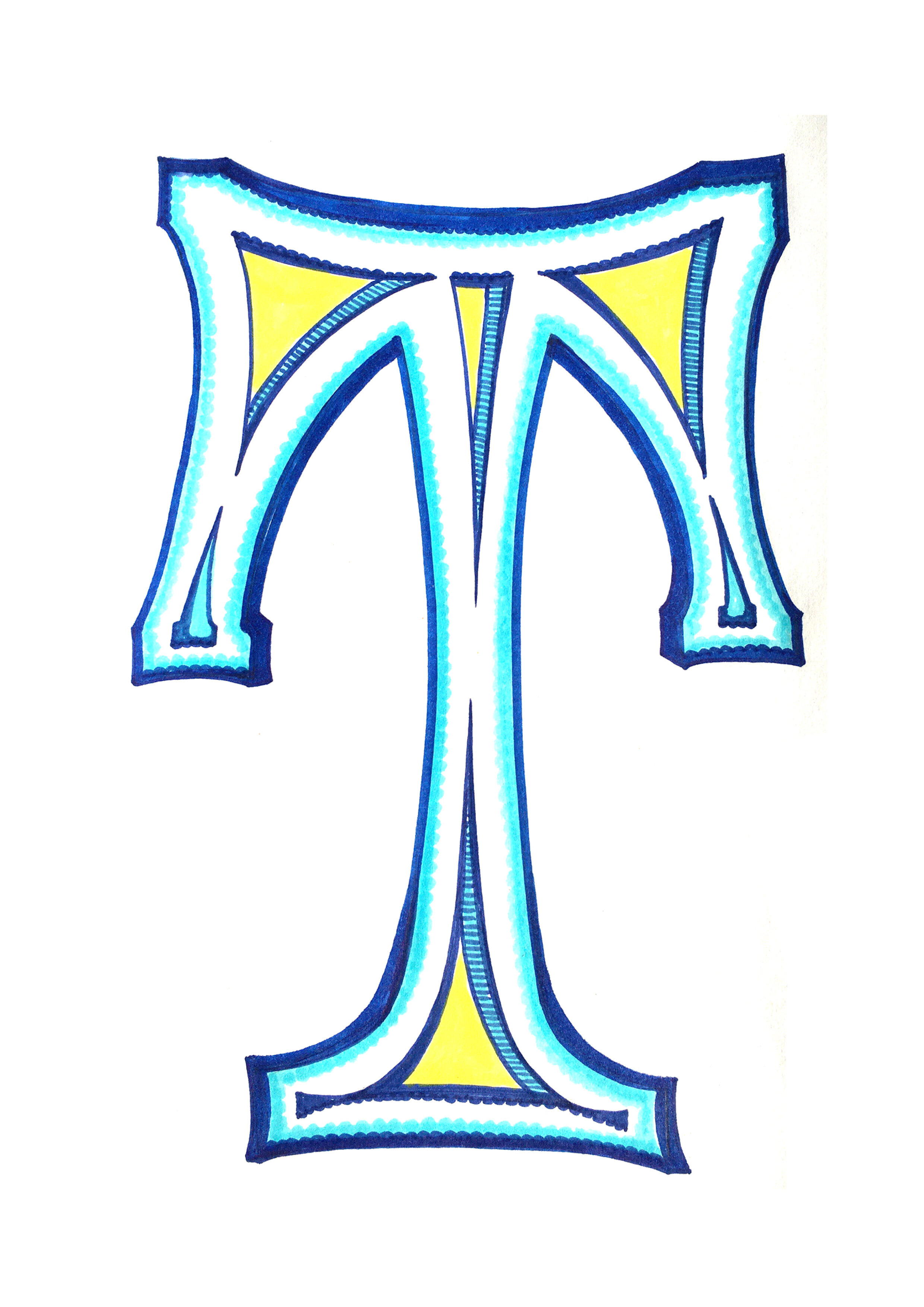
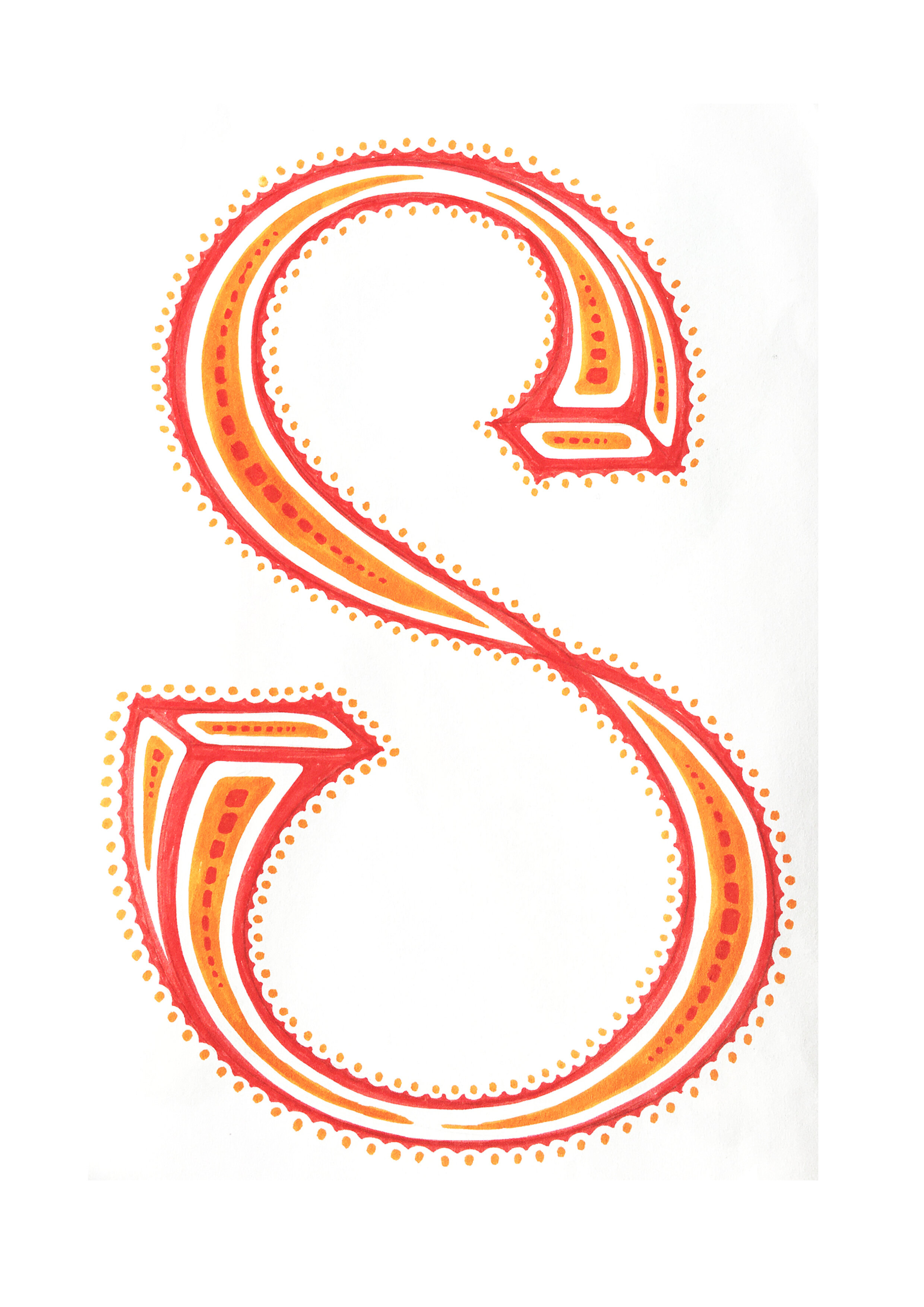
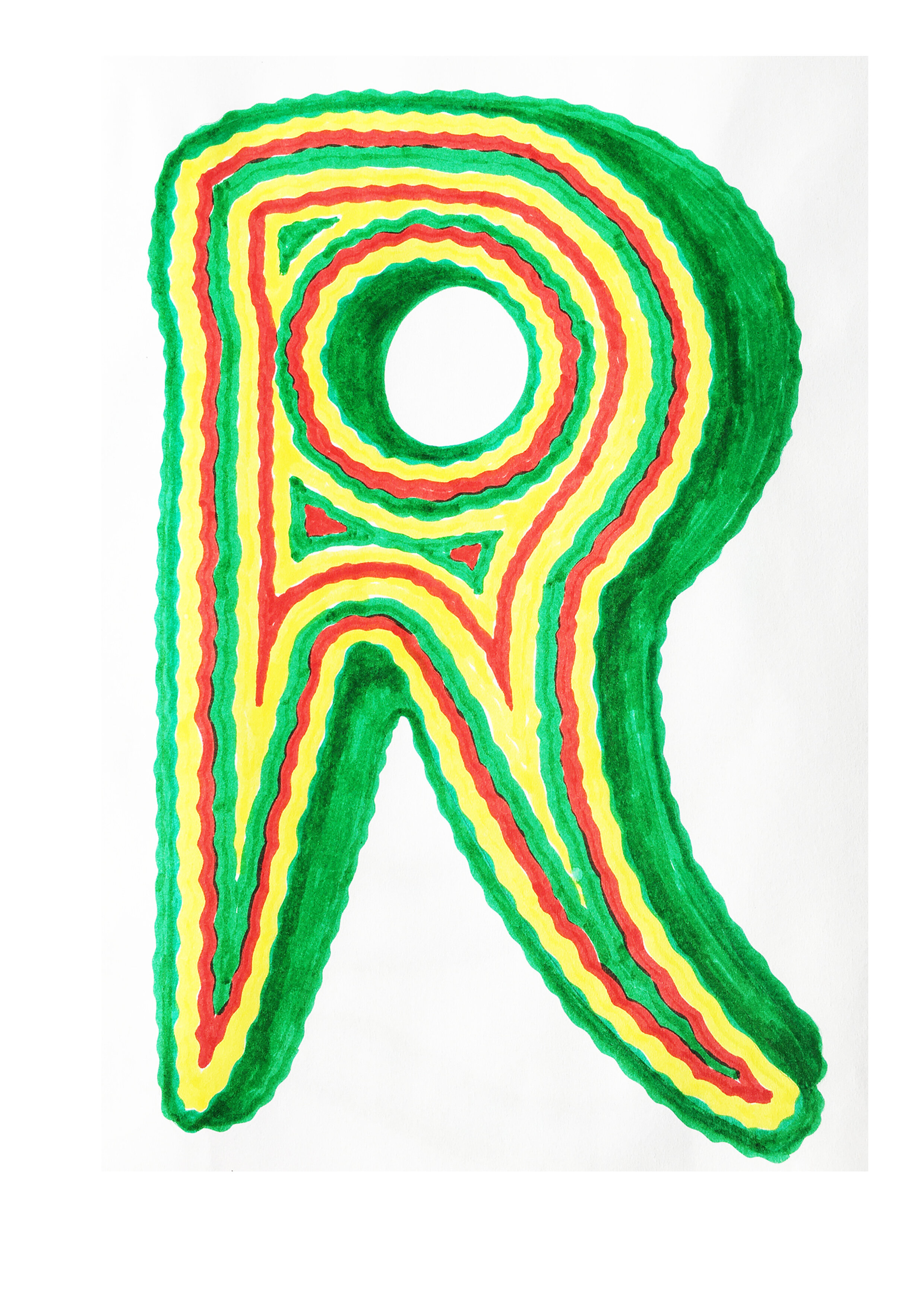

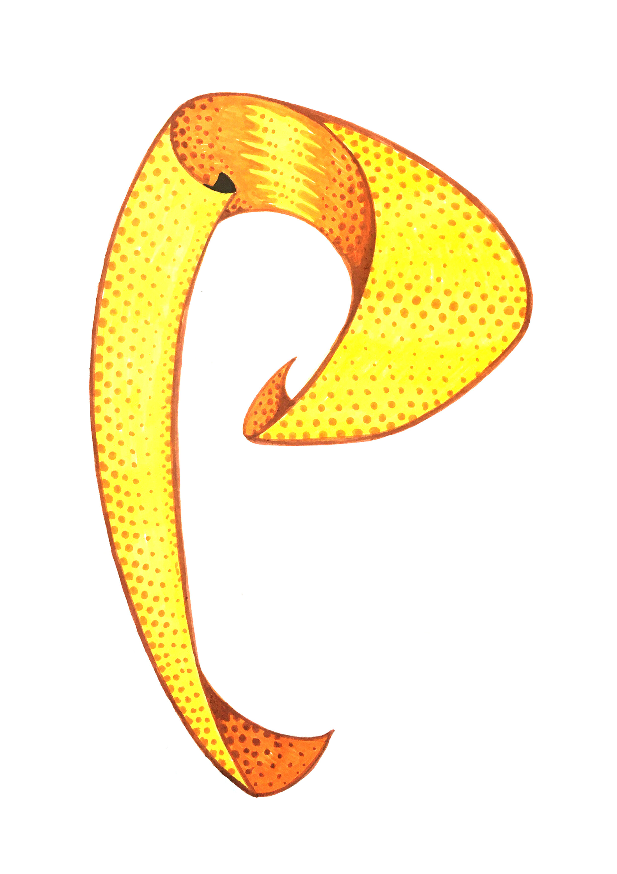
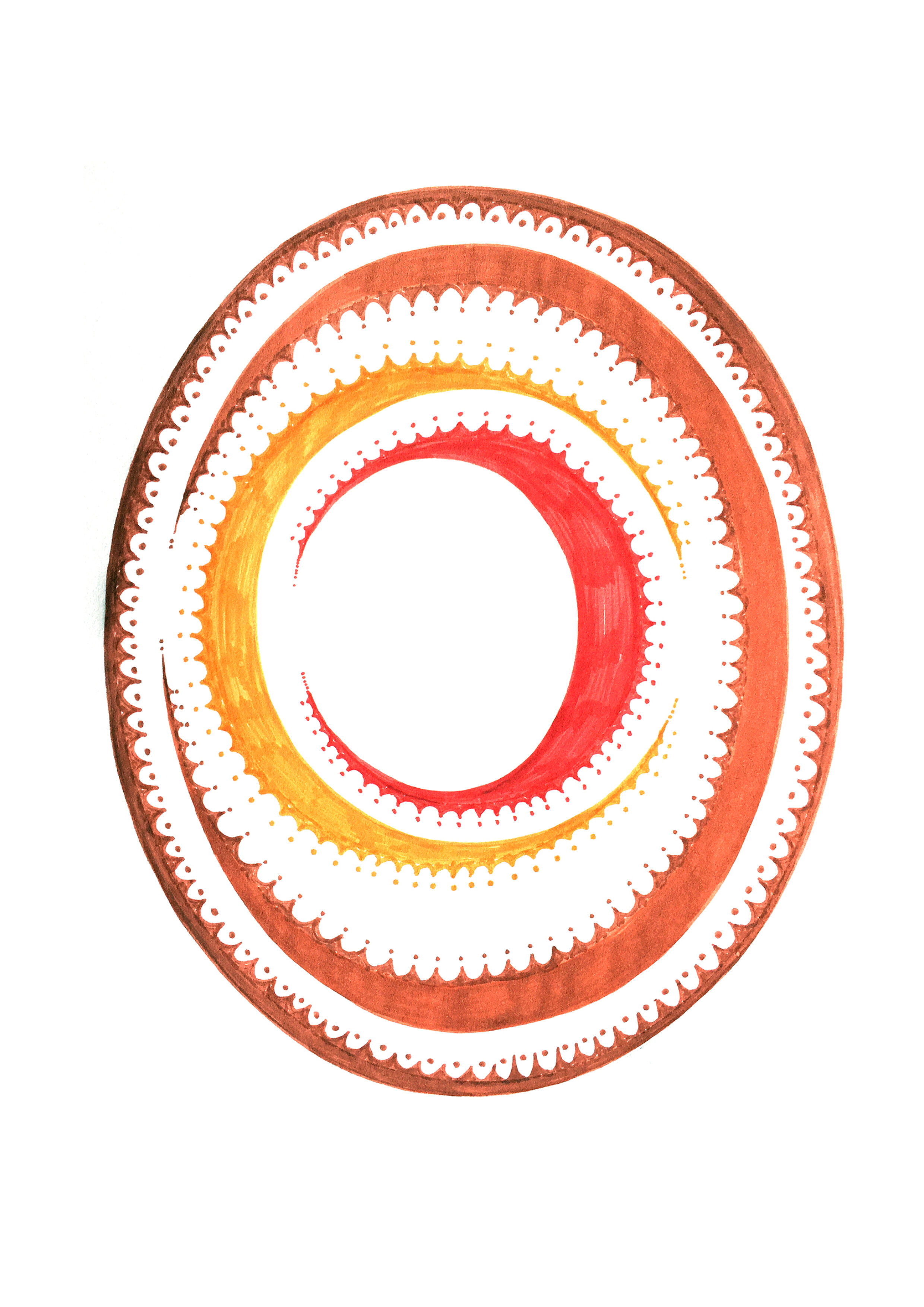
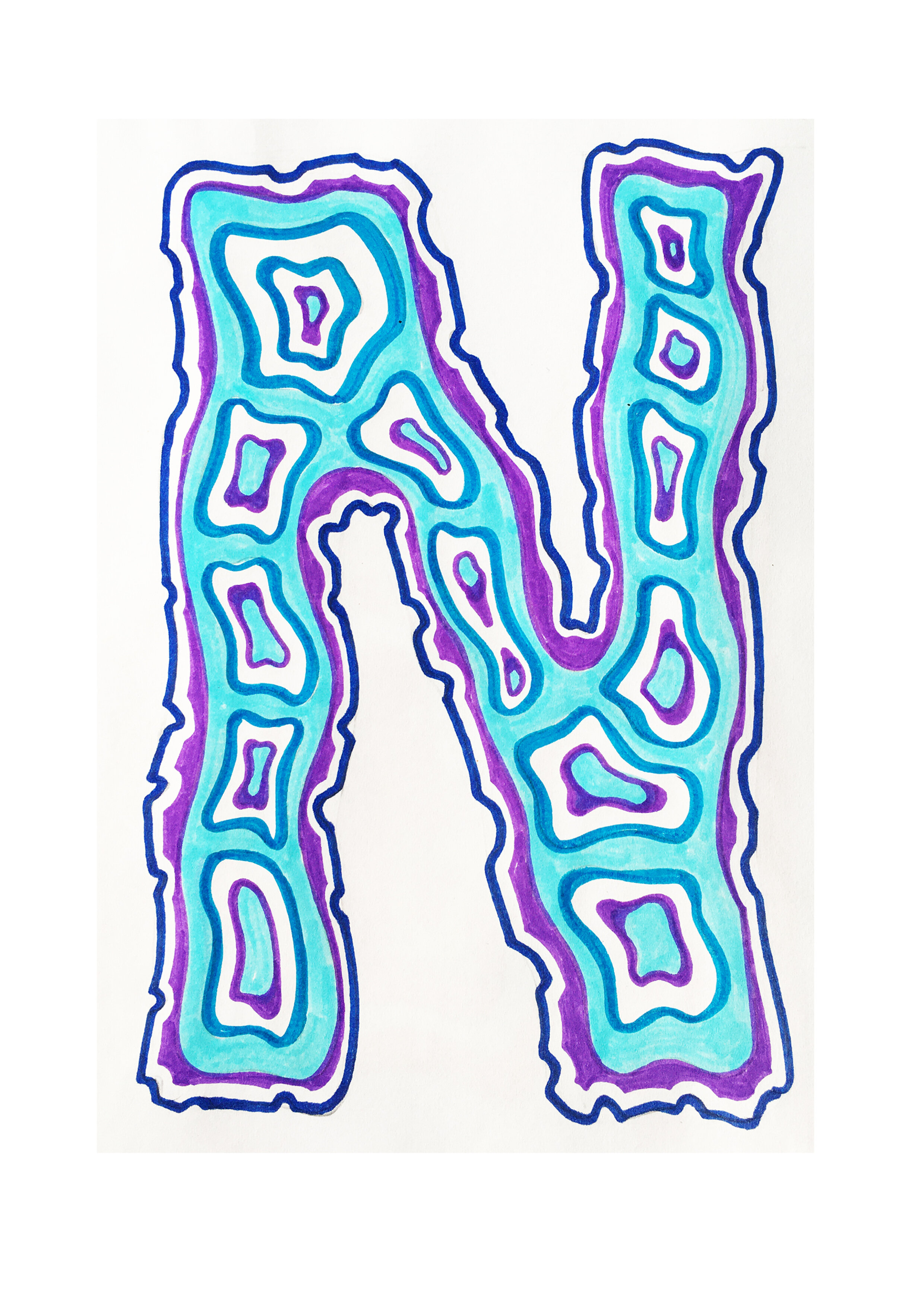

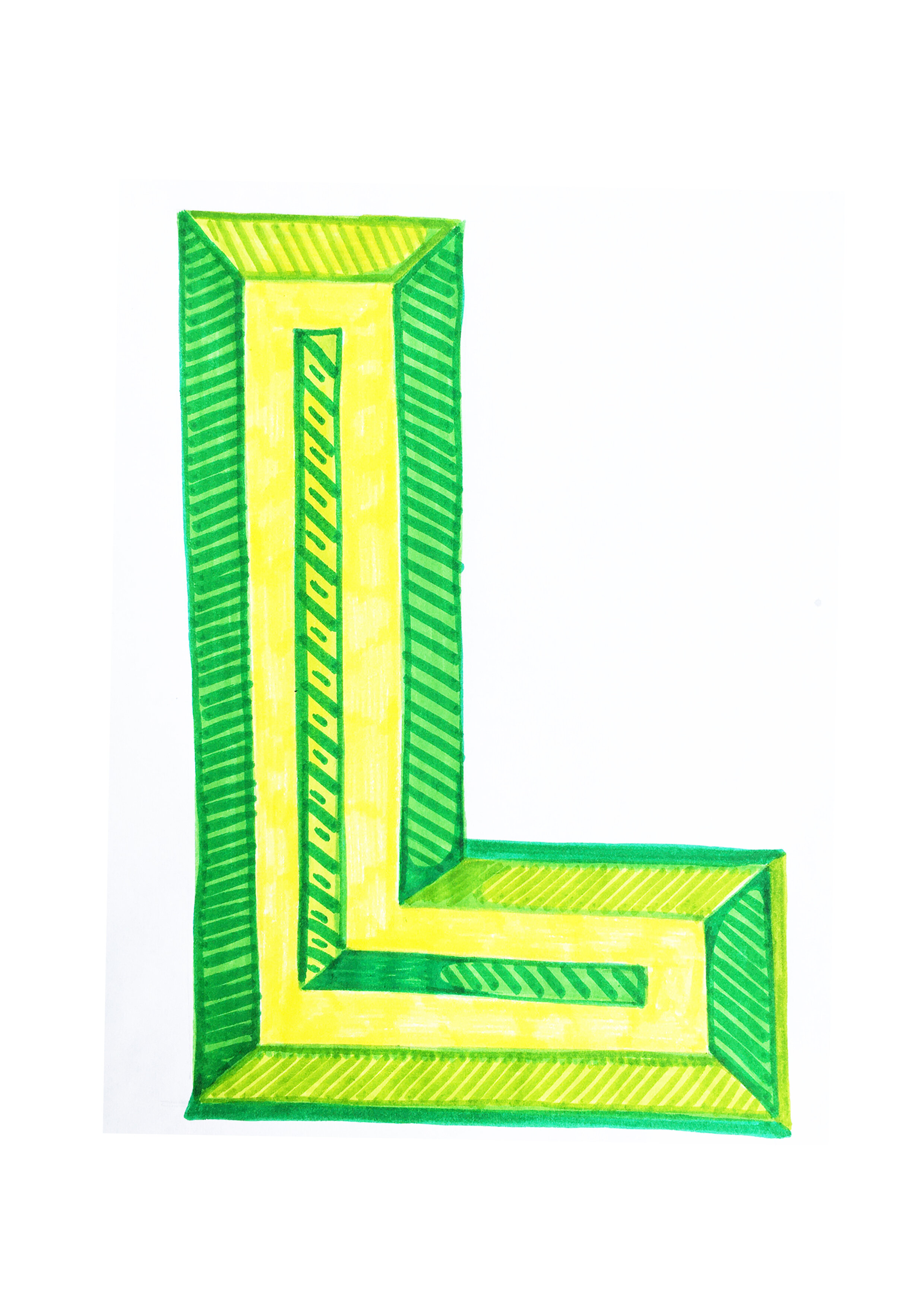
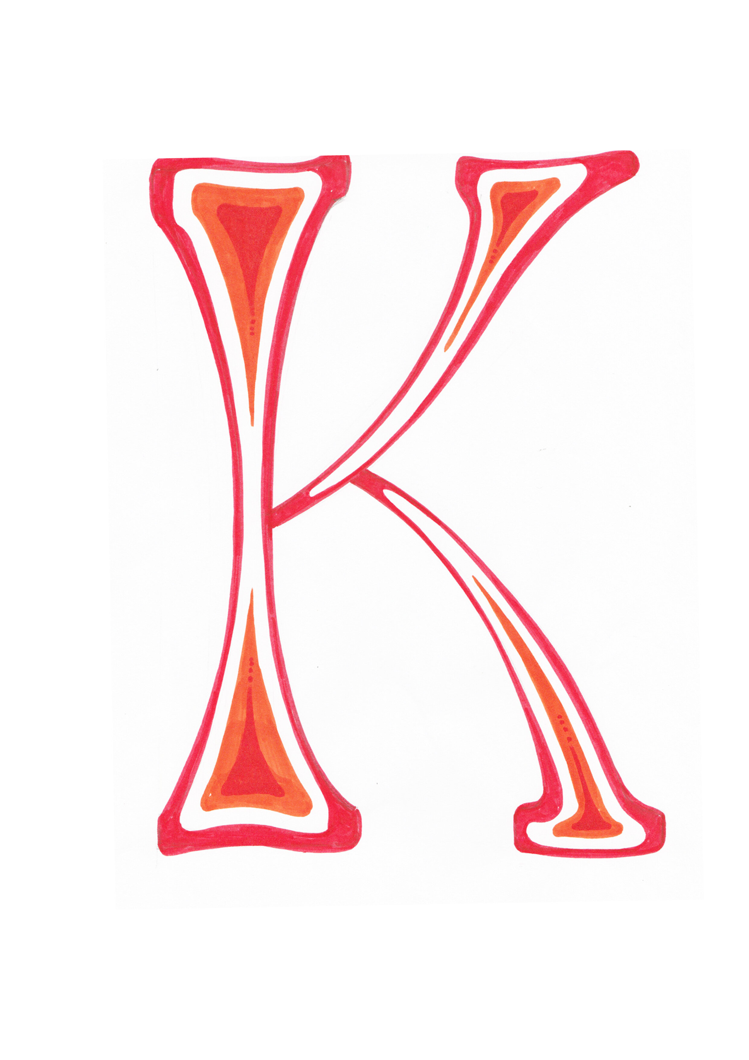

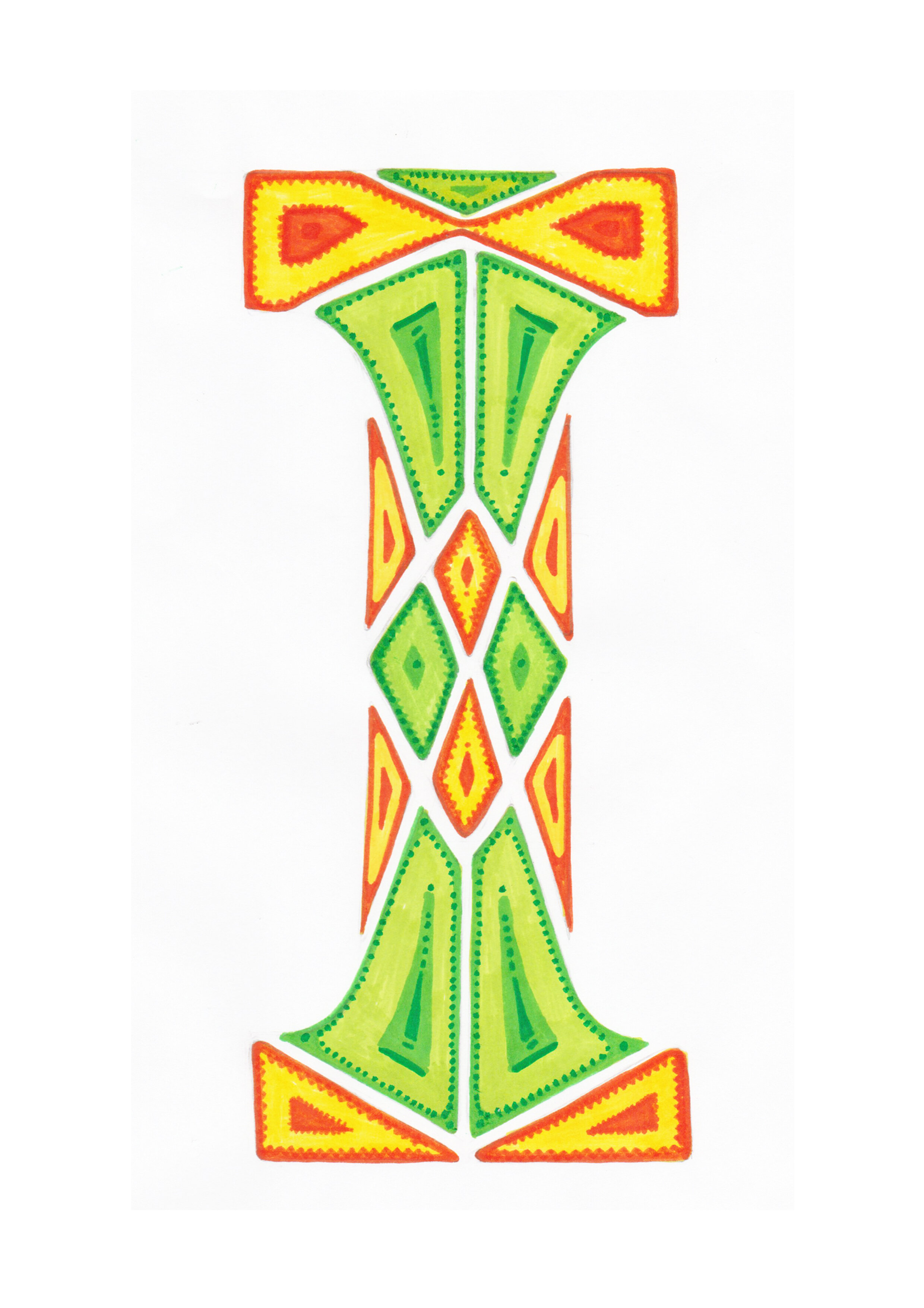
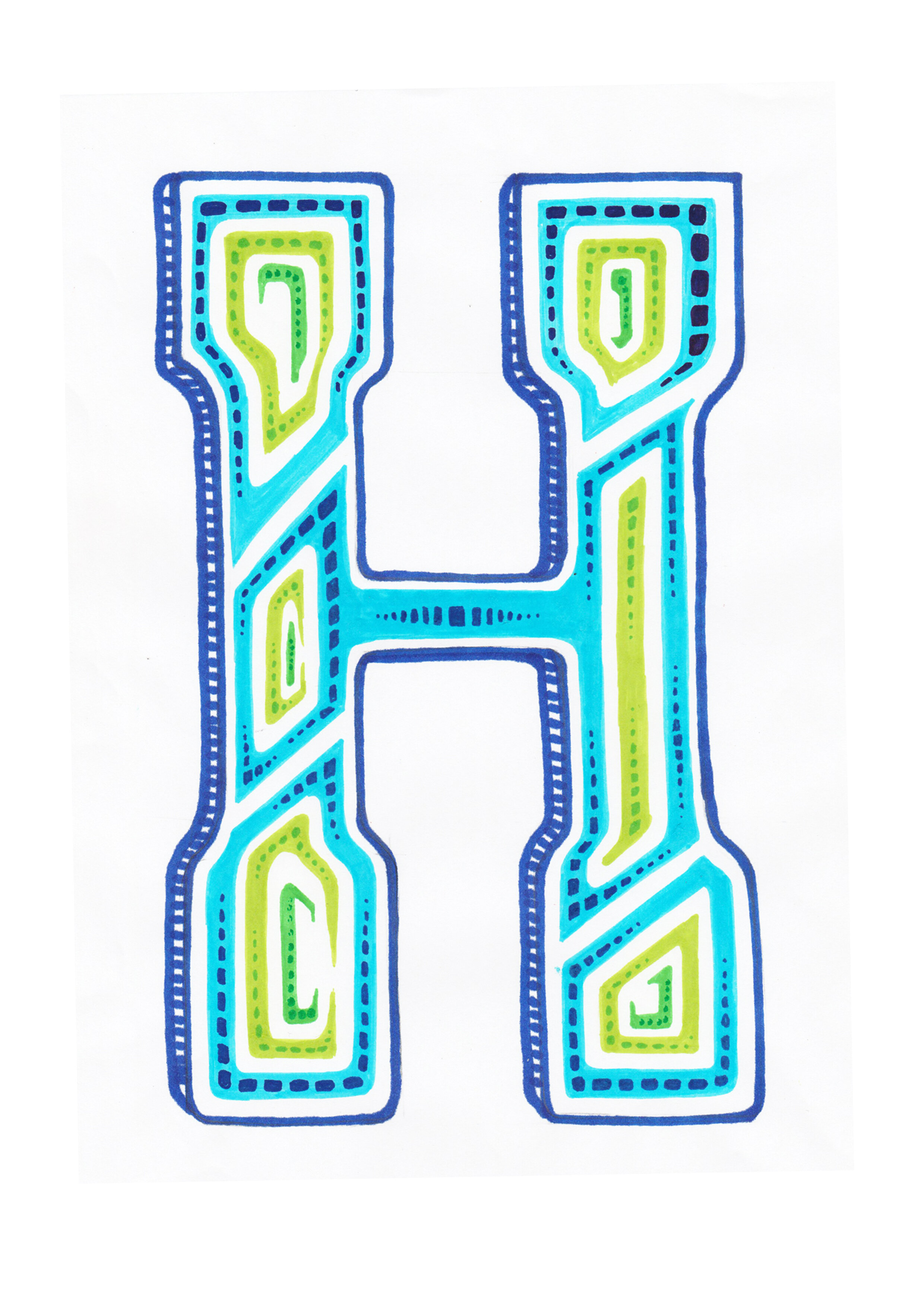
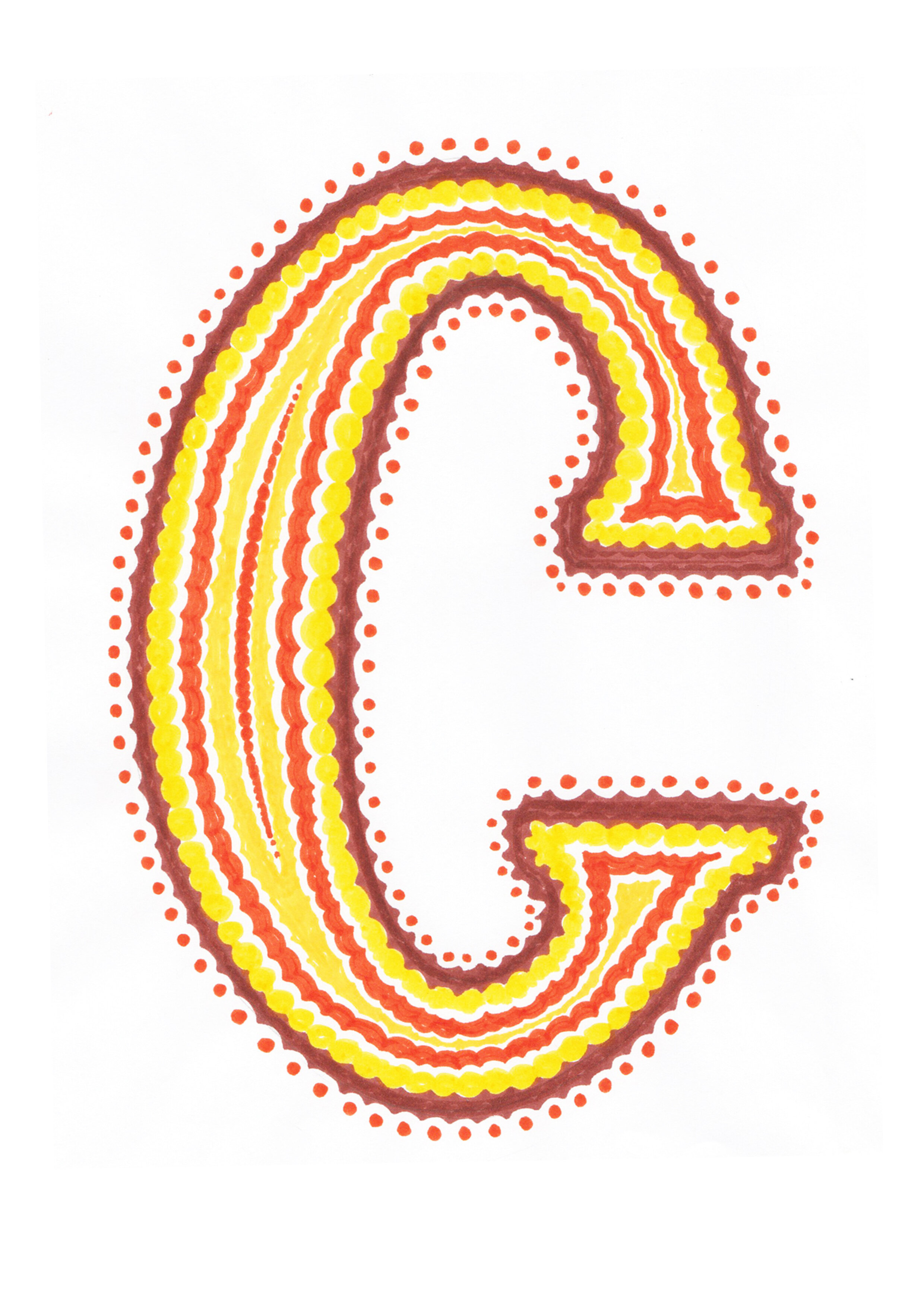
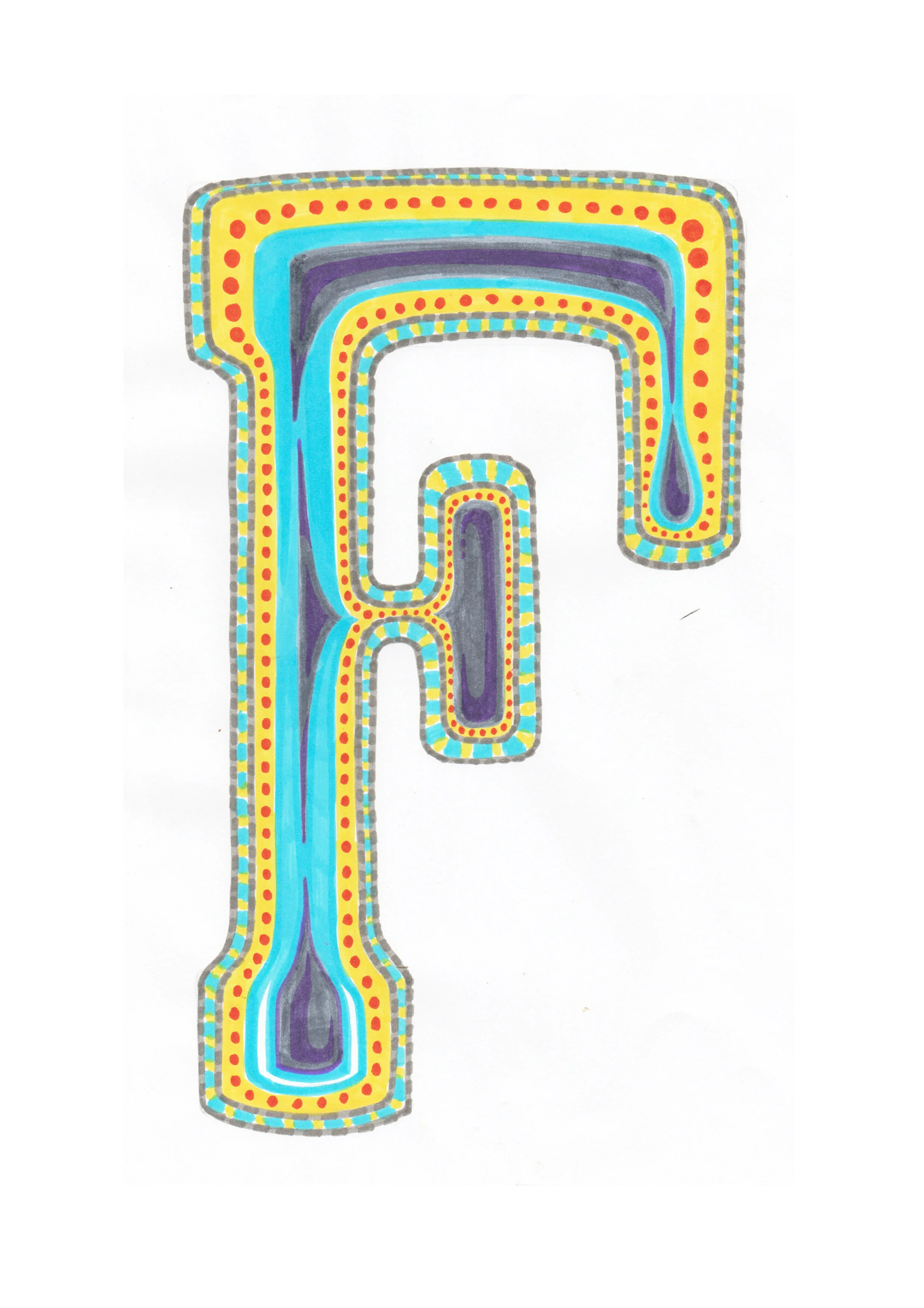
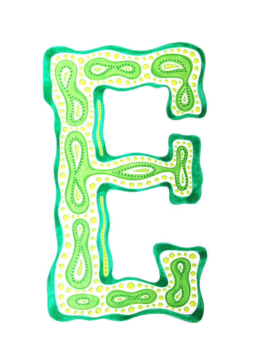
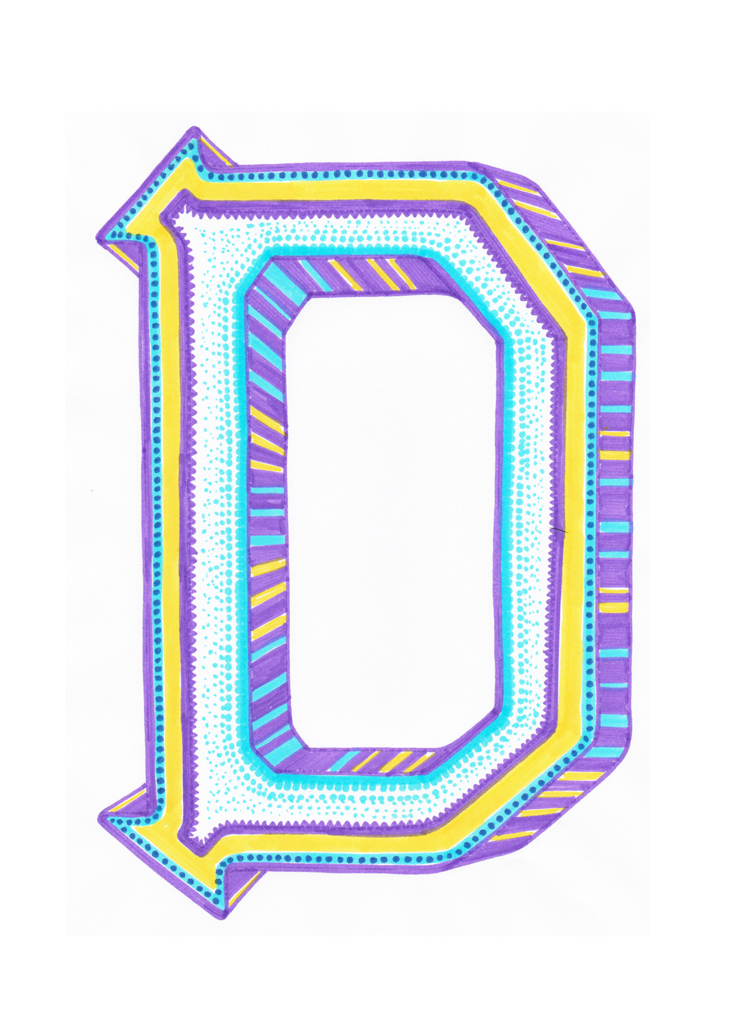


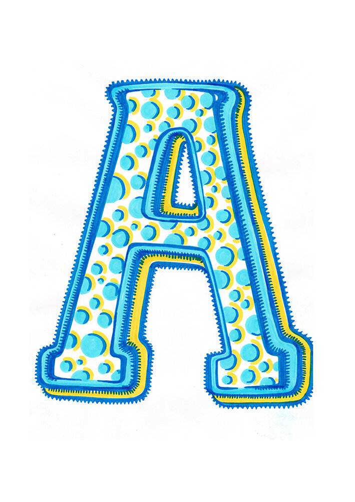

Eliza’s Pens
Milton Glaser “pushed everyone to always be drawing and sketching”, telling his students that: “Drawing is thinking.” This echoes Glaser’s comment to Design Week: “If you can’t draw as a designer, you’re in real trouble.” “Many people in graphic arts are incapable of drawing, and this limits them to layout, collage and typography,” he continued. “I come to each project with an open mind, then what emerges stylistically is something that is driven by the audience.”
Here we feature Justin Rolfe’s D&AD nominated typographic submission from 2015.
Great example of well observed, well cropped and well appropriated found typography hidden within Hitchcock’s films.
Here we feature another D&AD entry to the Monotype typography brief.
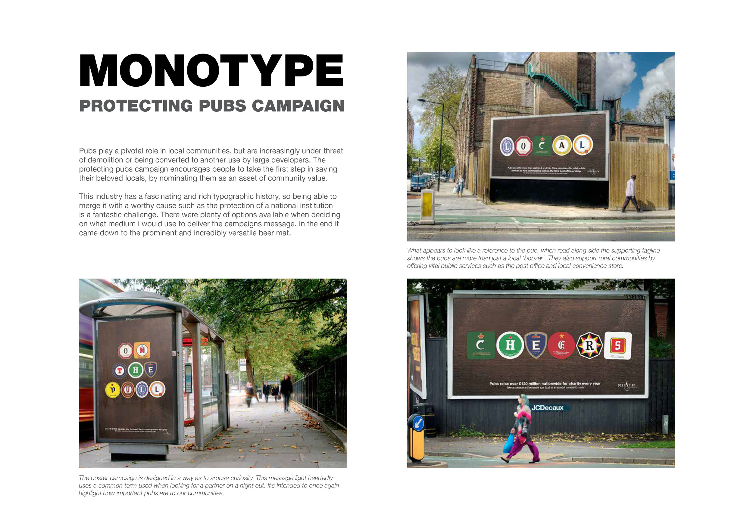
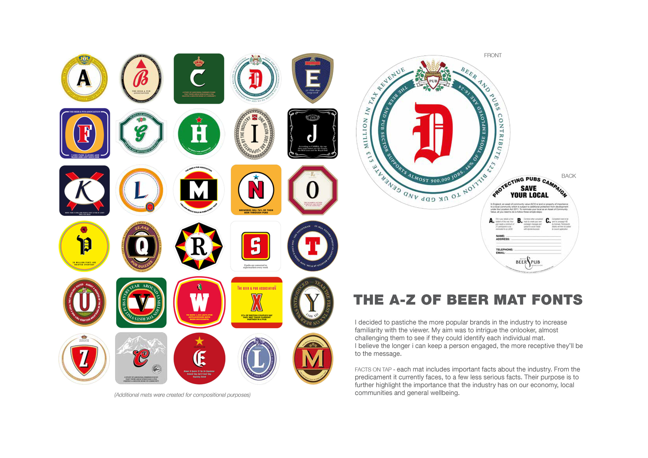
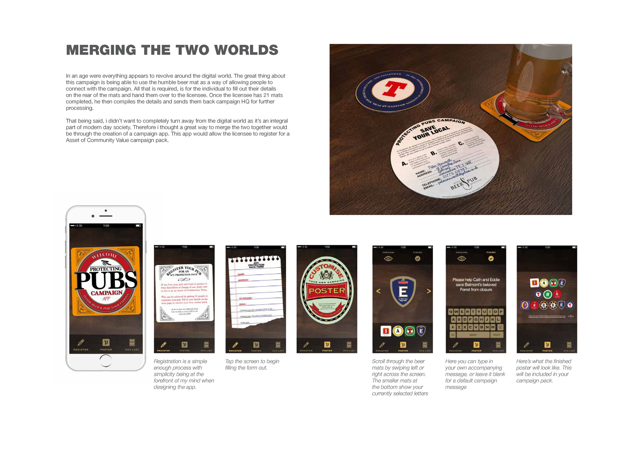
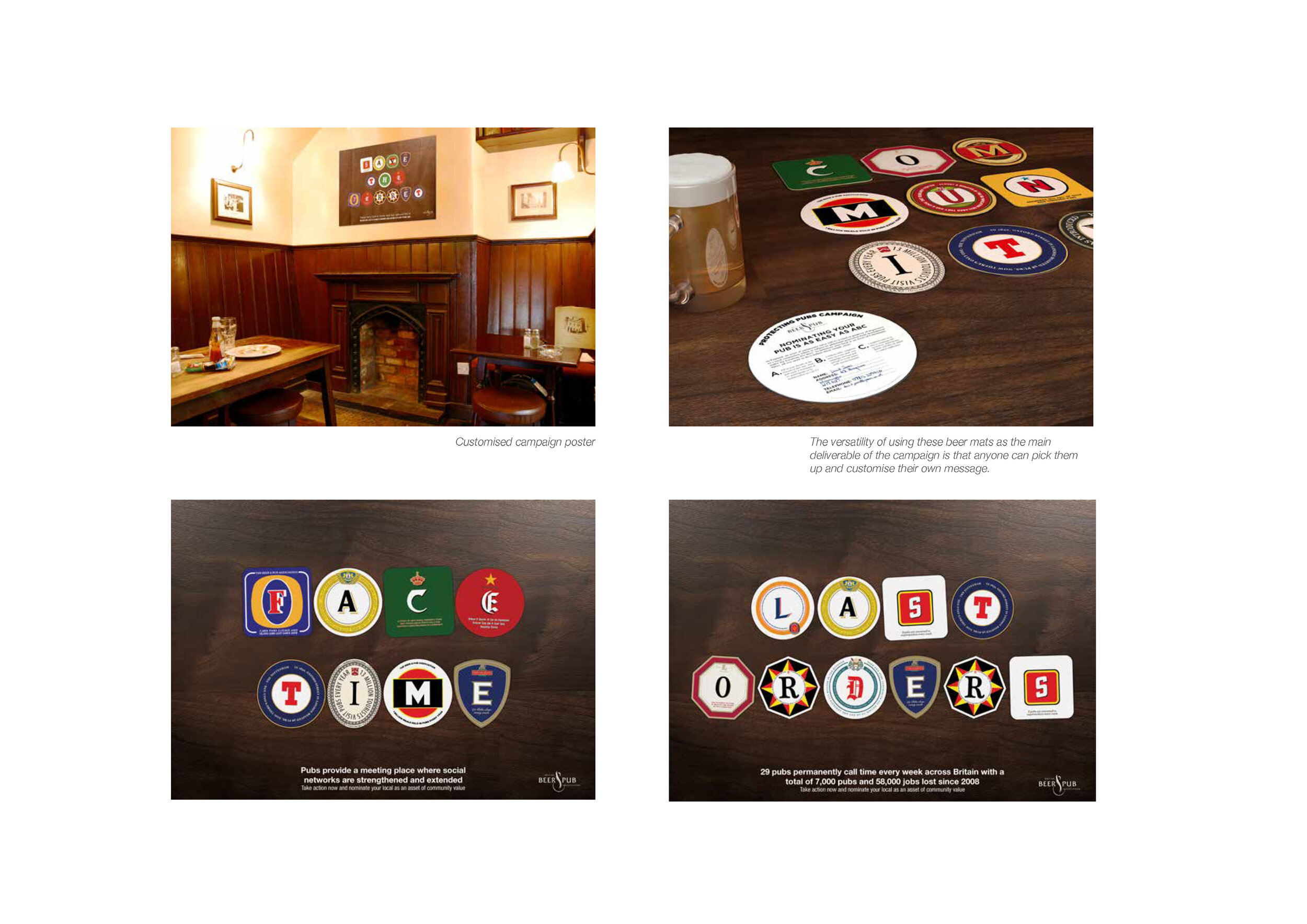
Pubs play a pivotal role in local communities, but are increasingly under threat of demolition or being converted to another use by large developers. The protecting pubs campaign designed by Neil Bennison encourages people to take the first step in saving their beloved locals, by nominating them as an asset of community value.
The pub industry has a rich typographic history, so being able to merge it with a worthy cause such as the protection of a national institution is a fantastic challenge. Using the versatility of a beer mat, a custom typeface was created which would underpin all messaging in the campaign.
THE CAMPAIGN
THE APP
As we’re currently off campus, we’re taking the time to trawl the archives, update and re-post where we can.
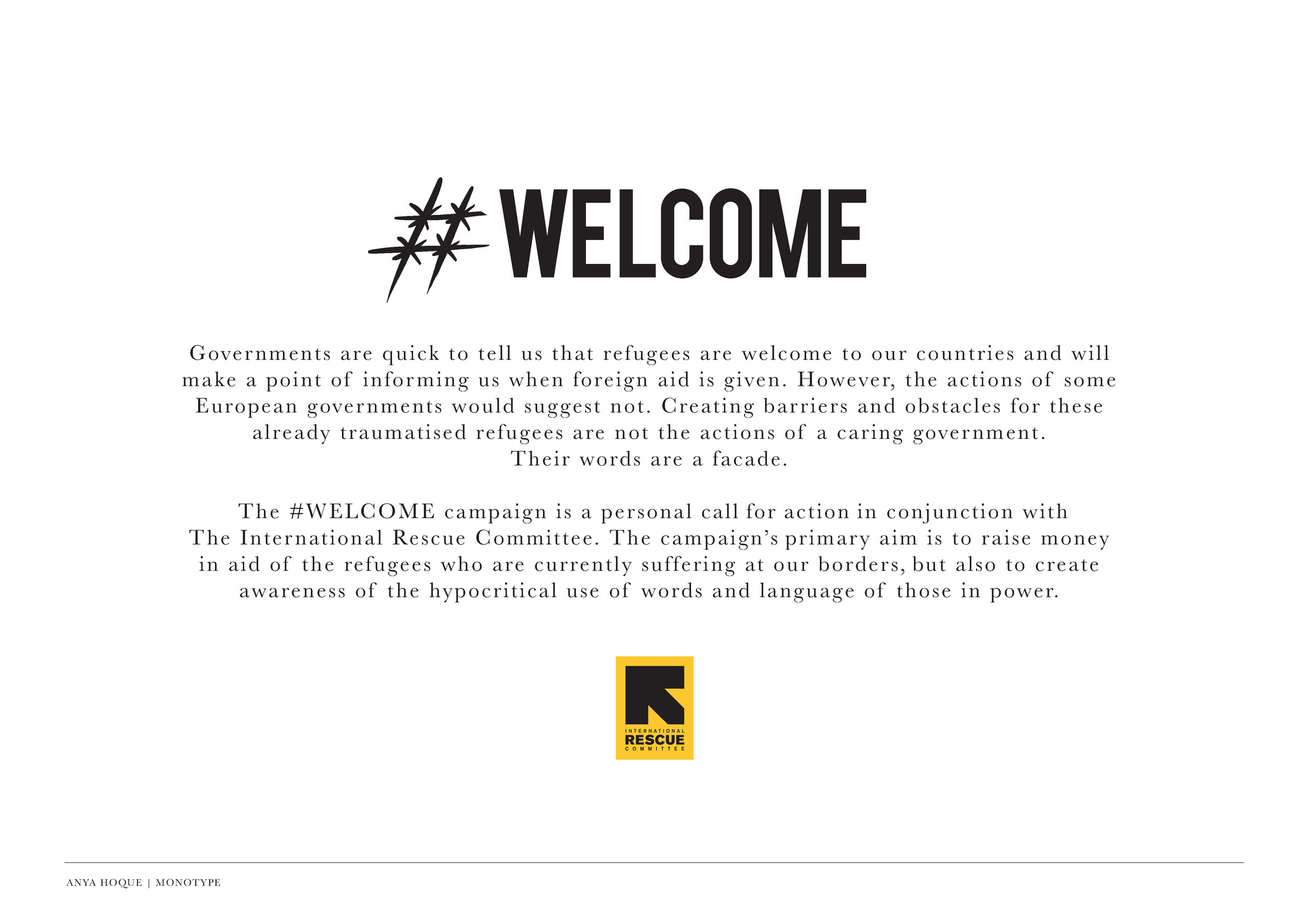
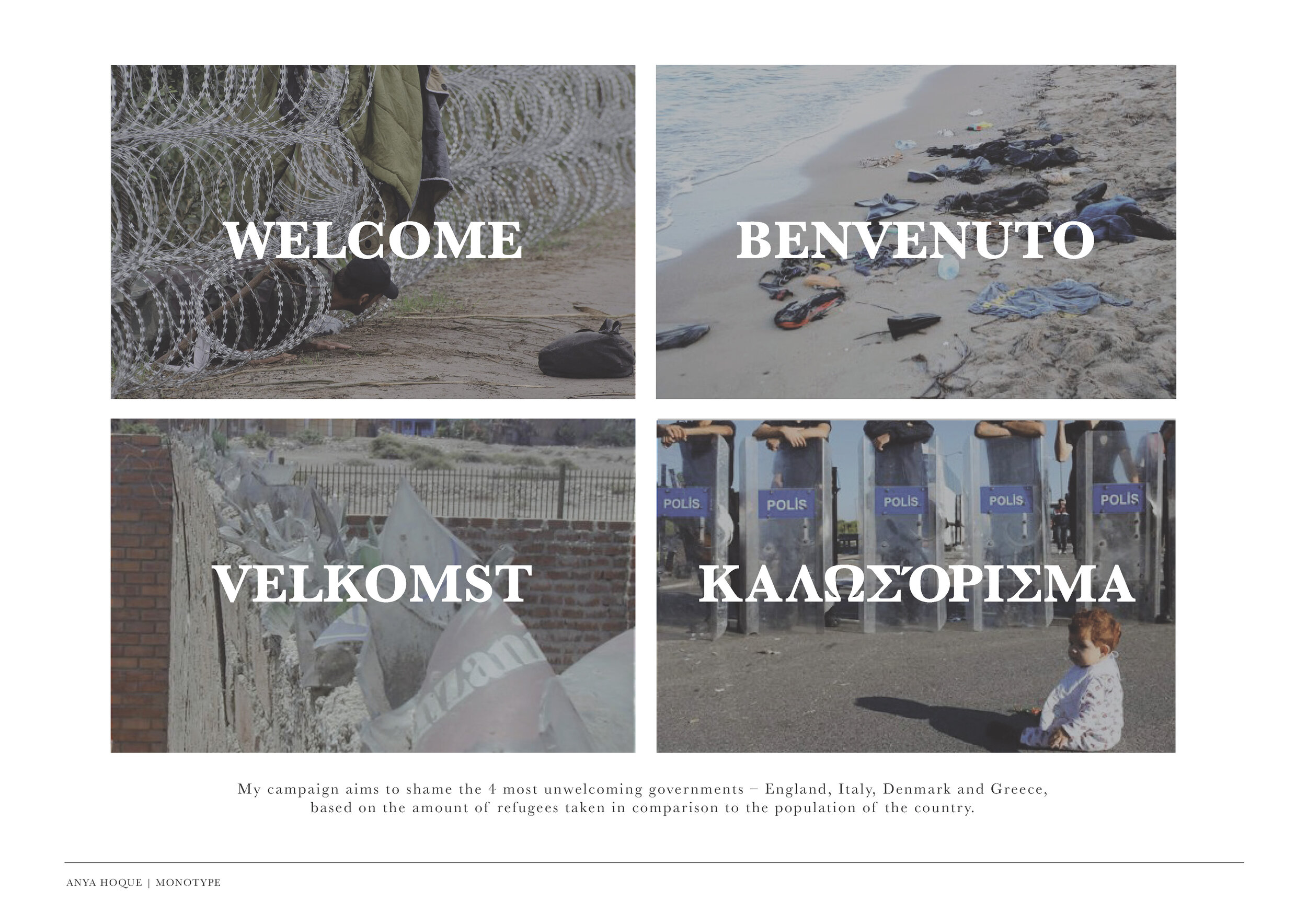
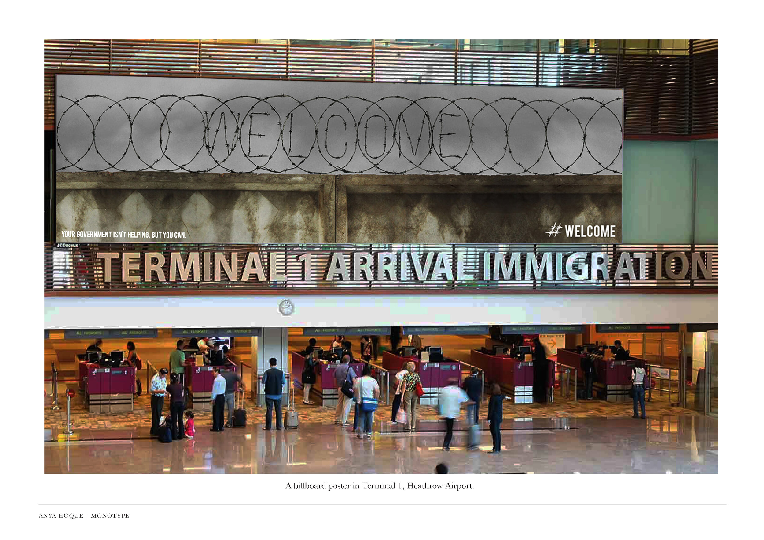
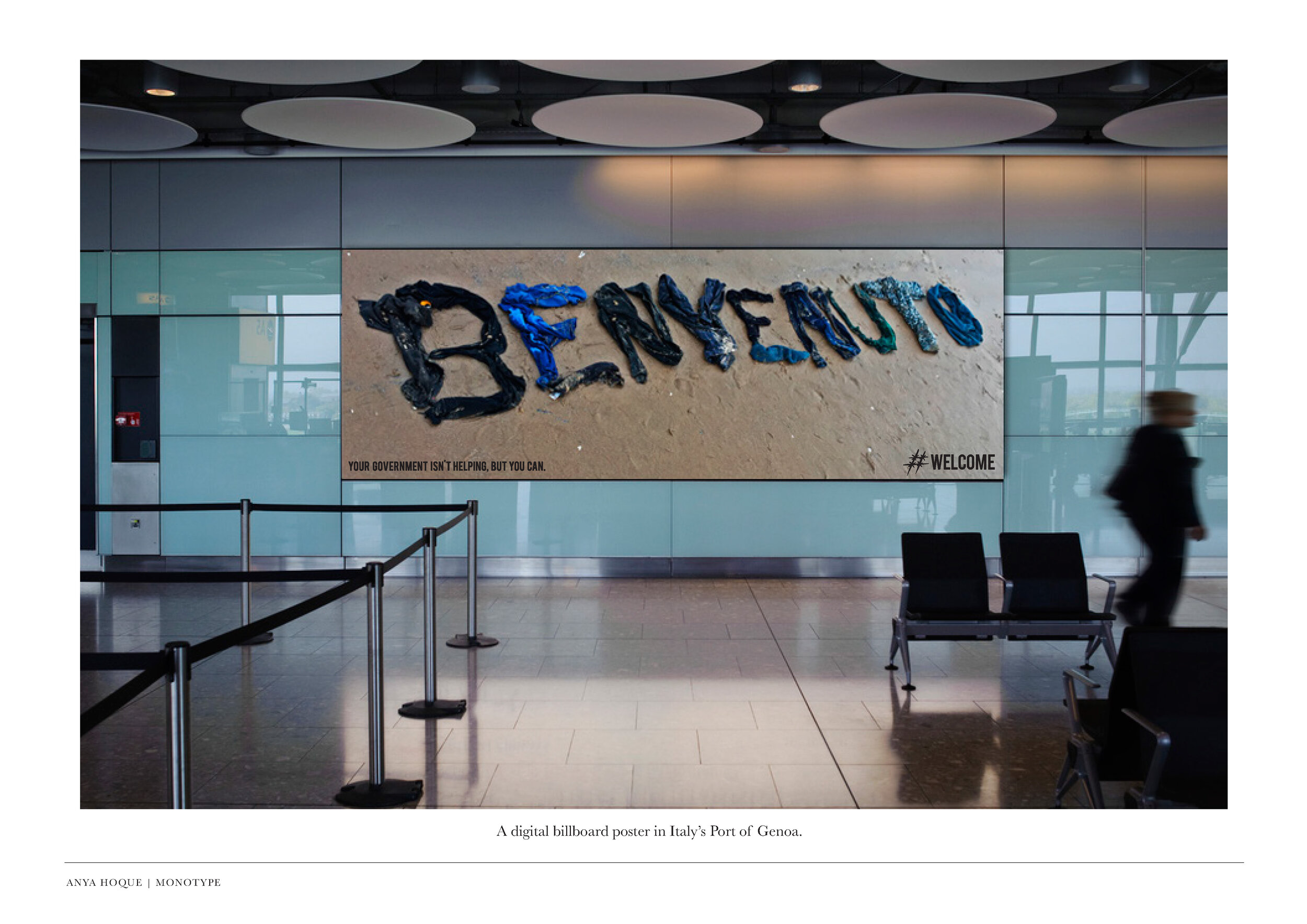
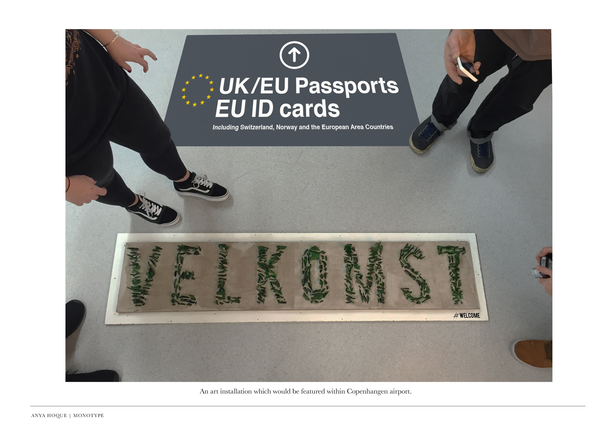
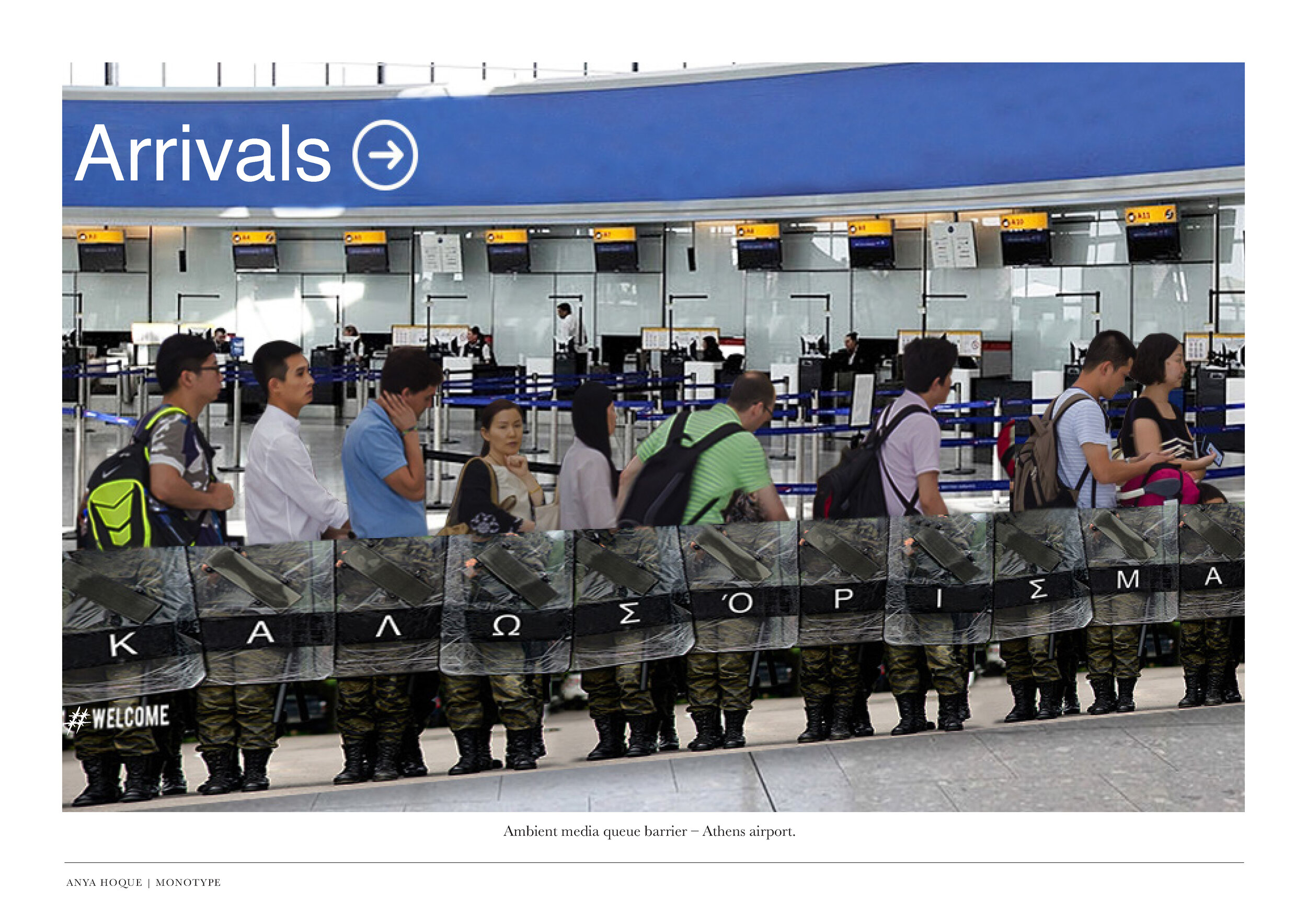
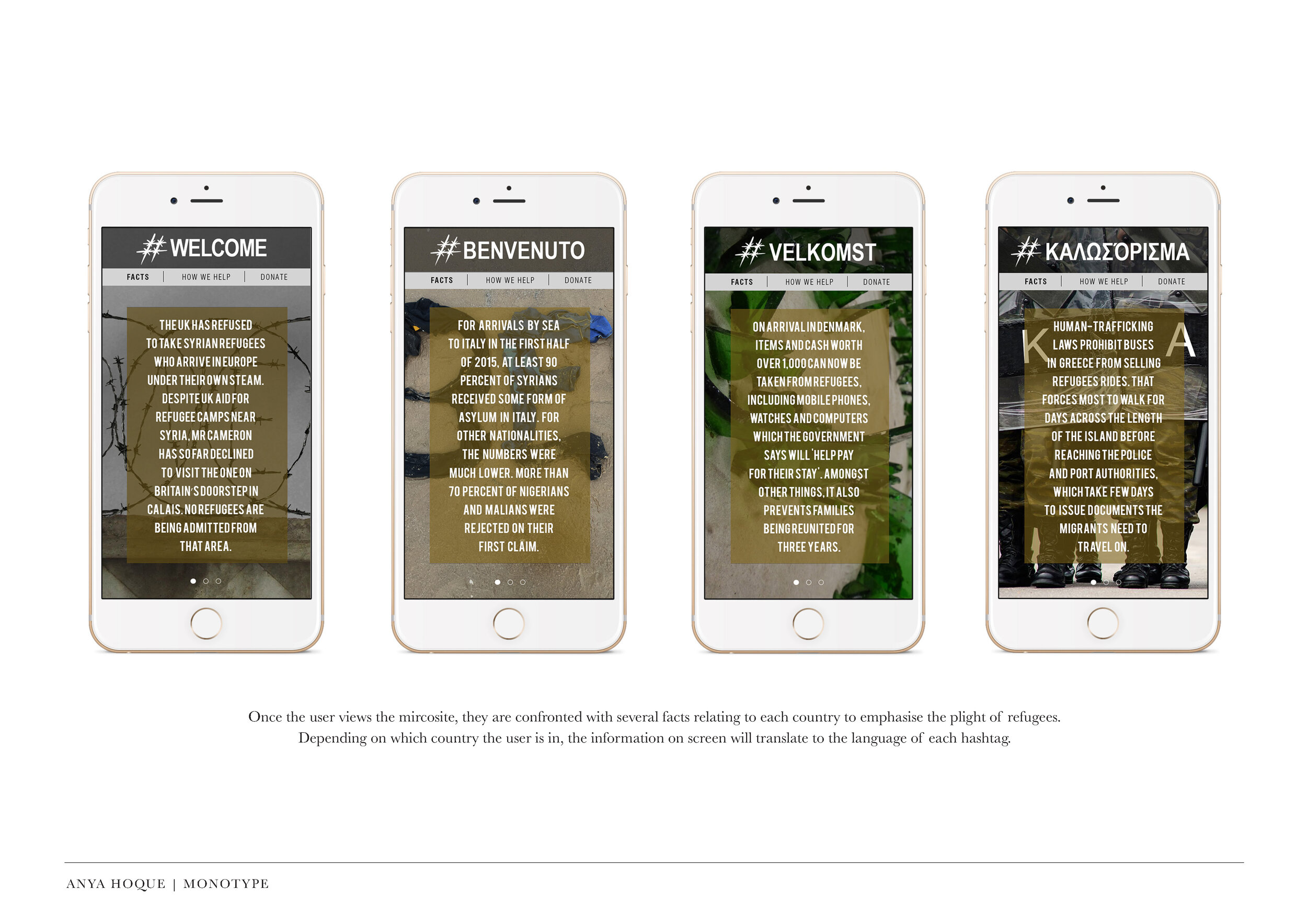
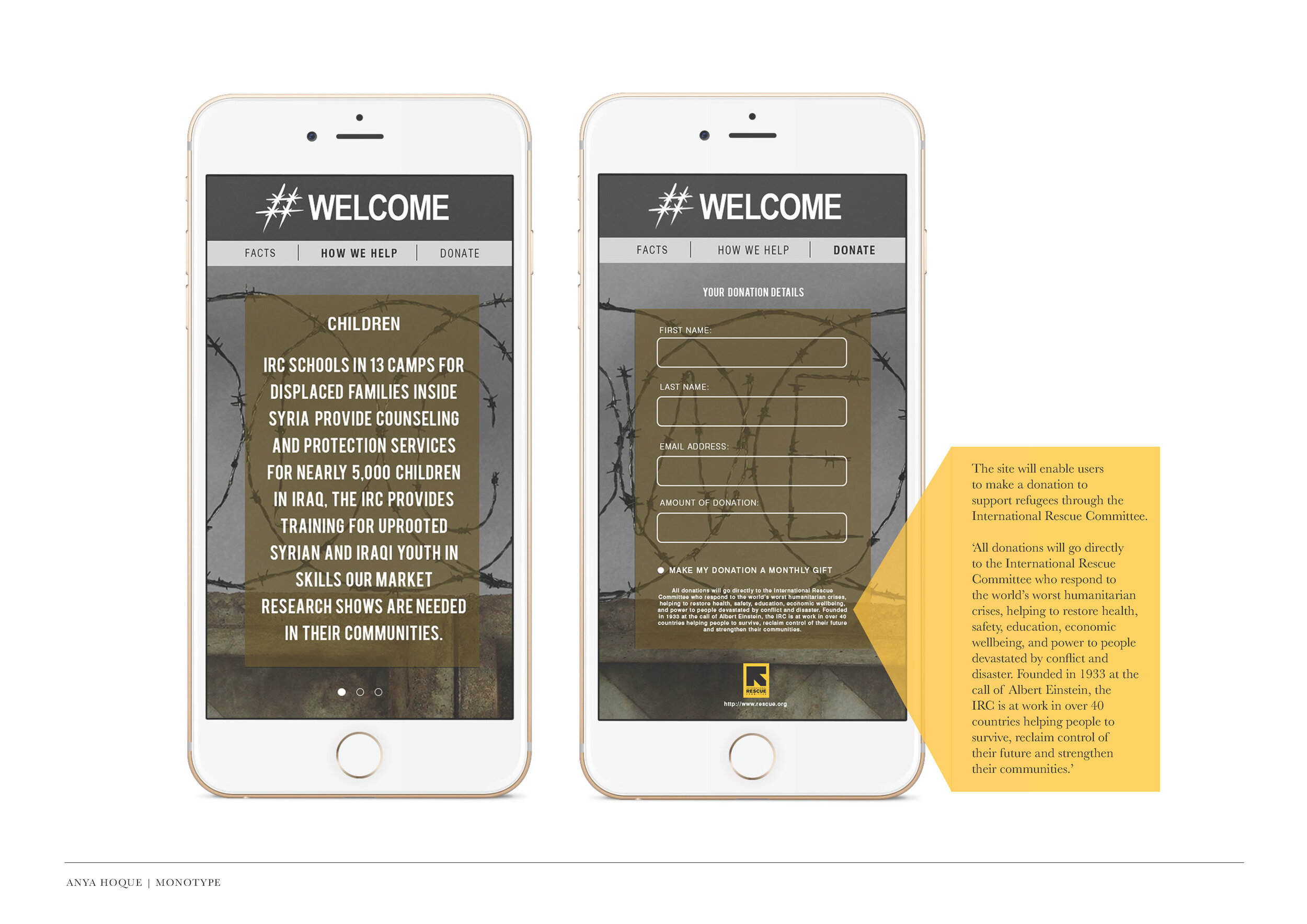
This project by Anya Hoque was for the D&AD Monotype brief, and was a response to the seemingly hypocritical welcome messages displayed by countries at their borders, and highlighted how unwelcoming these places actually feel. The video below demonstrates the level of commitment to the project.

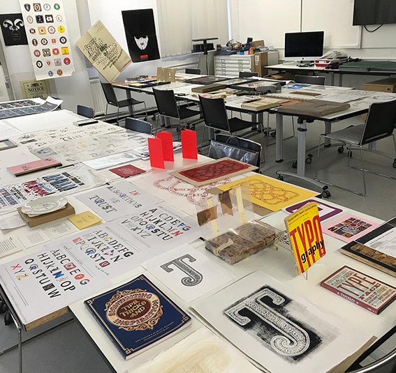
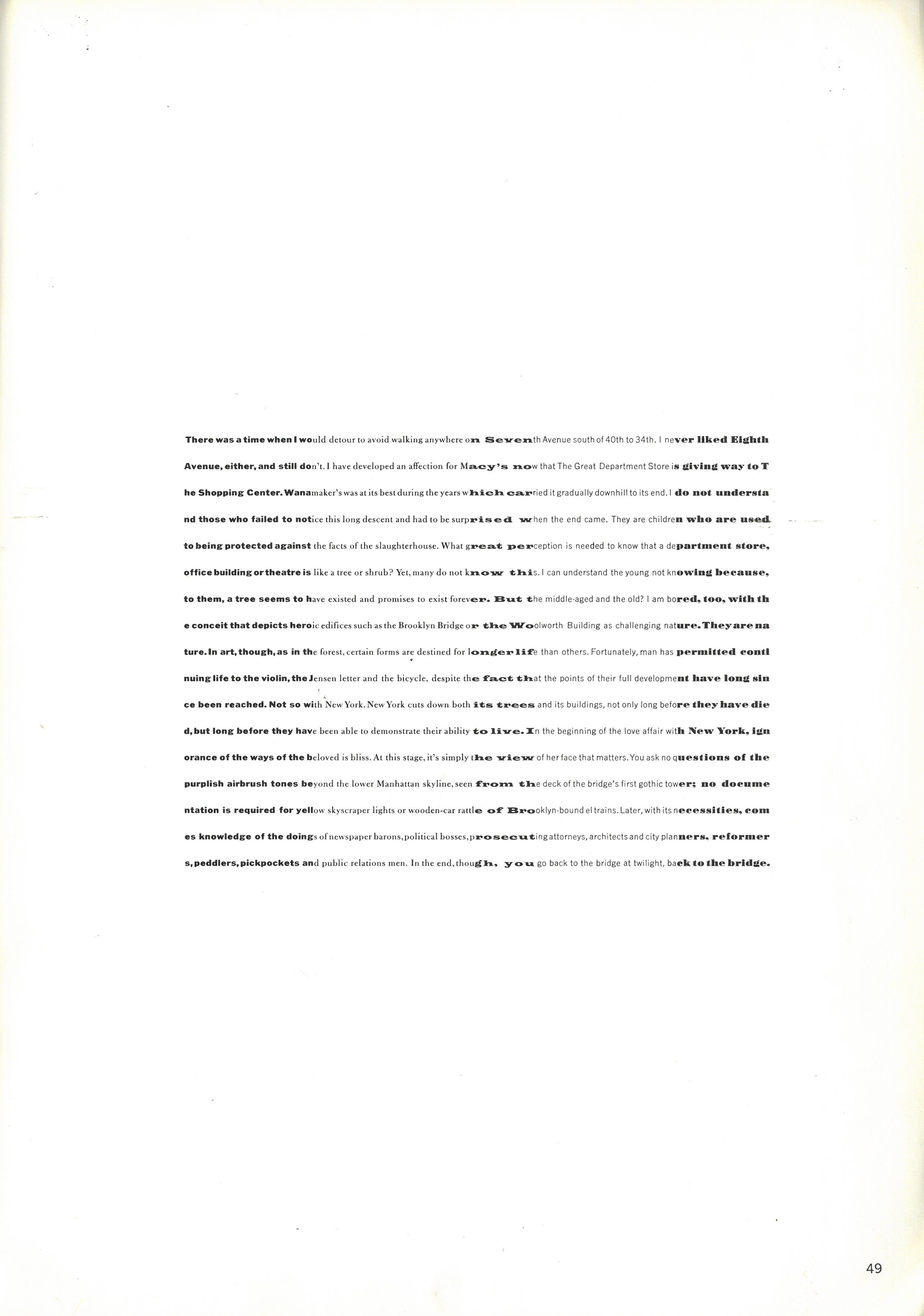
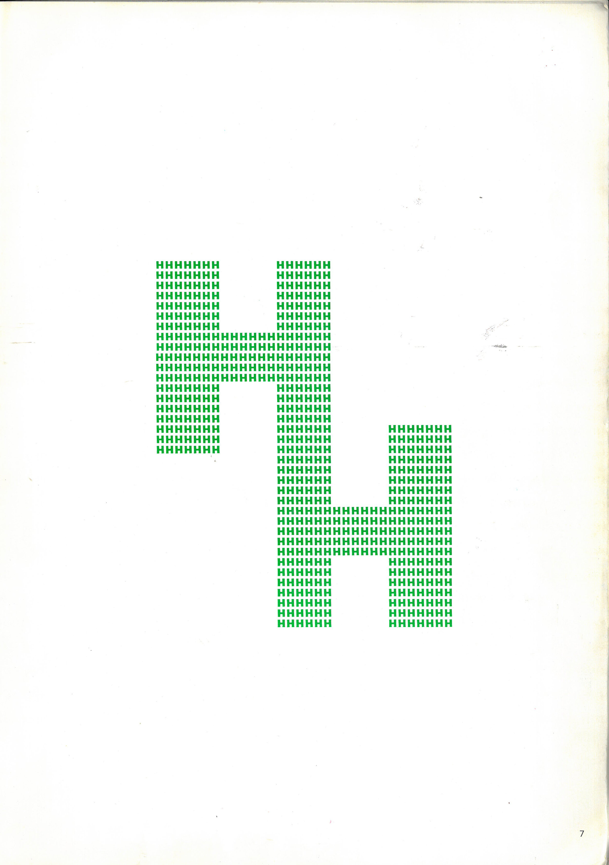
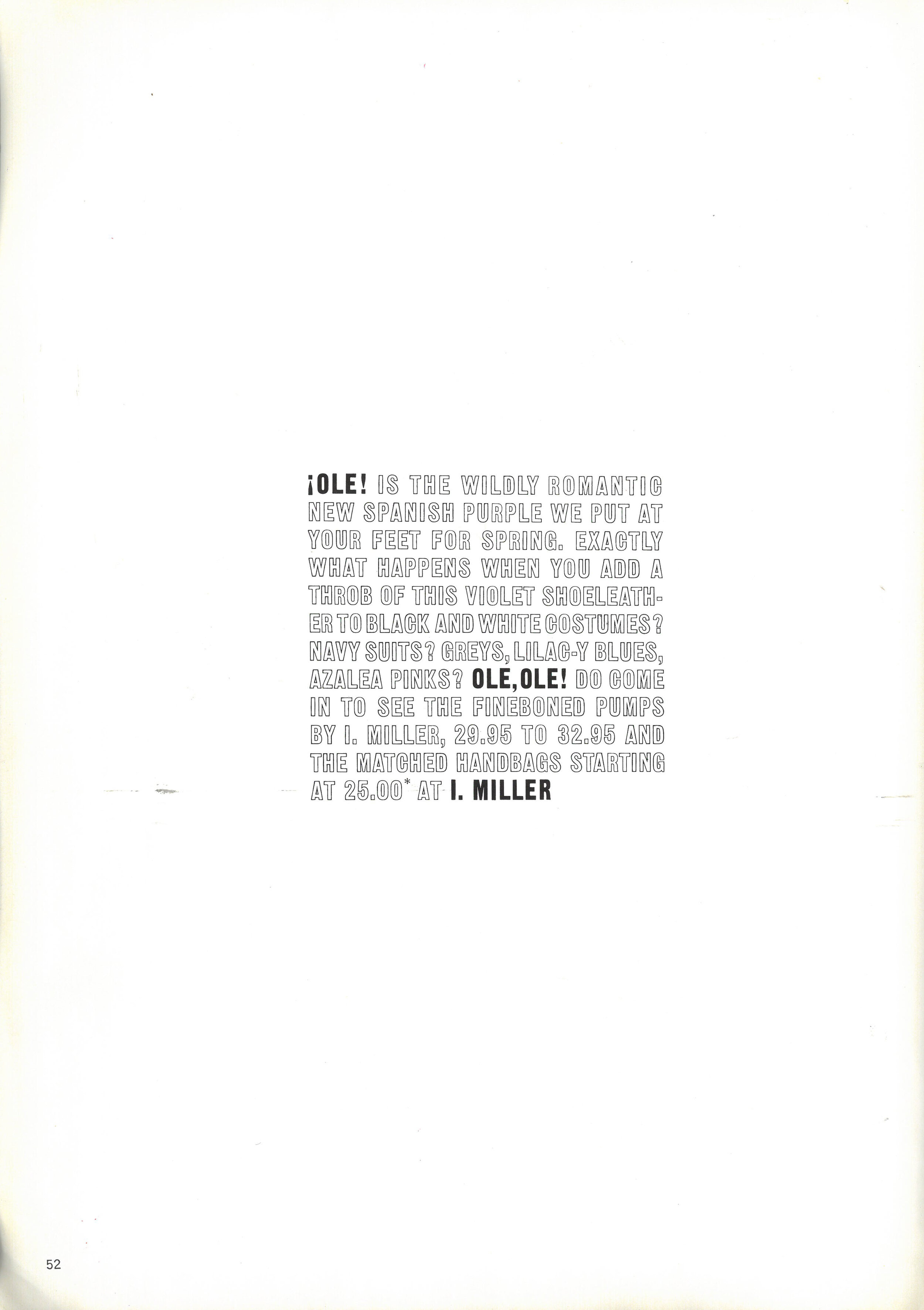
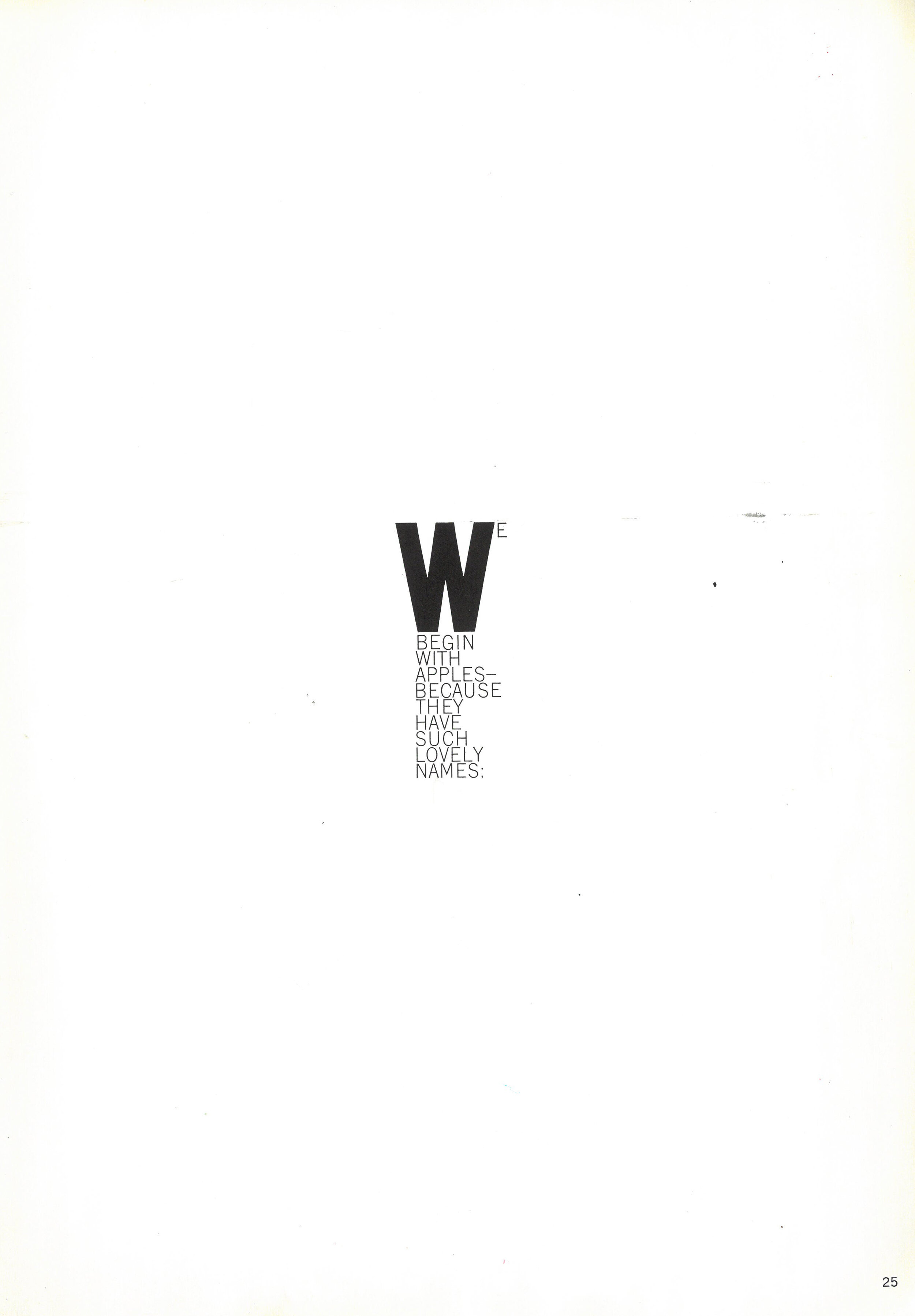
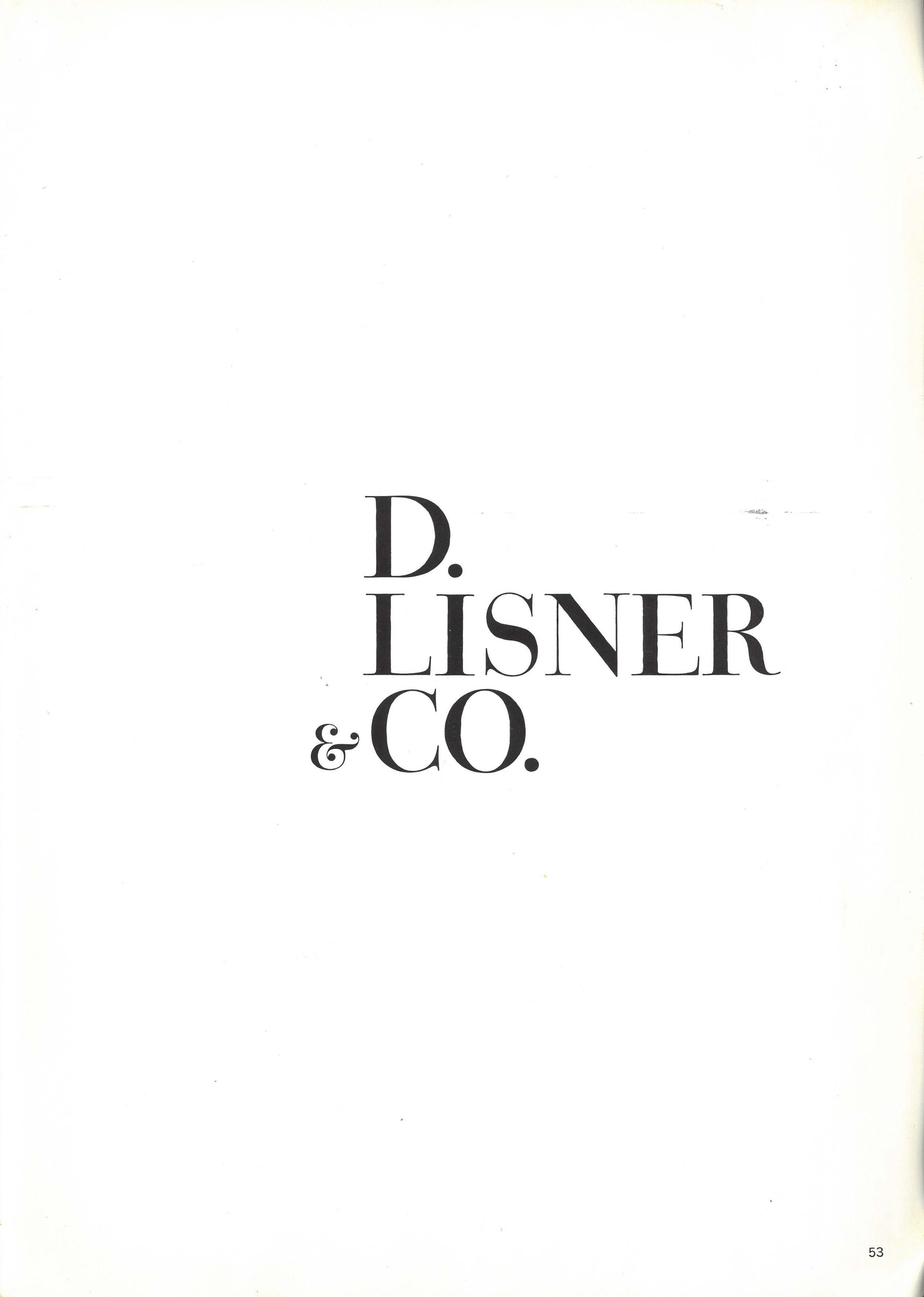
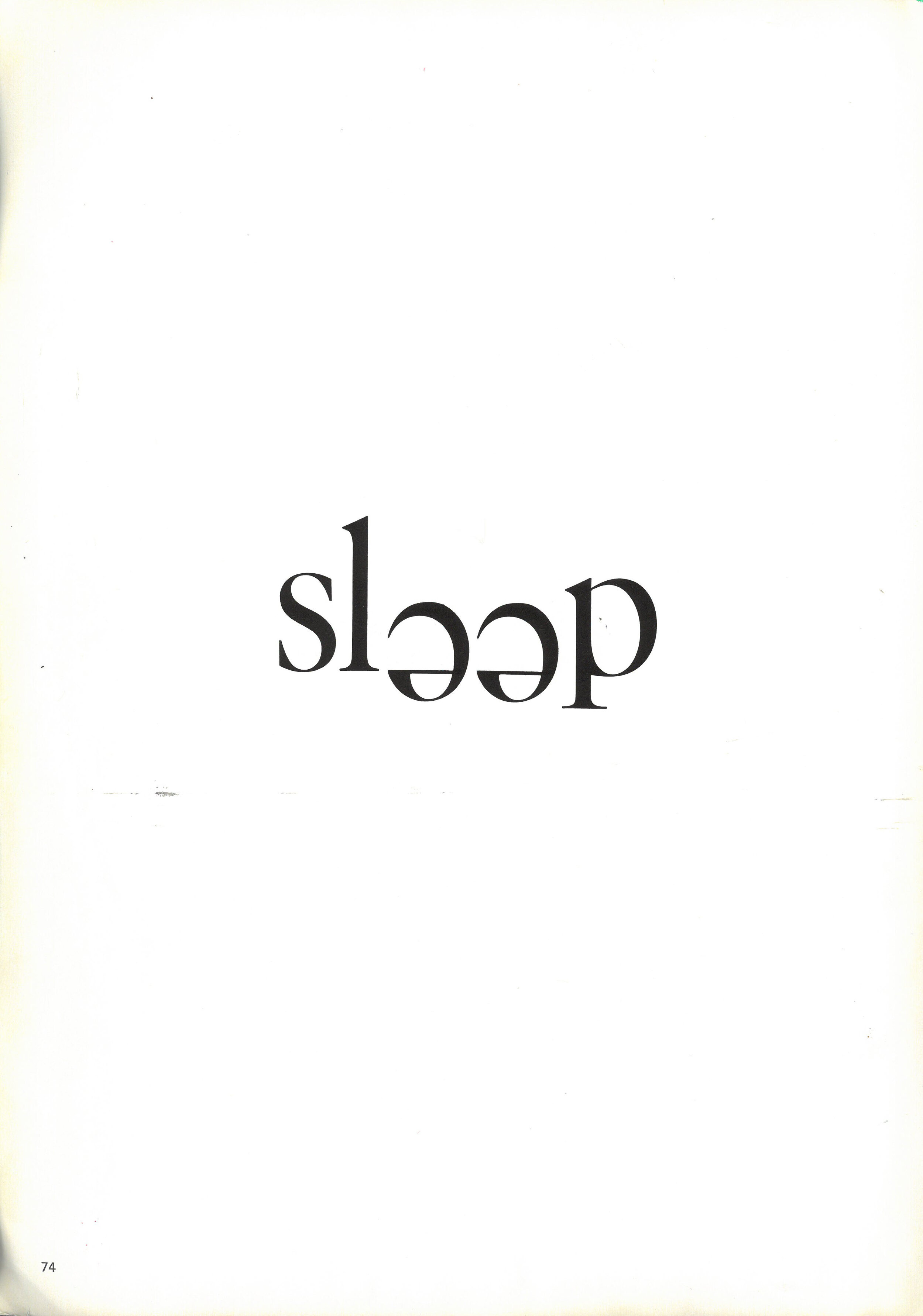
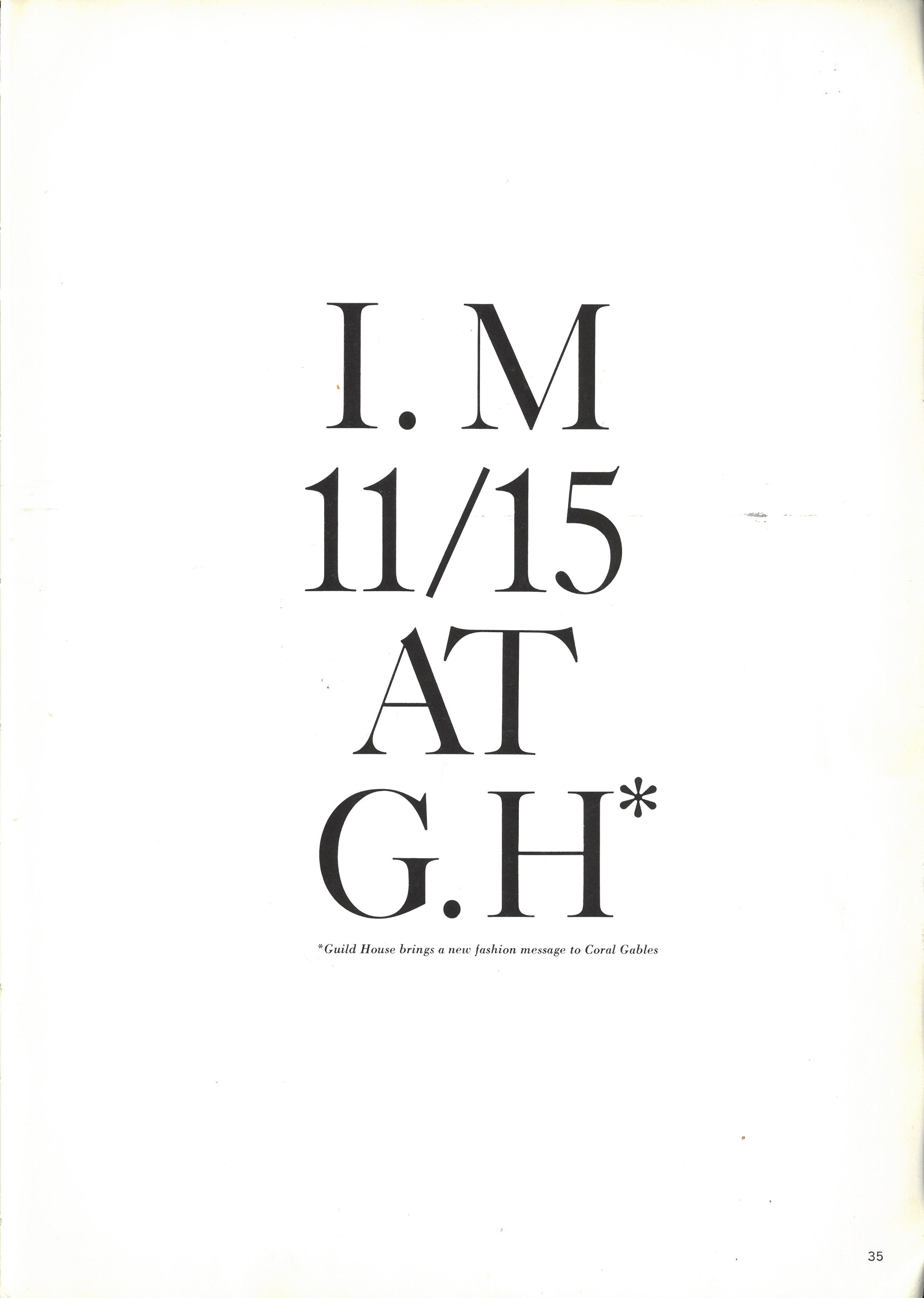
Rescued from the library skip by Andy, this fantastic book demonstrates an incredible range of typography. Resetting the type digitally would be a joy, perhaps an idea for a workshop or two. Enjoy.
Knowledge and courage are required to achieve the best results in typography … Fine typography is the result of nothing more than an attitude. Its appeal comes from the understanding used in its planning; the designer must care.
Advice to be heeded:
Evaluate your elements. Eliminate everything that isn’t absolutely necessary. Simplify, simplify, simplify.


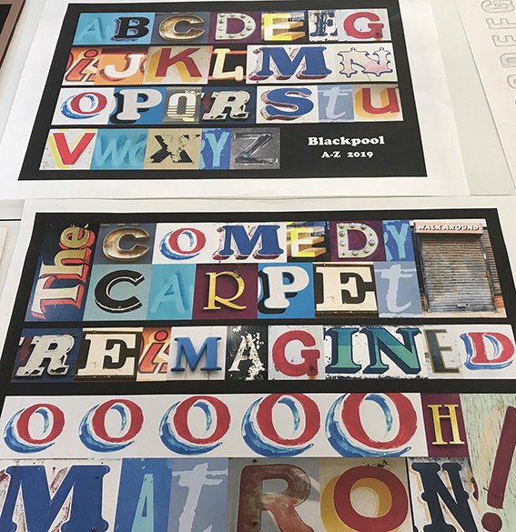
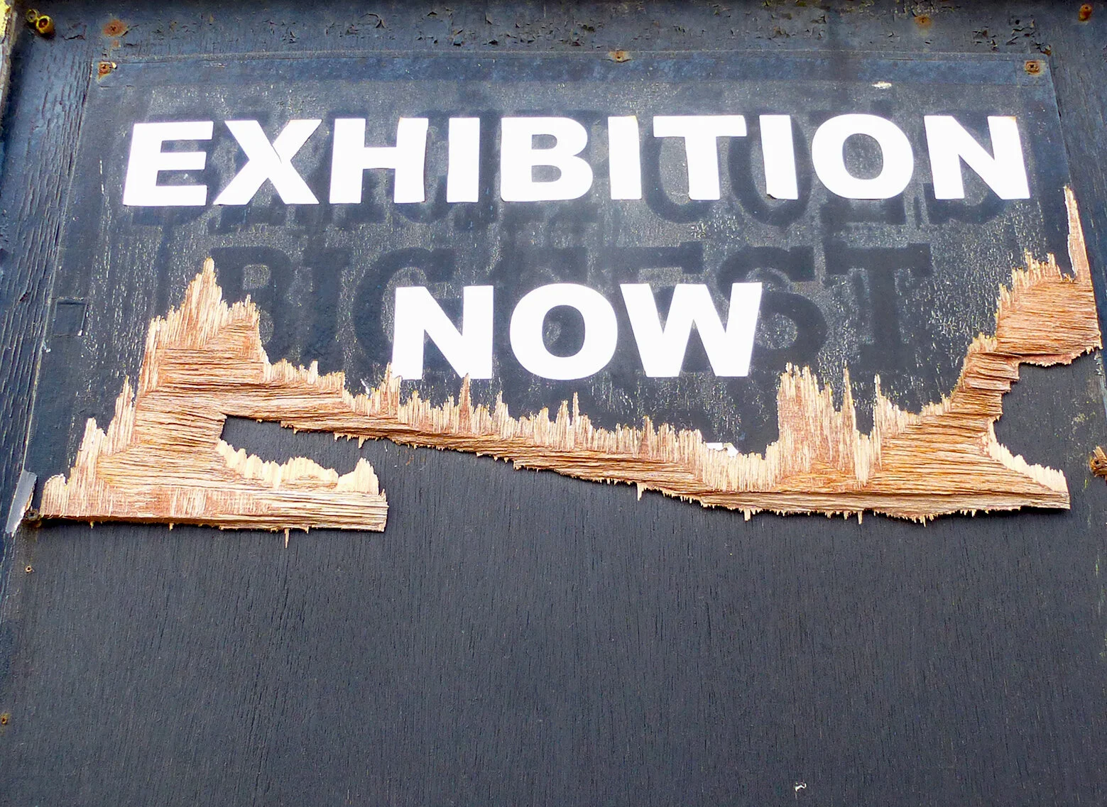
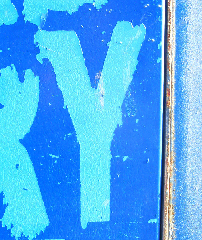
Yesterday the first year graphics students and staff visited Blackpool to capture some of the unique typography that adorns the town’s facades. This post is the first of many that will document the results of what was observed and captured on the day.


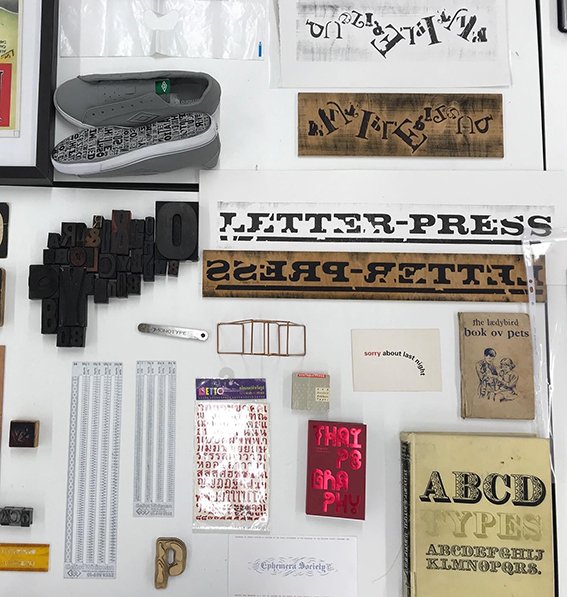
The Disciples Of Design are a global collective of design academics, practitioners, artists and students. We have one common thread – UCLan in Preston, UK; and one common aim – the creation of an ever evolving visual hub for the sharing of ideas and thoughts.

