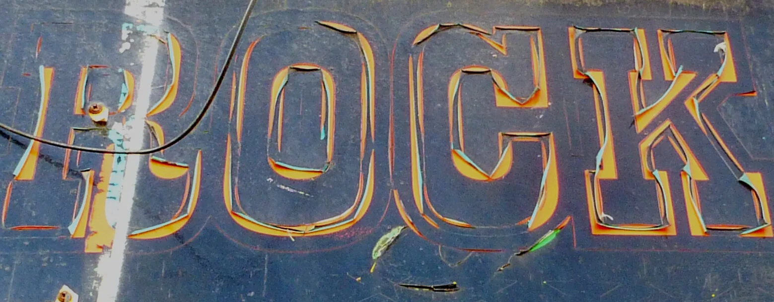
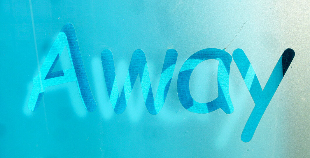
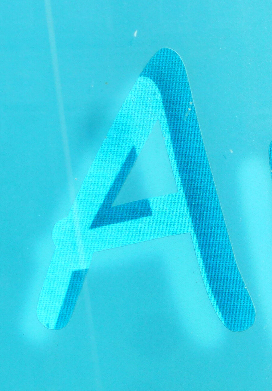
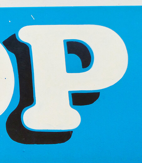
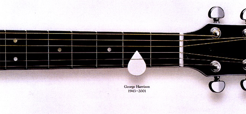
Design Classics No.1 in a series of...
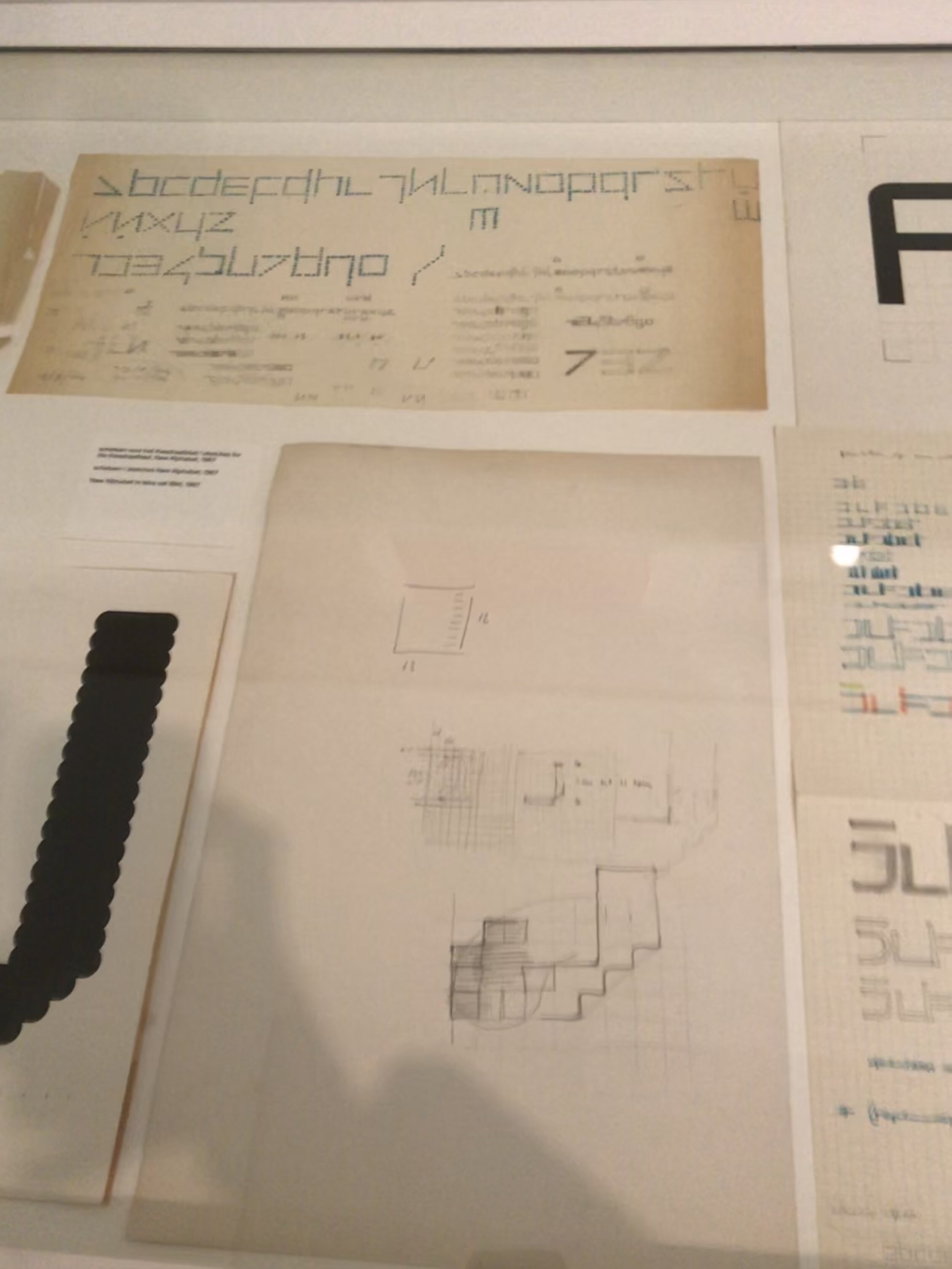
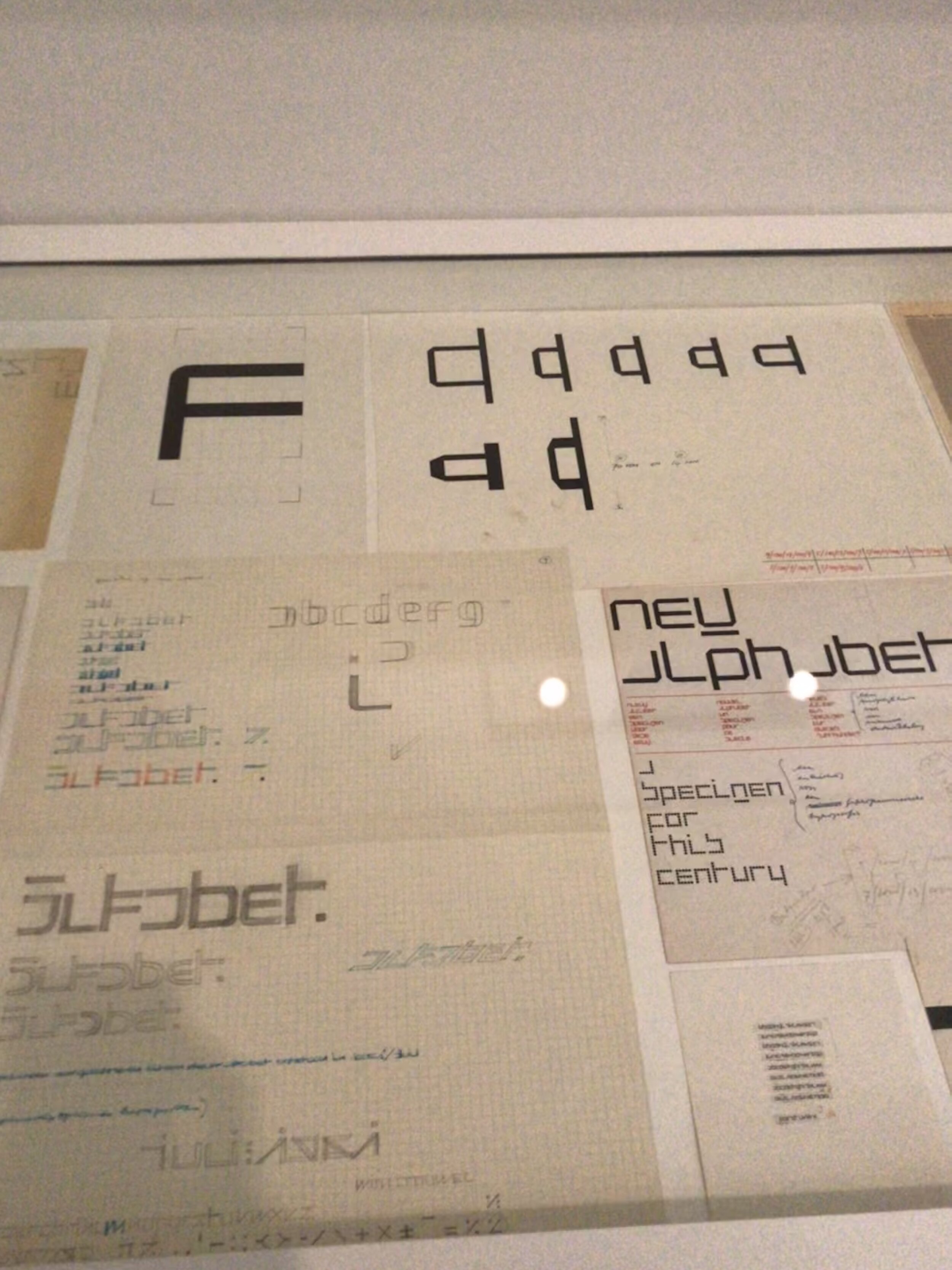
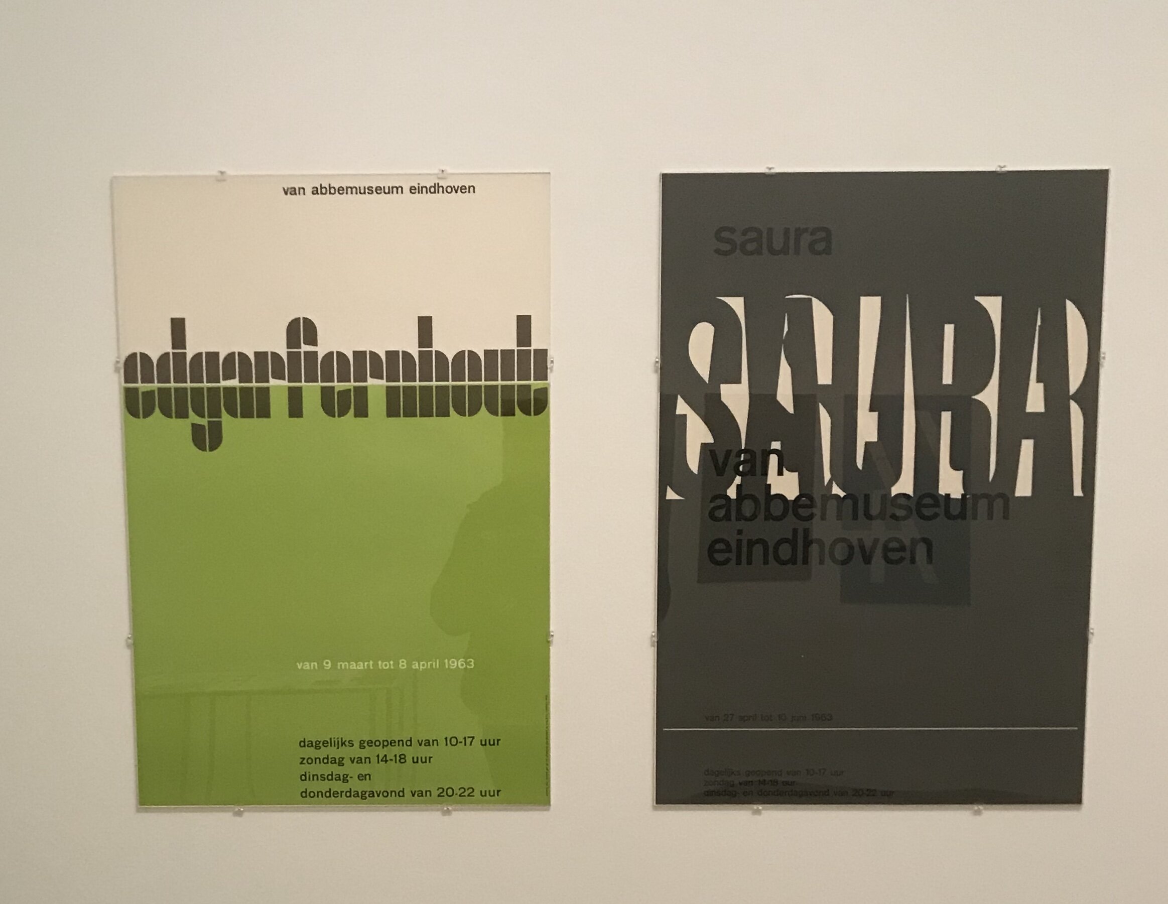
Here we feature the first in a series of short tutor lead talks looking at design classics and the thinking behind their conception. This particular short film looks at a typographic solution to an identity and how typography, in the right designer’s hands, can communicate a complex concept in a simple yet sophisticated manor.

Agency - Williams & Phoa - 1988

Our (other) man in The Dam

Last week, Year 1 Graphics student Max Greer headed to Amsterdam. Amongst the many pleasures the city has to offer, Max visited one of my favourite places in the world - the Stedelijk Museum - which houses vast collections of the world’s best art and design. He kindly took the time out to write us the following blog. Thanks Max!


A city of Tulips and Type

The Stedelijk Museum is an architectural spectacle located in the heart of the museum district in Amsterdam. It features modern artists and graphic designers of the highest level, both up-and-coming and giants of the industry. I was fortunate enough to visit it and see the art for myself and there was one exhibition that stood out. Wim Crouwel (1928-2019), was a Dutch graphic designer and typographer whose practice was that of a master level. There was a whole section dedicated to his work, which featured original posters, catalogues, designs and in-depth videos on all aspects of his career. In the images you can see the way he created his font ‘New Alphabet’ using grids and carefully measuring each piece of type to perfection. Though these images don’t justify the sheer wonder of his work. To all graphic designers, typographers and type designers this a must visit, you shall not be disappointed and will leave inspired!


If you’re in Amsterdam and you’d like to check the exhibition out, all the information is here.

Economy of Image and Maximum Means

Here we feature a few images and ads from an old one week presentation we came across while trawling The Disciples’ hard drive. We also thought it a timely post as the new year one students will soon tackle their third one week project, which is primarily based around image.

image 7.jpg
omage 4.jpg
image 6.jpg
image 5.jpg
image 2.jpg
image 8.jpg
image 3 Shot 2019-10-01 at 20.18.15 copy.jpg
image 1.jpg

Above are some great examples of both observation and cropping which can be learnt from and hopefully inspire. They look so effortless and simple but have only been achieved by designers who have really looked, observed and made lateral visual connections.

Type in the environment

On a recent weekend visit to Llandudno (North Wales) I came across a range of typographic signatures made out of Limestone. They were located on the summit of the Great Orm headland by tourist, visitors and walkers.

orm 16.jpg
orm 8.jpg

Some of the names had slowly been moved over the years probably due to the sheep that graze on the Orm.

orm 14.jpg

Here is an example that is almost unreadable.

One week project: Research

Yesterday we had our first crit for Year 1 graphics students, in room VB201 – the pseudo reincarnation of 217 (for our older readers). Having the crit outside of the studio results in a more focused environment, and all the staff were pleased to see the first pin-up go largely without hitch or hiccup.

Below are a couple of examples of the first project, research. Starting with a dictionary definition and then exploring the subject, students presented six images to convey their given word. The visual excerpt below either got us thinking, or were well cropped, or well researched, or a mixture.

vertical

vertical

stripes

stripes

spot (the difference)

spot (the difference)

tree

tree

queen

queen

stripes

stripes

eye

eye

ring

ring

water

water

bridge

bridge

Posters from the ephemeral archive

It’s that time of year again. As we get ready for the next intake of visual communications students, we have been rummaging through the plan chests and hidden crevices of the store rooms and come across some more 1970’s & 80’s posters. A visual feast of a not too distant past.

signateure shot.jpg
chile.jpg
fruit.jpg
worthing.jpg
hands.jpg
fags.jpg
beeching.jpg
by pass.jpg
Could they live without it now?

Could they live without it now?

Always a good idea

Always a good idea

un.jpg
radio 1.jpg
steve wright.jpg
john peepl.jpg
P1210072.JPG
Nice poster design…balance & restraint!

Nice poster design…balance & restraint!

preston.jpg
fat.jpg
heart.jpg
roots.jpg
books bigger.jpg
books.jpg
Jacob Reece-Mogg’s vision of Britain post Brexit foretold in this English Tourist Board poster.

Jacob Reece-Mogg’s vision of Britain post Brexit foretold in this English Tourist Board poster.

Only a snapshot of what we have in our archive, but I think you’ll be the first to admit that these rare survivors provide us with a valuable visual vignette of social history.

256 px

The favicon was introduced as a visual shortcut for a brand or organisation’s website in the form of a 256 pixel (16 x 16) icon that could be inserted into the address bar of a web broswer. This trend of proportion then took a foothold with the advent of social media, and each site requiring a circle or square icon to represent each individual user. As a quirk of the digital world, the below screenshot shows how it can throw three different logos together, from three very different organisations. All are equally appropriate, but seen together it indicates the impact of the favicon and how its necessary reductionism has consequently impacted graphic design.

F, F, F.

F, F, F.