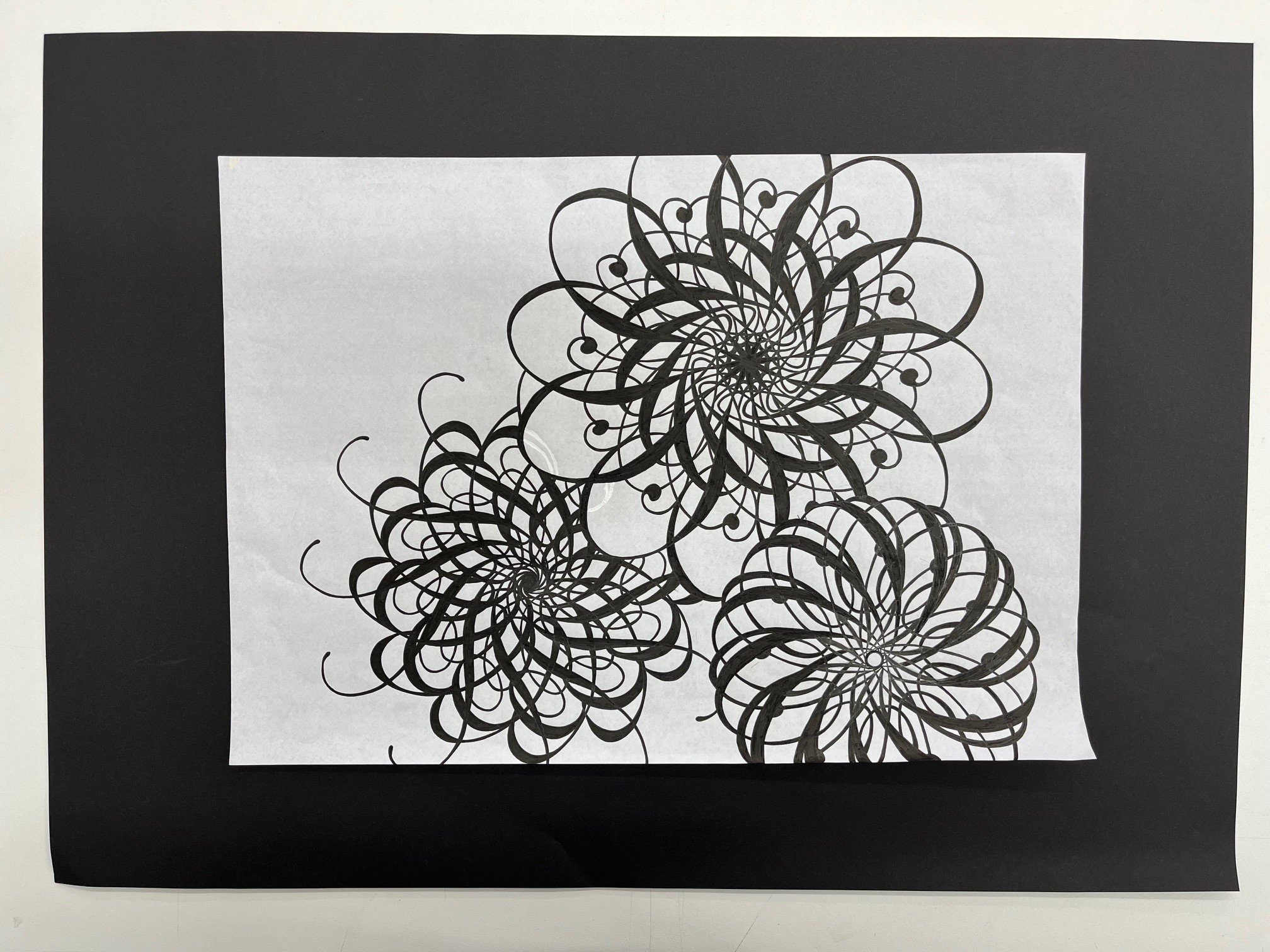
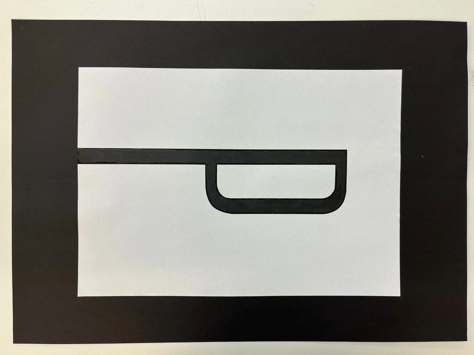
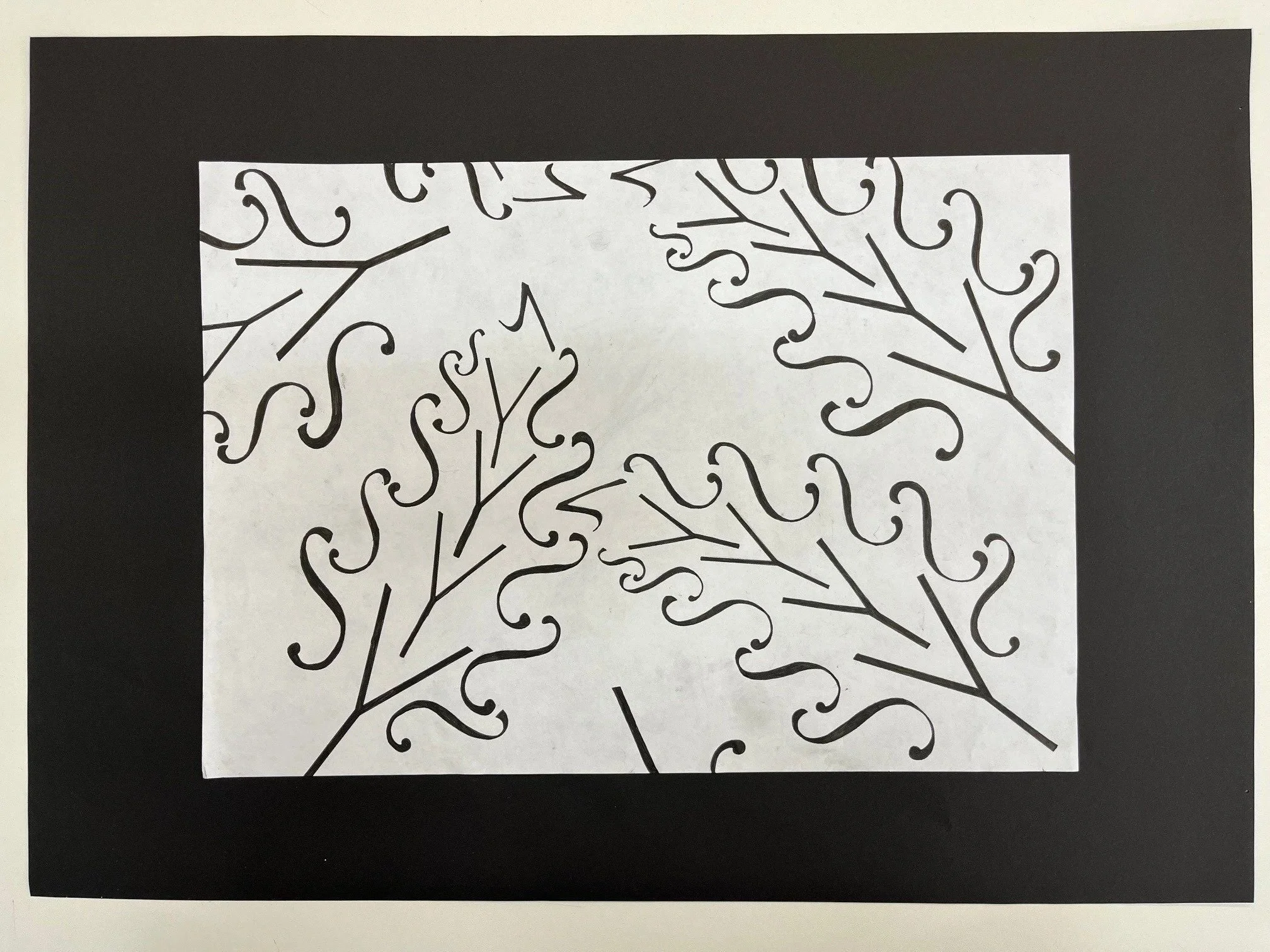
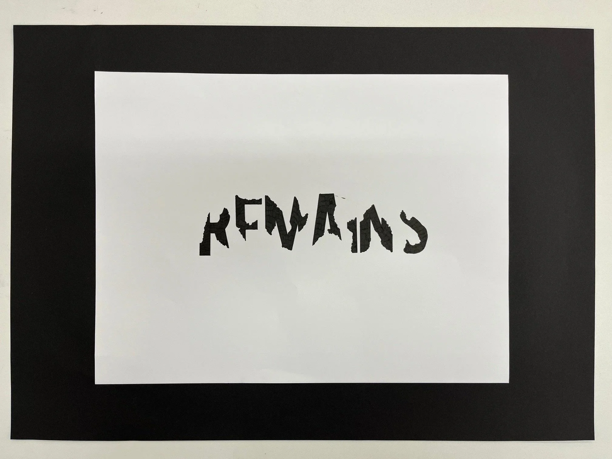
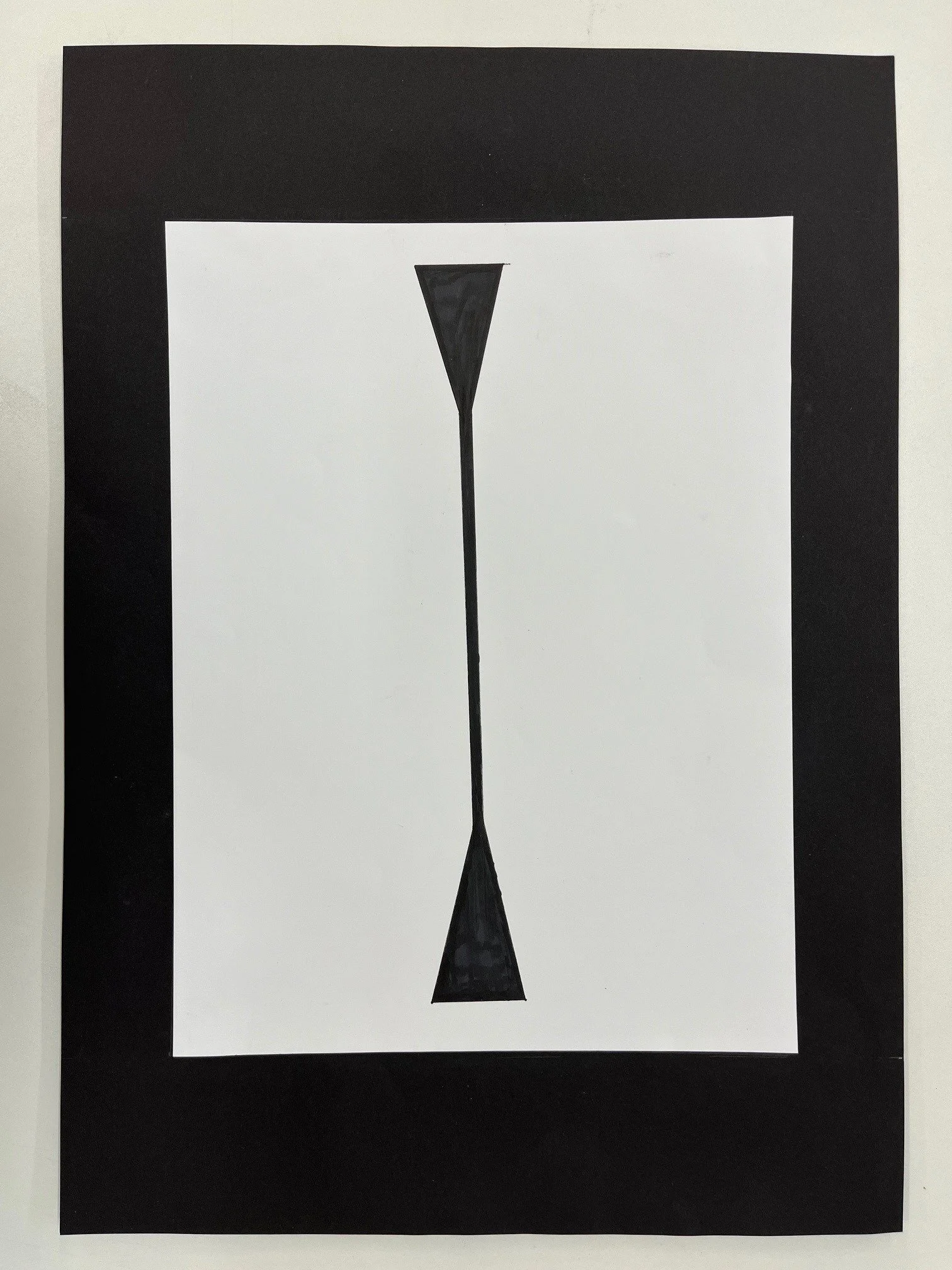
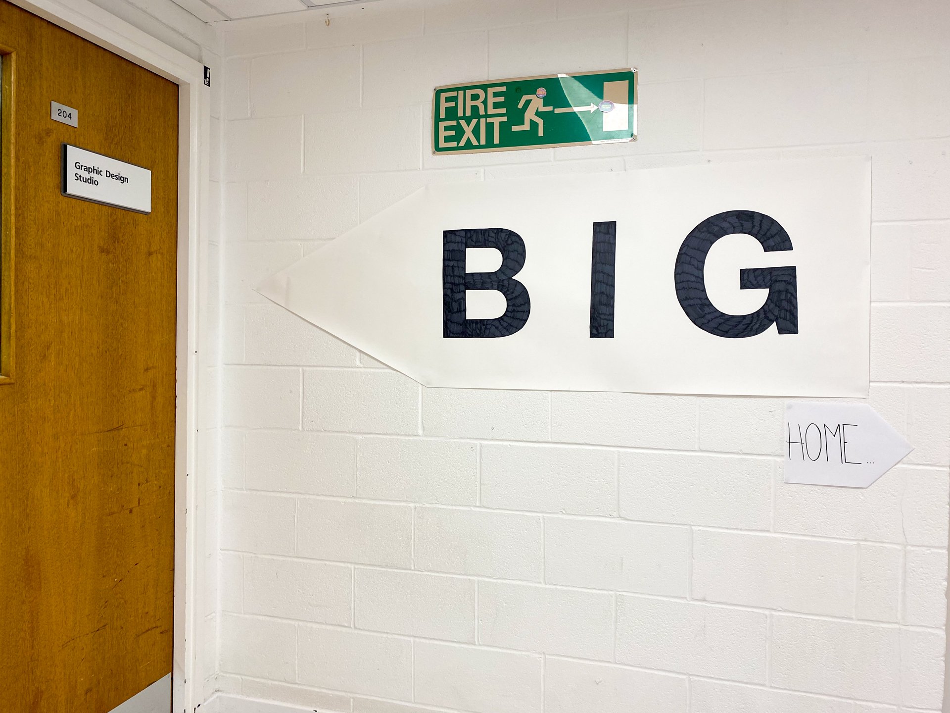
One week project: Typography
/A selection from 2024’s first year.
A selection from 2024’s first year.
Highlights from 2024’s vintage.
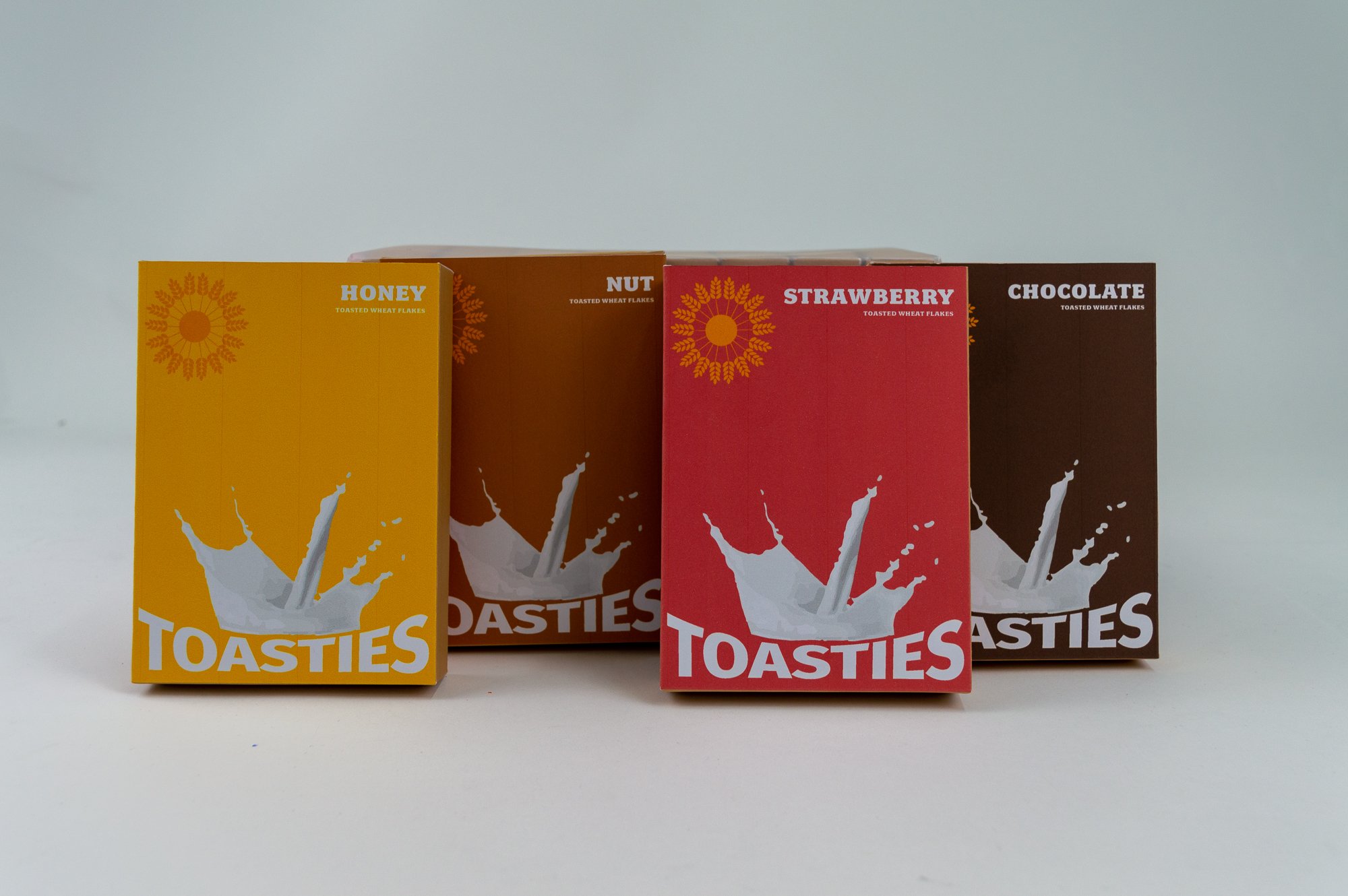
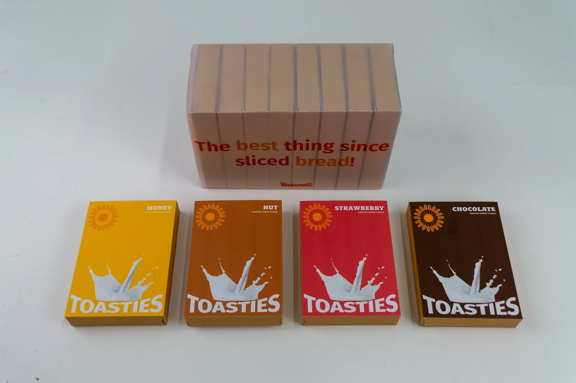
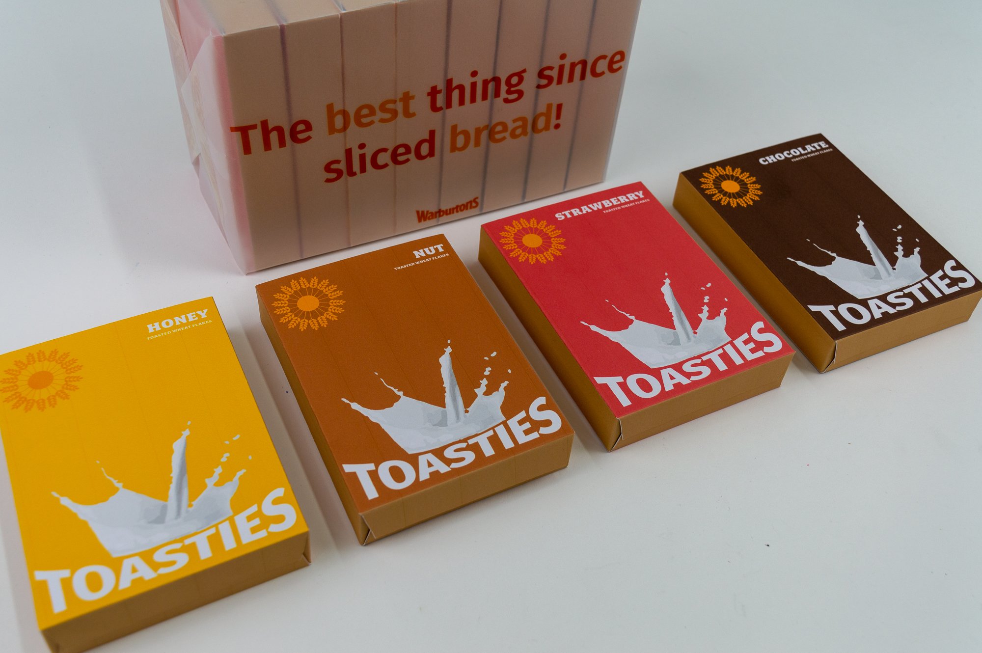
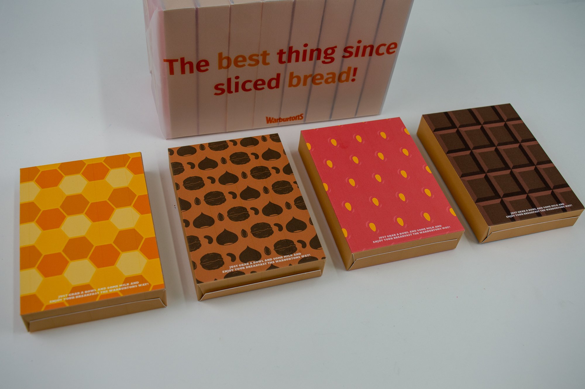
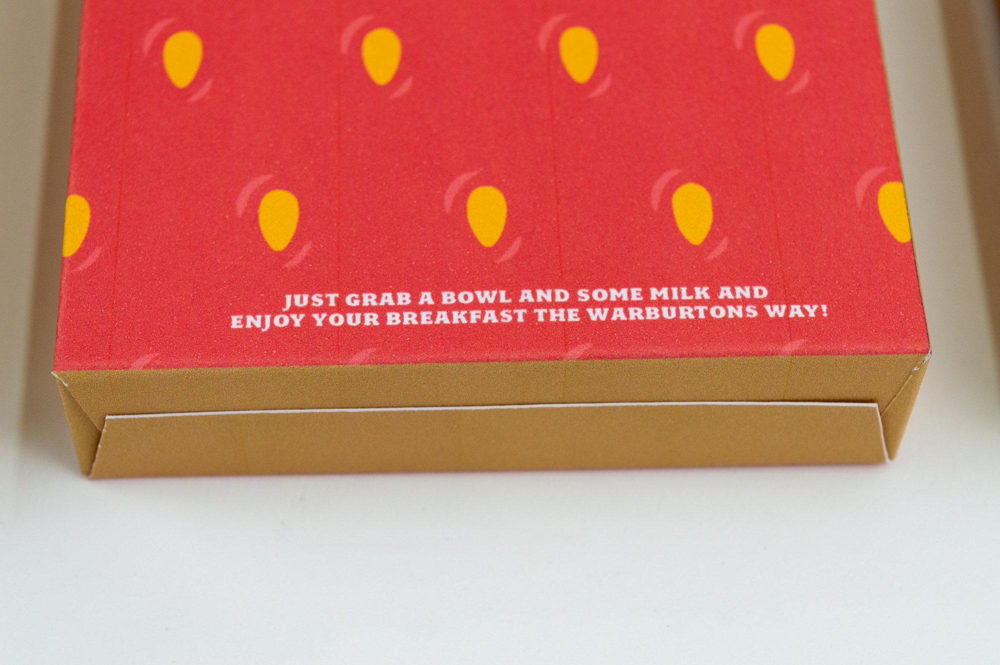
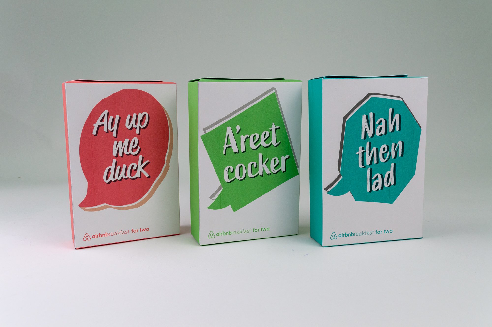
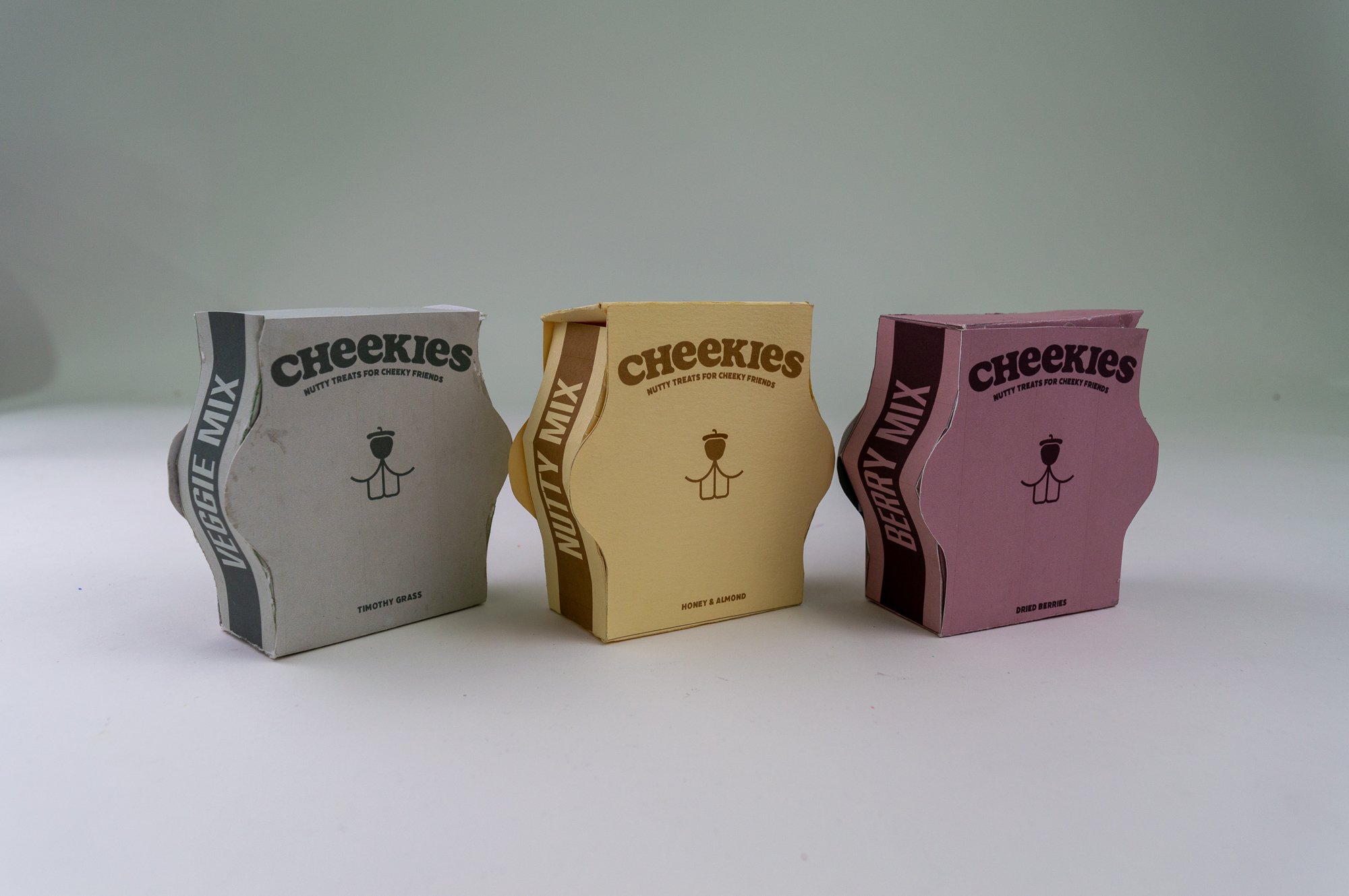
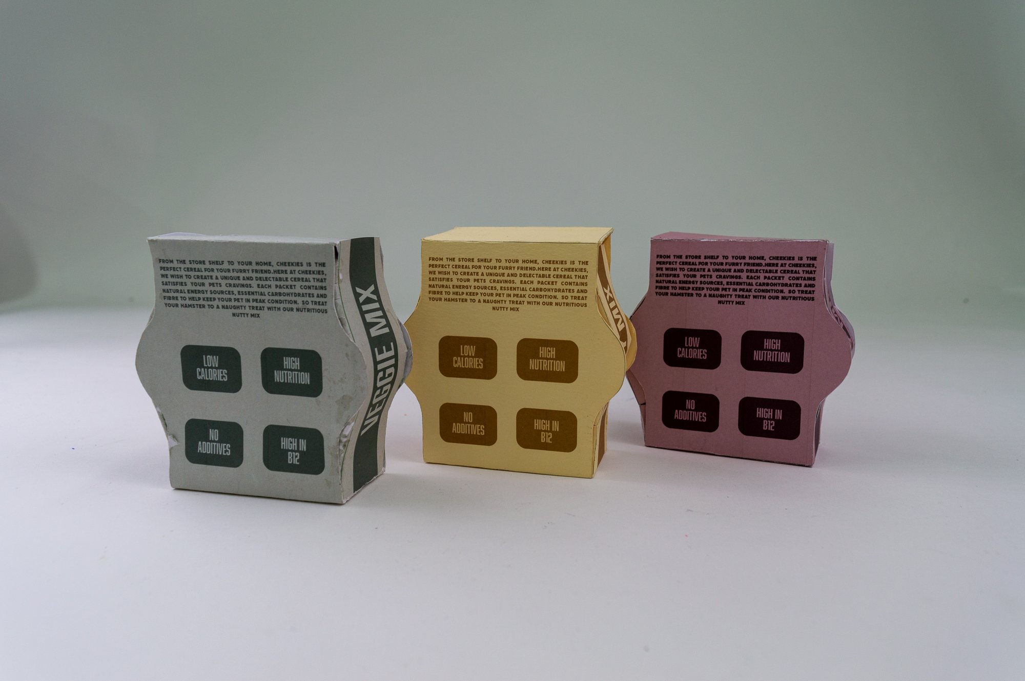
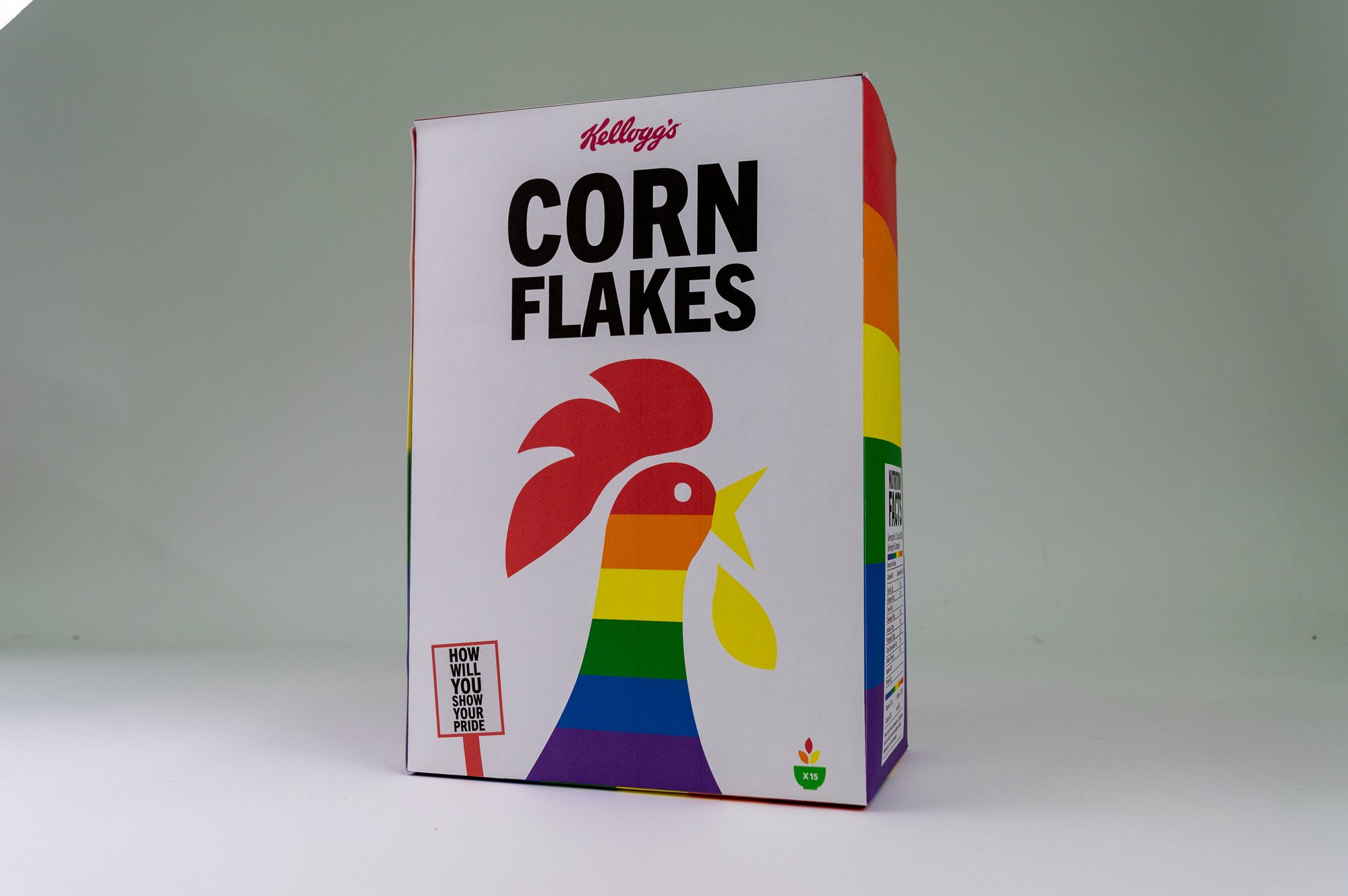
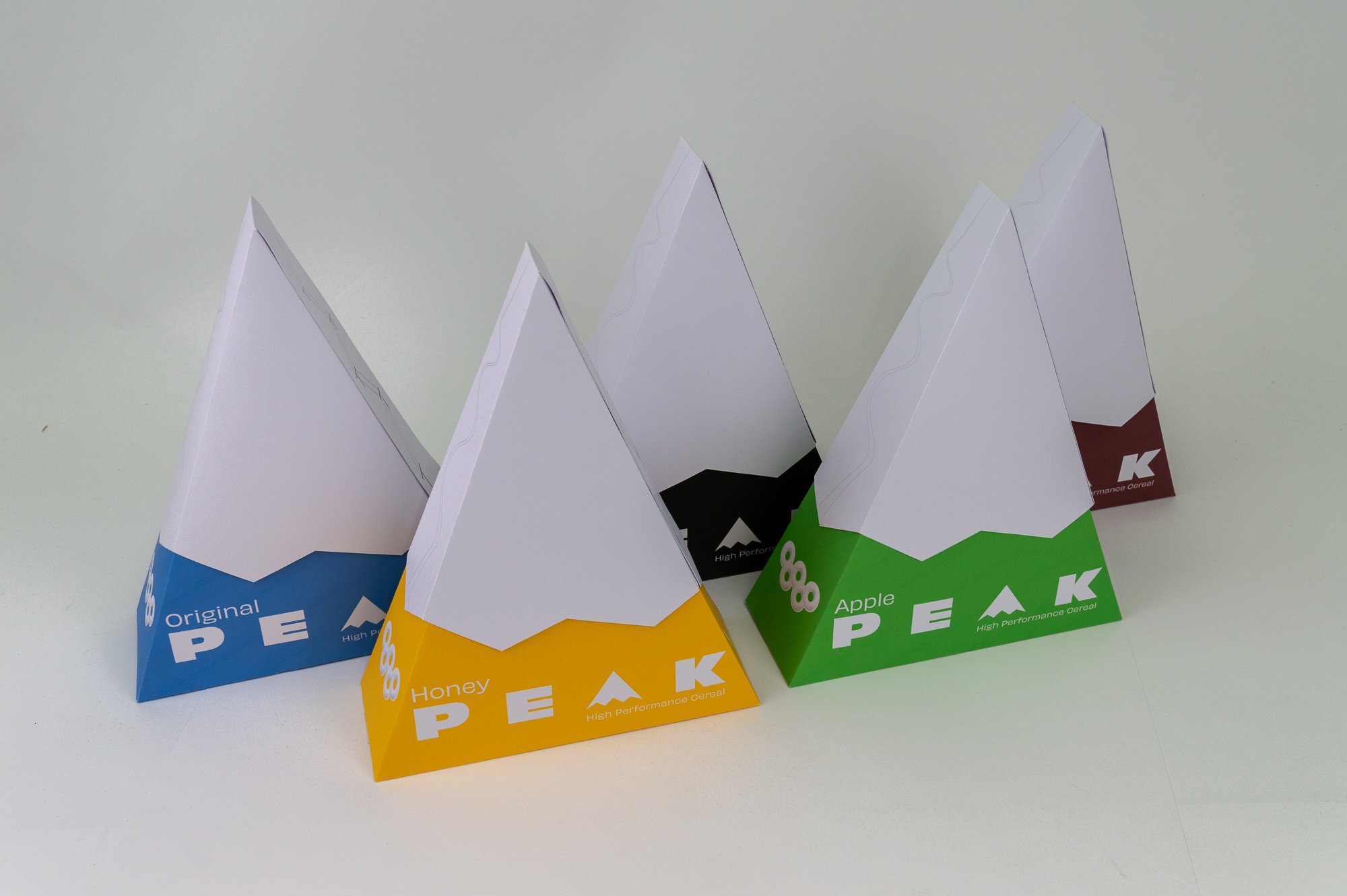
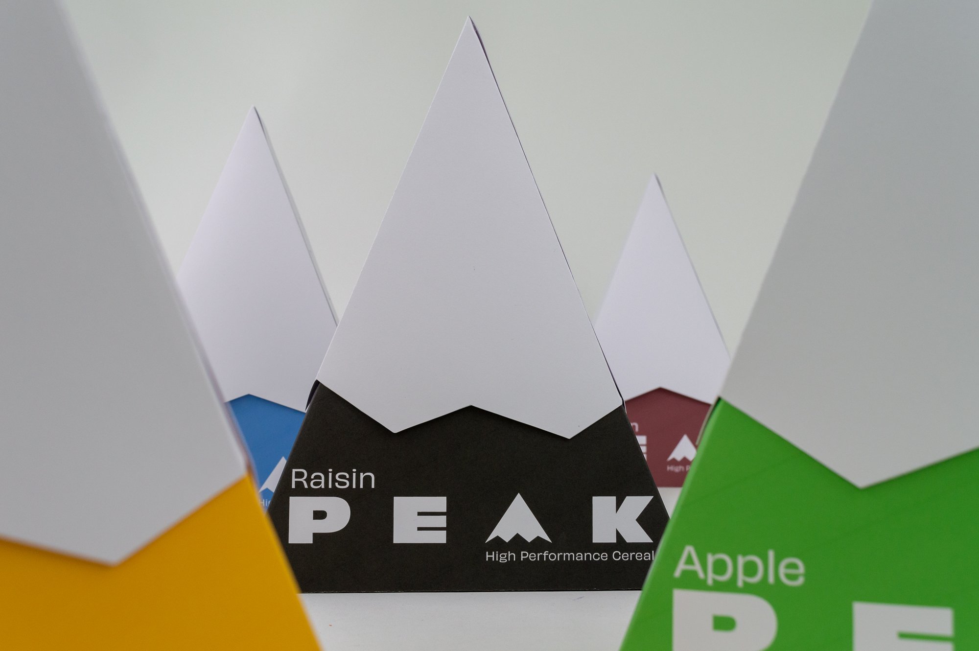
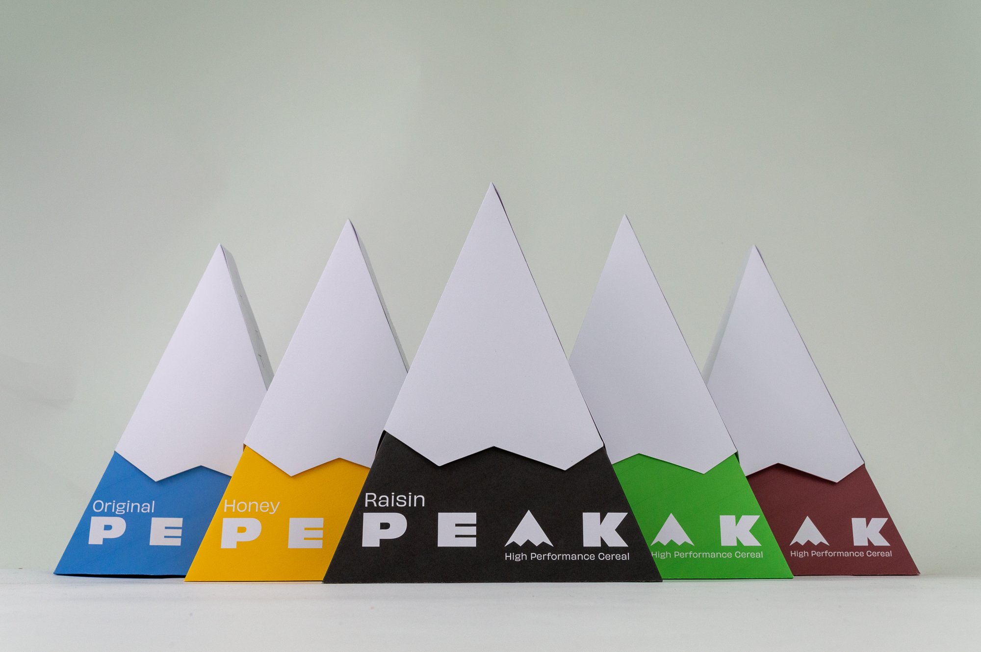
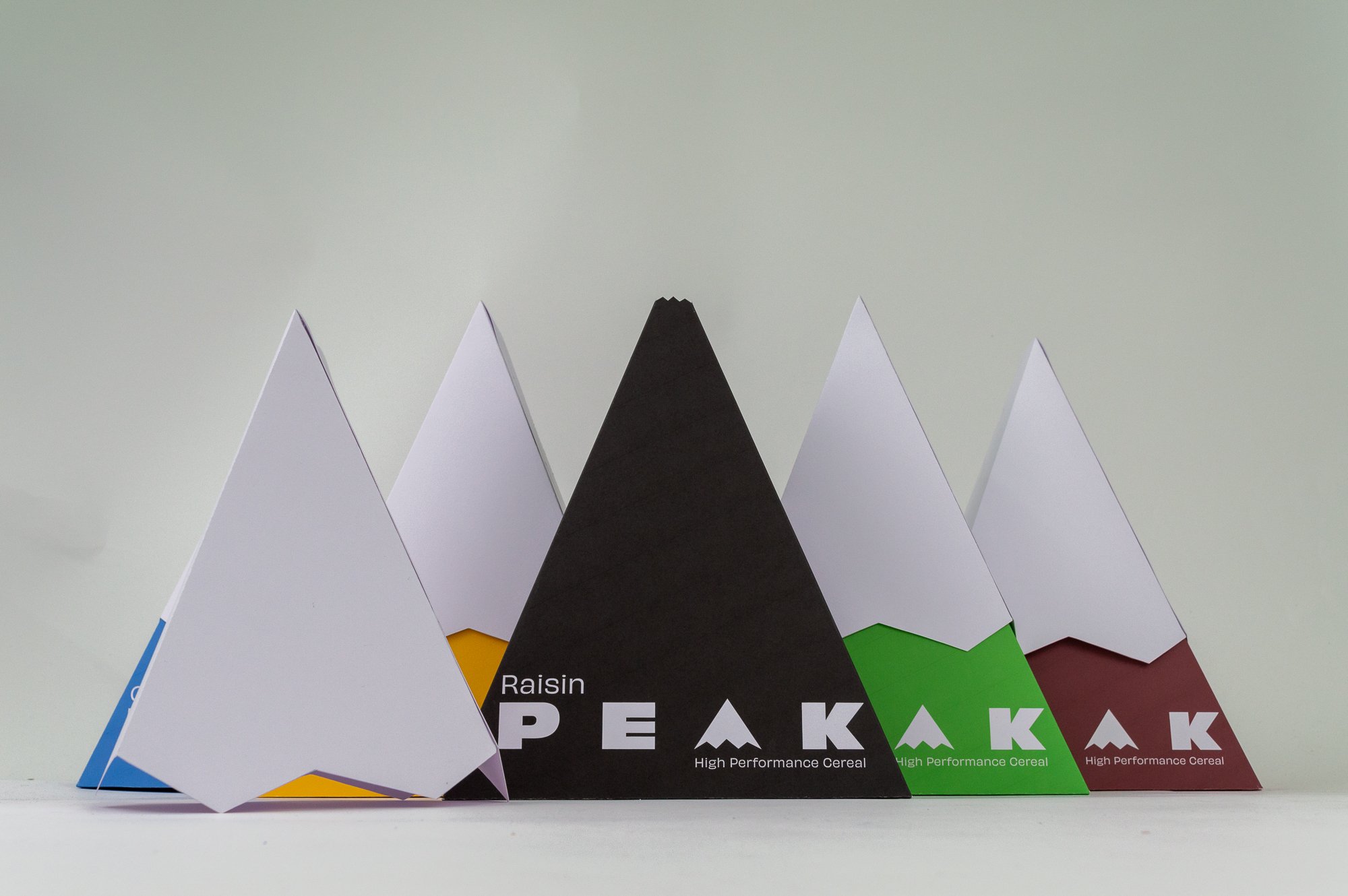
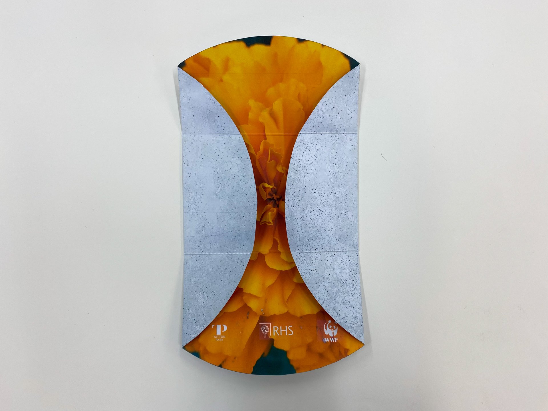
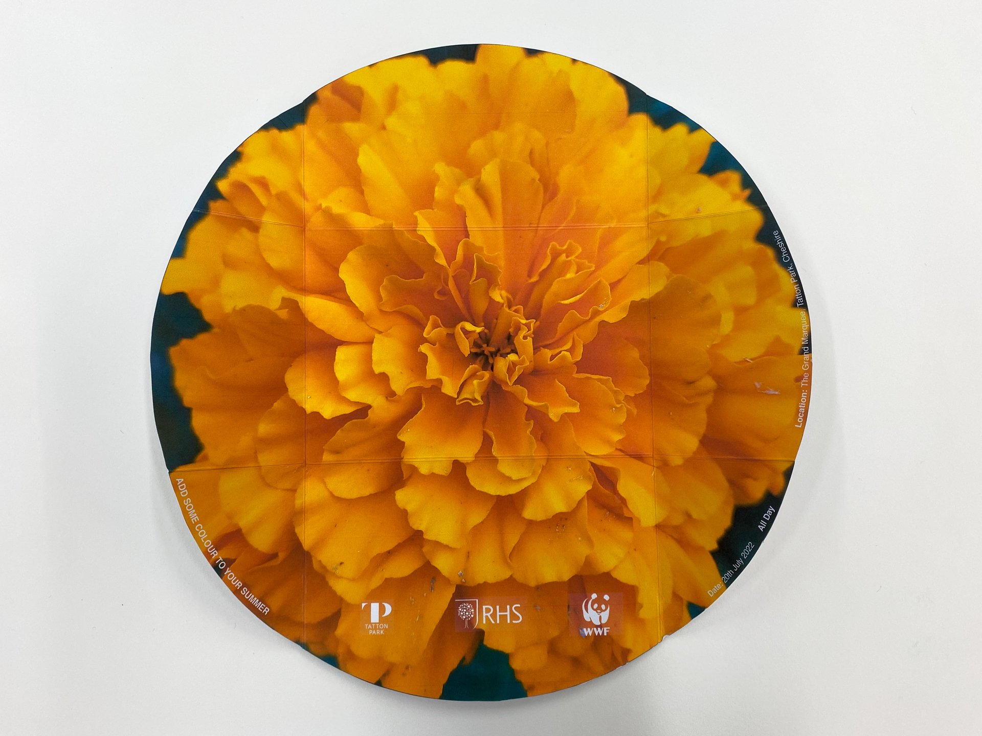
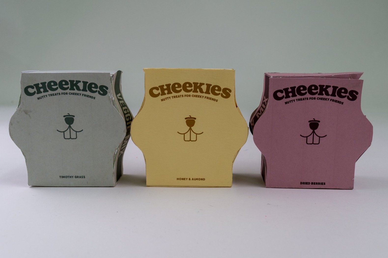
The graphic design first years have finished their second semester packaging project.
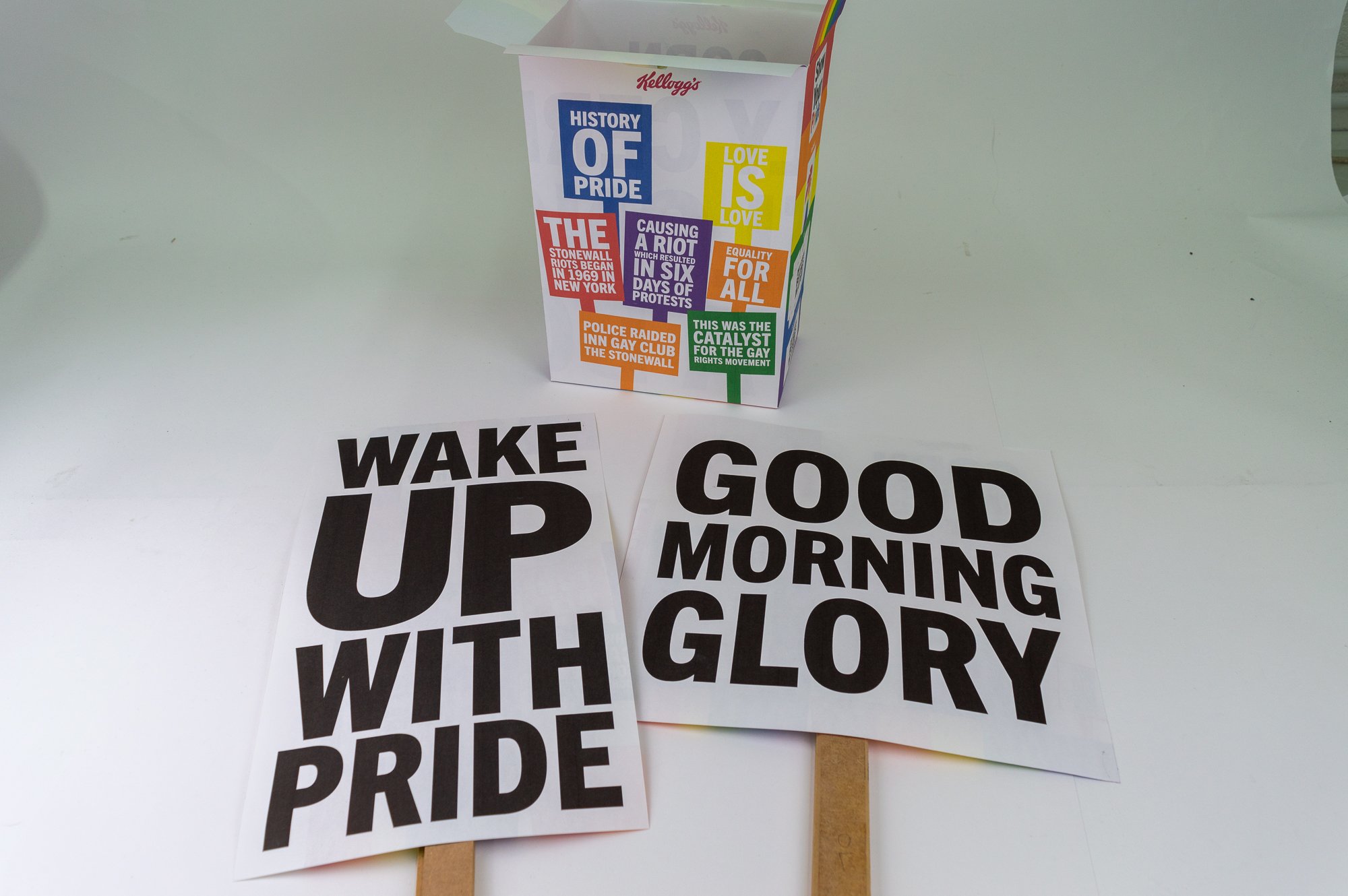
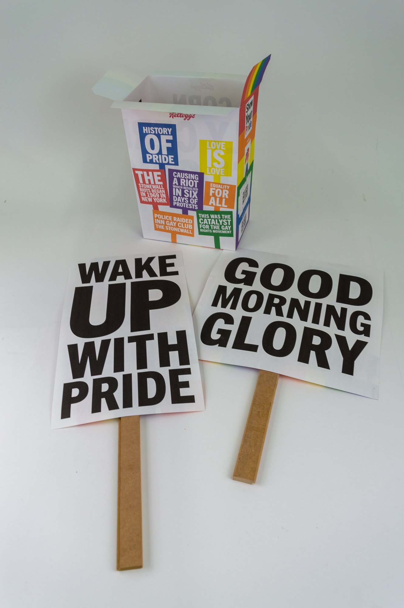
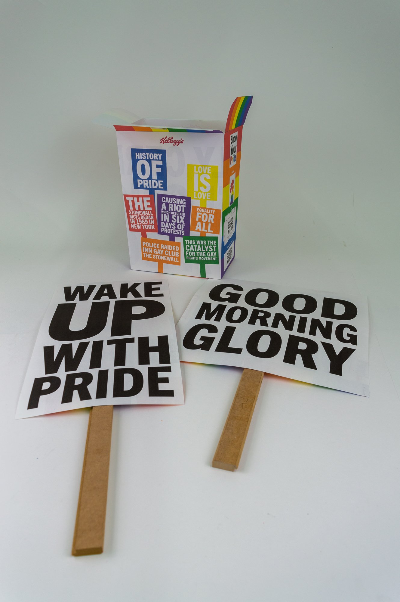
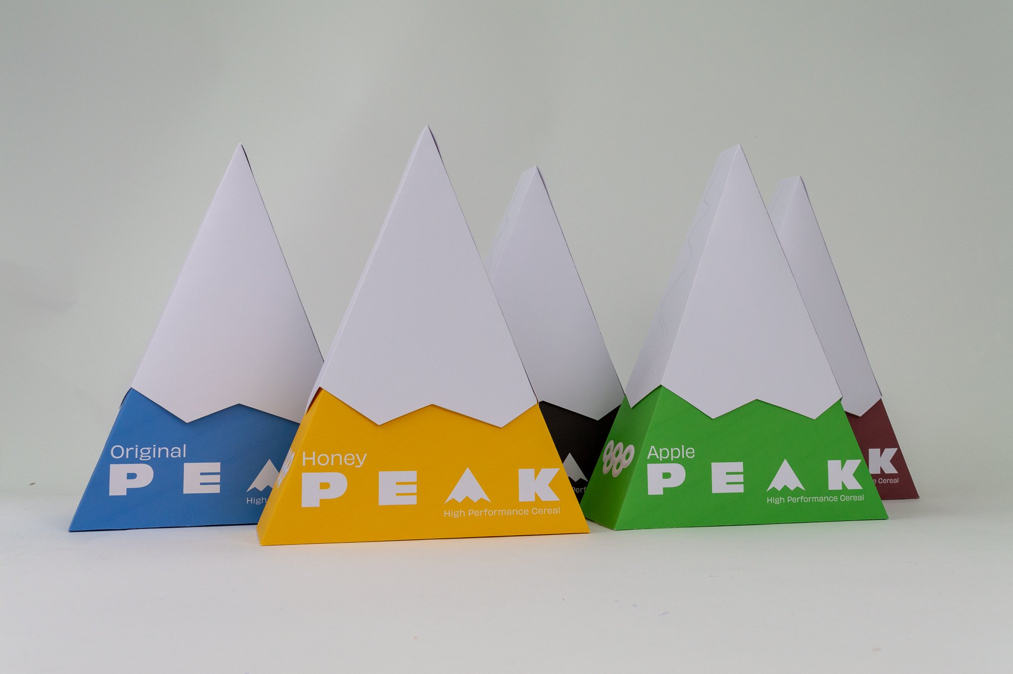
A new take on the brief itself involved taking a closer look at the world of cereal packaging, and creatively design a box of cereal on behalf of a given client, event or audience.
The student could choose the most appropriate cereal (cold or hot) for their client. The solution could be achieved through three-dimensional design, surface graphics or a combination of both.

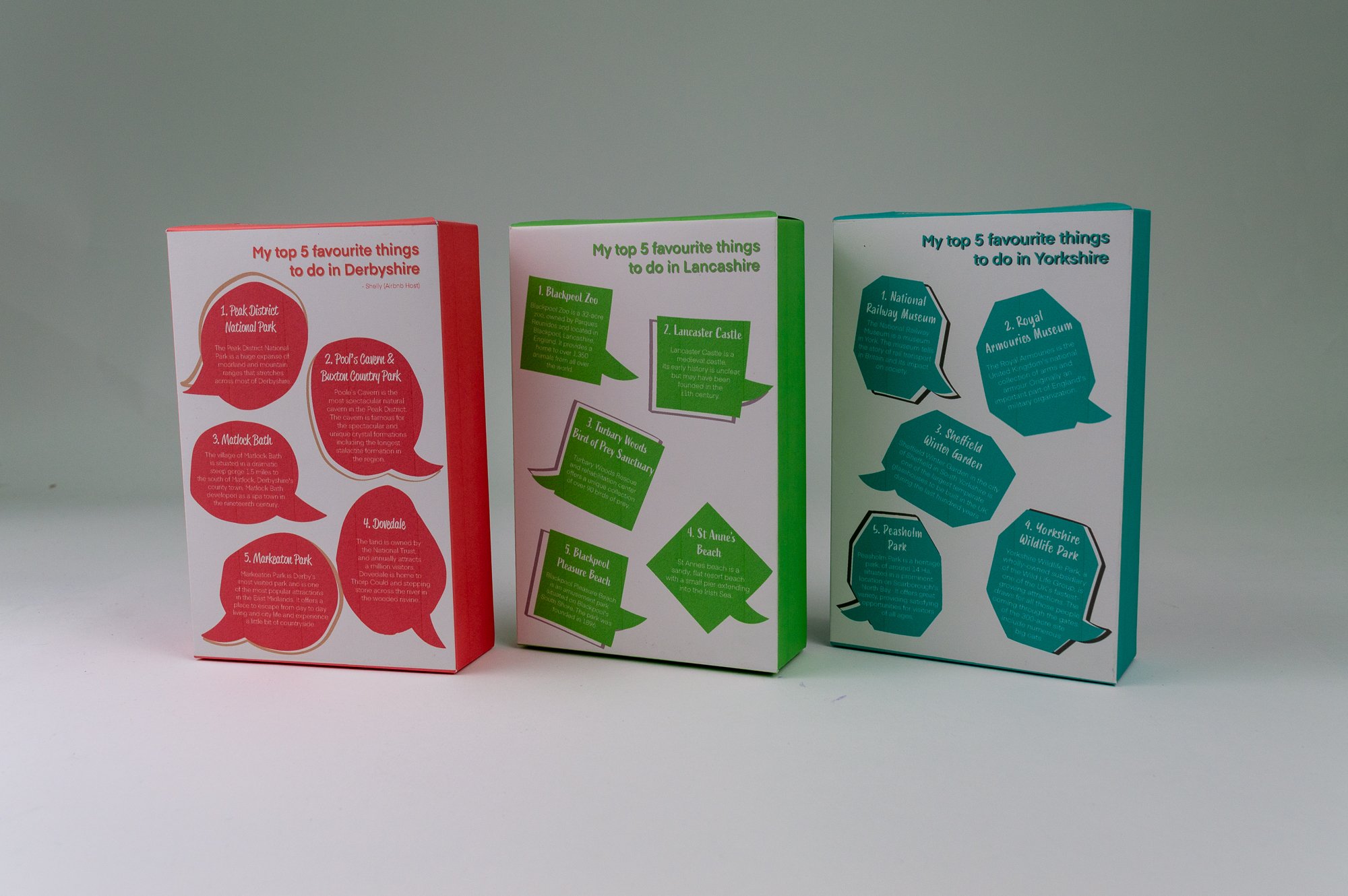
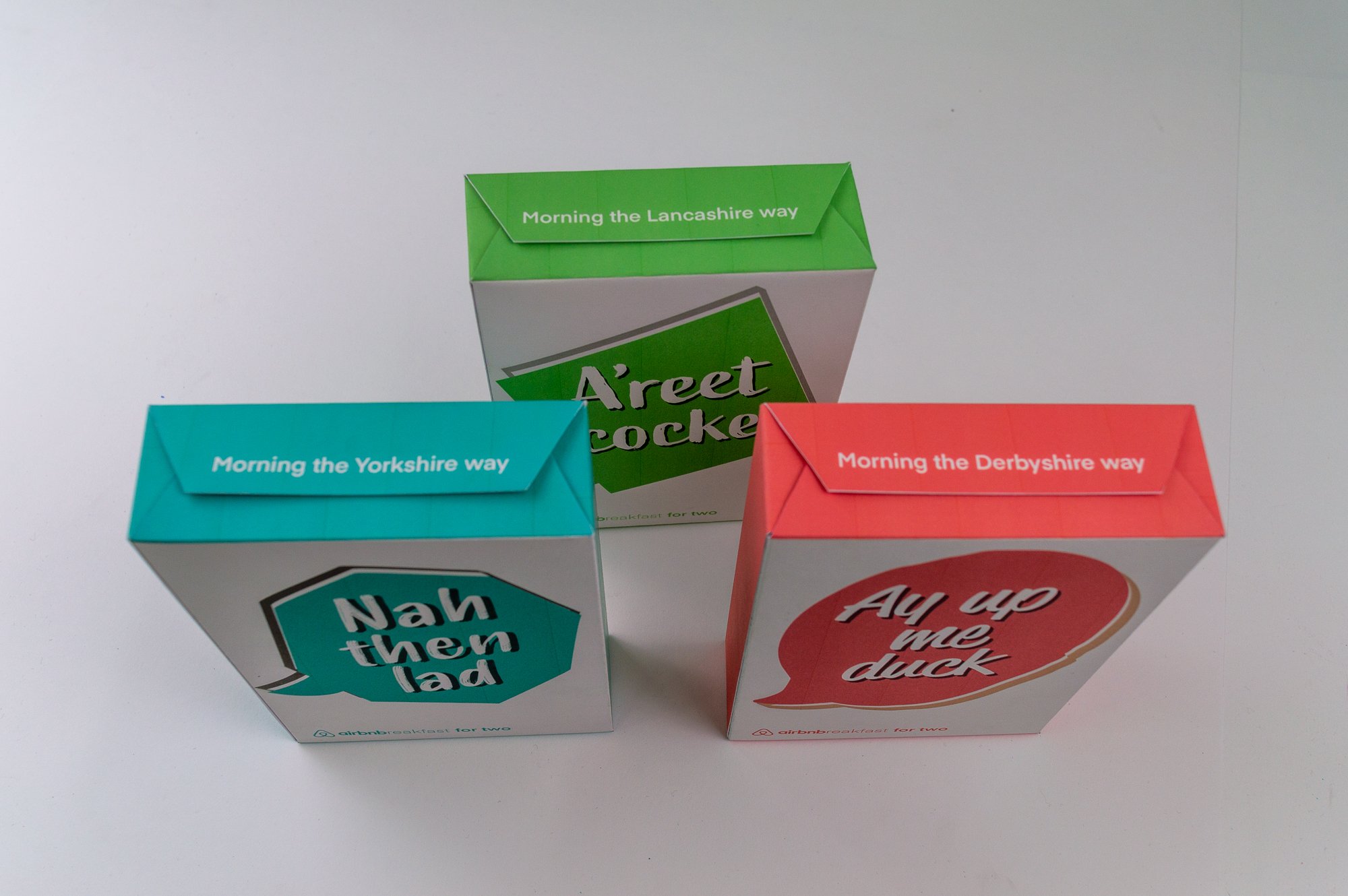
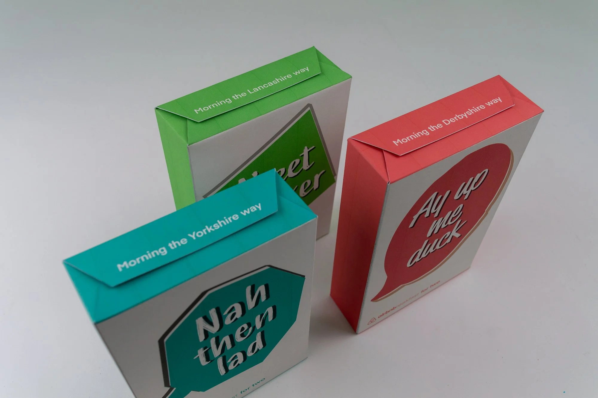
airbnb – Copos [translated from ‘flake’ in spanish’]

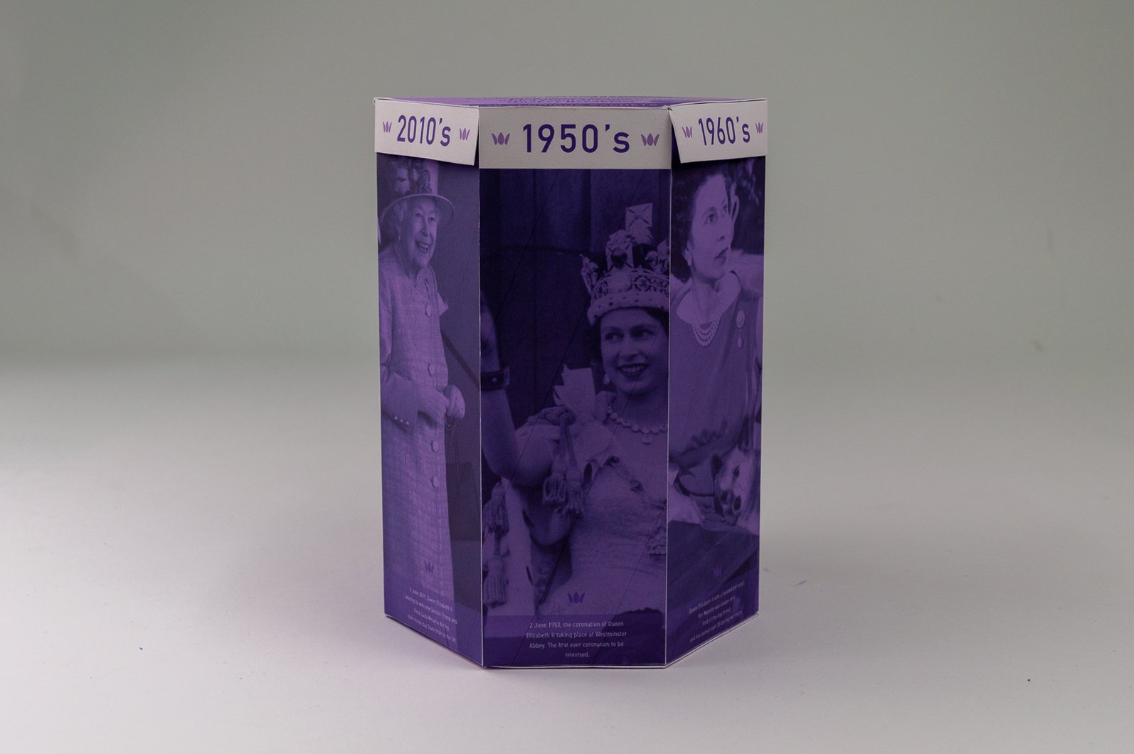
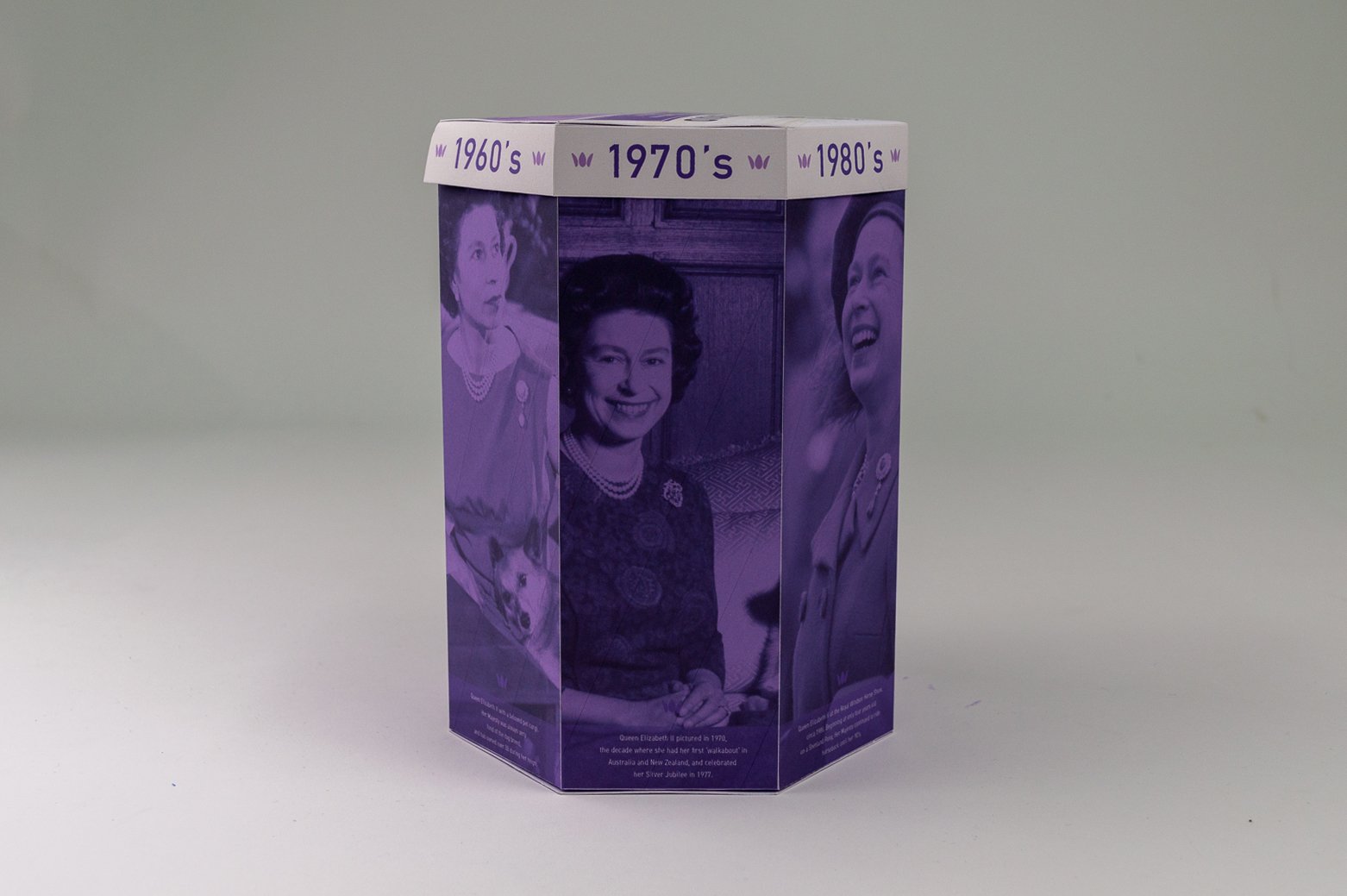
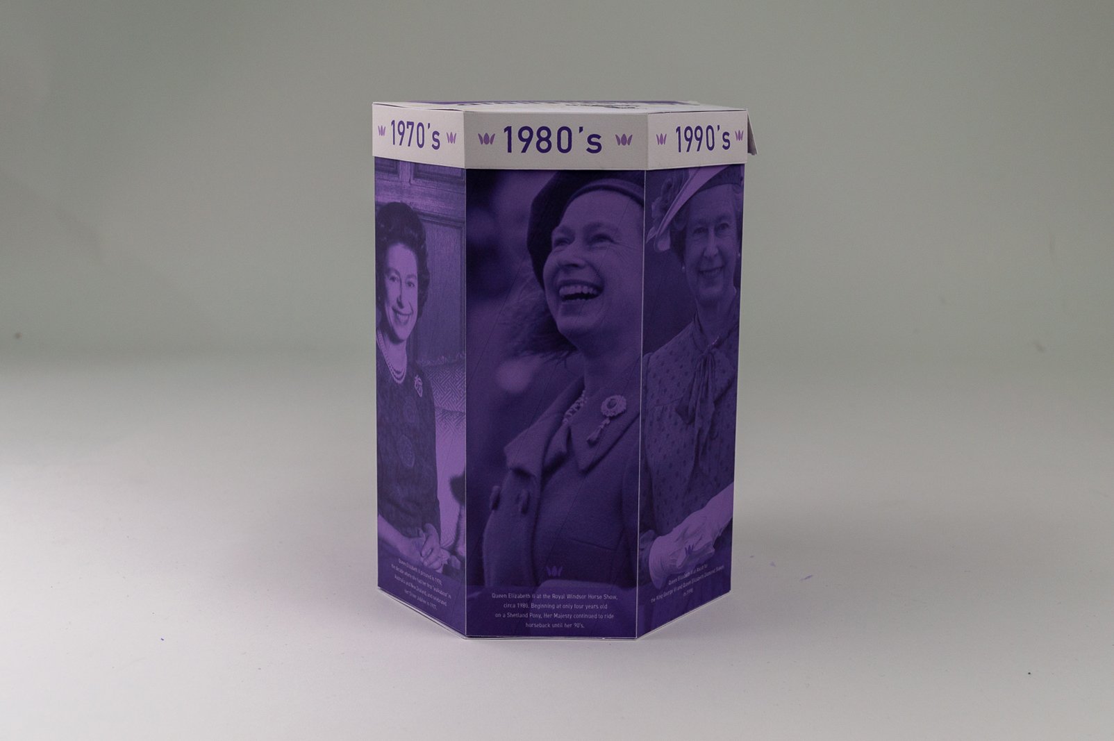
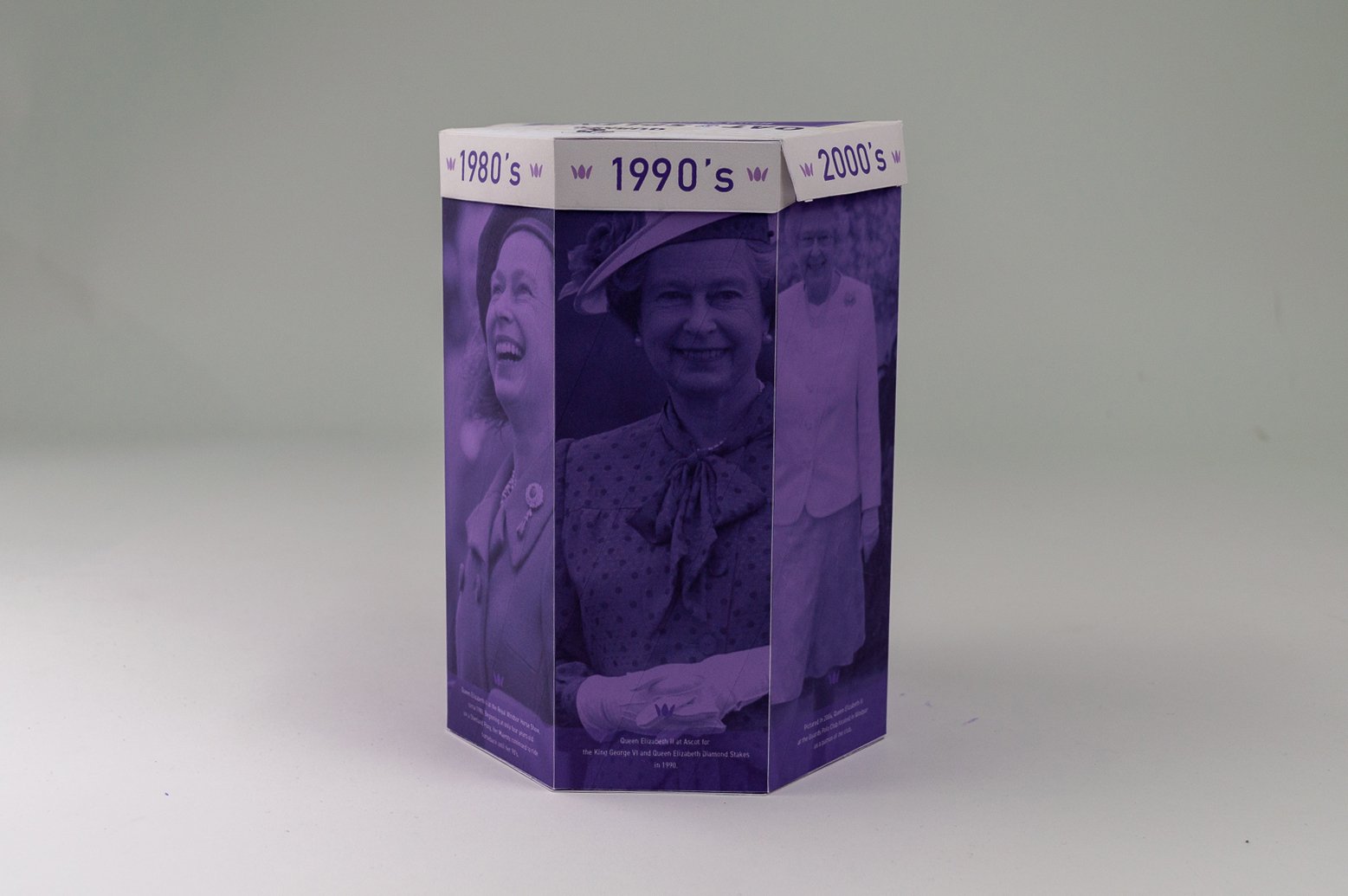
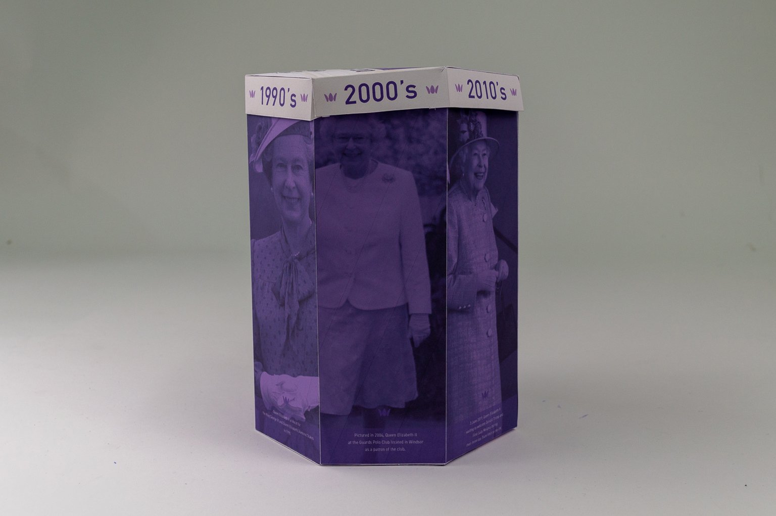
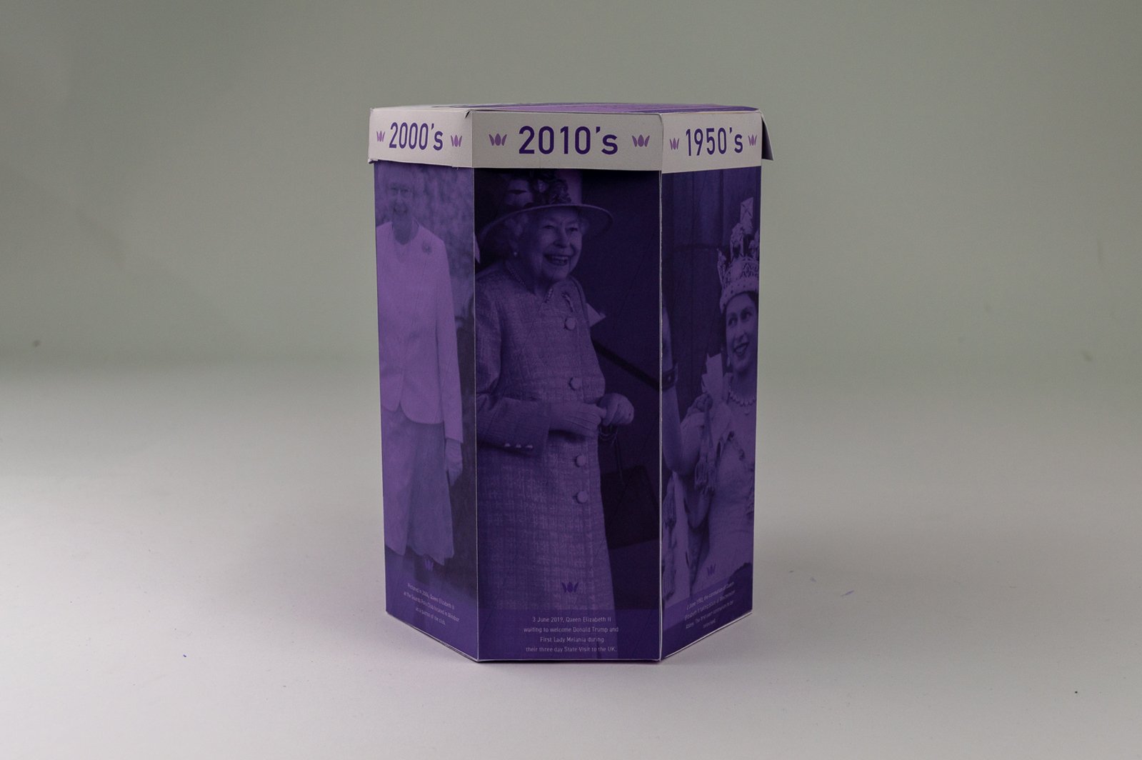
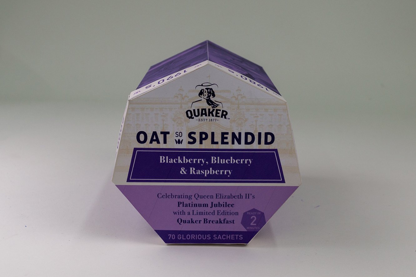
Queen’s platinum jubilee

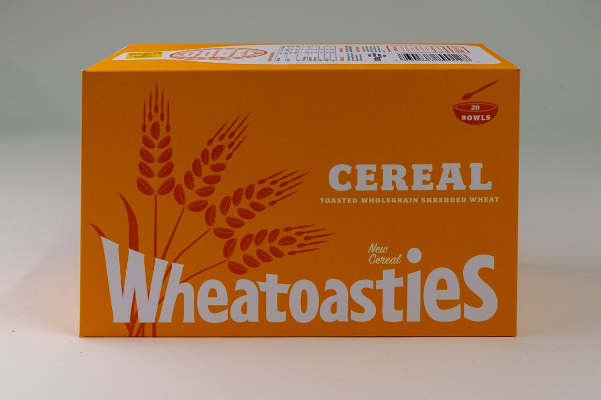
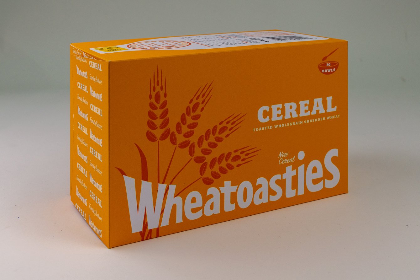
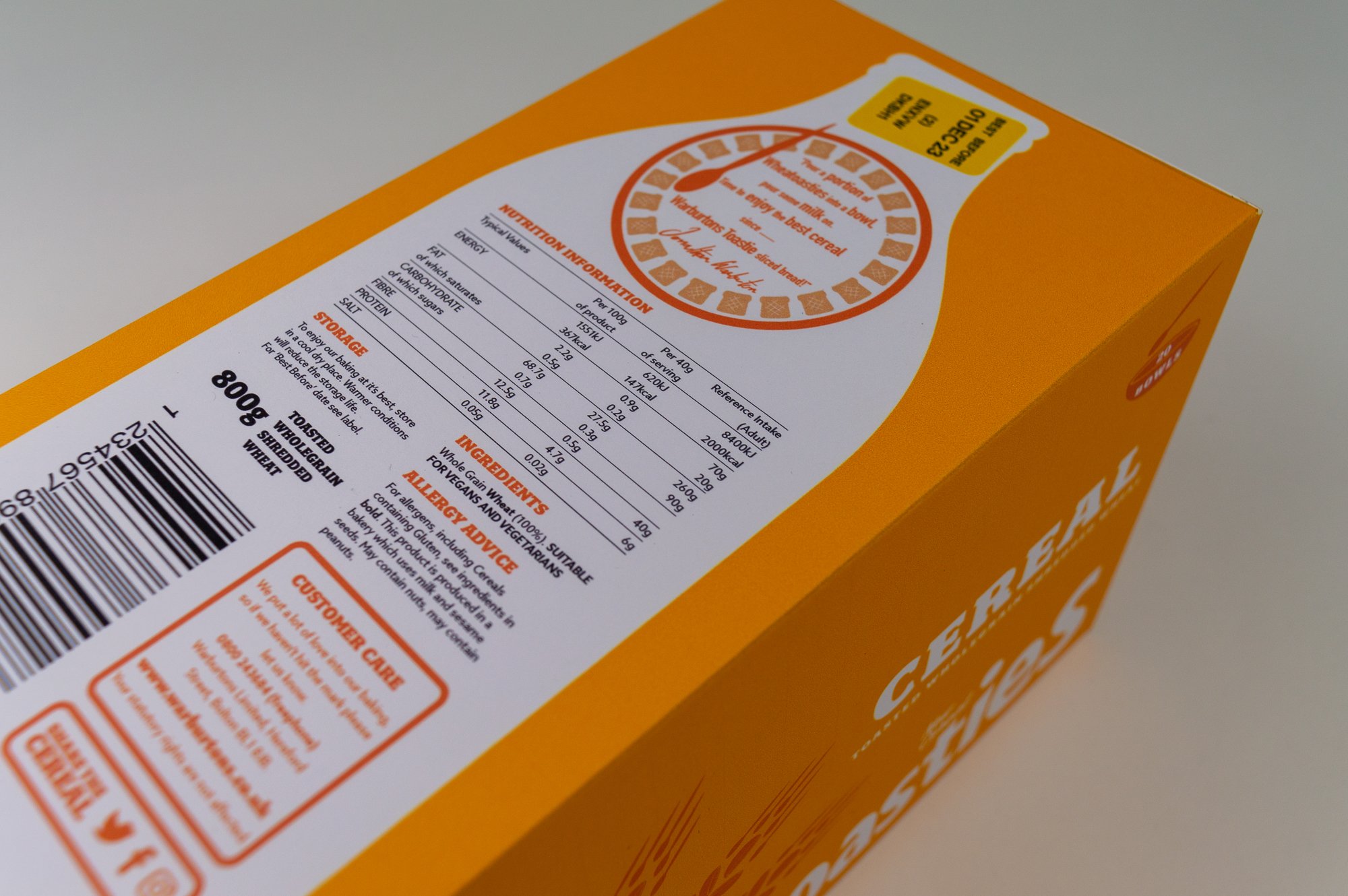
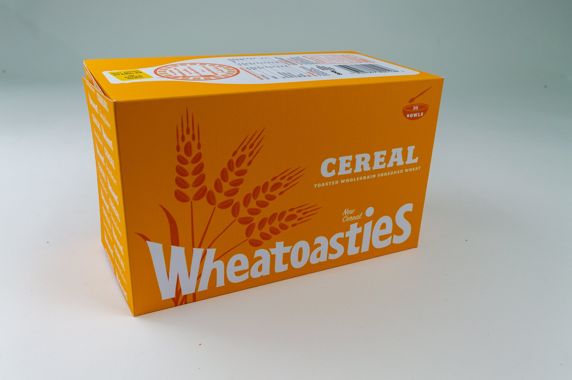
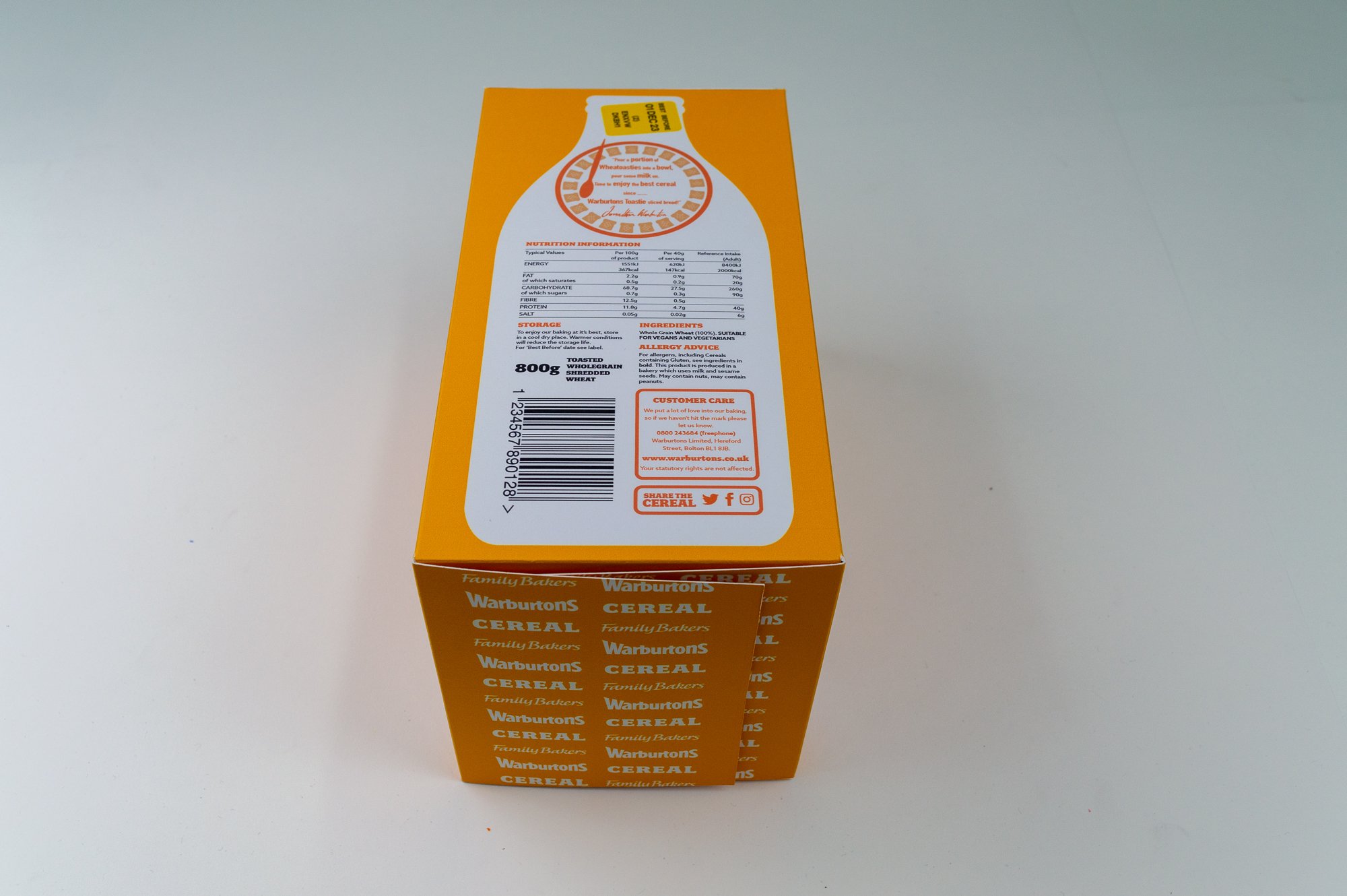
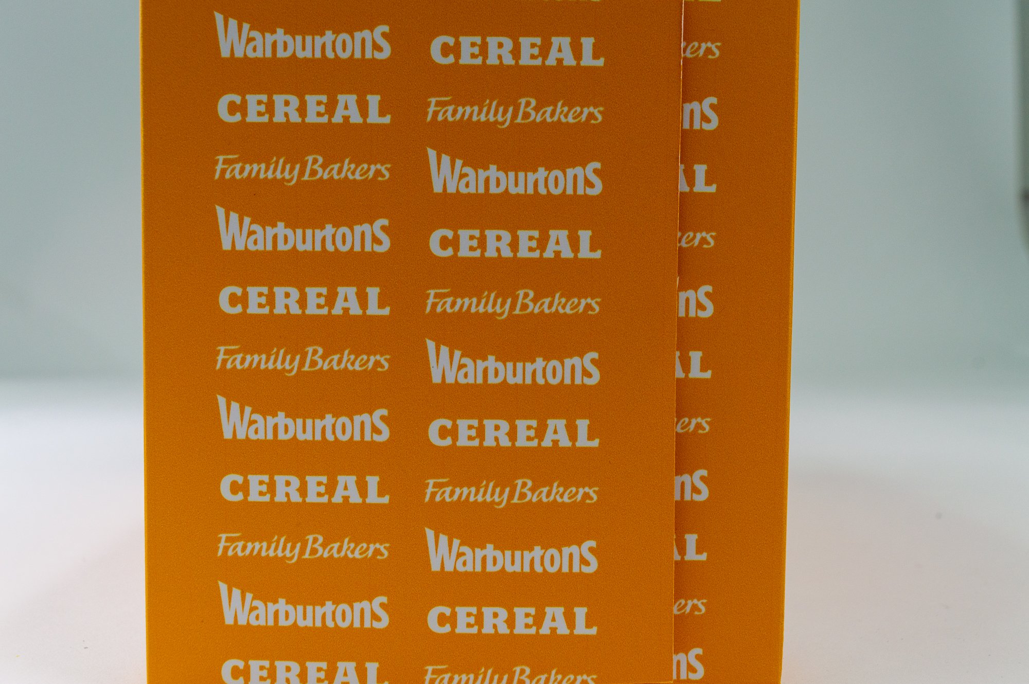
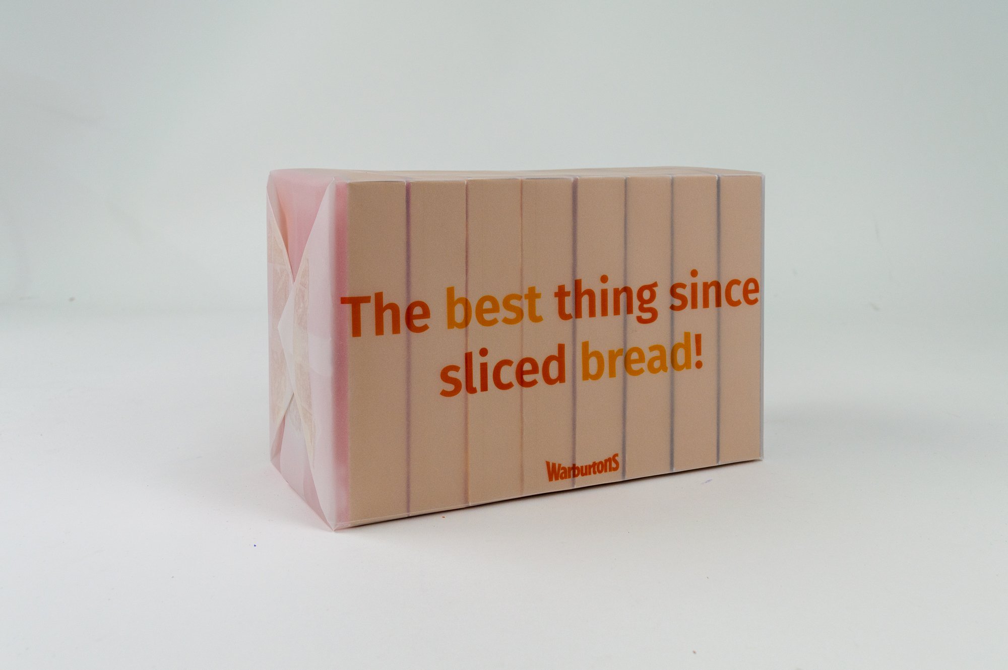
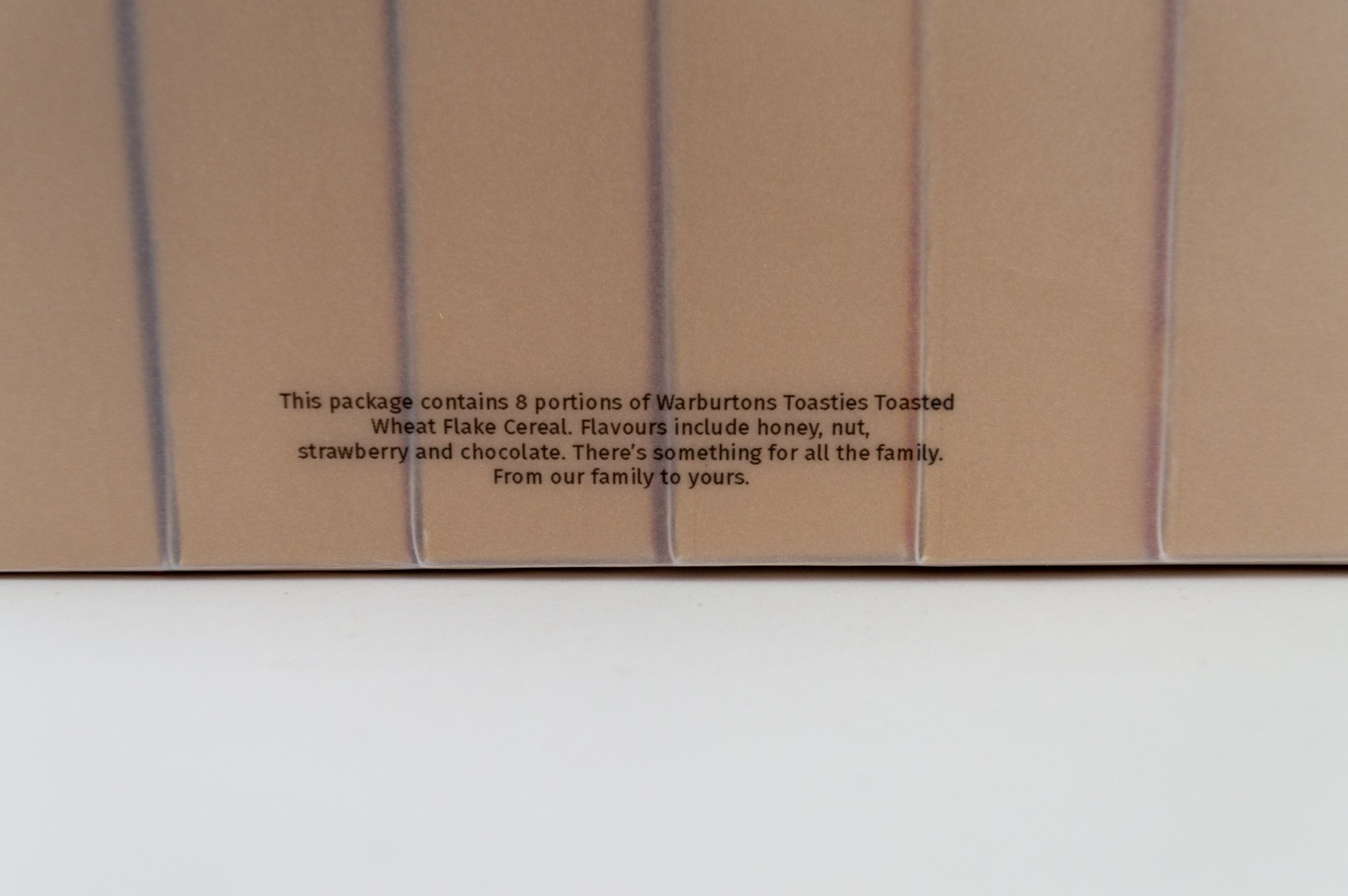
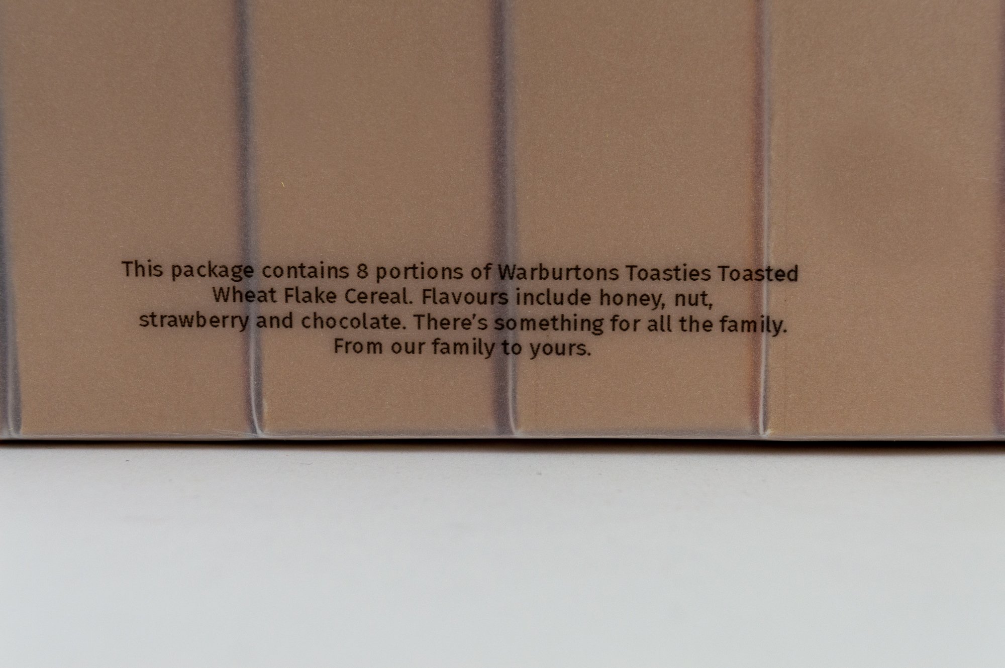
Warburtons

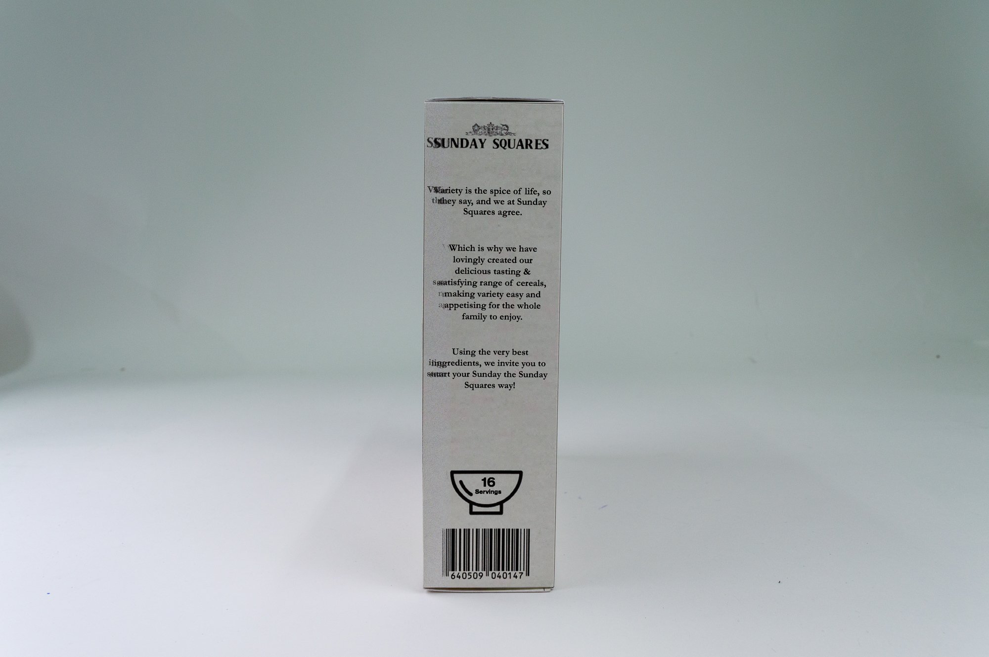
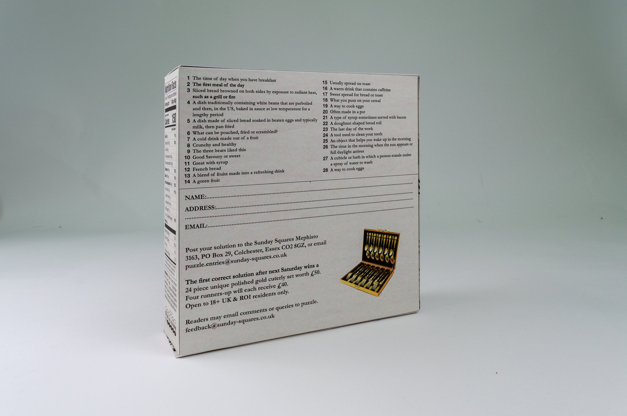
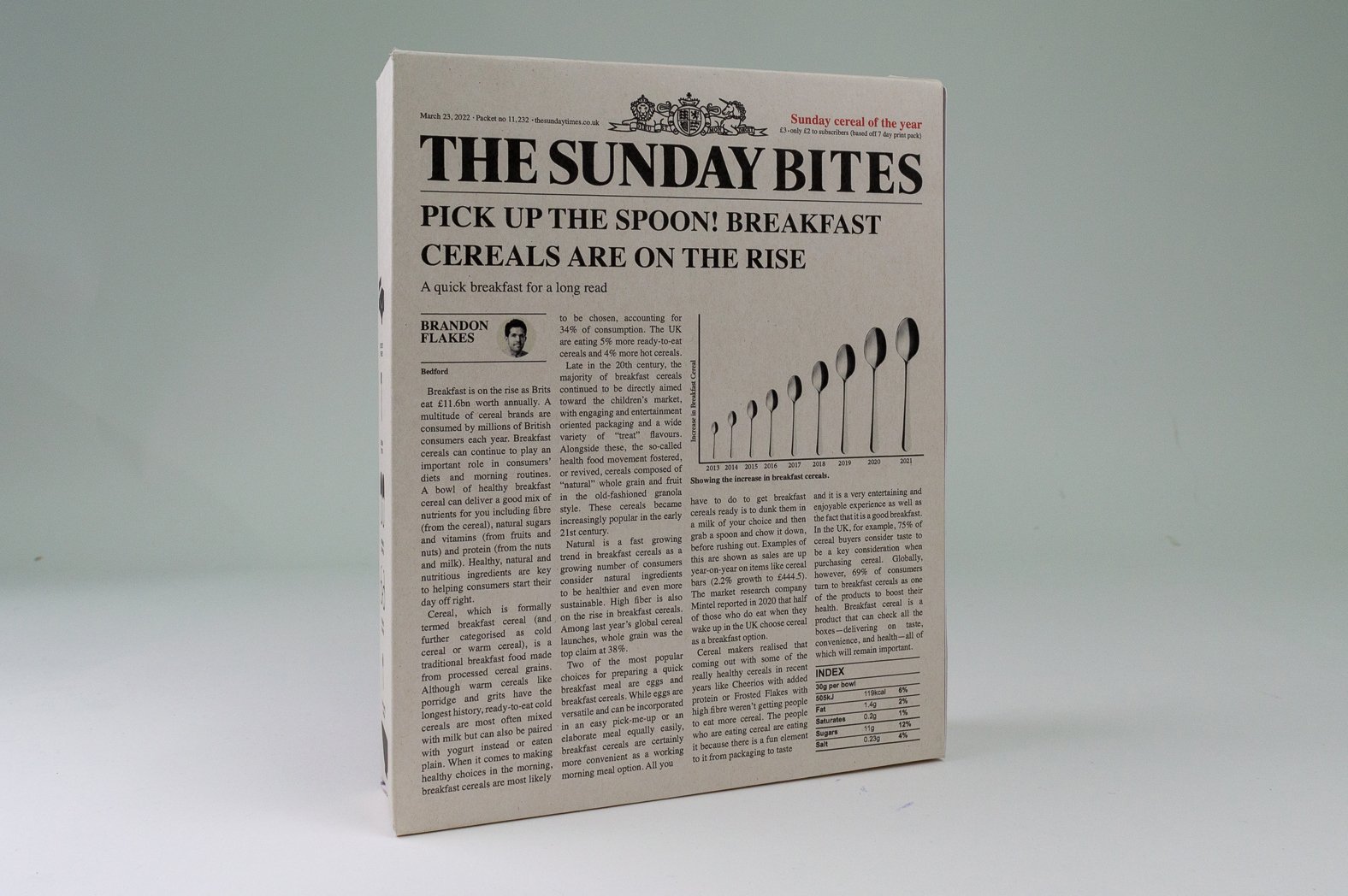
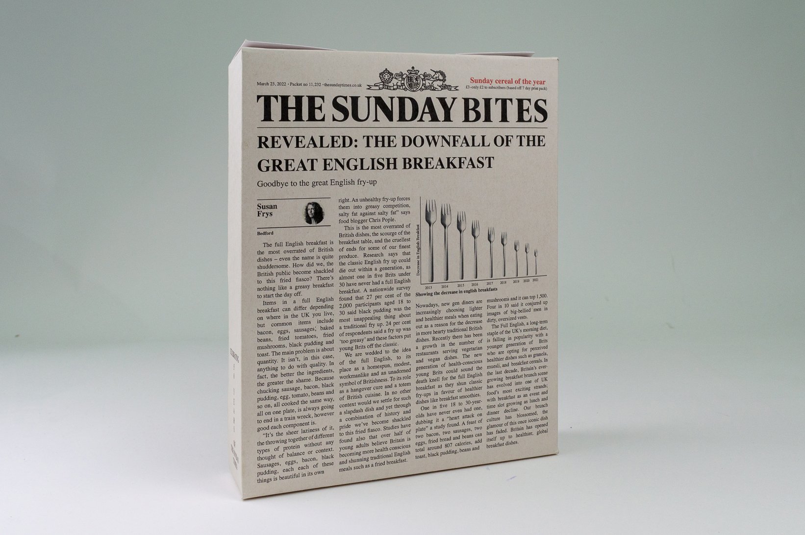
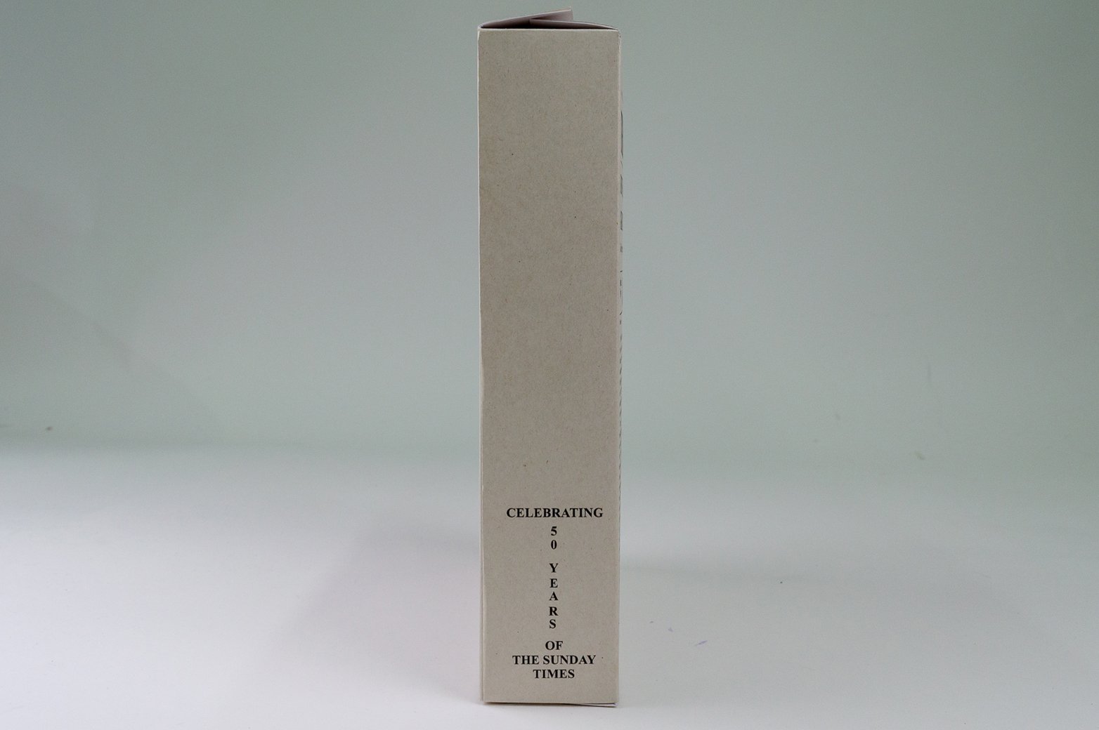
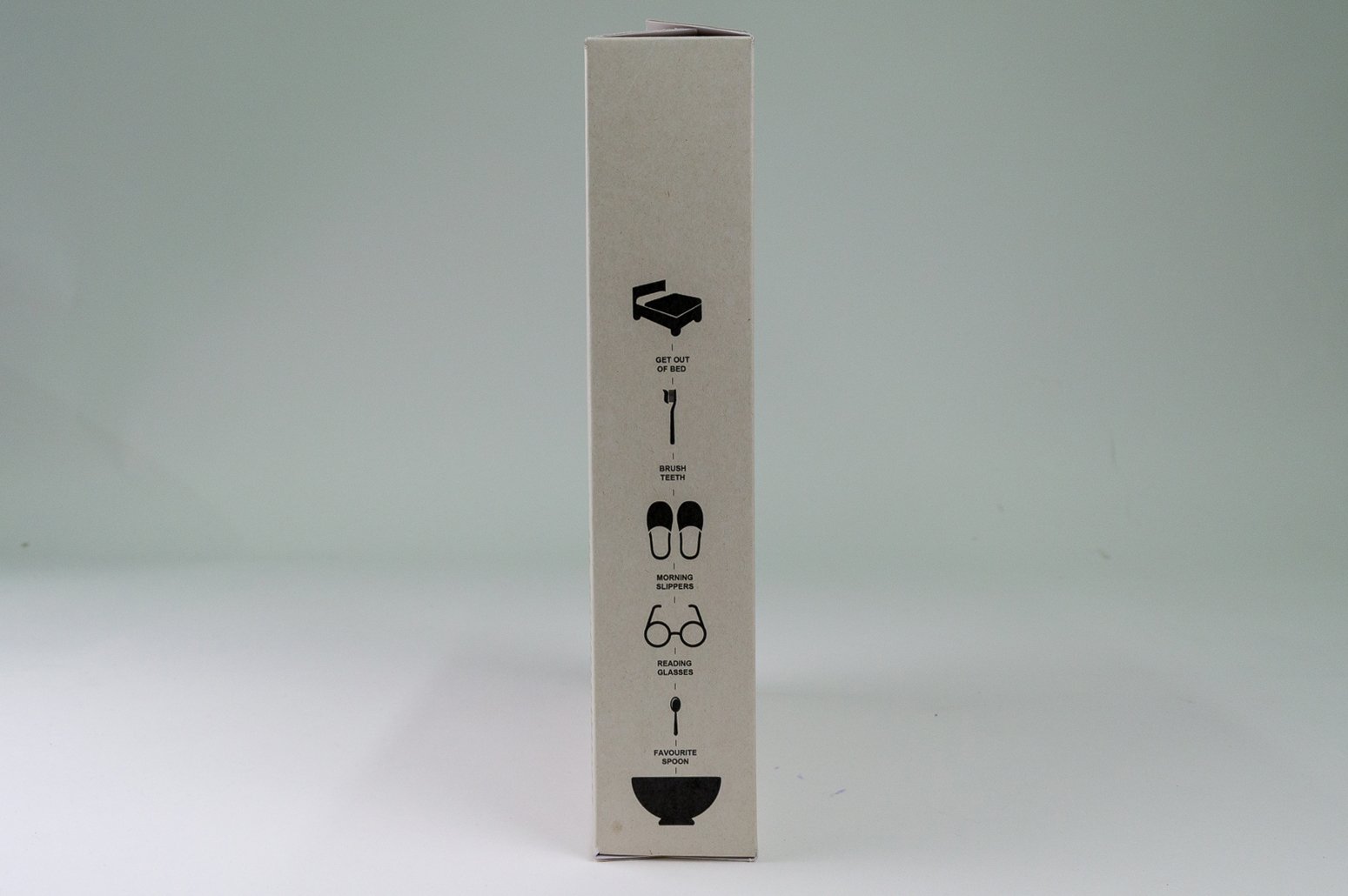
sunday times

Warburton’s

airbnb
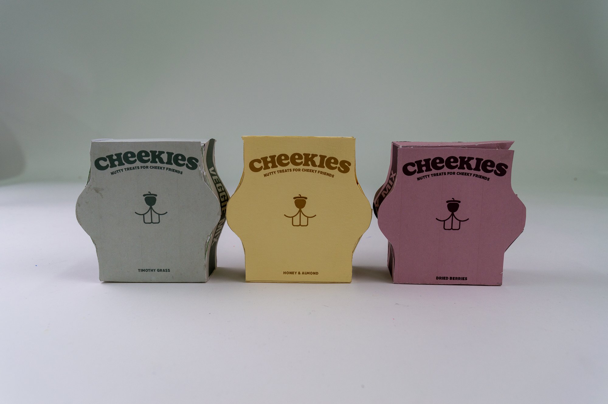
pet rodent owners

pride

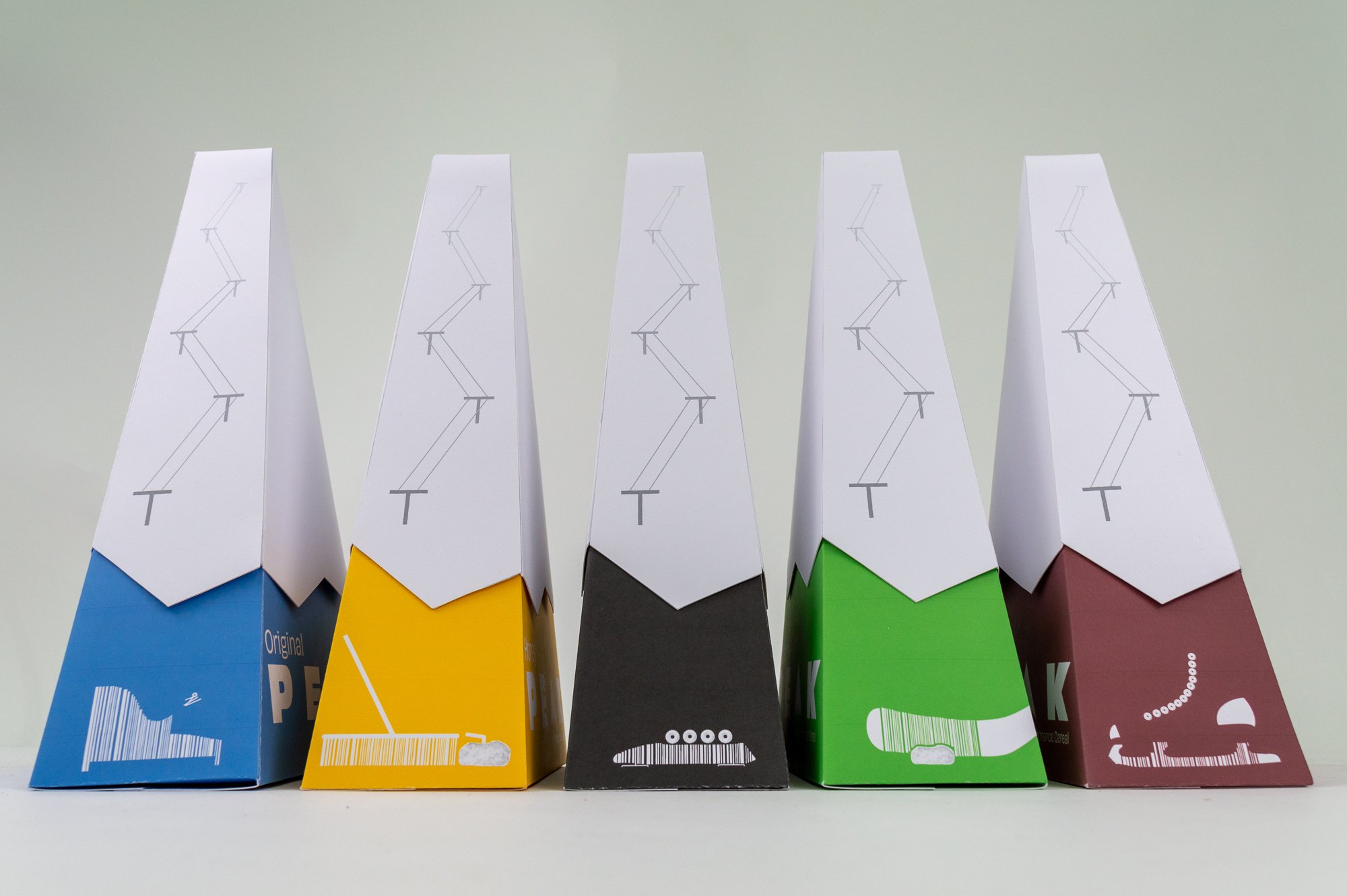
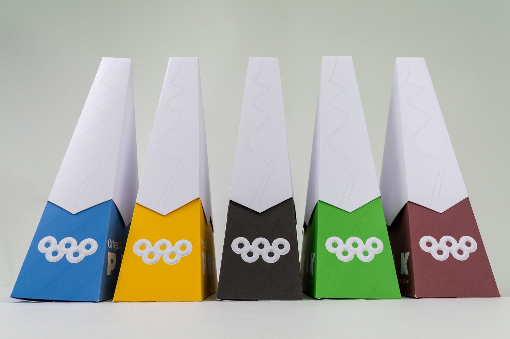
winter olympic games

The sunday times
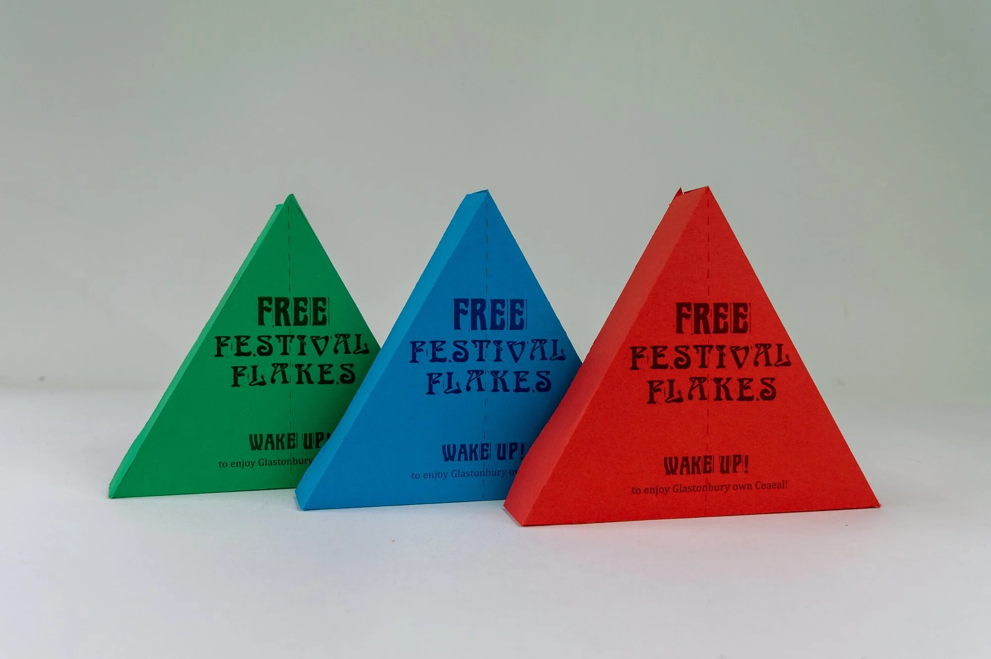
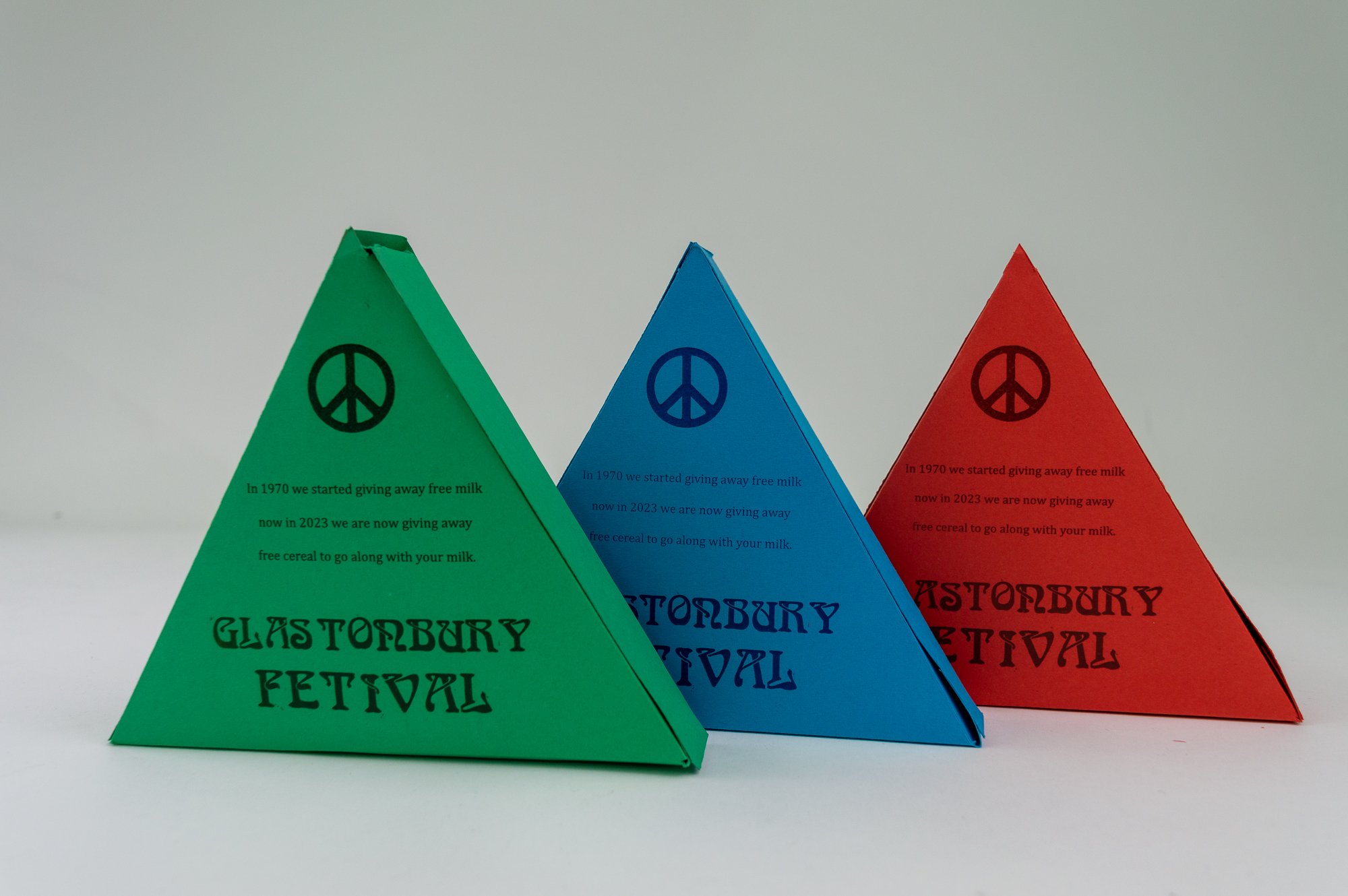
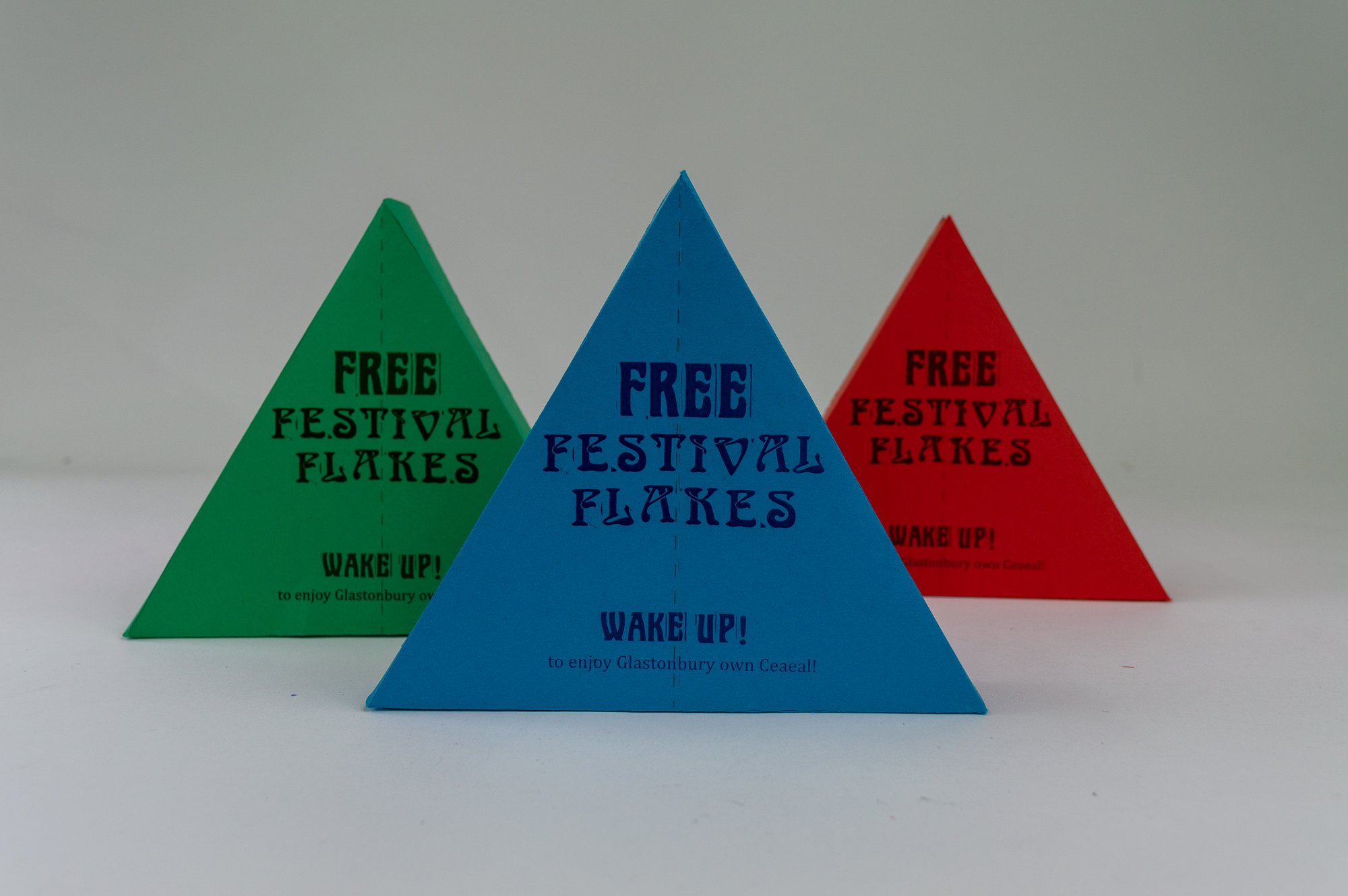
glastonbury festival
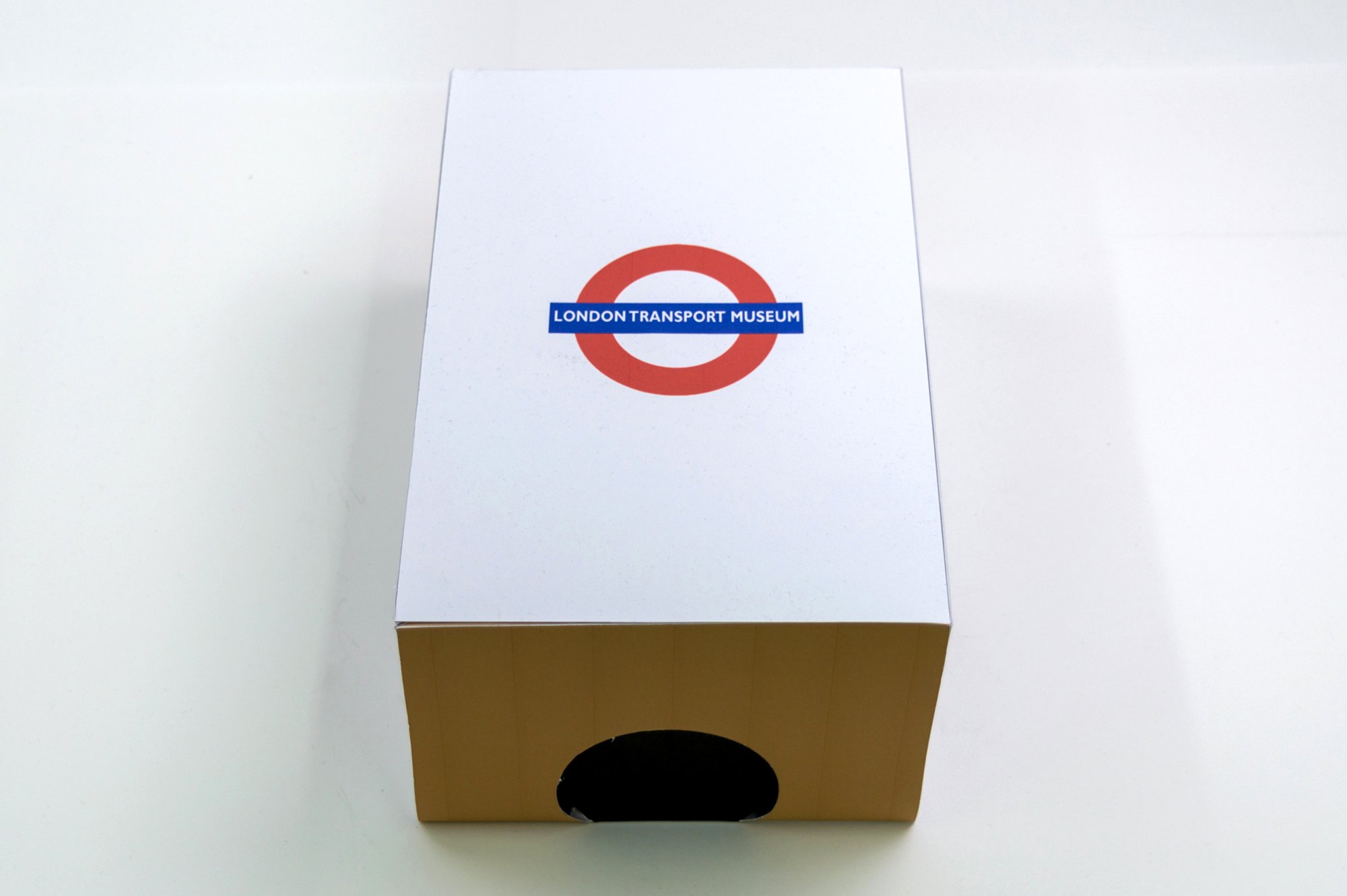
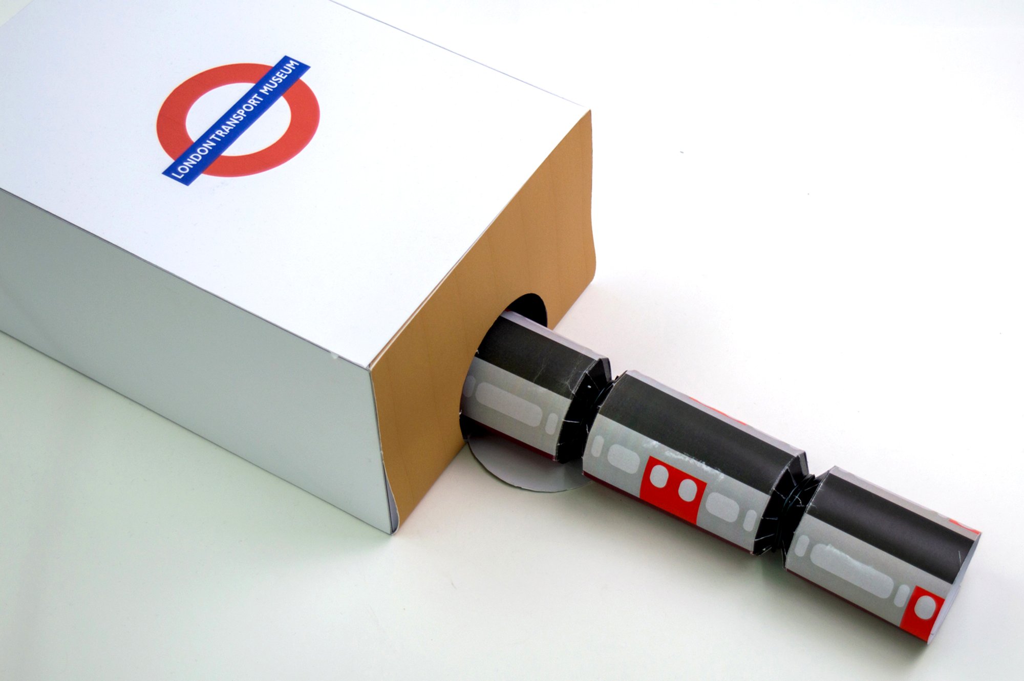
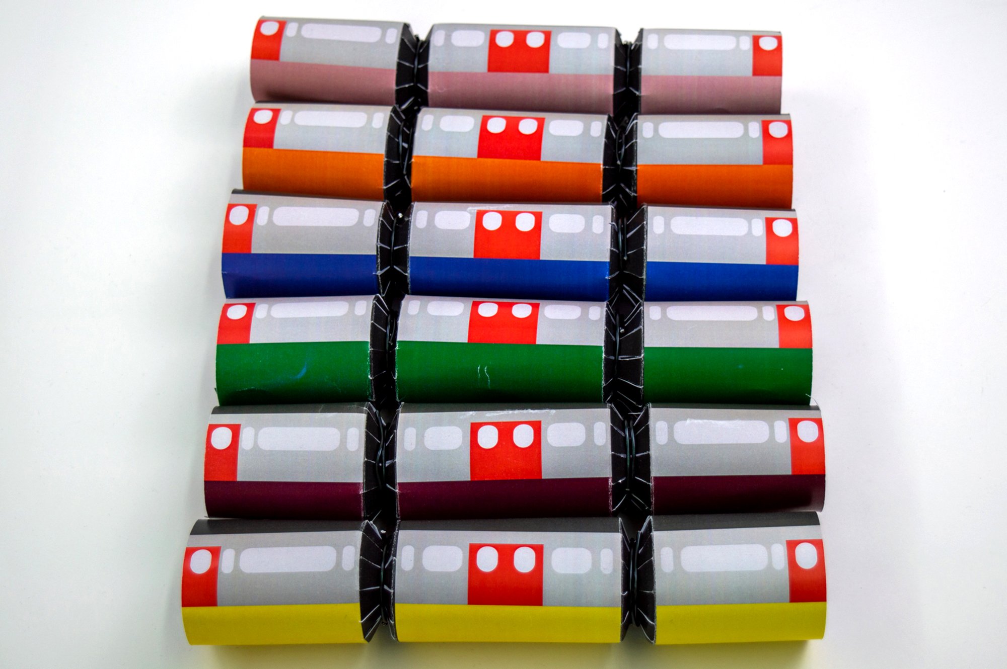
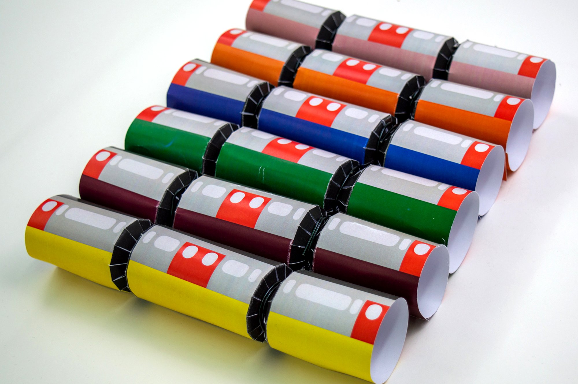
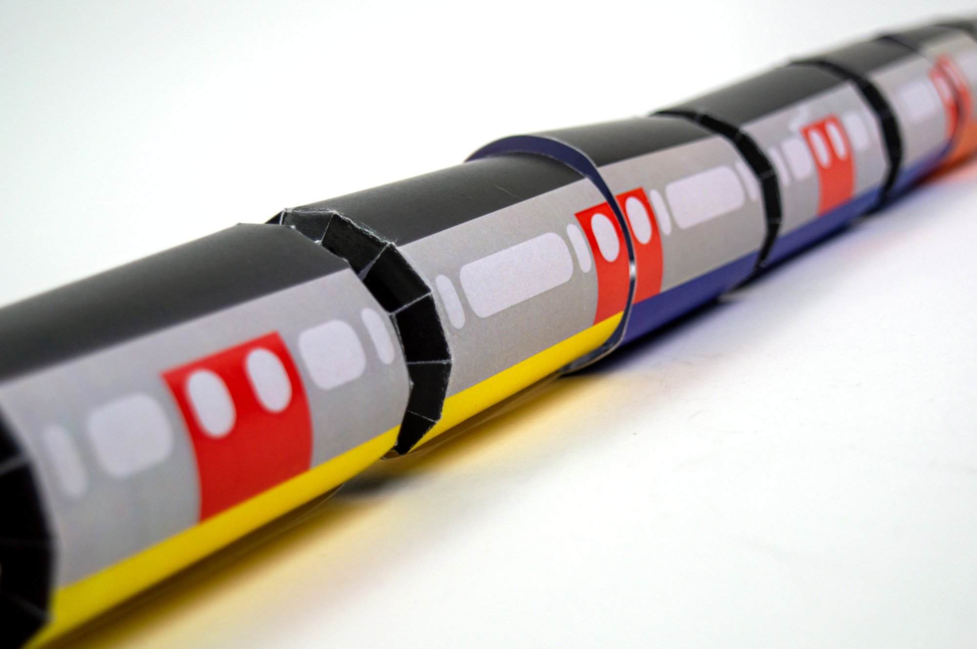
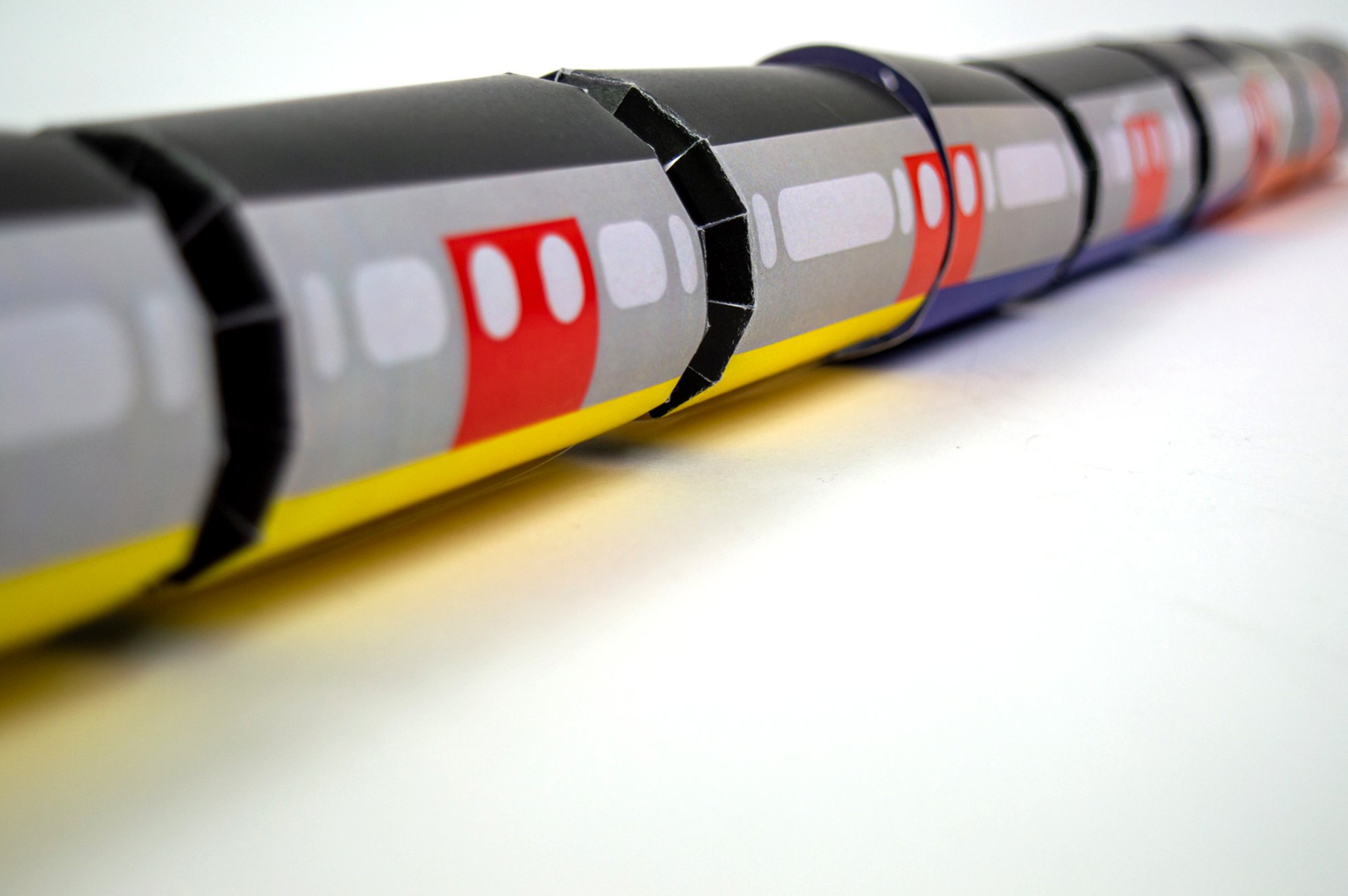
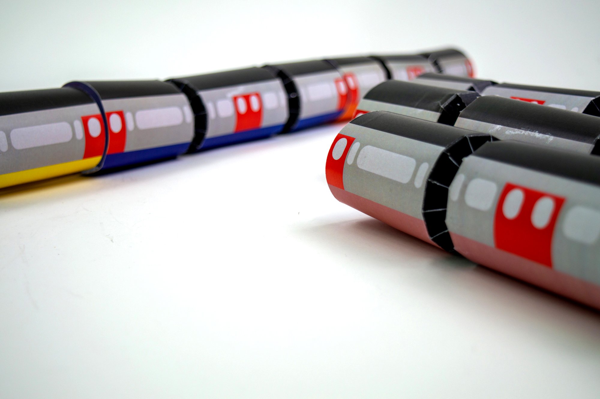
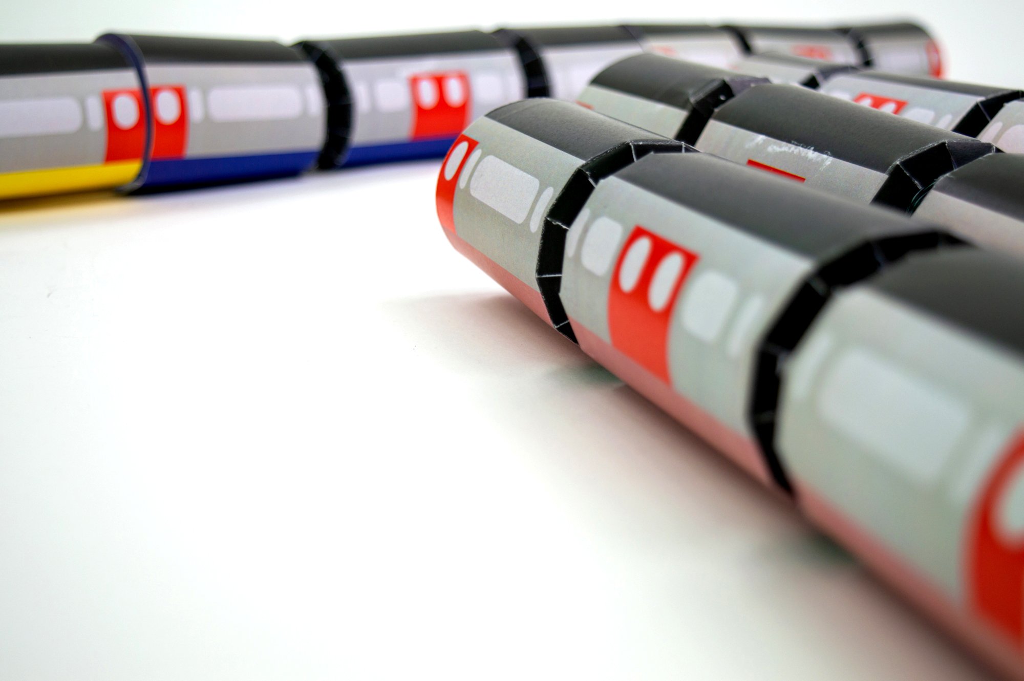
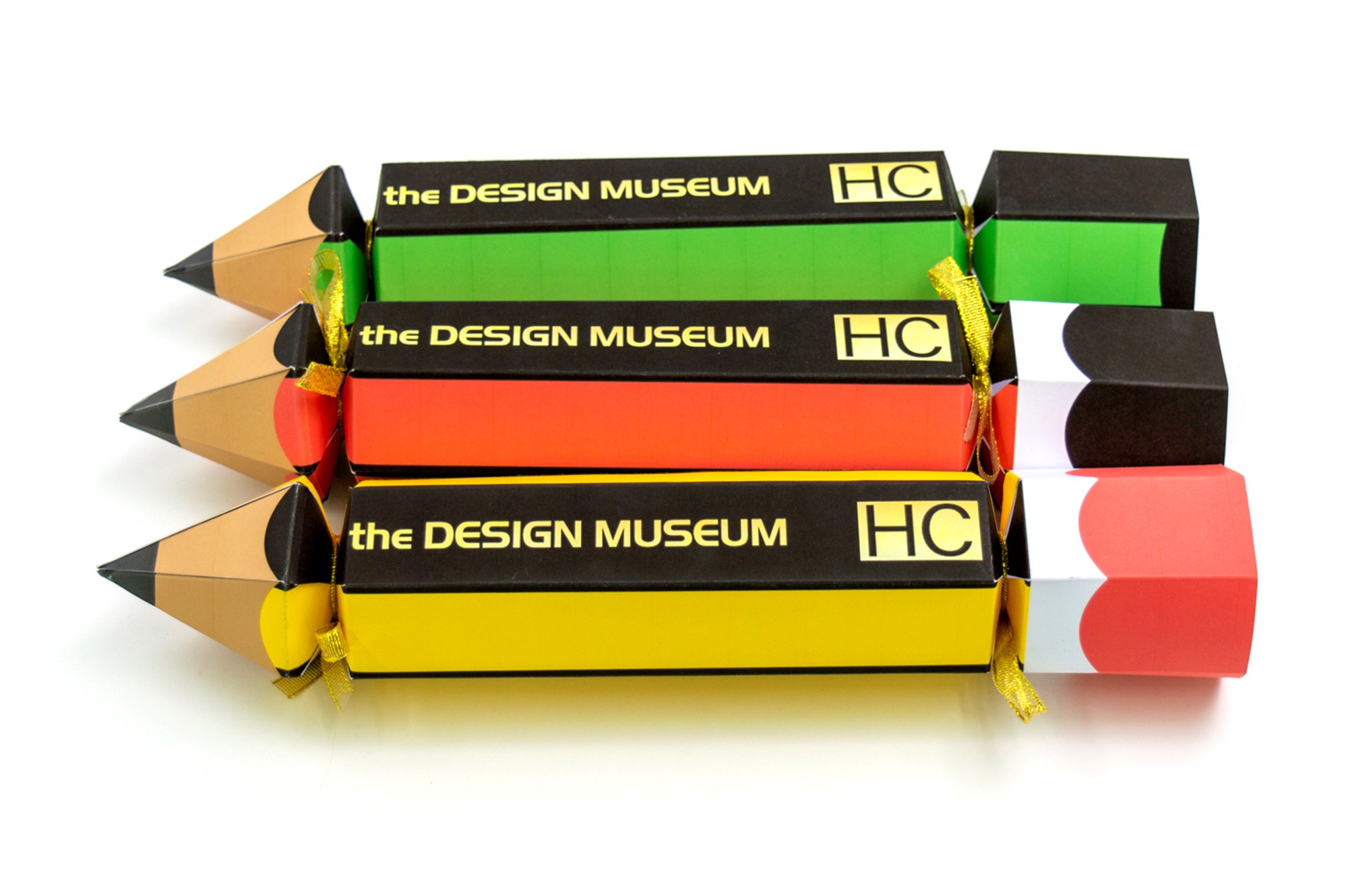
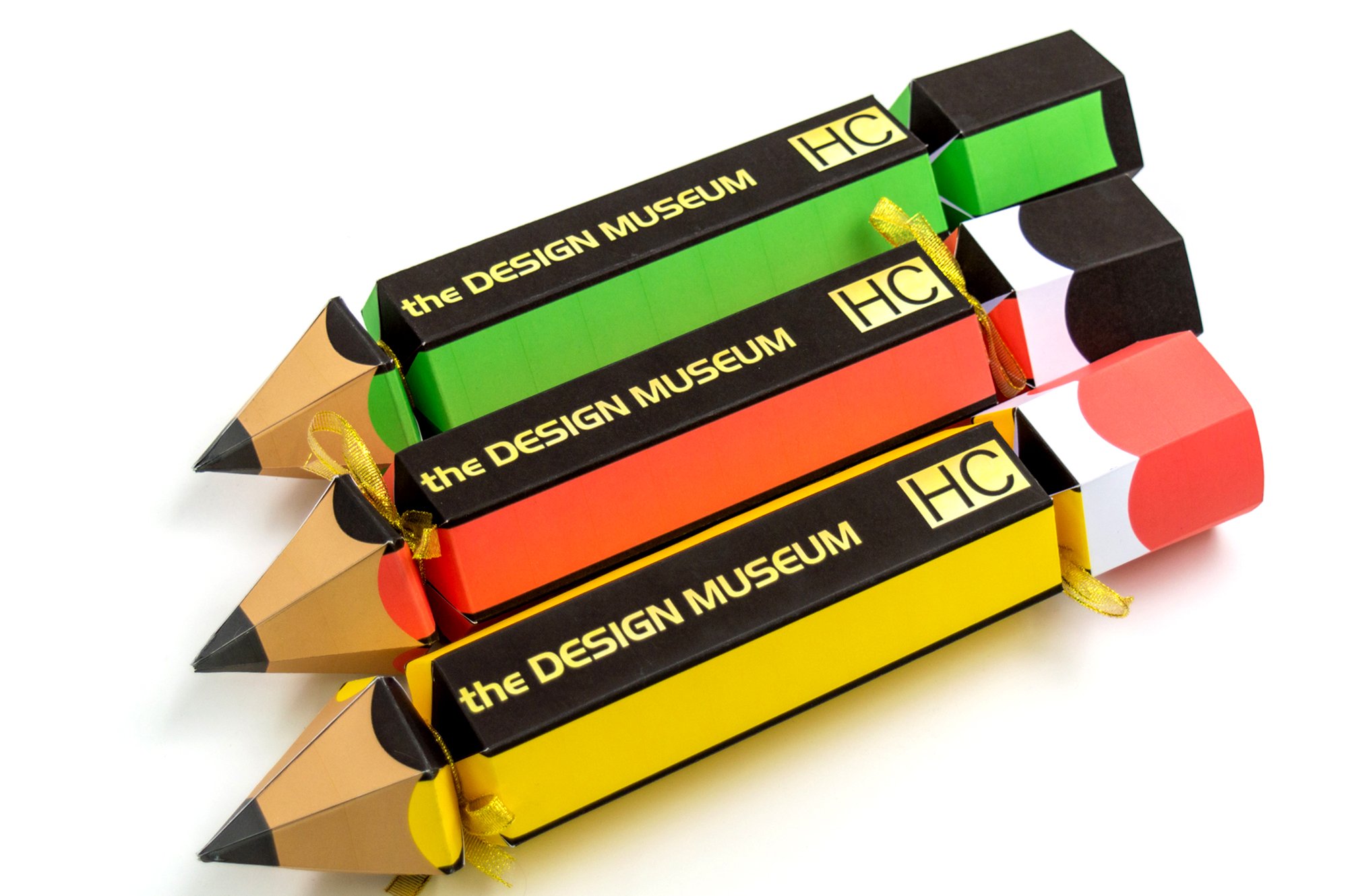
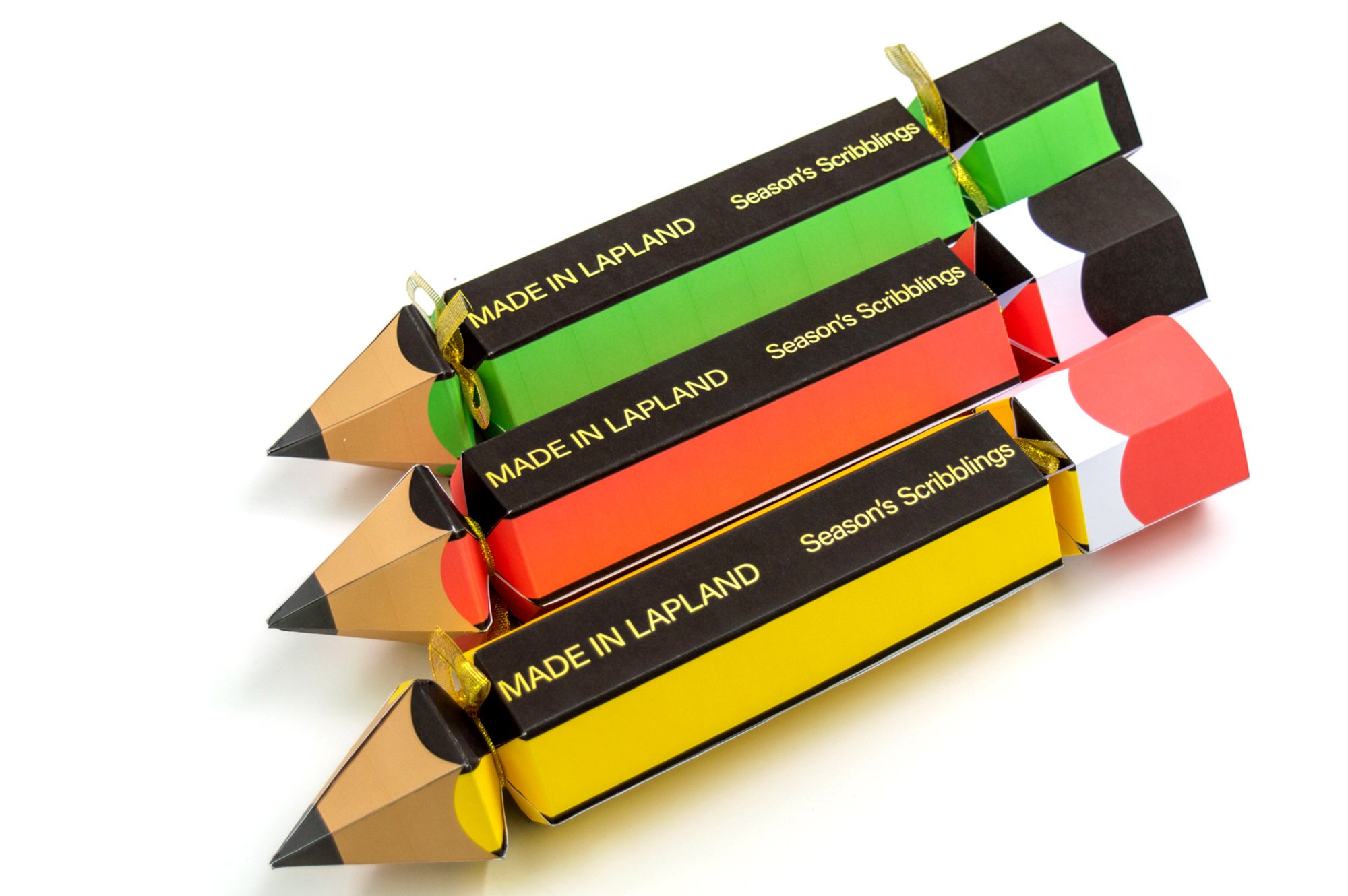
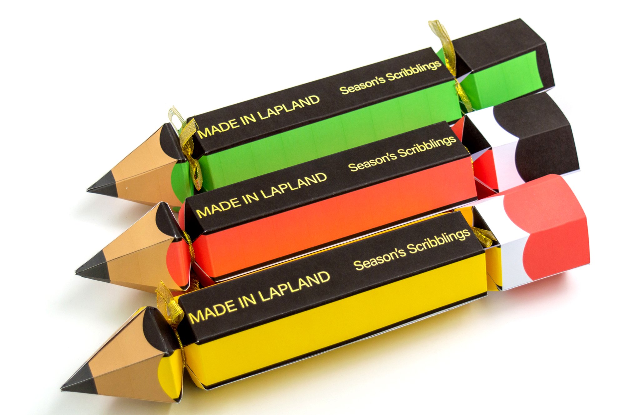
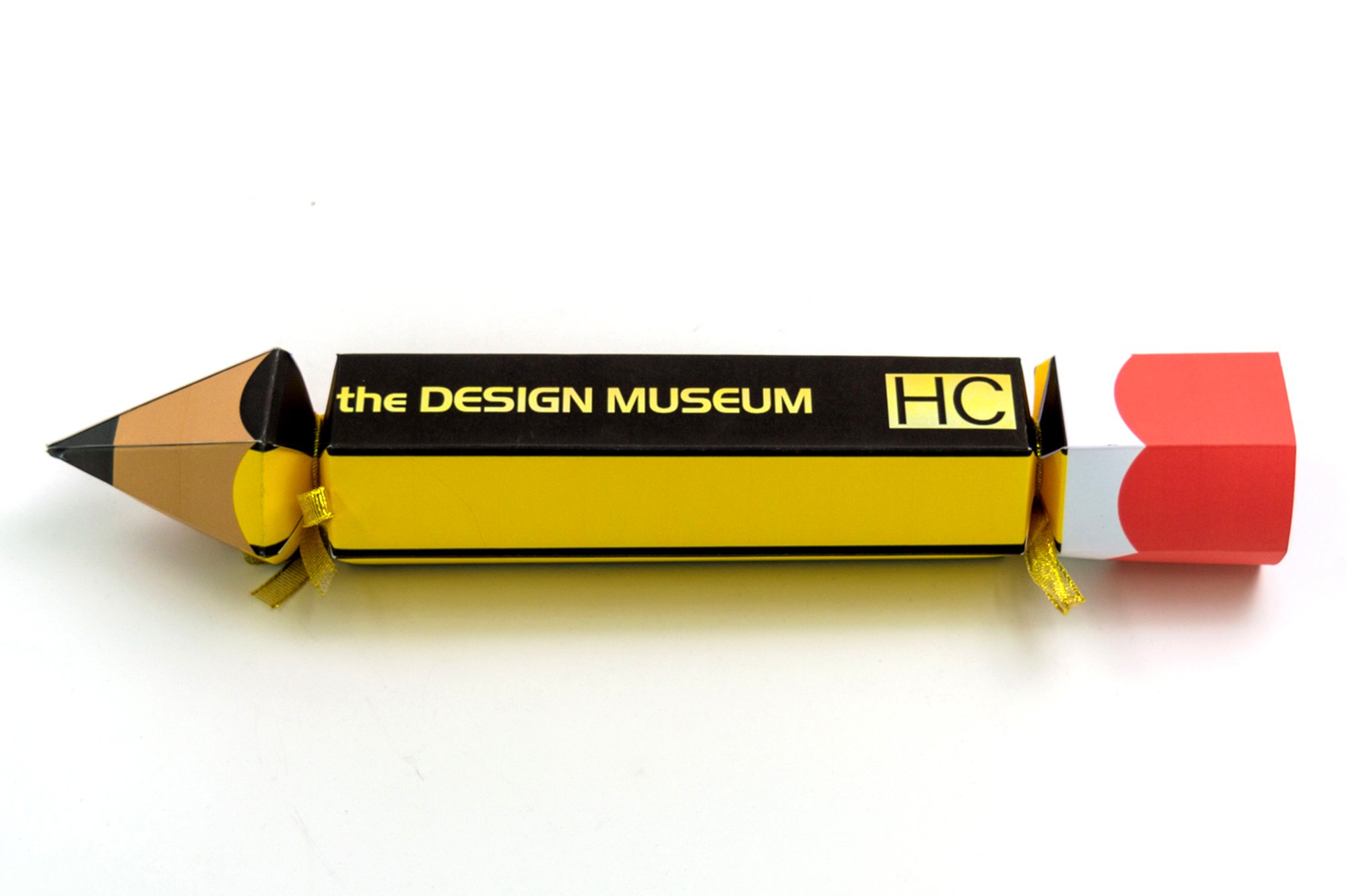
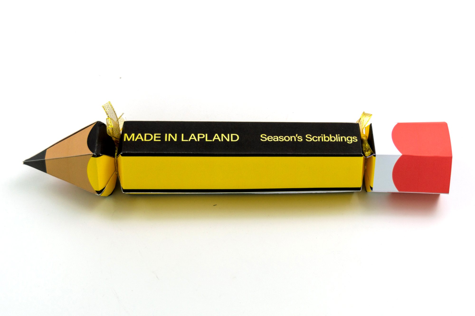
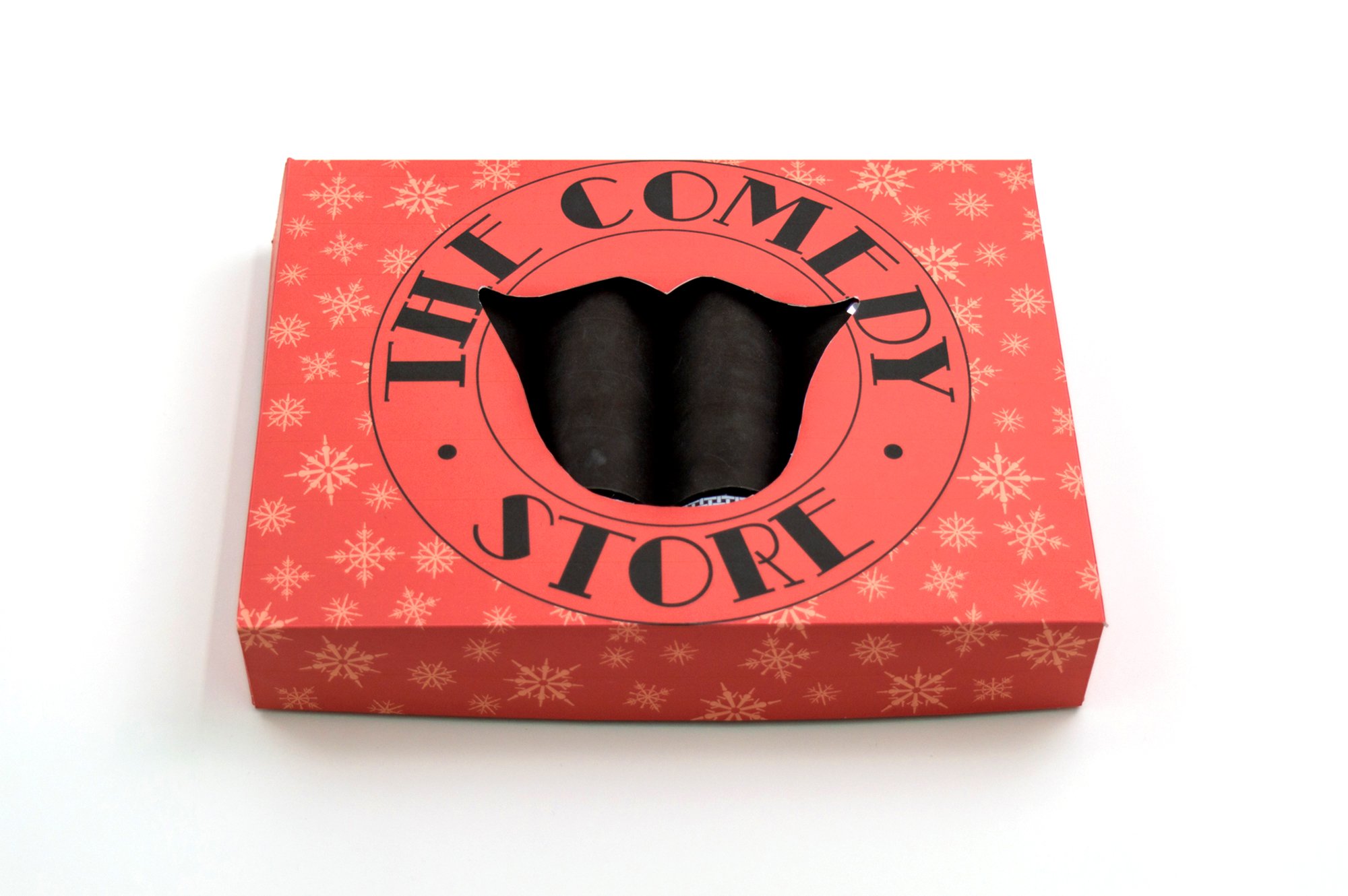
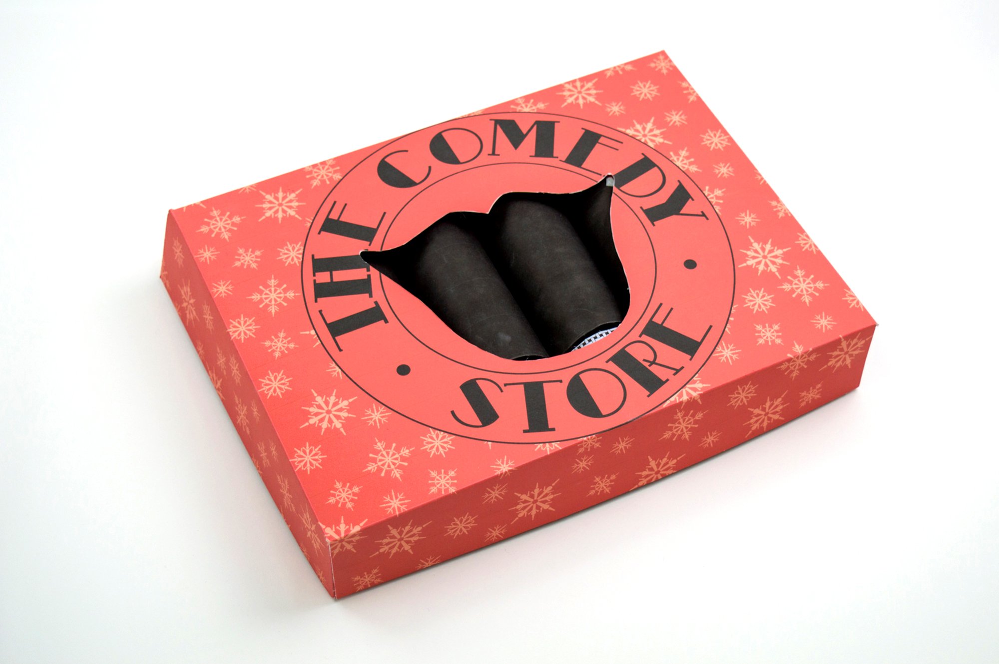
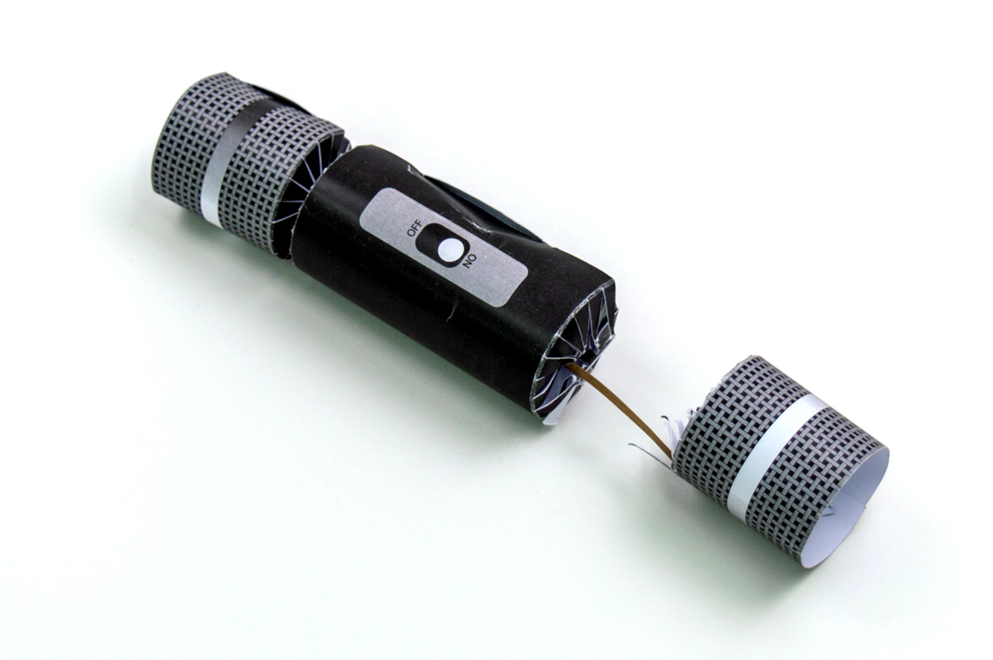
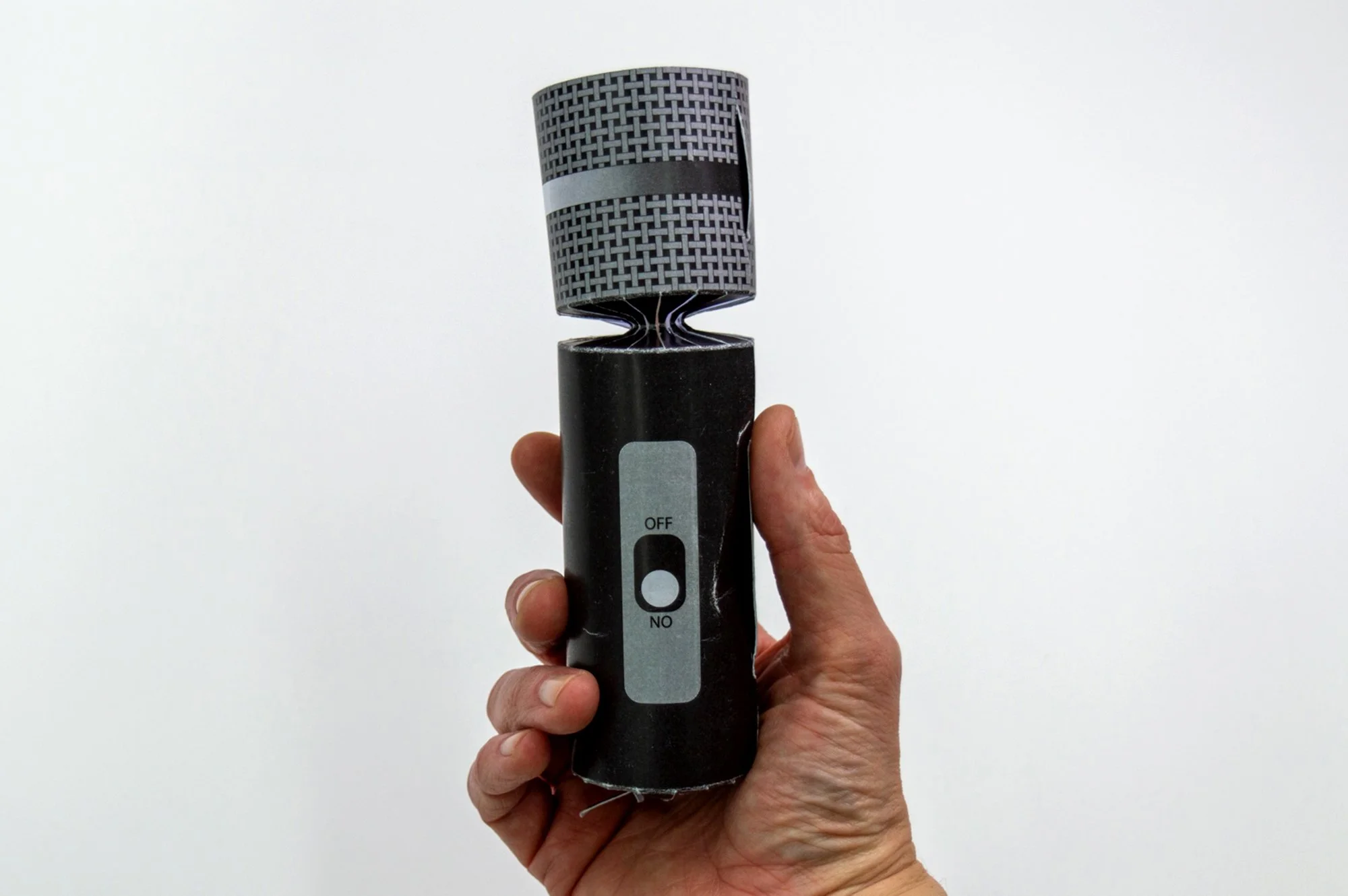
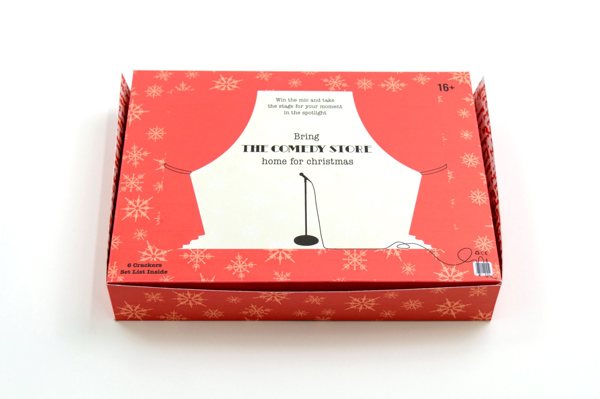
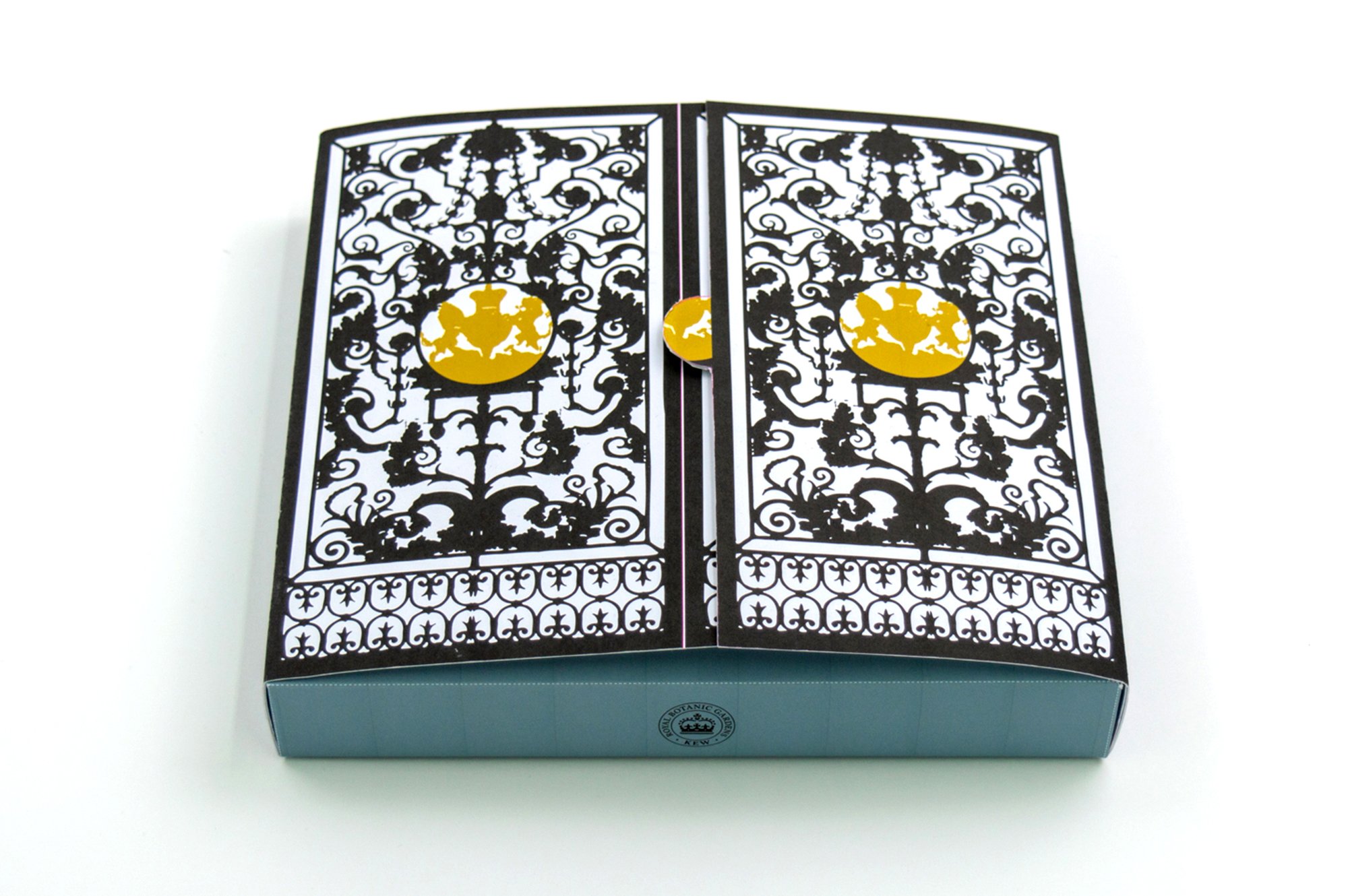
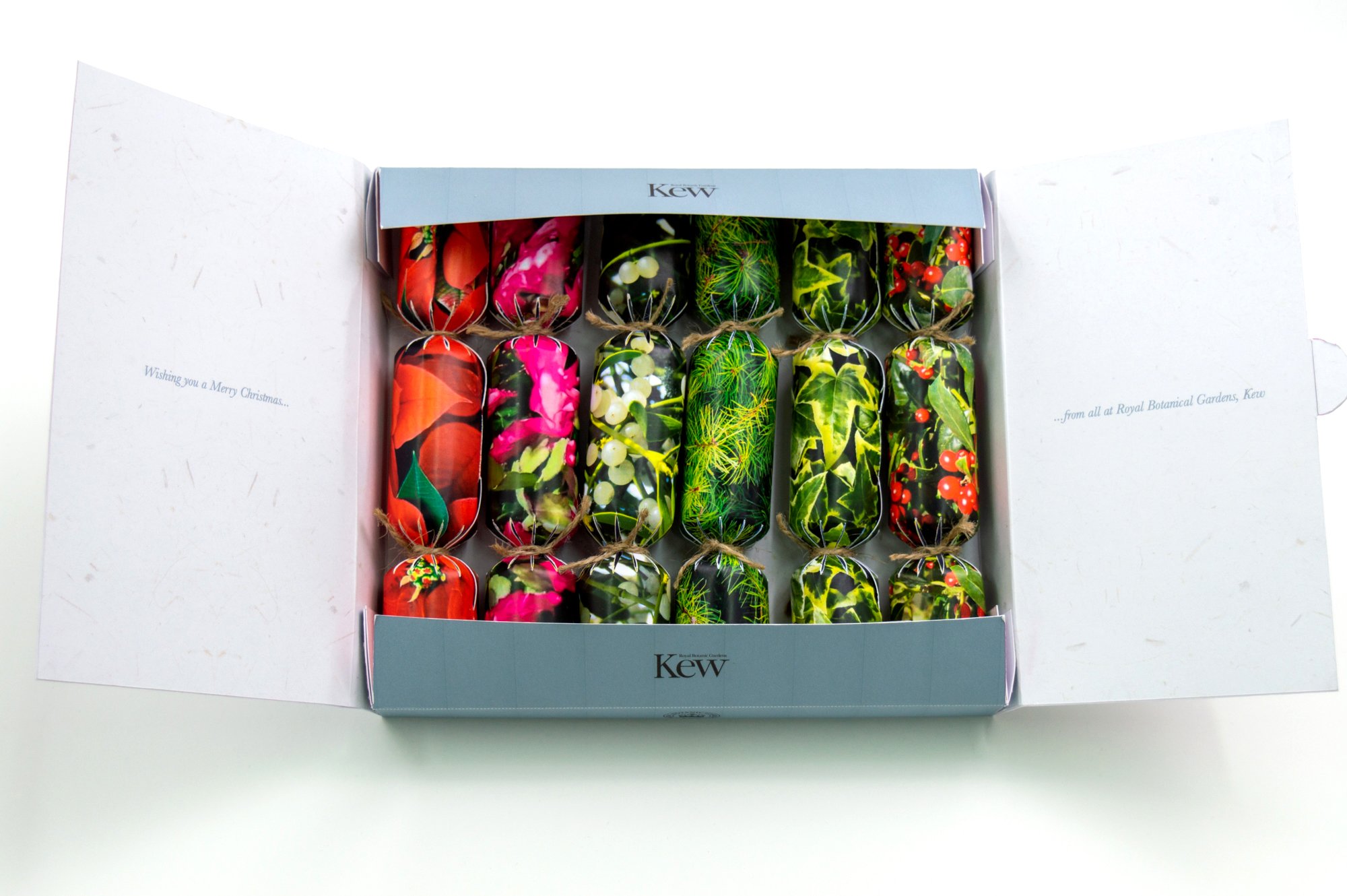
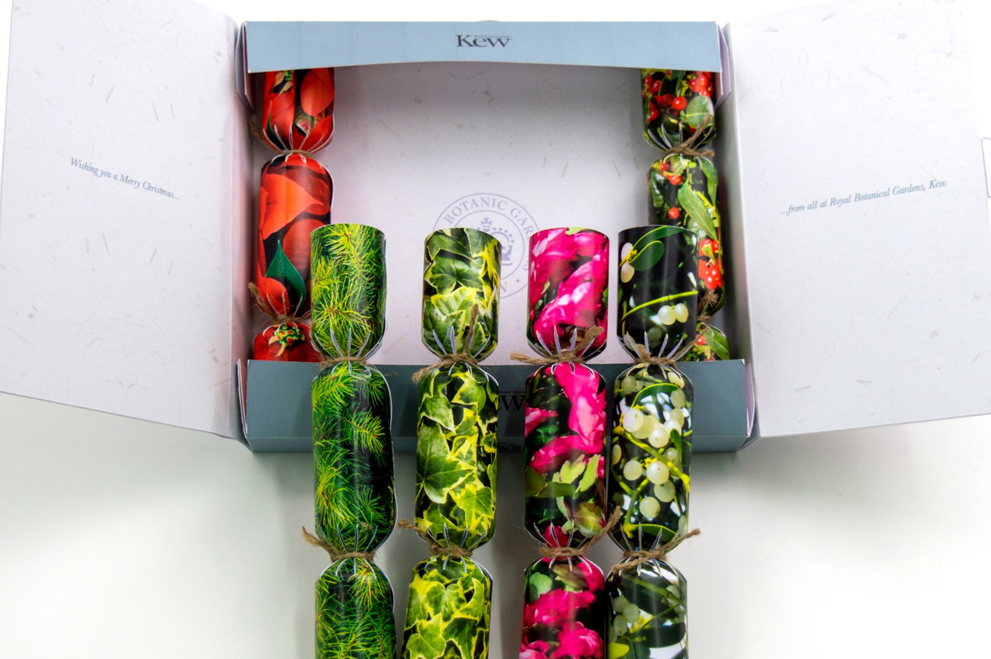
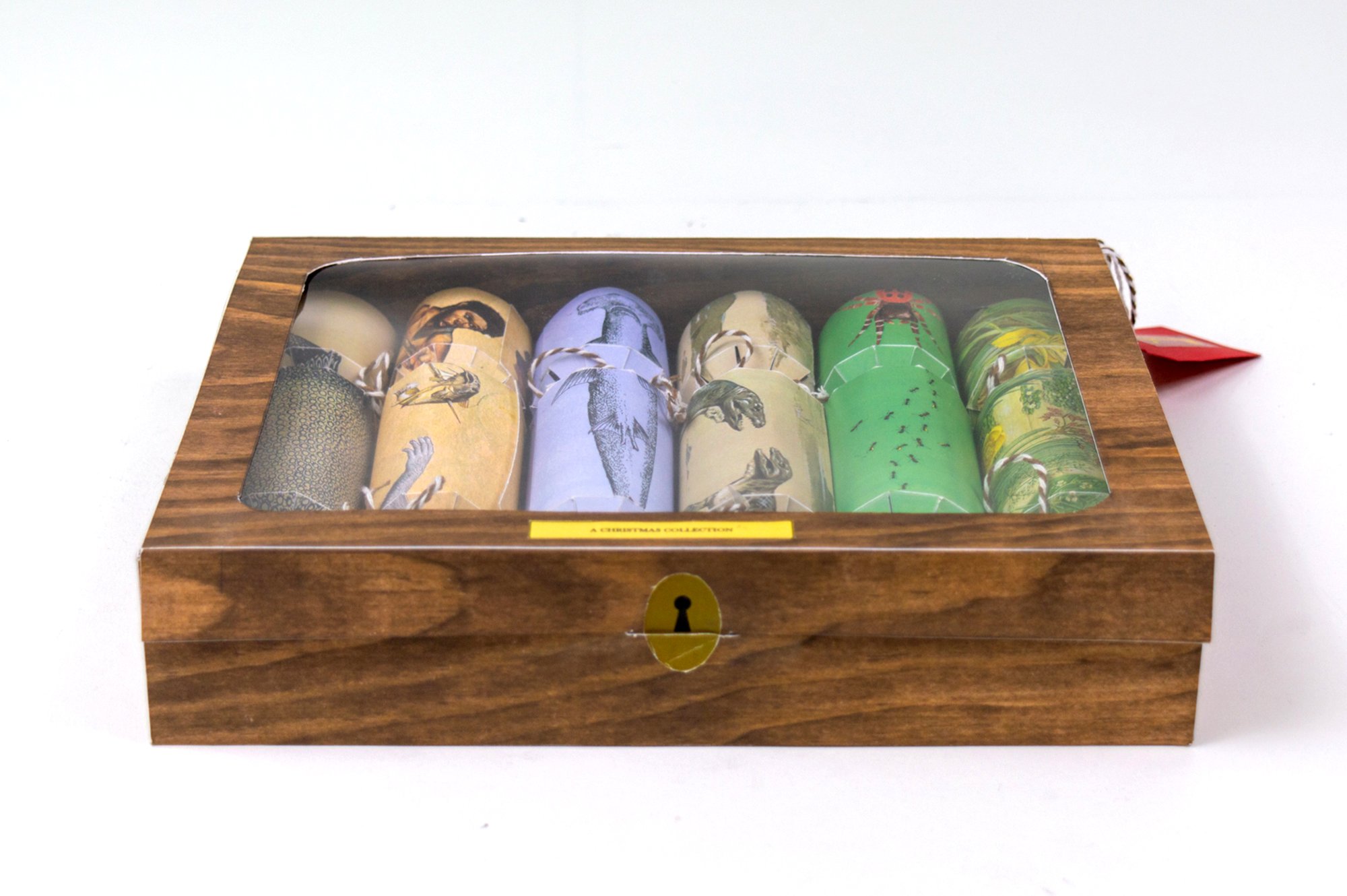
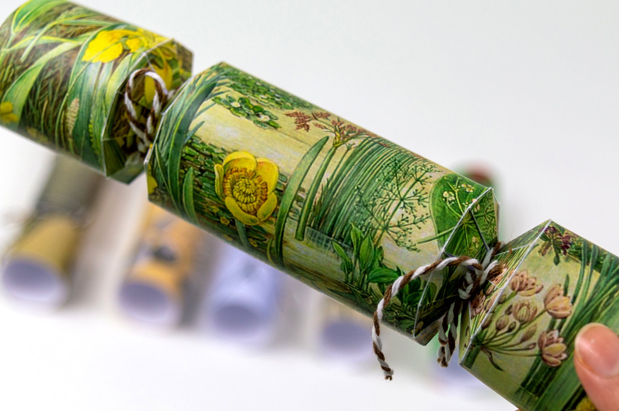
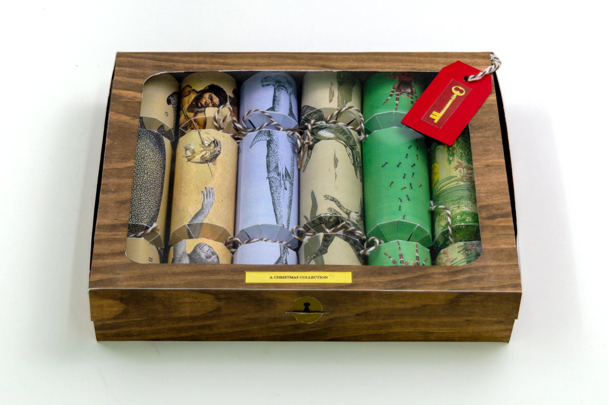
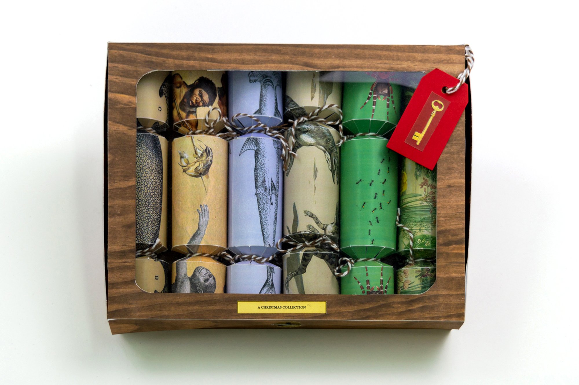
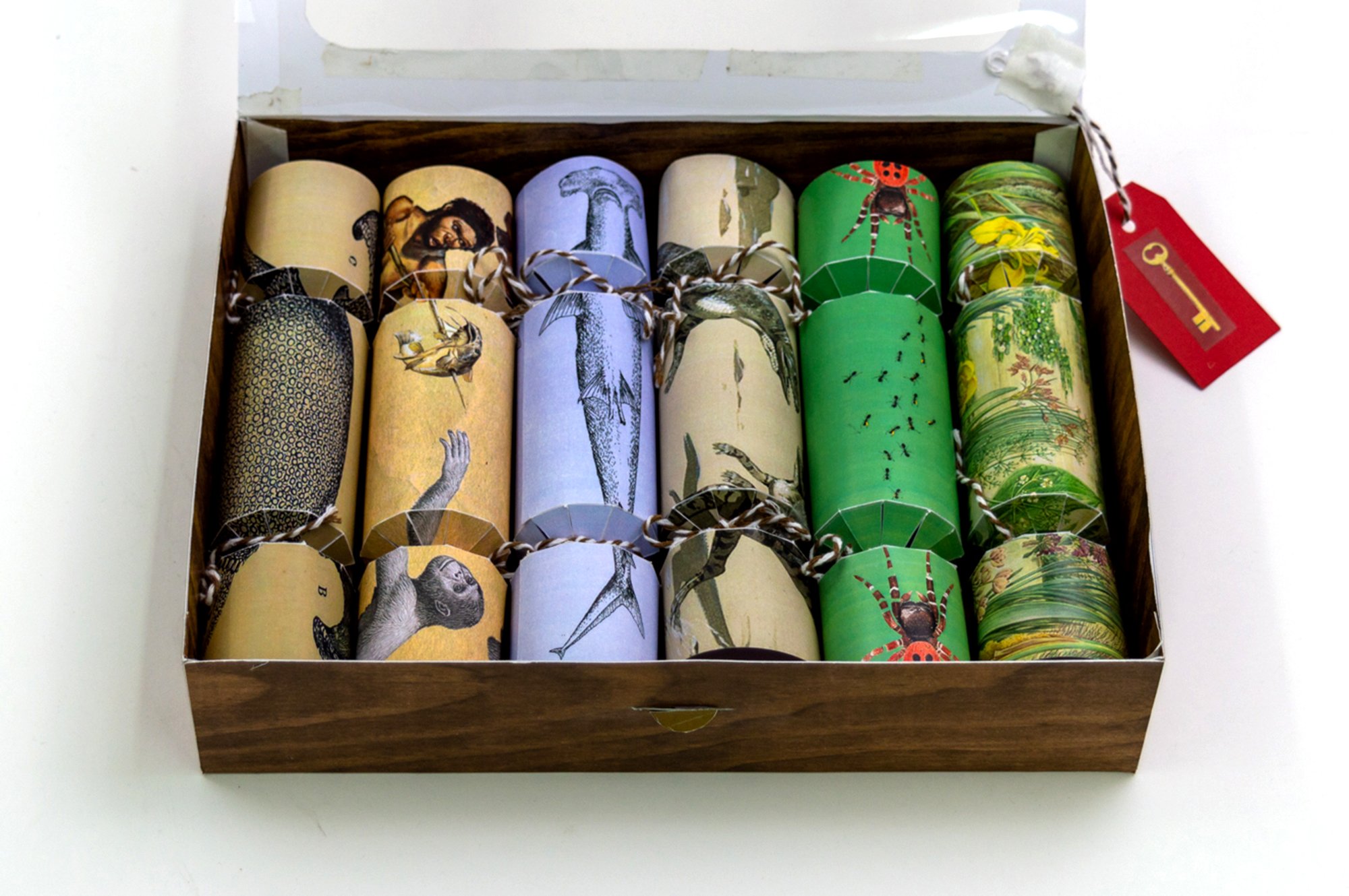
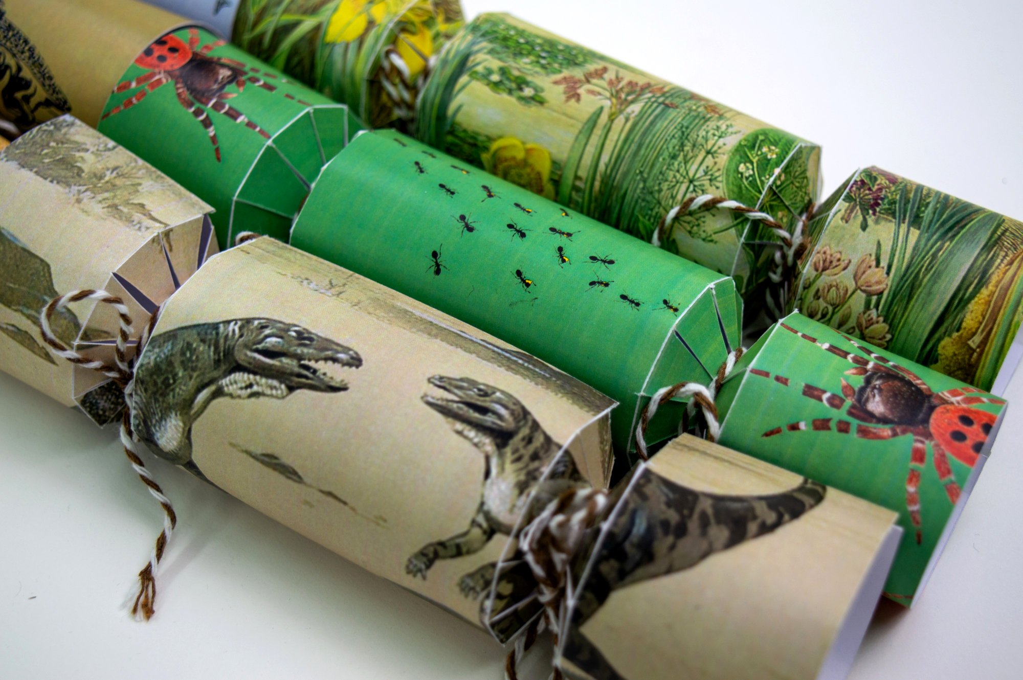
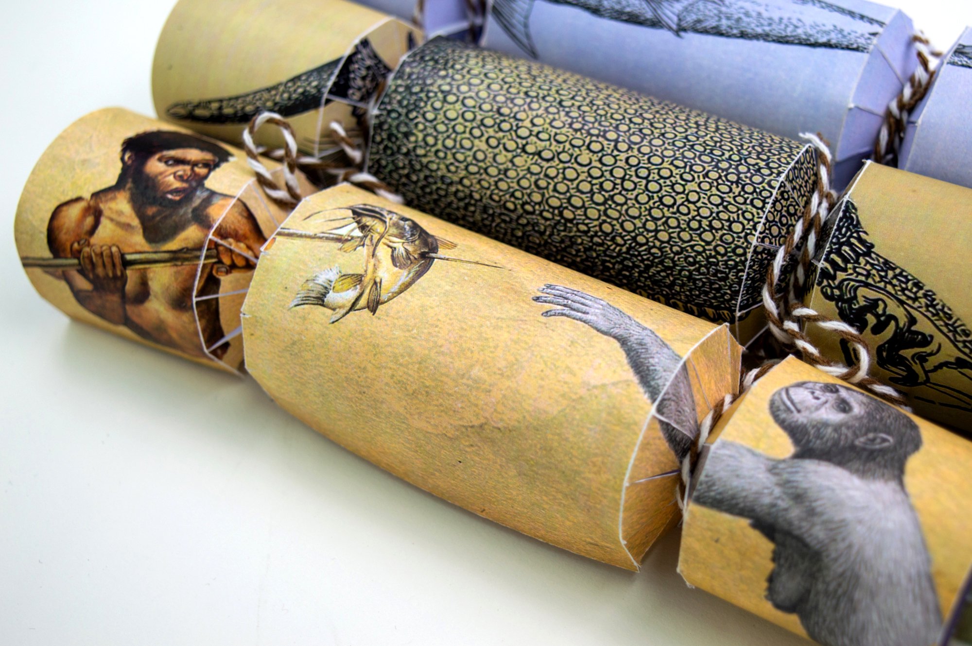
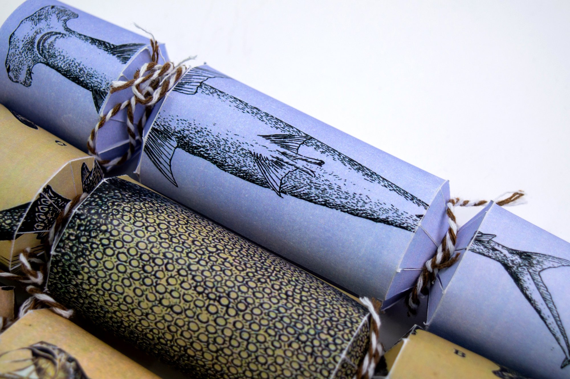
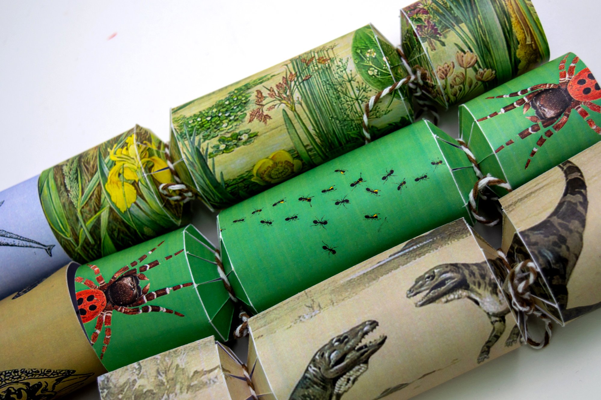
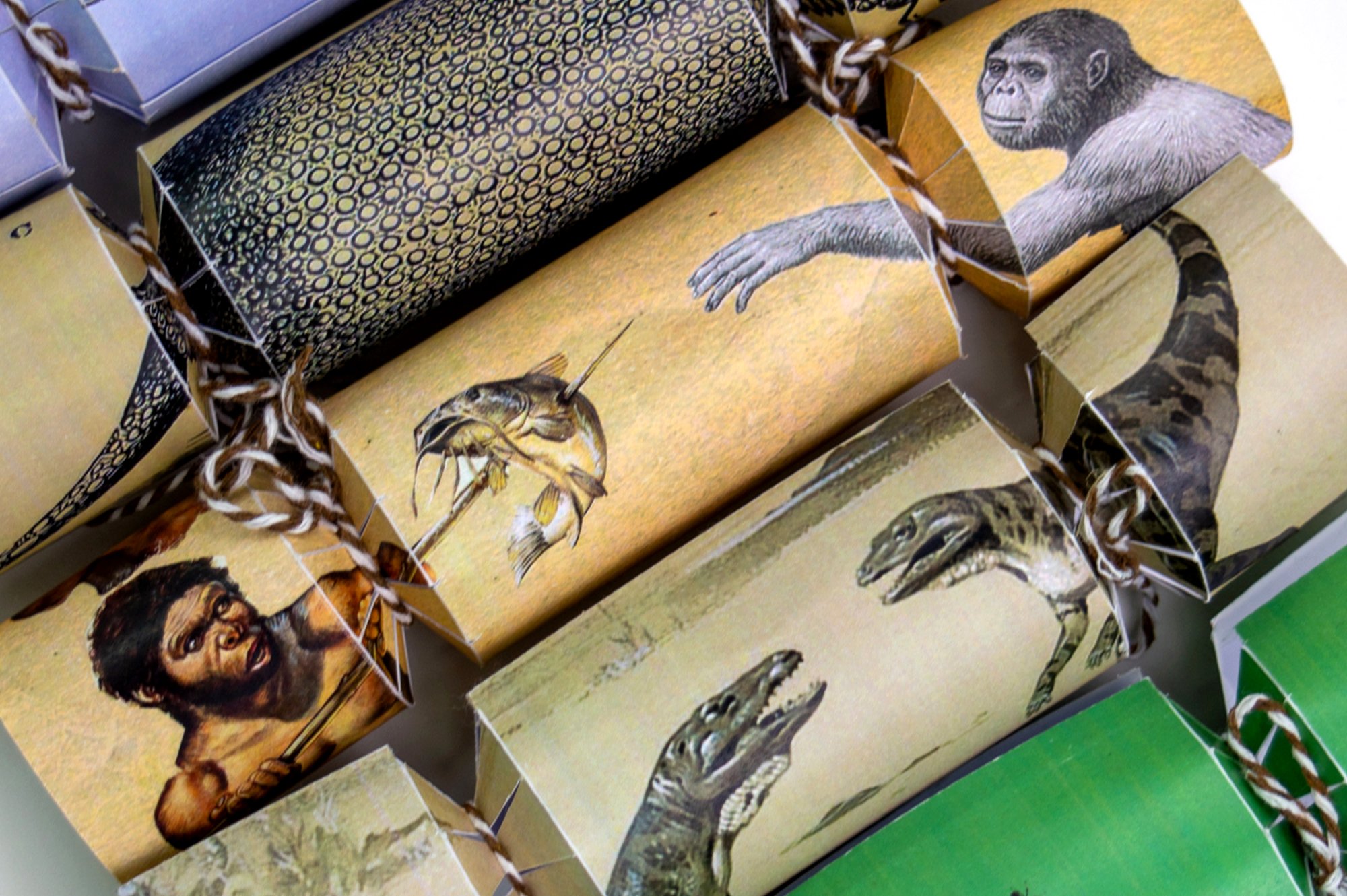
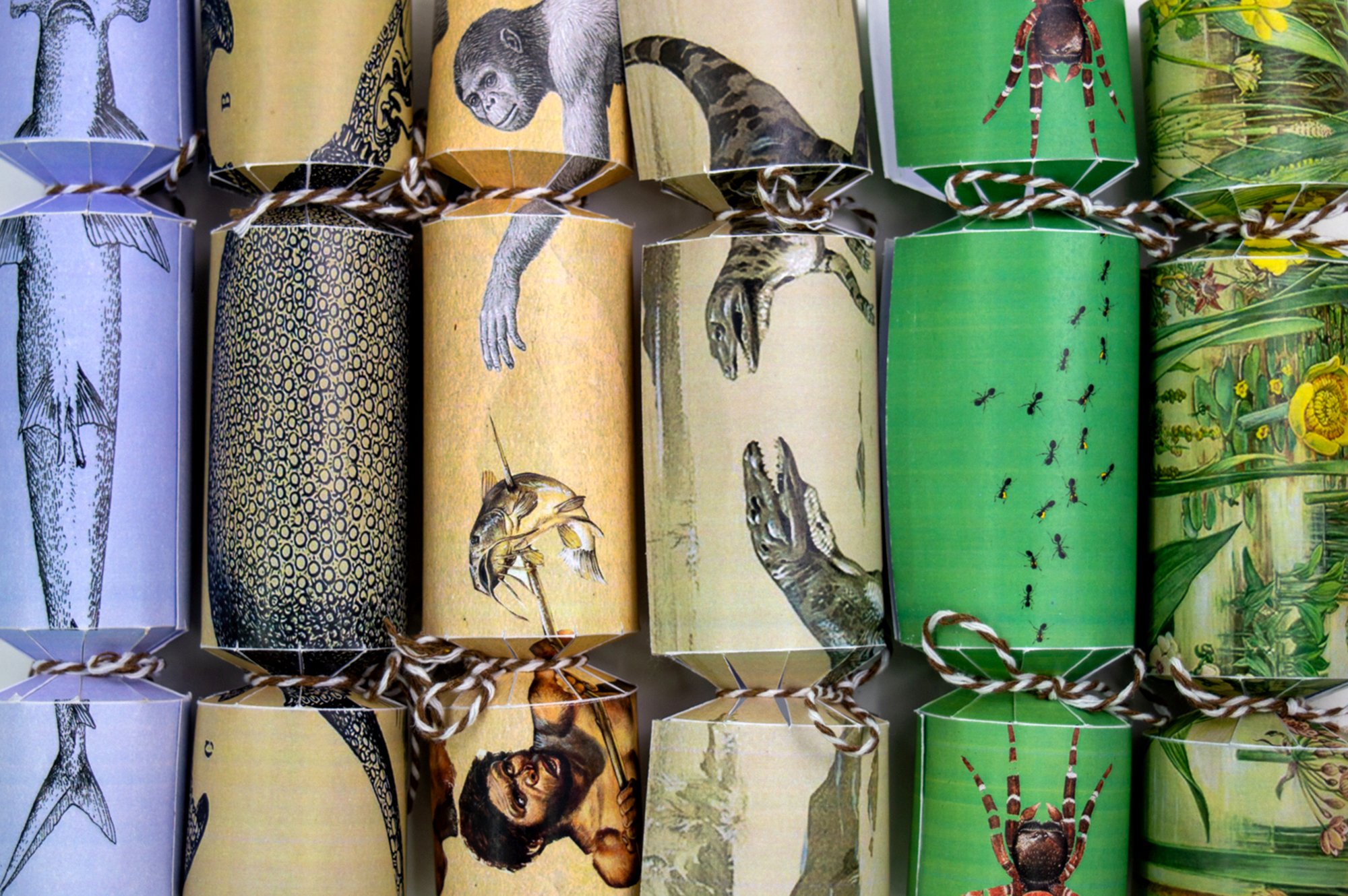
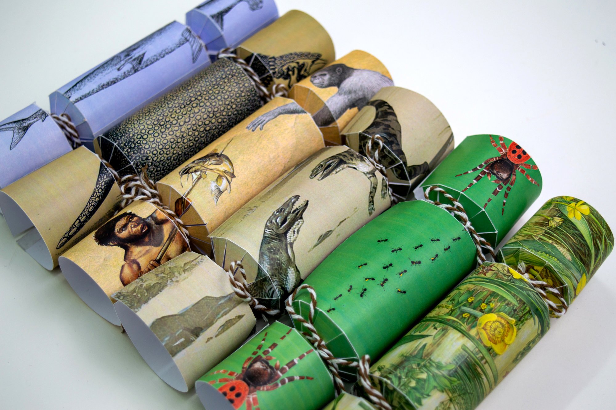
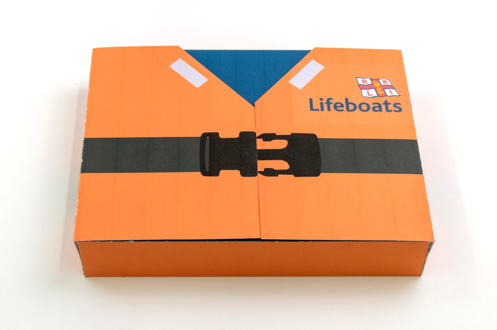
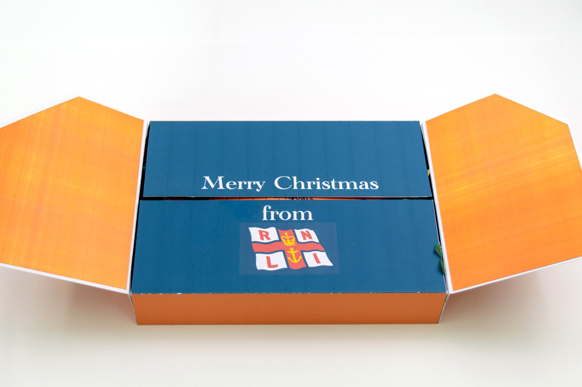
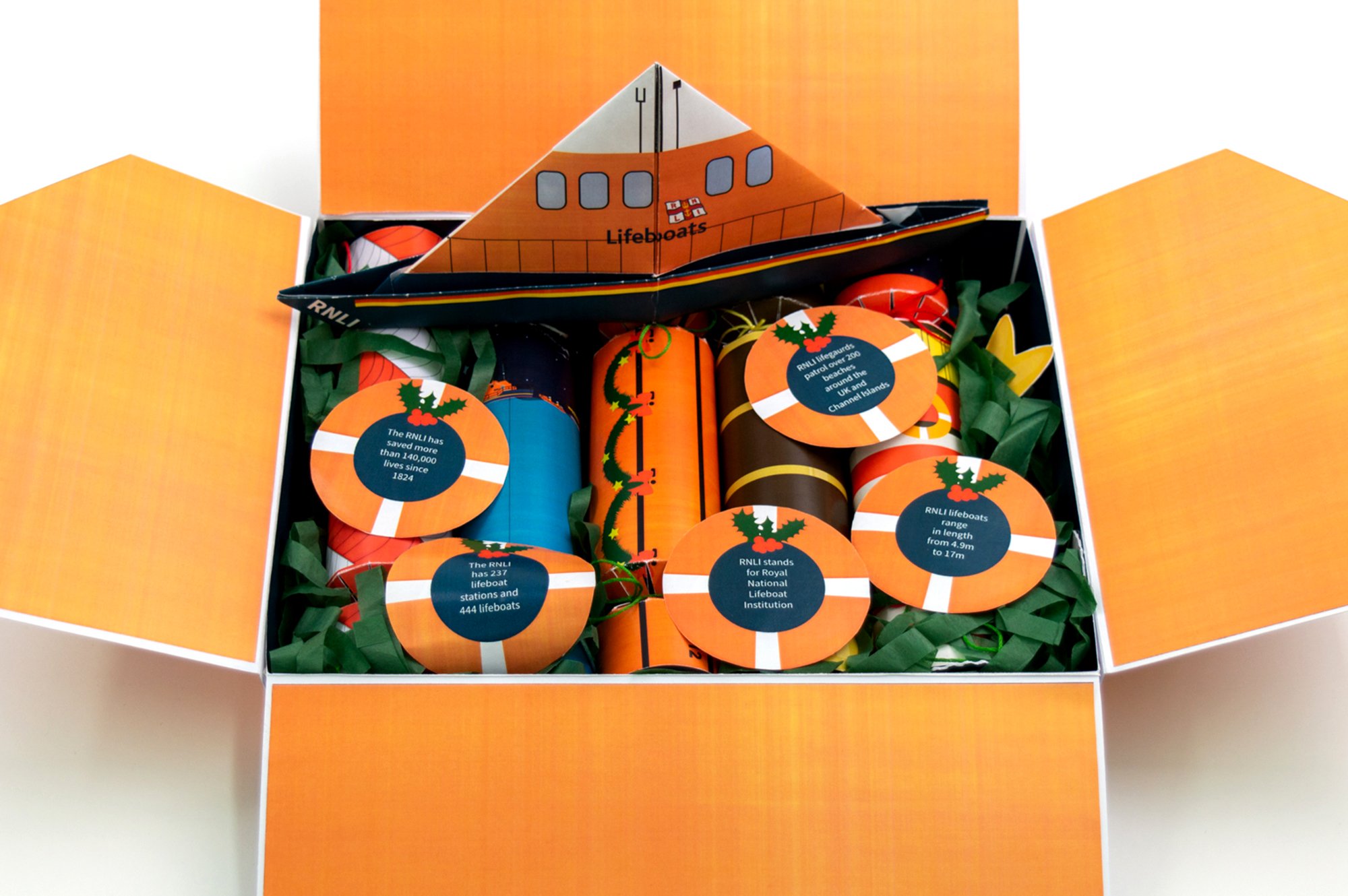
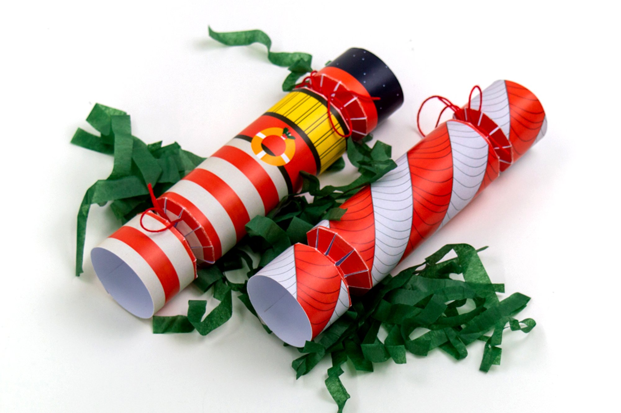
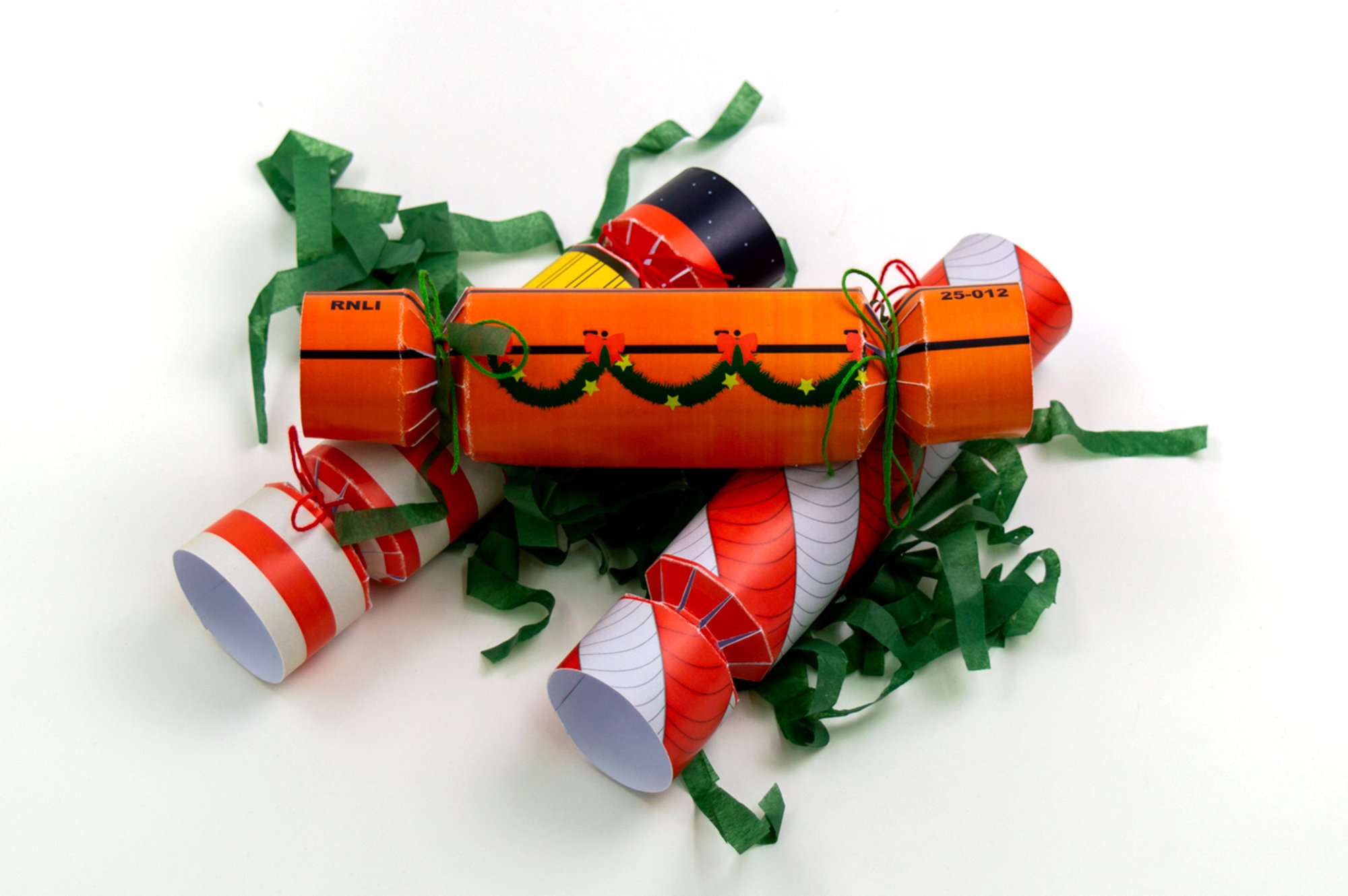
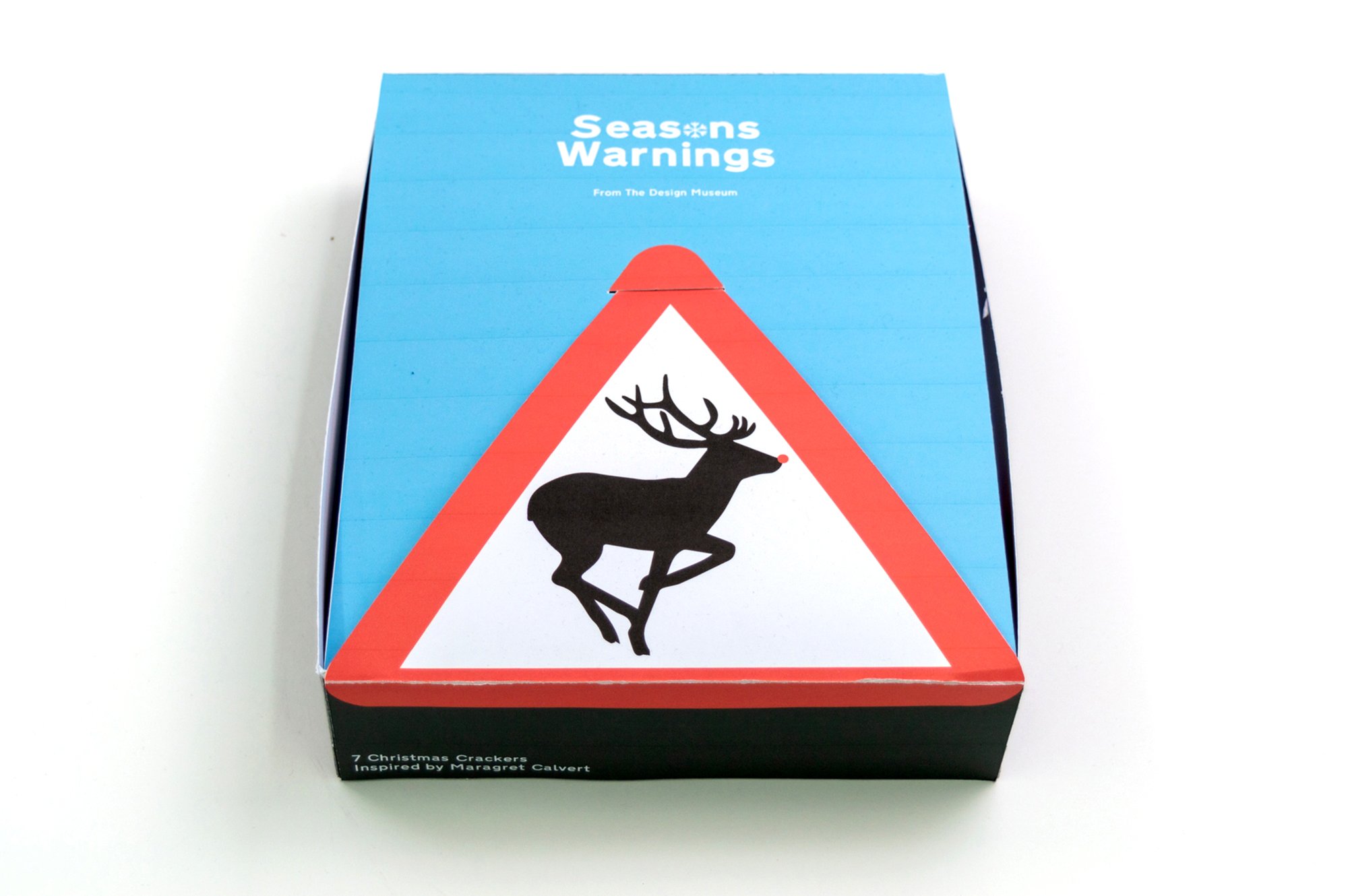
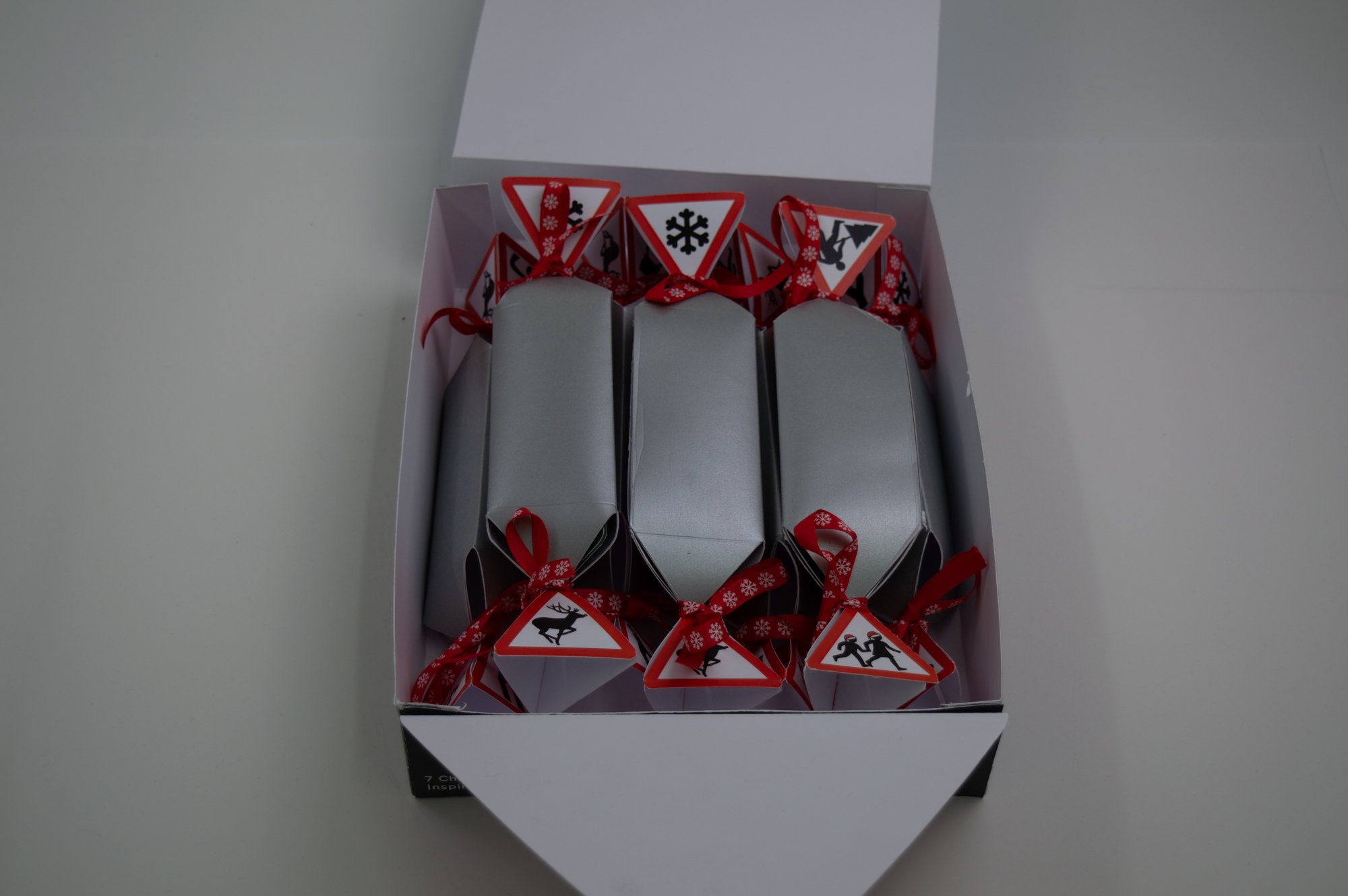
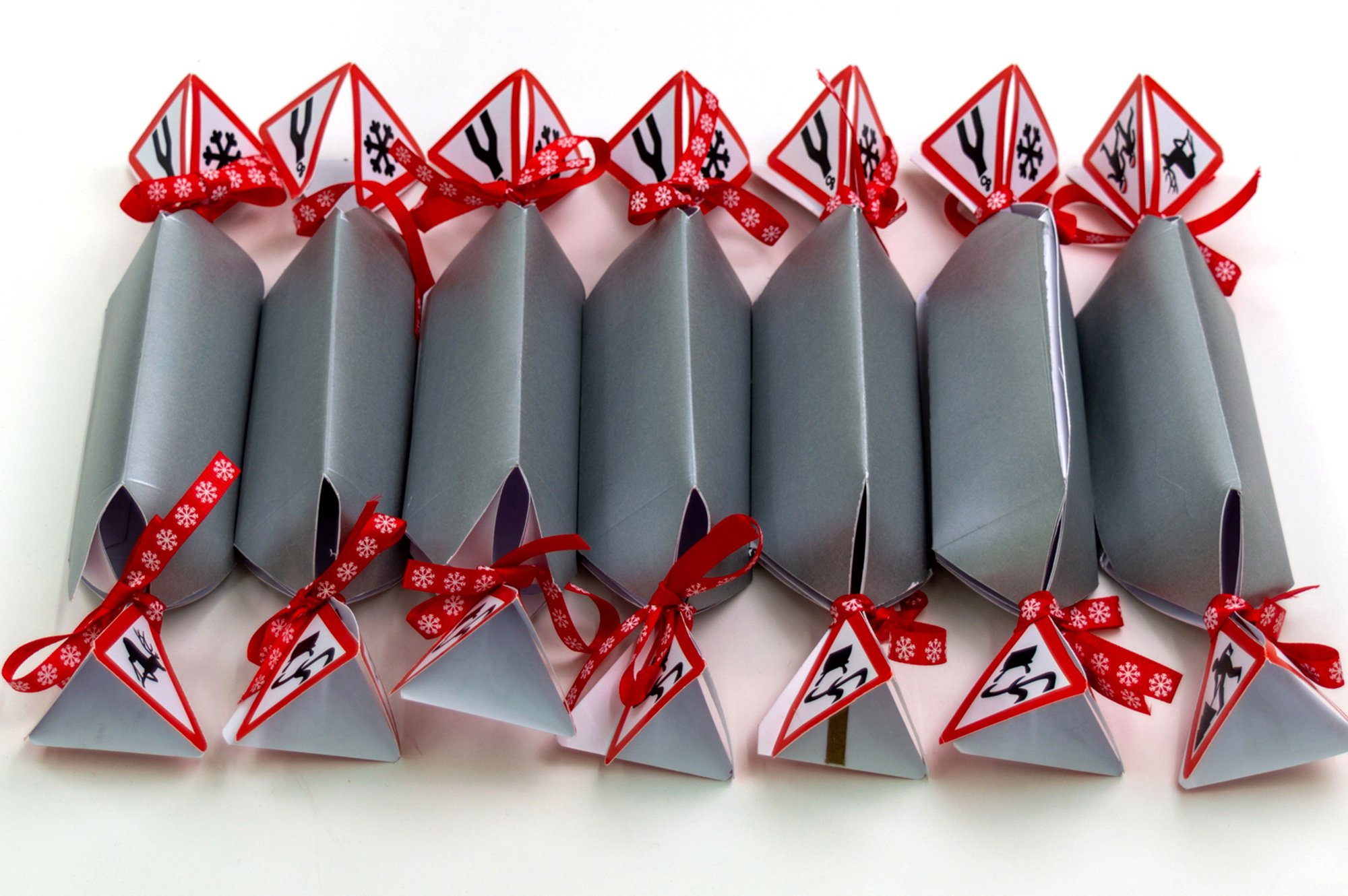
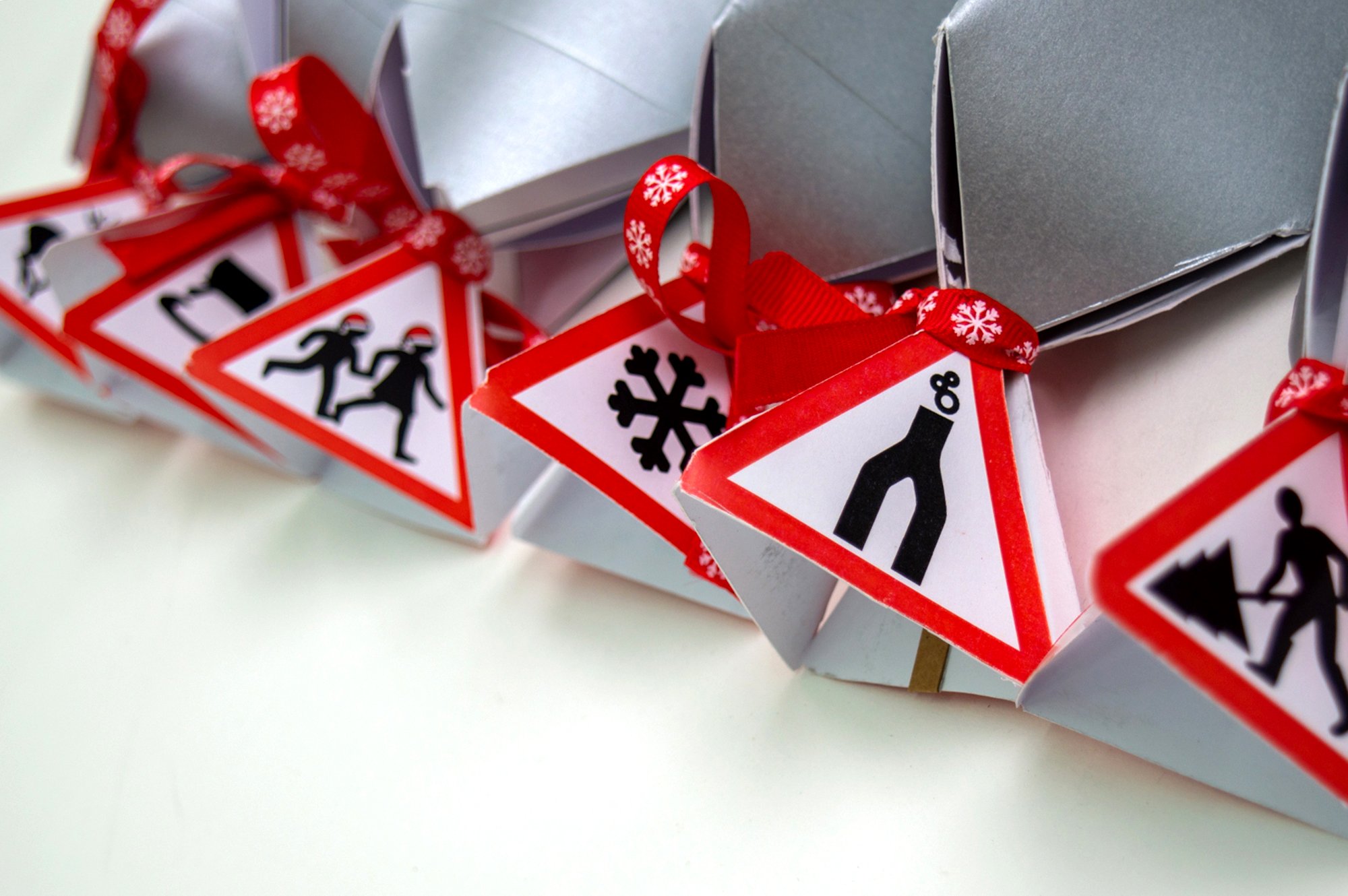
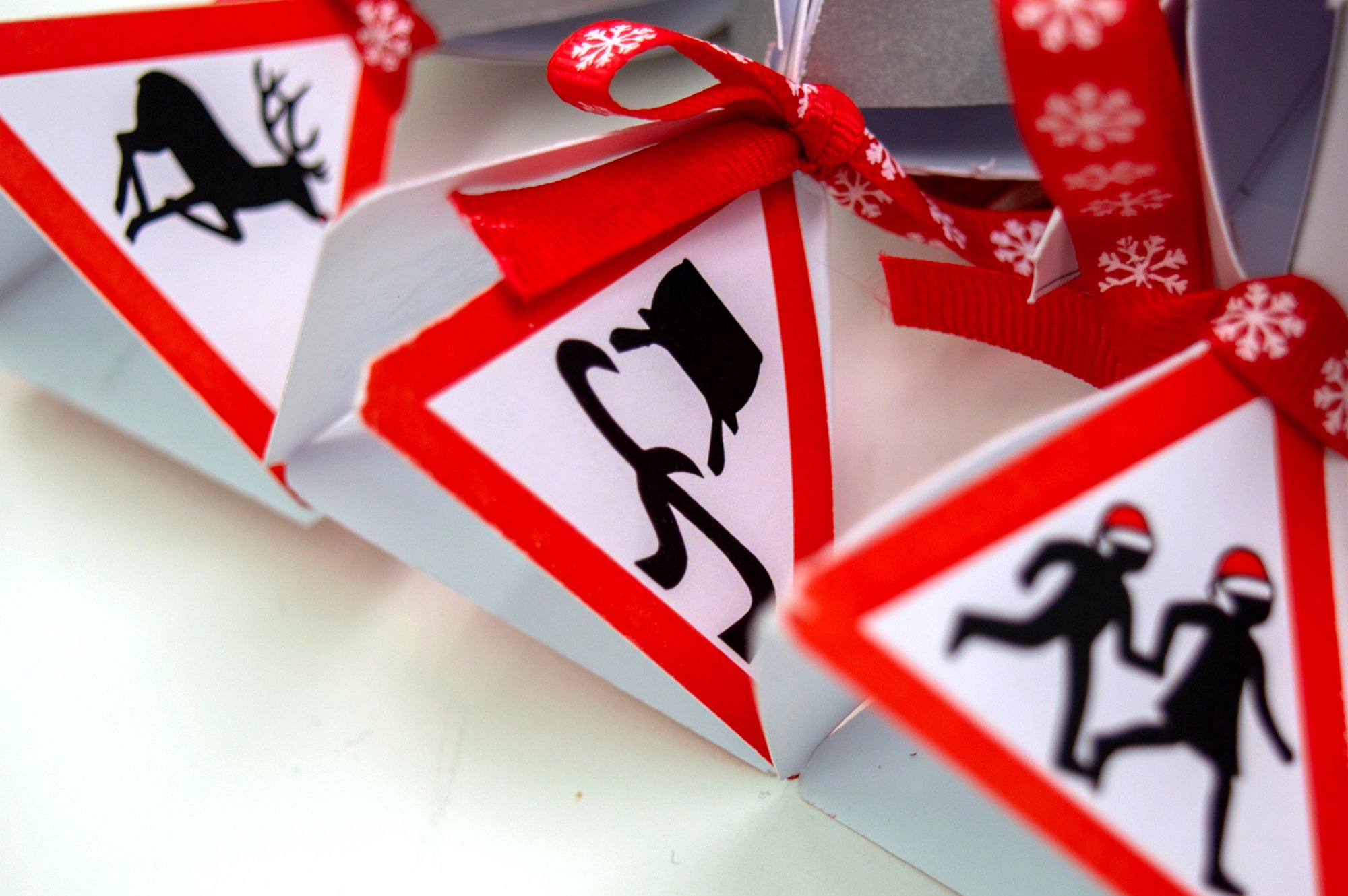
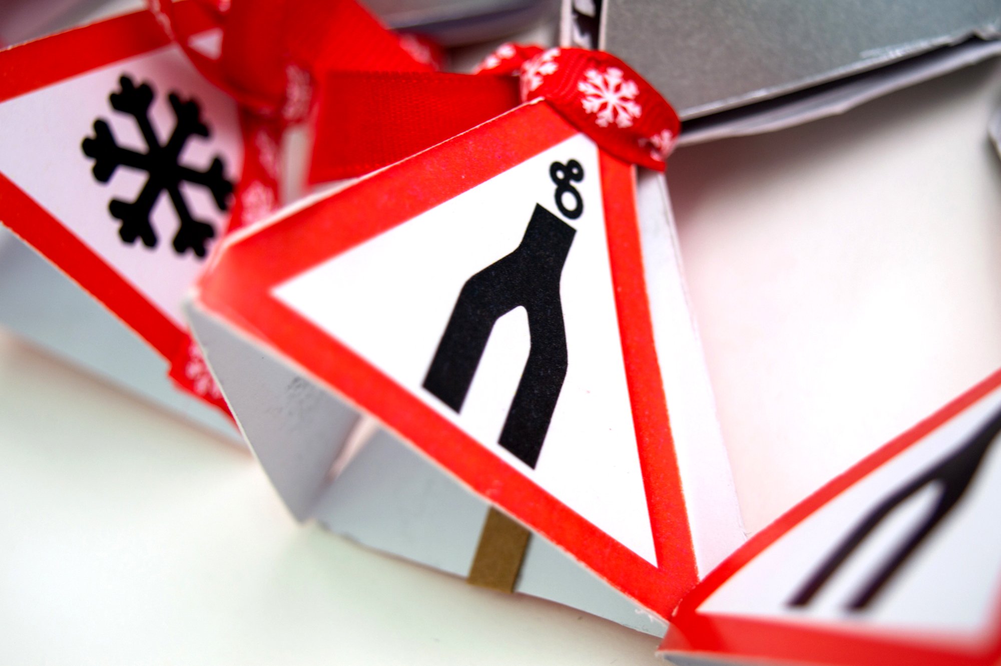
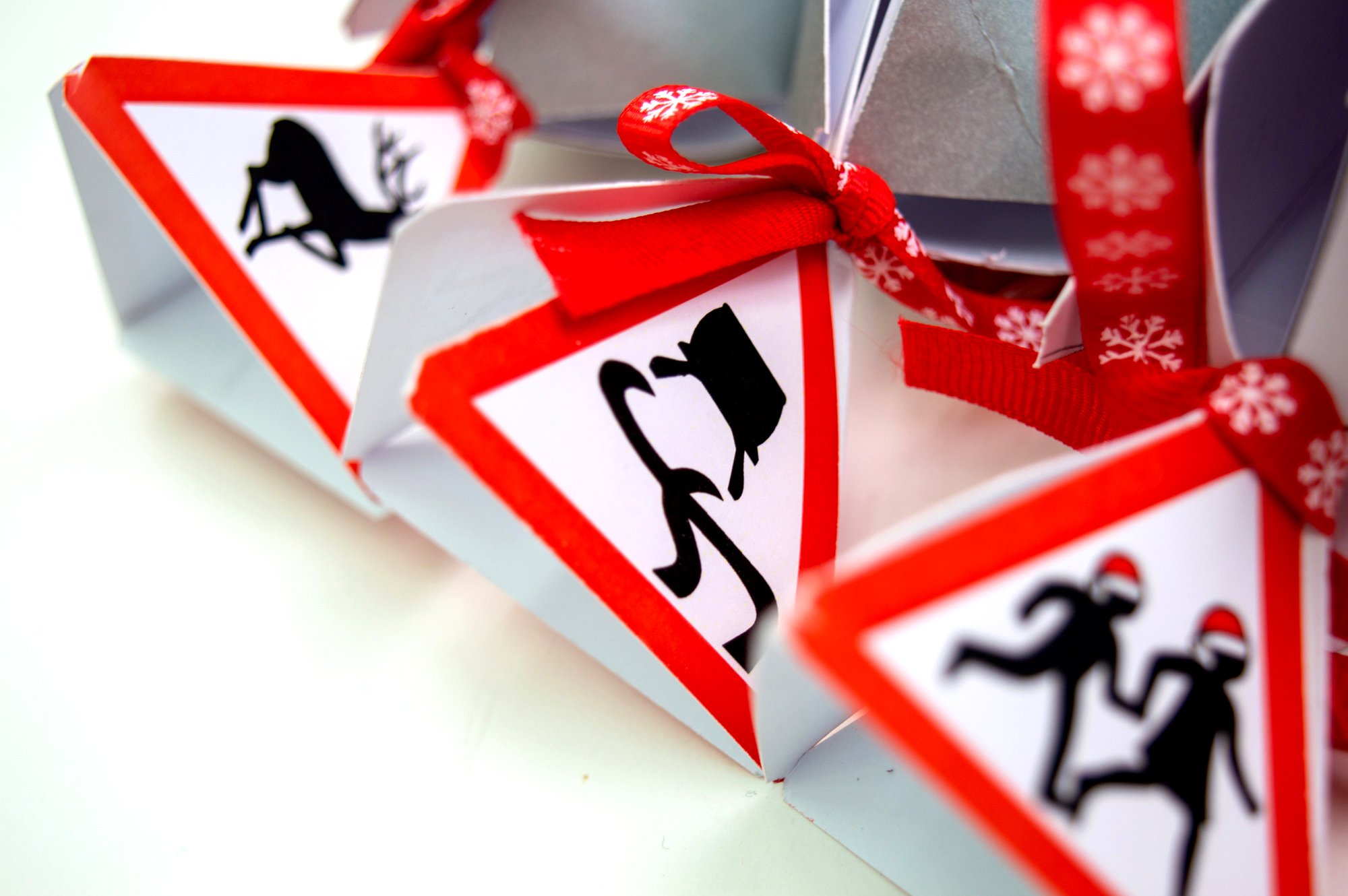
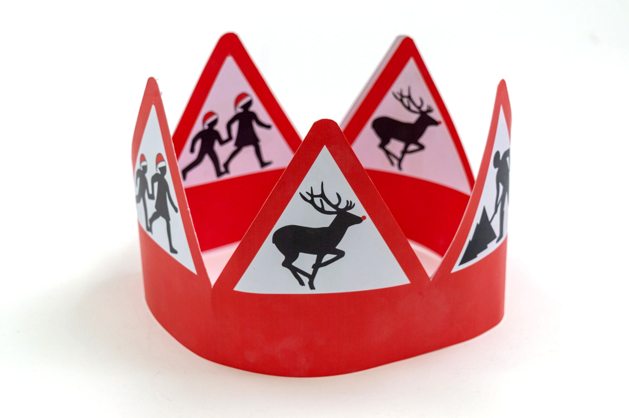
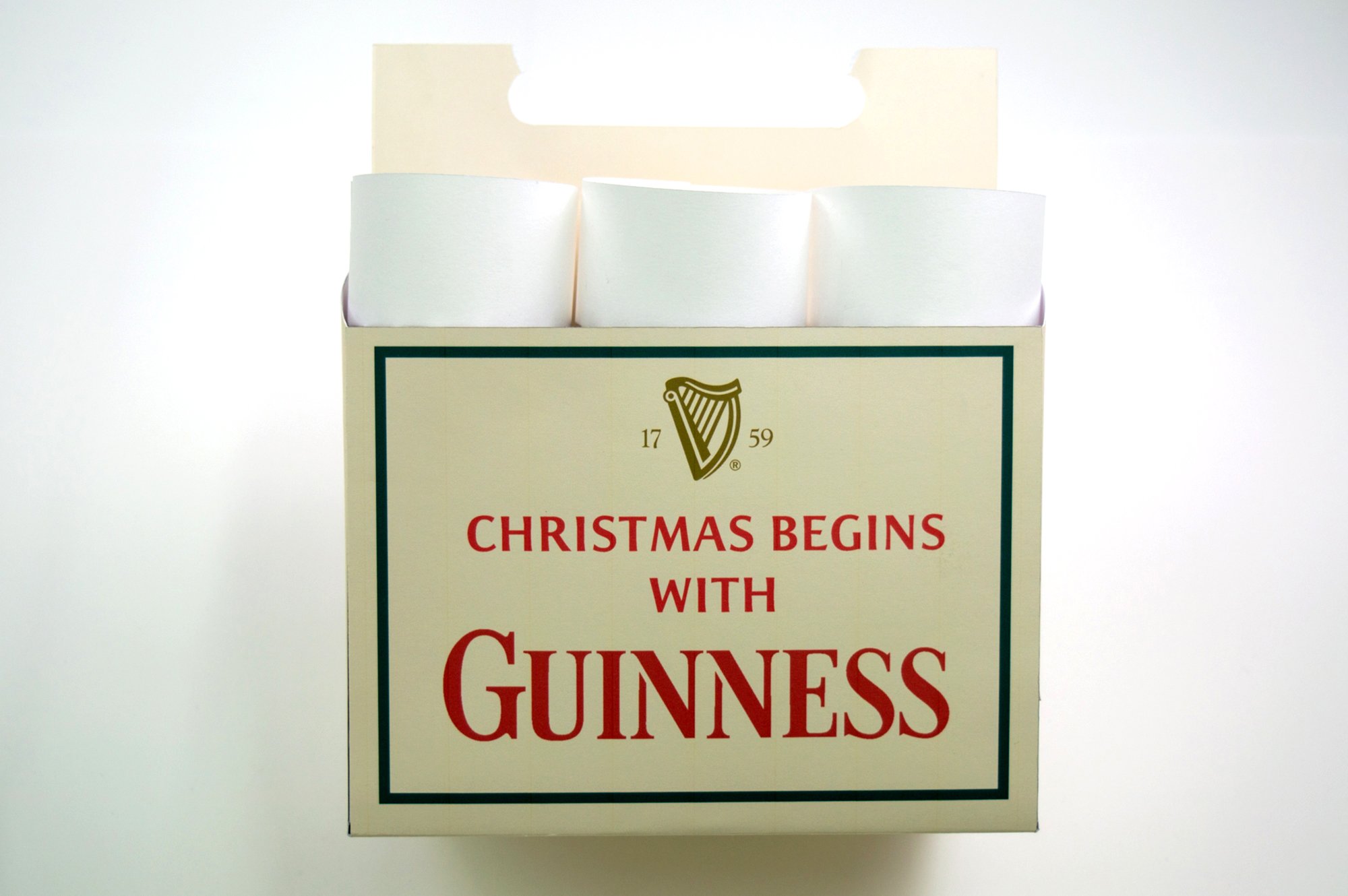
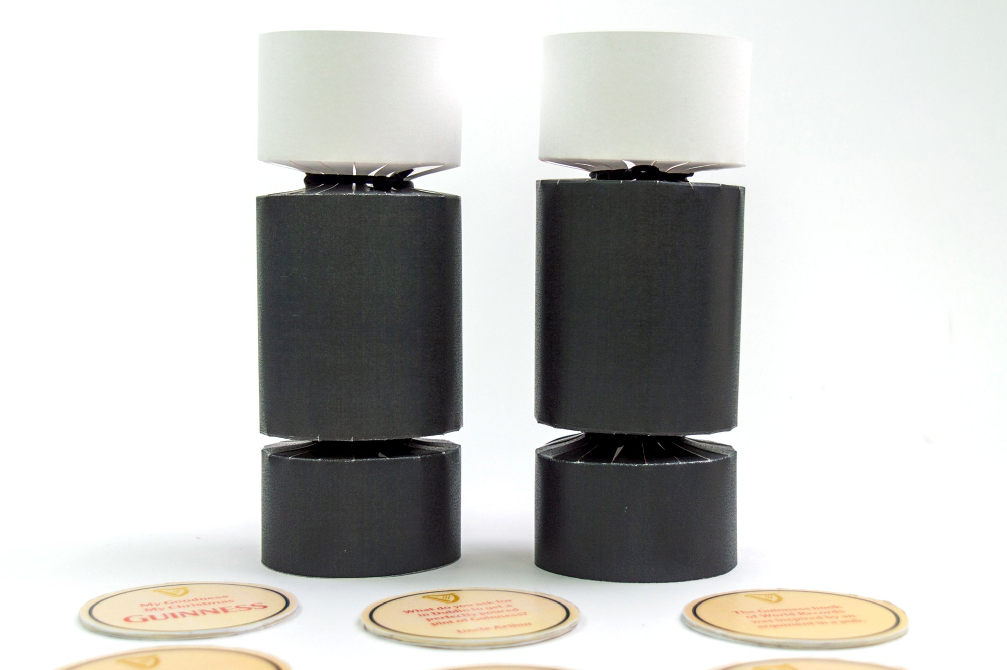
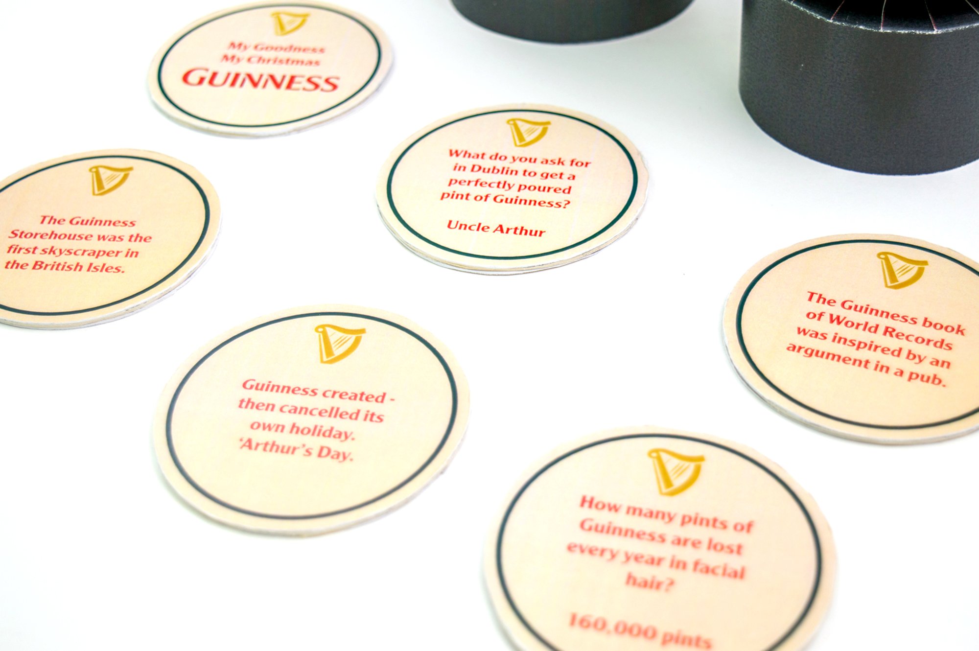
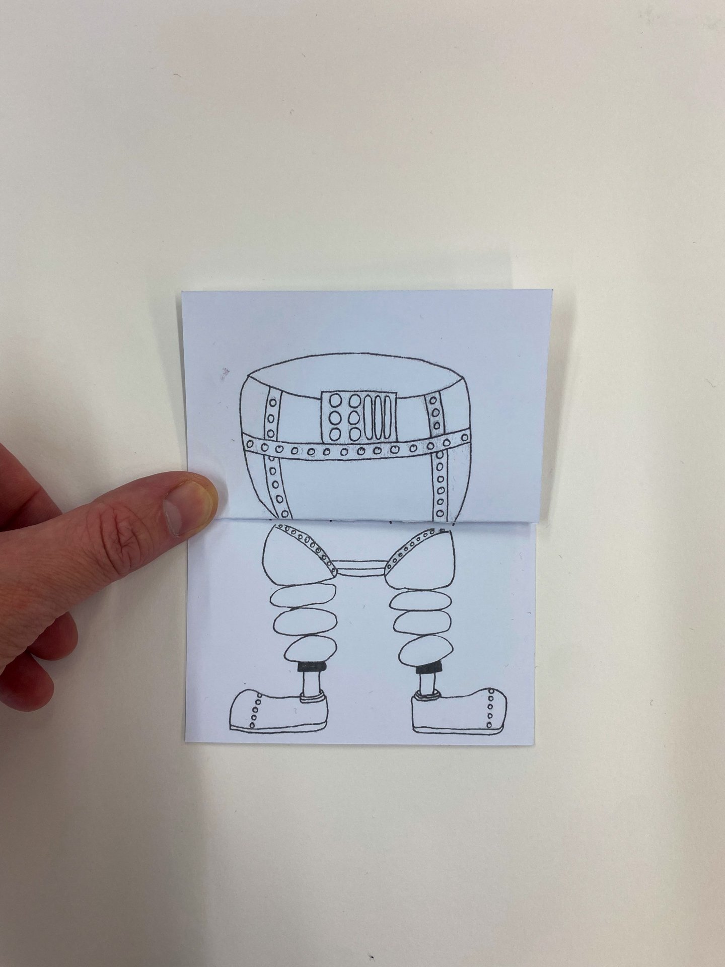
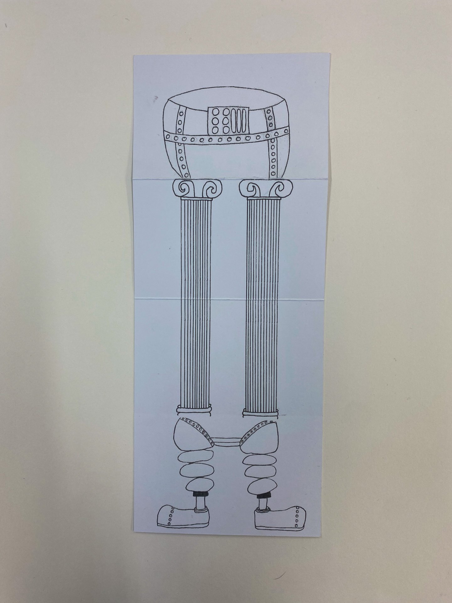
Here we feature a new brief for the Christmas project. It asked our first year designers to make a connection between their given client and Christmas crackers. A well known table decoration at Christmas time here in the UK that are just the type of Christmas merchandise the clients chosen would sell to help raise funds.
As a foundation in 3D thinking and packaging, the final crit (in conjunction with the use of the large format printer) delivered a pleasing range of ideas and connections; some of which are below.
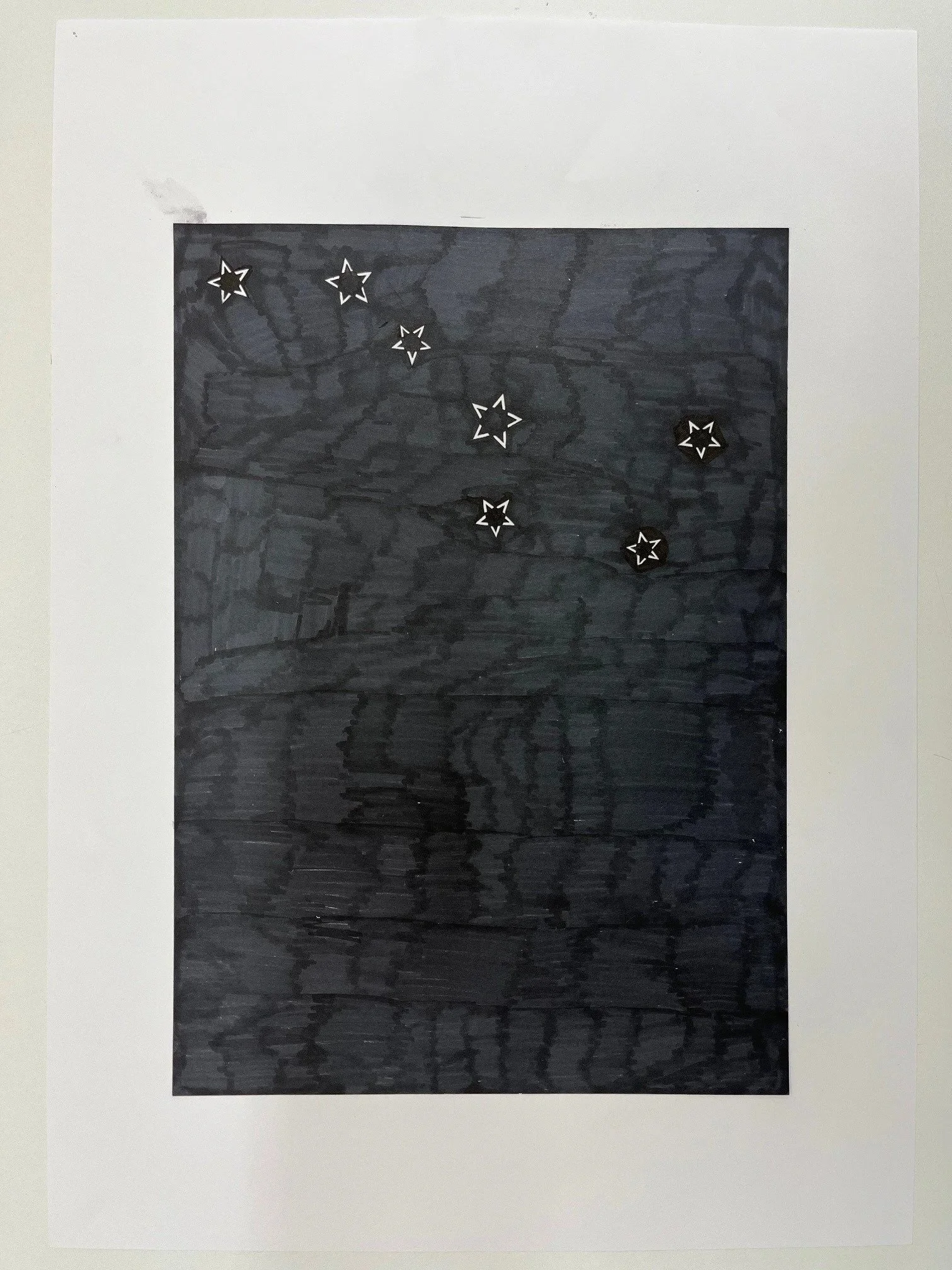
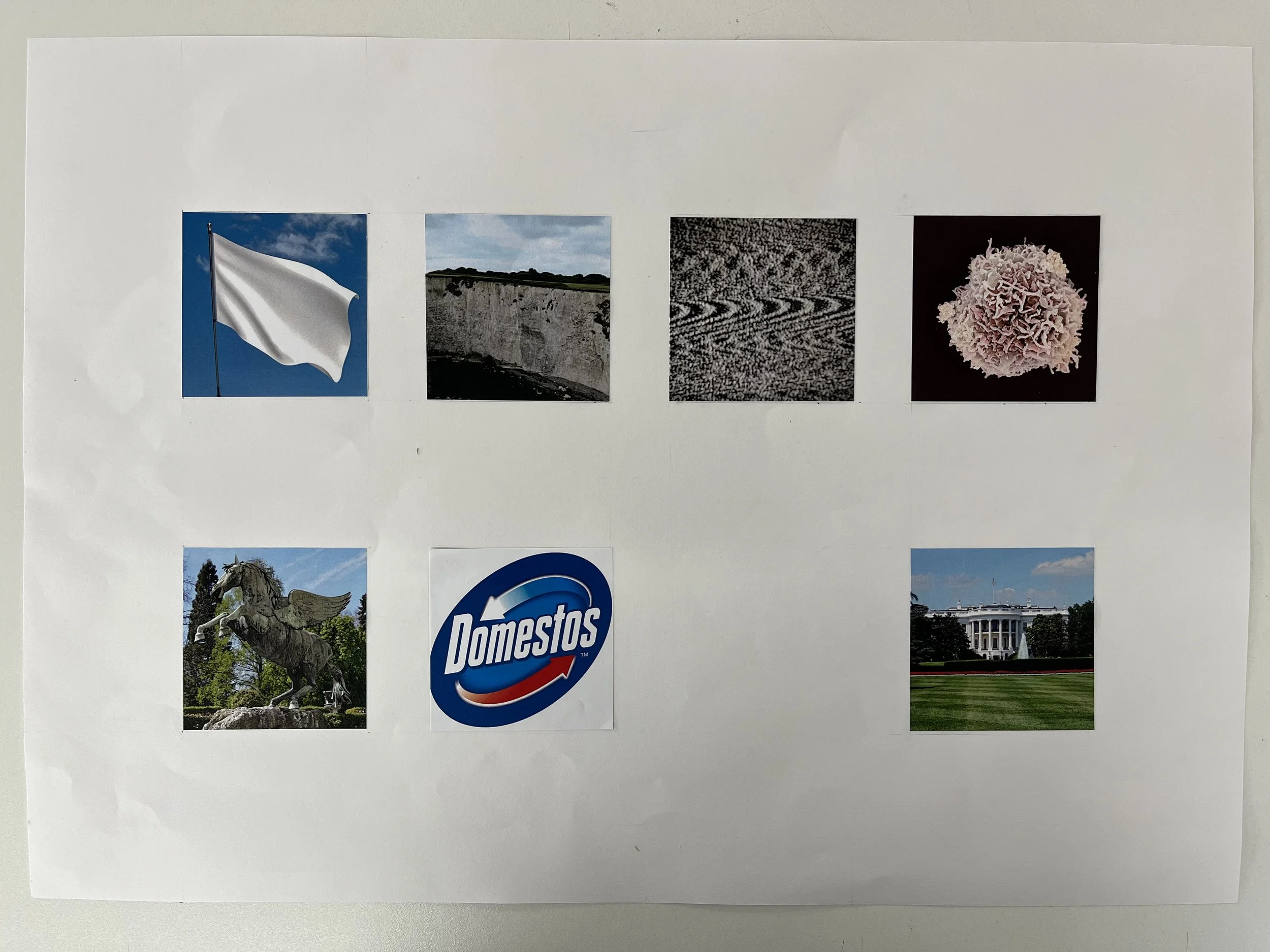
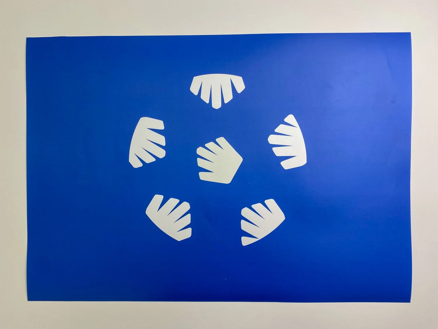
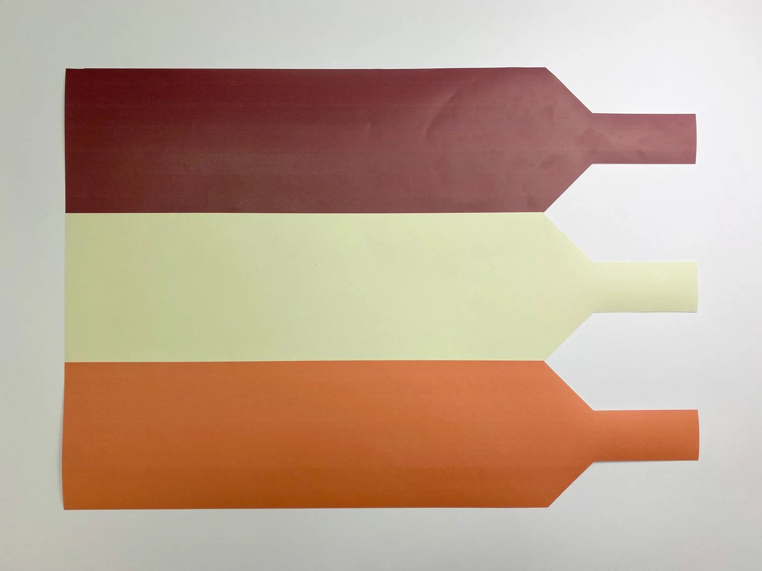
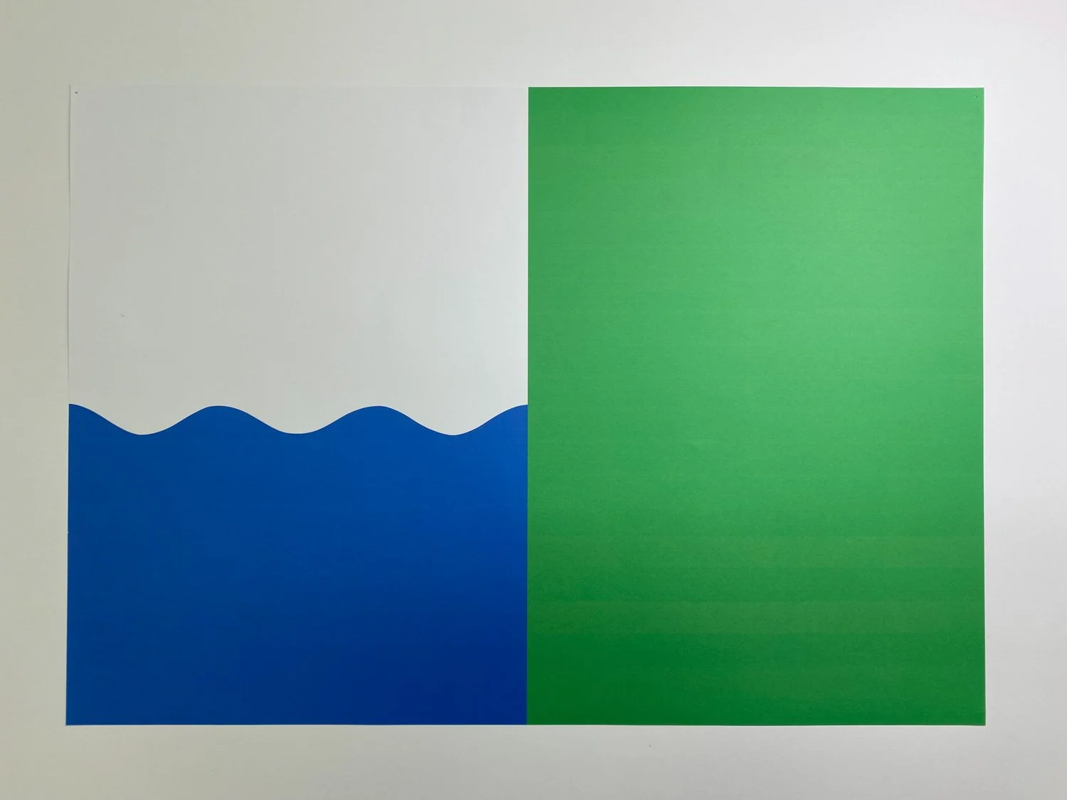
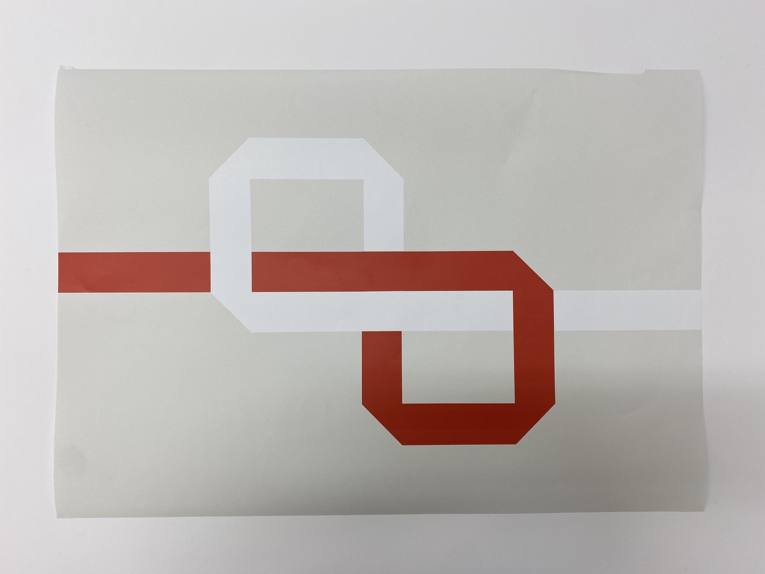
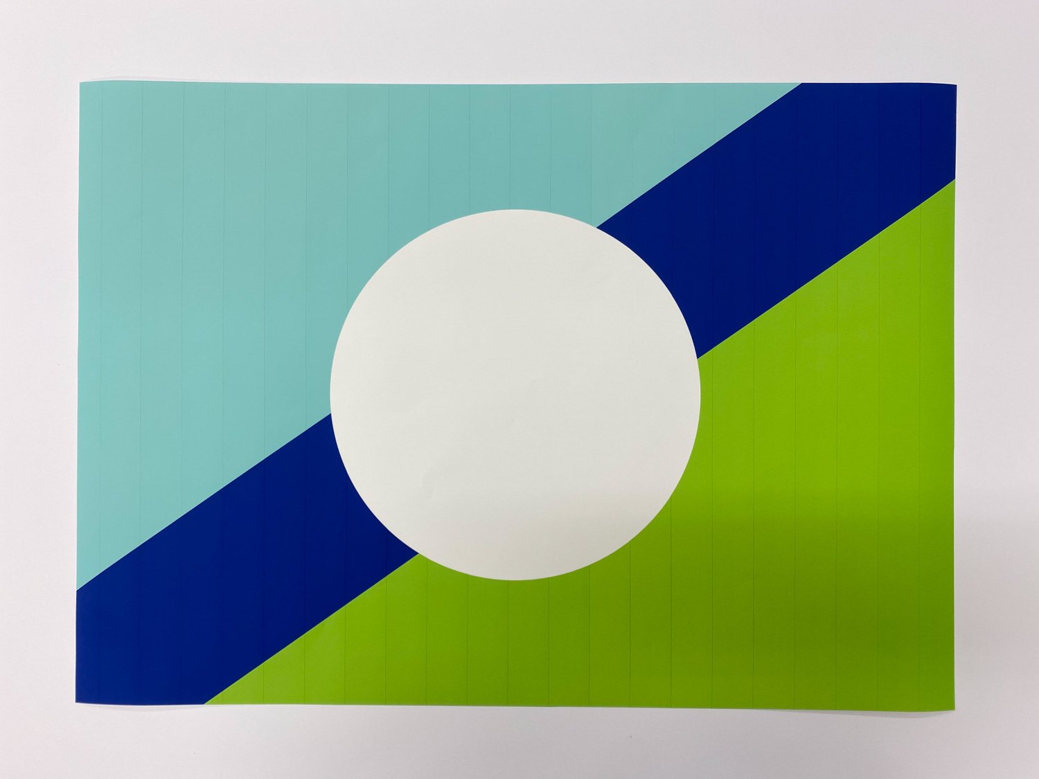
The penultimate project for the graphic design first year this semester is focused on symbolism. In particular vexillology: the design of flags. Each student was briefed to design a flag on behalf of any place, group or organisation of their choosing.
Like much of the world of design, flags are seemingly simple; but actually represent incredibly complex ideas. With this is mind, the brief required the students to remove all design representations of their chosen subject (and sometimes even more) to reveal an absolute purity of form and concept. The following five criteria outlined by the vexillology society were communicated by staff as a method of pressure-testing any design, and to also offer guidance on how to be self critical of a design.
Keep it simple
Use meaningful symbolism
Use two to three basic colours
No lettering or seals
Be distinctive
But beyond that, and quite simply…does it look like a flag? Can it be seen and understood visually from distance? And can it be made from cotton?
Below are a selection of the final designs and a brief description of their origins.

Dogs trust
a charity which specialises in the wellbeing of dogs
Football for Humanity
a charity which uses the power of FOOTBALL to educate, empower and protect children facing the threat of violence, exploitation and poverty
the society of vintners
an association of British wine experts
retro gamers society
a group of gamers dedicated to the original class video games
little princess trust
The Little Princess Trust provides free real hair wigs to children and young people, up to 24 years, who have lost their own hair through cancer treatment or other conditions

BLACKPOOL CHESS CLUB
the tower comes into play

BFI
The British Film Institute is a film and television charitable organisation which promotes and preserves filmmaking and television in the United Kingdom
SKELMERSDALE
a young town built in the brutalist style
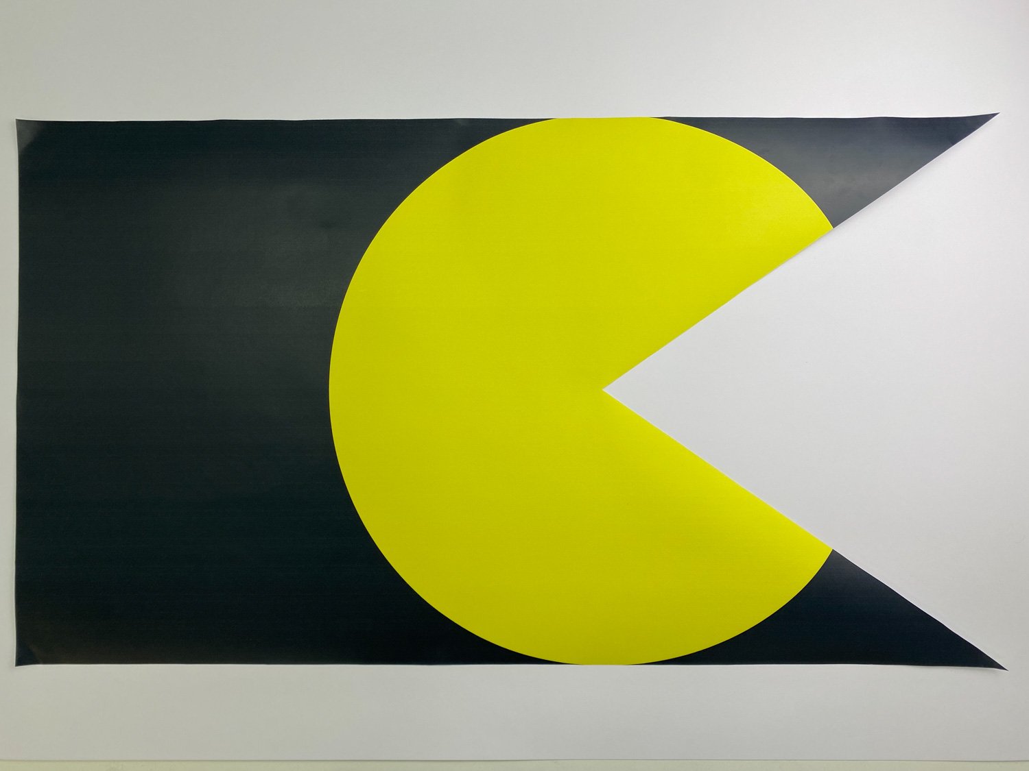
E3
a trade event for the games industry held annually in los angeles – the city of angels

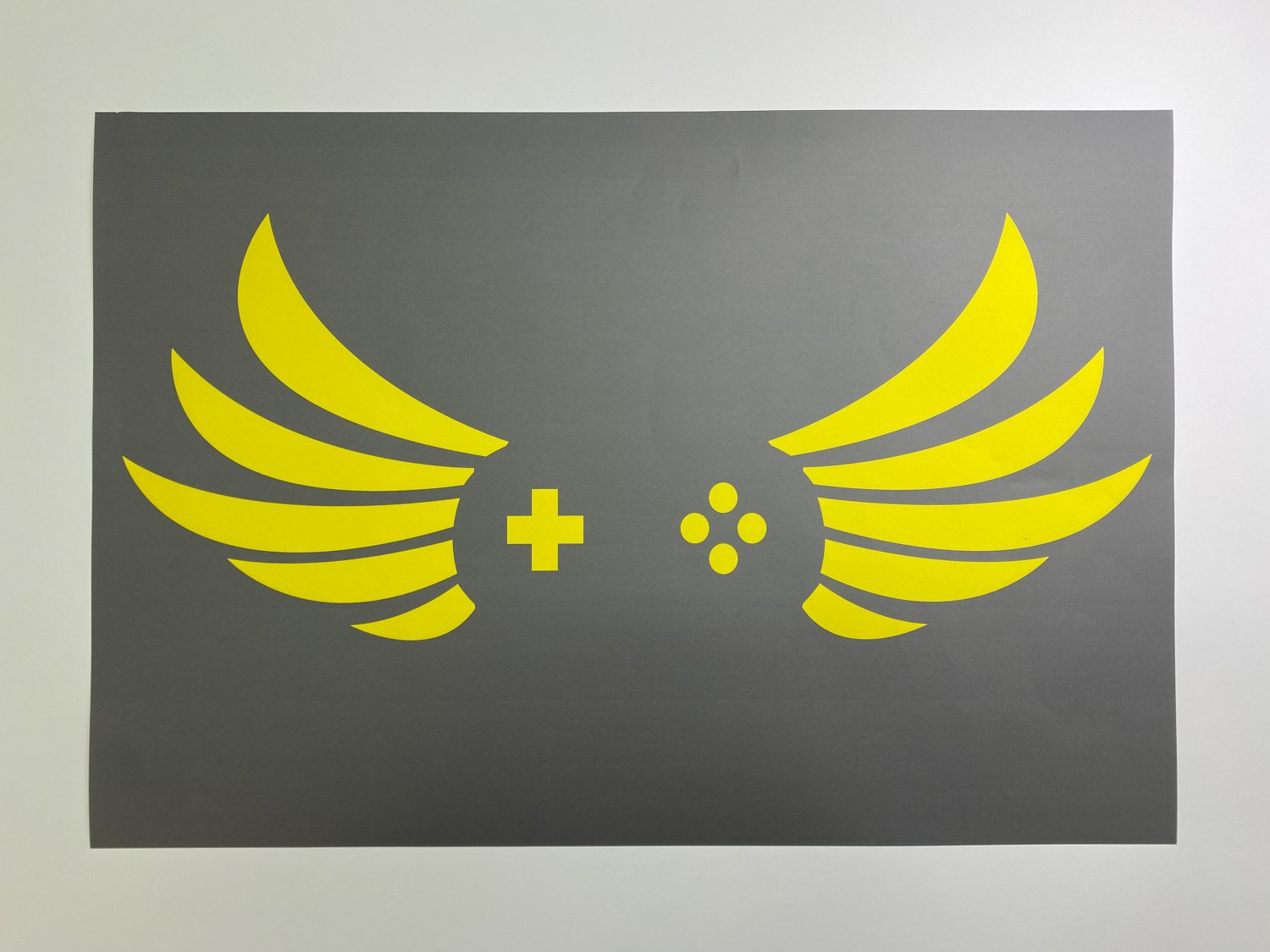
uclan rams
an american football team based at the university of central lancashire

gainsborough
a town known for its agriculture, river and oil deposits

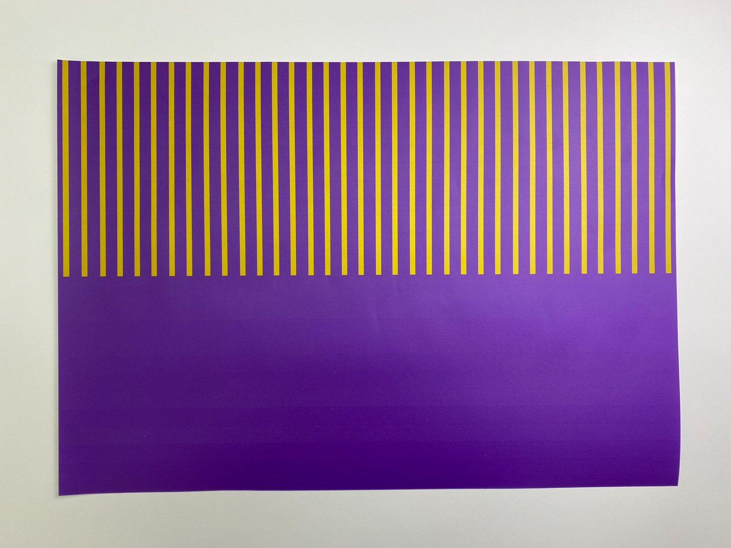
ondo, nigeria
an area known as ‘the sunshine state’, which predominantly grows cocoa (a yellow coloured fruit), and also palm fruit (which are red)

harris museum
a preston building with six columns to its facade

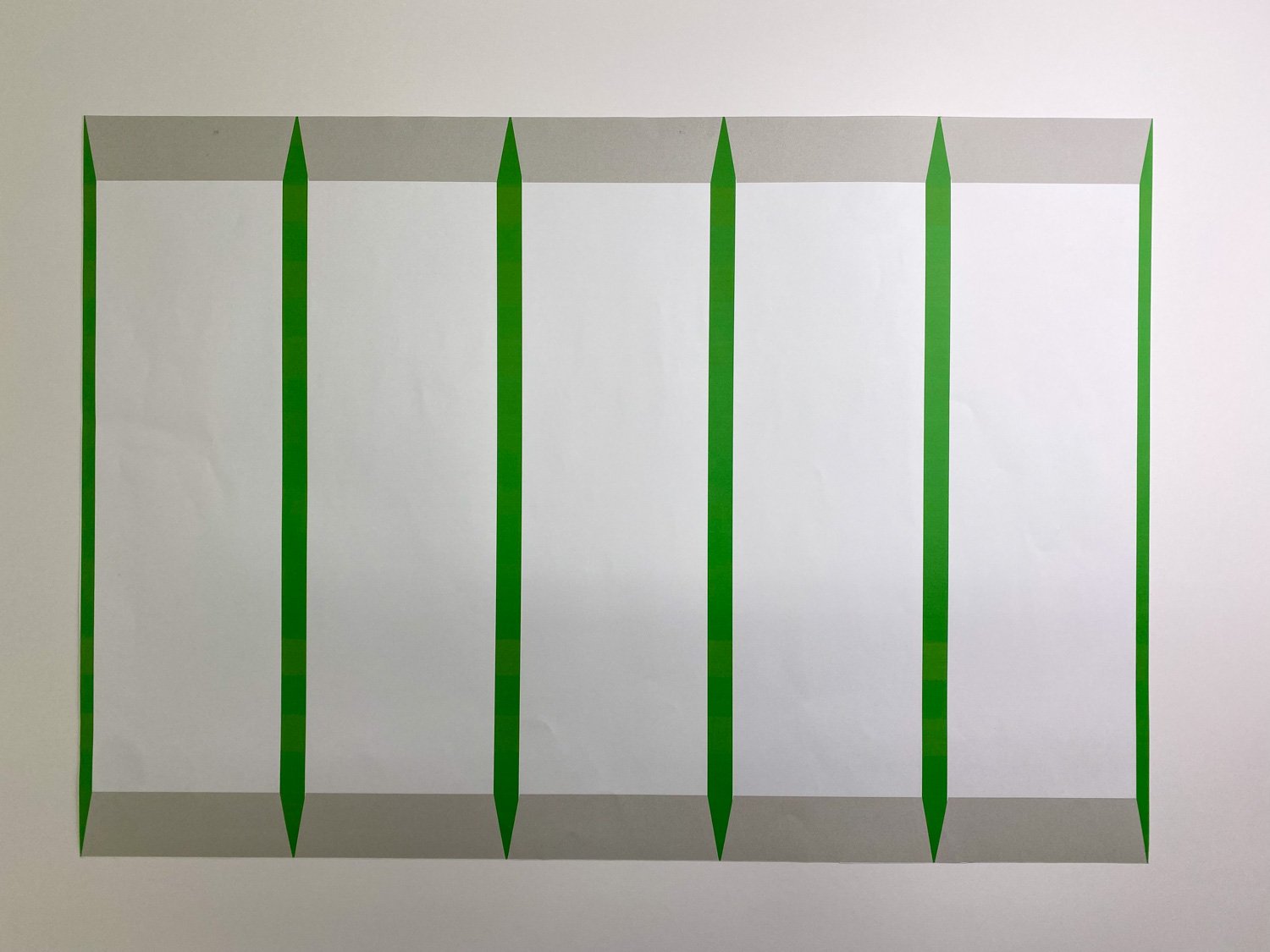
cumbria
a geographical area famed for its lakes, fells (hills) and natural scenery

bhutan
a buddhist kingdom known for its colourful prayer flags

uk downhill ski club
an organisation interested in descending whte covered slopes

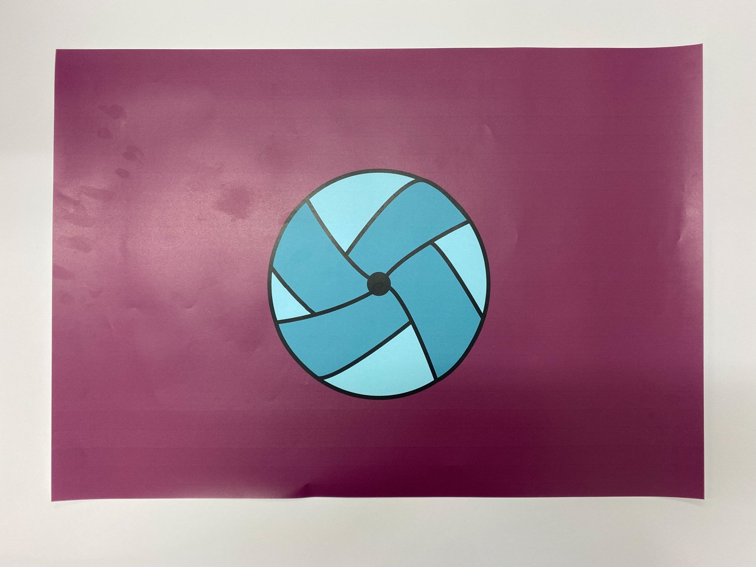
lancashire archery club
lancashire’s red rose meets arrows and a target
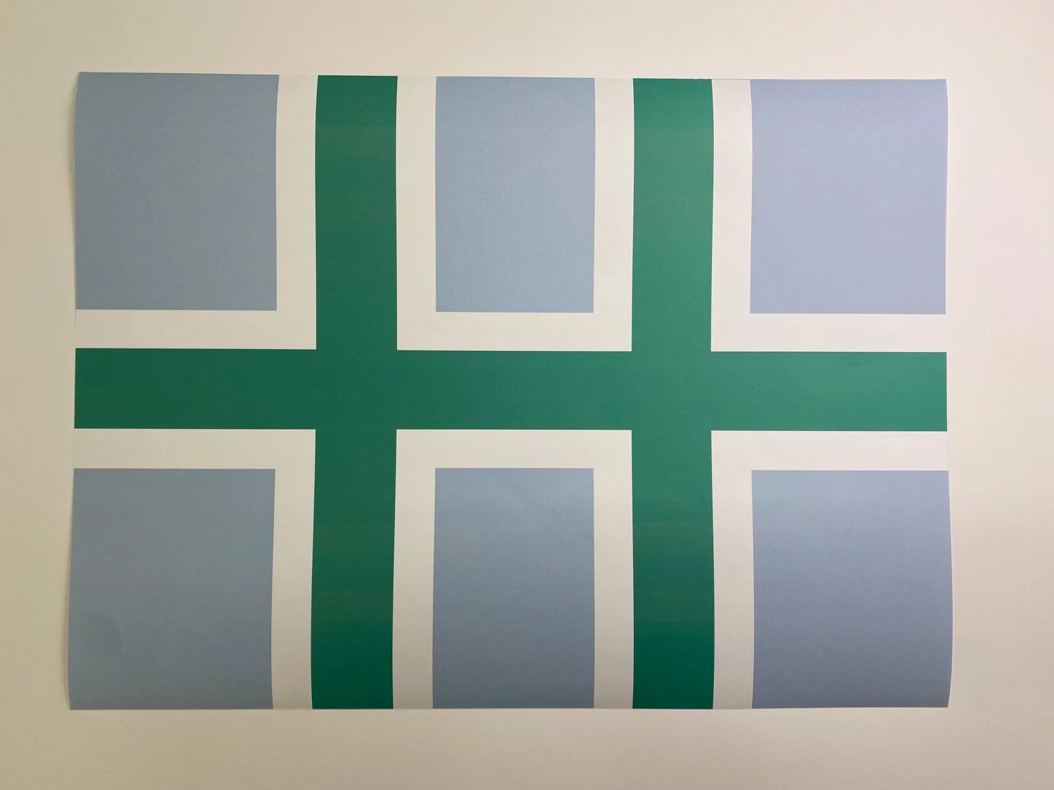
Liverpool
a weathered city with scandinavian heritage which was originally designed with a ‘h’ formation built around seven main streets
cumberland cliff diving association
leap from the land to the sea
polish community in preston
the two p’s of two communities weave together in a slavic pattern

lytham
a town know for its welcoming vista of green grass, blue skies and a white windmill

trafford libraries
denoting nine libraries found in the southwest region of manchester
shrovetide football
an ancient game played each shrove tuesday by the up’ards and the down’ards along a three mile stretch of river
layton juniors football club
a junior football team who play on the site of a former windmill
The sixth of our semester one lateral thinking projects has just been completed be the first years. The brief took the definition of the word ‘illustrate’ [ORIGIN early 16th century (in the sense ‘illuminate, shed light on’): from Latin illustrat- ‘lit up’, from the verb illustrare, from in- ‘upon’ + lustrare ‘illuminate’] and use that idea to convey the meanings behind idioms and proverbs. Students could choose any idiom they wanted in order to think broadly around any potential solutions. There were no restrictions with regard to technique: image / photography / video / sound / performance were all encouraged, in order to best present the idiom in question.


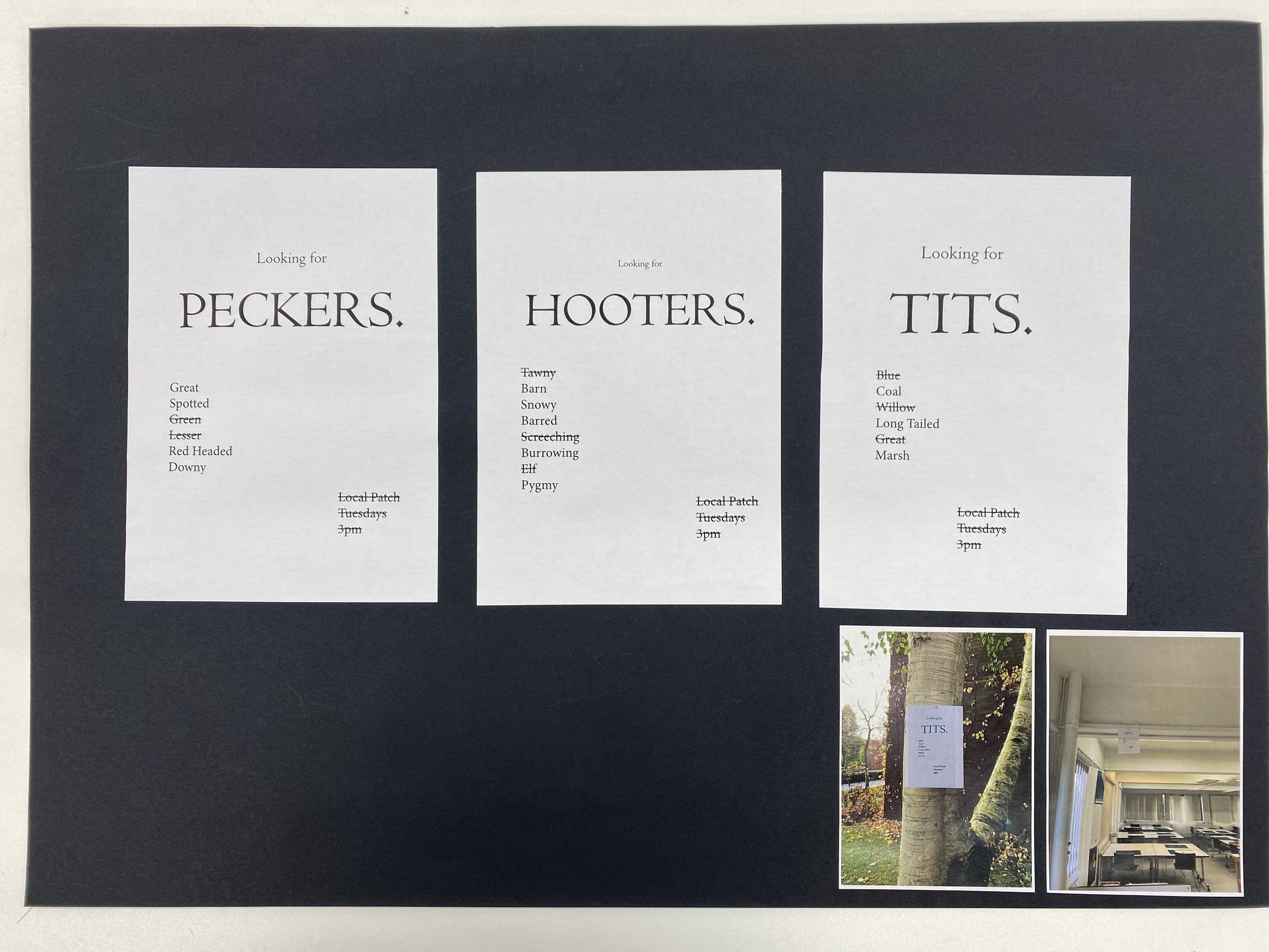
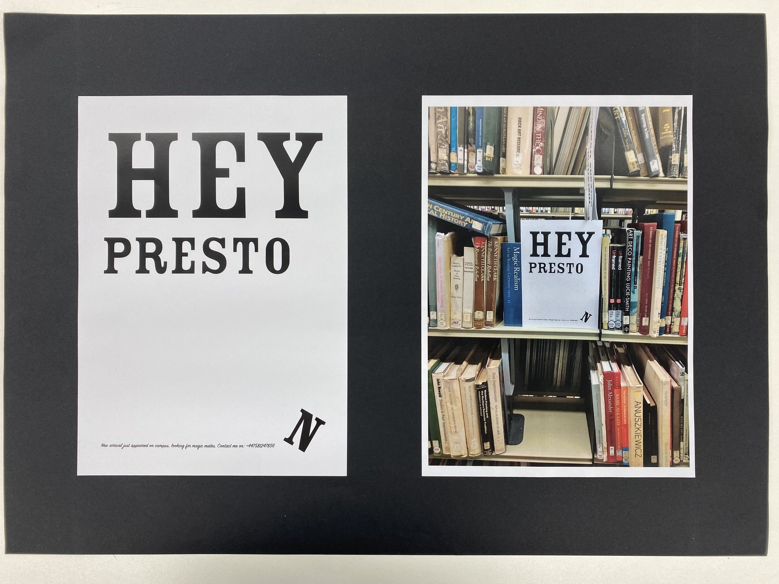
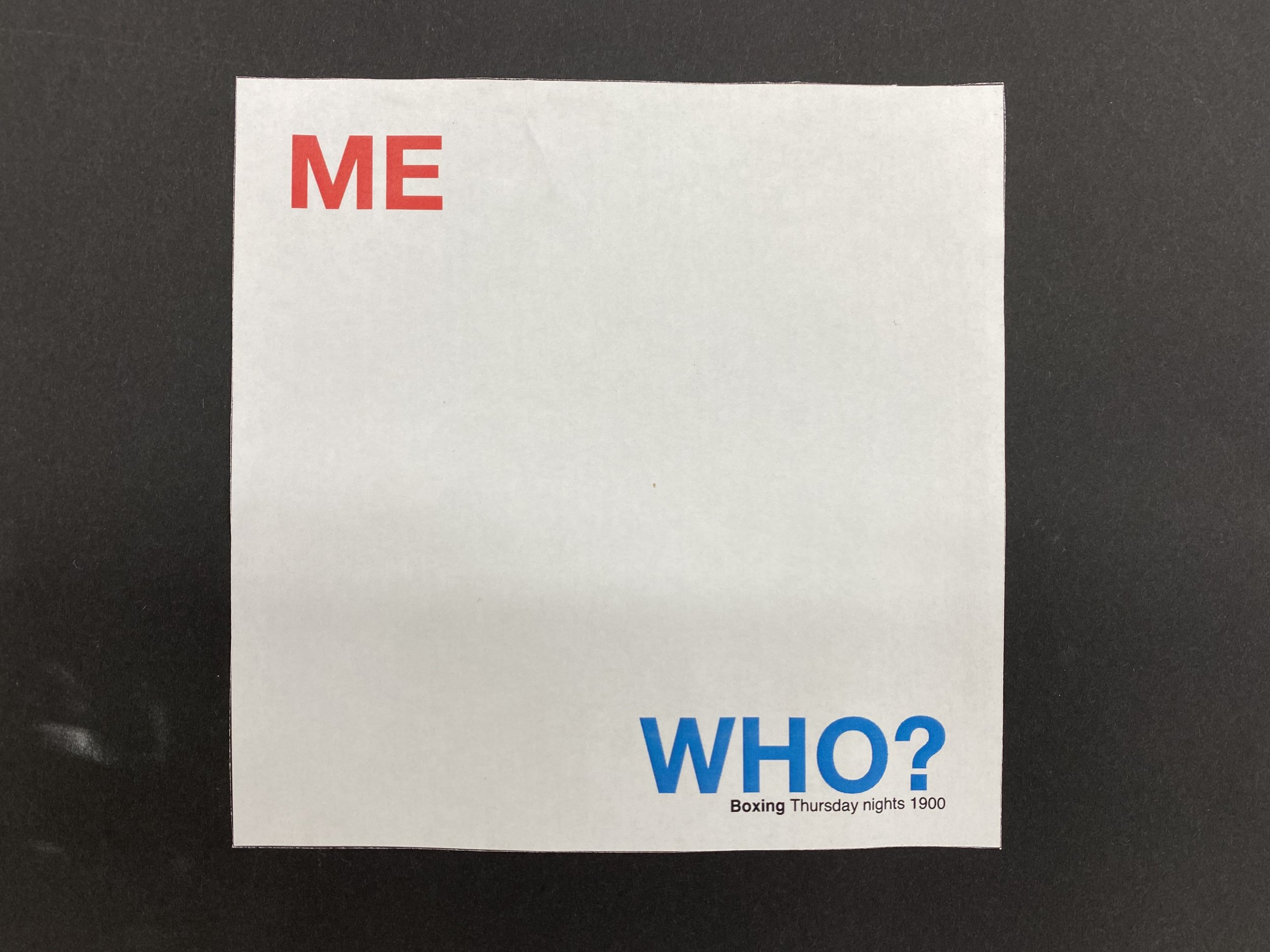
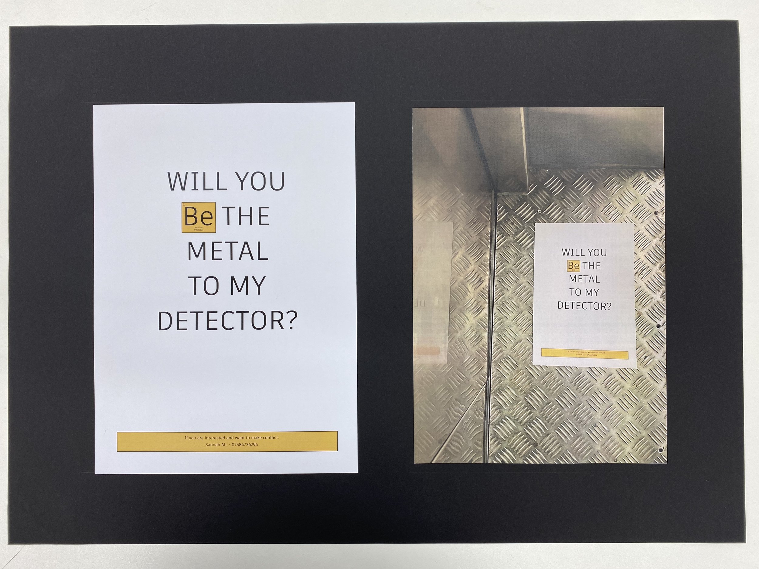
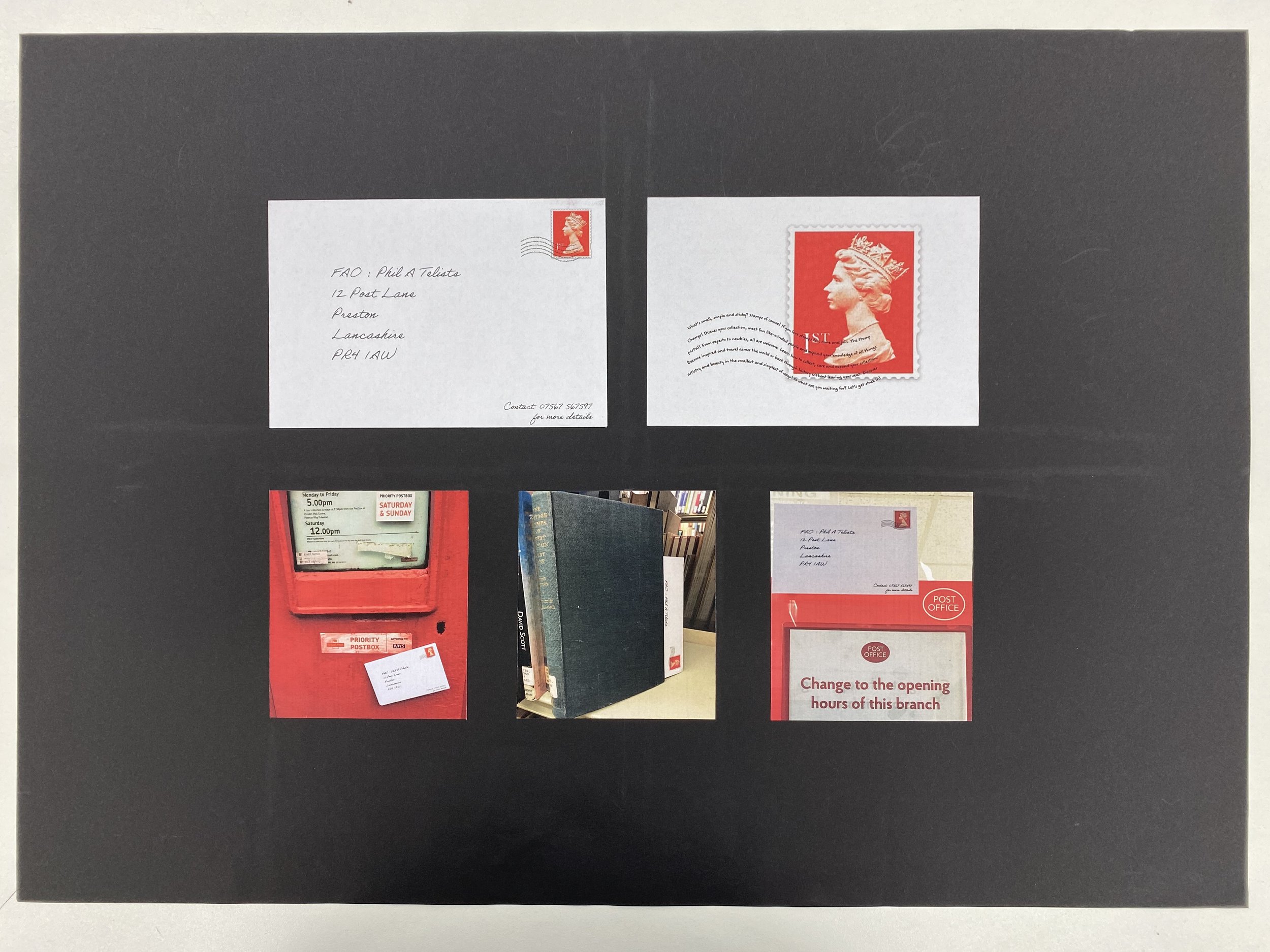
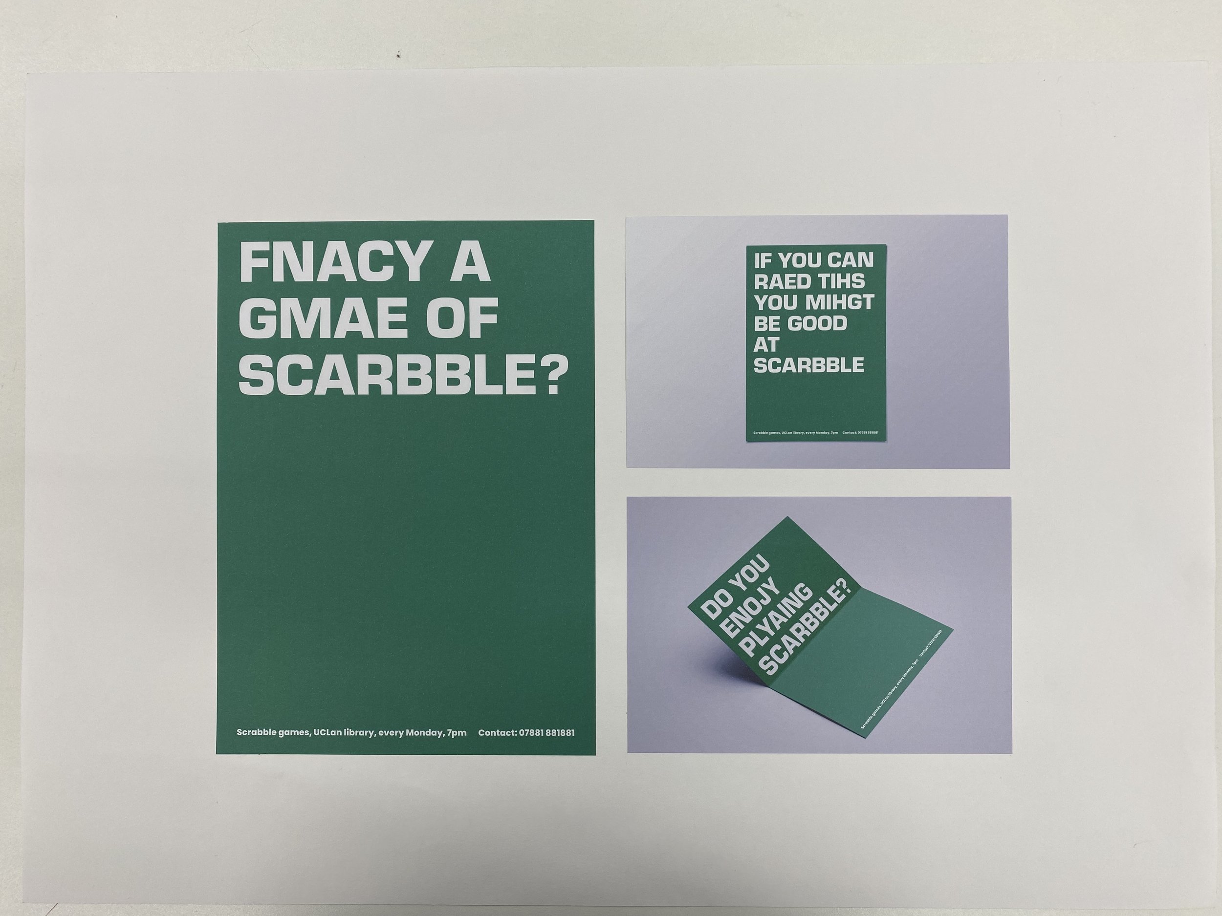
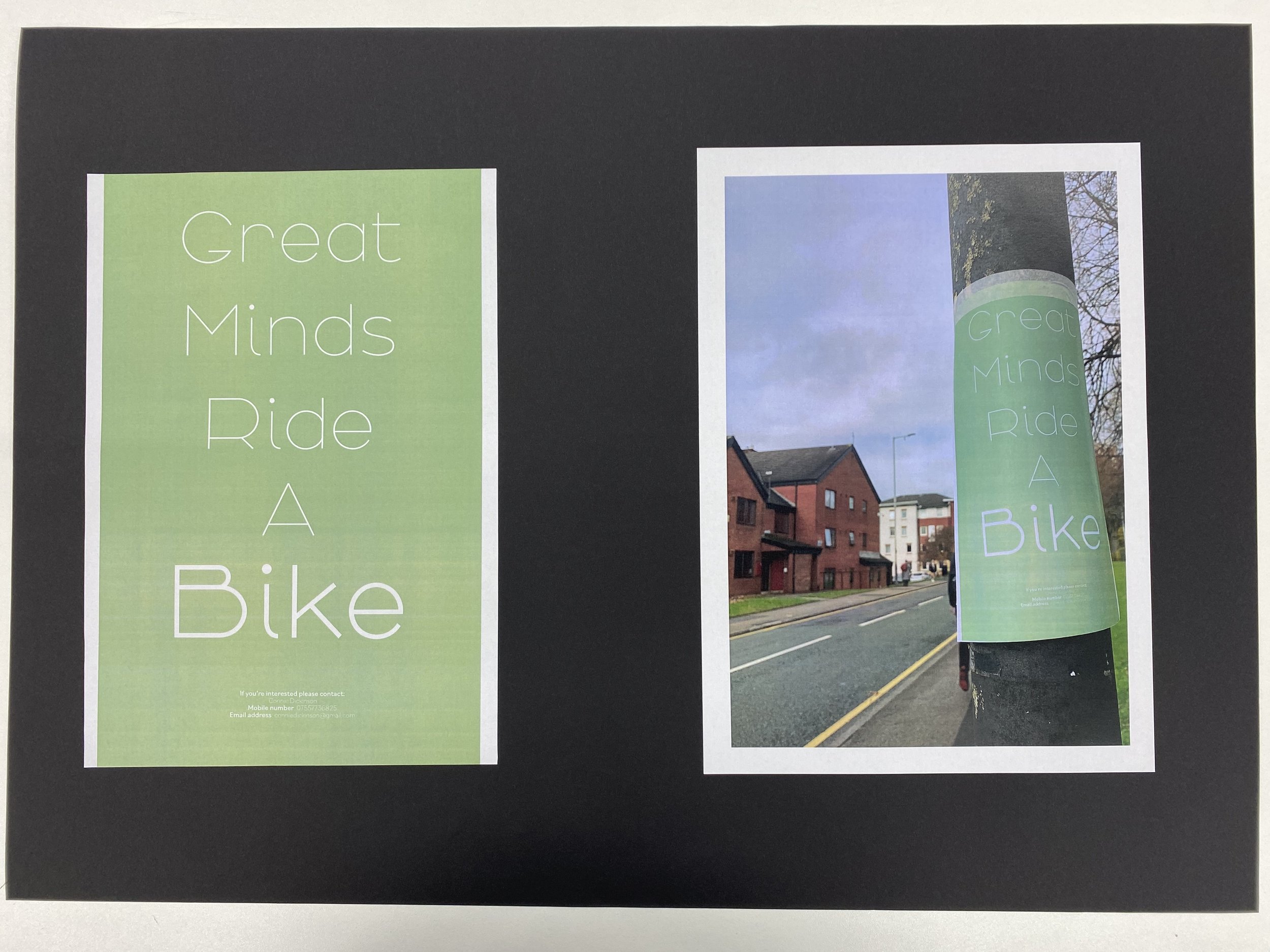
As we approach the final third of the semester, the latest first year brief asked the students to directly engage with the concept of copywriting; to put words front and centre of a communication.
Each student was asked to research and immerse in a given area of interest: ornithology or philately for example. Then, whilst imagining themselves as a keen pursuer of their given field, write an advert seeking like-minded individuals on campus.

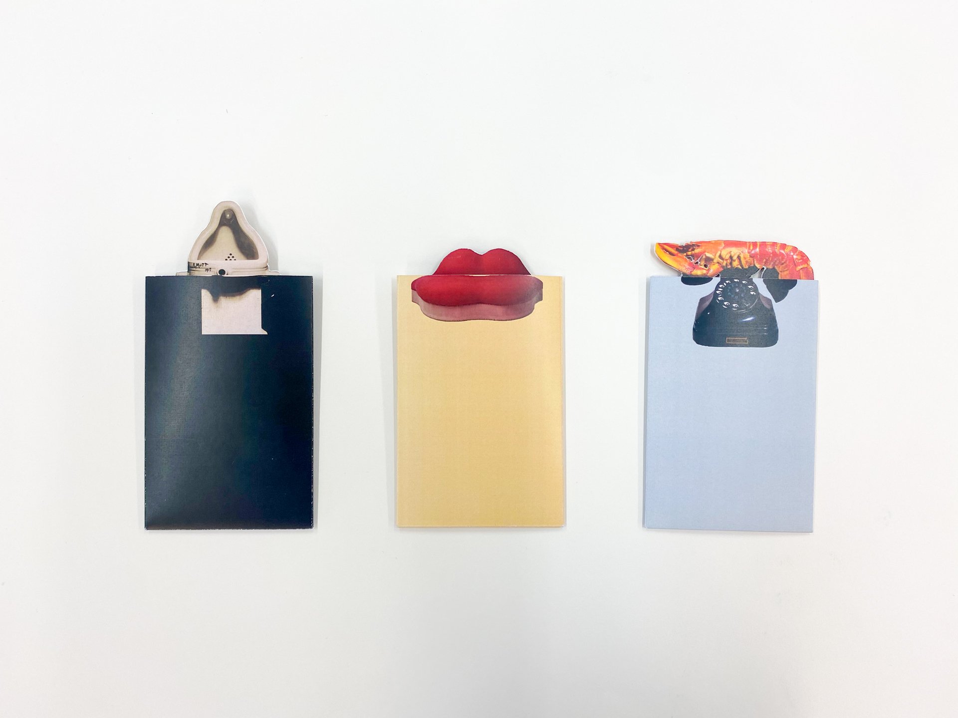
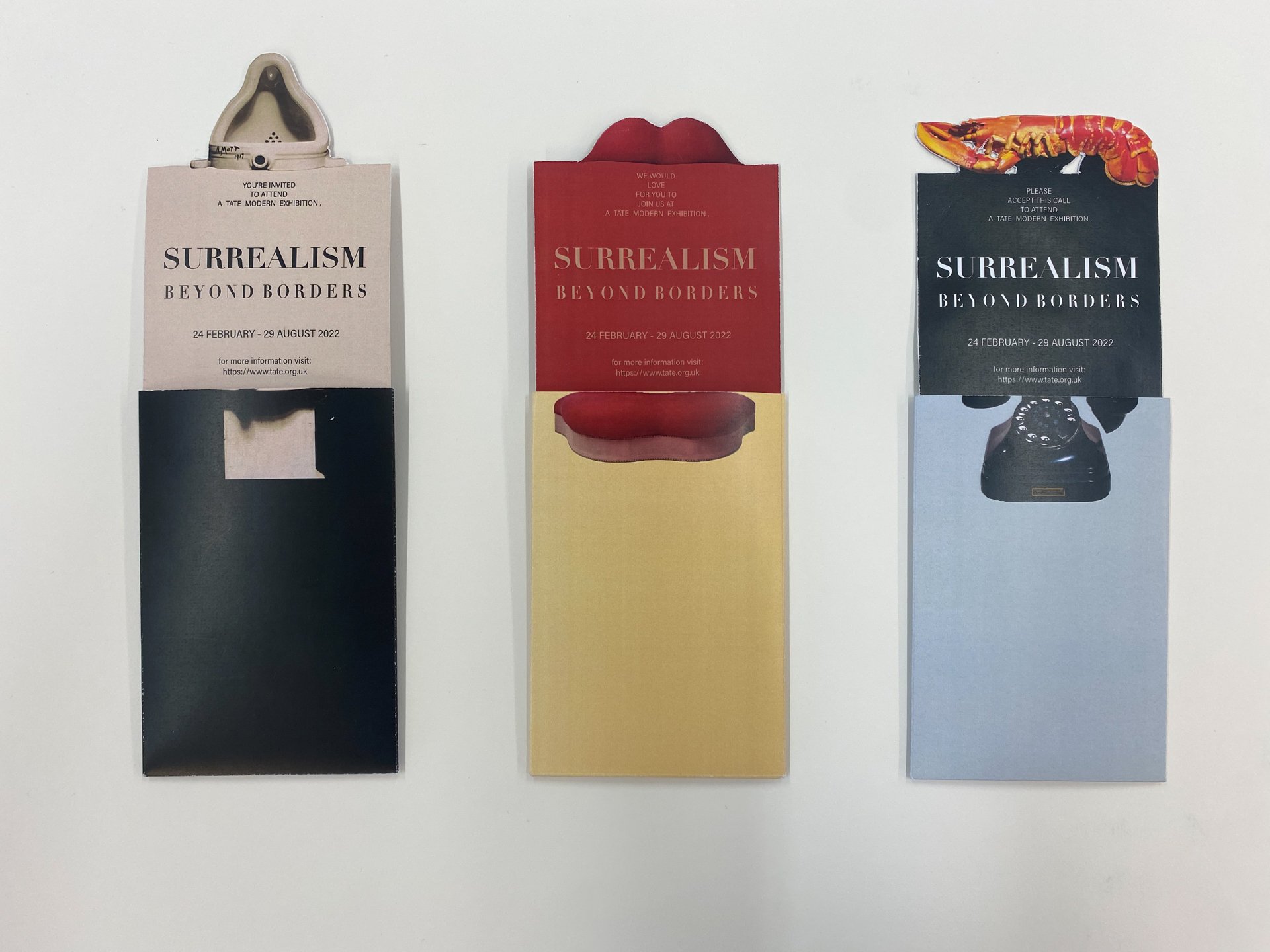
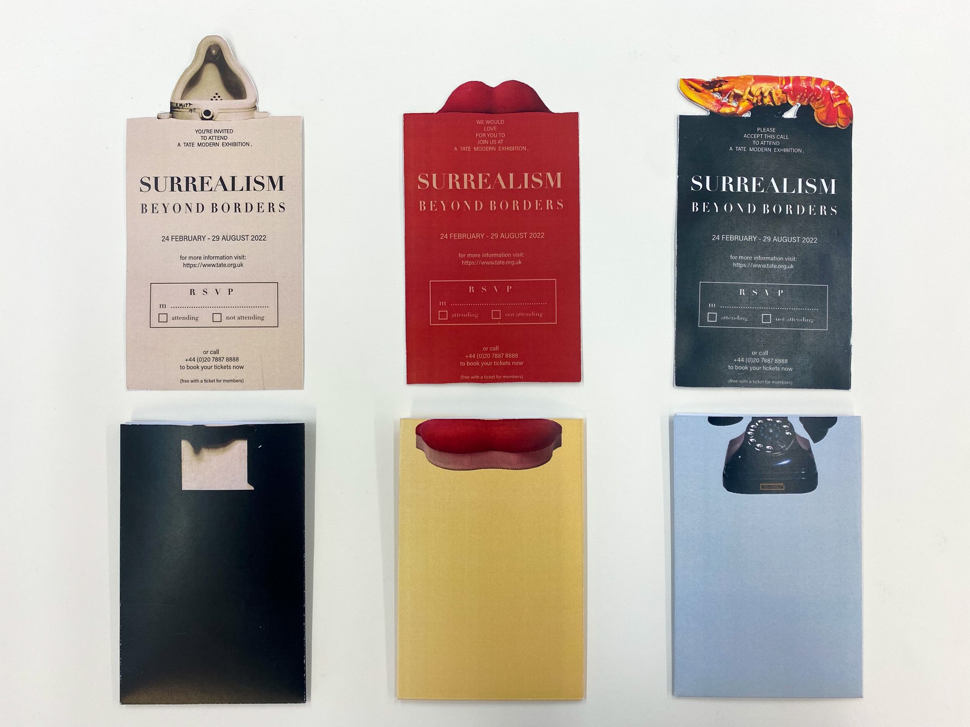
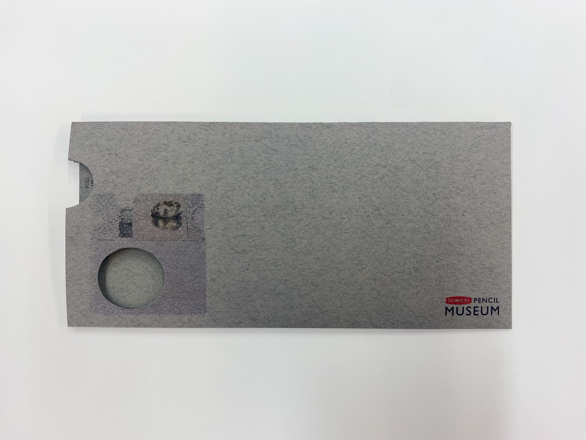
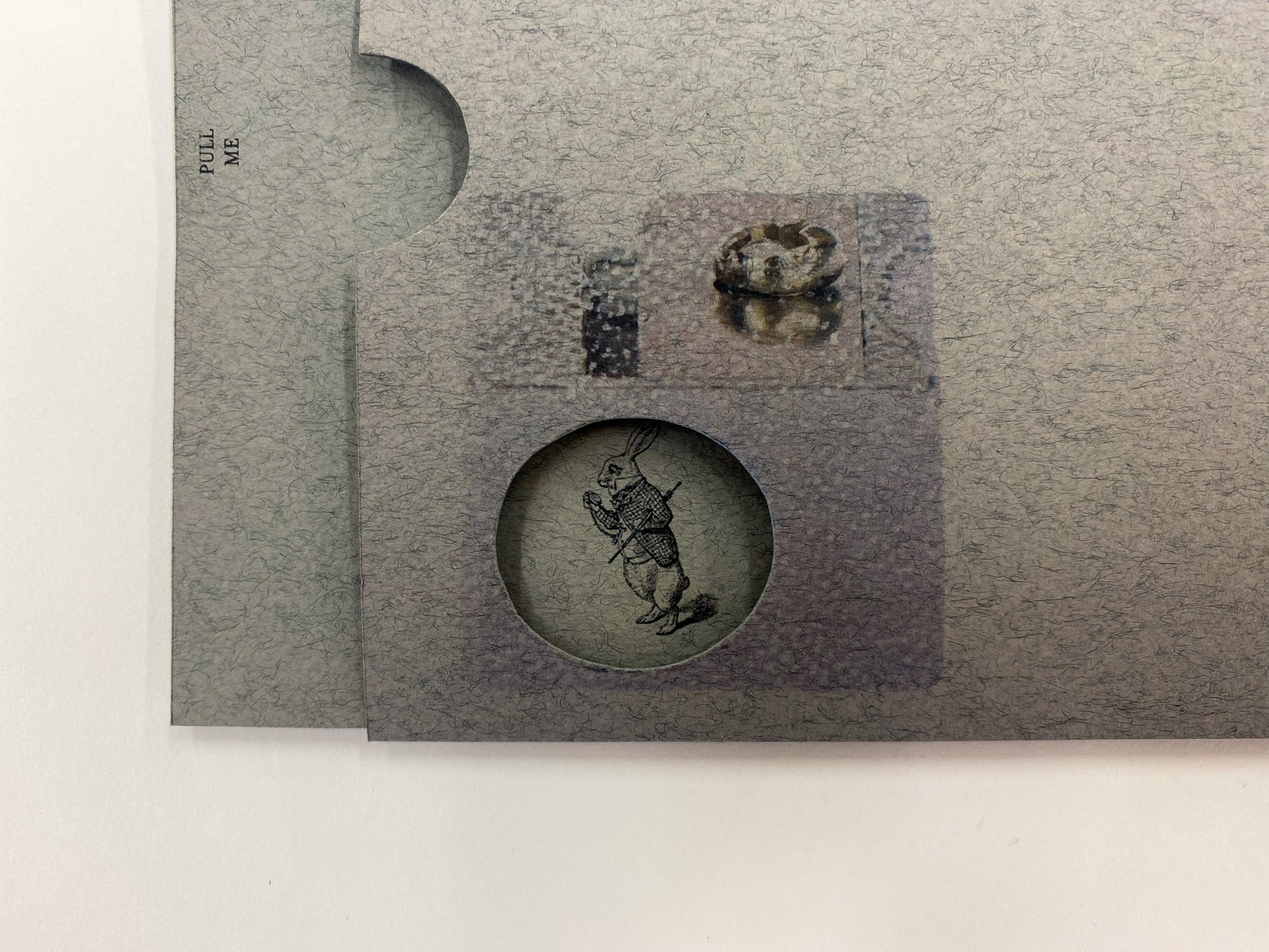
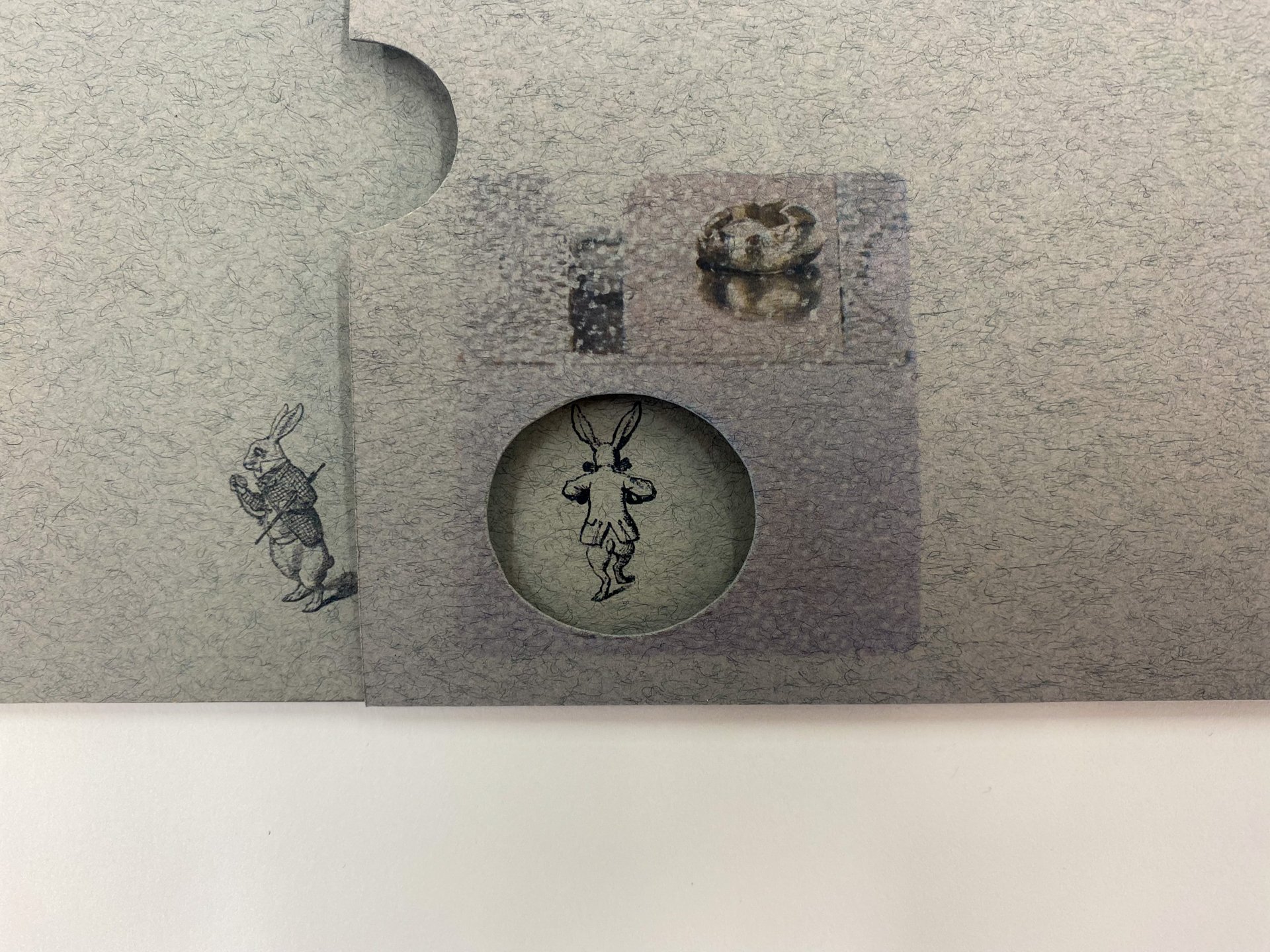
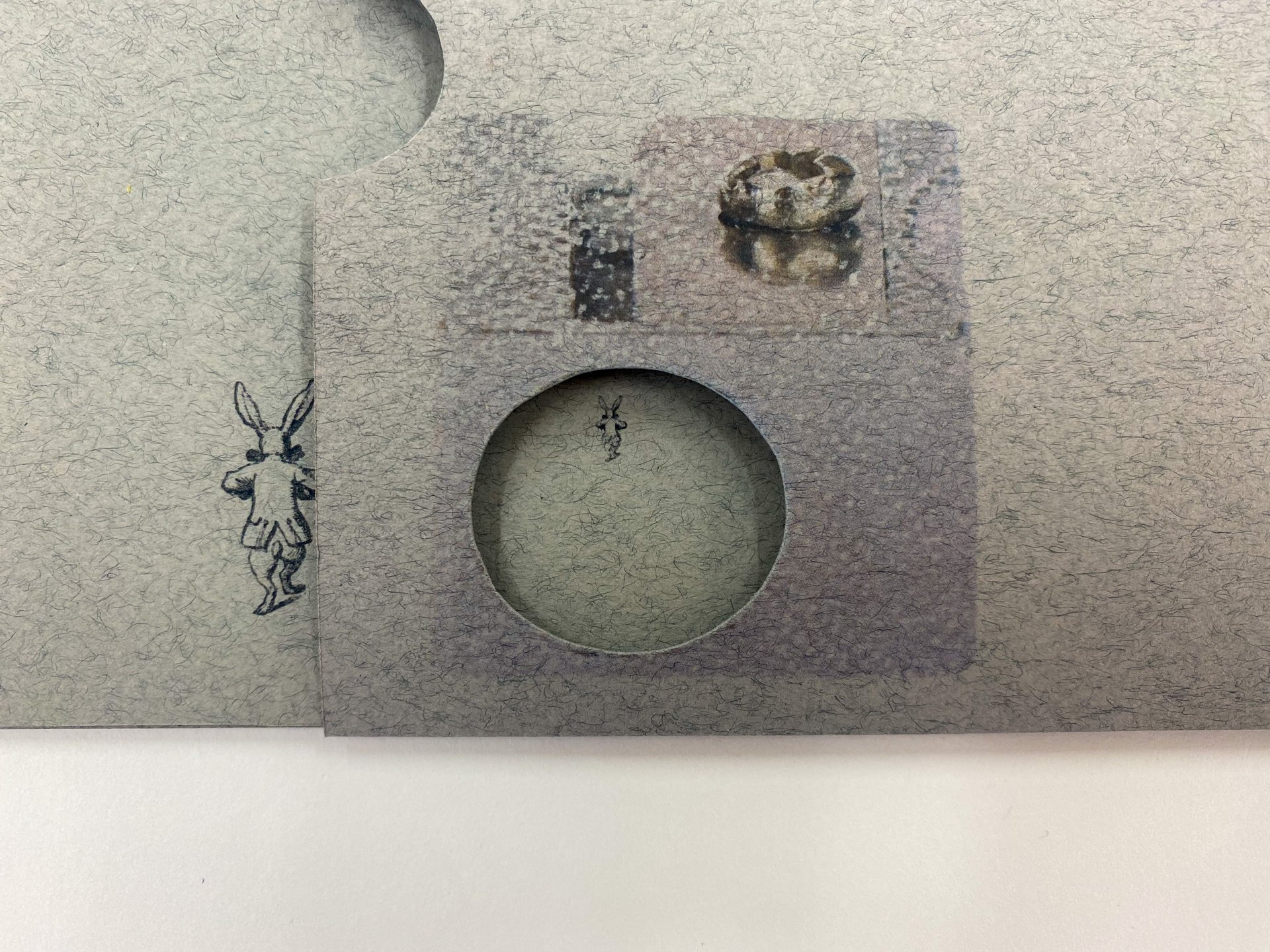
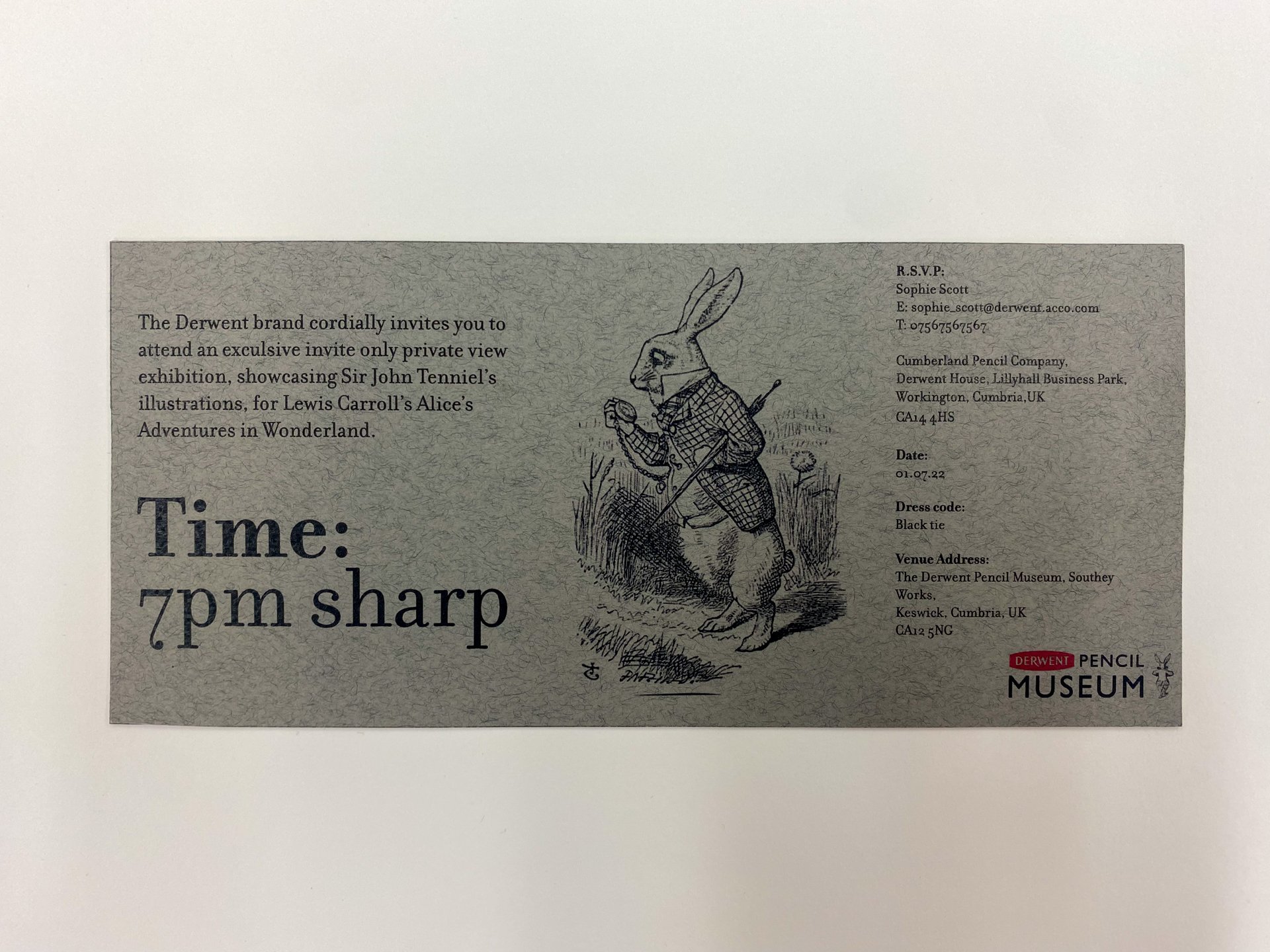
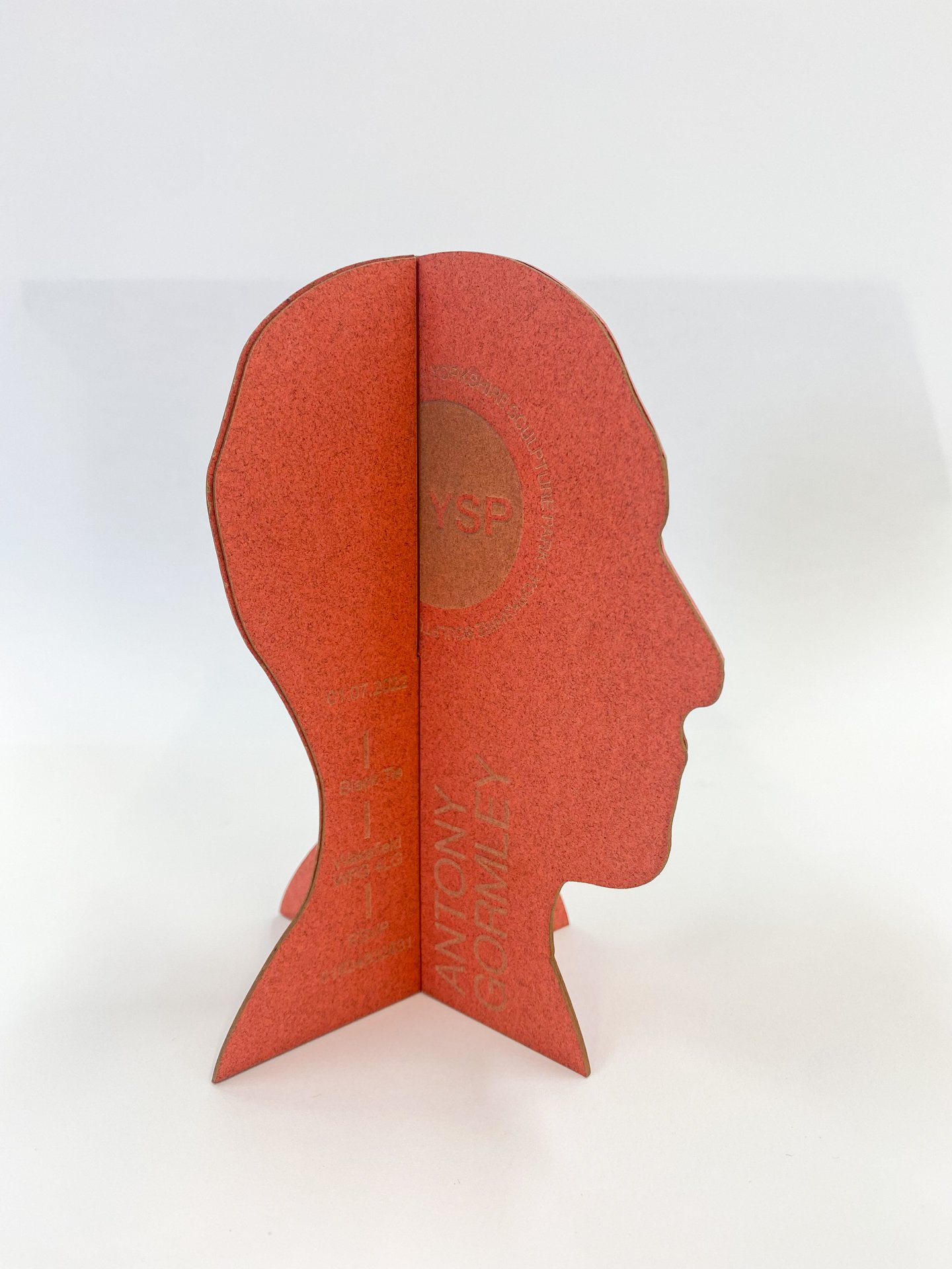
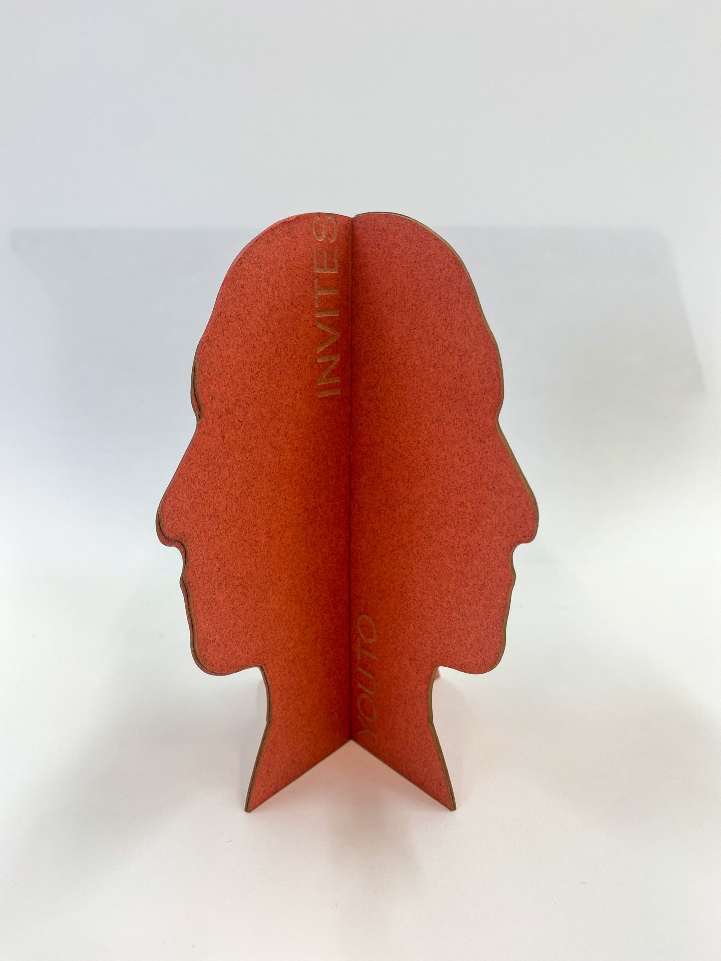
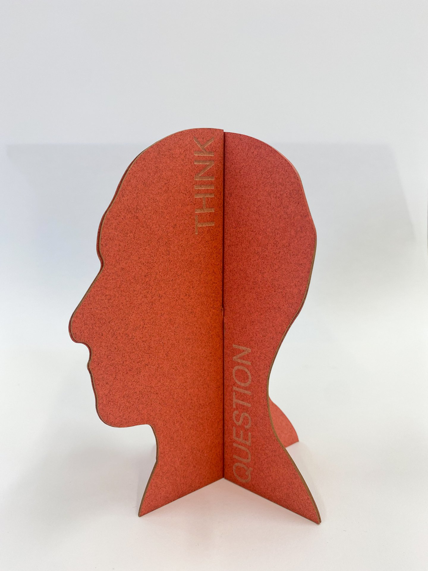
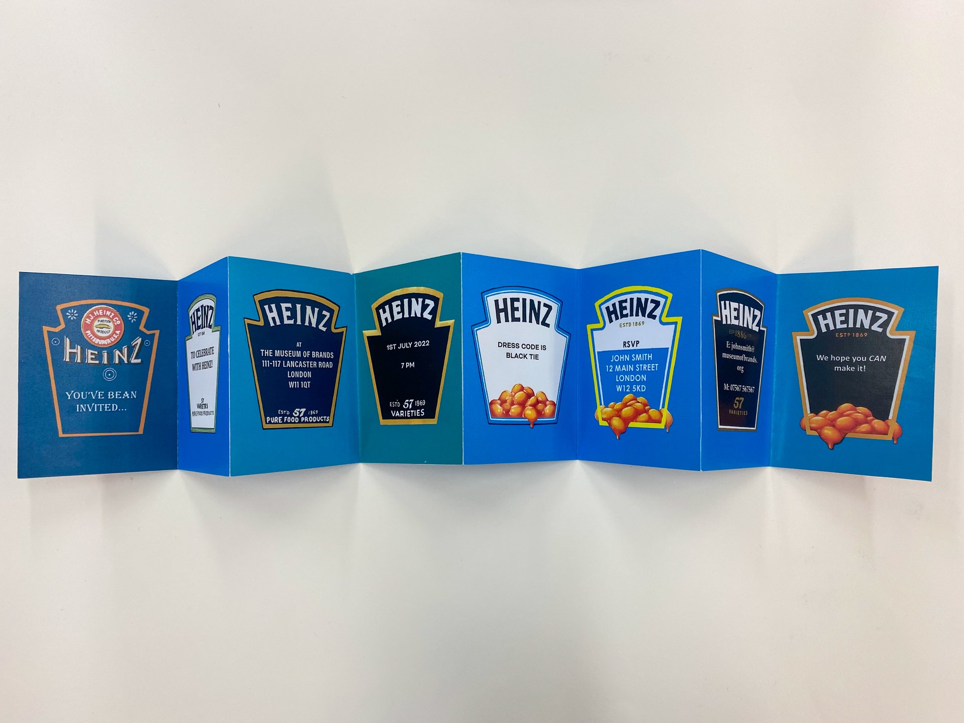
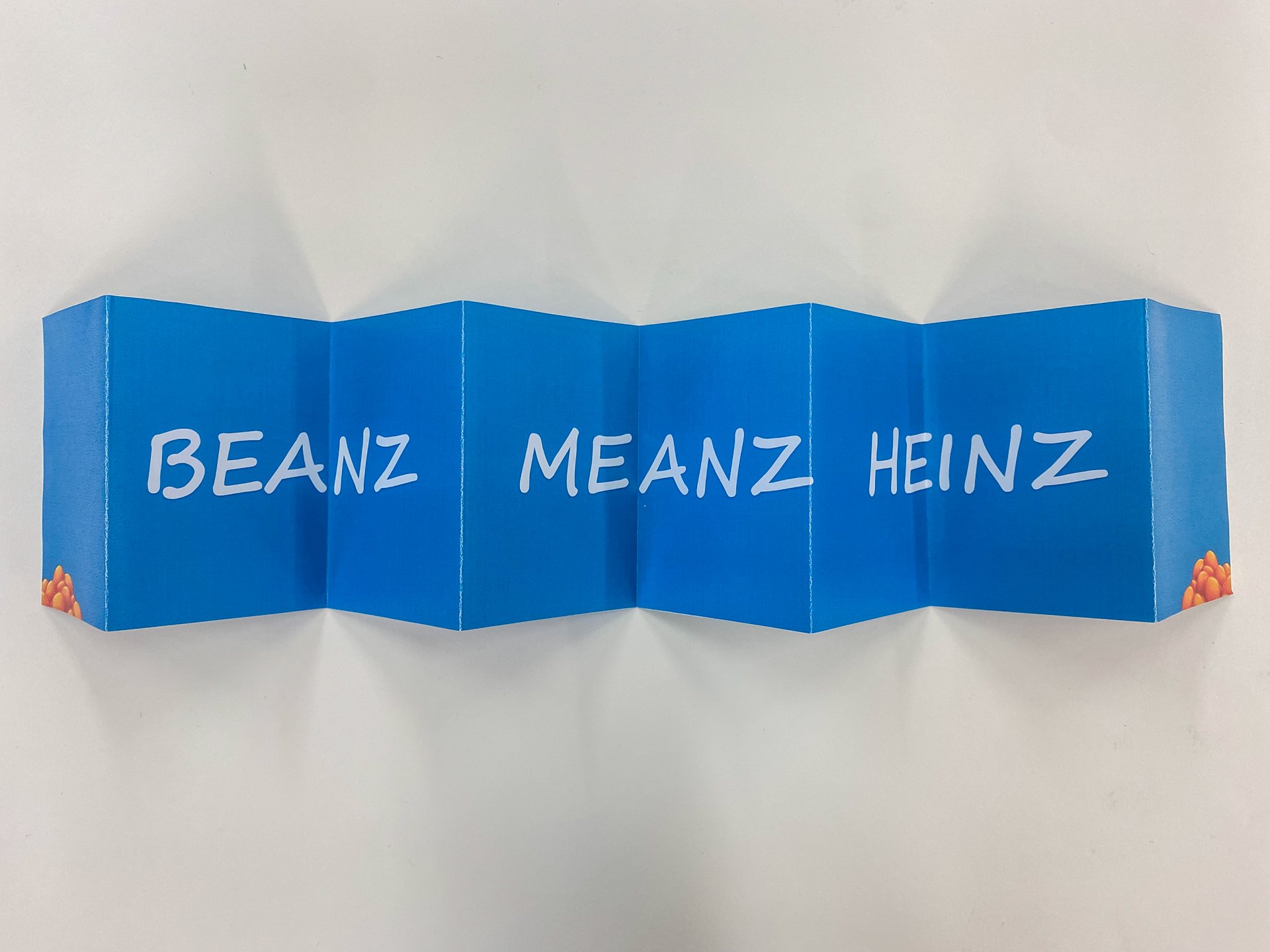
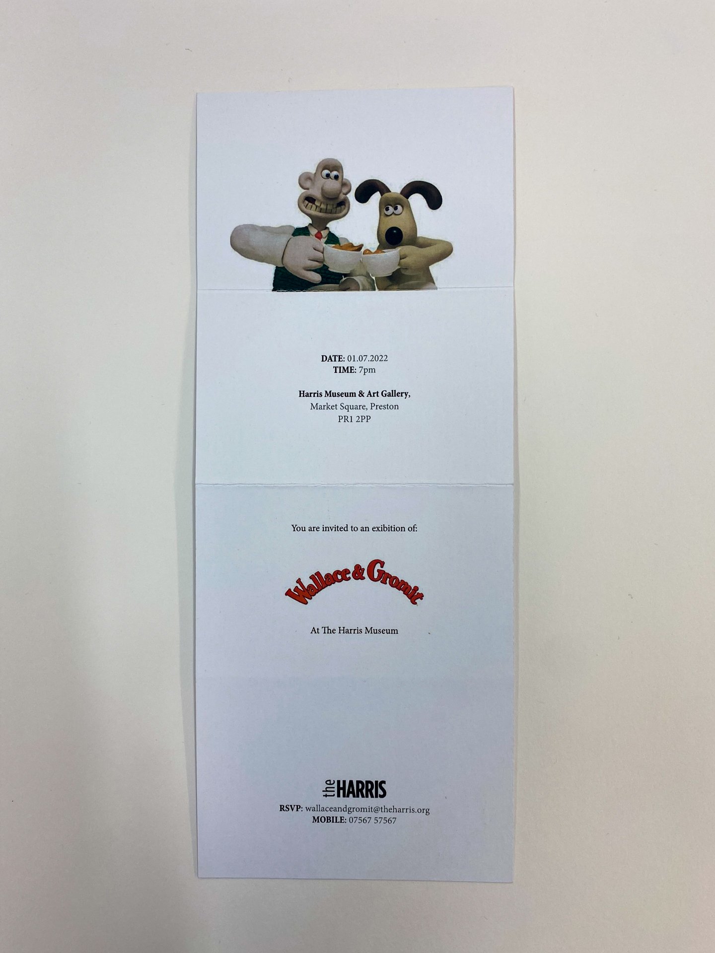
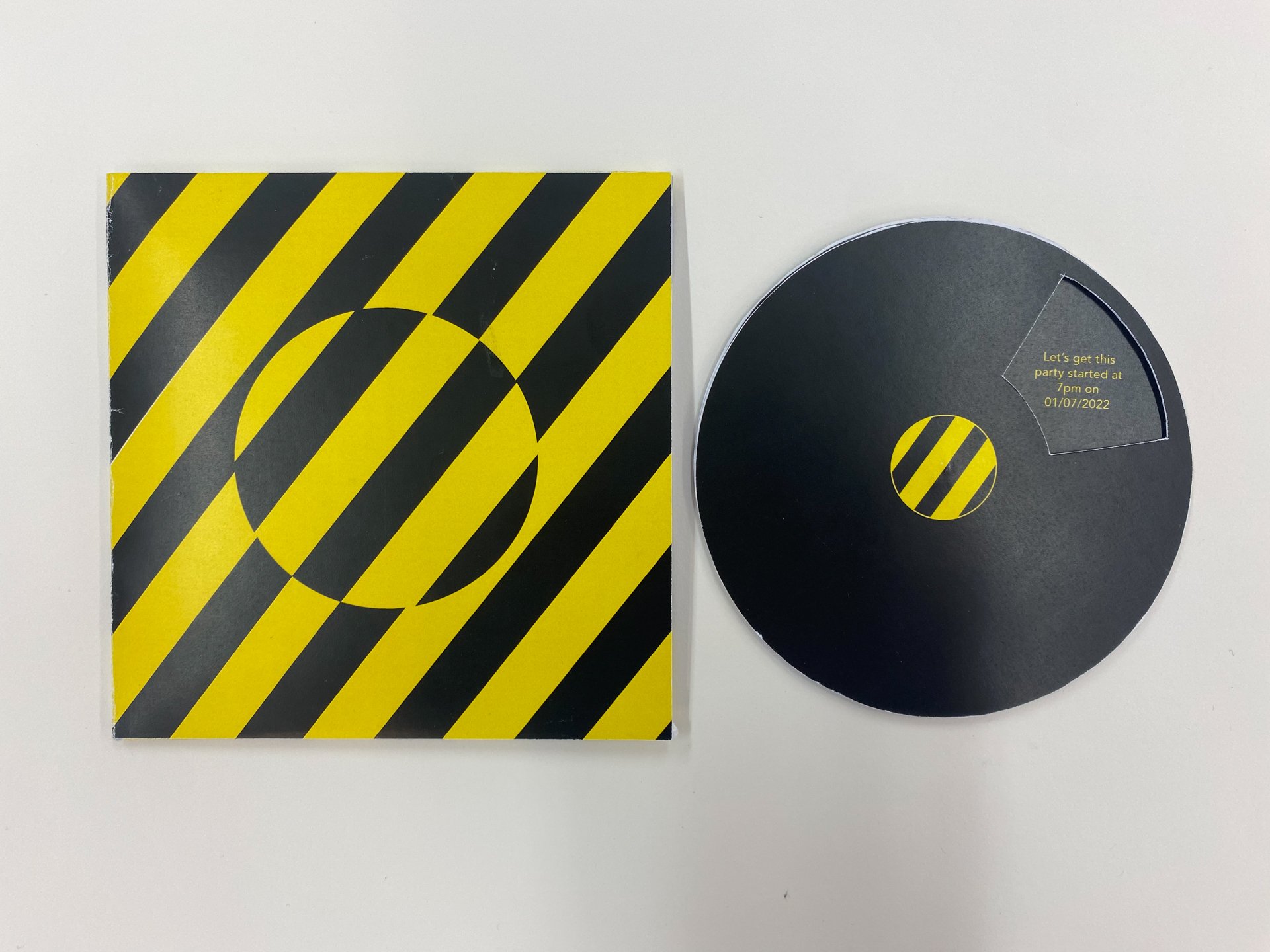
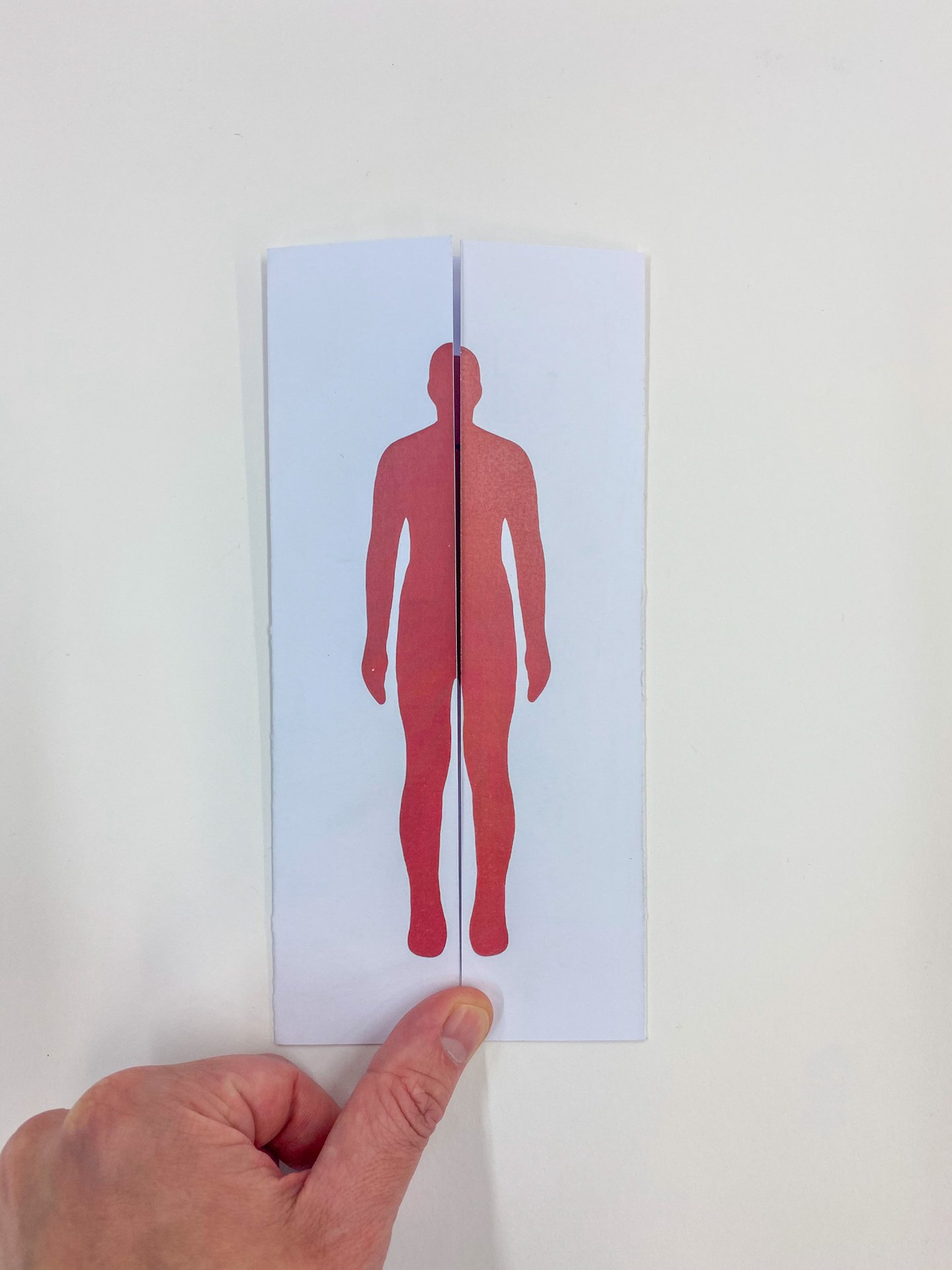
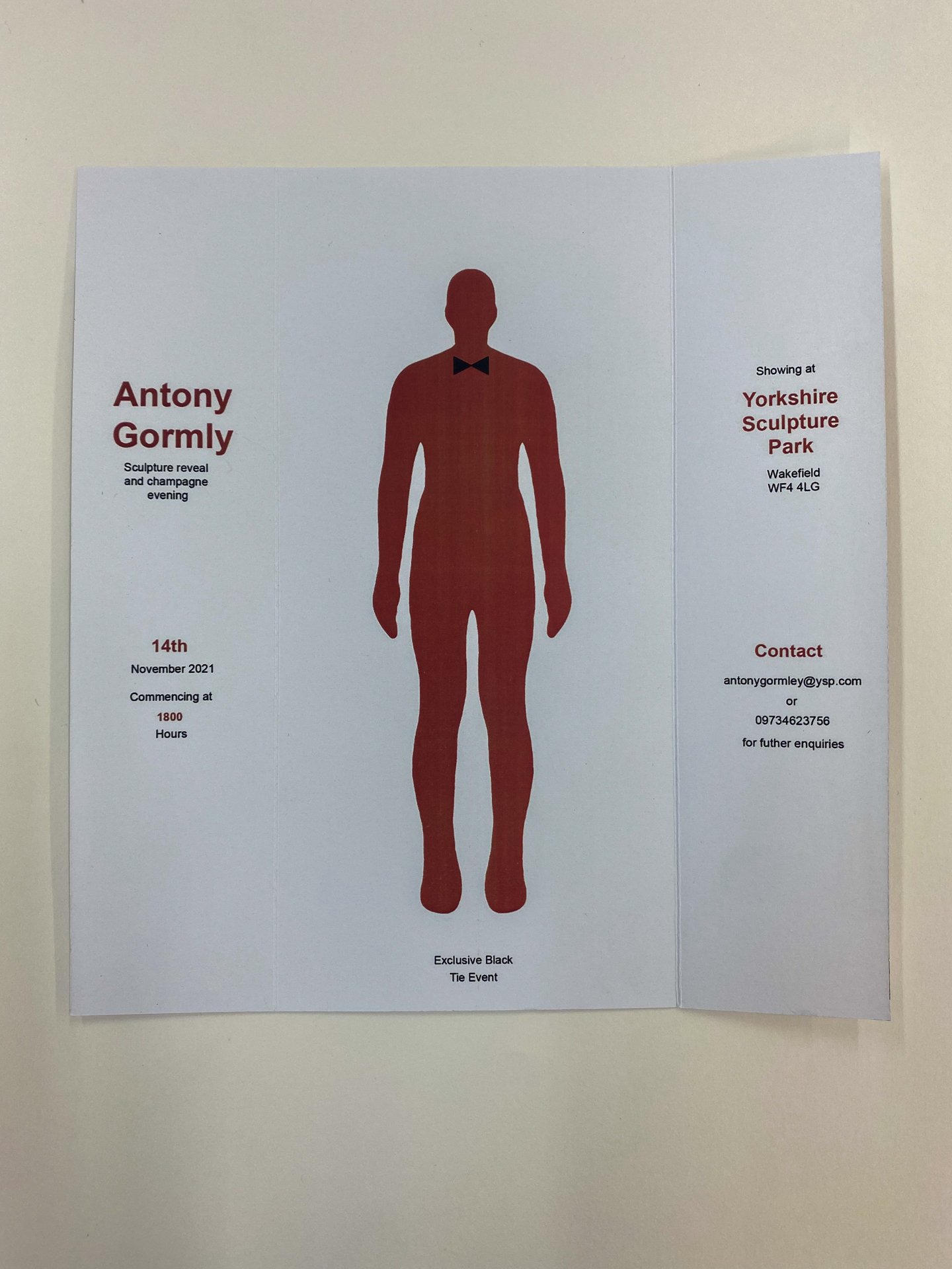
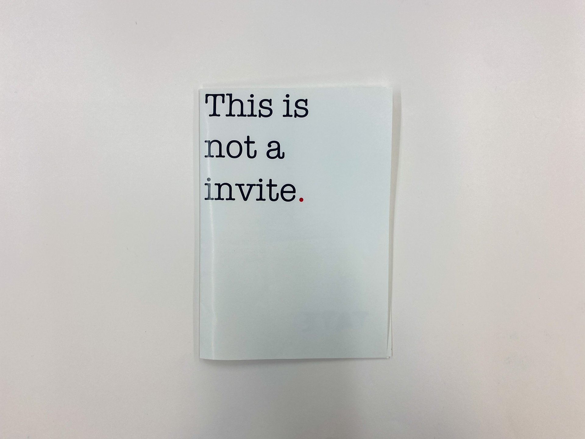
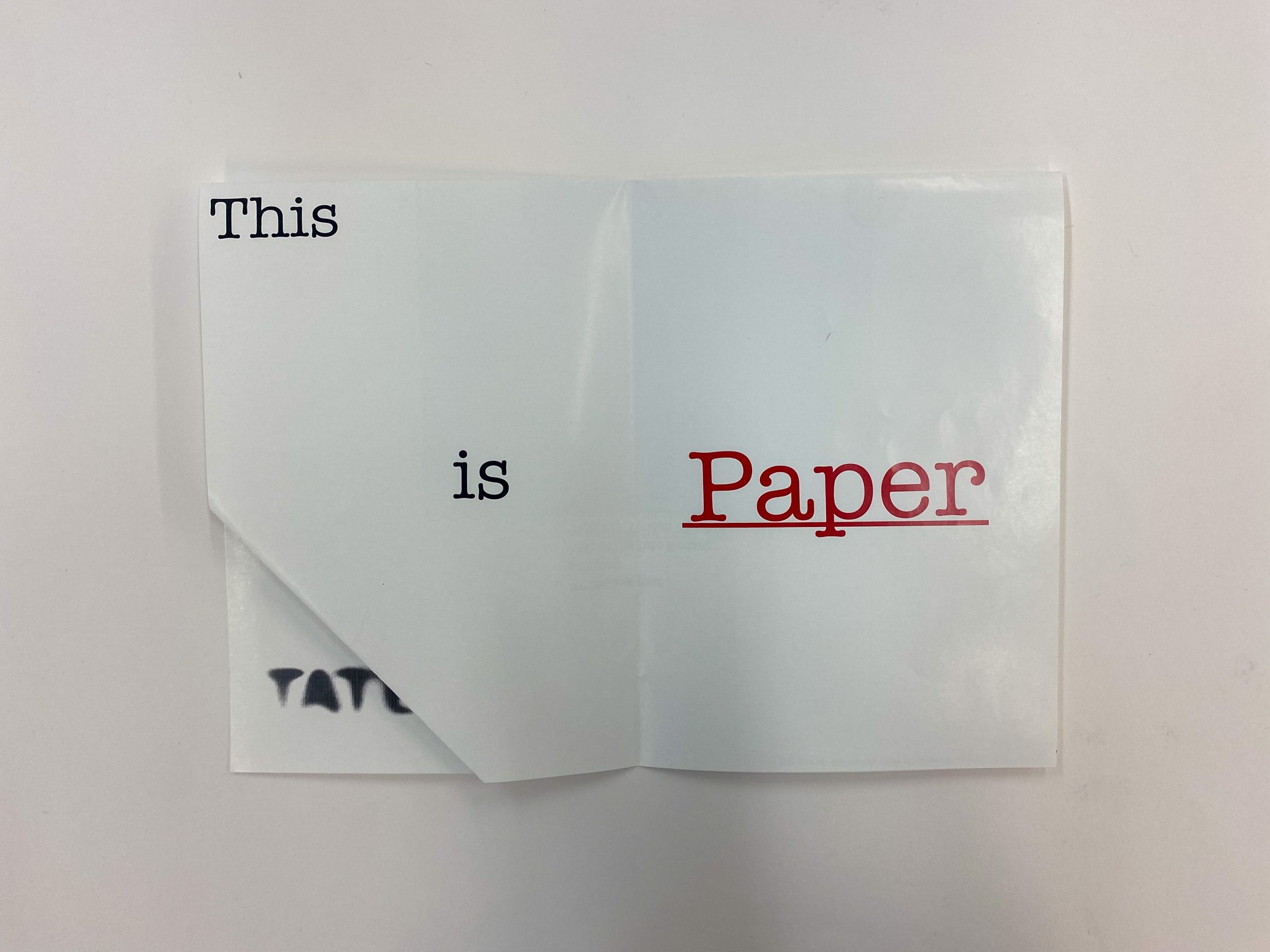
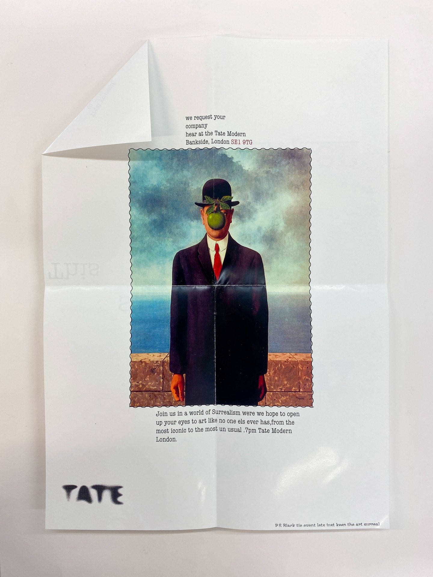
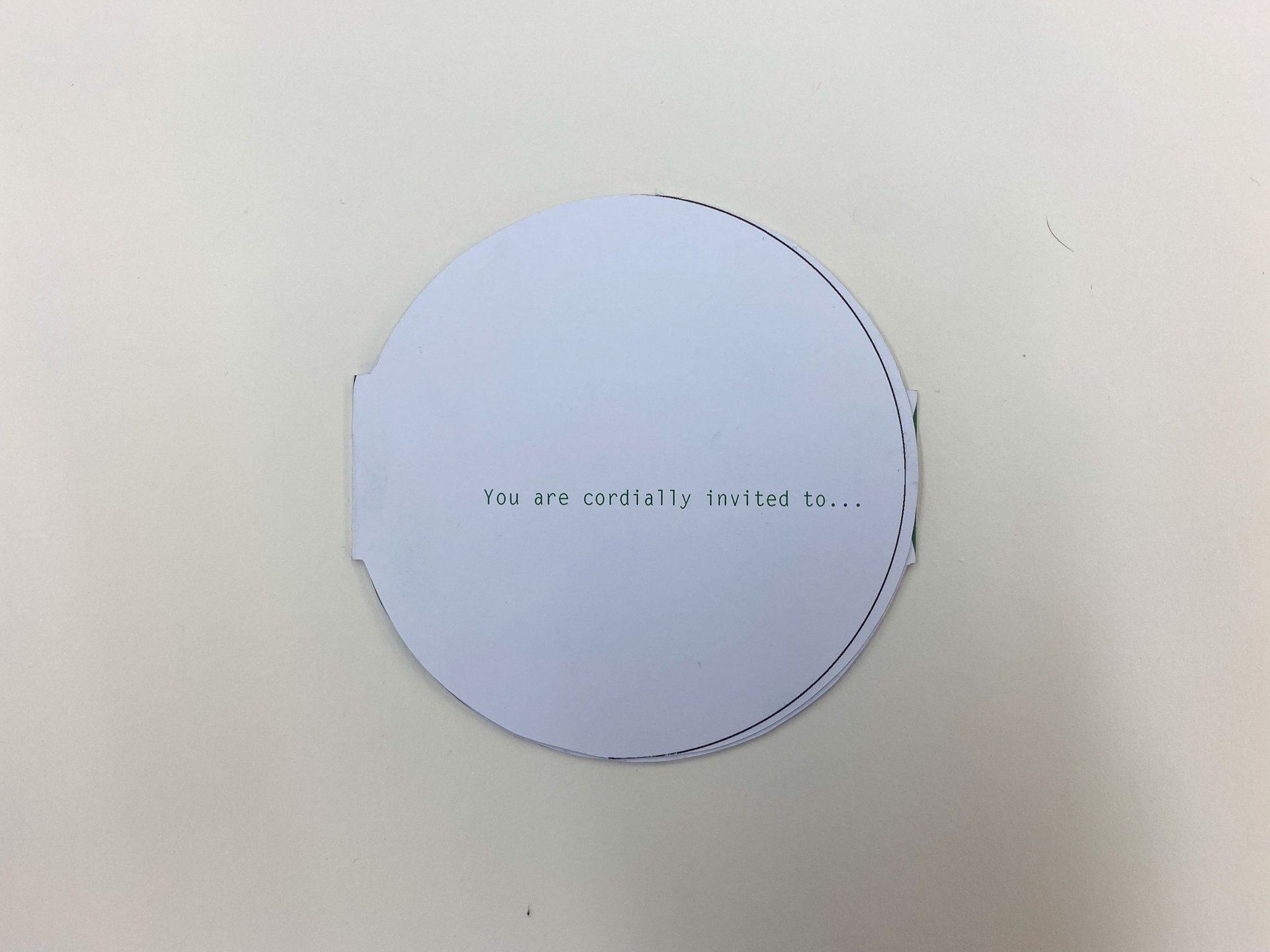
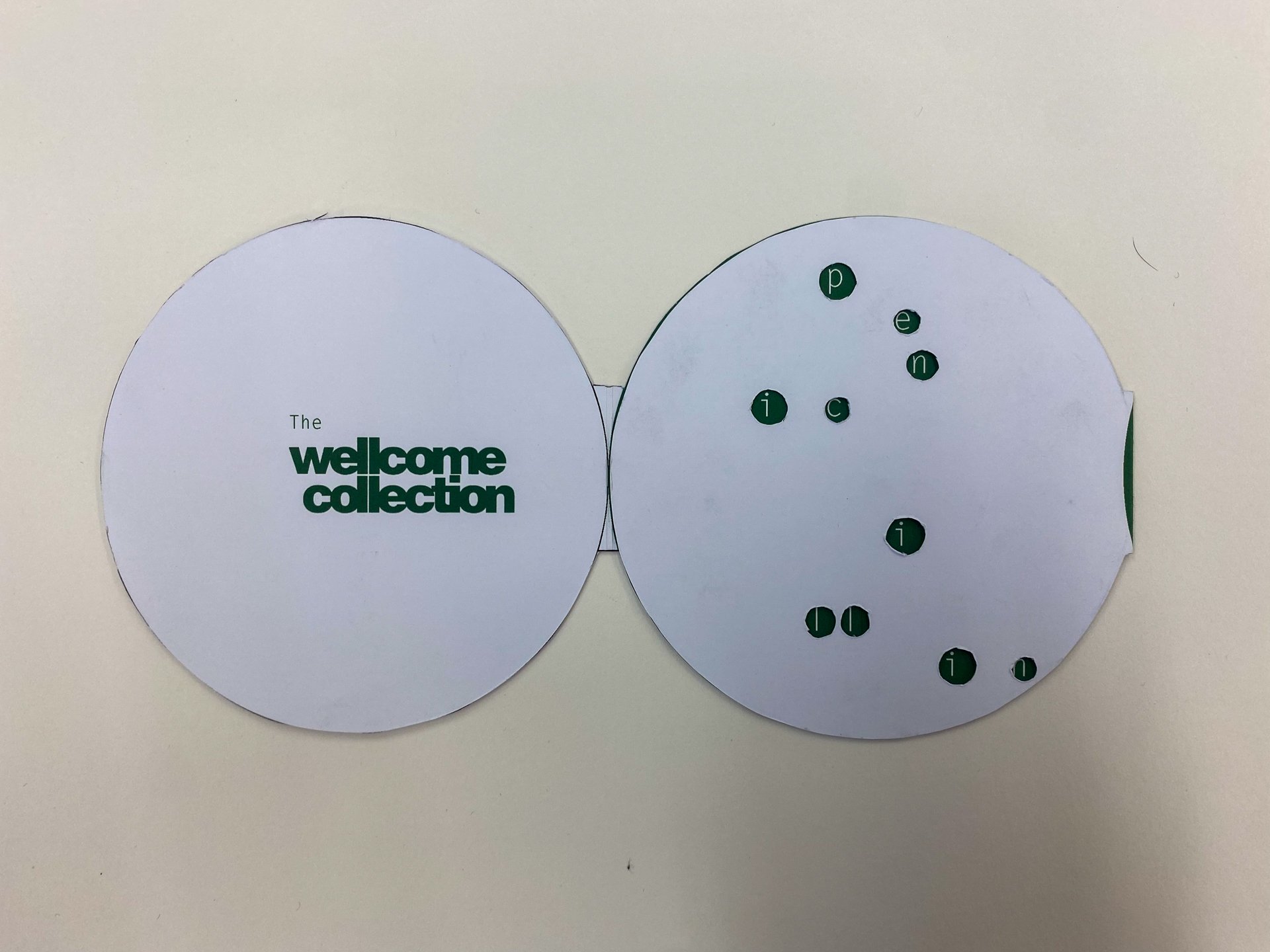
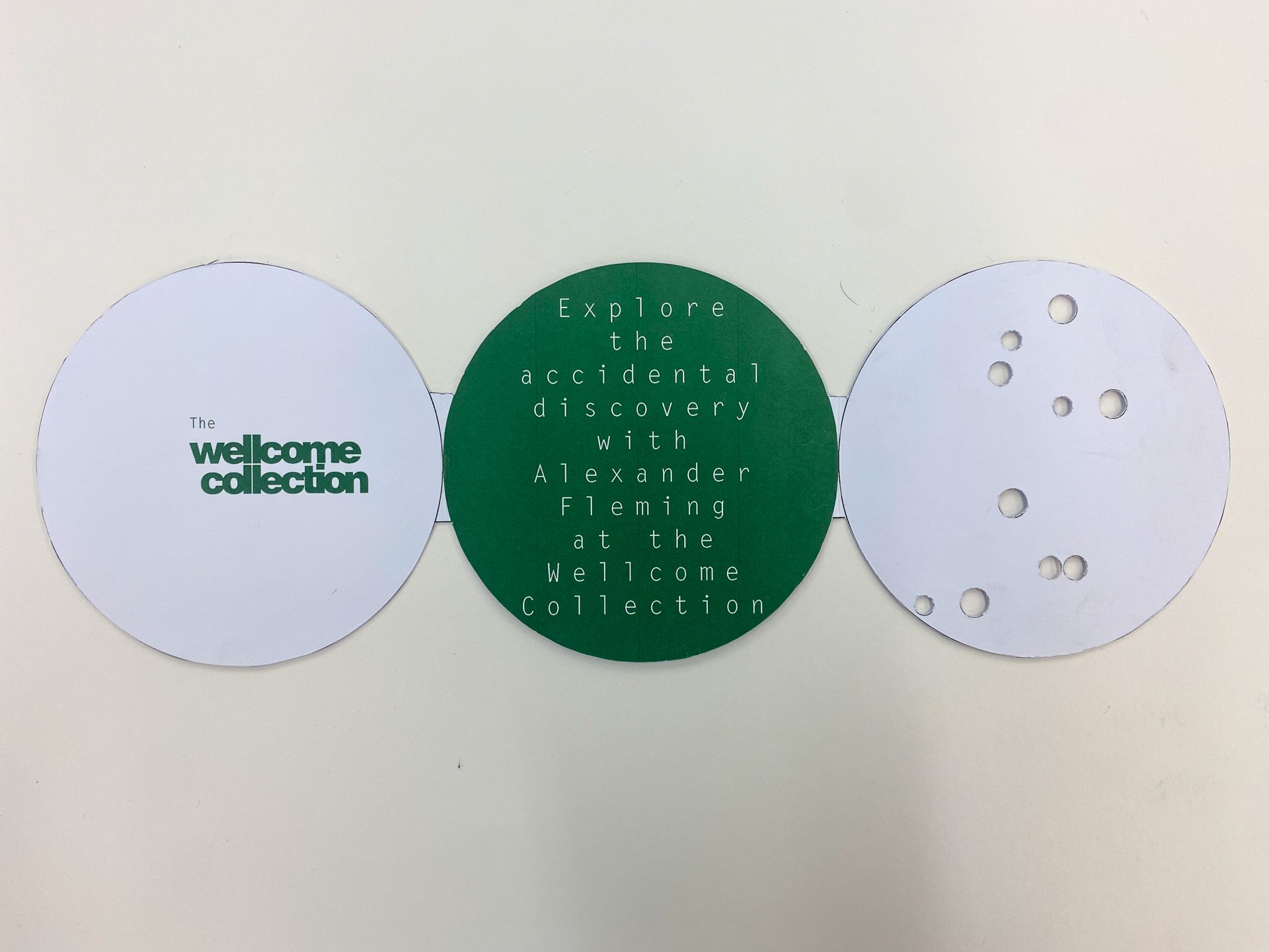
Graphic design first years have recently completed their fourth creative brief roughly halfway through their first semester here at Preston. The latest task was to produce an invitation to the opening of an exhibition, at a Museum or public space.
This year staff were presented with a bumper crop of responses in both creativity, and craft. Also pleasing was the thought given to the copywriting and how that supported the idea (and on occasion was the idea).
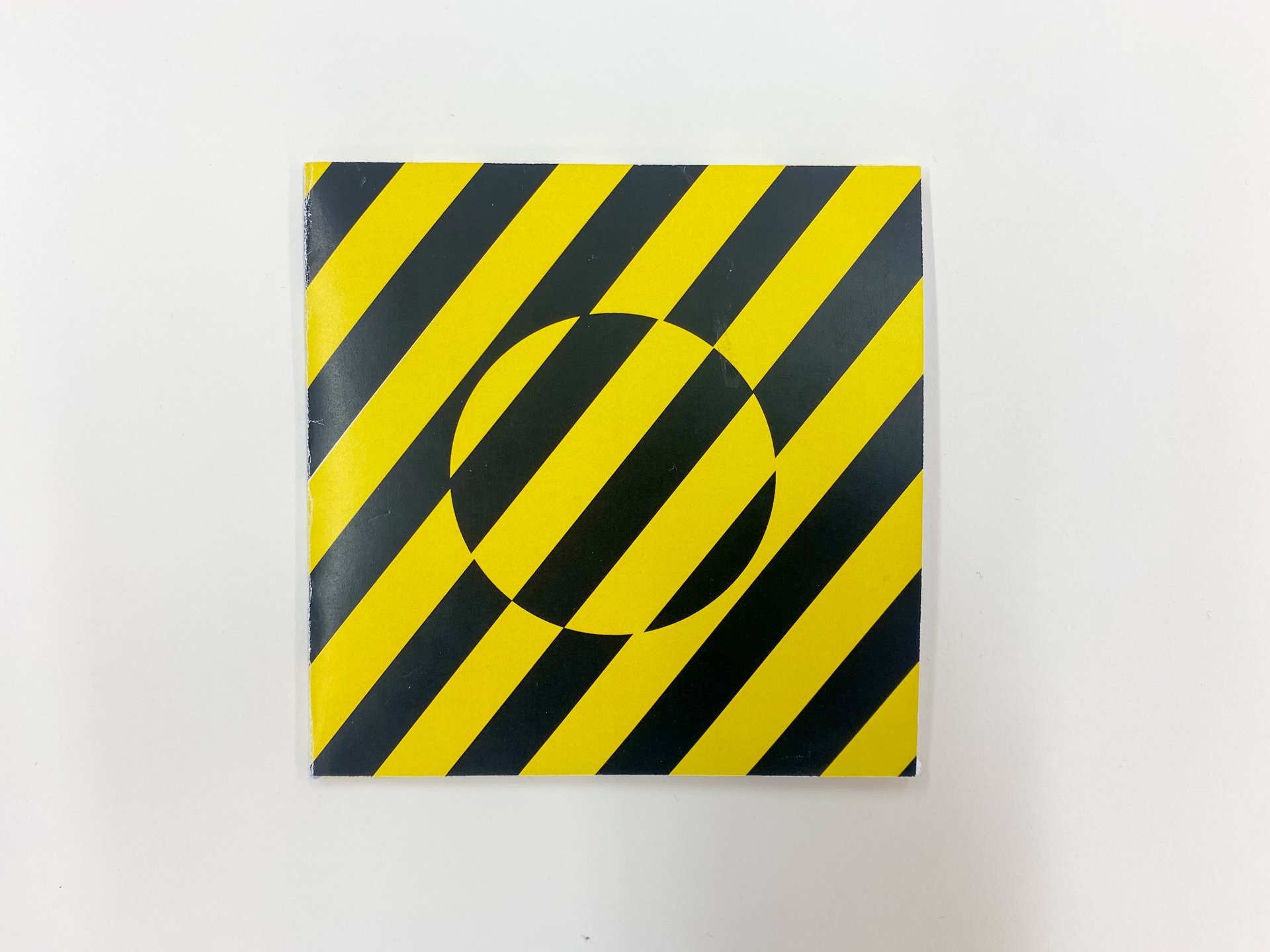
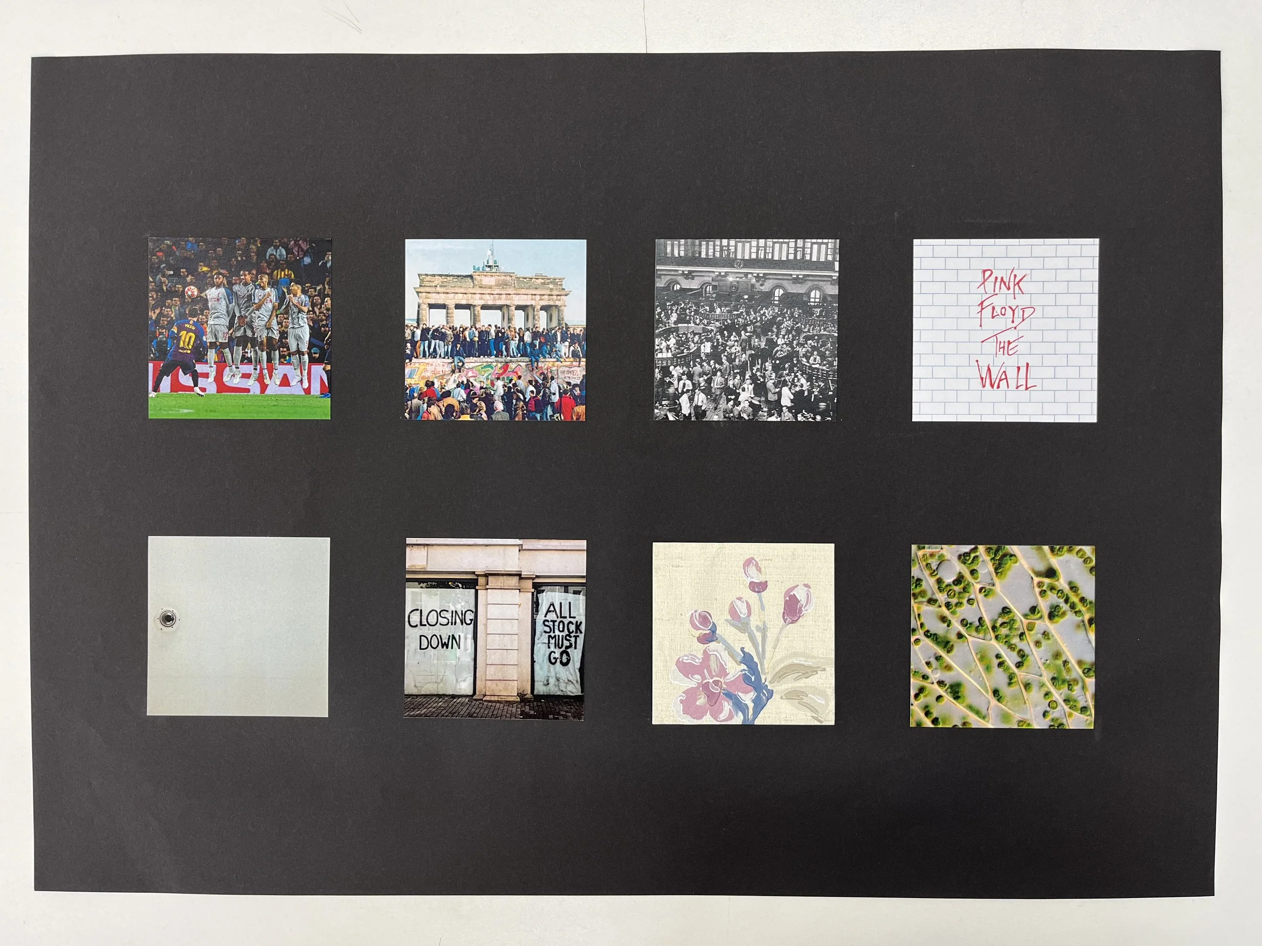
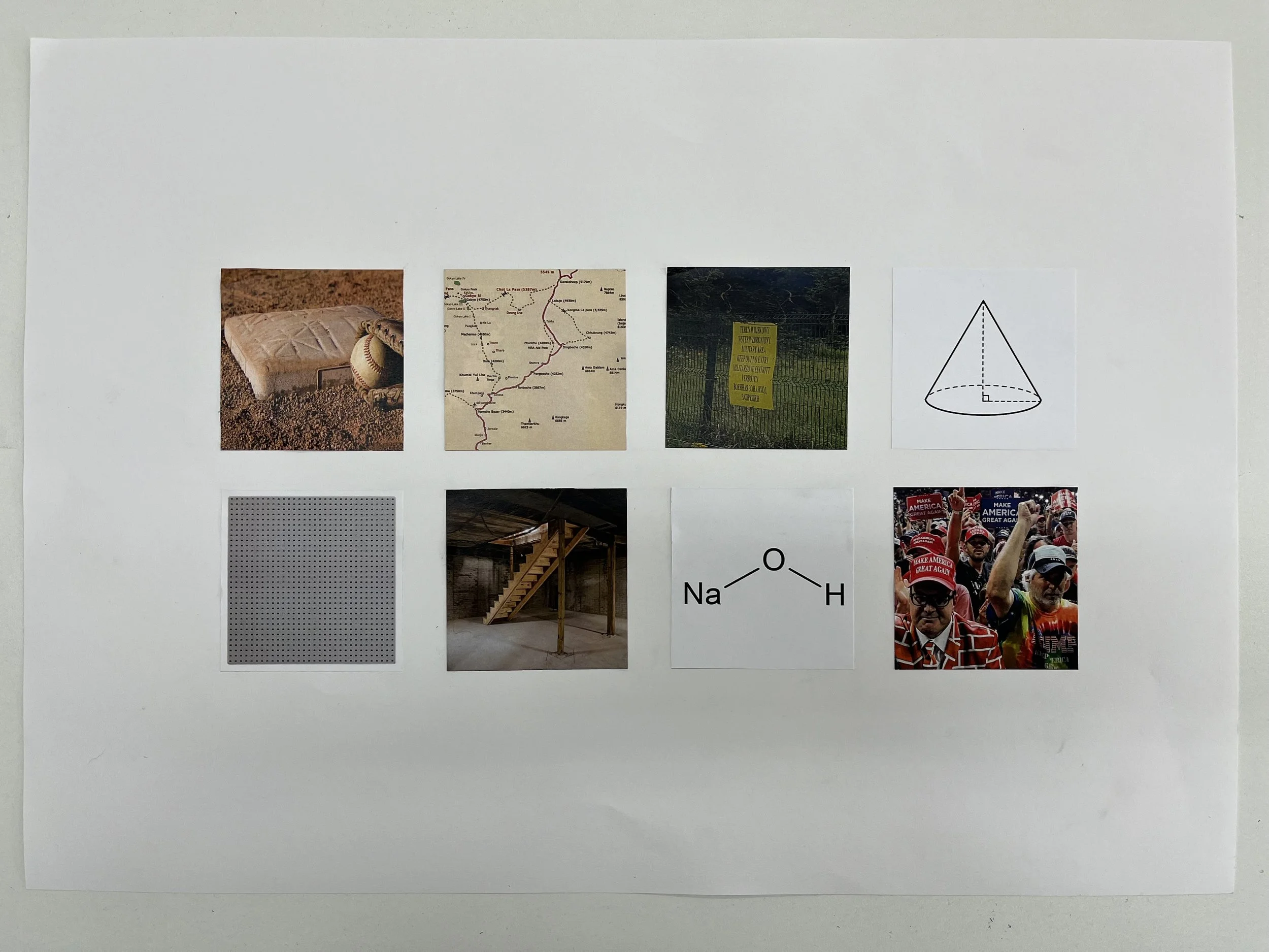
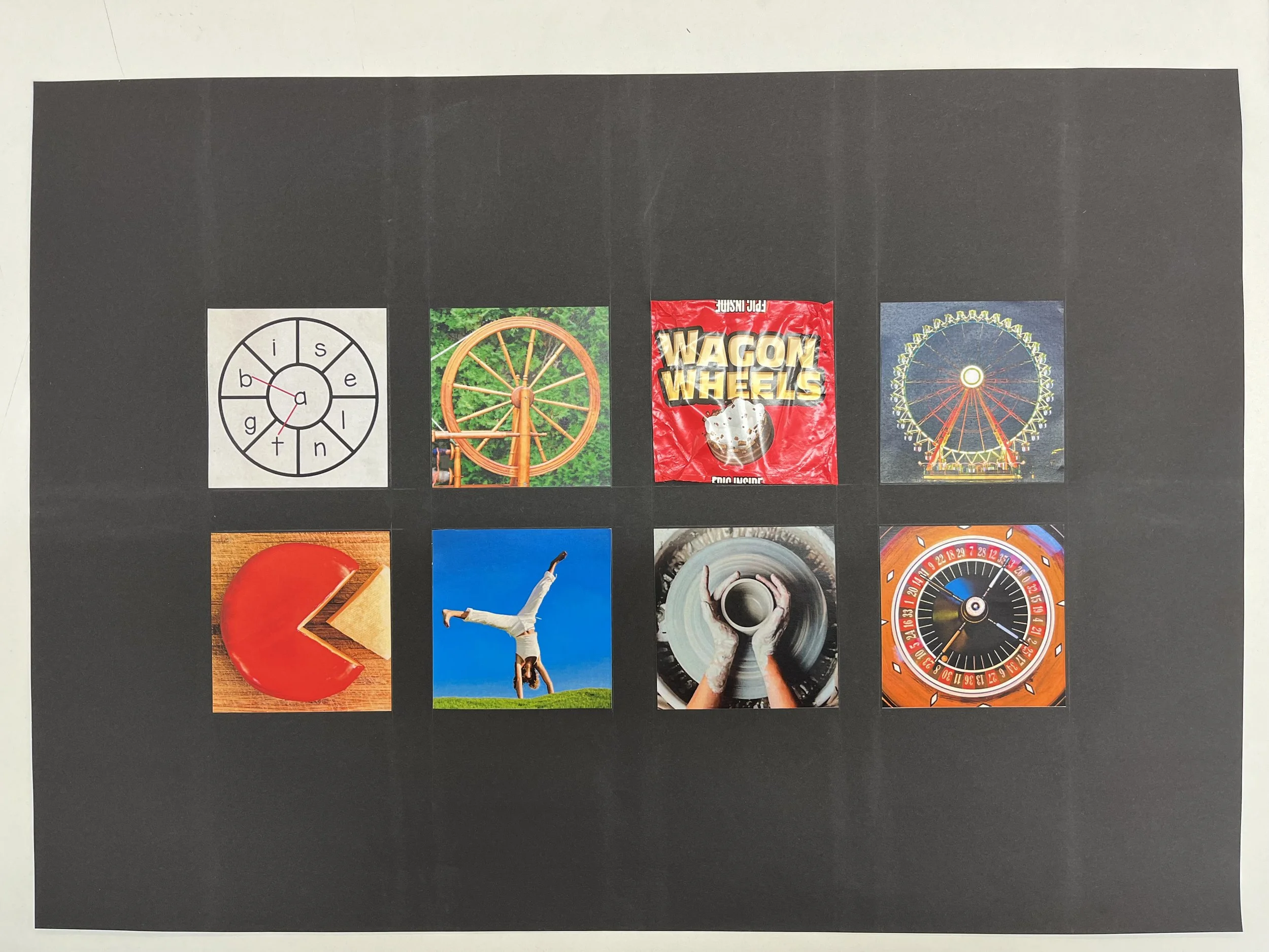
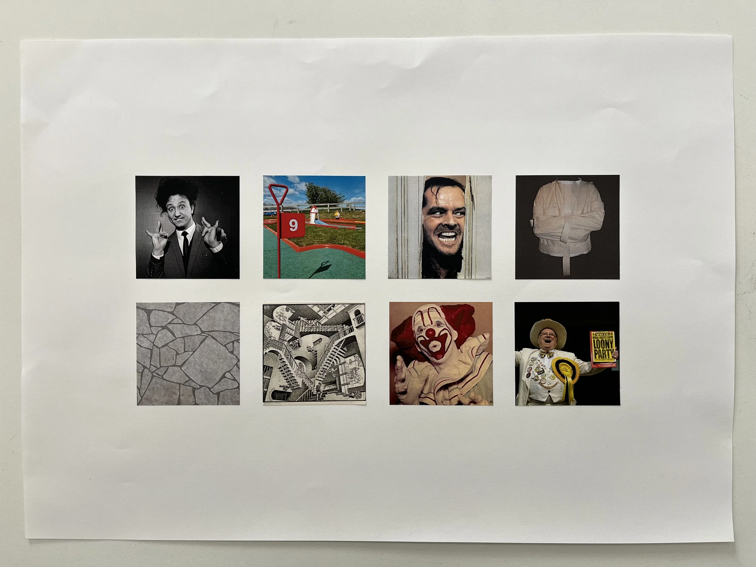
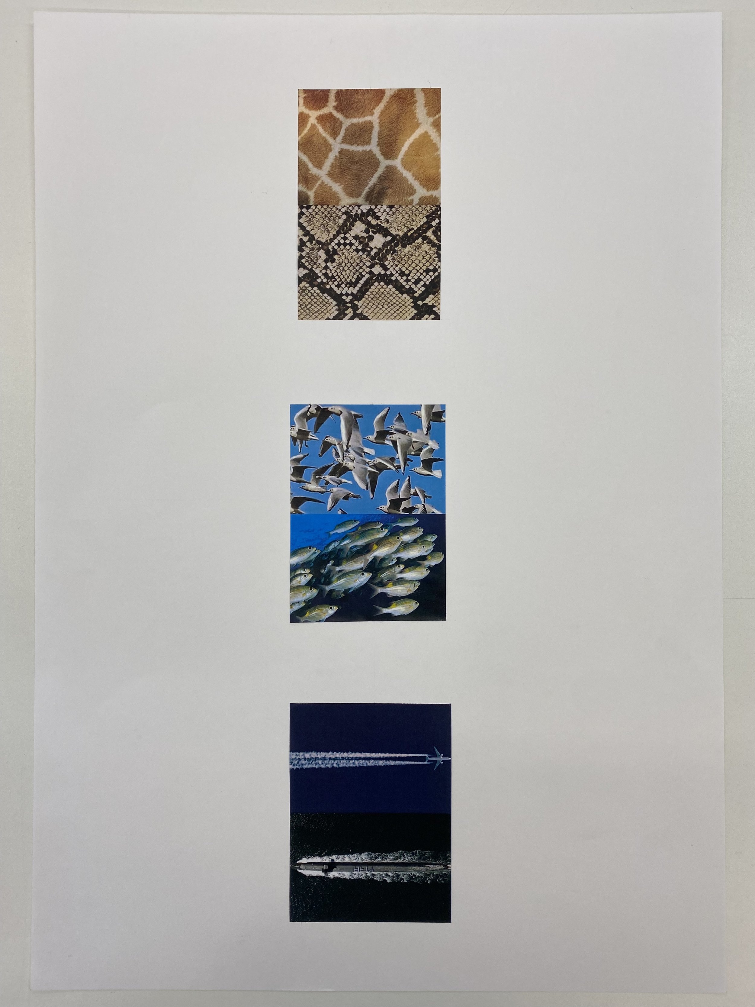
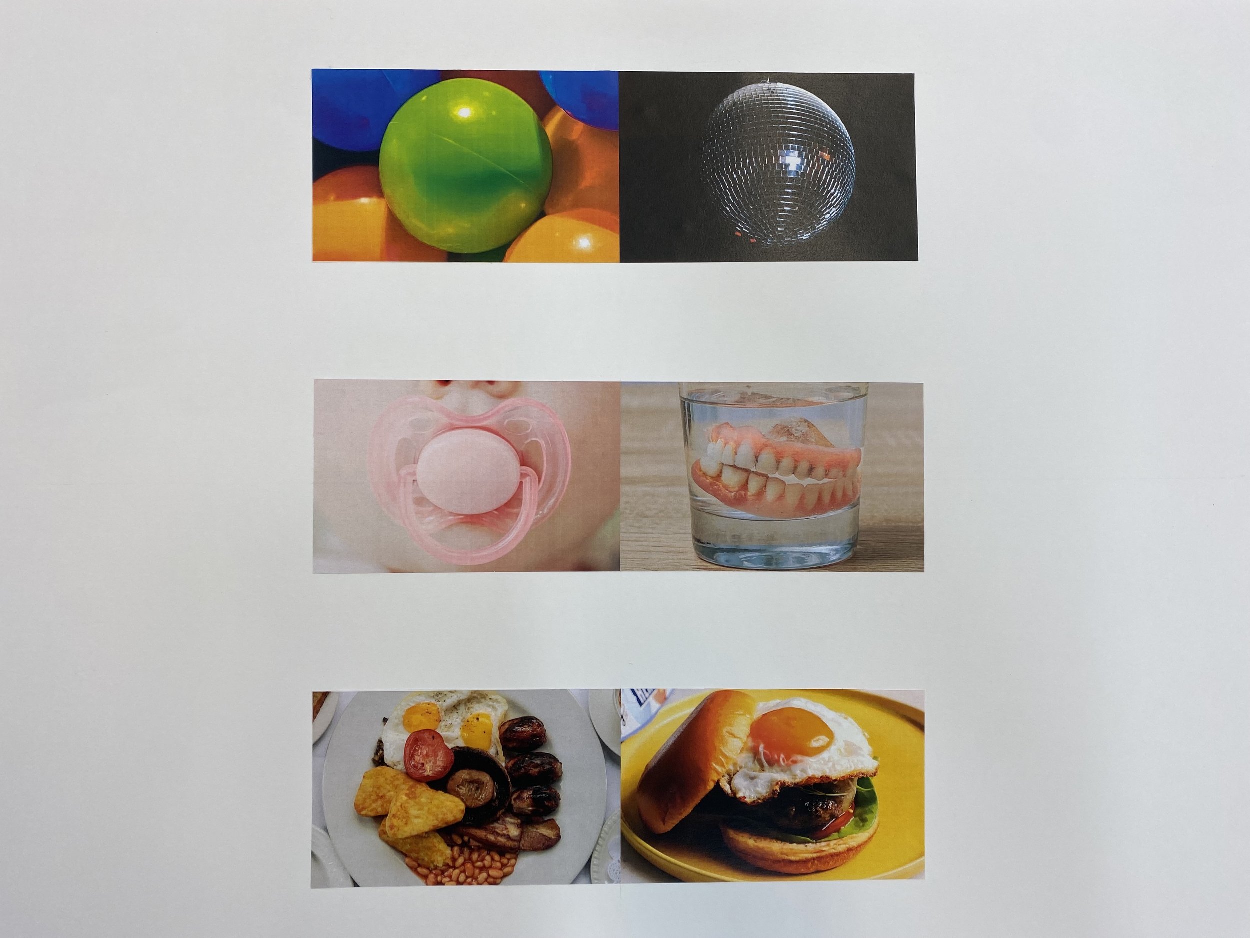
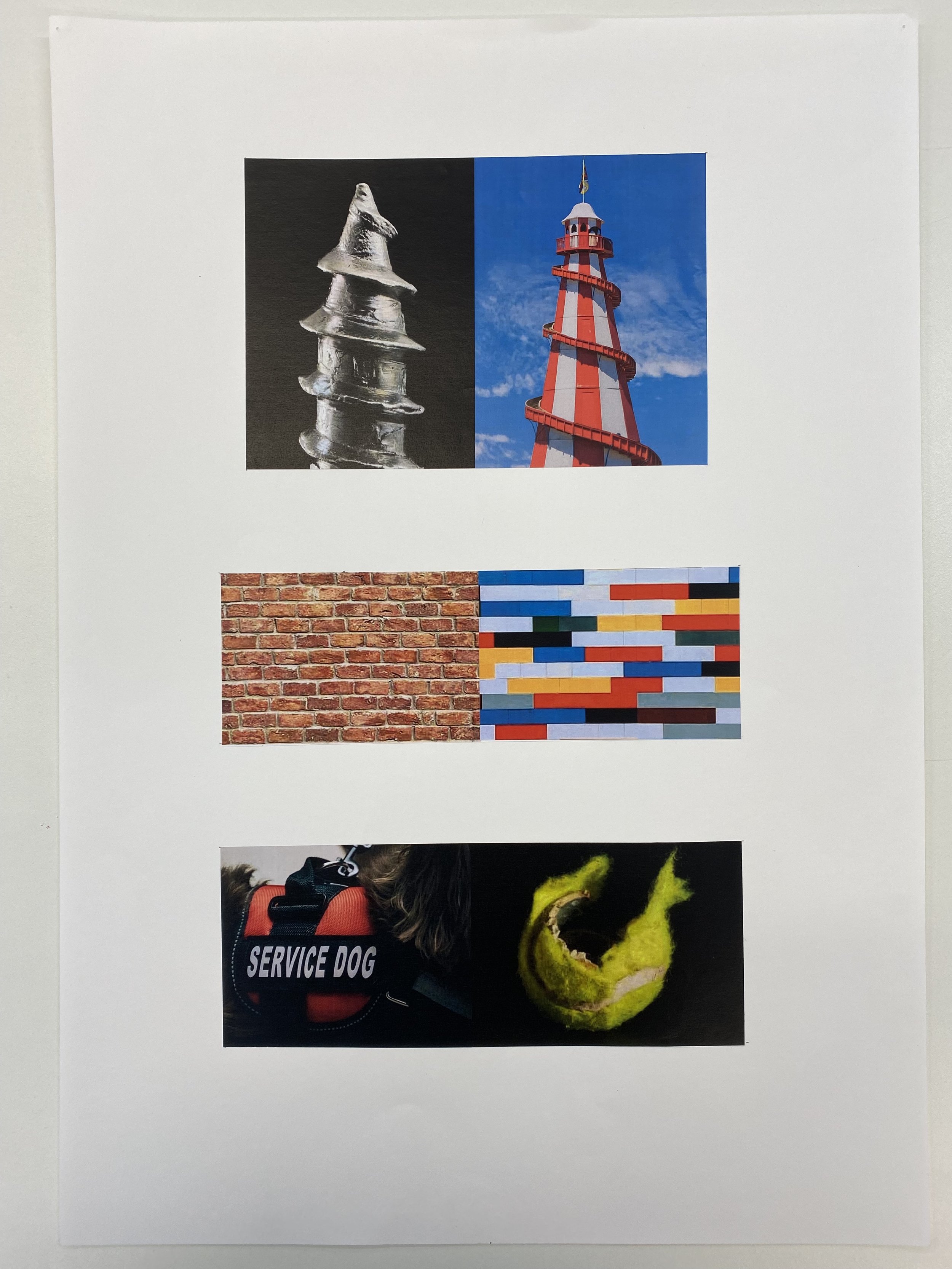
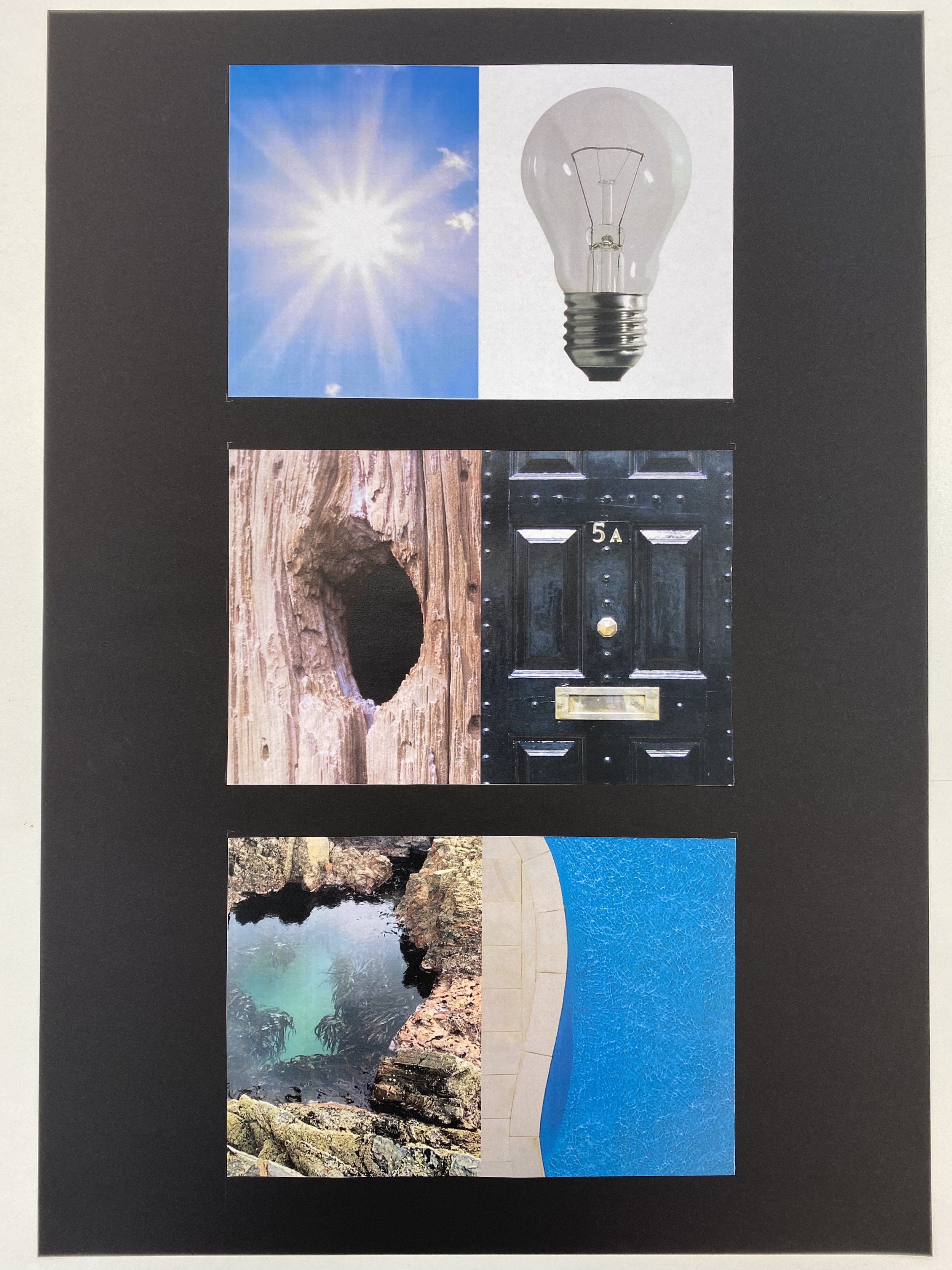
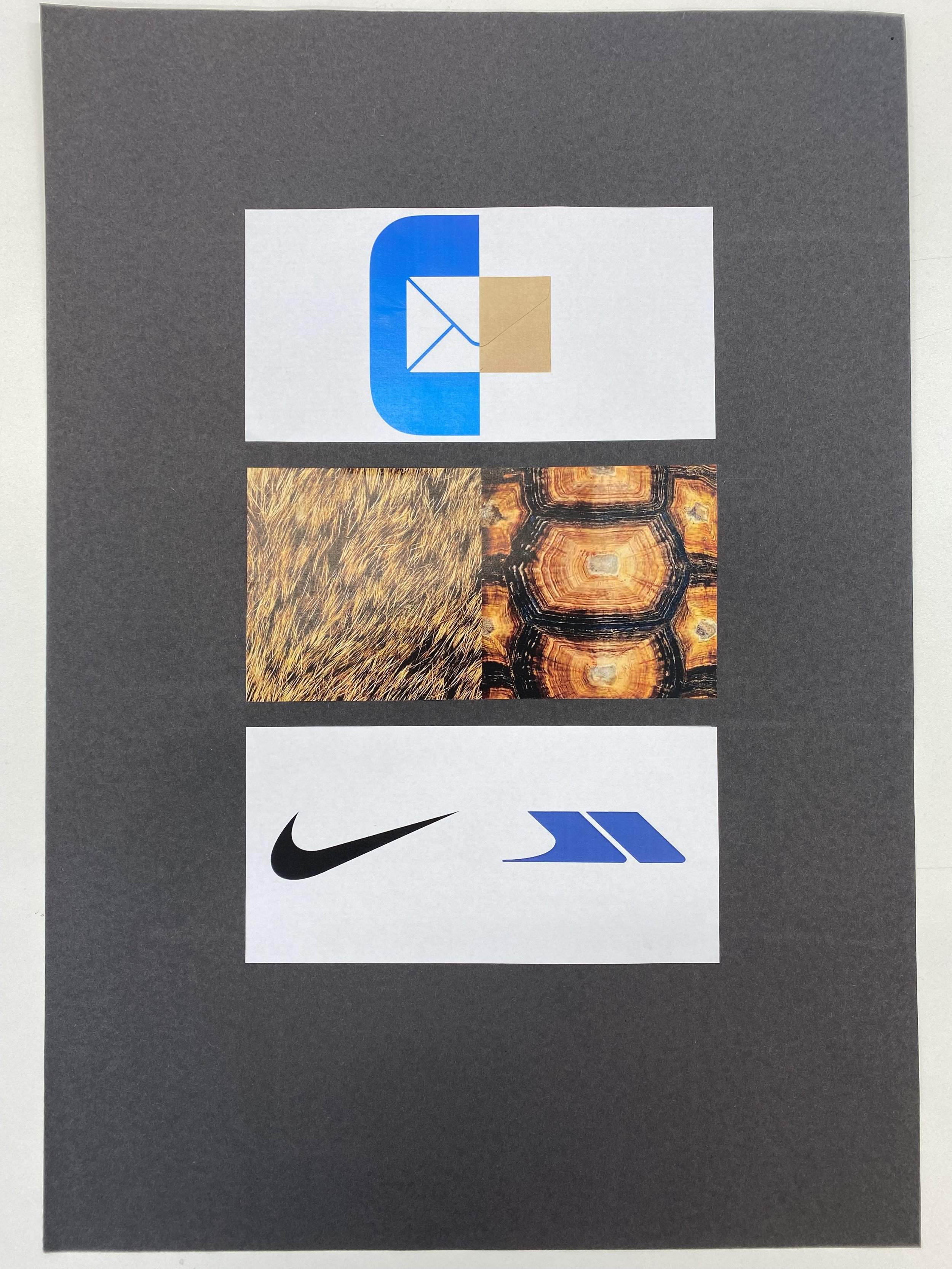
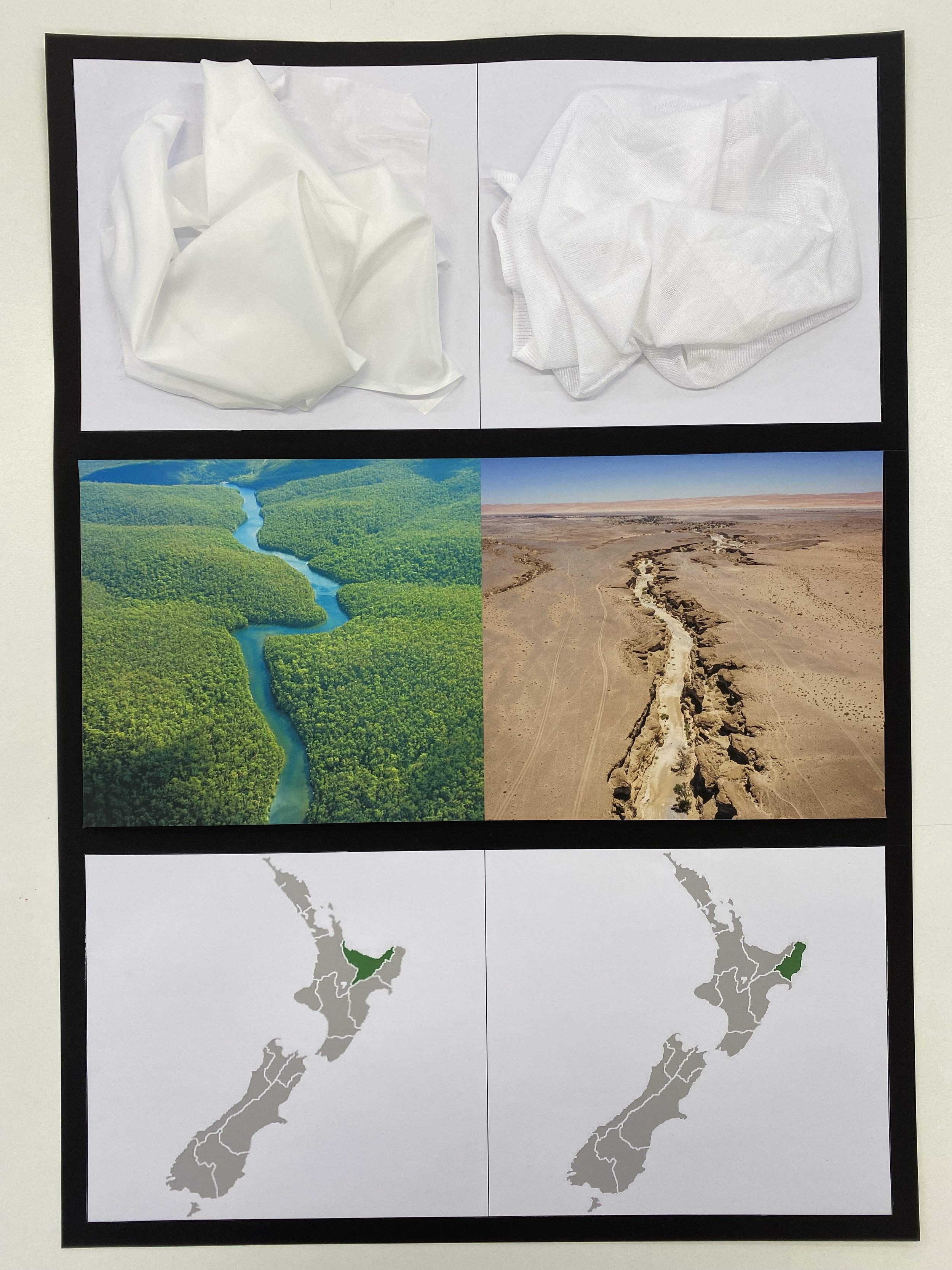
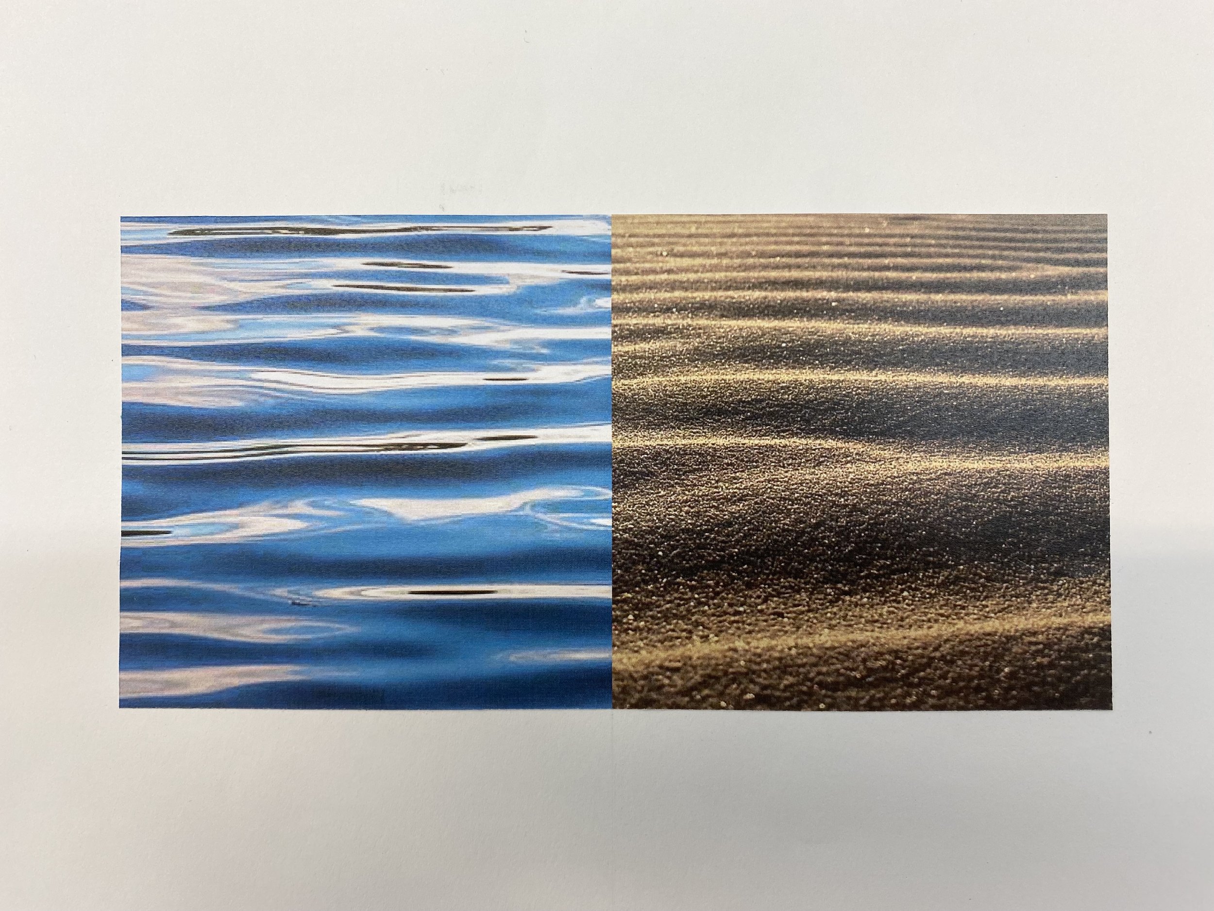
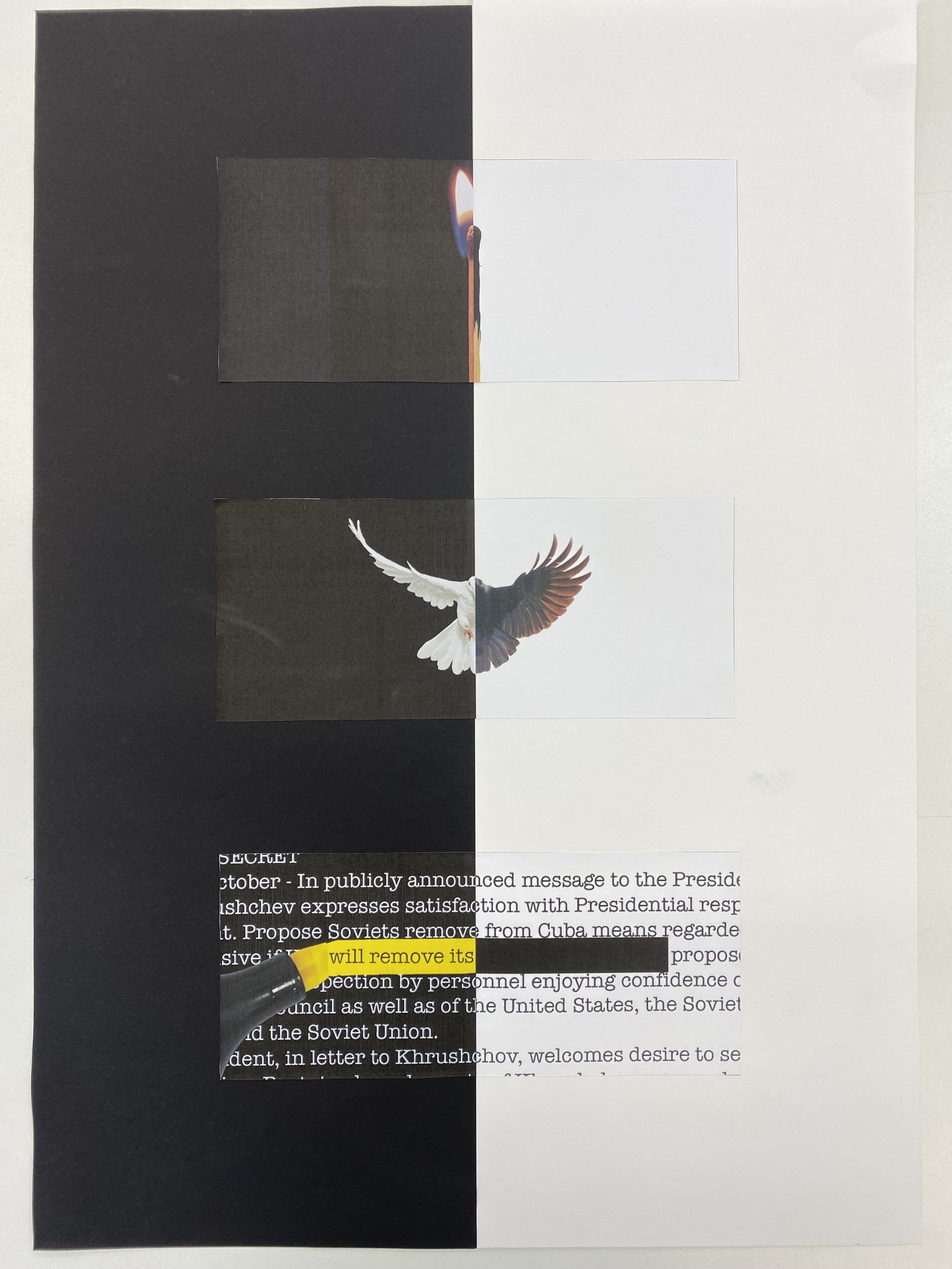
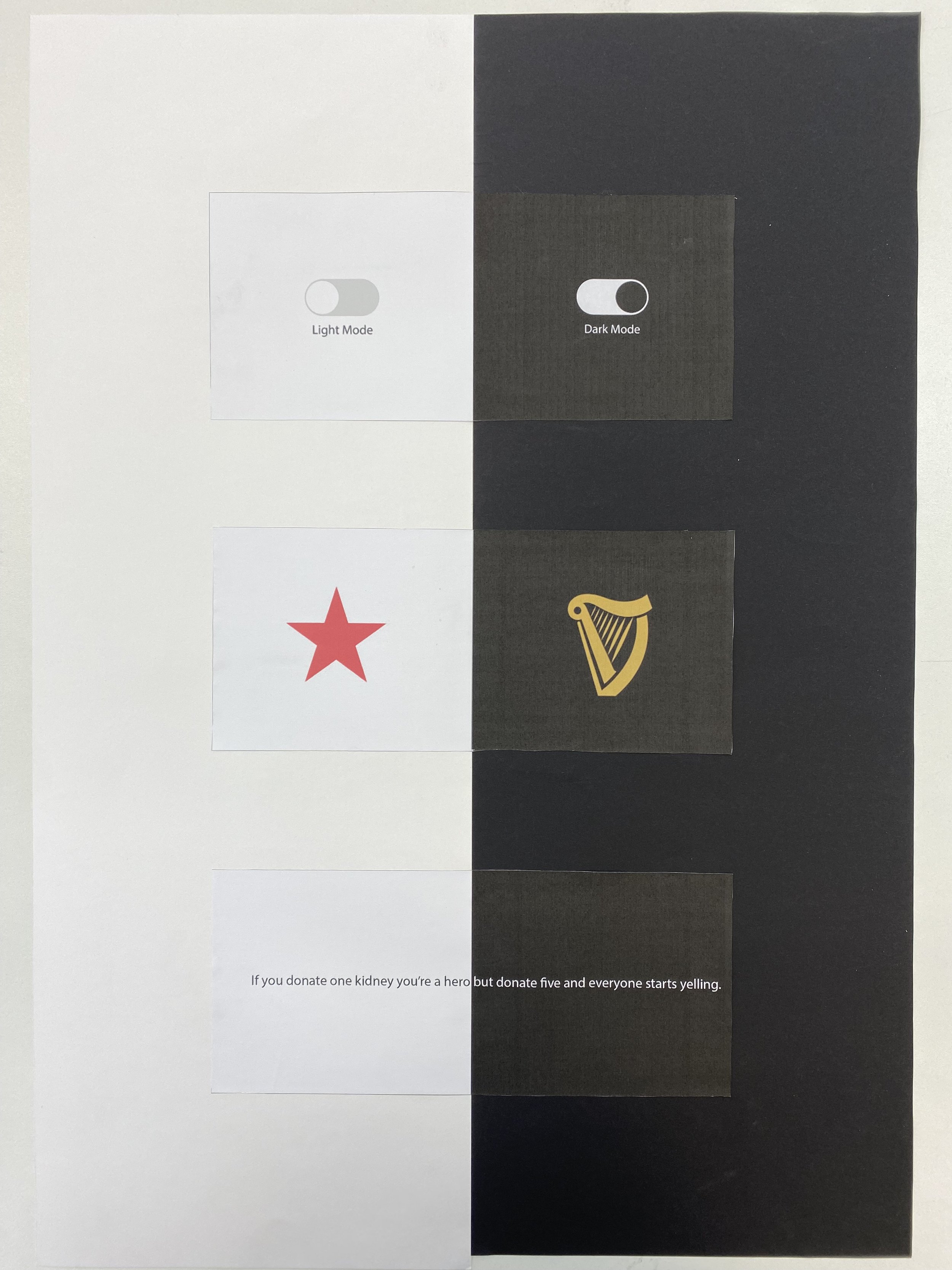
Our most recent first year project was image, taking a theme - high & low for example - and bringing the two opposing ideas together in one composition. The brief is straightforward, but this is a project which requires depth of thought, research and craft. Being a hard brief (this is a regularly used technique, so to be original requires digging deep), many were of a good standard, but only a handful truly surprising.
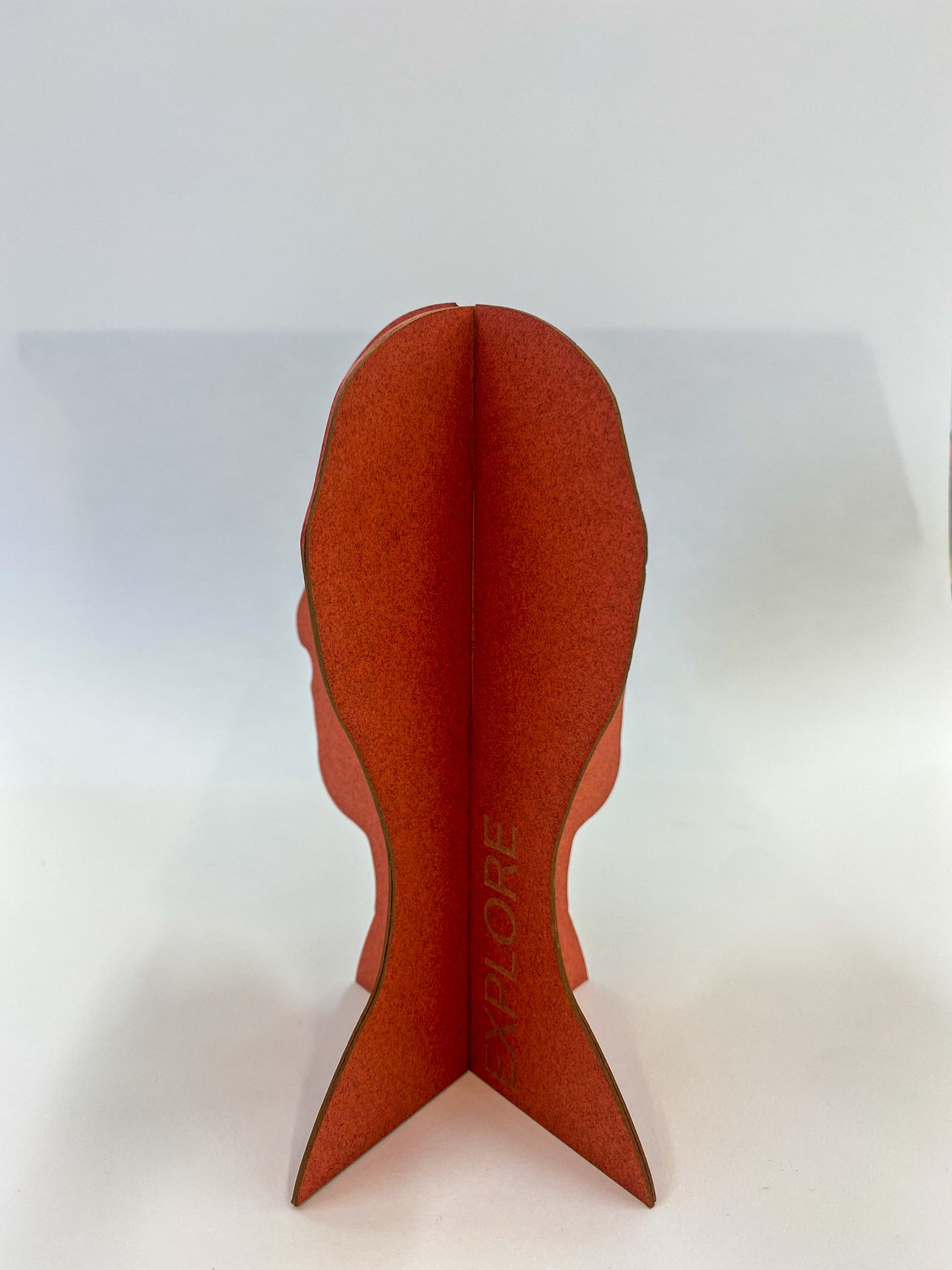
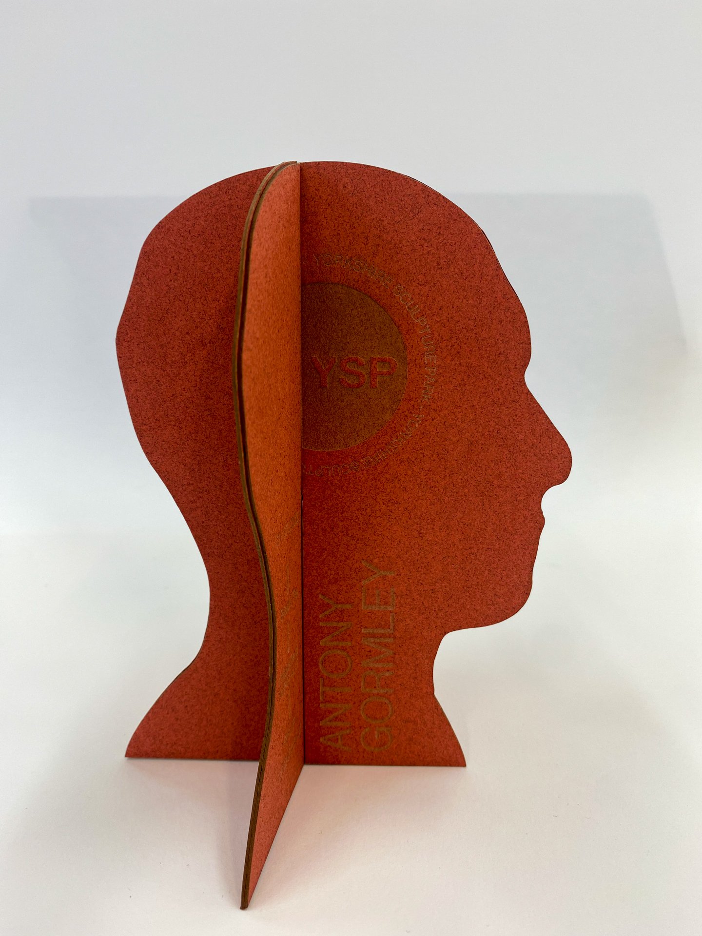
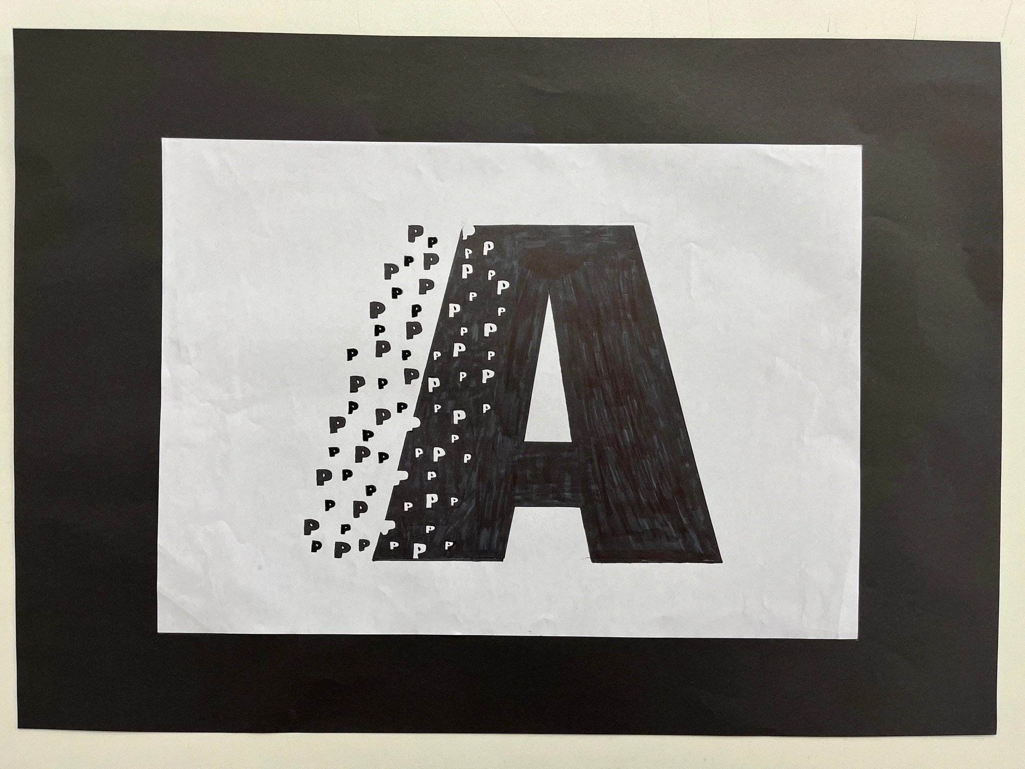
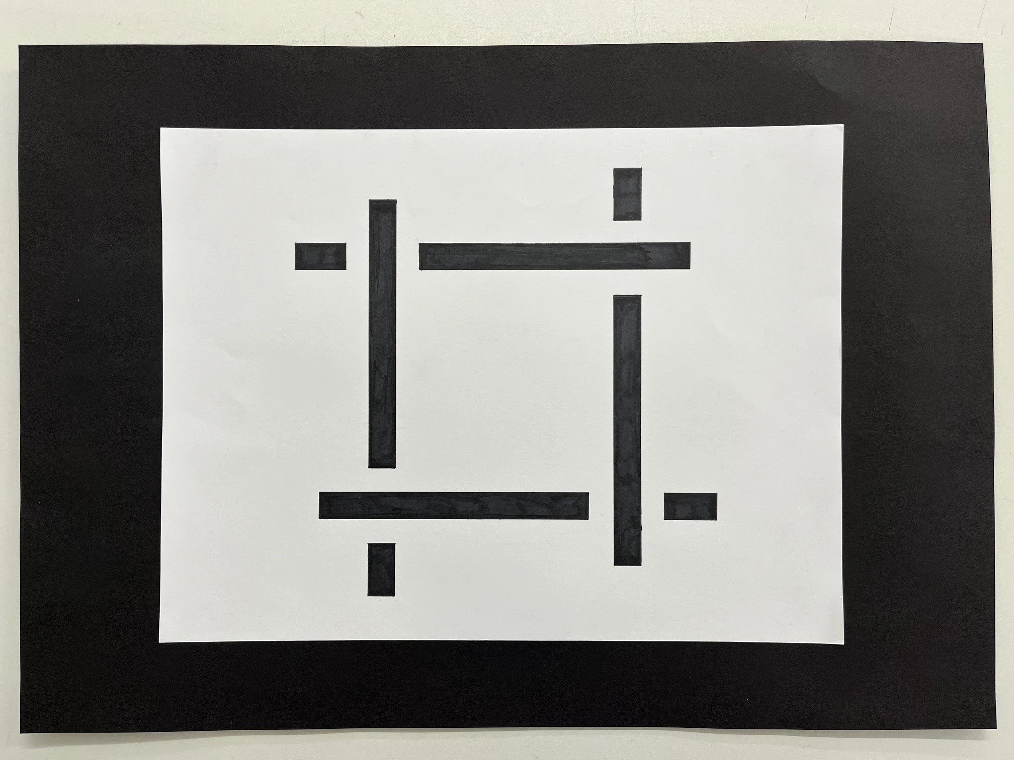
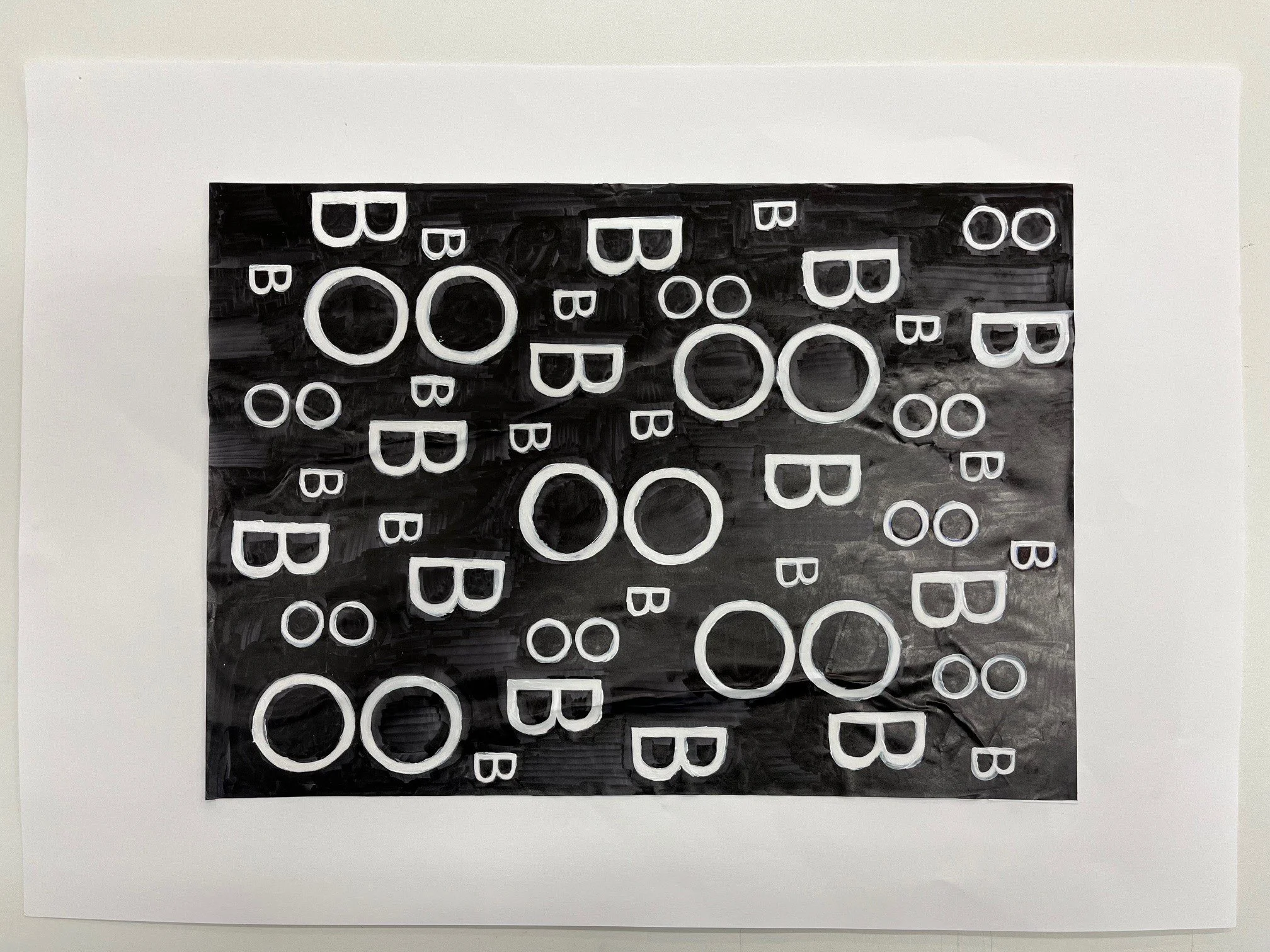
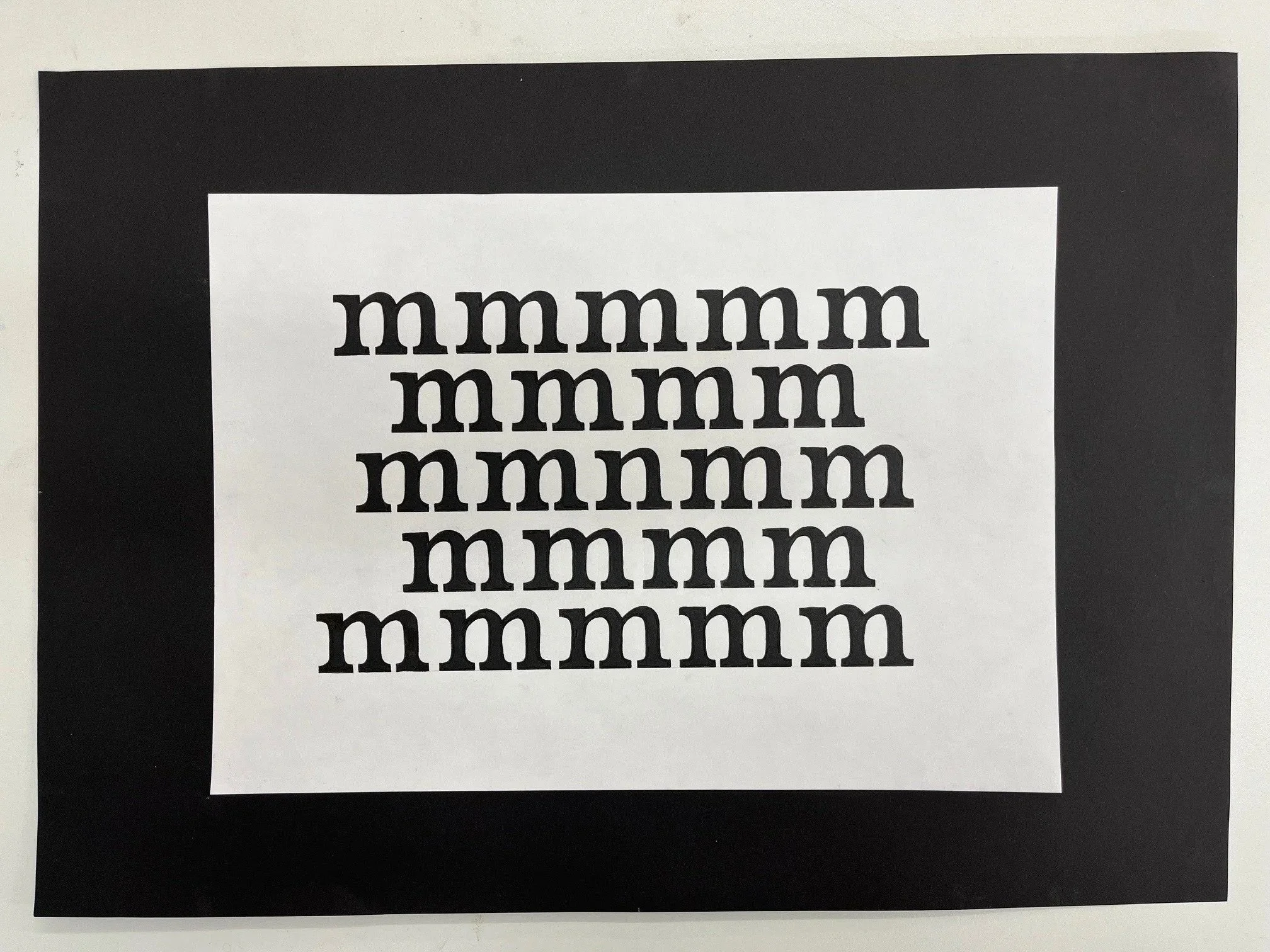
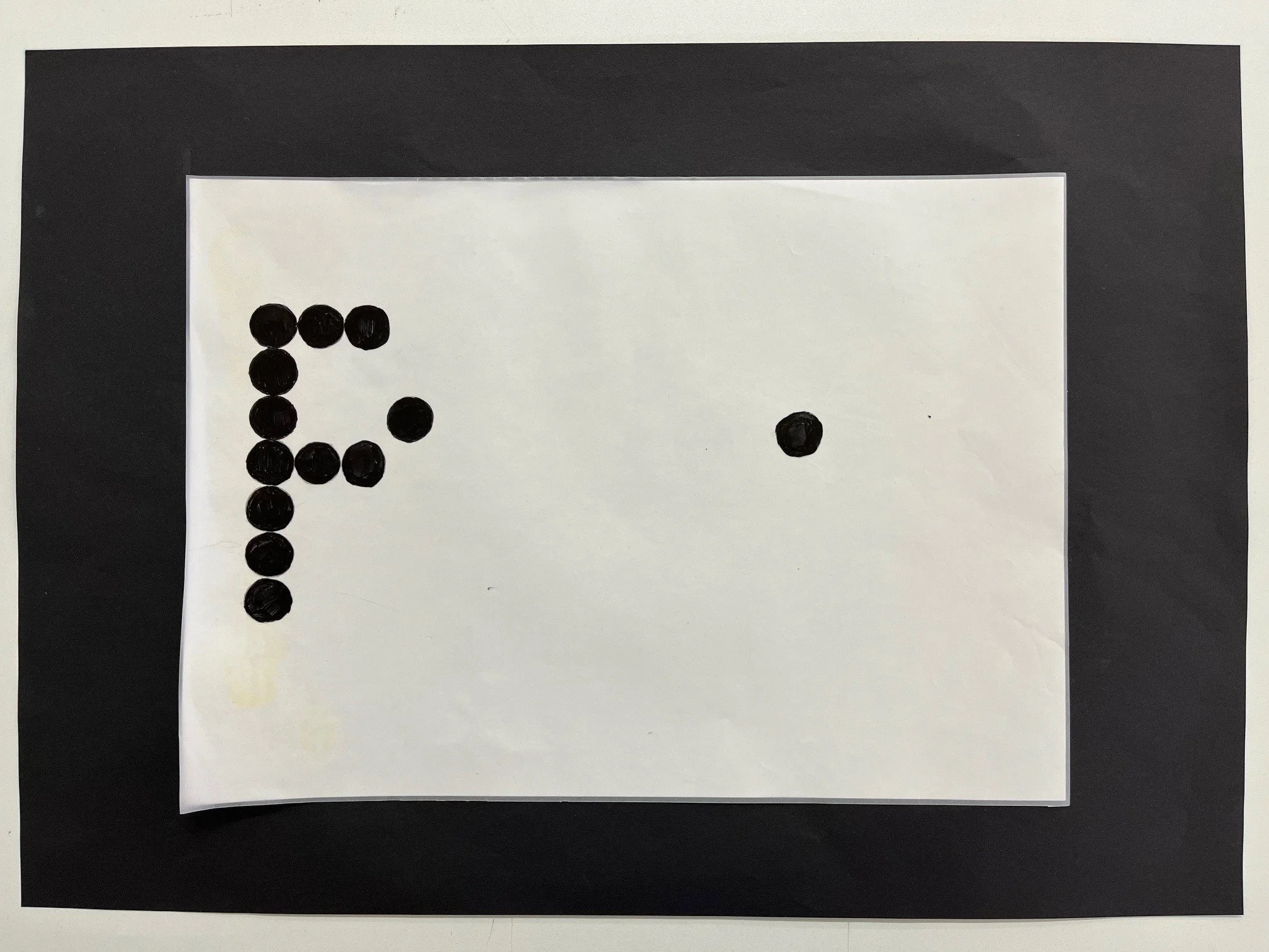
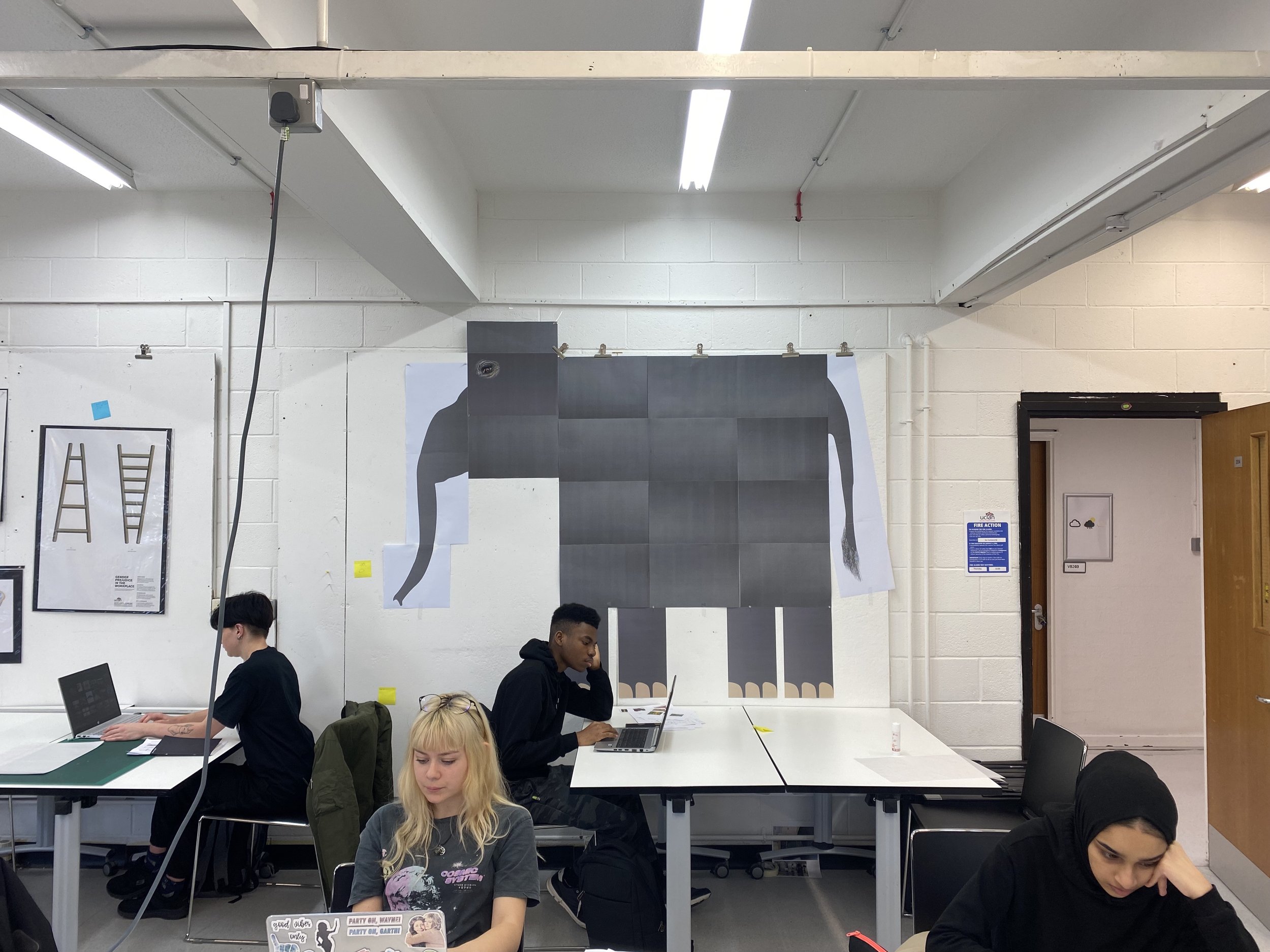
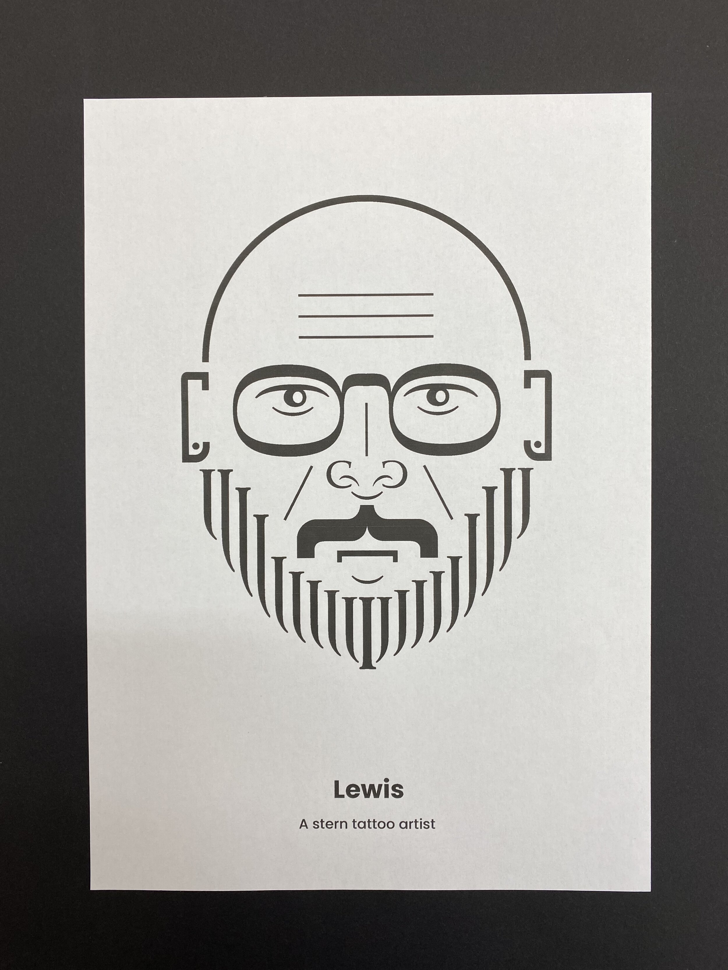
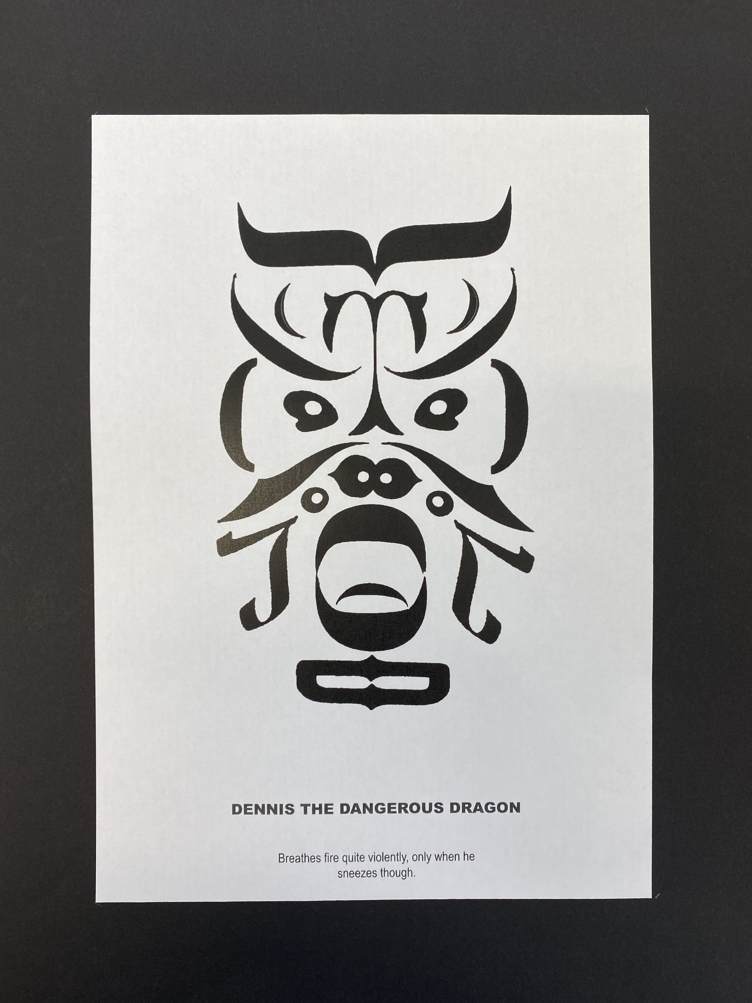
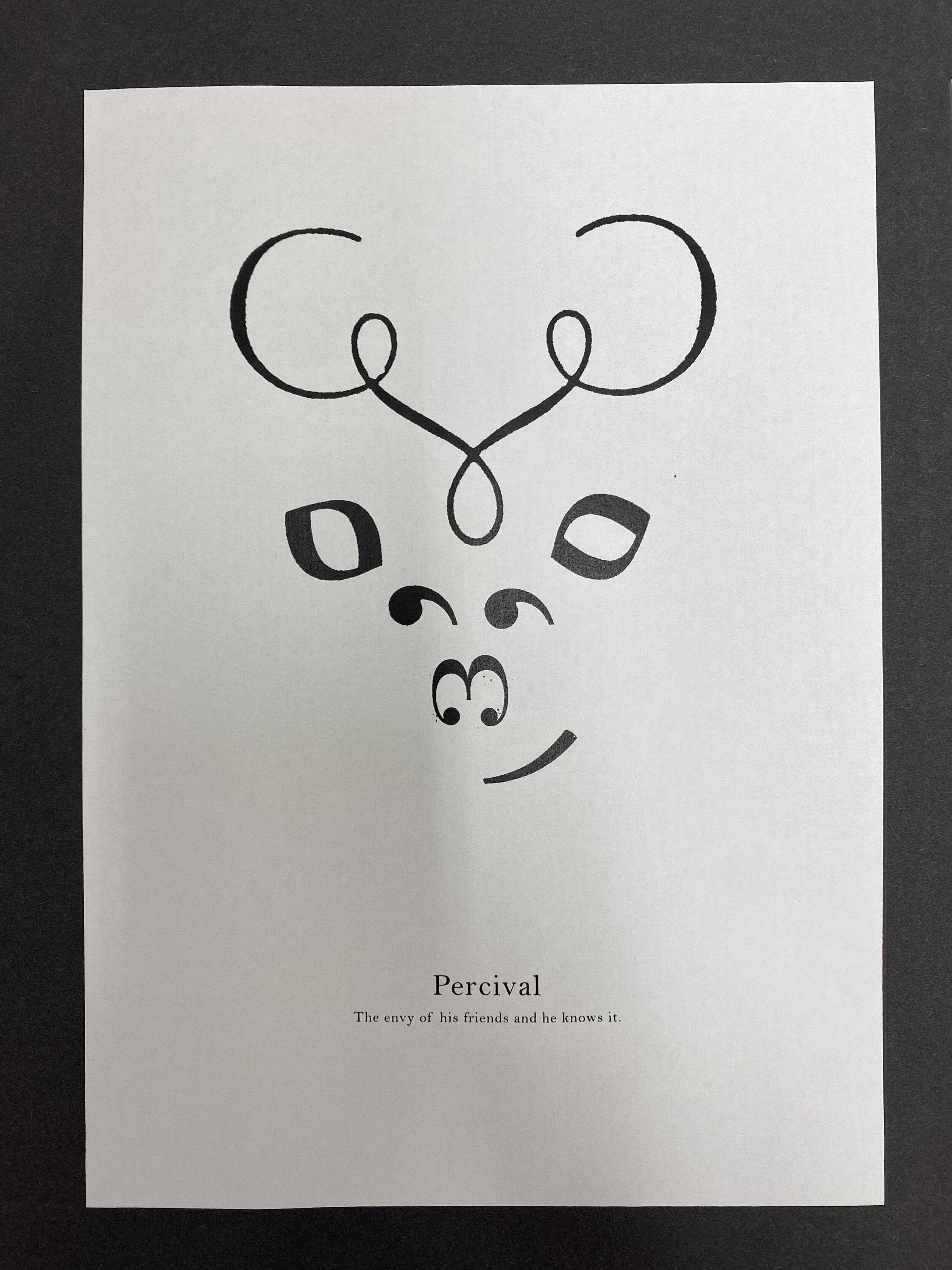
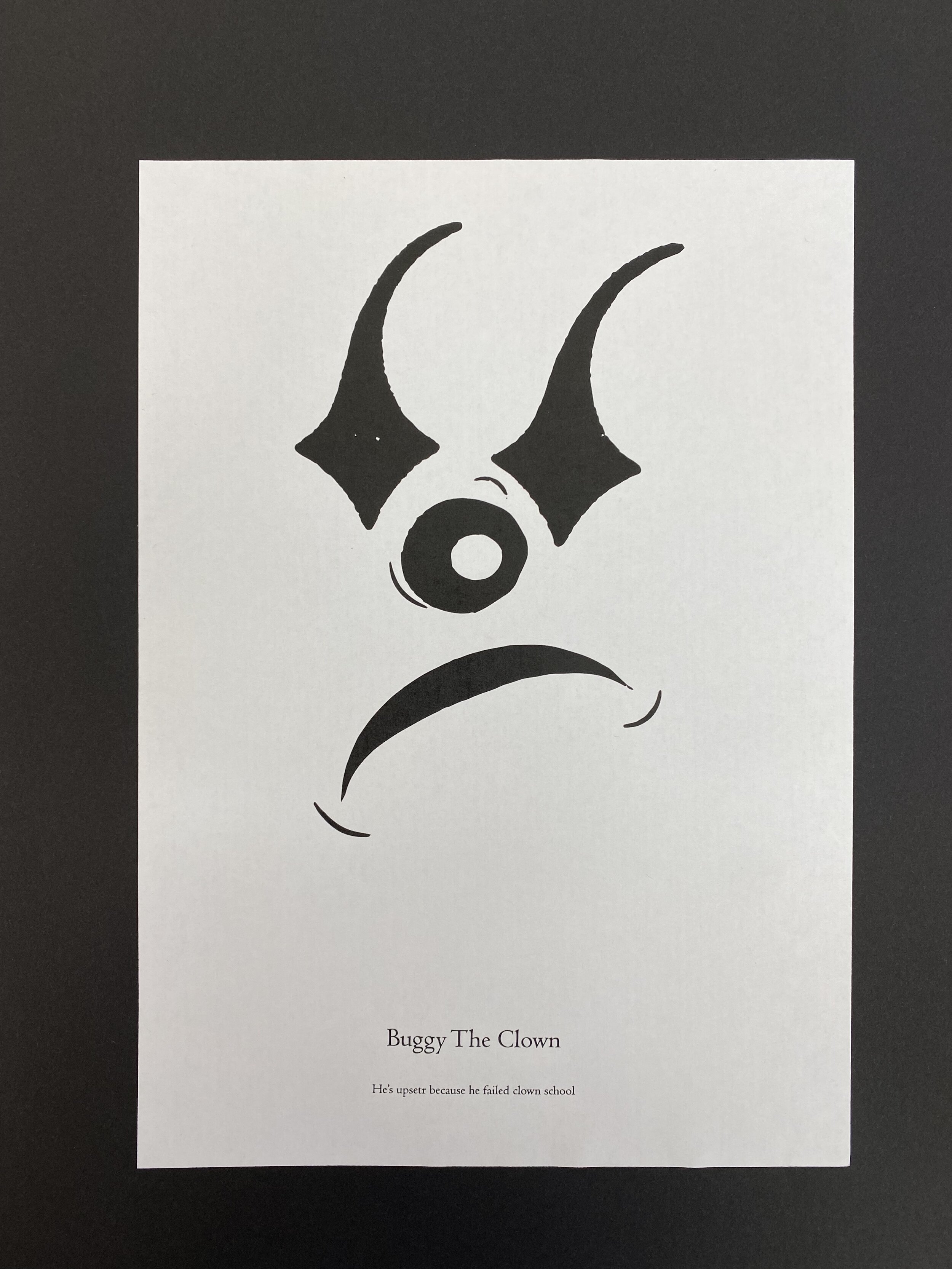
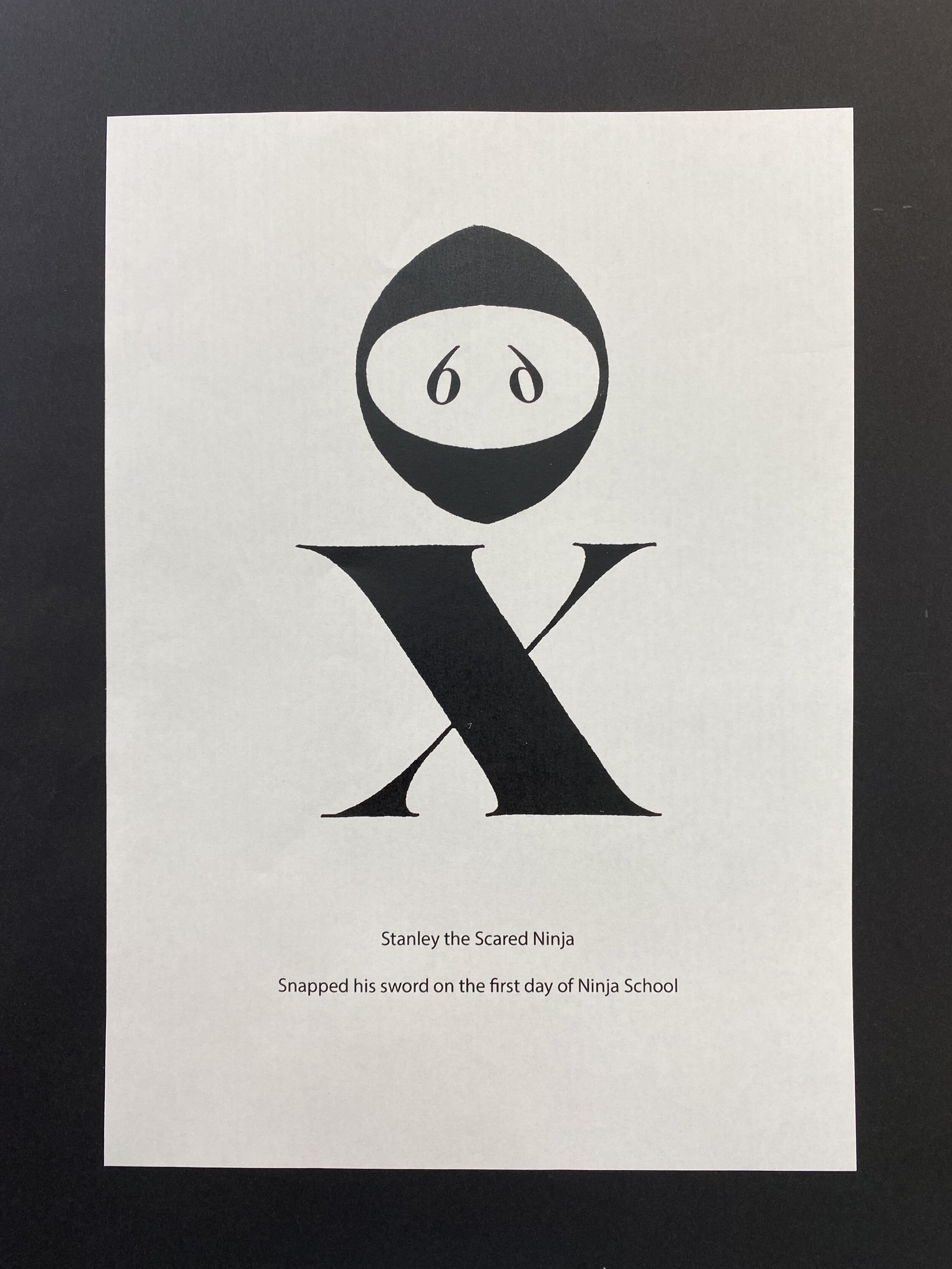
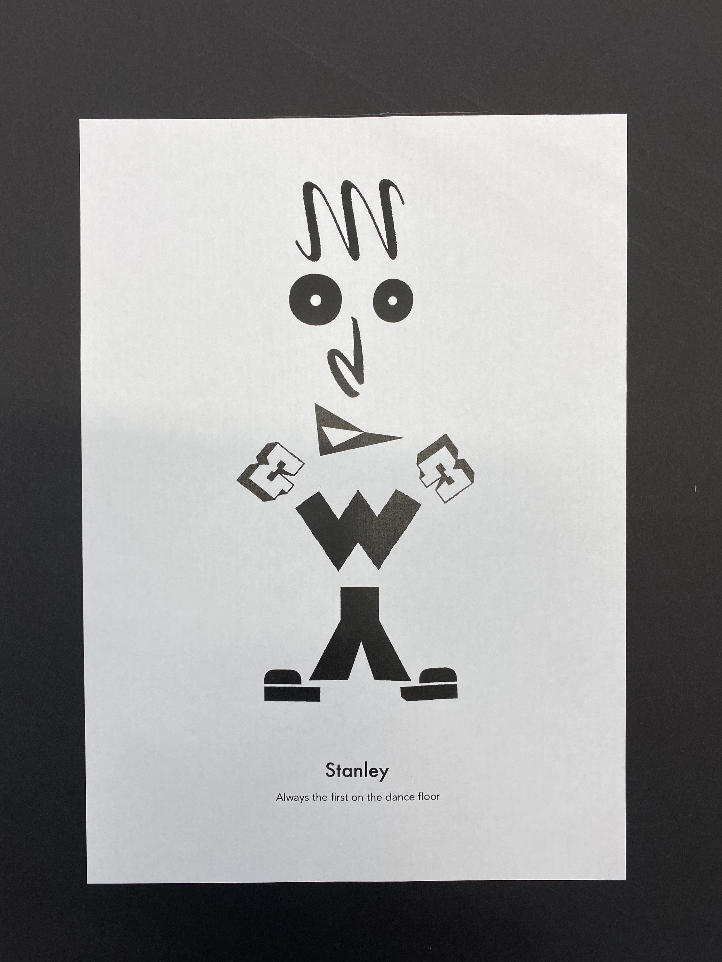
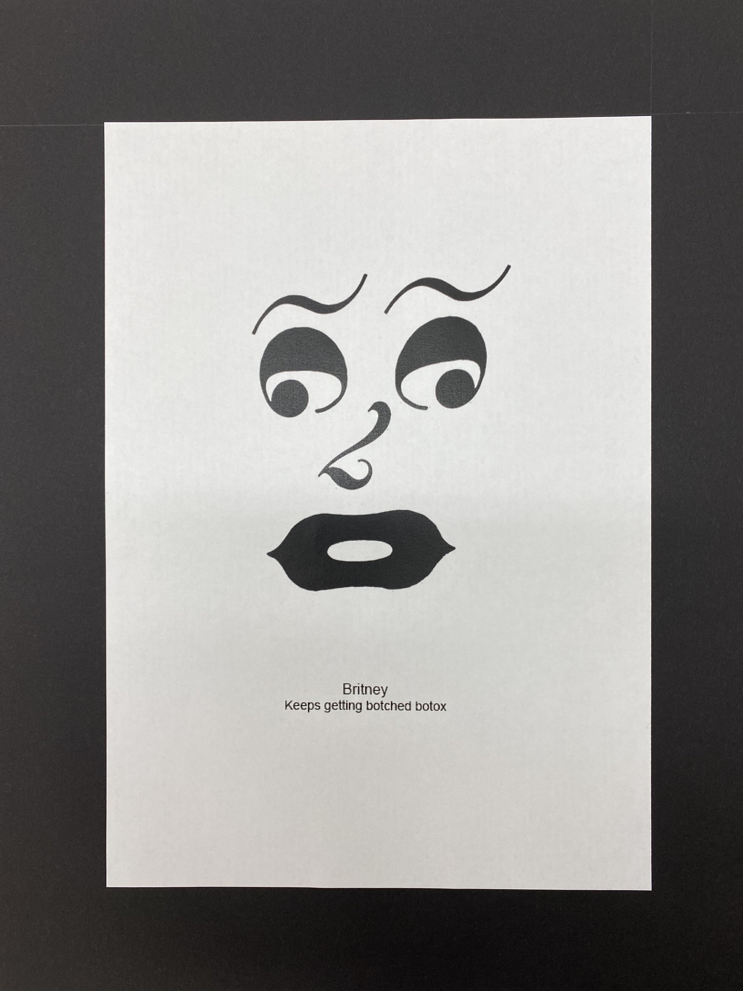
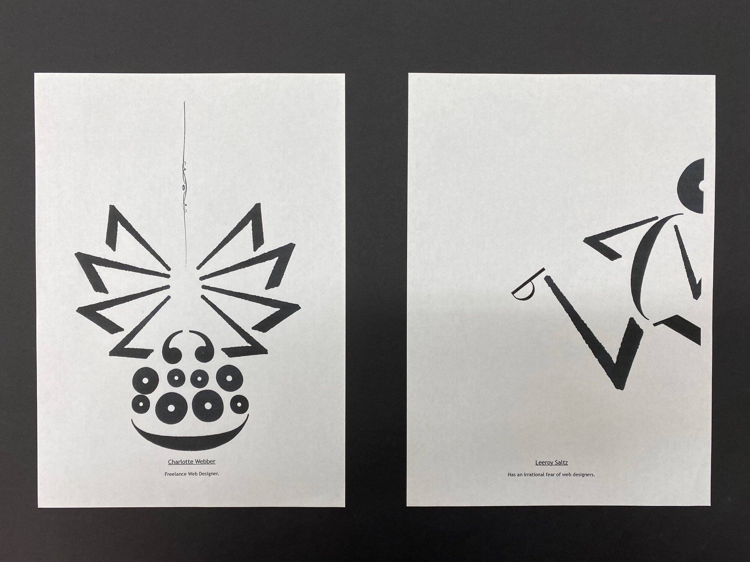
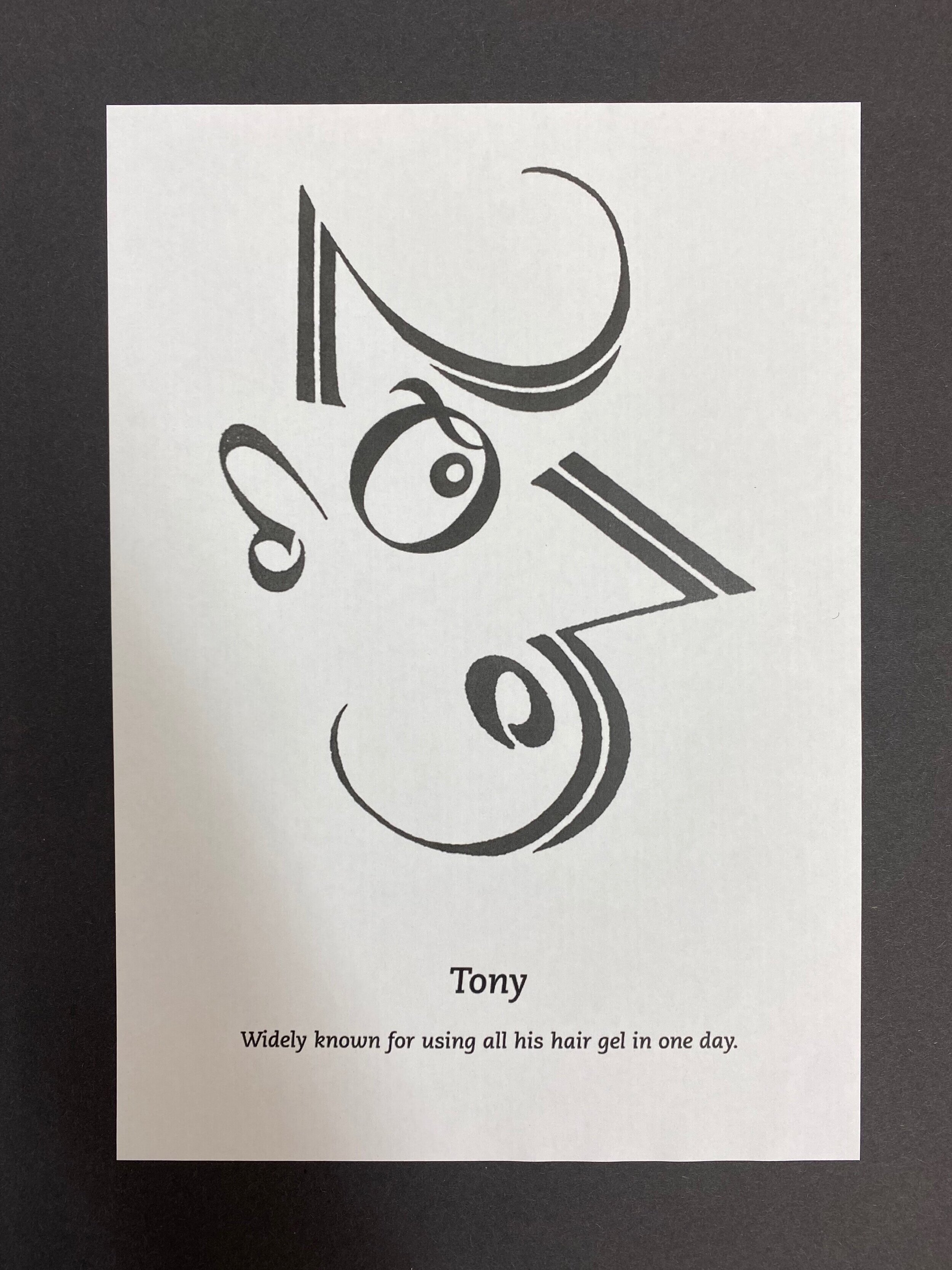
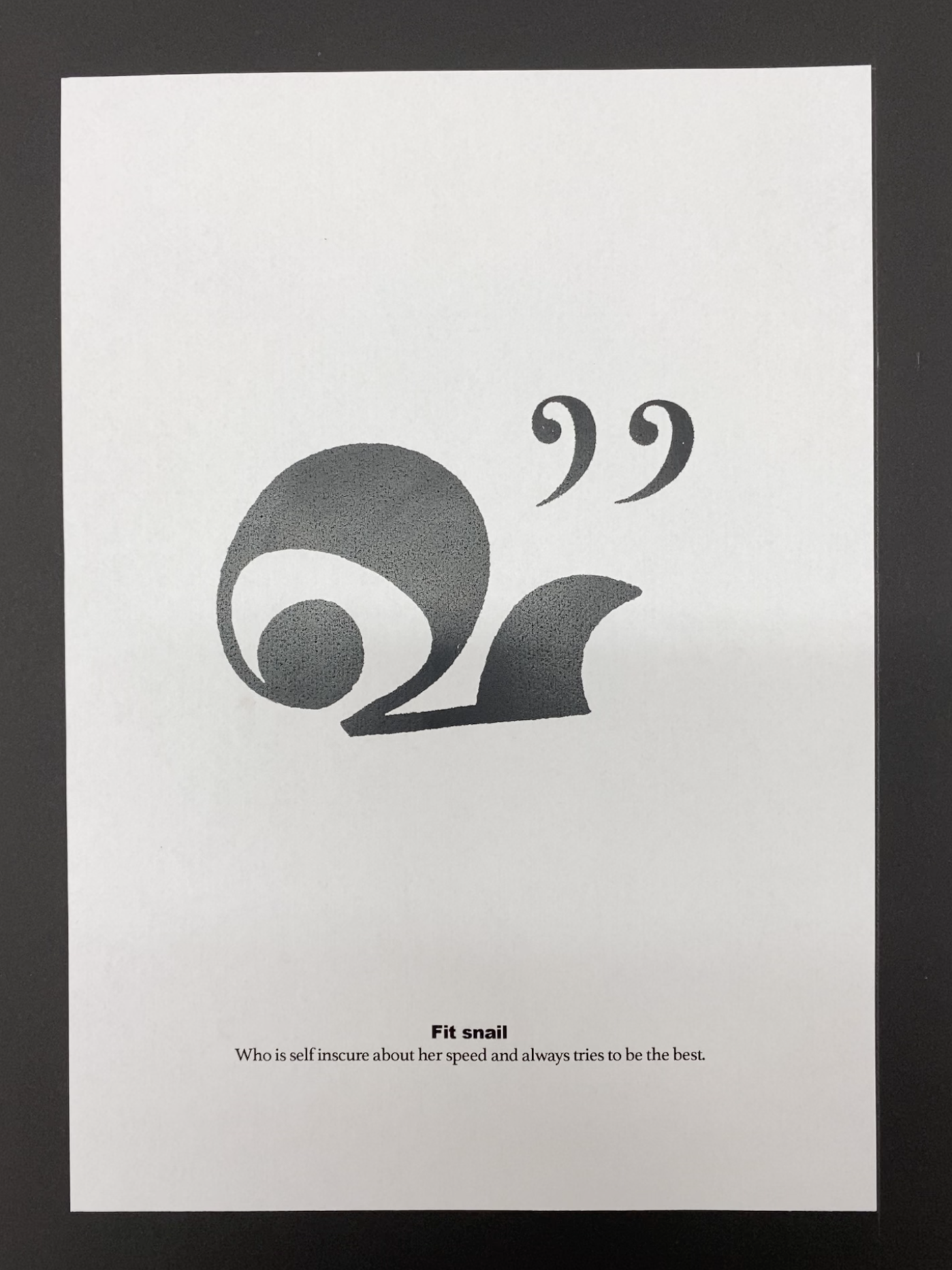
Inspired by the Reverend’s good book, this year’s typography brief took the raw materials of letters, numbers and glyphs; and asked the students to create faces and animals from them. The premise of the project was to instil the notion that through taking a seemingly everyday object and looking at it with fresh eyes, you can create a completely new idea. This is a fundamental lesson in lateral thinking, and a primer in the ‘art of looking sideways’.

The Disciples Of Design are a global collective of design academics, practitioners, artists and students. We have one common thread – University of Lancashire in Preston, UK; and one common aim – the creation of an ever evolving visual hub for the sharing of ideas and thoughts.