Minimum Means Maximum Effect

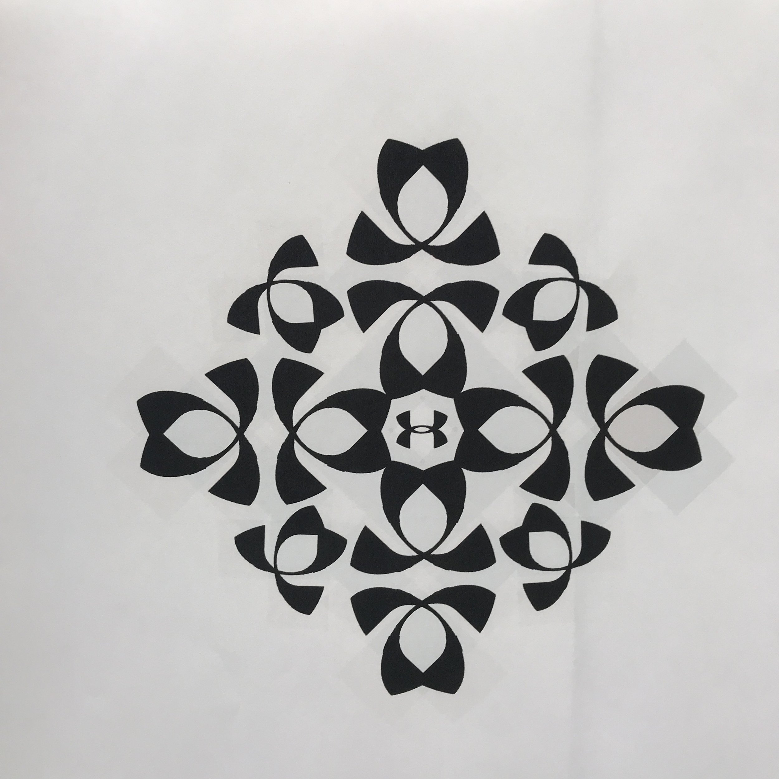
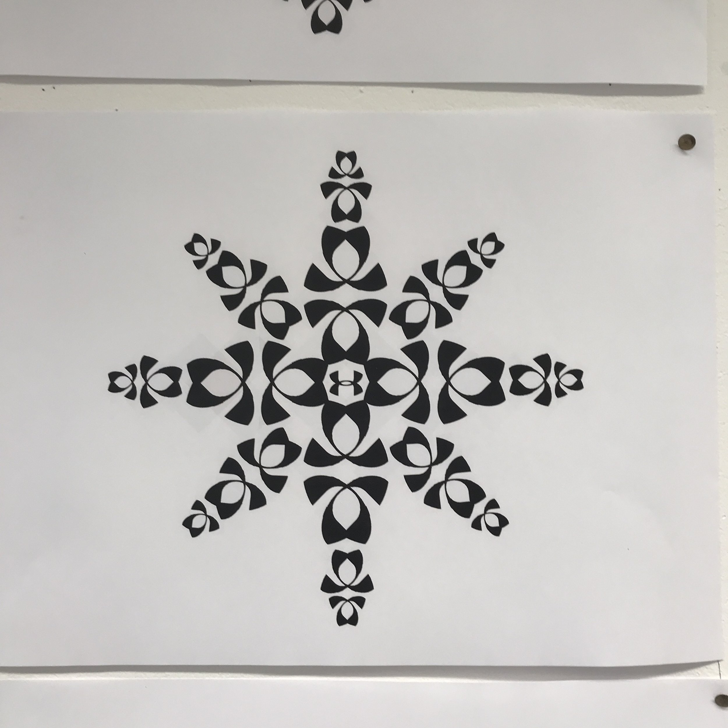
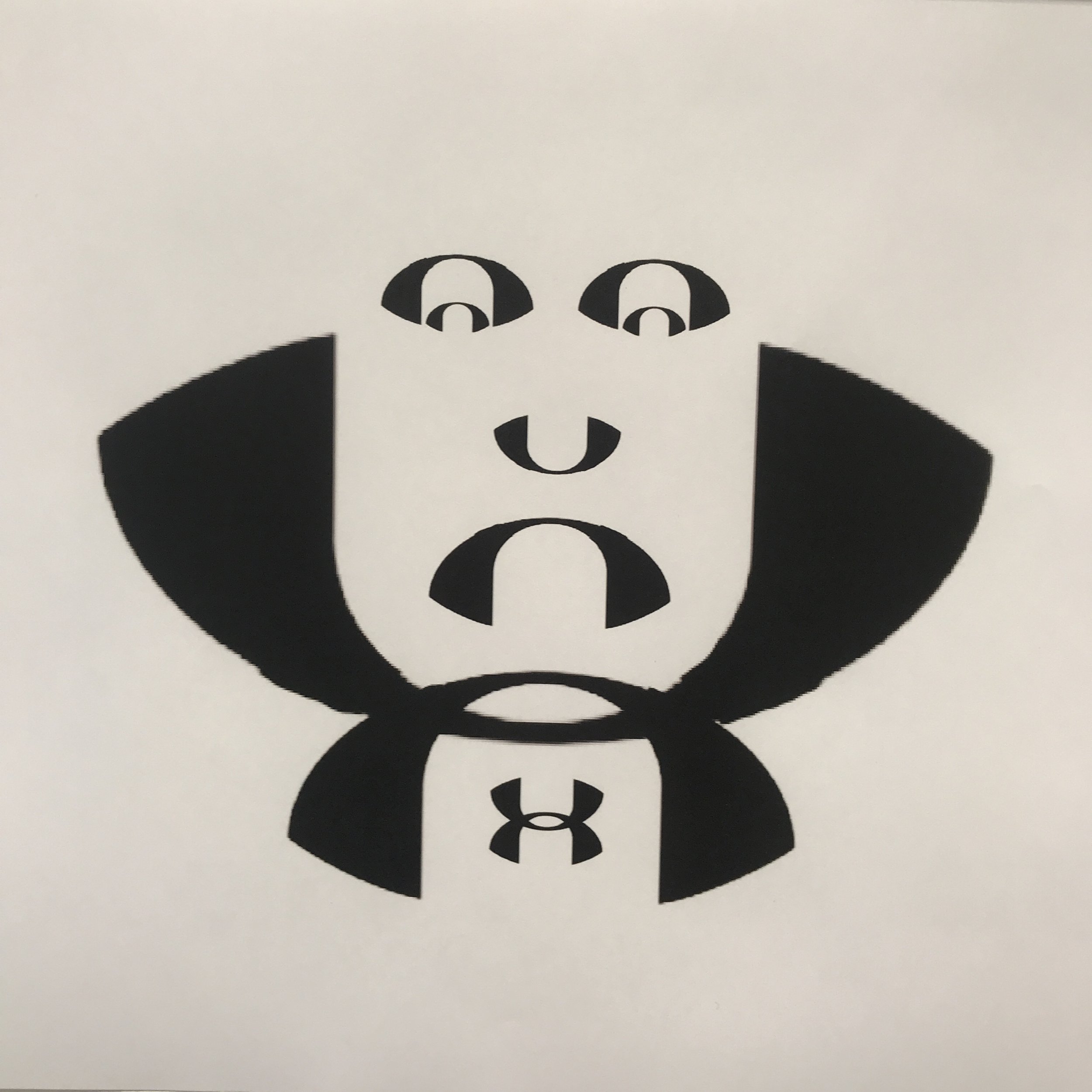
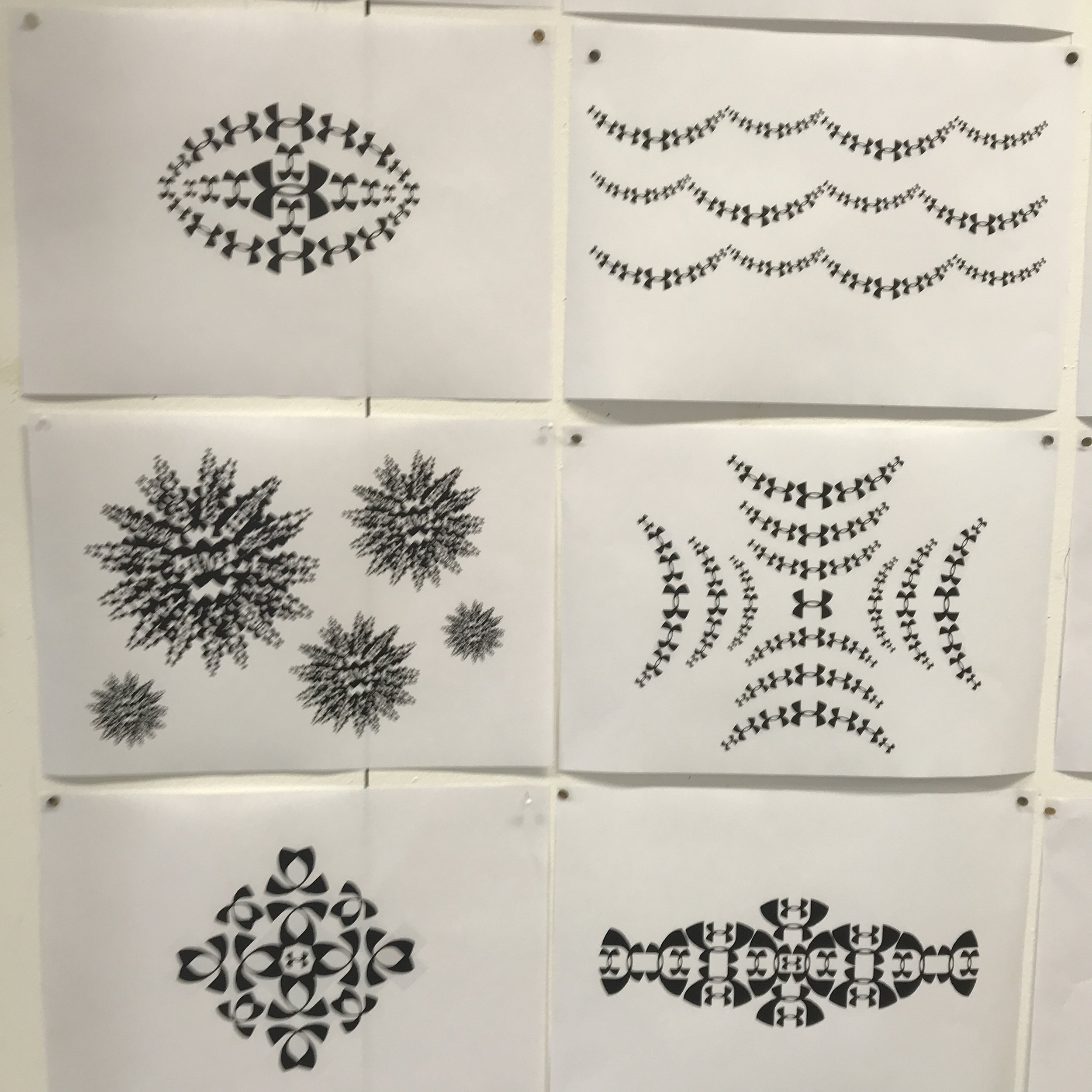
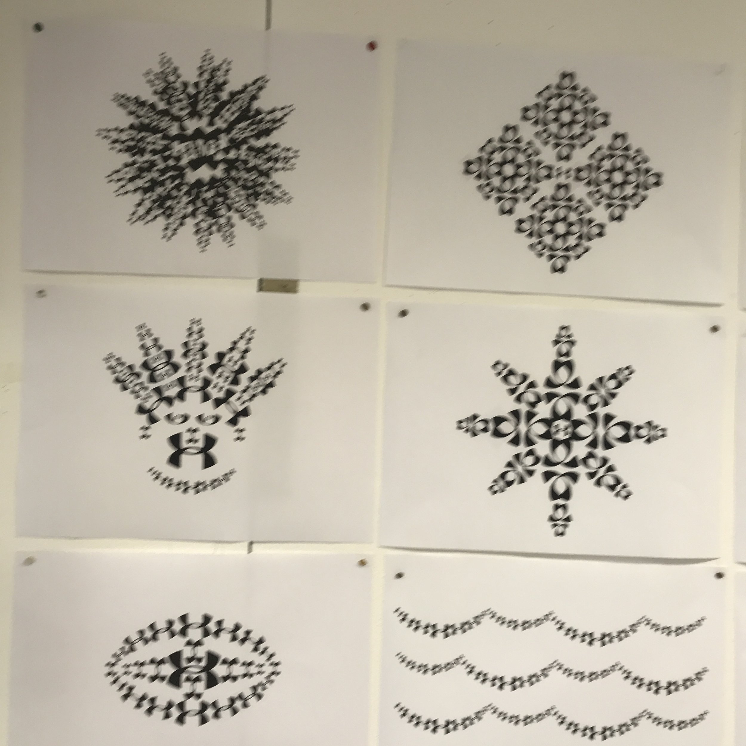
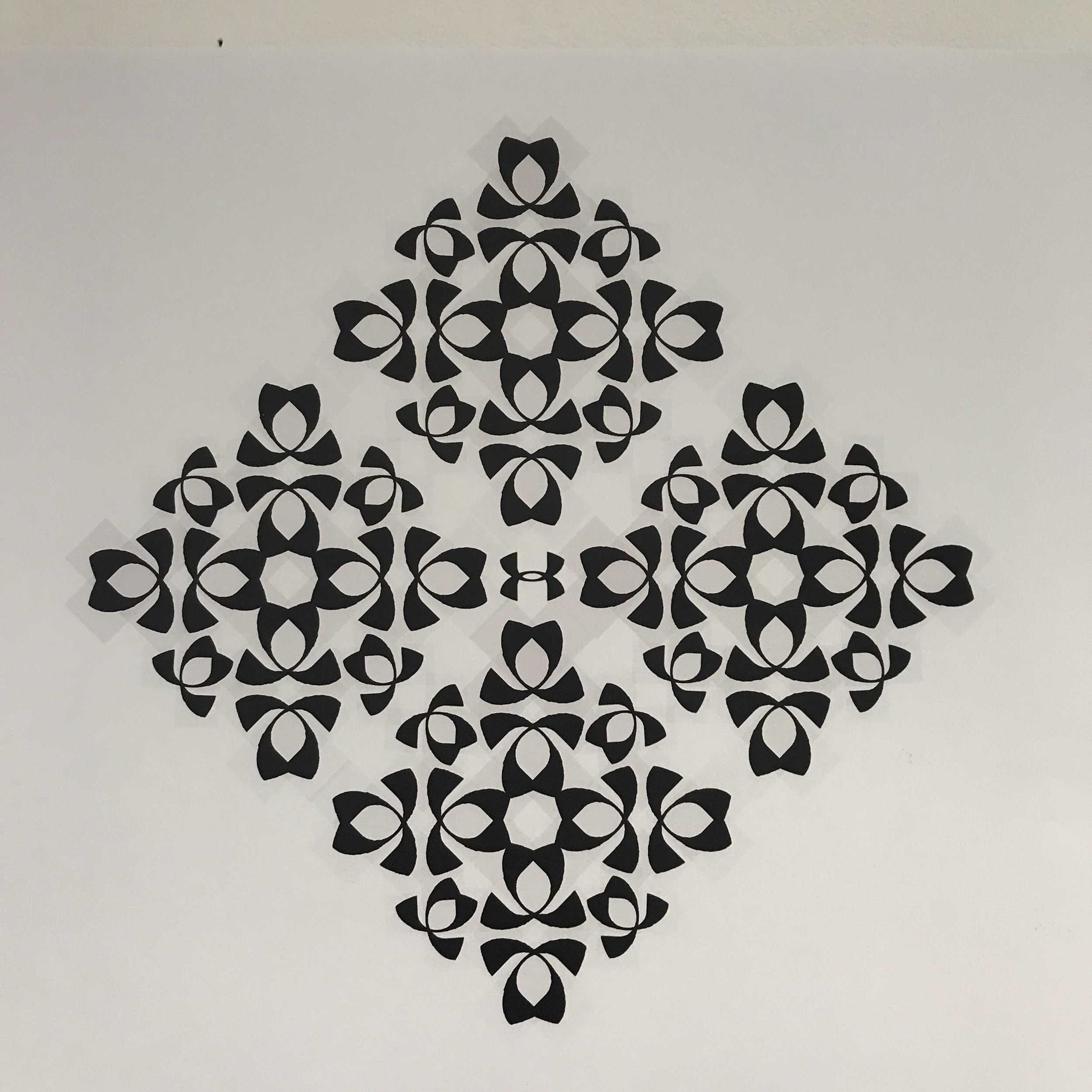
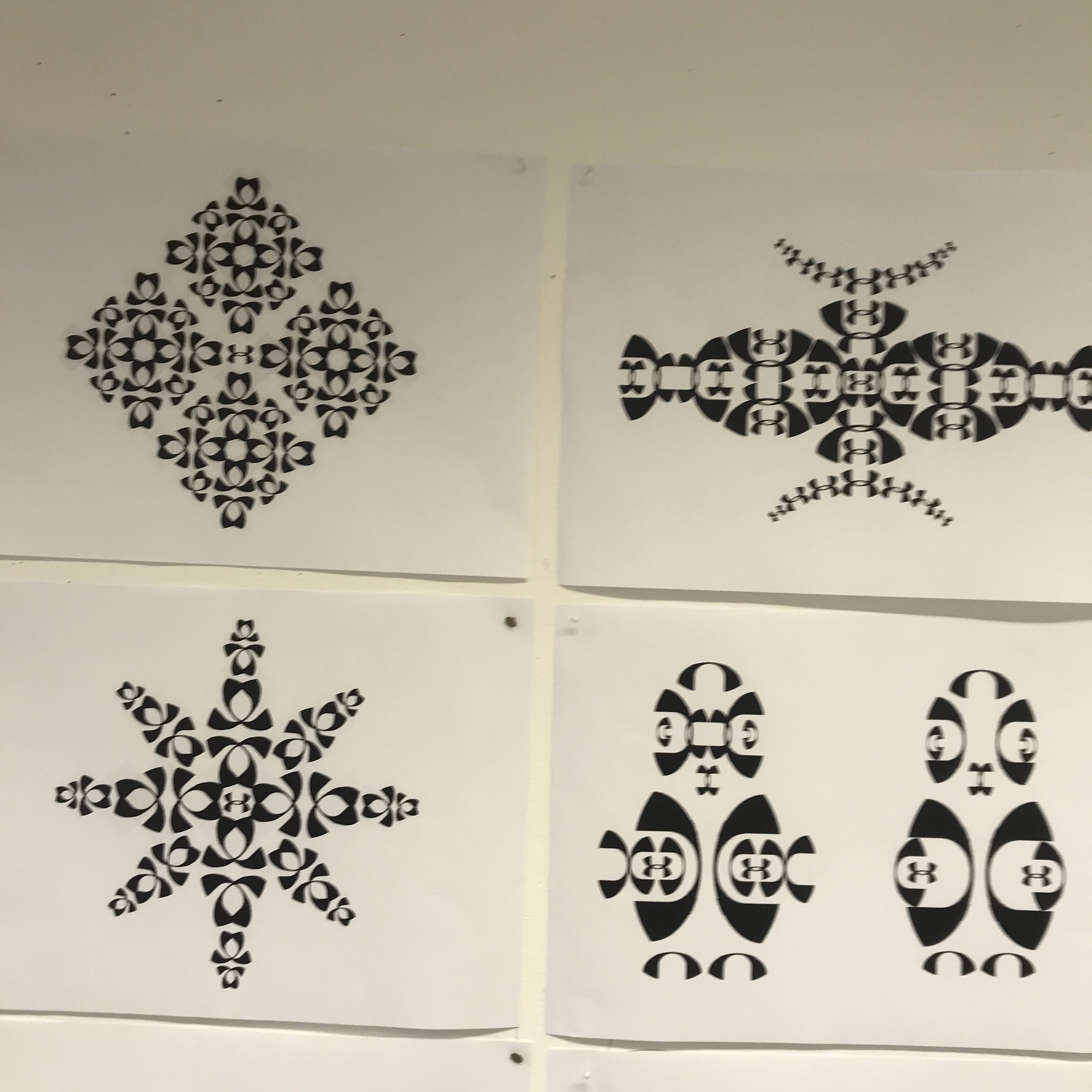
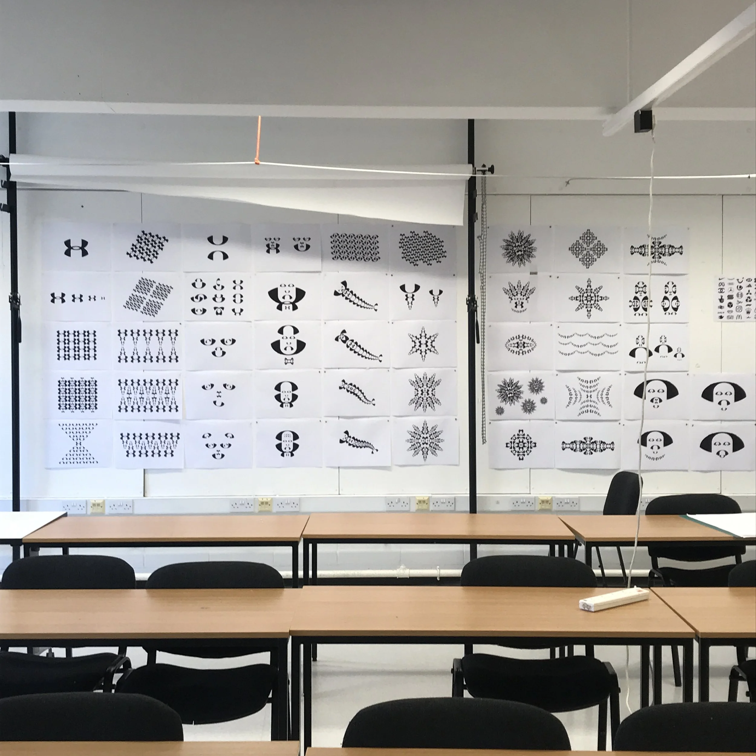
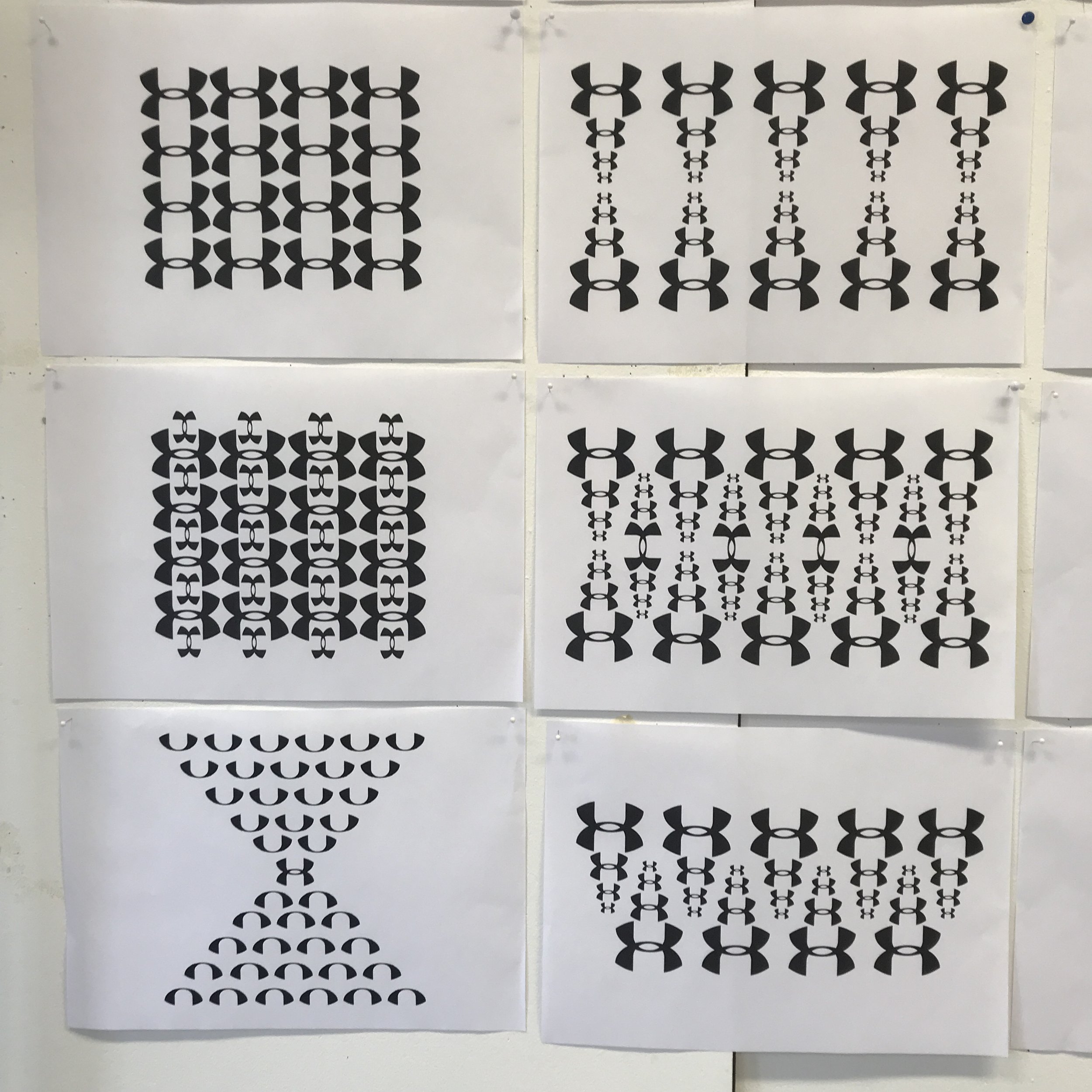
Here we feature some ground work examples for an up and coming Year 1 project . The one day studio workshop will be held in he Autumn term of academic year 2022/23.

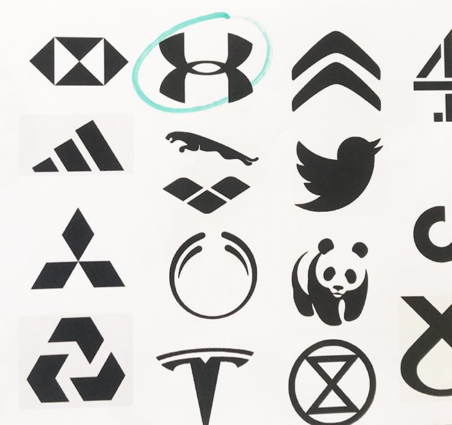
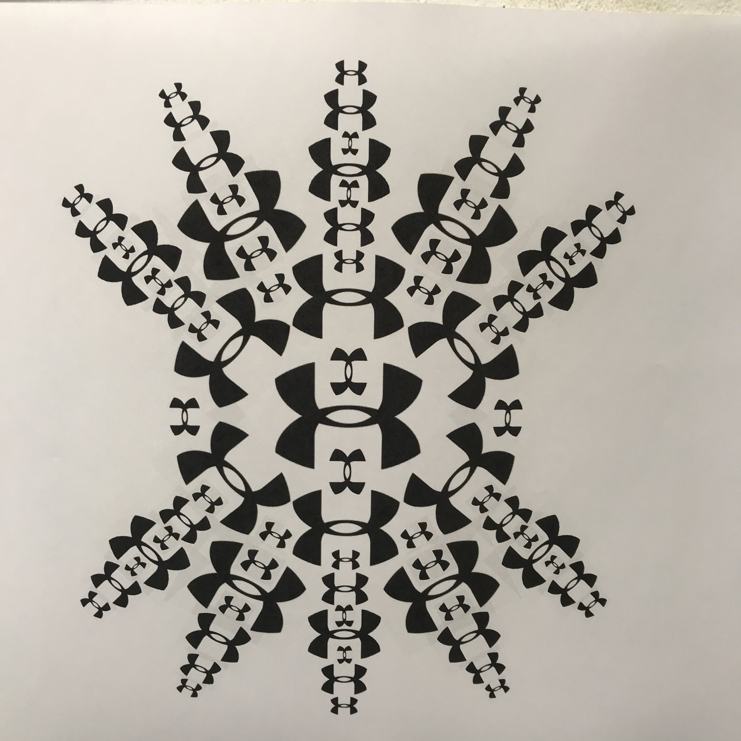
The brief will involve giving each student one well known brand element and working in black and white only, on an A3 canvas, we will be asking the students to play and create as many images as they can using their given element.

They will be encouraged to use and explore a basic design palette of scale, reflection, multiples, proportion, space and layout to create as many interesting and intriguing images as they can in 4 to 5 hours.

A selection of well known brand elements

Highlights – Part 1

Here we feature part 1 in our degree show highlights from The Class of 2021.

Branding - Opus AI music creation by Joe Leeny

Patch Plants - Promotional Campaign by Agatha Blazey

Branding - Sisterhood ‘helping single female travellers’ by Darcy Tromp

Rebrand - Preston Bus by Michael Cardwell-Clarke

Patch Plants - Promotional Campaign by Sara Esat

Branding - Women’s Film Academy by Emma Barber

Promotion - Trinidad & Tobago by Sara Esat

A MAGIC IDEA!

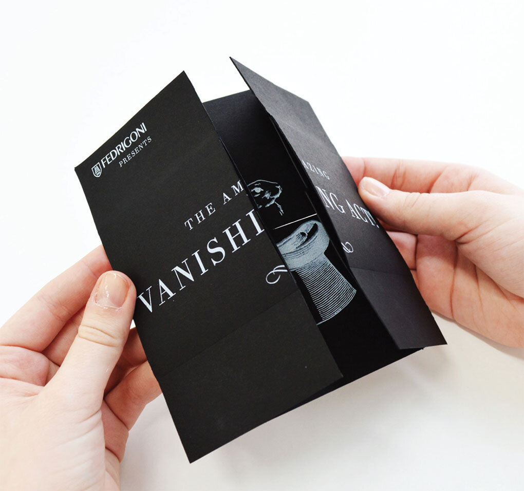
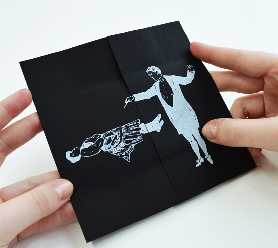
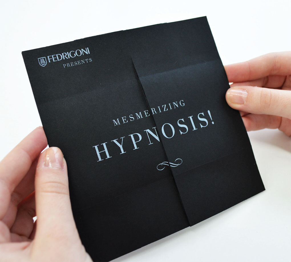
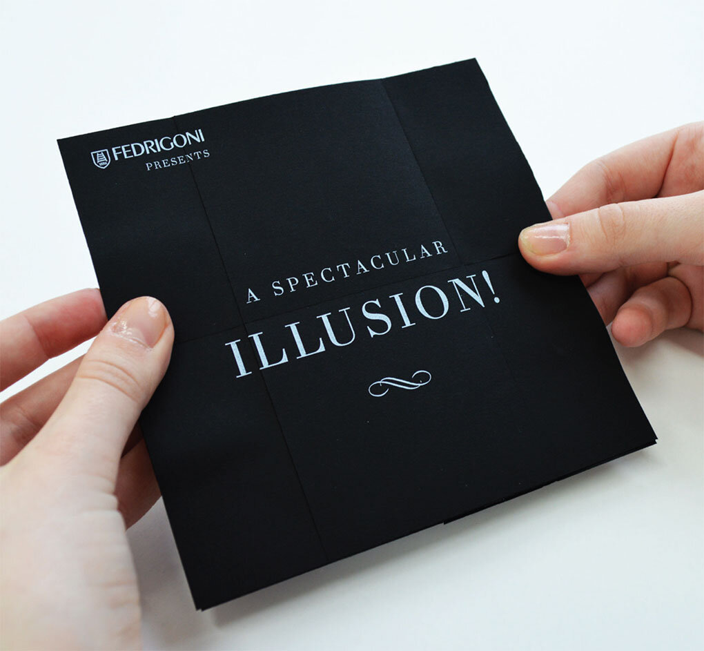
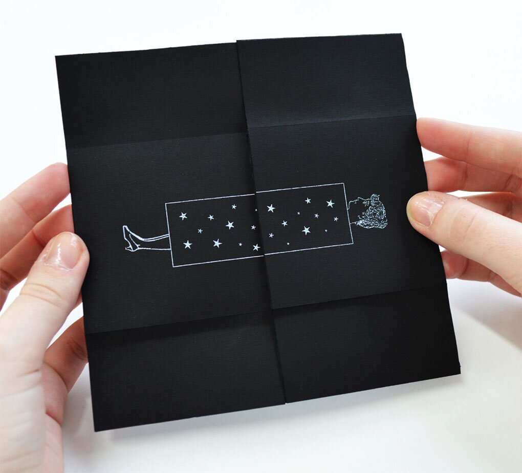
Here we feature a year 2 project by Harriet Richardson from back in 2014 for Fedrigoni Fine Papers.

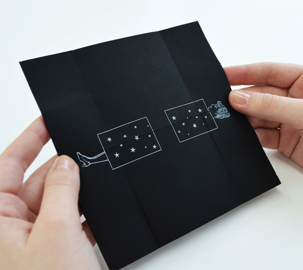
Fedrigoni were launching their new Sirio Ultra Black range of papers and needed an eye catching direct mail to send out to designers and agencies that introduced the range plus highlighted some of it’s unique features.

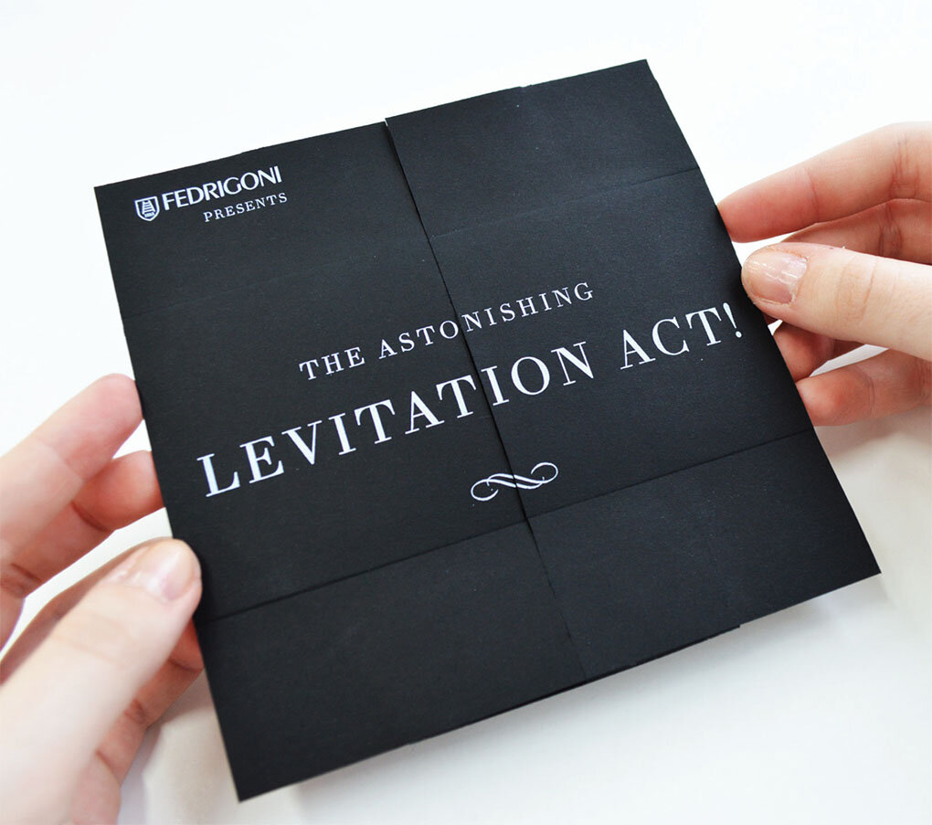
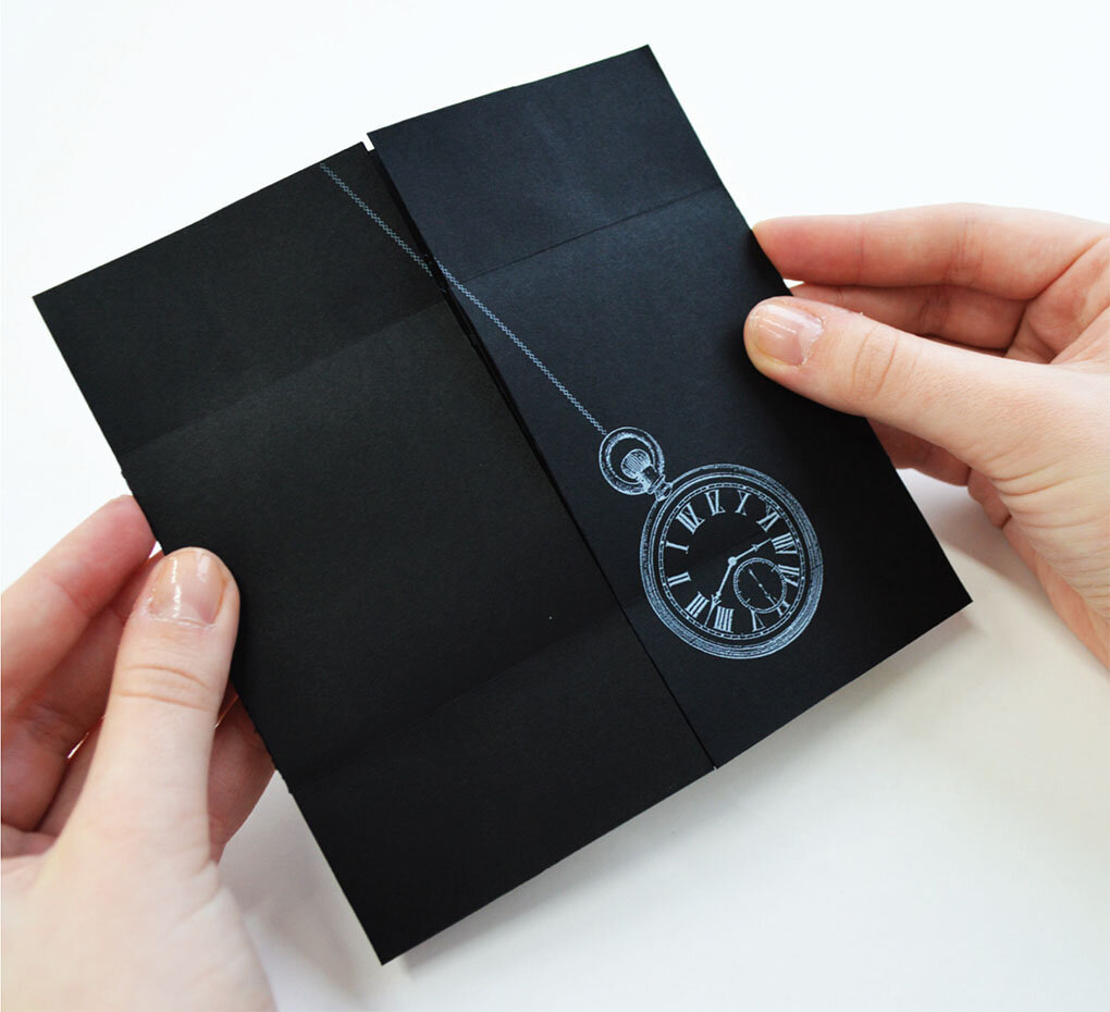
Harriet’s solution highlighted the magic properties of Fedrigoni’s new Sirio paper range by appropriating the visual language of 19th Century magicians and illusionists.

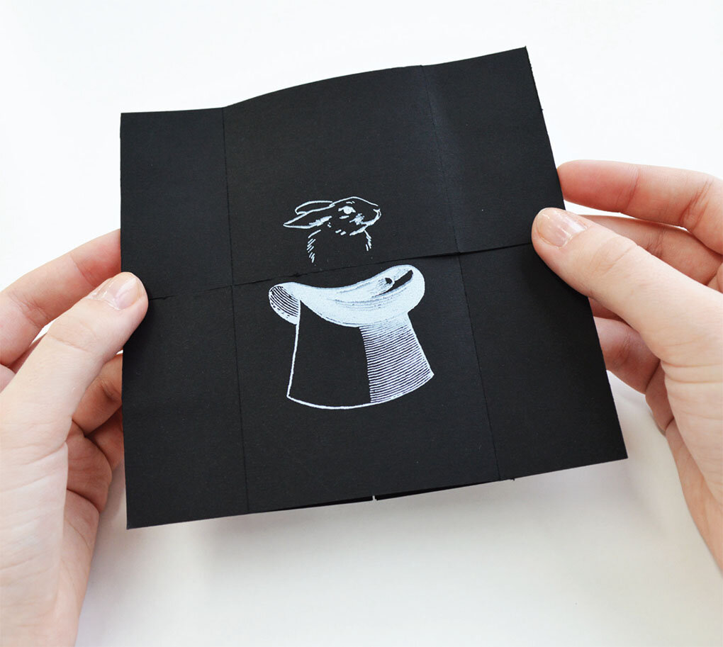
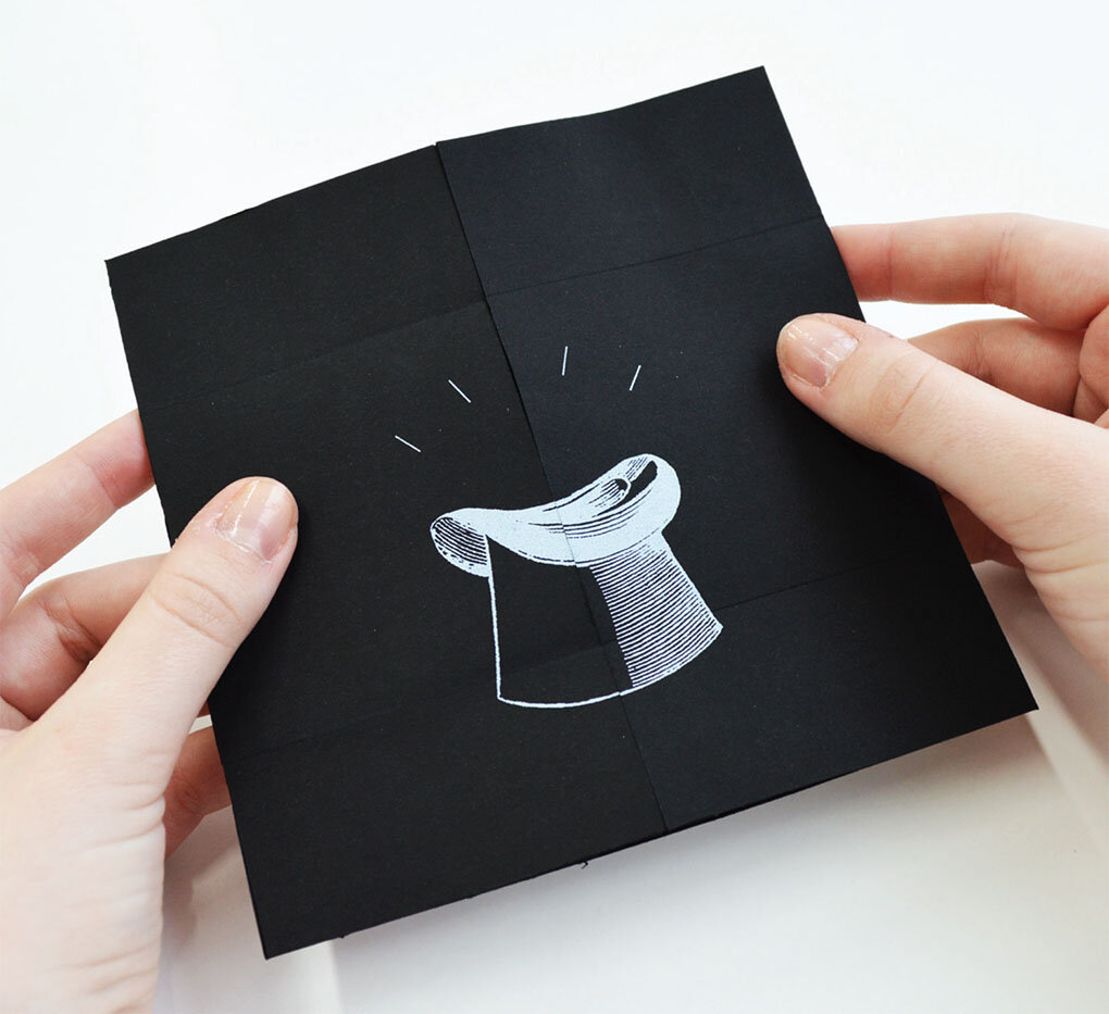
The series of 4 direct mail shots, were silk screened onto Sirio Ultra Black paper stock and inventively utilised an ‘infinity fold’ to reveal a series of stories and insights into the papers unique qualities.

Introducing

Introducing

The range of 4 magic mailers

The range of 4 magic mailers

Trick 1 - The Vanishing Rabbit!

hat 5.jpg

Trick 2 - The Levitation Illusion

lev 4.jpg

Trick 3 - The Hypnotic Illusion

hyoe 4.jpg

Trick 4 - The Cutting in Two Illusion

cut 4.jpg

A great piece of work that highlights how you can write a project into existence, inventive copy cleverly highlights the papers properties and at the same time ties them into the magic theme. Now that’s MAGIC!

One week project: Symbolism

This semester staff have introduced two new projects to the end of the DD1101 module. These projects have been designed to bridge the gap between lateral thinking exercises, encourage the development of individual process and ultimately be resolved as a formal pieces of graphic design. As such though billed as one week projects, they have been extended to two weeks.

The first of these projects is underpinned by the theory of symbolism, in particular vexillology. The objective was to design a flag on behalf of any place, group or organisation of the student’s choosing. For those seeking some background of flags and vexillology in particular, then we highly recommend this Ted Talk by Roman Mars – host of the excellent design & architecture podcast 99% Invisible.

Like much of the world of design, flags are seemingly simple; but actually represent incredibly complex ideas. With this is mind, the brief required the students to remove all design representations of their chosen subject (and sometimes even more) to reveal an absolute purity of form and concept. The following five criteria outlined by the vexillology society were communicated by staff as a method of pressure-testing any design, and to also offer guidance on how to be self critical of a design.

  1. Keep it simple

  2. Use meaningful symbolism

  3. Use two to three basic colours

  4. No lettering or seals

  5. Be distinctive

But beyond that, and quite simply…does it look like a flag? Can it be seen and understood visually from distance? And can it be made from cotton?

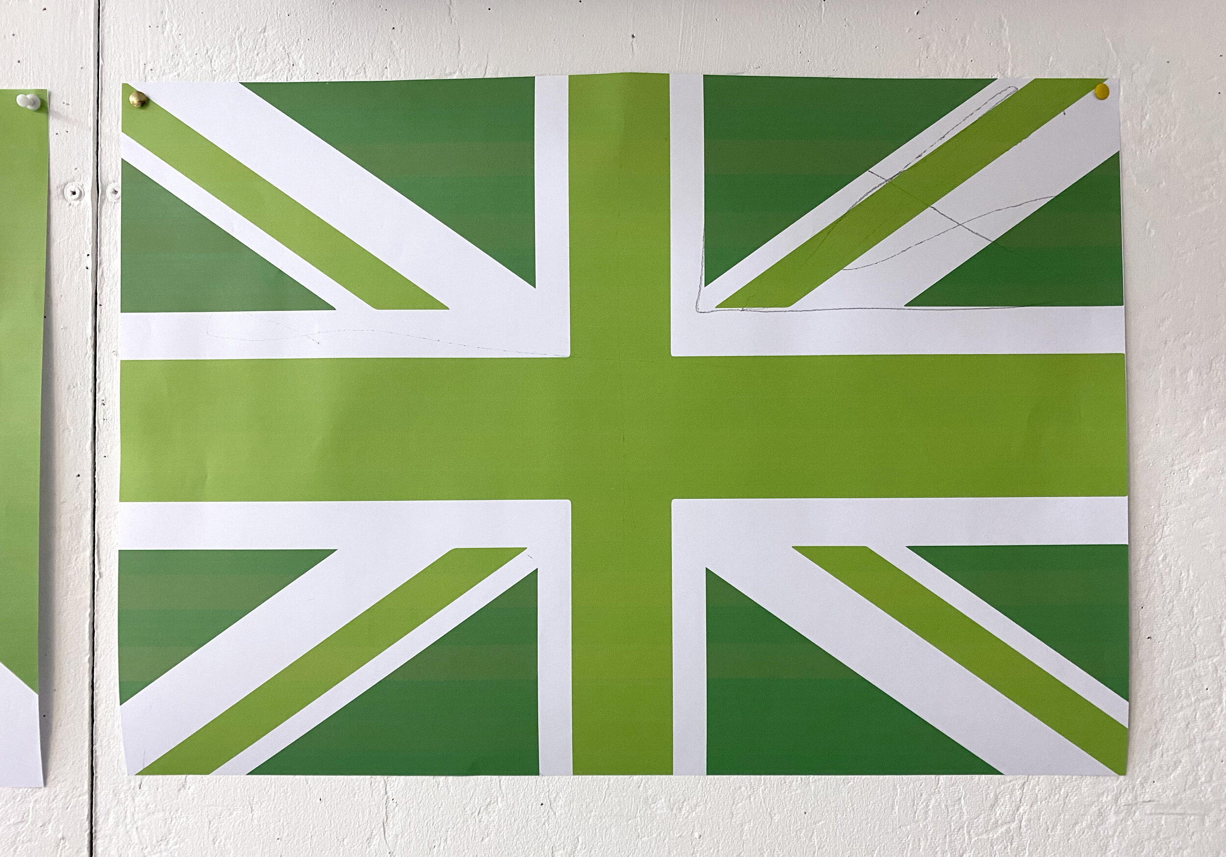
At the final crit all the flags were printed out at A2 and hung in the studio to test impact, message and above all design.
Process

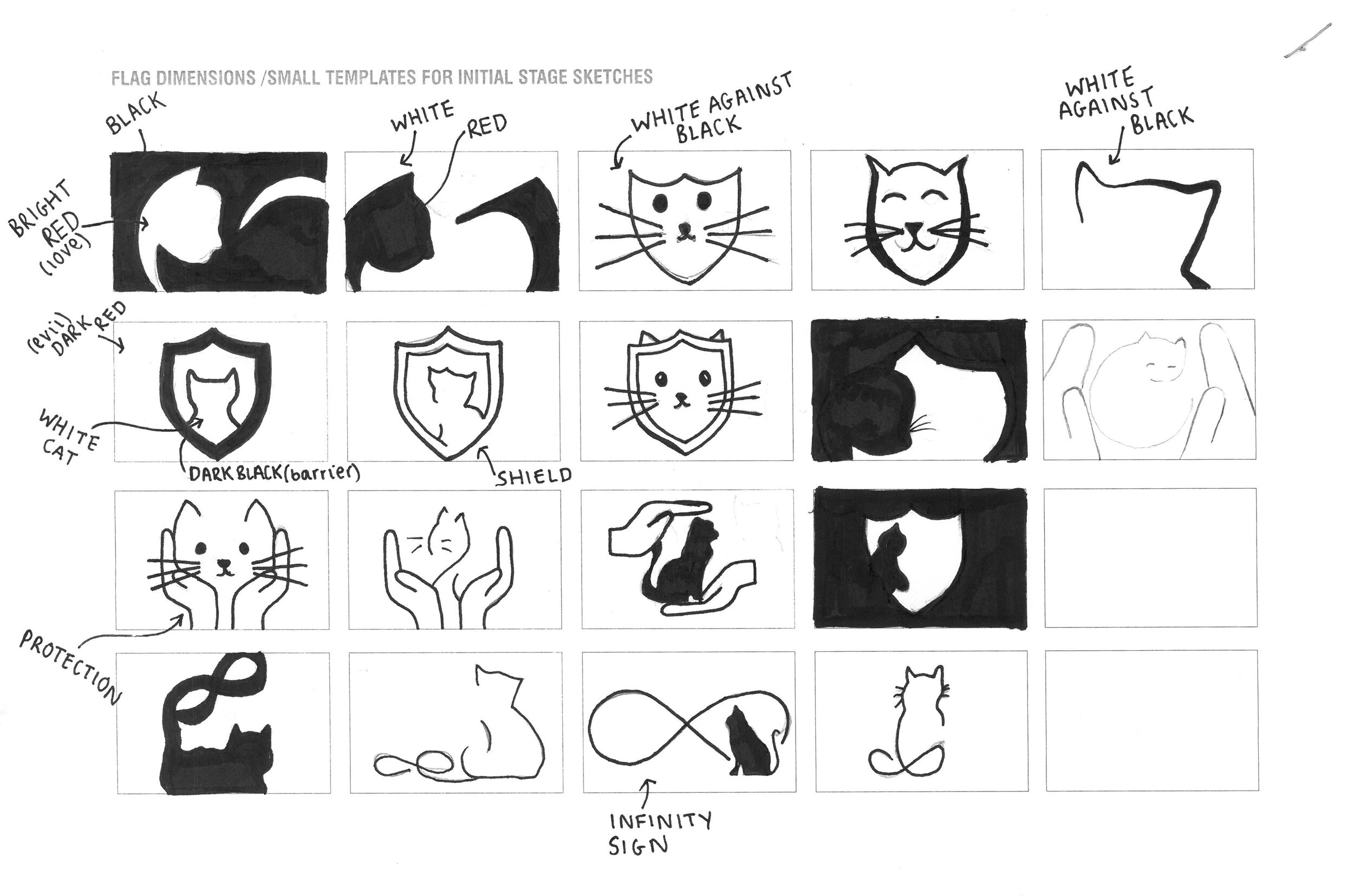
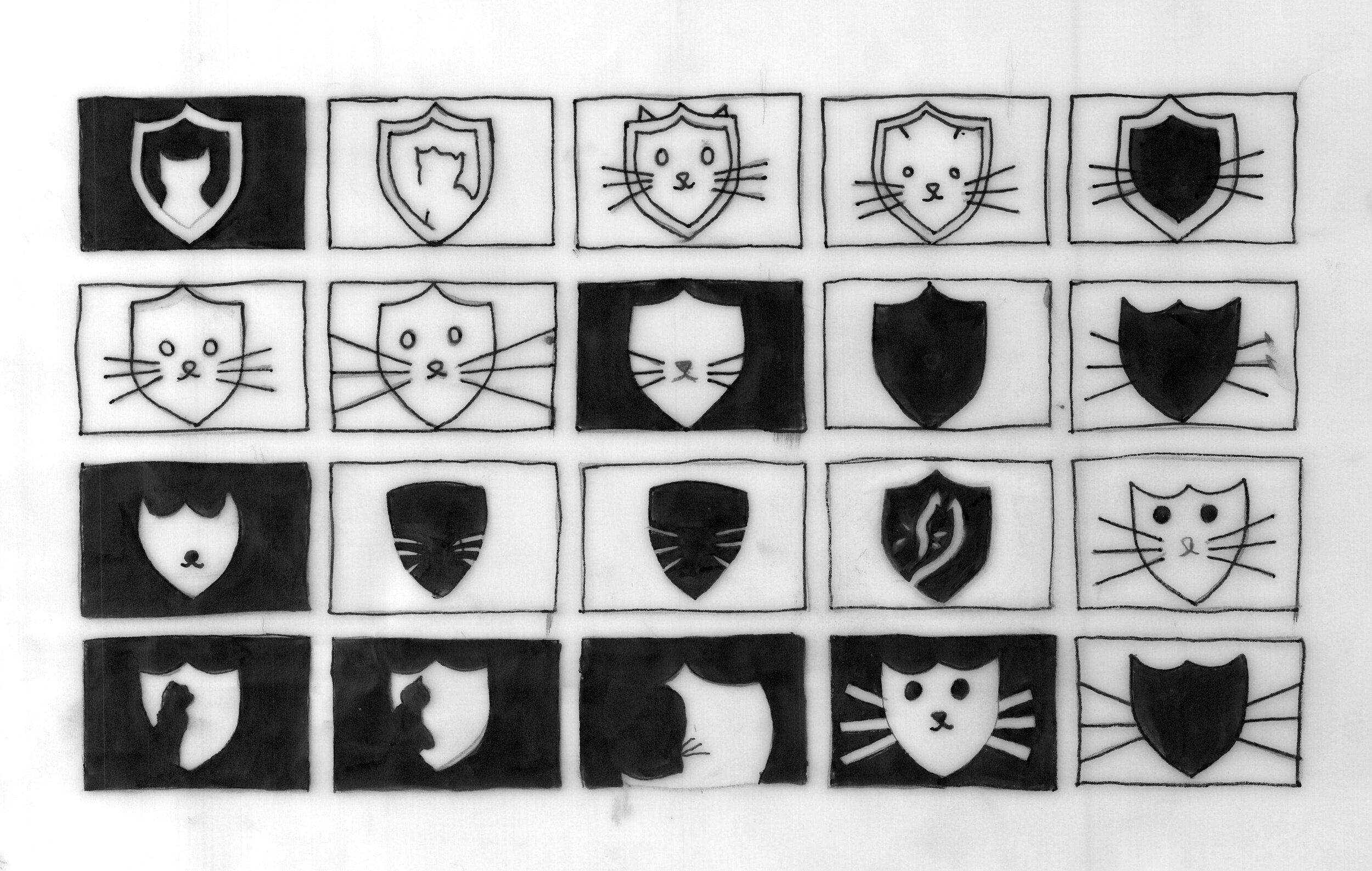
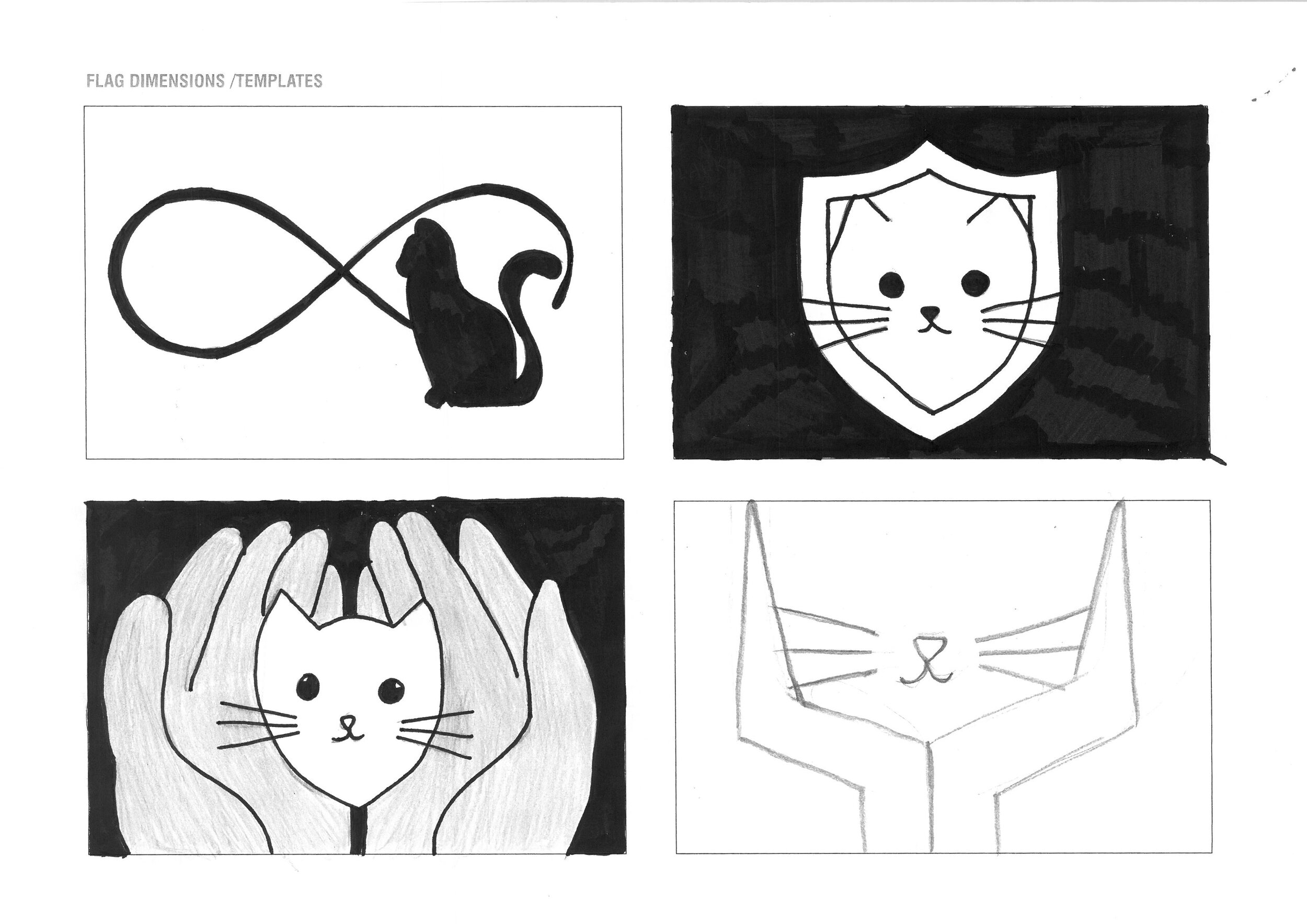
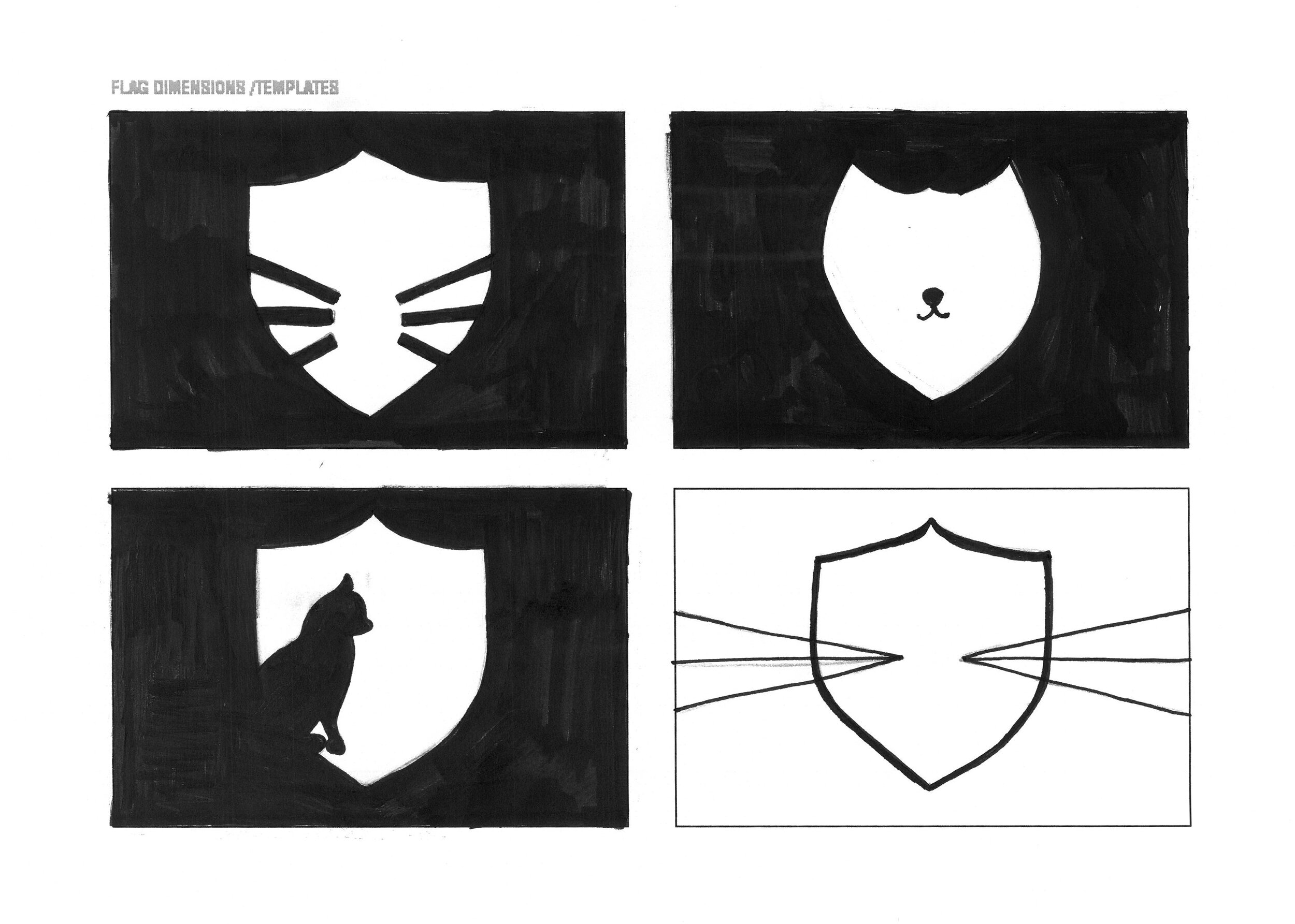
Below is the process undertaken by one student who chose to create a flag on behalf of Cats Protection. All students were required to draw – specifically trace – to get their ideas underway. Also demonstrated in these sketches is a recognition of the symbolism of cats, protection and the task of graphically resolving the two as one design.

Final Crit

Cats Protection

Cats Protection

City of Coconut Creek

City of Coconut Creek

Swim England

Swim England

River Lune Metal Detecting Club

River Lune Metal Detecting Club

Sustainability UK

Sustainability UK

Stanley Park, Blackpool

Stanley Park, Blackpool

Design Classics No.1 in a series of...

Here we feature the first in a series of short tutor lead talks looking at design classics and the thinking behind their conception. This particular short film looks at a typographic solution to an identity and how typography, in the right designer’s hands, can communicate a complex concept in a simple yet sophisticated manor.
Agency - Williams & Phoa - 1988

Miscellaneous Bits & Bobs

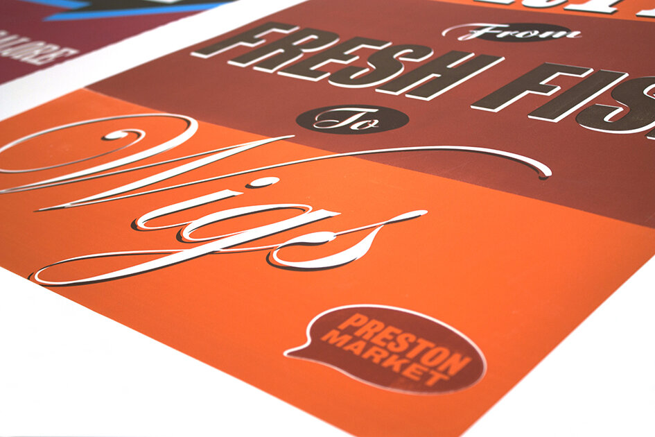
Here we feature a selection of projects that we came across while cleaning out our hard drives. In the main they are snippets of larger projects that span a decade or so, we apologise if we get the year wrong or fail to namecheck everyone’s work. Our filing system and memories are beginning to fail us!

Mike Kirkpatrick’s Museum of the Circus identity from 2014. (Please click image to play film)

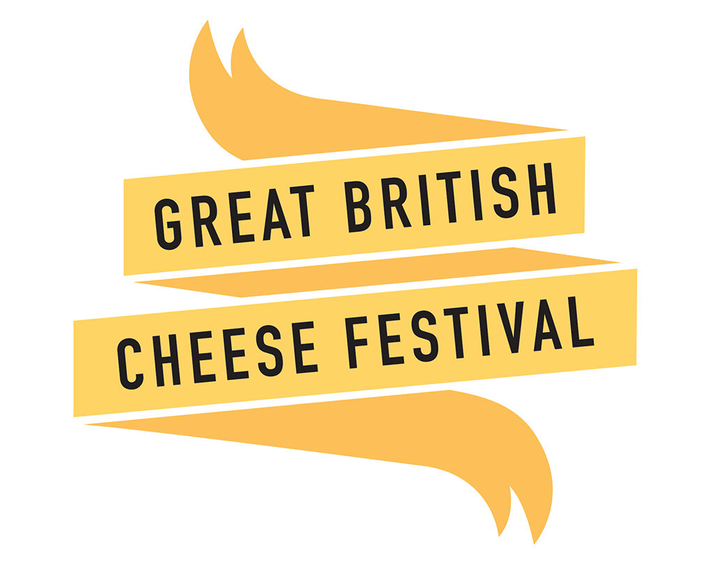
cheese festival.jpg

Mark Young’s Cheese festival identity from 2013

D&AD Royal Opera House Brief Nominee - 2008

D&AD Royal Opera House Brief Nominee - 2008

Mike Selby’s Royal Opera House poster that uses the classic visual cliche the Rorschach test to great effect. Look closely at the gold image and you will begin to see things in things.

UK currency Design concepts

UK currency Design concepts

These designs were by Chris McMahon in 2010 and were one of his final year self initiated projects.

Pen Pals Project Identity

Pen Pals Project Identity

This project was by Uzma Padia from 2014…we think. Lovely image of one person made up out of 2 pens.

Identity

Identity

This re brand was part of Huzaifia Sidat’s final year show back in 2018

From 2018, this identity was by Mike Barrow and formed part of his 70th celebration of Silverstone project. (Please click on image to play film)

Identity

Identity

Bespoke Typeface Design

Bespoke Typeface Design

We are not too sure who produced the above?

Above we feature Ben Bassett’s Blackpool Tramway Identity from his final year show in 2018. (Please click on image to play film)

Here is another snippet from 2108, this identity was created by Hedi Woodhead and was part of a larger project to celebrate Nikon’s 100th Anniversary. (Please click on image to play film)

2019 - Brandon Thomas created this campaign highlight testicular cancer in young males. (Please click on image to play film)