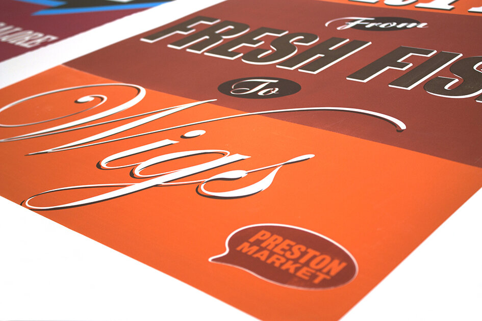
Over the last four weeks graphic design first years have been tackling what staff thought might be a designer's dream brief…
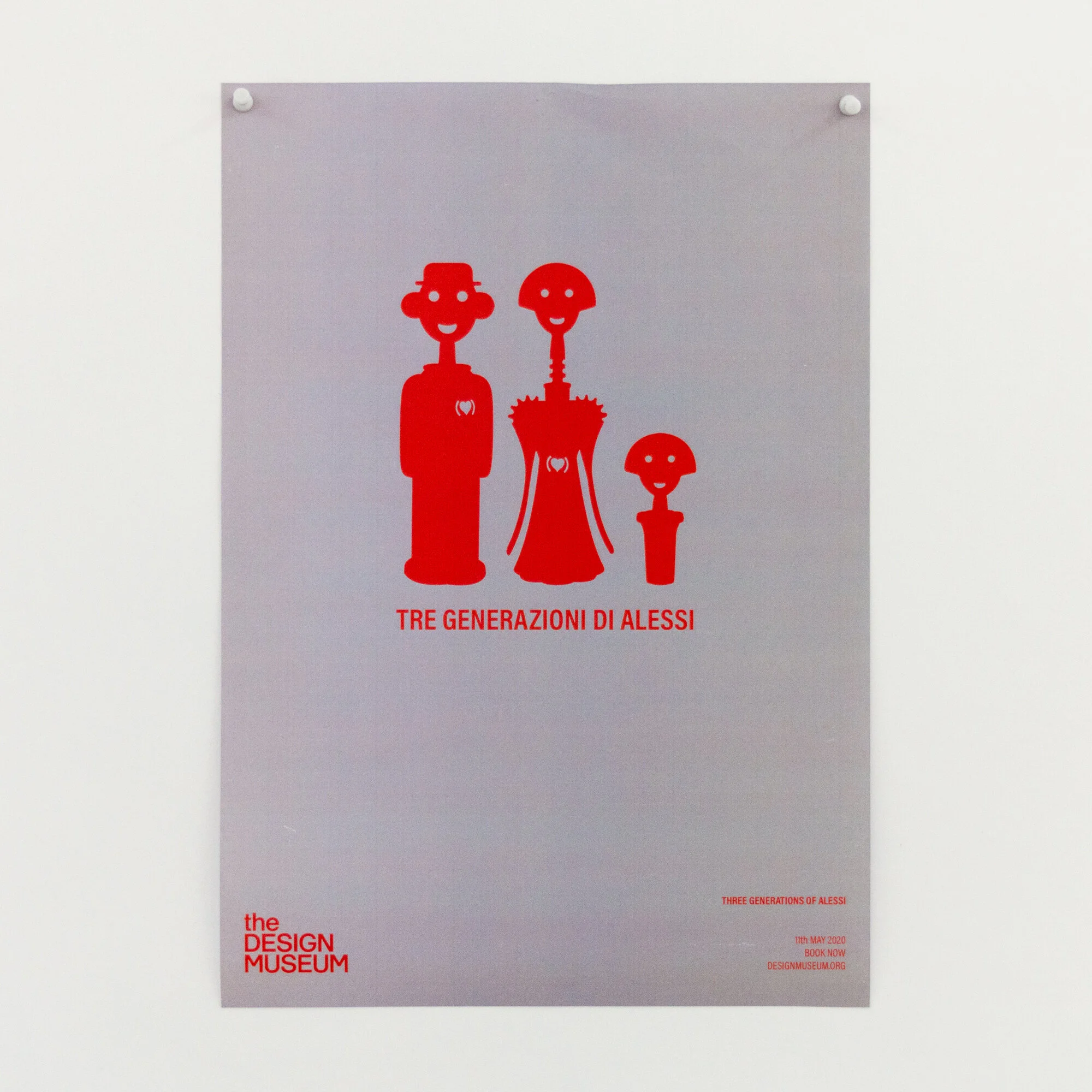
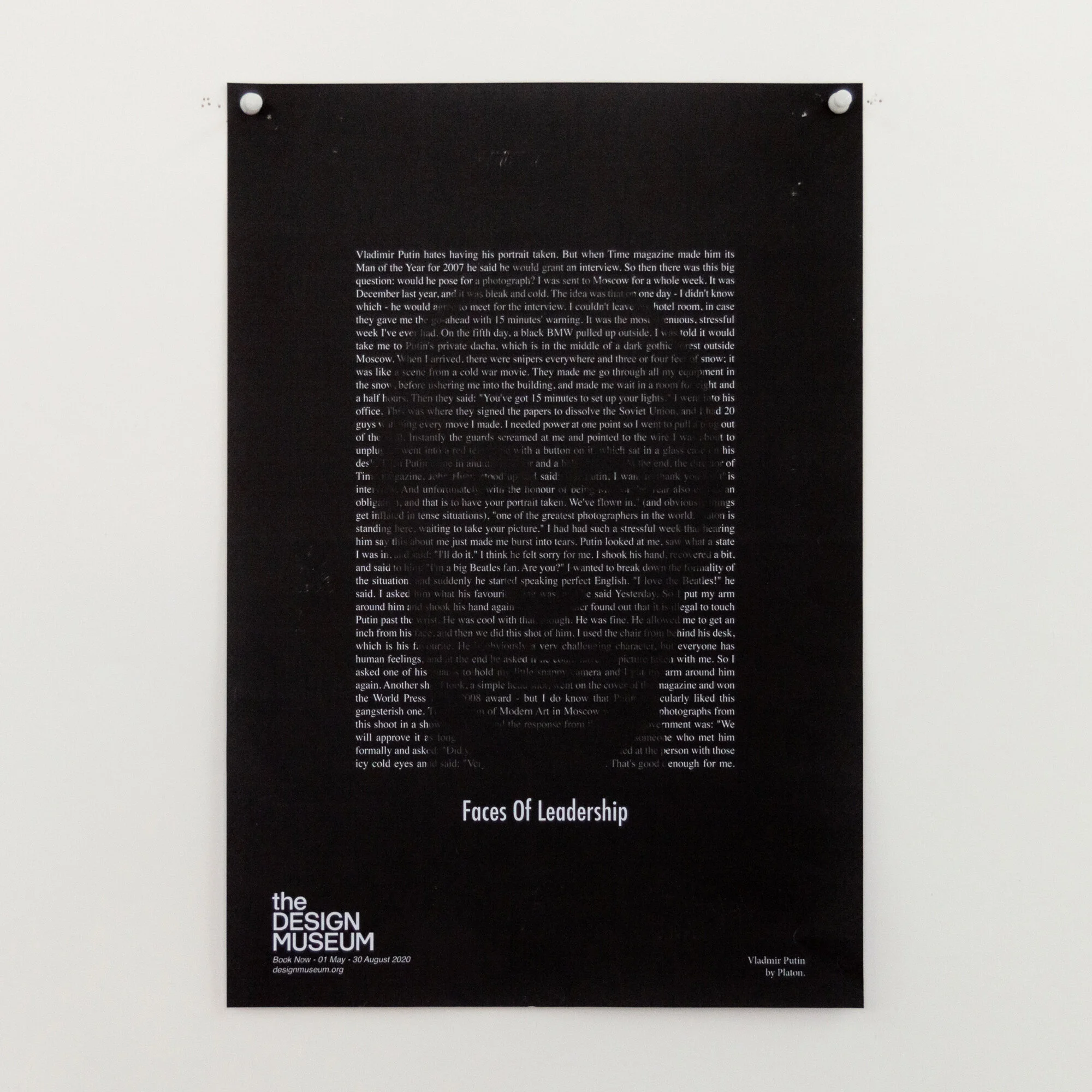
The students chose a designer from outside the world of graphic design, and researched them through new channels such as Netflix and iPlayer, as well as the traditional channels of books and print. Distilling their gathered knowledge, the first task was based in copywriting and naming the exhibiton. Using the name(s) as a starting point, the second task was to create an image to counterbalance the copywriting and make a creative connection. The restriction of colours amplified the focus on the idea, and consideration to the overall layout and its impact.
Below are example colour proofs from the final crit which are yet to be screen printed, but are built around a strong proposition.


