A Sign of the Times
/ andy BainbridgeHere we feature a slide show of a series of snap shots from the Sunday Times broadsheet and accompanying supplements, that show just how pervasive and all consuming the current crisis has become.


Here we feature a slide show of a series of snap shots from the Sunday Times broadsheet and accompanying supplements, that show just how pervasive and all consuming the current crisis has become.
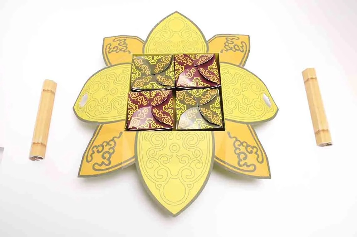
Here we feature a creative packaging concept for a Vietnamese take away meal for two. This project formed part of Mohamed Adam’s final year show back in 2011.




Here we feature a selection of projects that we came across while cleaning out our hard drives. In the main they are snippets of larger projects that span a decade or so, we apologise if we get the year wrong or fail to namecheck everyone’s work. Our filing system and memories are beginning to fail us!
Mike Kirkpatrick’s Museum of the Circus identity from 2014. (Please click image to play film)
Mark Young’s Cheese festival identity from 2013

D&AD Royal Opera House Brief Nominee - 2008
Mike Selby’s Royal Opera House poster that uses the classic visual cliche the Rorschach test to great effect. Look closely at the gold image and you will begin to see things in things.

UK currency Design concepts
These designs were by Chris McMahon in 2010 and were one of his final year self initiated projects.

Pen Pals Project Identity
This project was by Uzma Padia from 2014…we think. Lovely image of one person made up out of 2 pens.

Identity
This re brand was part of Huzaifia Sidat’s final year show back in 2018
From 2018, this identity was by Mike Barrow and formed part of his 70th celebration of Silverstone project. (Please click on image to play film)

Identity

Bespoke Typeface Design
We are not too sure who produced the above?
Above we feature Ben Bassett’s Blackpool Tramway Identity from his final year show in 2018. (Please click on image to play film)
Here is another snippet from 2108, this identity was created by Hedi Woodhead and was part of a larger project to celebrate Nikon’s 100th Anniversary. (Please click on image to play film)
2019 - Brandon Thomas created this campaign highlight testicular cancer in young males. (Please click on image to play film)
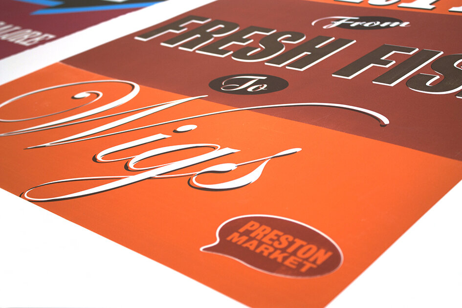
Here we feature Ben Tustin’s colourful silk screened poster promoting Preston Markets, they formed part of his final year show in 2011.

Poster 1

Poster 2

Detail

Poster 3

Detail

Poster 4
Detail
Bold sumptuous colours combined with simple direct copy and minimum design…equals a lush result!
Here we feature Ben Tustin’s innovative Oxo Packaging concept which was nominated for a D&AD in their open category way back in 2011.

Pack shot 1

'Oxo brings a meal together’

‘Oxo brings a meal together ‘
Please click on the image above to view the film.

Pack shot
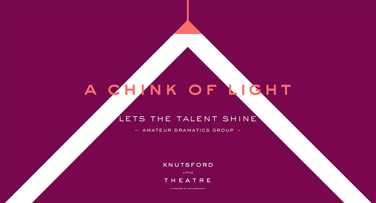
Here we feature James Clarke’s final year self initiated project from 2018.

The Brief

Identifying the distinctive chevron from the apex of the Theatre rooftop

Copywriting plays on the little element of the Theatre.

‘Little things make a big difference’ becomes the point of focus for the copywriting and how it’s applied.
Please click on image to play the film.
Application 1 - Poster

Application 2 - Poster

Application 3 - Poster

Chevron icons
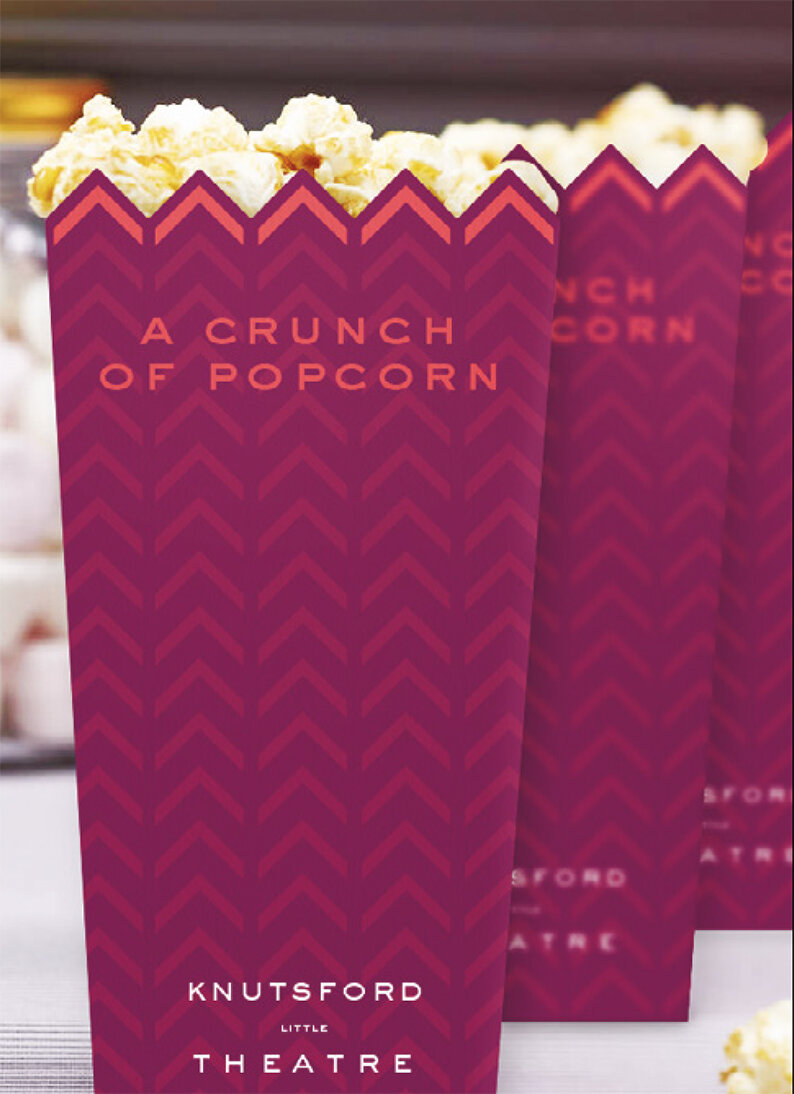
In theatre application

Calendar of events

Magazine Advertisement
A good example to any year 1 student of how working within the constraints of a limited amount of appropriate assets - good copywriting, a strong graphic element and distinctive colour pallet can create a coherent brand look and feel.

The set up
Here we feature Thomas Mcinally, Roberto Bagnoli, Ryan Tinsley’s entry for the Creative Conscience Student Awards 2014.
“This project is a social experiment to test people’s levels of conformation. Focusing on the figure of Kim Jong-Un, the trio created his portrait out of dominos in an art gallery and filmed people’s responses for two days. The aim of the campaign was to raise awareness for the oppression and lack of human rights for the mass population of North Korea”.
Please click image above to play the film.

Tom & Ryan get to grips with the set up
This project was the first in a long line of success over recent years for Preston Graphics students in the Creative Conscience Awards. The whole project came about with one simple word connection based around the word toppling, ‘domino toppling’ and ‘to topple a dictator’. This connection sparked the whole project off and provided the core concept onto which the students could then build around and upon to create a great final year project.
Here we feature Kristian Shepherd’s winning entry for the Round Creative Network Awards 2016.


Packaging Designs

Neck Label -1
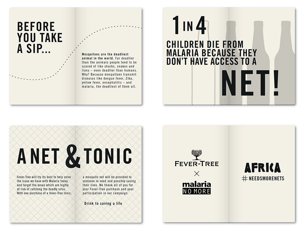
Neck Label Details - 2

Coster & Glass Design Concepts

Adshel Design
A nice clear appropriate connection of protection applied and rolled out across several touch points.
Here we feature Brandon Thomas’s D&AD winning entry from 2019.
Please click the image above to play the film.

1 - Recommended for you

2 - Filtered for you

3. Personalised for you
Great example of clear concise thinking, nailing the problem and then using copywriting to highlight and force the point home.
Here we feature a special article that delves the depths of our archive here in Preston to reveal some of the earliest correspondence between the Preston Graphic Design course and the design industry at large.
Dating from the late 1960’s & early 1970’s, the letters featured were written in the main by two Lecturer’s, George Hollingsworth and Duncan Glenn, to various companies seeking possible student placements.
They provide a fascinating insight and record of a nascent placement programme that was nationally ground breaking and is still alive and well and running to this day.

Letter 1: duncan glen

Letter 2: jock kinneir

Letter 3: peter march

Letter 4: andrew noble

Letter 4

Letter 5

Letter 6

Letter 7

Letter 8

Letter 9

Letter 10

Letter 11

Letter 12

Letter 13
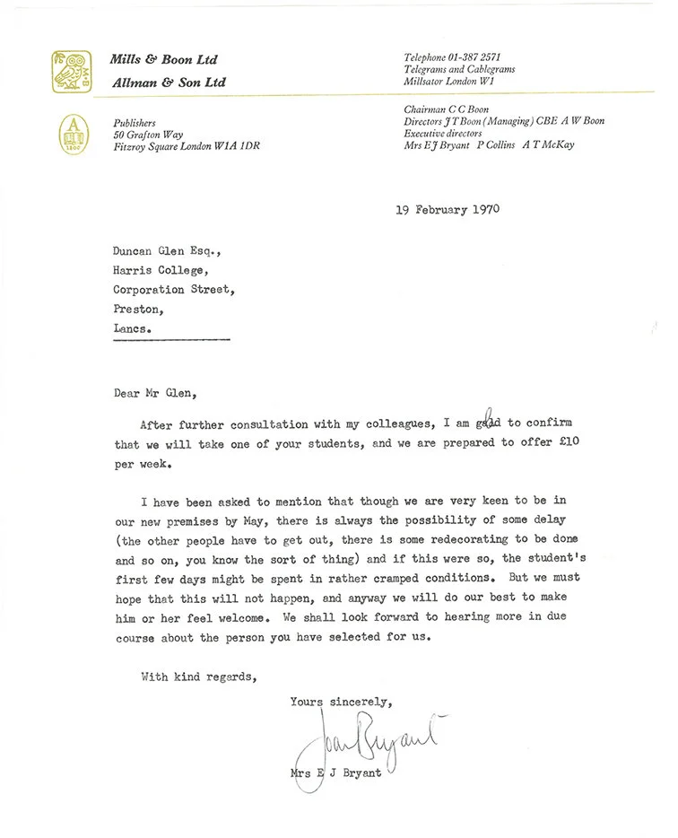
Letter 14

Letter 15

Letter 16

Letter 18

Letter 19

Letter 20
A selection of the letters above have also been included in the recent ‘Words of Wisdom’ publication, which has a series of case studies from 50 alumni over the past 5 decades, with their advice to future students and a selection of their professional work .

Preface

Letters printed at the rear of the book.

Outer packaging

Front cover & spine

Cover & inside front cover

The Disciples Of Design are a global collective of design academics, practitioners, artists and students. We have one common thread – UCLan in Preston, UK; and one common aim – the creation of an ever evolving visual hub for the sharing of ideas and thoughts.