Prussia Cove
/ Ted HowellA concept for a new rum by Sam Holcroft.
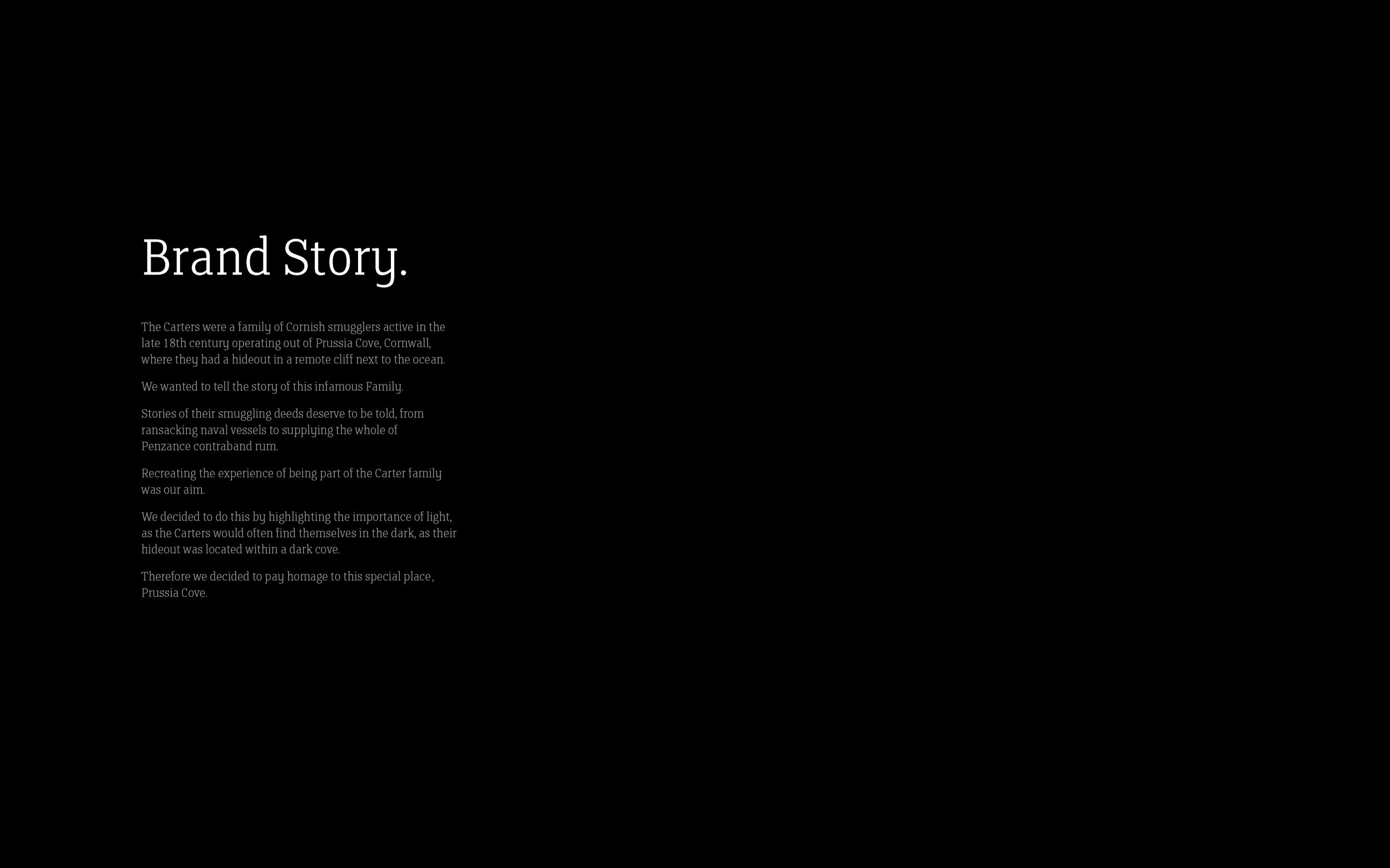
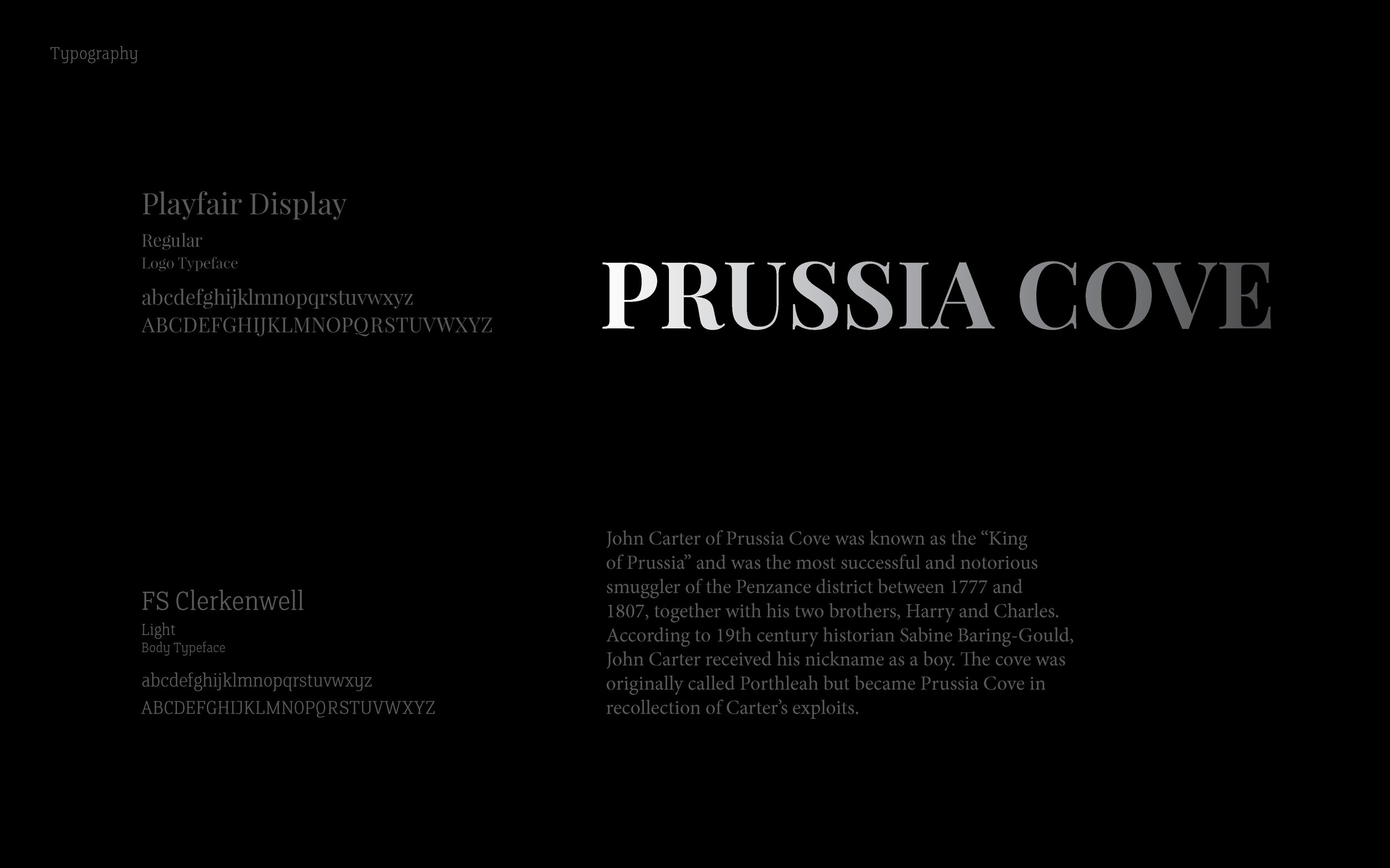
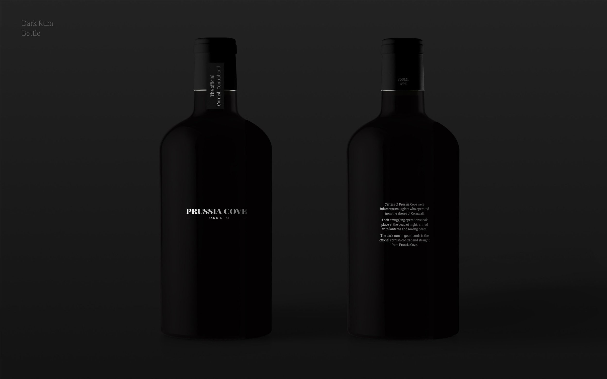
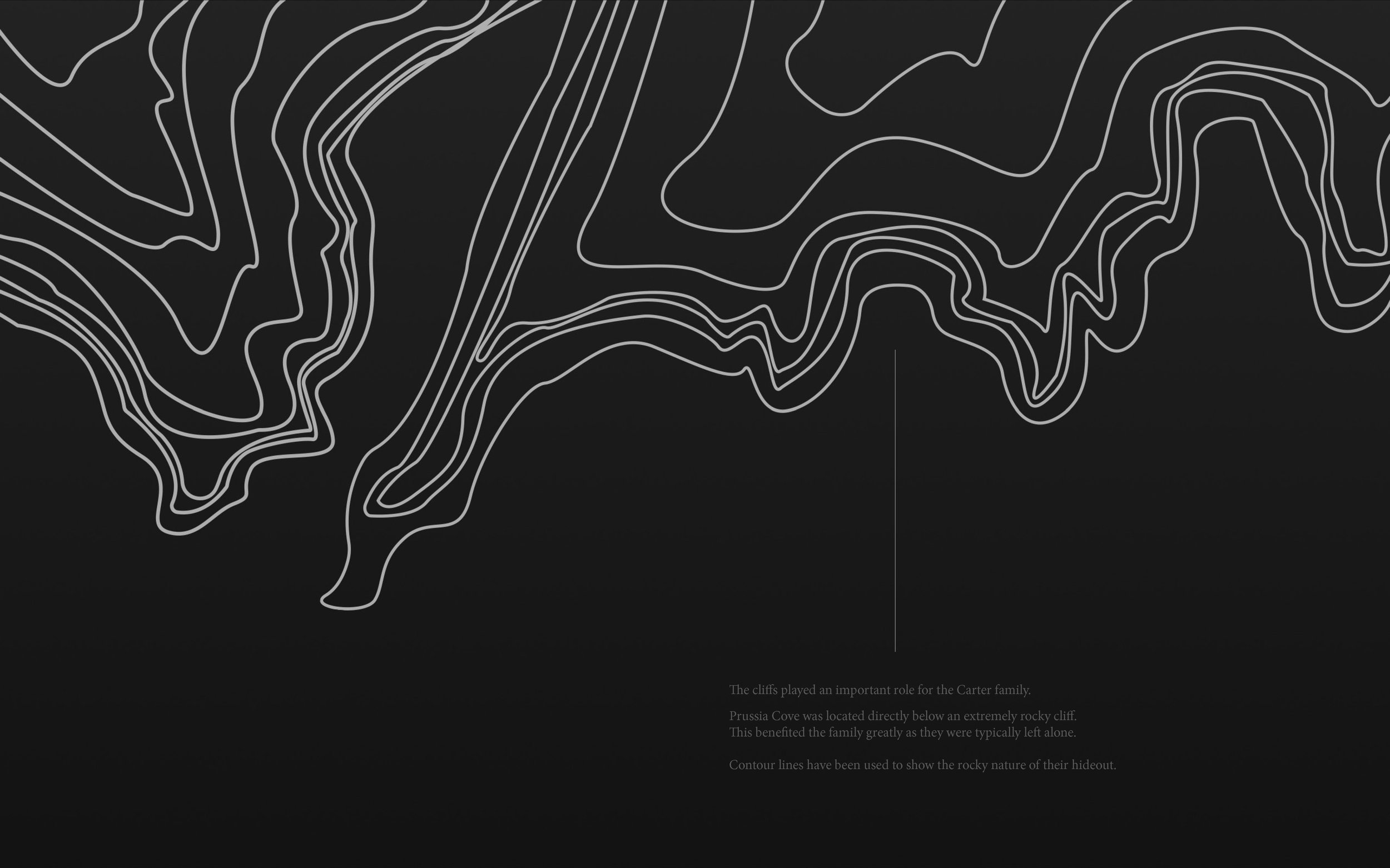
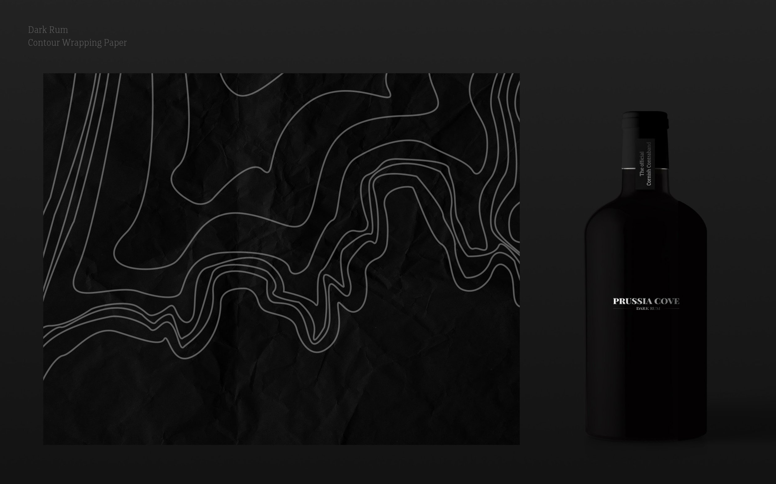
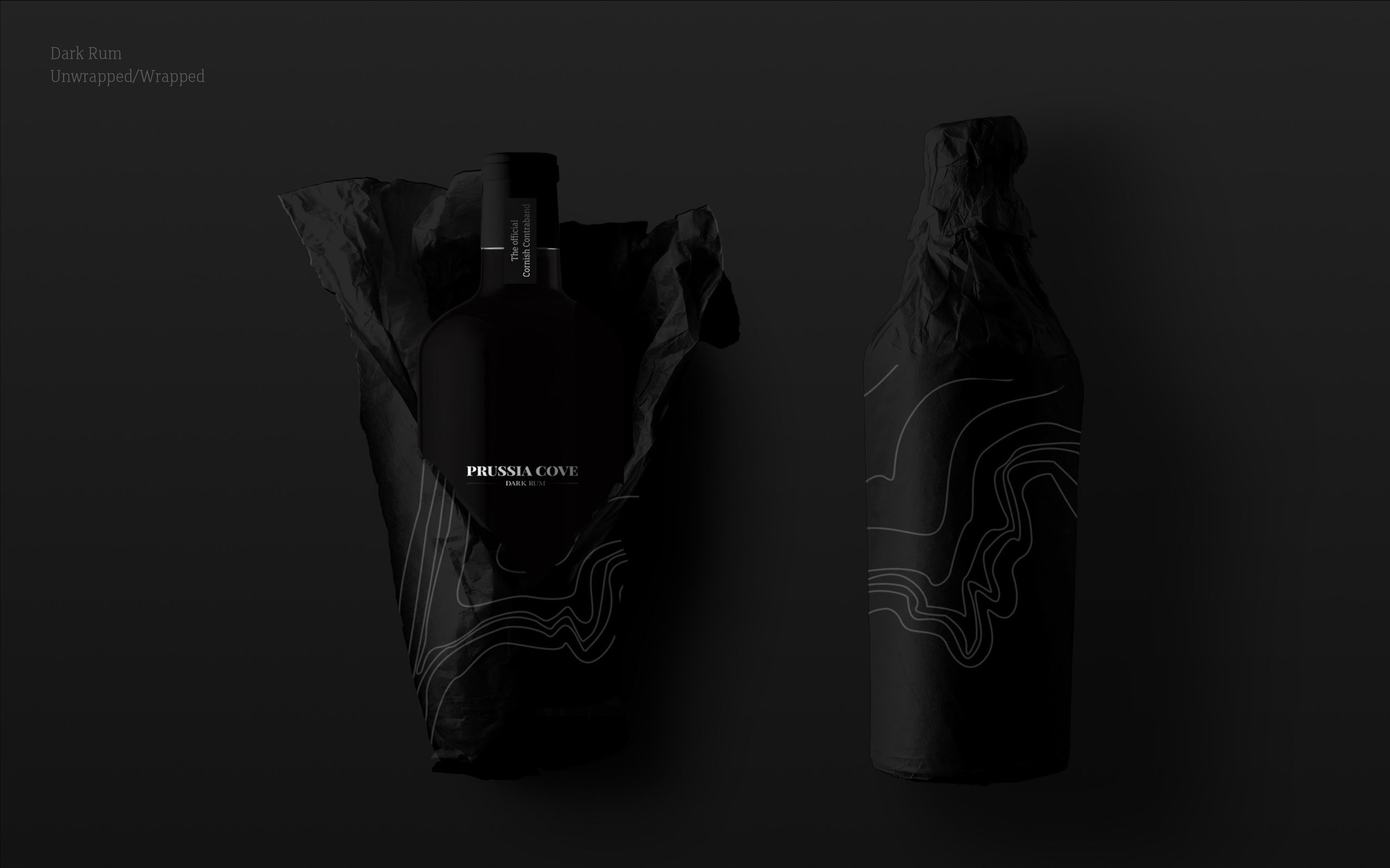
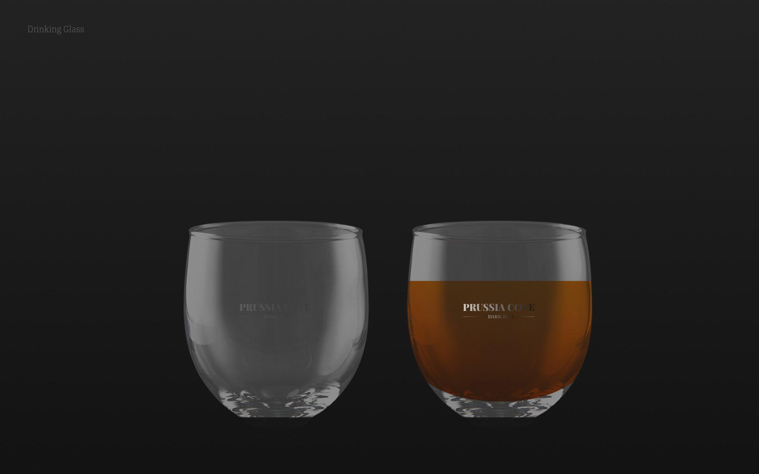
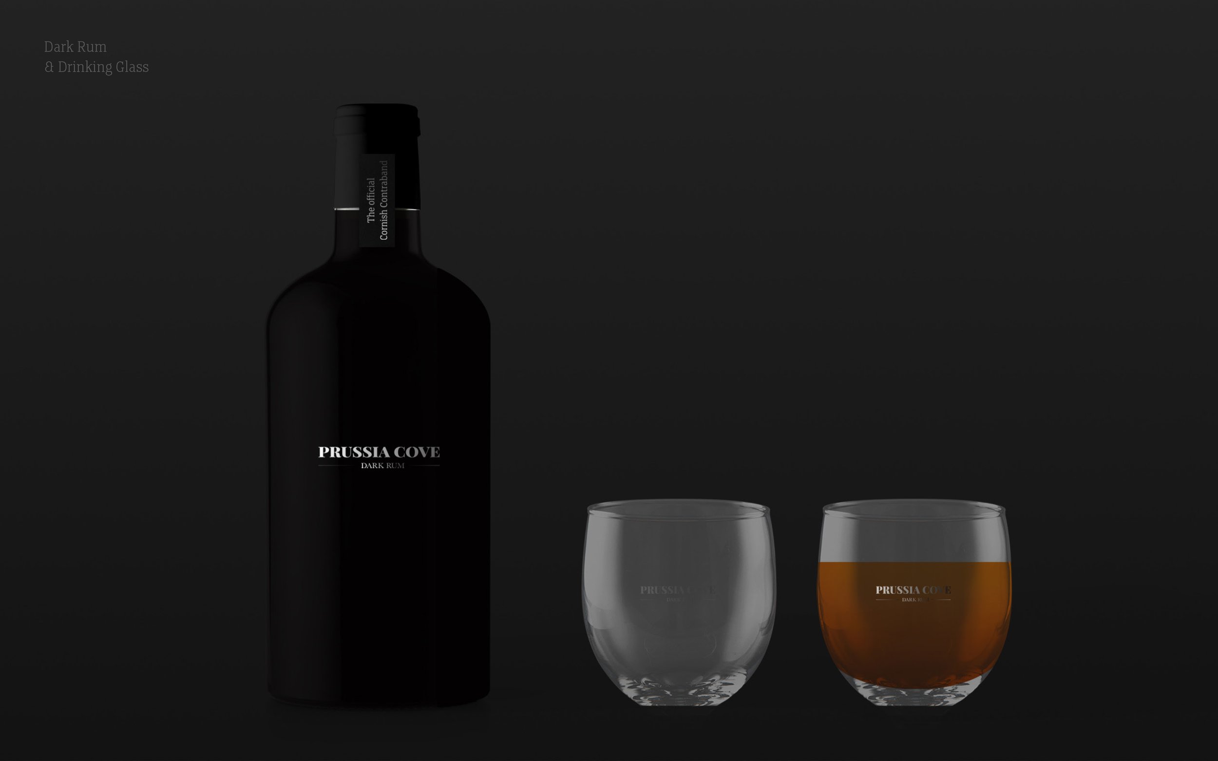
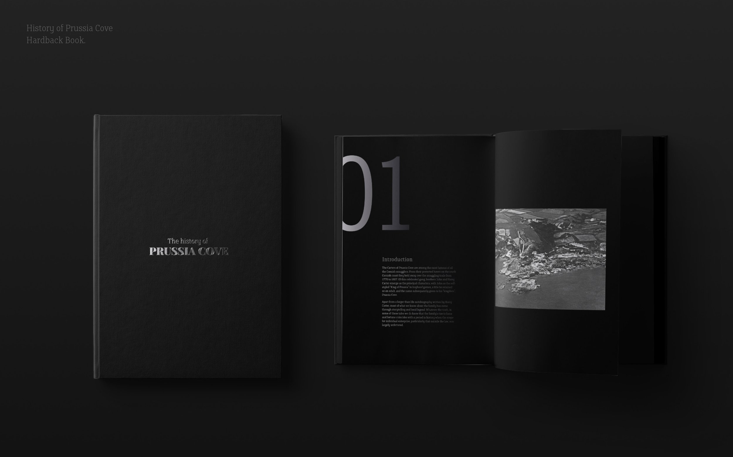
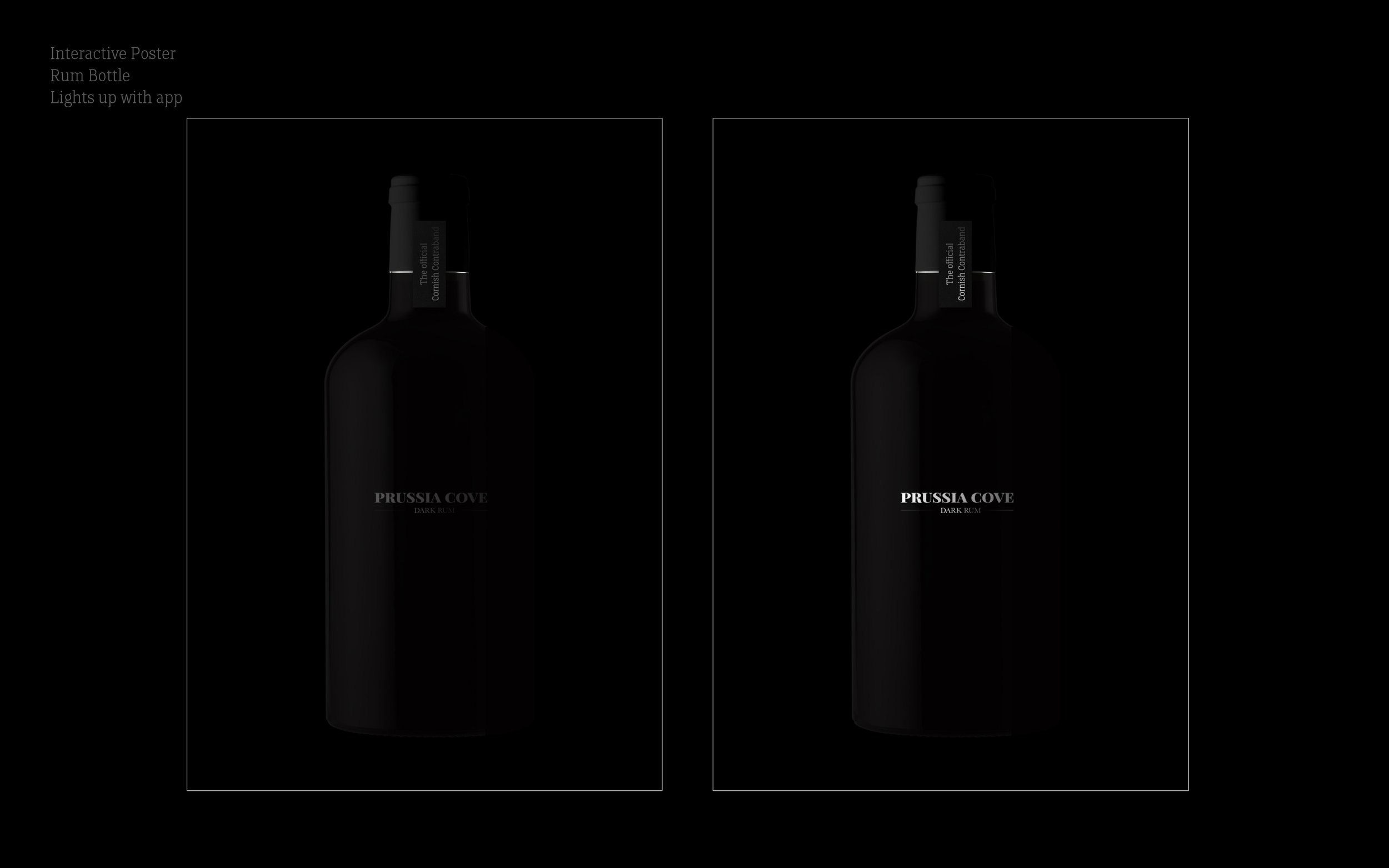
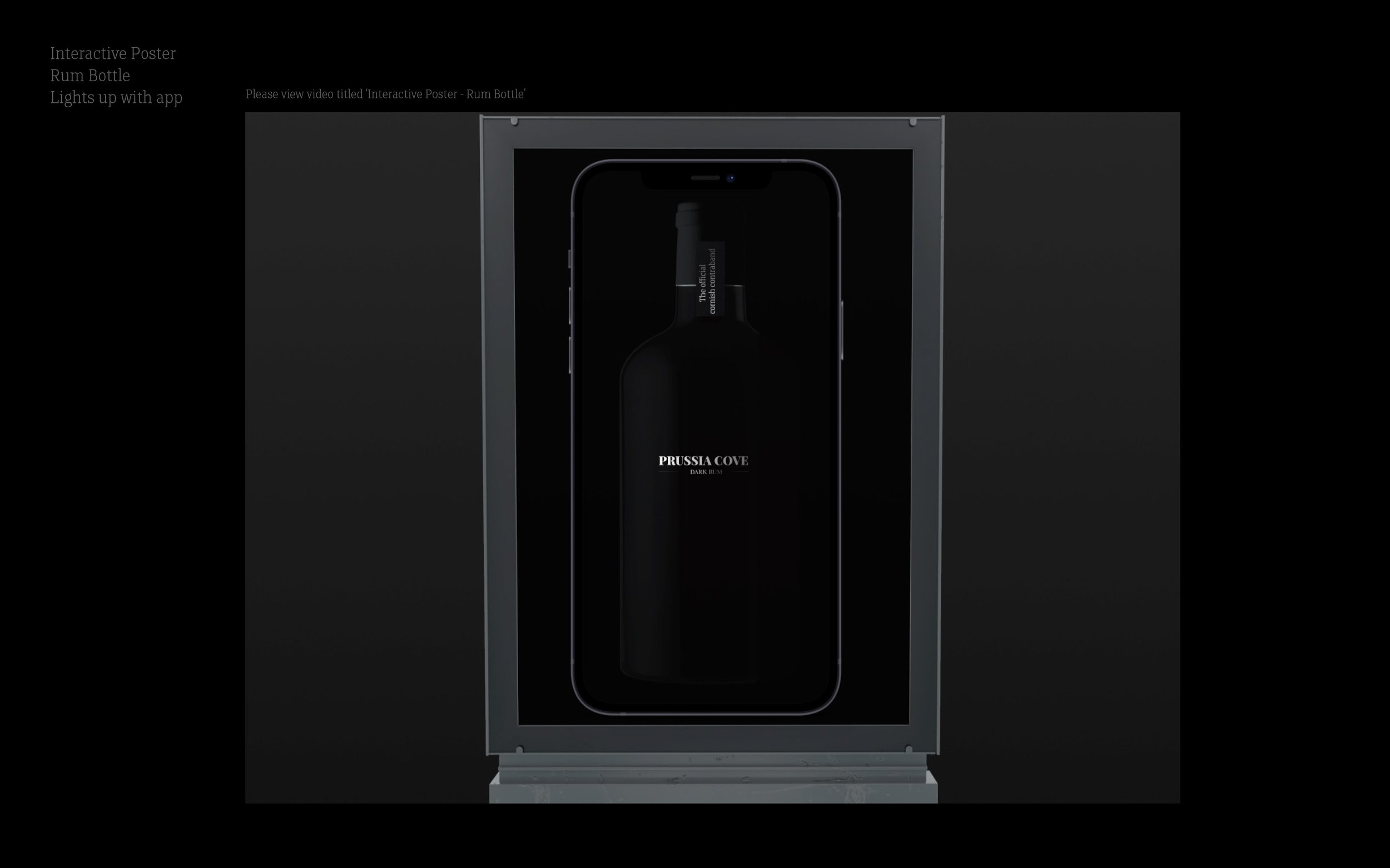
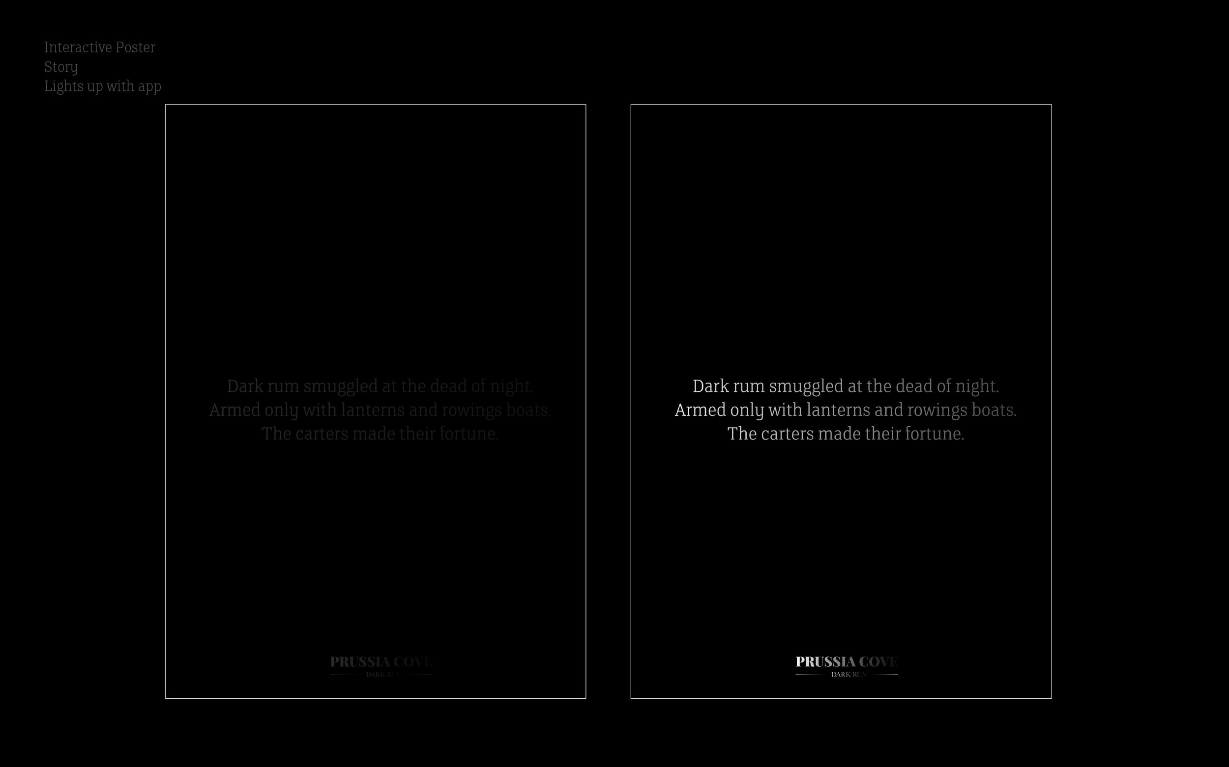
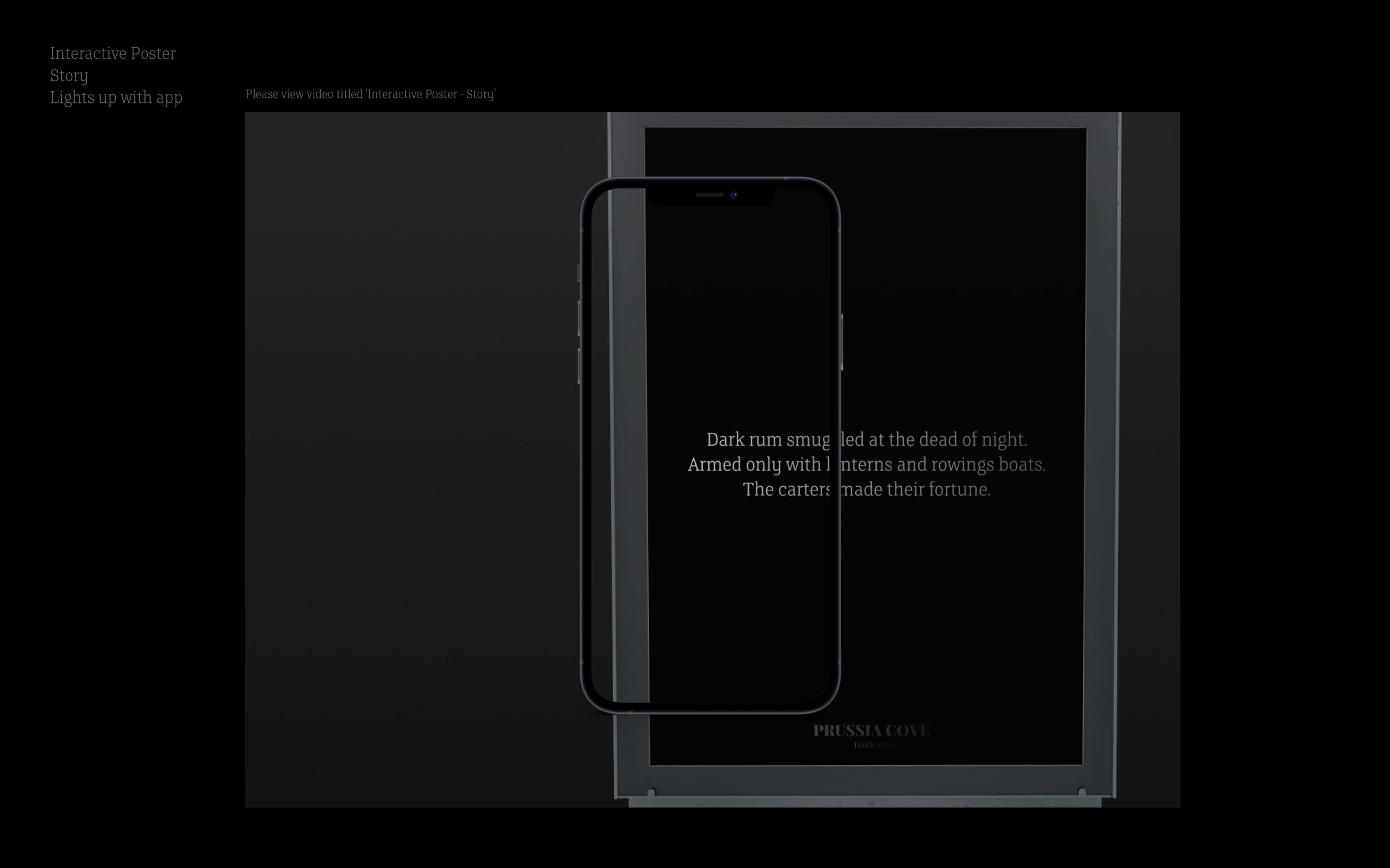
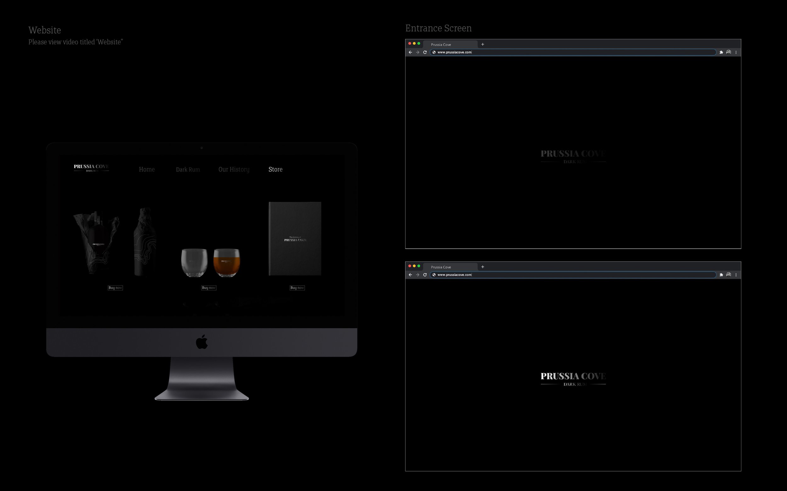
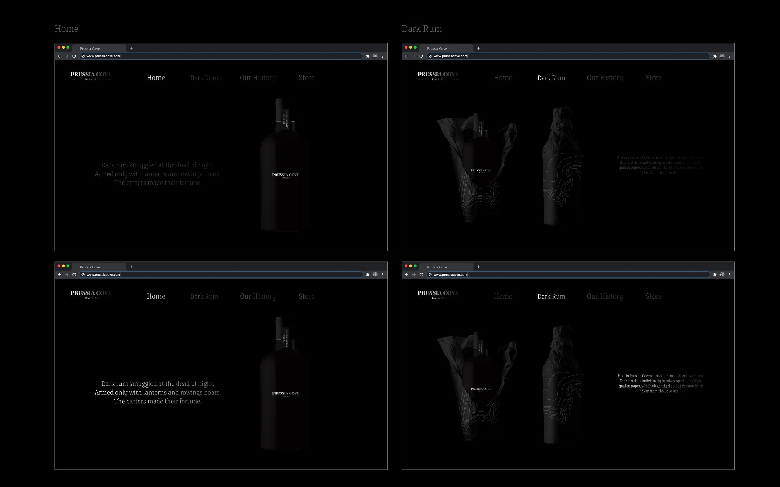
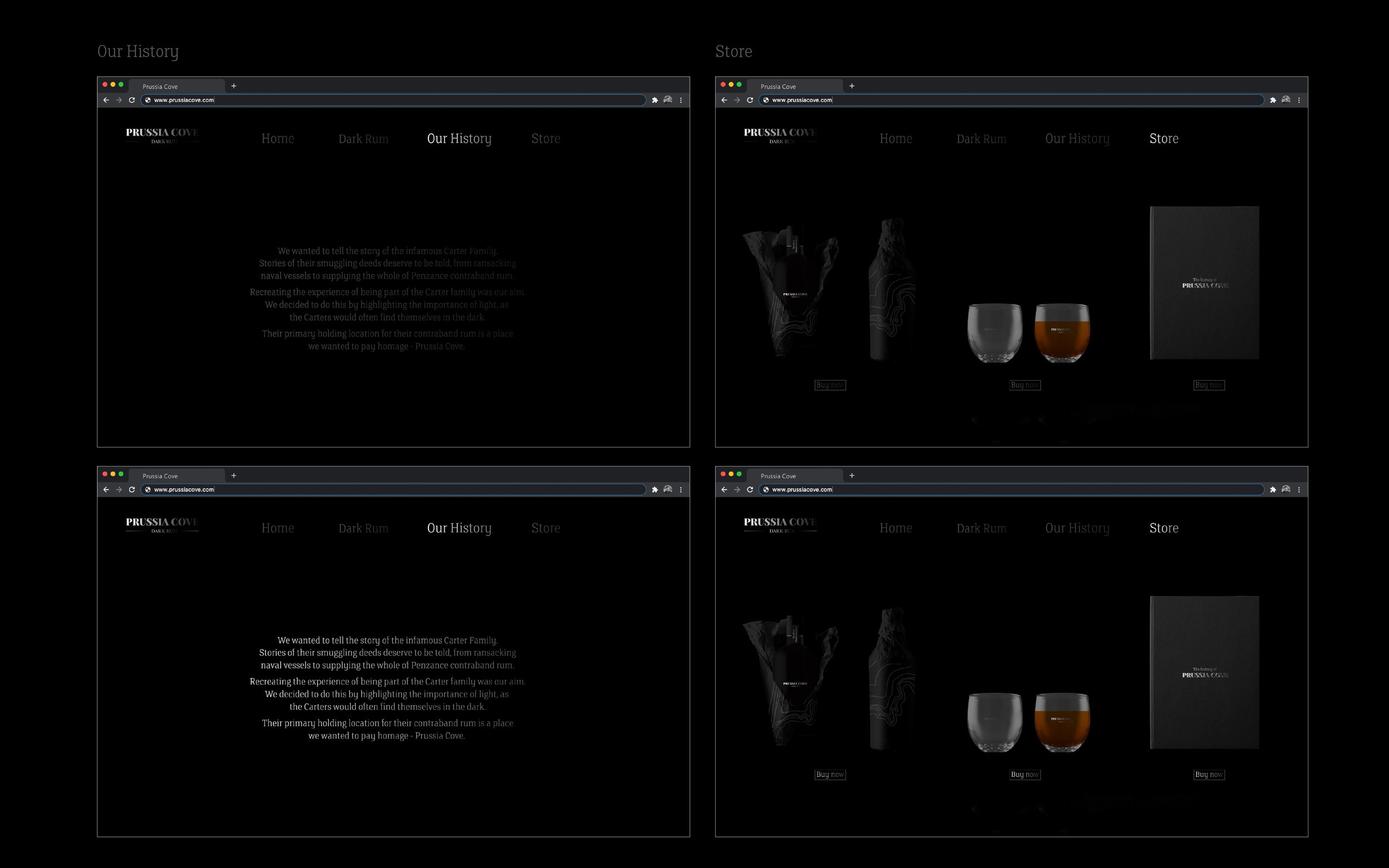

A concept for a new rum by Sam Holcroft.
2021 has been a vintage year for the Graphics Course here at Preston, not only did we scoop 6 nominations in 6 separate categories in this yeas D&AD Global Student Awards, but these nominations now take our 20 year tally to a remarkable 180 student D&AD successes.
This grand total only covers the past 20 years and with the D&AD student programme initially starting in 1980 this means there is another previous 20 years of student success that can be added to the current tally of 180! After consulting the archives and a few old sagely tutors, we now estimate that the Graphics course has amassed probably in the region of 300 + D&AD awards since the schemes inception.
A quite remarkable statistic and one that bares testament to the ideas based philosophy which is at the heart of the course of study here at Preston. These accolades bare witness to this tired and tested creative thinking philosophy that runs deep and one that has helped the course gain such a revered reputation and renown, both in educational and professional circles. Here’s to the next 20!

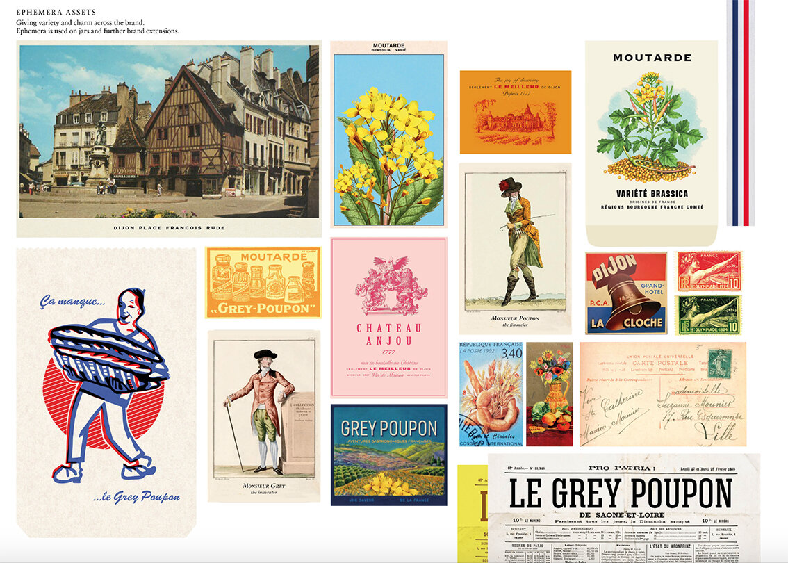
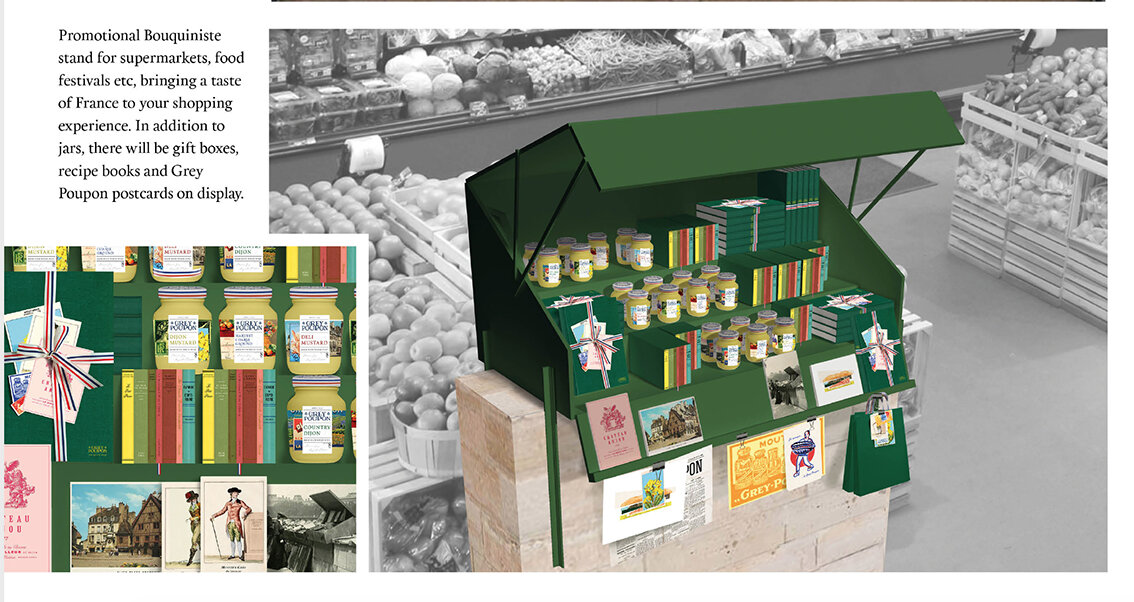
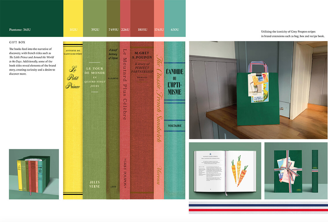
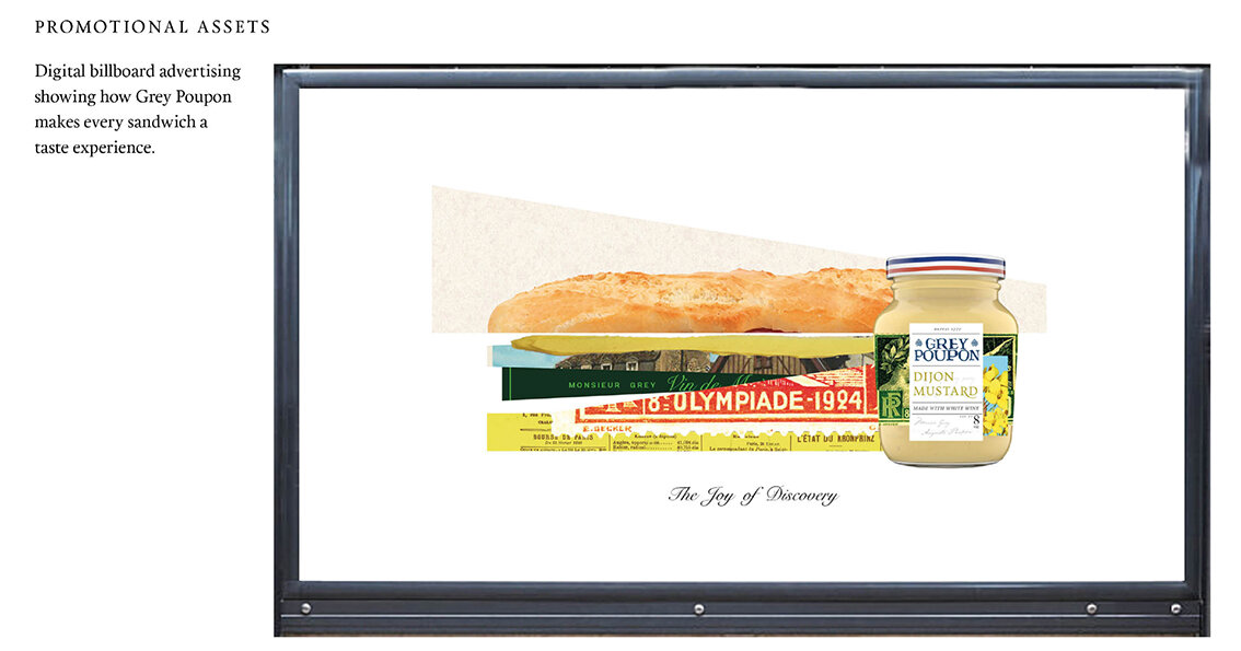
No.1 of our six nominees is Agatha Blazey’s response to the Grey Poupon Dijon Mustard brand refresh.


The Jar labels - Ephemeral feel

The Label Type Anatomy
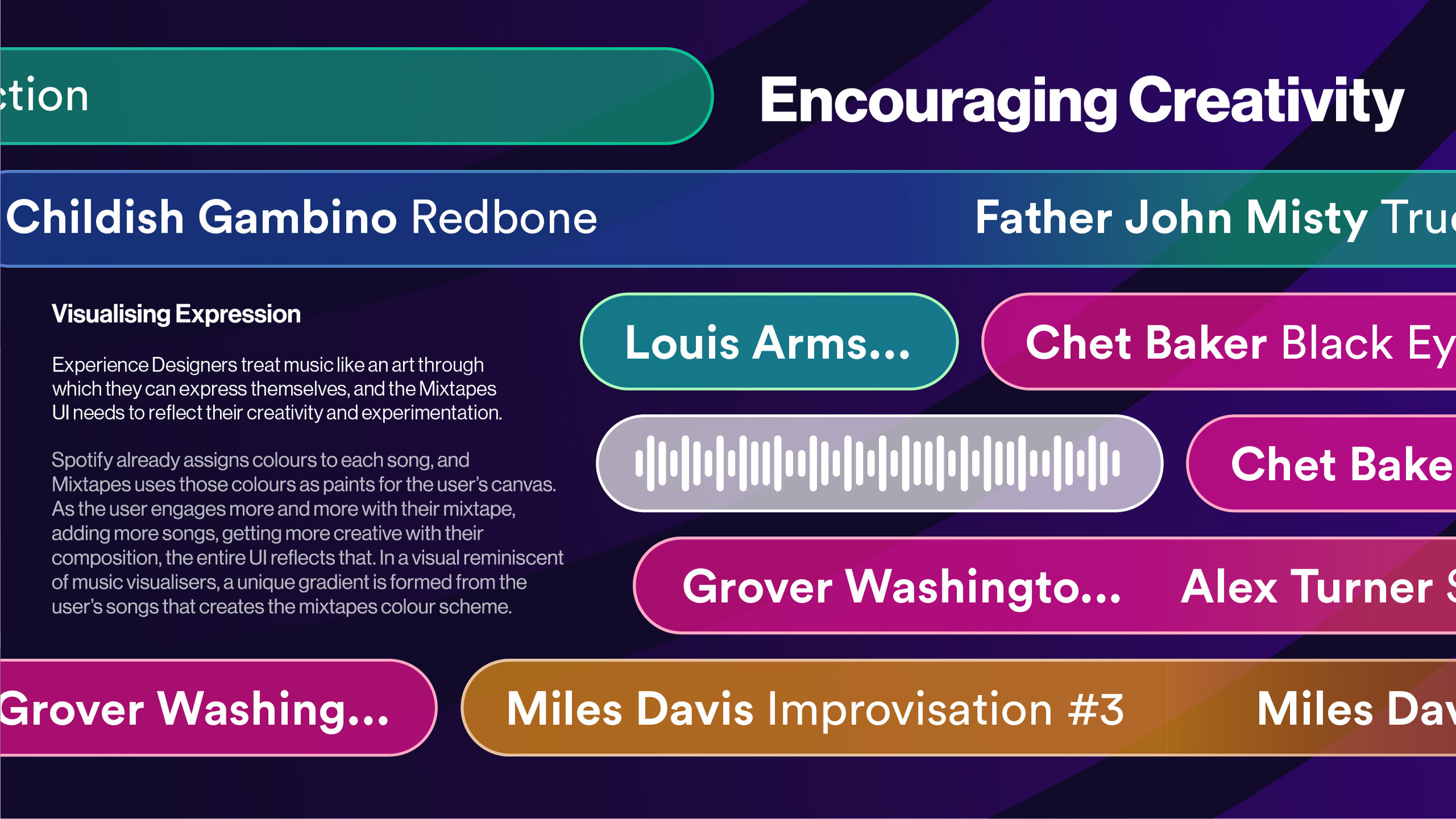
No. 2 of our six nominees is Dom Dzik’s response to the Spotify Brief.



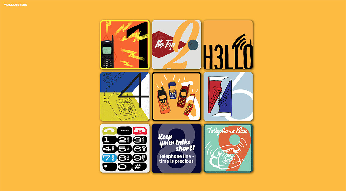
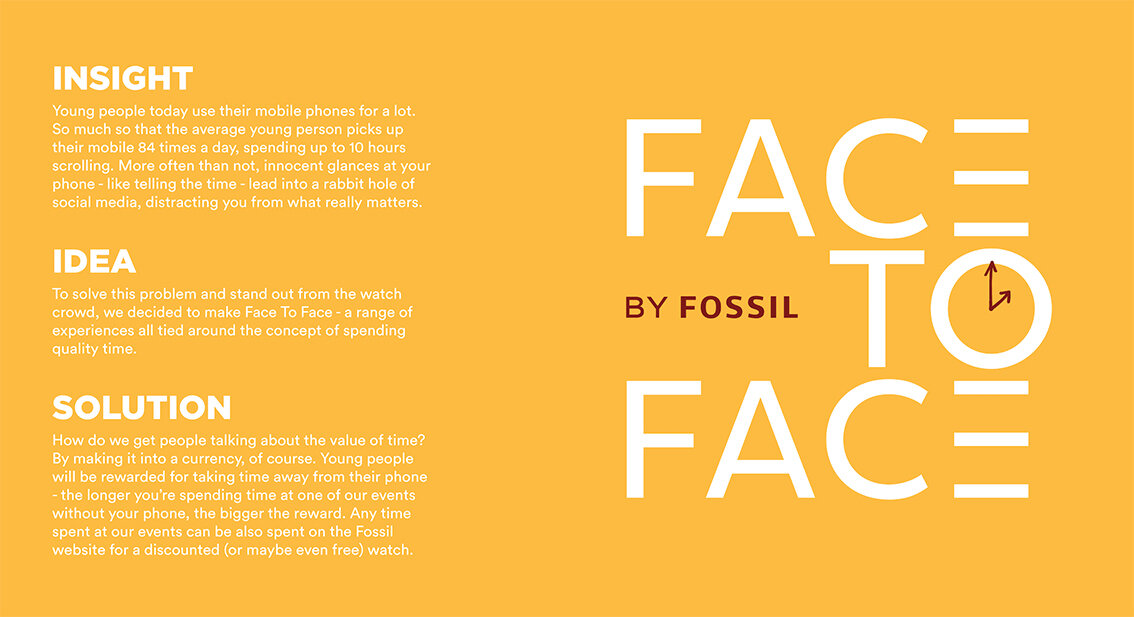
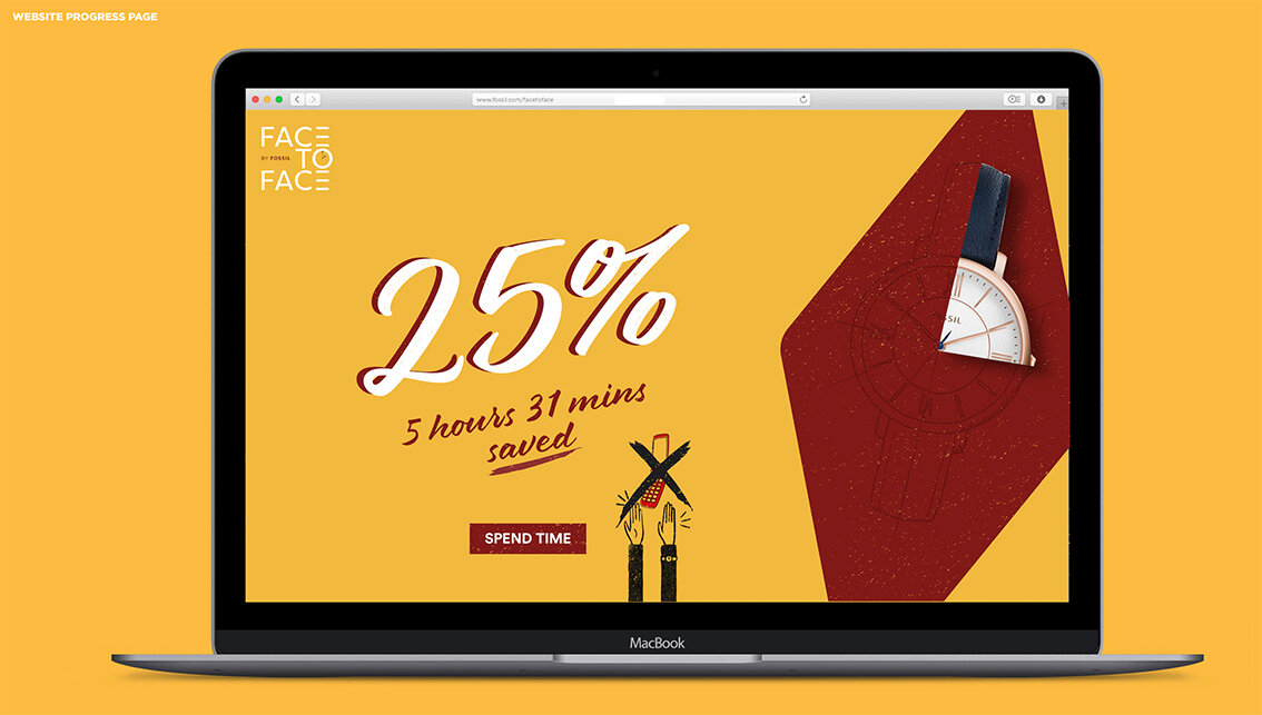
No.3 of our six nominations is Sarah Gregory’s response to the Fossil Brief.

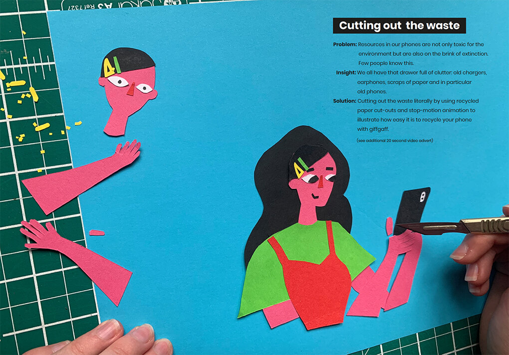
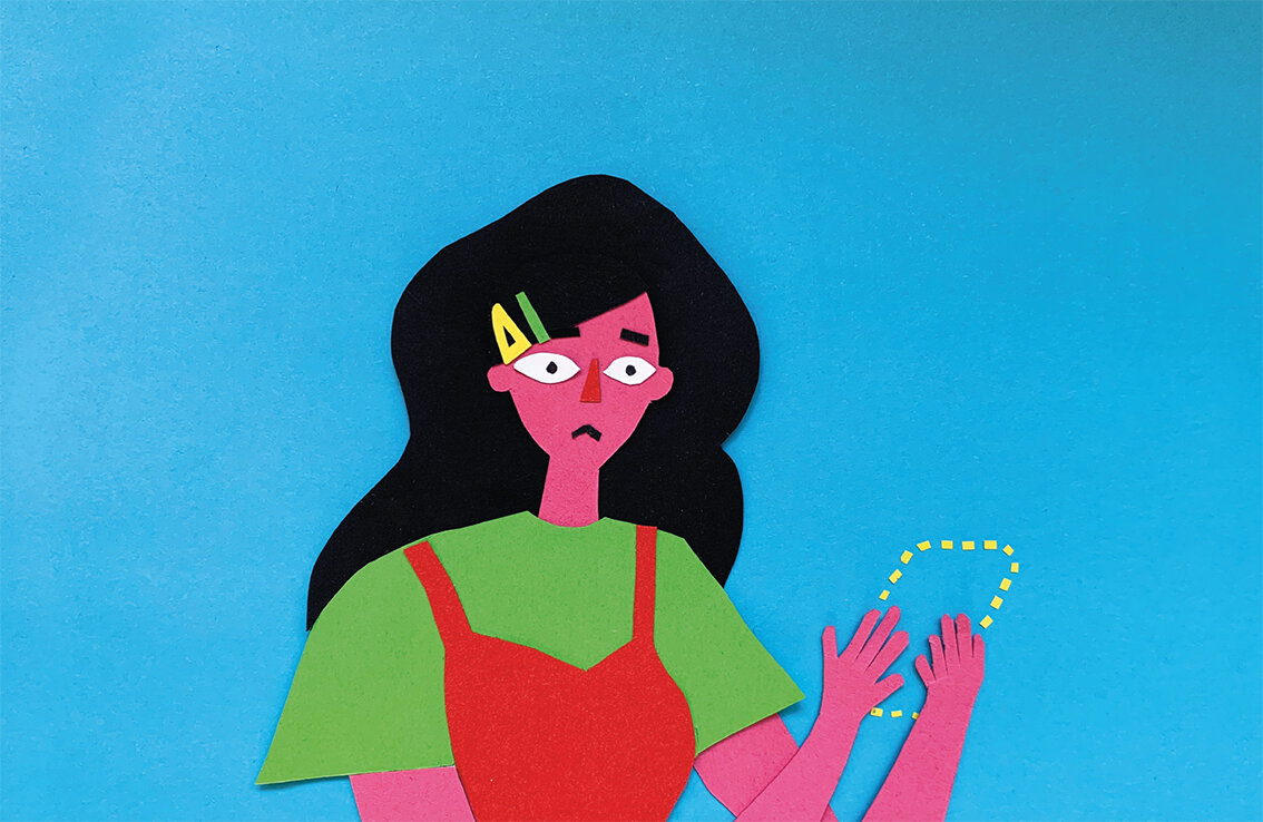
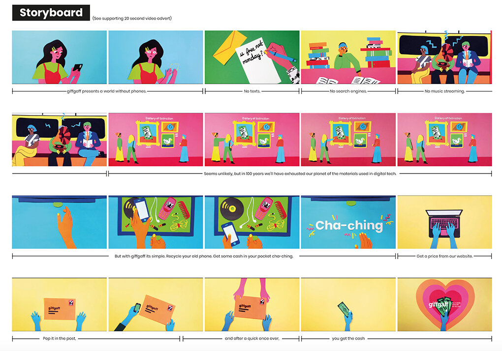
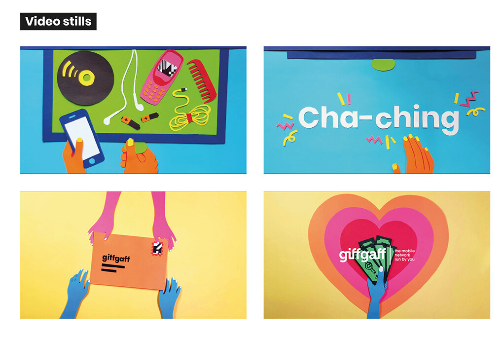
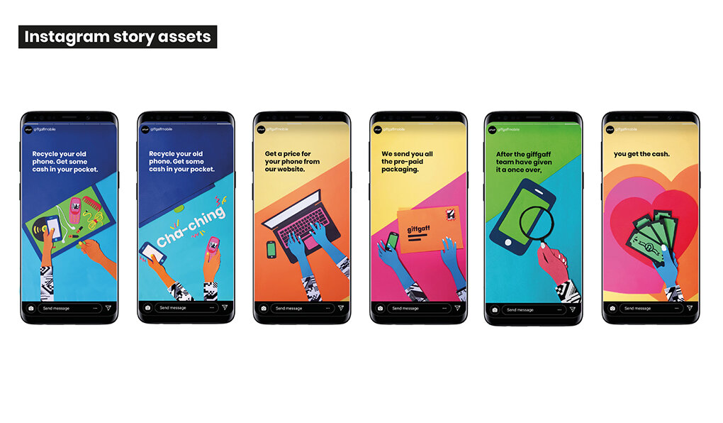
No.4 of our six nominees is Agatha Blazey again with her response to the GiffGaff Brief.


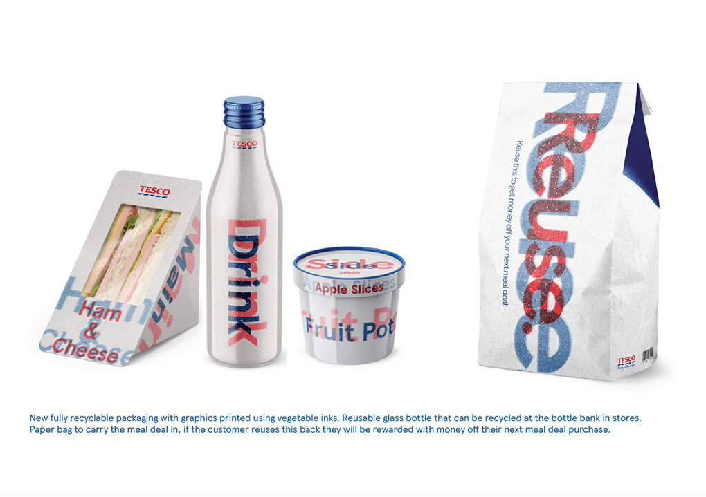
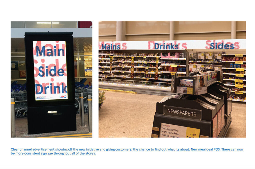
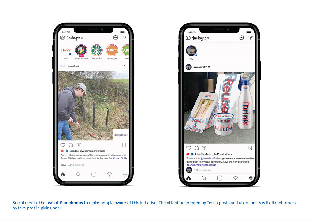
No.5 of six nominees is by Will Davies and is in response to the Tesco brief.



No.6 in the last of our series of nominees is a joint effort by Ryan Boyes, Joe Leeny & Dom Dzik again with their response to the Rare Brief
Good luck everyone on the evening of the 8th July when the winners will be announced.
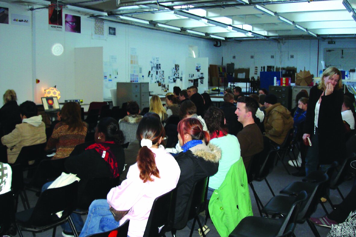
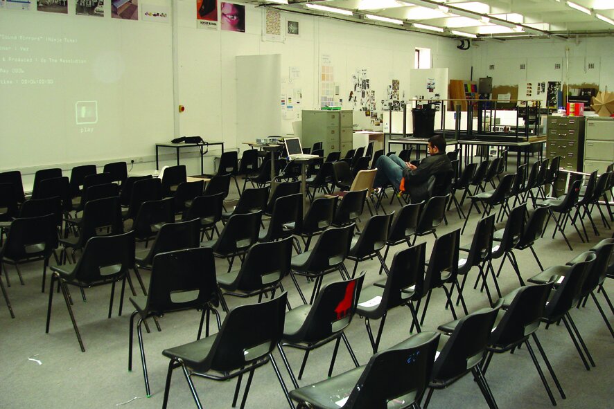
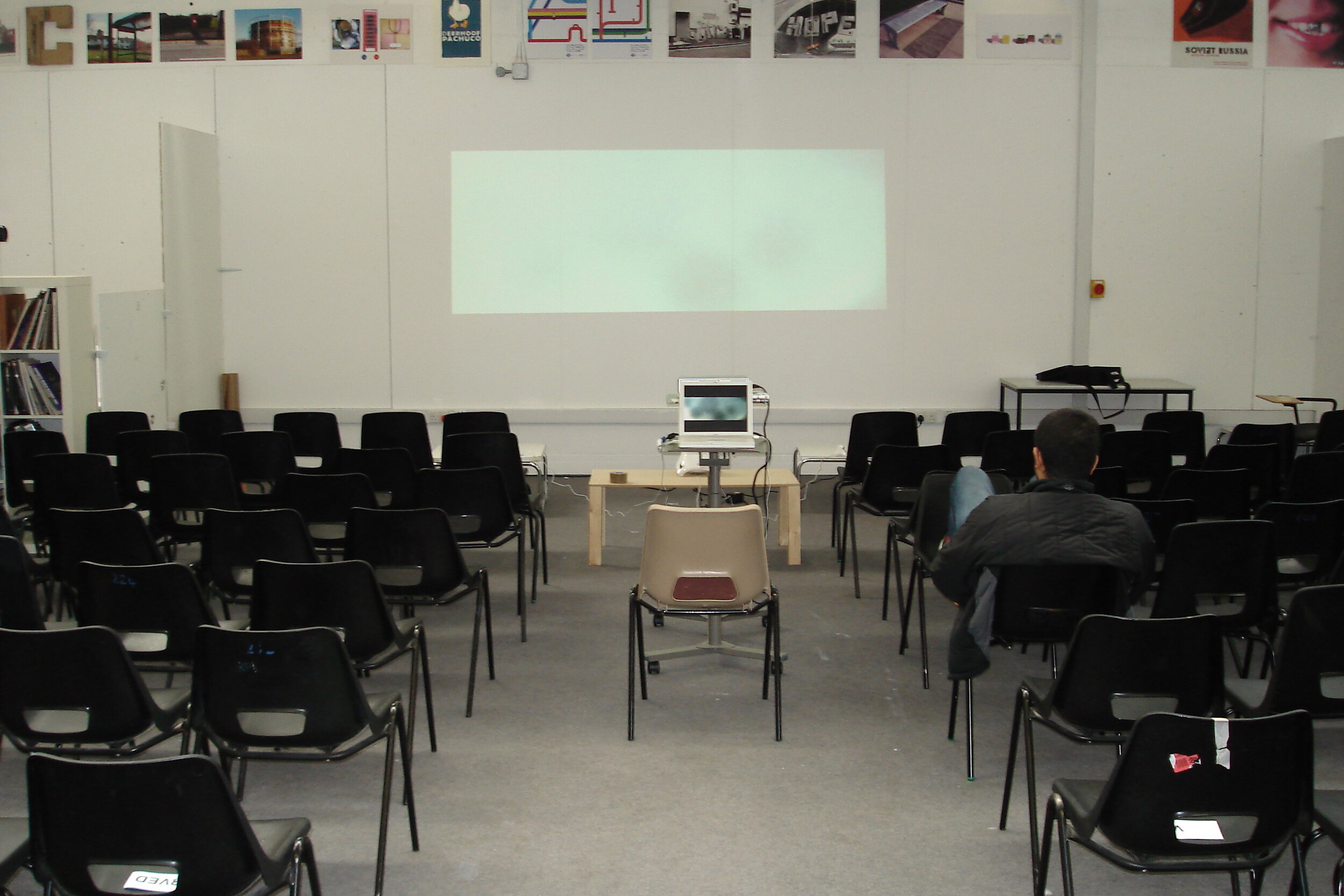
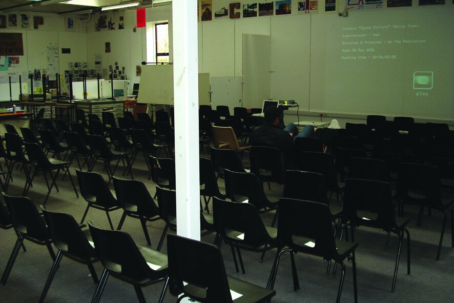
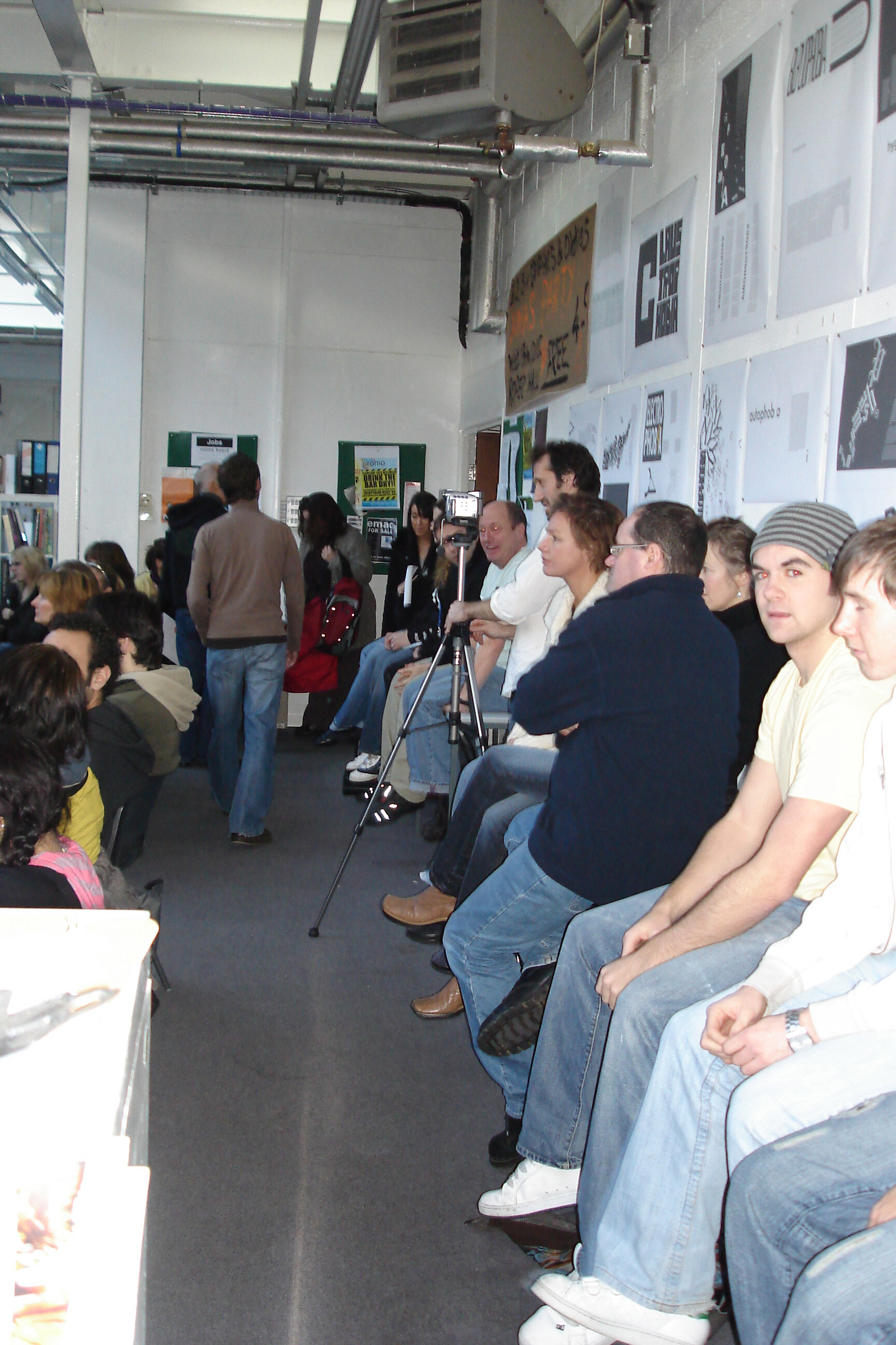
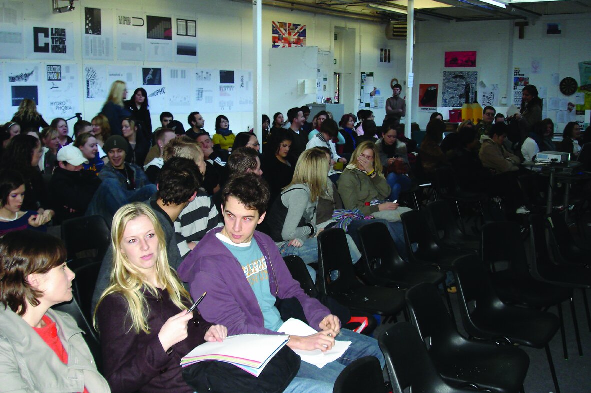
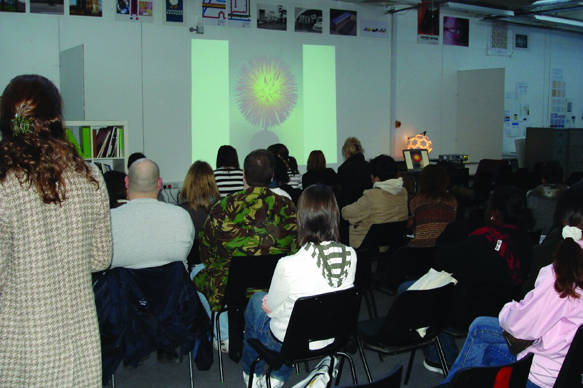
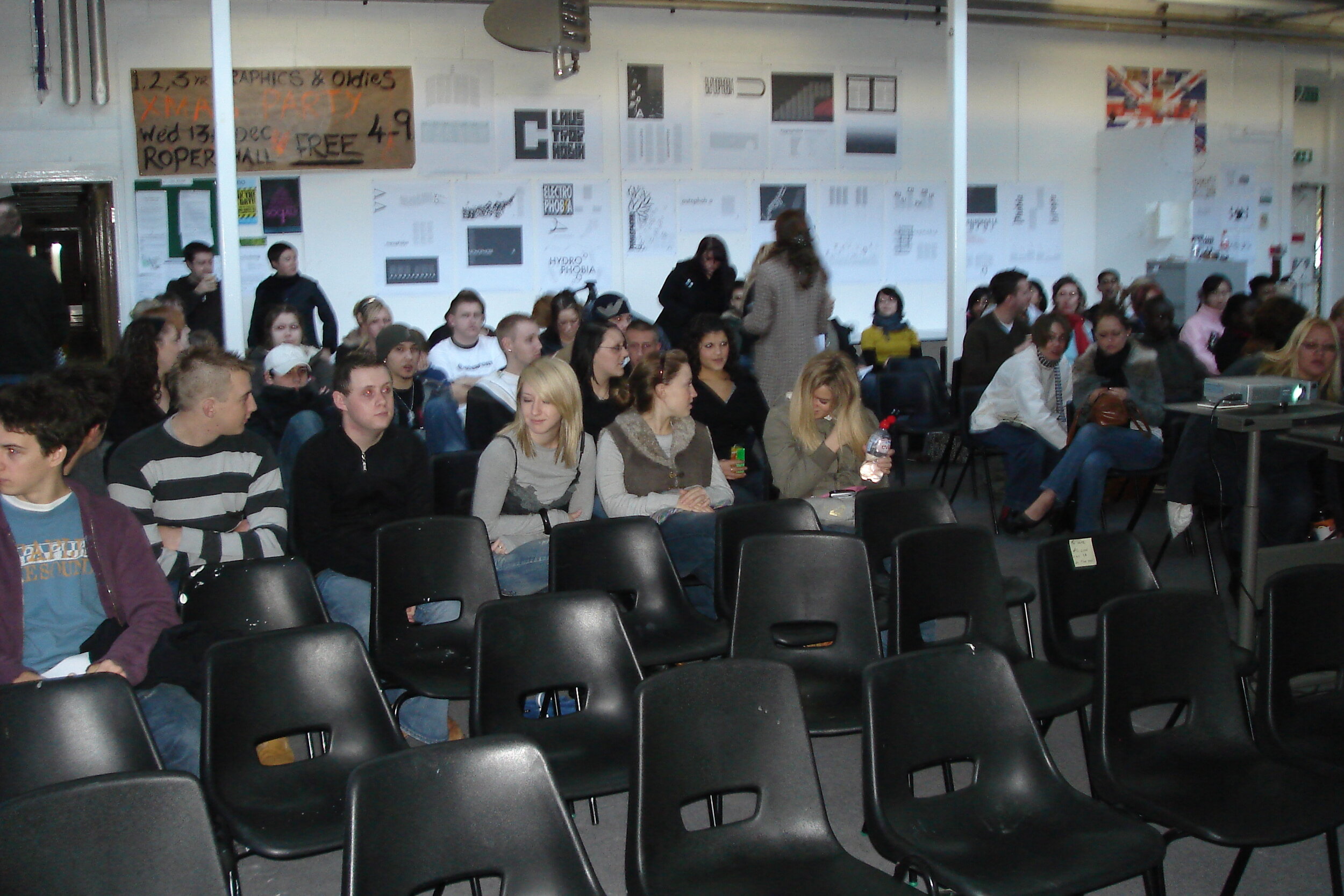
Going through our hard drive we came across some rare snaps of what was to become our annual conference week event.
Back in December 2007 we initiated 3 days of speakers under the title ‘The Christmas Lectures’ and here is a short review of the event that we also happened to find on a word document attached to the file.
“Over three days the department played host to a series of informative a well attended visiting speakers from a variety of disciplines. These included Andrew Griffin from ‘up the resolution’ a multi-disciplinary design agency, specialising in music videos, film and animation. Claire Norcross - head of lighting design at Habitat UK and Richard Scholey creative director of Elmwood – Leeds.
Over 400 students attended these informative lectures which were followed by brief question and answer sessions”
Fast forward 14 years.
We have just recently celebrated our 10th conference week event, themed around ‘Making your Mark’. which consisted of 24 speakers, from a wide cross section of design disciplines spread over 5 days.
Over the past several years the event has become a mainstay of our wider alumni family as well as other professional practitioners currently working in the creative industries.
This year we also broadcast the whole week via teams as well as making the talks available on youtube and between those tuning in live on the day and those watching on youtube catch up, this years figures were estimated at around 4,000+.
Should you have missed the event all the talks are archived and available to watch here.
Here we feature another D&AD winning entry from 2006 by Jenney Sutton. The brief was to imagine a new set of designs for the iconic flags that adorn the outside of Coutts Bank - 440 The Strand London.

3 designs based on bank notes

Flag Design 1
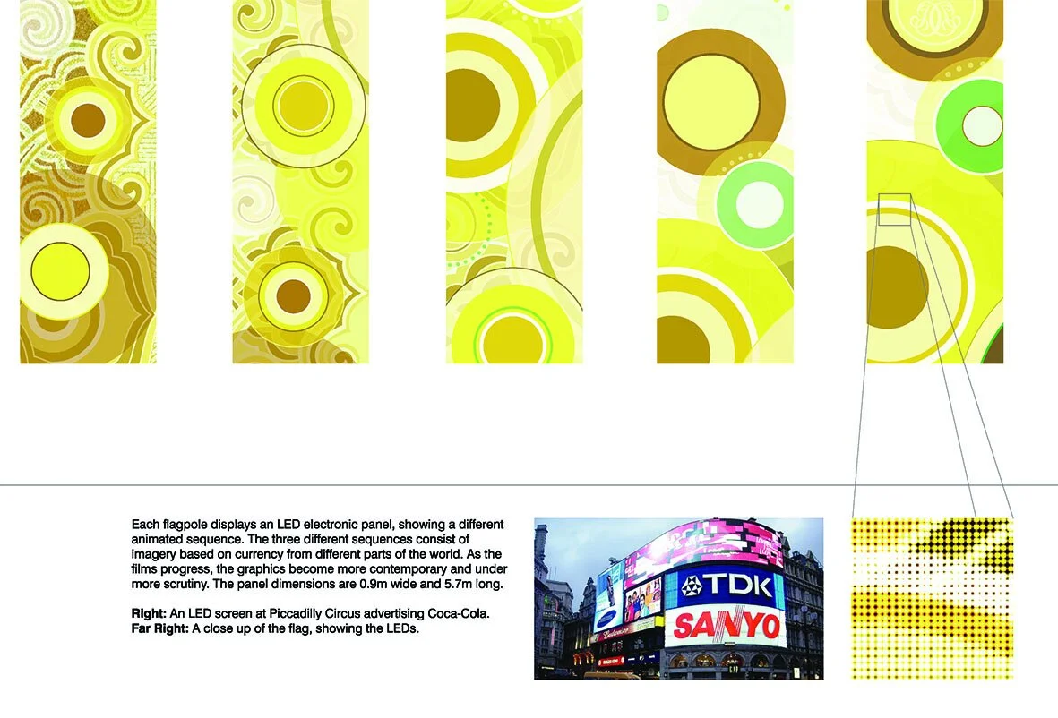
Explanation

Flag Design 2

Flag Design 3
Here we feature a couple of projects from way back in 2006. If our memories serve us well, we think they are solutions to a D&AD typographic brief - Create a series of posters to advertise a Horror Film Festival in a town or city of your choice.


It’s that long ago we can’t actually remember who did the first solution? The second one was created by Rachel Simpson
Here we feature a year 2 project by Harriet Richardson from back in 2014 for Fedrigoni Fine Papers.
Fedrigoni were launching their new Sirio Ultra Black range of papers and needed an eye catching direct mail to send out to designers and agencies that introduced the range plus highlighted some of it’s unique features.
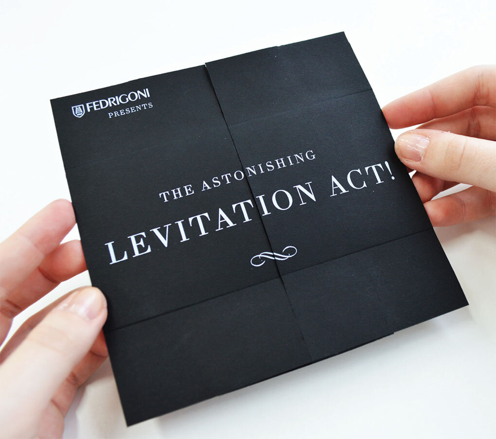
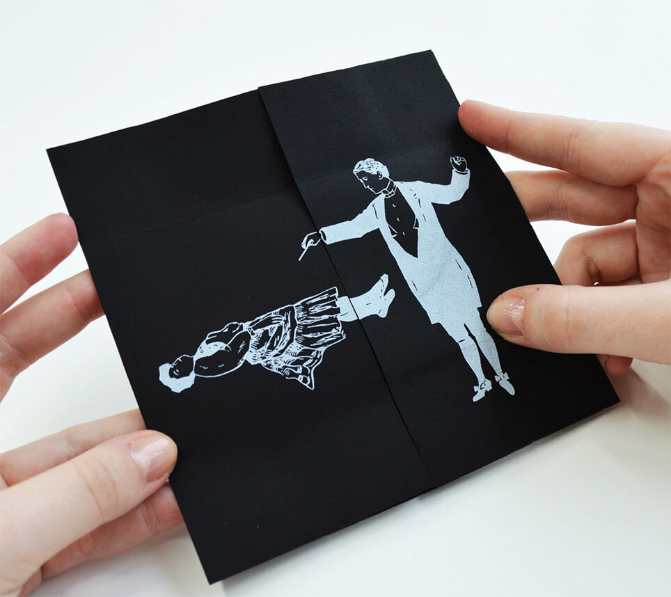
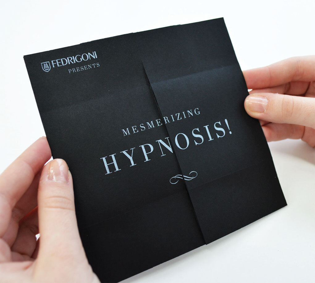
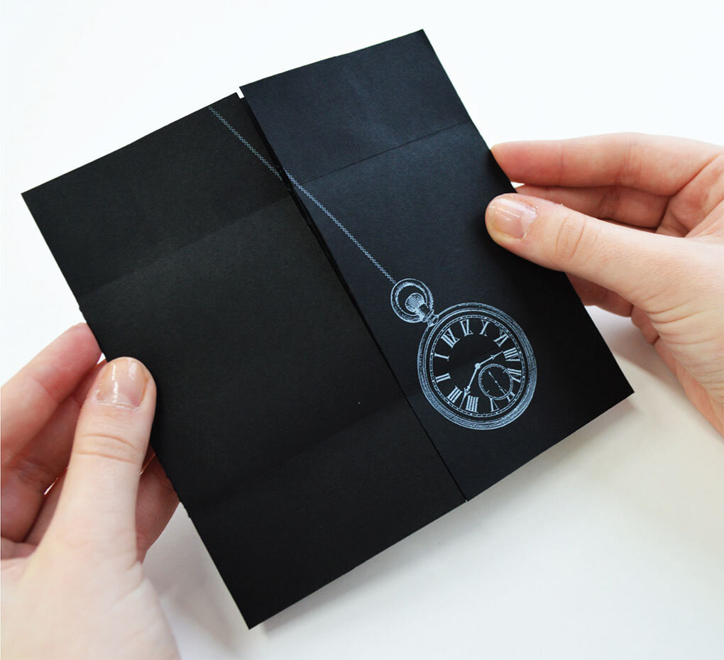
Harriet’s solution highlighted the magic properties of Fedrigoni’s new Sirio paper range by appropriating the visual language of 19th Century magicians and illusionists.
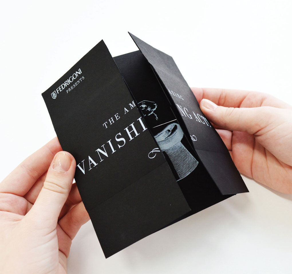
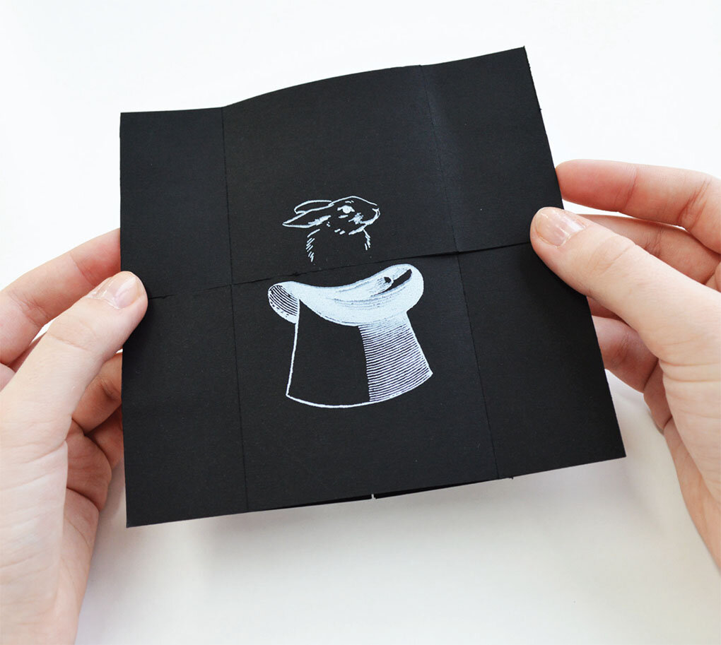
The series of 4 direct mail shots, were silk screened onto Sirio Ultra Black paper stock and inventively utilised an ‘infinity fold’ to reveal a series of stories and insights into the papers unique qualities.

Introducing

The range of 4 magic mailers
Trick 1 - The Vanishing Rabbit!
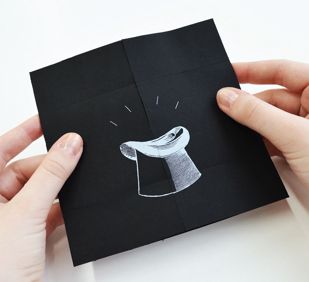

Trick 2 - The Levitation Illusion


Trick 3 - The Hypnotic Illusion


Trick 4 - The Cutting in Two Illusion
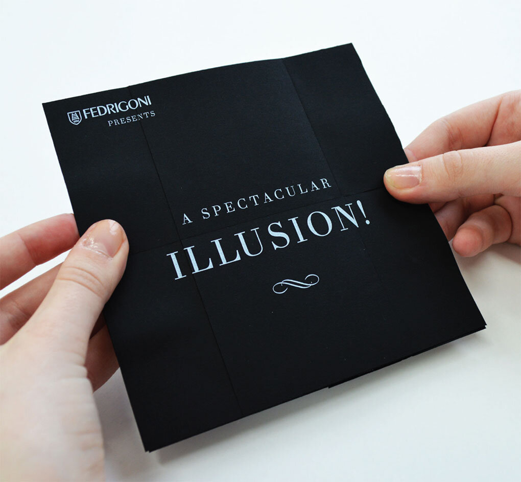
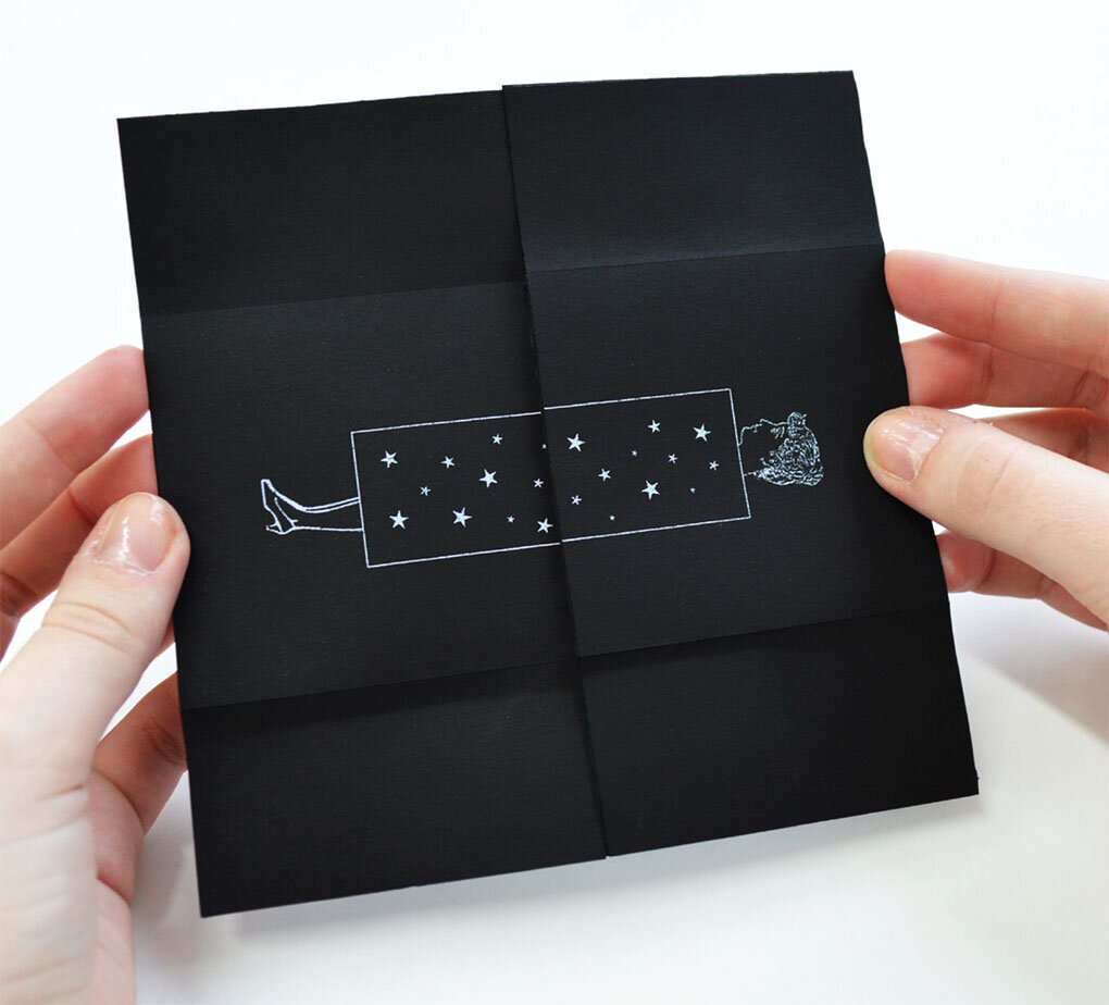
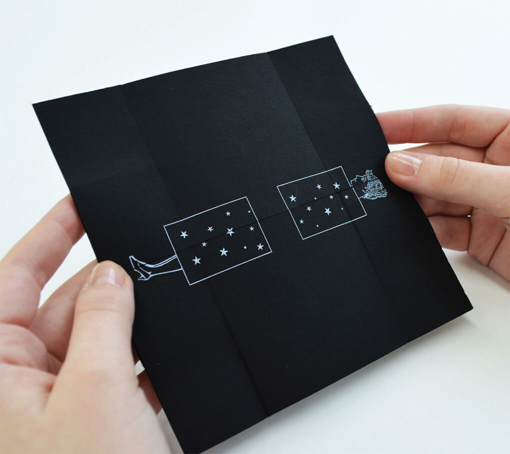

A great piece of work that highlights how you can write a project into existence, inventive copy cleverly highlights the papers properties and at the same time ties them into the magic theme. Now that’s MAGIC!
For our followers who are not yet part of the ‘Preston family’, please pay us a visit this summer. On 26th June, our open day is a great opportunity to visit our campus, check out our facilities and meet the course tutors.
We look forward to seeing you there.
Click here to book your place.

Another great online archive. There’s nothing we can say about Alan and his work that hasn’t been said already. So we say simply this: soak it up, and enjoy.
Visit here: Alan Fletcher – Archive
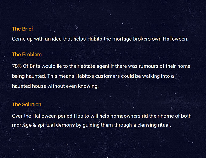
Here we feature recent graduate Dave Shorrock’s Halloween inspired Habito 'Demon Cleansing Ritual' kit feature in The Drum
The concept was created by recent graduate David Shorrock, after he pitched via You Can Now’s network of universities, colleges and art and design schools, as part of Habito’s Halloween challenge.
The brief asked graduates to come up with a creative concept that would be bold, clever and bring Habito’s mission (to save people from mortgage hell) to life.
Inspired by research that showed that 55% of people in the UK would be put off buying a property if they thought it was haunted, Shorrock created Habito’s eight-step home exorcism ritual to banish any ghouls back to the other side this Halloween.
Insight

Word mark

Cleansing Kit

Instructions

Detail

Mailer

Ambient - Vue cinema hook up
Nice work Dave, a great fun appropriate idea well crafted!
Here we feature a recent find – The People’s Graphic Design Archive – uncovered by Dylan Carr. In its own words here’s an overview of the website and its intentions:
The People’s Graphic Design Archive is a crowd-sourced virtual archive that includes everything from finished projects to process, photos, letters, oral histories, anecdotes, published and unpublished articles, essays, and other supporting material in the form of documents, videos, audio, as well as links to other relevant archives and websites.
Our goal is to enable new and expanded stories about a graphic design history— one that represents diverse cultures and a broad range of interests! The archive exists in Notion now, but will eventually move to a purpose-built, public website.
We’ve had a brief peruse and it is clearly an absolute warren of resource. Below is just a very small snippet of a quick journey over a coffee. So, from The People’s Graphic Design Archive, we went to The School of Visual Arts Archive, which took us to an archive of Chermayeff & Geismar.
This is along with our other featured archives is a free, seemingly infinite resource of graphic design from across history. Incredibly important. Incredibly useful. Thanks Dylan.

The Disciples Of Design are a global collective of design academics, practitioners, artists and students. We have one common thread – UCLan in Preston, UK; and one common aim – the creation of an ever evolving visual hub for the sharing of ideas and thoughts.