Paul Rand - Auction

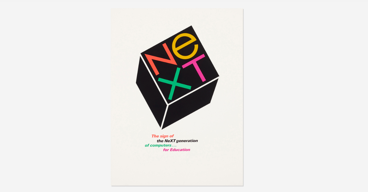
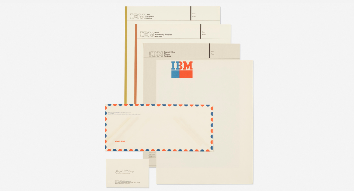
For those of you who know Paul Rand, an exhibition catalogue for an auction sale of some of his work, belongings and prints has been put up online. And for those lucky enough, there's an opportunity to own a piece of design history. Take some time to have a look through the collection, when seen as a whole it's awe inspiring.

If you don't know of Paul Rand then you're a newcomer, but he is one of the absolute masters of design. The auction catalogue features his work, but also things that inspired him. It is so important to remember that we should look to take inspiration from the world outside of design, not just repeat what we already know.
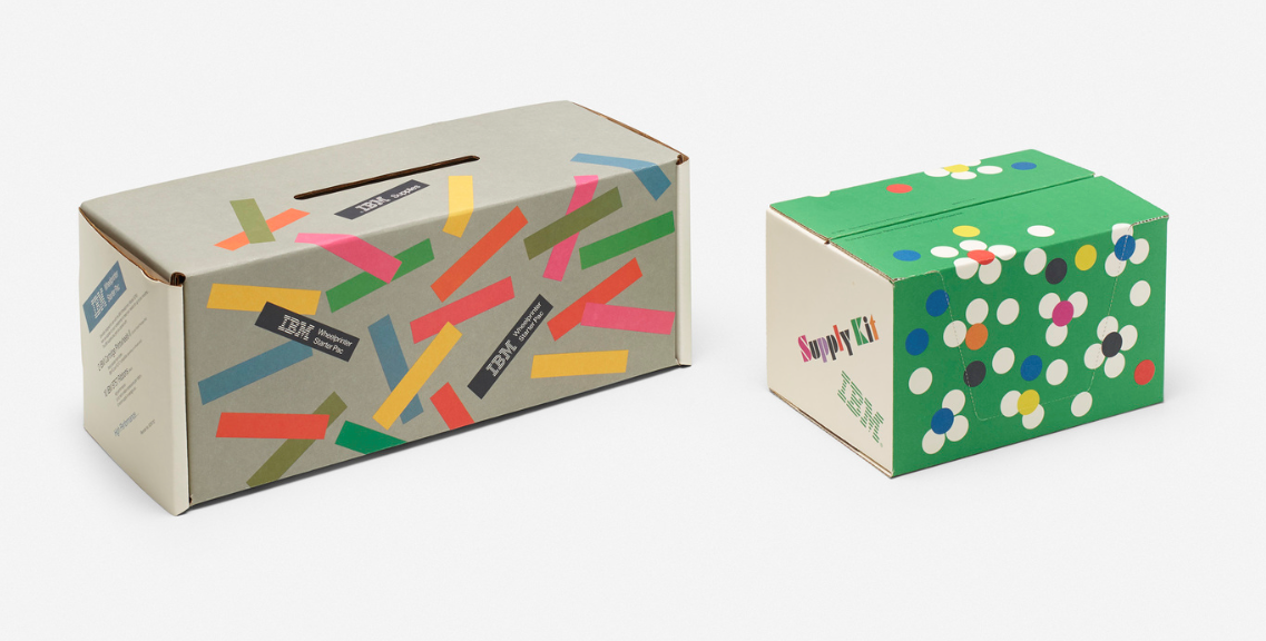
His house is up for sale as well, it also offers an interesting insight into a designer's way of living. 

Cream of the crop

Gareth Southgate, obviously

Gareth Southgate, obviously

Cropping a photograph or image is one of the most powerful tools in a designer's skillset. It allows the designer to draw focus to a particular area of the subject in the image, in essence strengthening the communication and creating clarity of meaning for the viewer. The example above from the Guardian shows us Gareth Southgate, without actually showing us Gareth Southgate. But we know who it is, instantly. The designer has recognised the minimum amount of information required from the image for the viewer to process its meaning, and has had the gumption to crop it such a way. It is unusual and unexpected, so therefore visually rewarding. 

Further to that very tight crop demonstrated above, a keen eye can enhance balance, contrast, scale, and even the dramatic effect of an image through cropping it in the most effective way.

Cropping can be done on a Mac, but if you have a hard copy of the image it is so much easier (and quicker) to crop it using two pieces of card. This is the best way to learn the art of the crop as it gives you instant feedback in the power of the image as it changes. Make your cropping tool with one sheet of paper.

The further examples below are taken from the Guardian's beautiful World Cup colour chart, which portrays the 2018 World Cup through a rainbow of colour. It is an excellent example of cropping, enjoy.

guardian.jpg

The results are in

Not before time, we'd like to congratulate this year's award winners.

At D&AD New Blood, advertising had fantastic success with a Yellow and Graphite Pencil. Graphic Design came away with the Wood award.

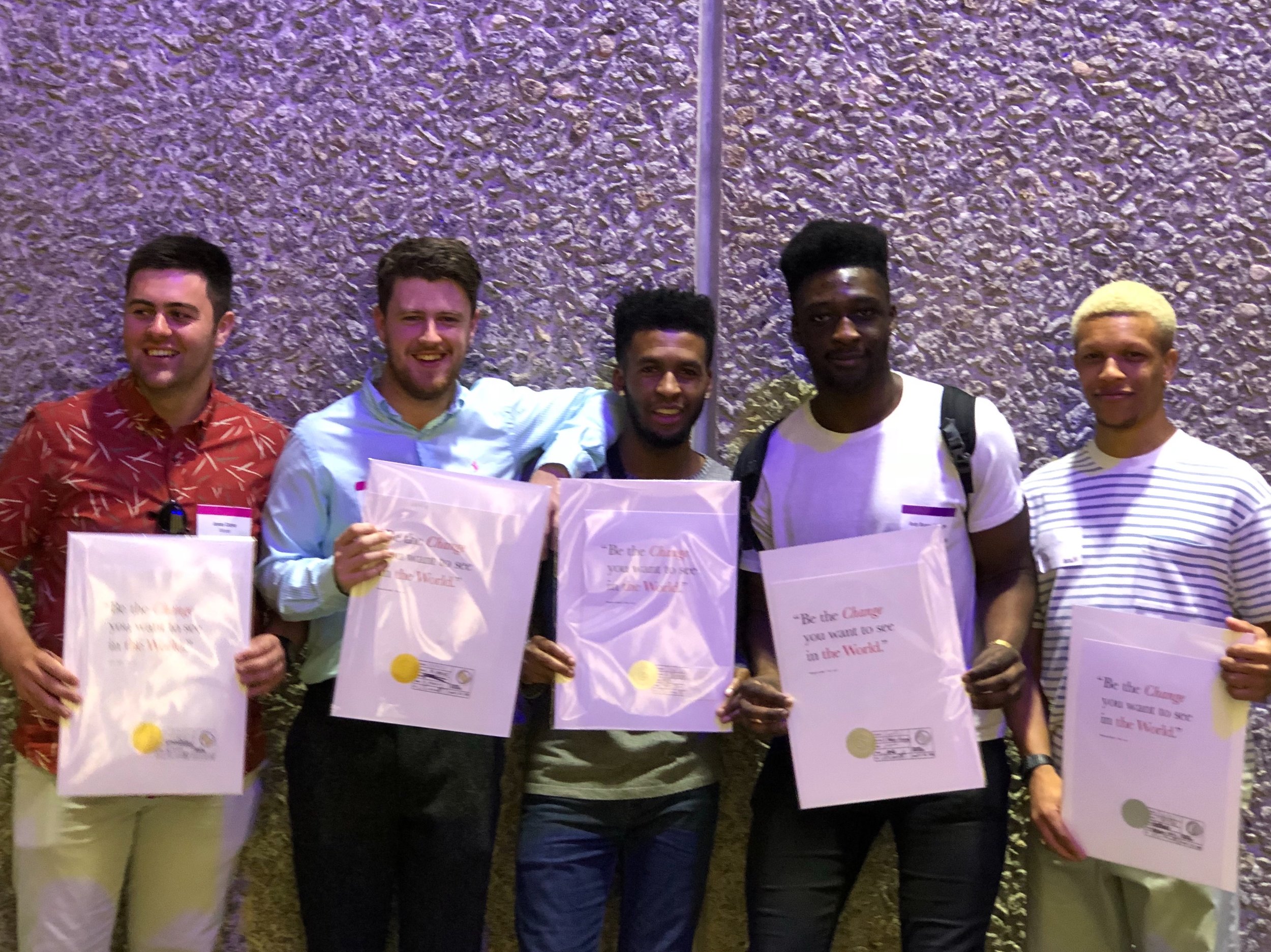
Also congratulations to our winners at this year's Creative Conscience awards.

Amazing (hard) work everybody.

Ya wang (DIANA), Jemma Redpath, gail mcfadzean & olivia downing (tutor)

Ya wang (DIANA), Jemma Redpath, gail mcfadzean & olivia downing (tutor)

james clarke, louis murphy-hancock, nathaneal johnson, andy Boakyi-aboagye & troy witter

james clarke, louis murphy-hancock, nathaneal johnson, andy Boakyi-aboagye & troy witter

Have a look at their projects:

Advertising

D&AD - Jemma Redpath

D&AD - Gail McFadzean

Graphic Design

D&AD - Ya Wang (Diana)

Creative Conscience - James Clarke & Louis Murphy-Hancock

Creative Conscience - Andy Boakyi-Aboagye, Nathaneal Johnson & Troy Witter

LogoArchive

A snapshot of the delights within

A snapshot of the delights within

A fantastic resource for all students of graphic design. LogoArchive has been created by designer and design-reviewer Richard Baird who also runs the excellent website BP&O (Branding, Packaging & Opinion). He describes the LogoArchive as: A study of form language in logo design. A recovery, research & restoration project by Rich Baird, BP&O.

Follow him on Instagram.

And on twitter.

Andrea Ucini

Another recommendation from illustration's Steve Wilkin is Andrea Ucini. A regular in the Guardian, Andrea's illustrations convey a strong sense of idea.


I´m a freelance conceptual illustrator living and working in Denmark.

I was born in Italy and graduated in classical piano and composition at the Music Academy of Florence. Music was my first source in a new form of expression. Drawing has been a deeper research in order to discover the different ways a concept or an emotion can be decoded in.


Lost & Foundry

A very interesting type project, preserving the characteristics of typefaces which could be forever forgotten.

But the most important project is that all proceeds go to The House of St. Barnabas, a social enterprise and members club in Soho, London. They are a charity who work to lift people out of homeless and into employment.

The fonts can be purchased from from their website lostandfoundry.org.uk or directly via Fontsmith.com.

Many thanks to Simon Warden & Jason Smith, Creative Directors of Lost & Foundry who have been in touch to update our original post.


Lost & Foundry is a unique collection of 7 typefaces based on the disappearing signs of Soho, these are at risk of being lost forever due to the ever changing landscape of the area. By re-imaging the signage as complete fonts, we have rescued this rich visual history from the streets and present the typefaces into a contemporary context for a bright optimistic future.

 
james.PNG

Christoph Niemann

Illustration Course Leader, Steve Wilkin, has recently switched us on to the incredible ideas and work of Christoph Niemann. Slightly perturbed as to how we missed him, the one lesson we can draw from this particular experience is that you must always keep your eyes (and ears) open as even talents like Christoph could somehow pass you by.

Here's the copy (text) from his website, and a few taster images. You could spend many hours on his website and Instagram.


Christoph Niemann is an illustrator, artist, and author. His work has appeared on the covers of  The New Yorker, WIRED and The New York Times Magazine and has won awards from AIGA, the Art Directors Club and The Lead Awards. His corporate clients include Google, St. Moritz, LAMY, and The Museum of Modern Art. He is a member of Alliance Graphique Internationale. In 2010, he was inducted into the Art Directors Club Hall Of Fame.

He has drawn live from the Venice Art Biennale, the Olympic Games in London, and he has sketched the New York City Marathon — while actually running it. He created The New Yorker’s first Augmented Reality Cover as well as a hand drawn 360 degree VR animation for the magazine’s US Open issue.

Niemann is the author of many books, including the monograph  “Sunday Sketching” (2016), “WORDS” (2016) and “Souvenir” (2017). With Nicholas Blechman he published the book “Conversations“. With Jon Huang he created the kids’ apps PETTING ZOO and CHOMP. His work is subject of an episode of Abstract, a new original NETFLIX series.


GRexit - Year 3 Graphics - Manchester Degree Show

As we bid farewell to the graphic design final year graduates, you can spend one last night with them in the EU. Kindly hosted by True North, the Manchester degree show will be on from 5pm on the 5th July. Are you in or out?

GRexit
05 July – 5PM Till 10PM
True North, 24 Lever Street,
Manchester, M1 1DZ

*The UCLAN Graphics class of 2018 will officially be the last year to graduate from within the European Union.

*The UCLAN Graphics class of 2018 will officially be the last year to graduate from within the European Union.