One week project: Typography
/Here we feature some of the solutions to the latest year 1 creative thinking briefs - typographic interpretation.

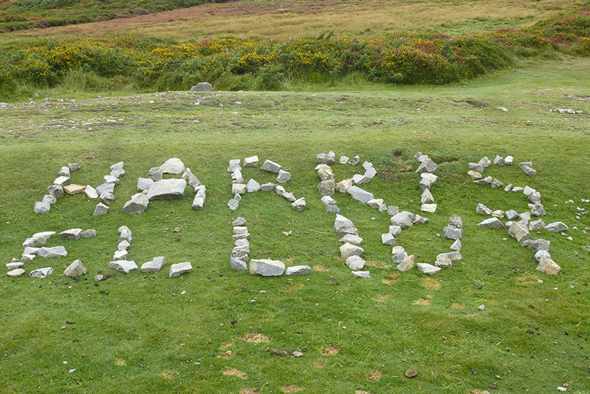
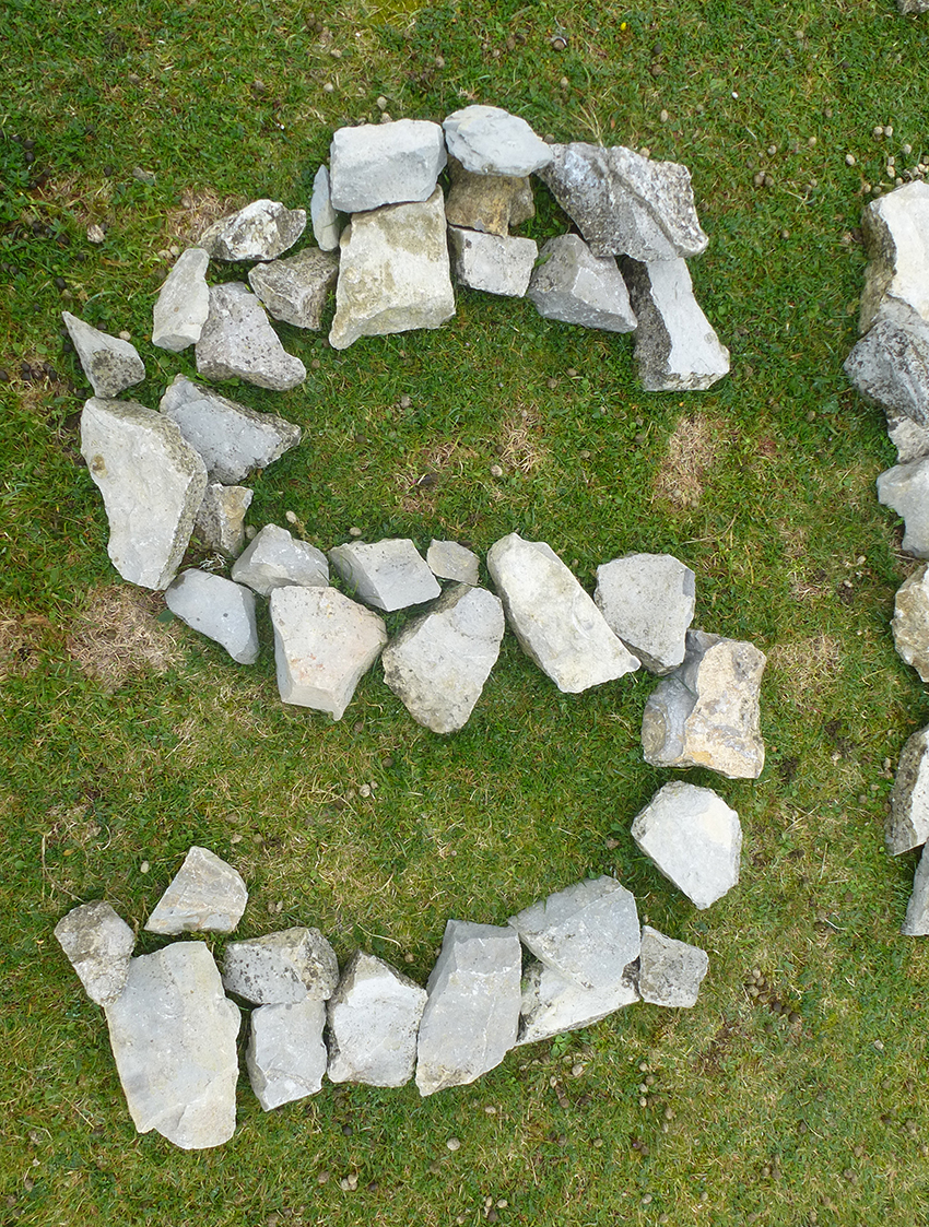
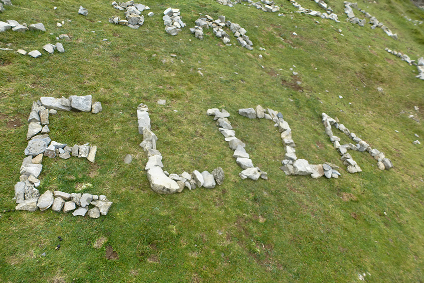
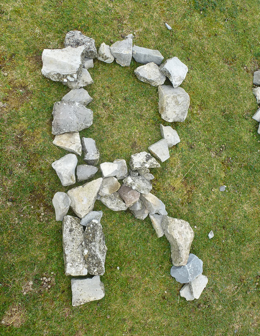
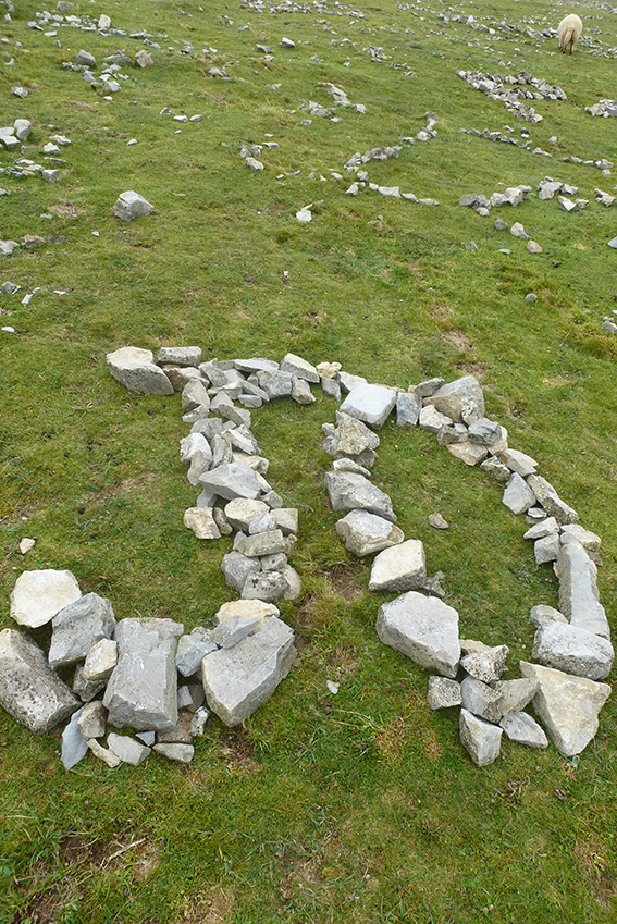
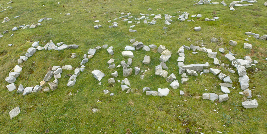
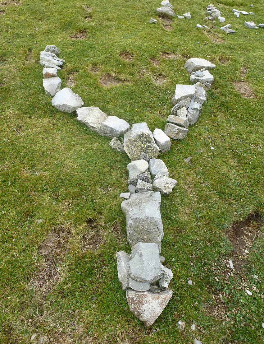
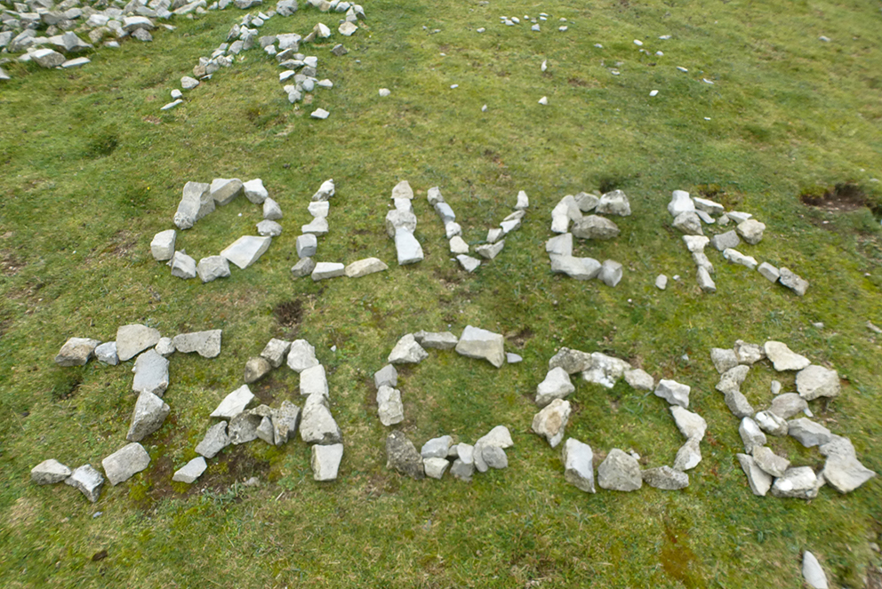
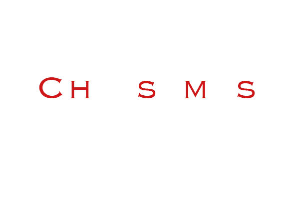
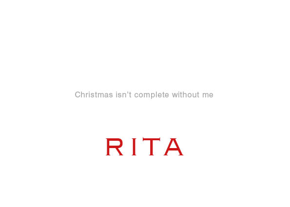
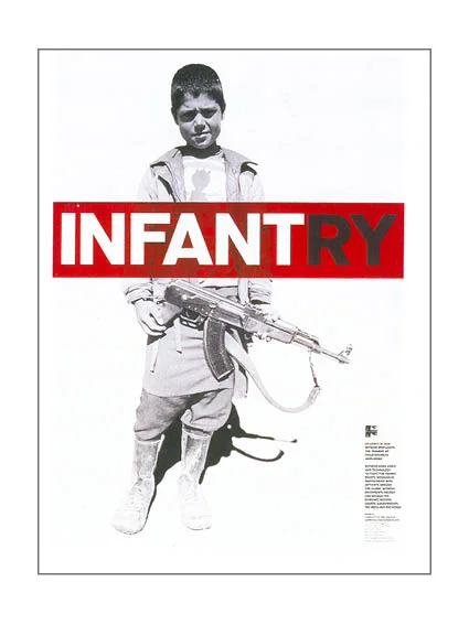
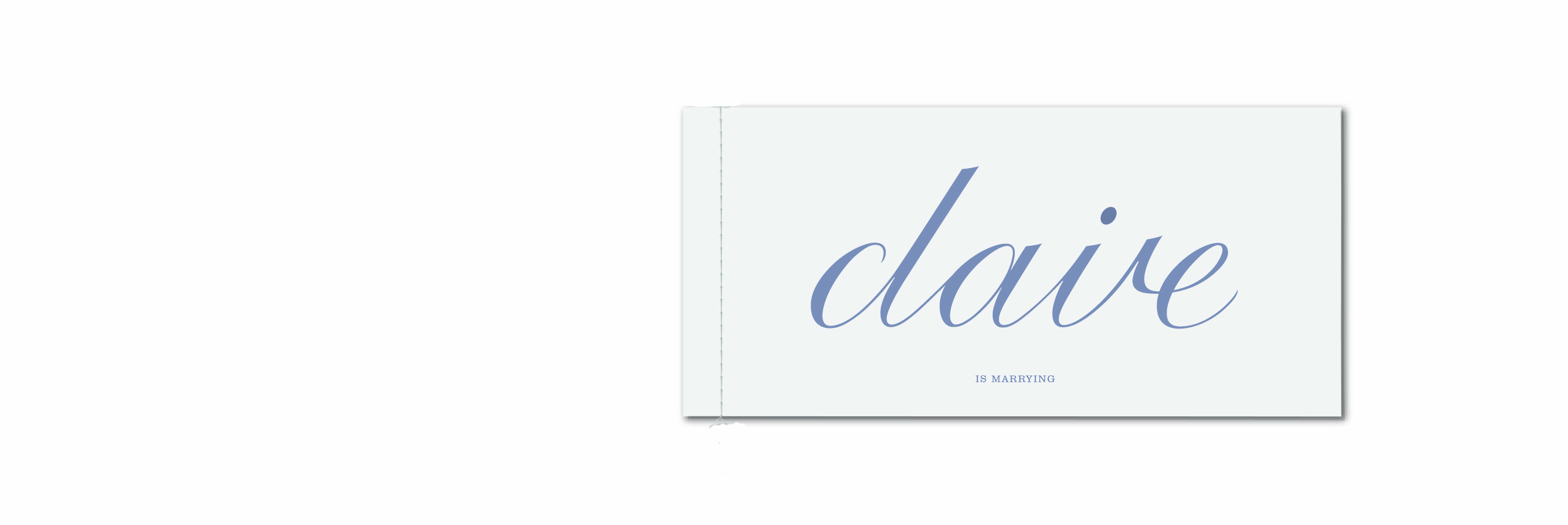
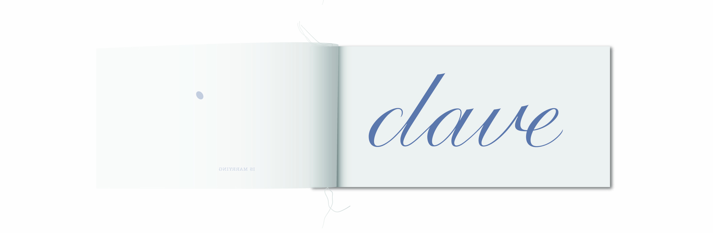
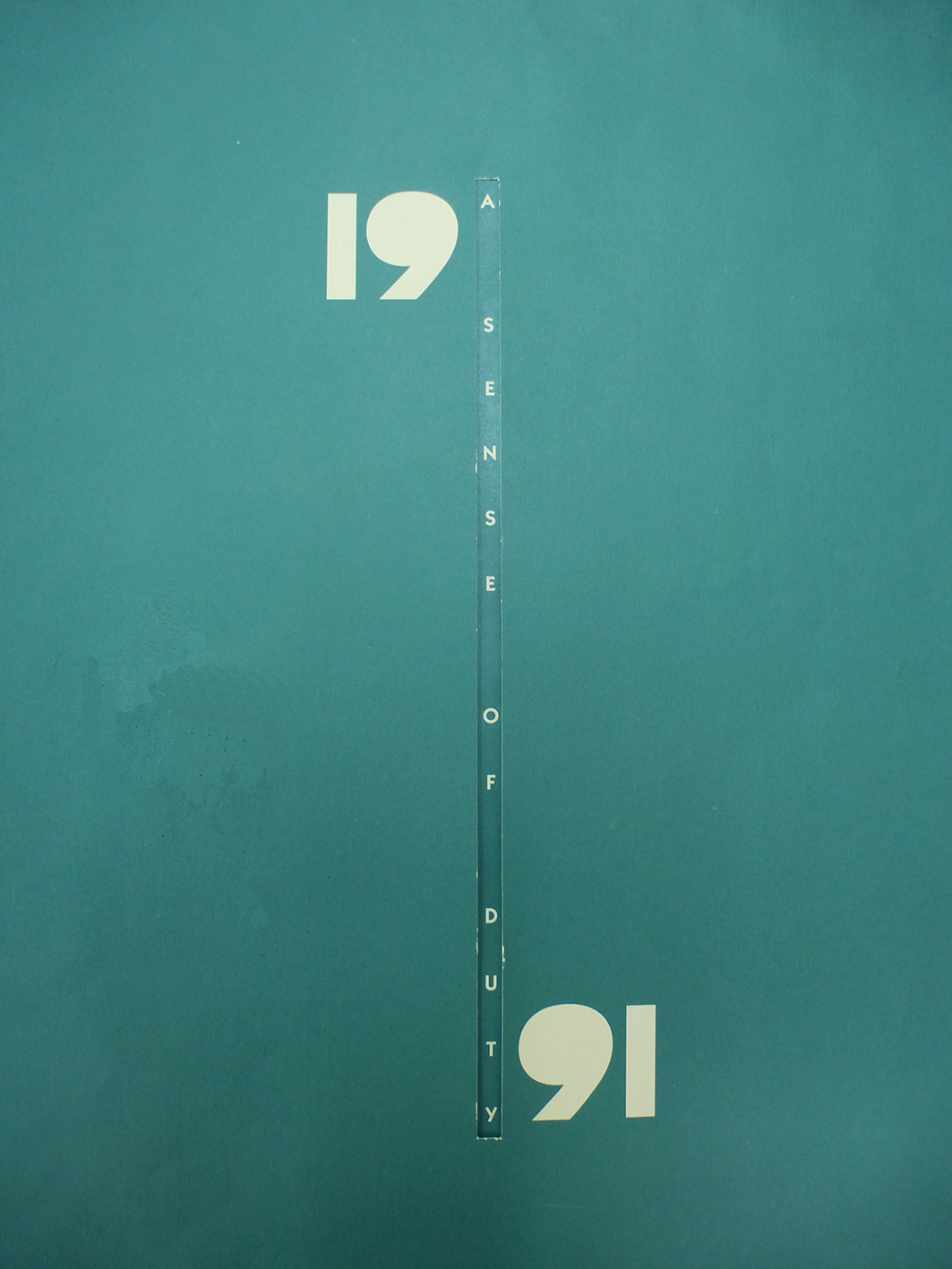
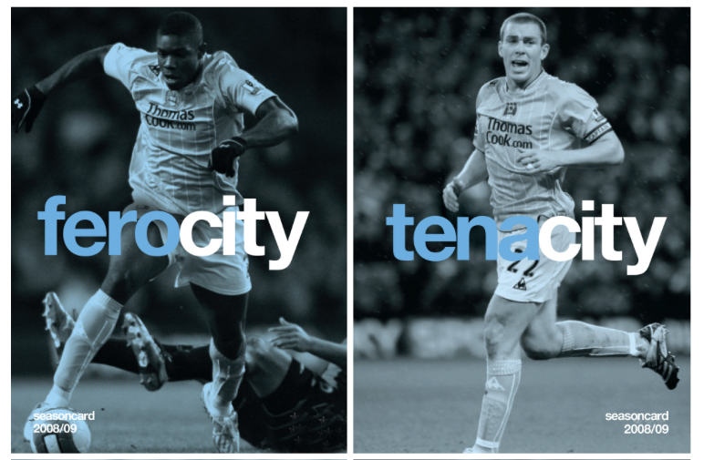
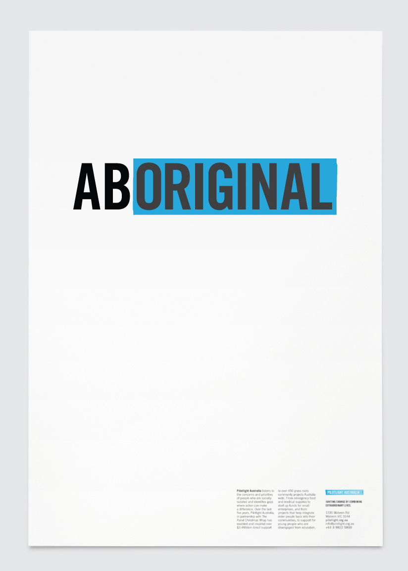
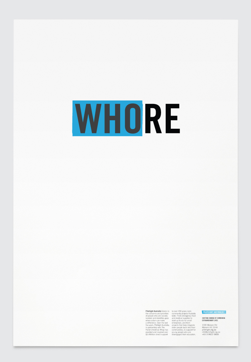
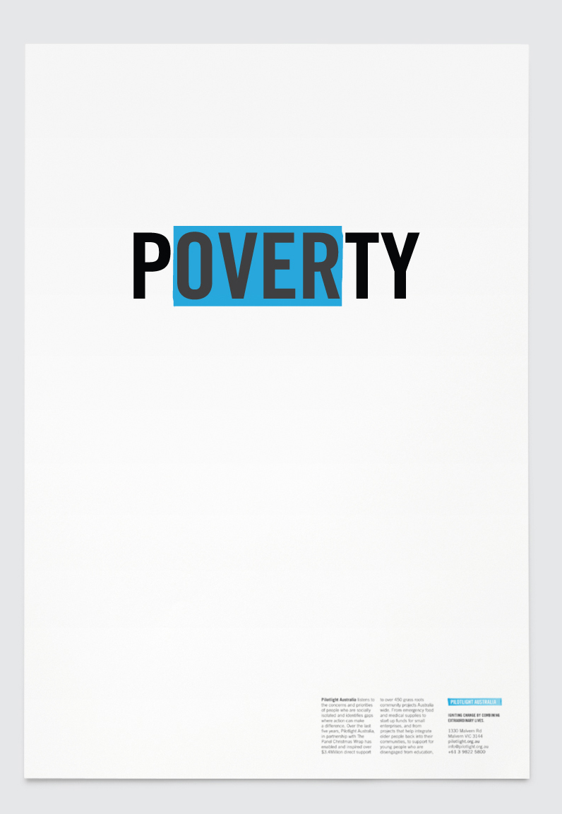
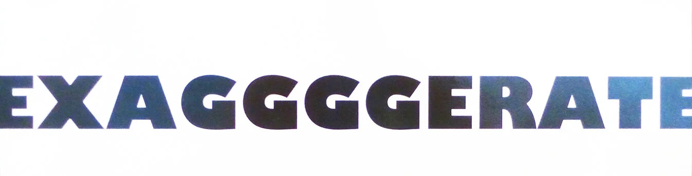
Each student was given three words to explore and express typographically in black & white.
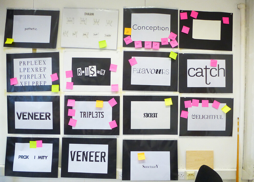
A section of the studio critique wall

This task was all about understanding the meaning and nuance behind the given words. Then it was about how to represent and interpret the word in a simple yet creative way.

Students spent a day tracing and sketching their ideas from type samples.

They were encouraged to really look at typefaces and letterforms as shapes.

Restraint and simplicity were also encouraged in their solutions.
Also they were asked to take the format and page size into consideration. Exploring scale and positioning in their layouts and compositions.


In summary, this exercise appeared at first glance to be quite easy to gain a satisfactory solution…but much harder to get a truly outstanding one. Tutors stressed the importance of tracing from type to have an idea before going to a computer in order to render it.

It was noticeable that a lot of solutions had been rendered on the computer in the intervening period before the crit and in most cases had, in some way, suffered because of this treatment. Some solutions had begun to rely on Photoshop tricks which was a sideways step and in some cases a backward step.
That said, overall the staff thought everyone had a good solid direction, in some cases more than one direction. The advice given to each solution and the overarching points that came up in the crit session has given everyone food for thought.
Staff look forward to seeing how each solution develops over the semester prior to folder hand in at Christmas.