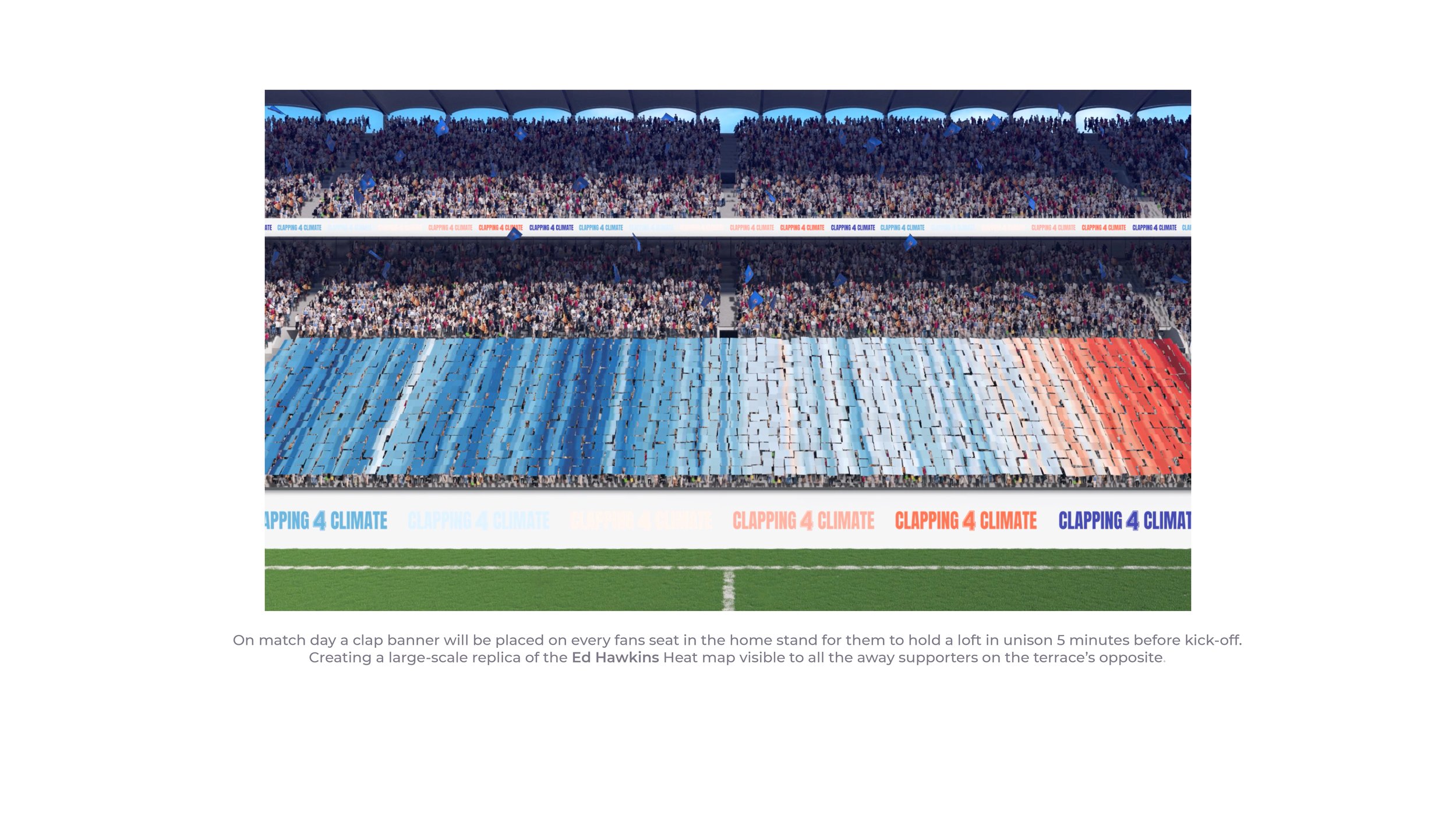
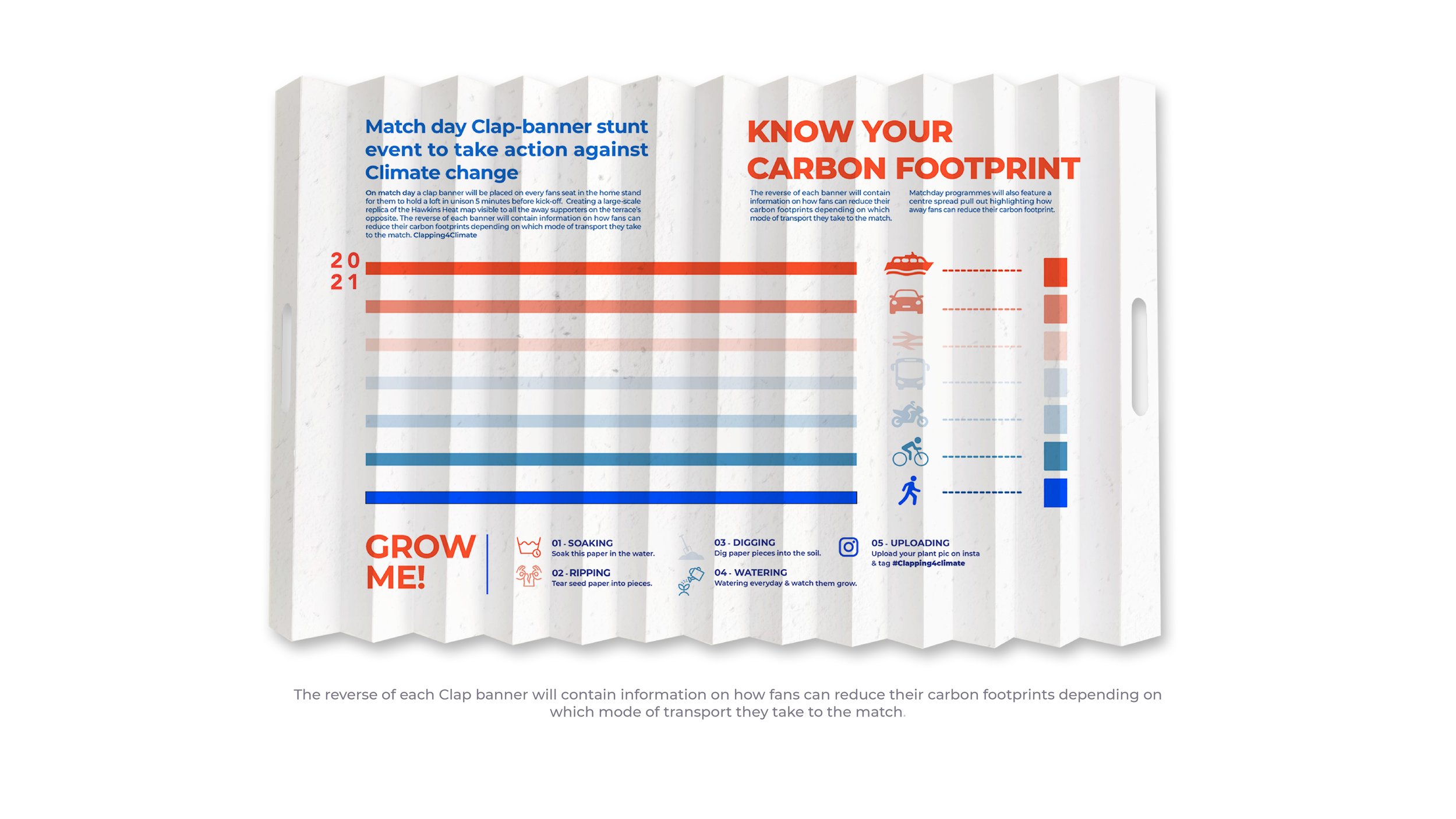
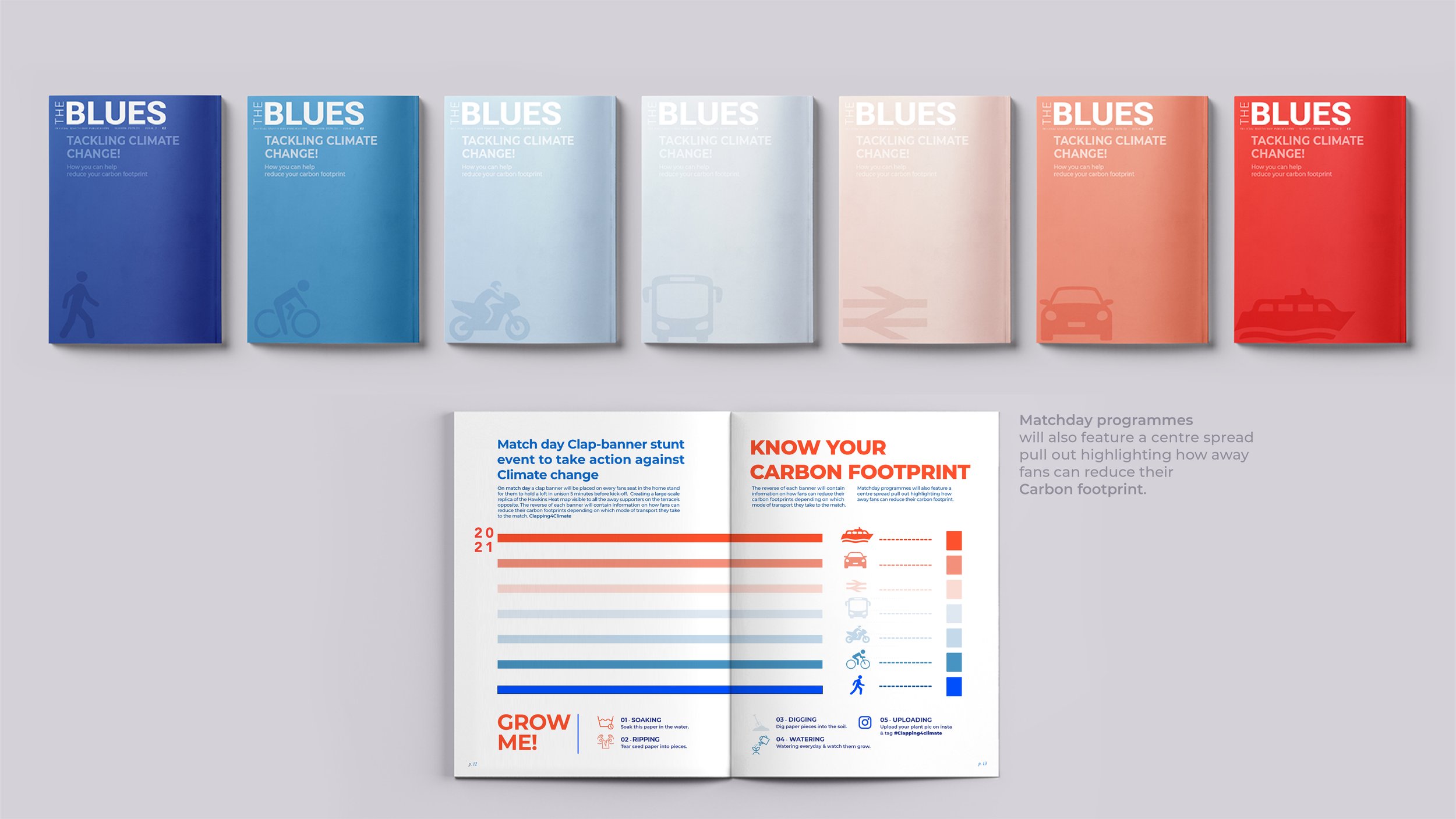
Connect4Climate – Clapping4Climate
/Campaign concept by Nilseh Kawale.
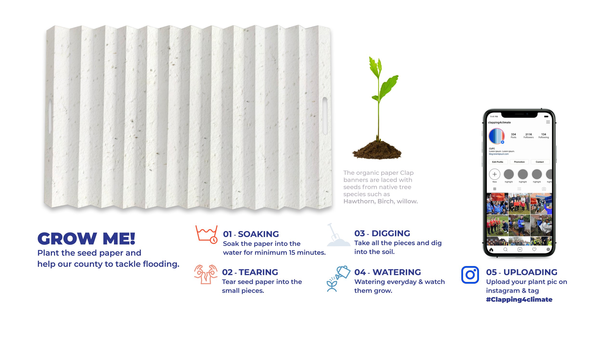


Campaign concept by Nilseh Kawale.
Here we feature current 2nd year placement student, Dom Dzik’s brand identity for a Piano Tuner.

Word mark

Bespoke piano key typeface

Stationery set
Please click image above to play the film
A very competent, sophisticated and professional solution for a second year student. Dom even went as far as creating the brand guidelines, which you can see here.
Congratulations to Year 2 Graphics student Tom Culton who has just won an industry led competition set by Bulletproof Design - London. The brief was titled ‘Fresh Meat’ and students were asked to think outside the box and break away from the expected rules of branding.
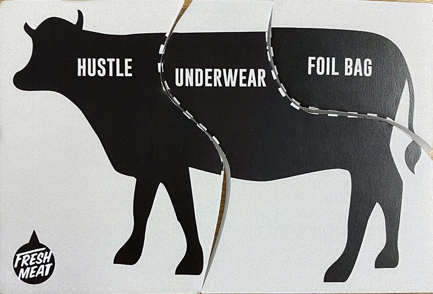
There were 3 parts of a cow representing the brand name, product and format. The students were asked to pick one card for each from lists of options to create a brand identity and a piece of packaging.
Tom got brand name ‘Hustle’, the product being underwear, in a foil bag format.

The proposition was ‘a brand that doesn’t try too hard to be sexy and is instead fun, cheeky and loud - relating to the ‘hustle’ name, celebrating diversity in body image’.
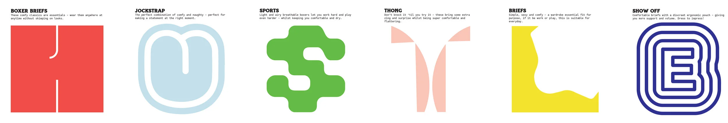
There are 6 styles of underwear in the Hustle range. They have cheeky typographical personalities with a nod to the type of underwear (ie. The ‘H’ resembles boxer shorts) which spell out Hustle when displayed in the shop.
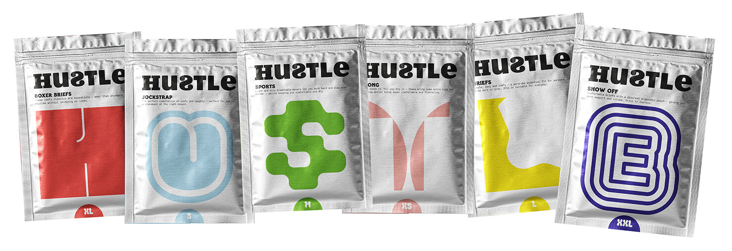

His winning entry has won him a 2-week placement at Bulletproof in London.
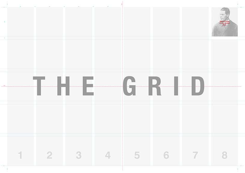
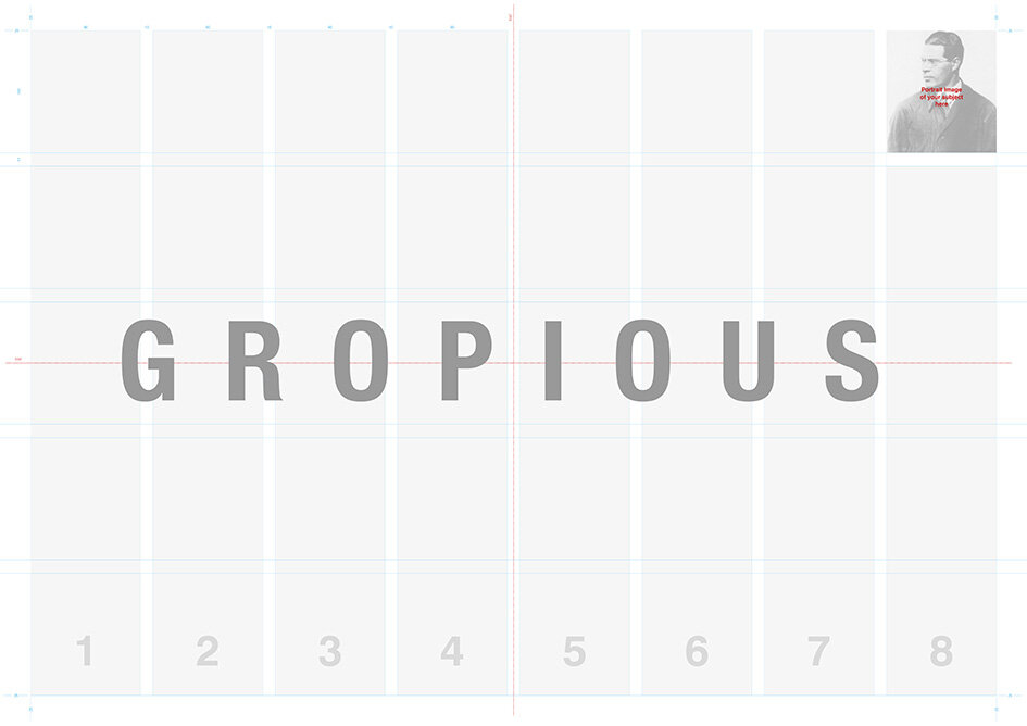
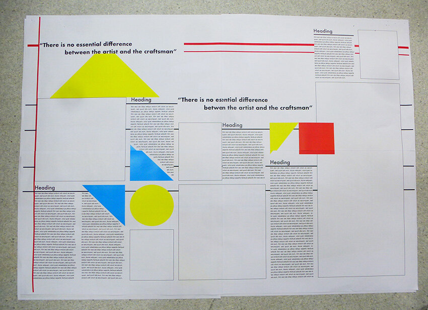
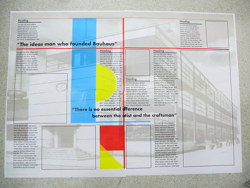
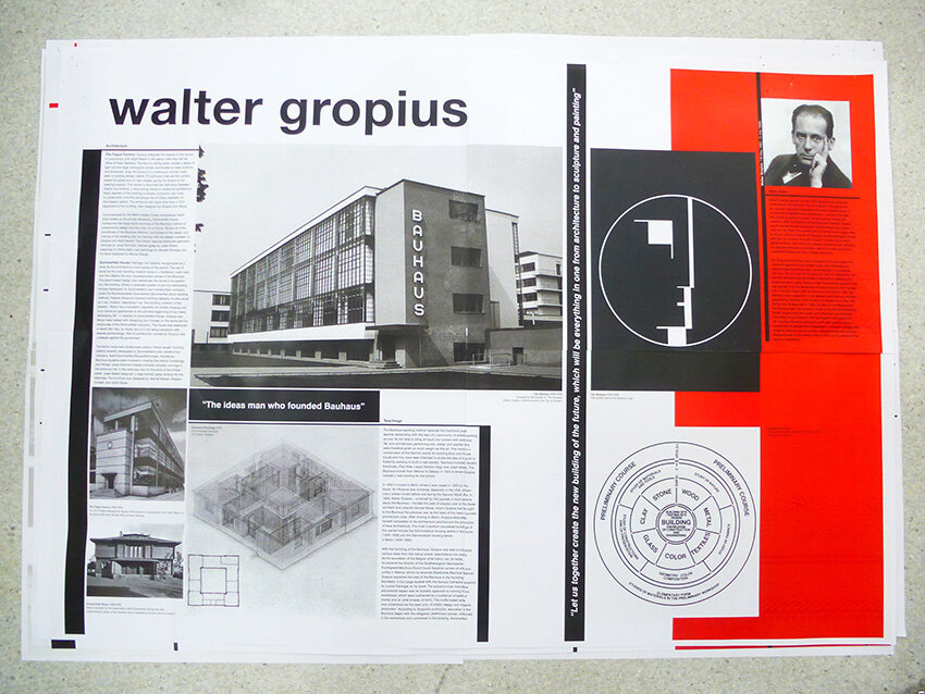
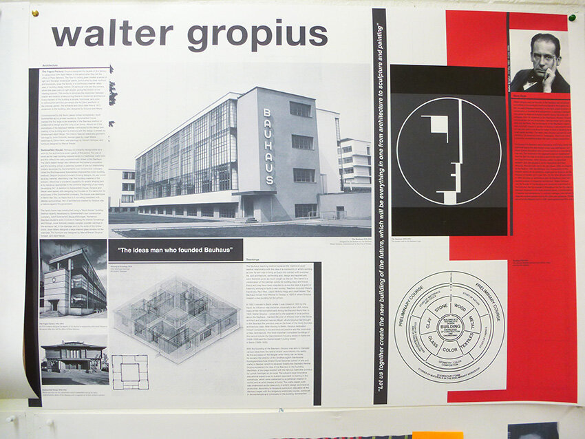
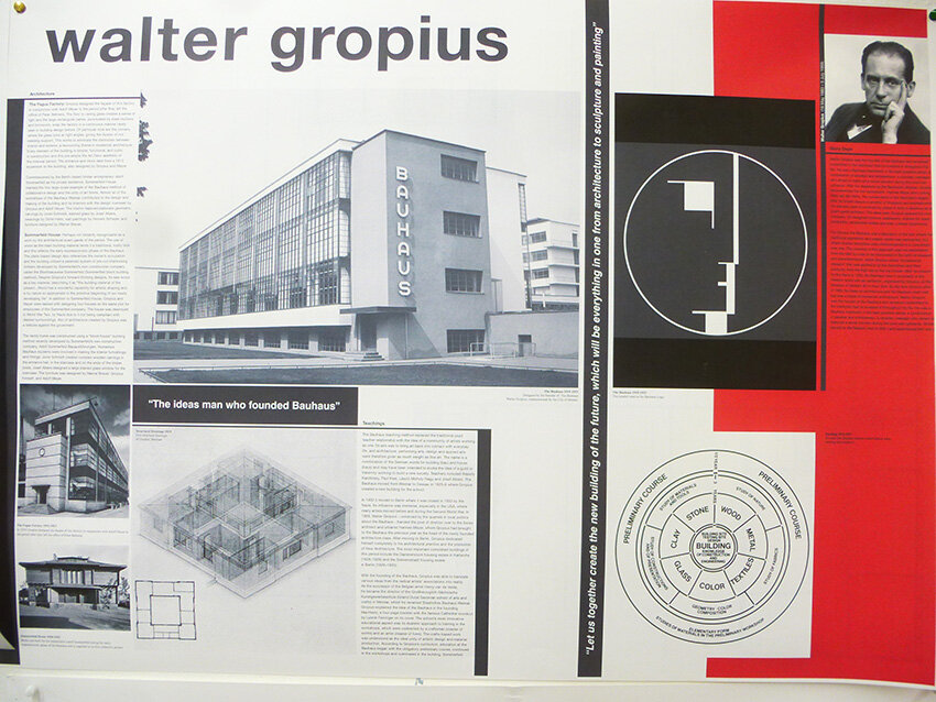
Here we feature a few examples of the design development from the year 2 students Bauhaus 100 project. This exercise was a chance to brush up on the students typographic layout skills. Building upon their year one magazine layouts the students had to consider, copy, composition, grids, general typographic principles, hierarchies of information, image, cropping , colour and detail.

Final Crit wall
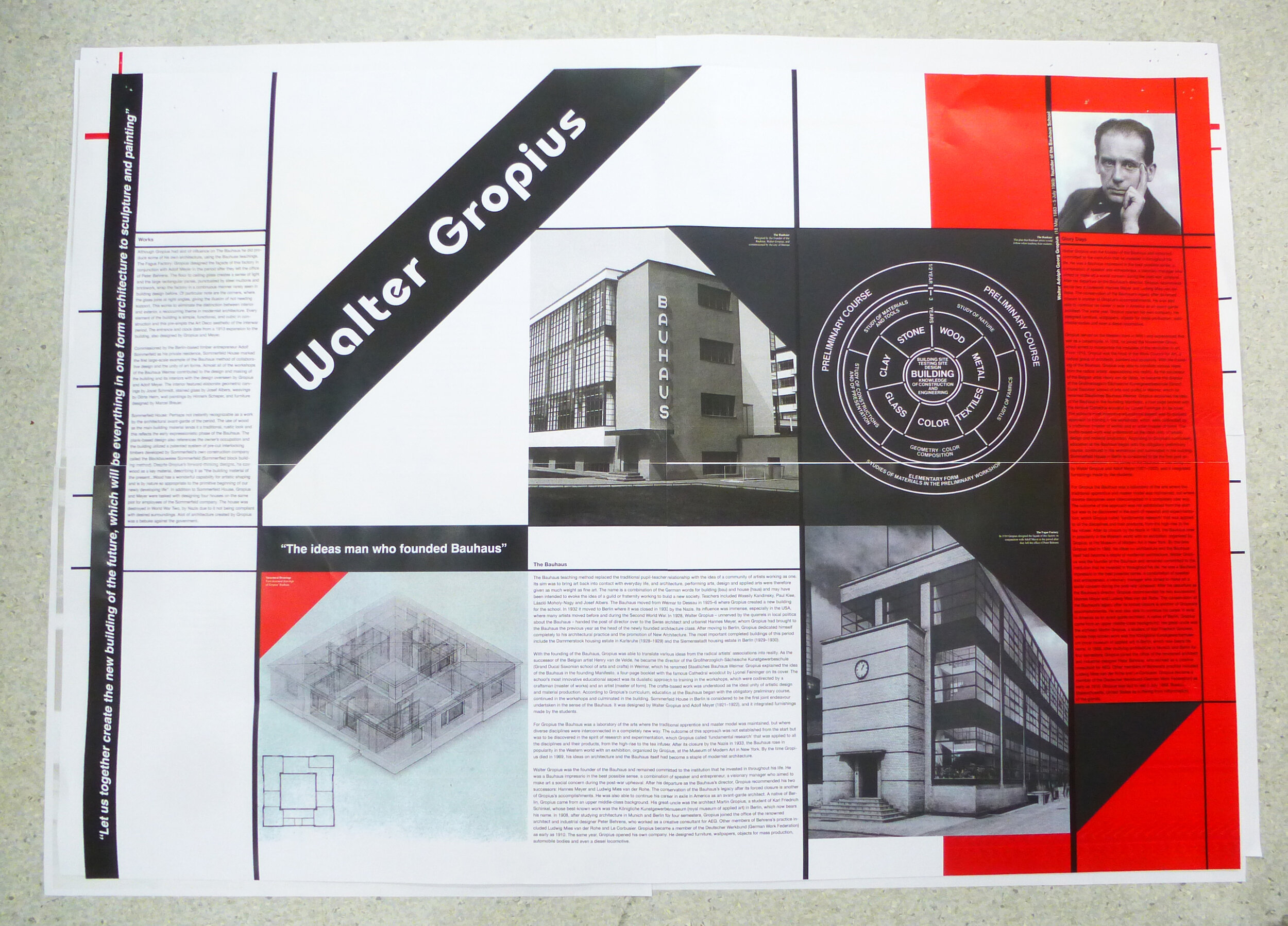
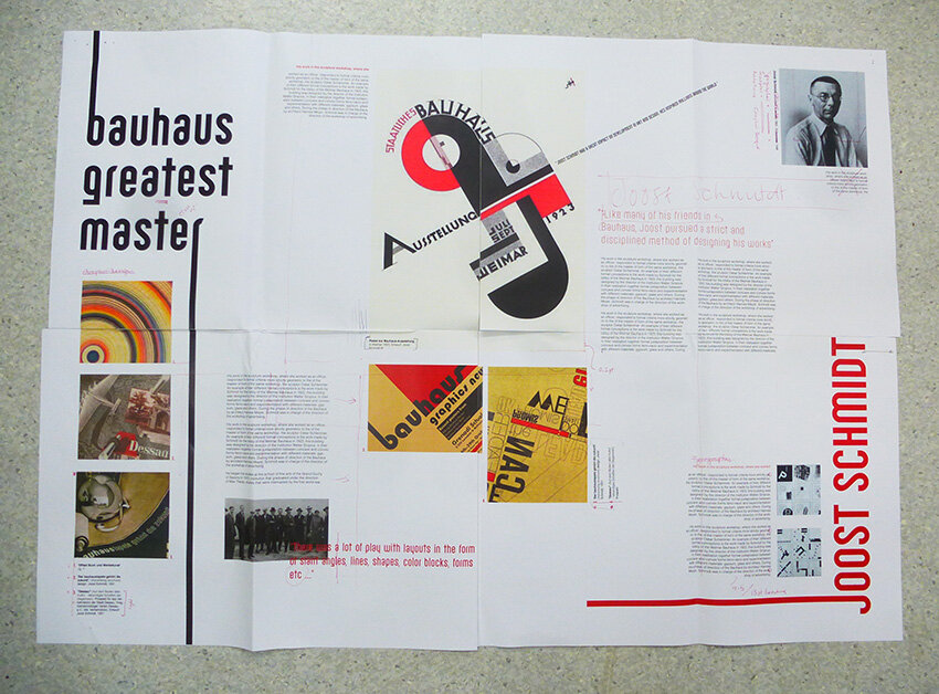
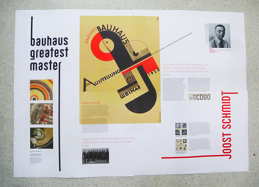
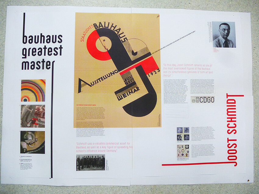
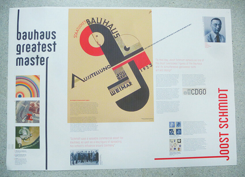
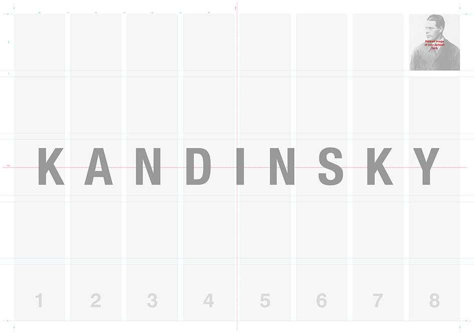
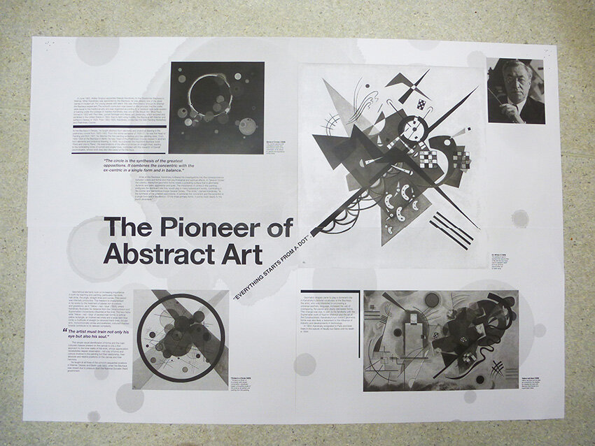
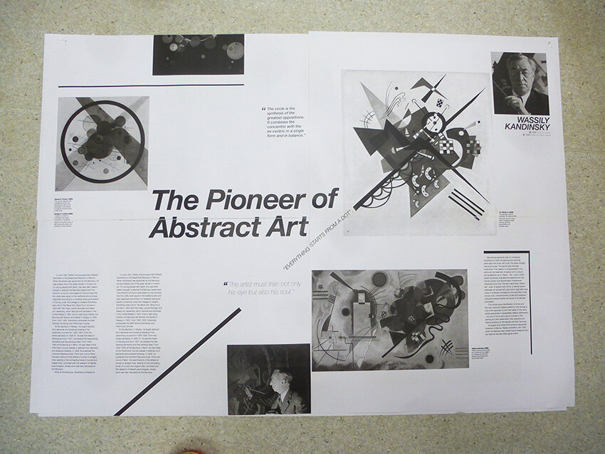
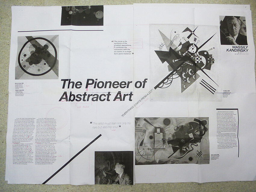
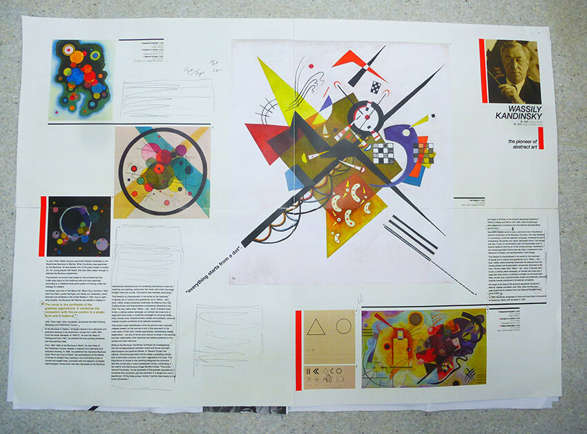
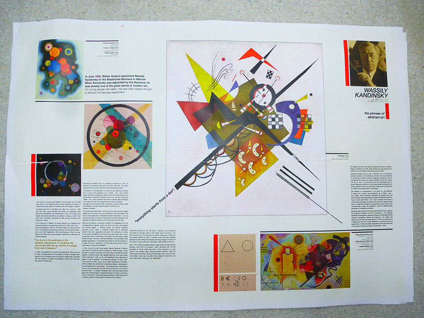
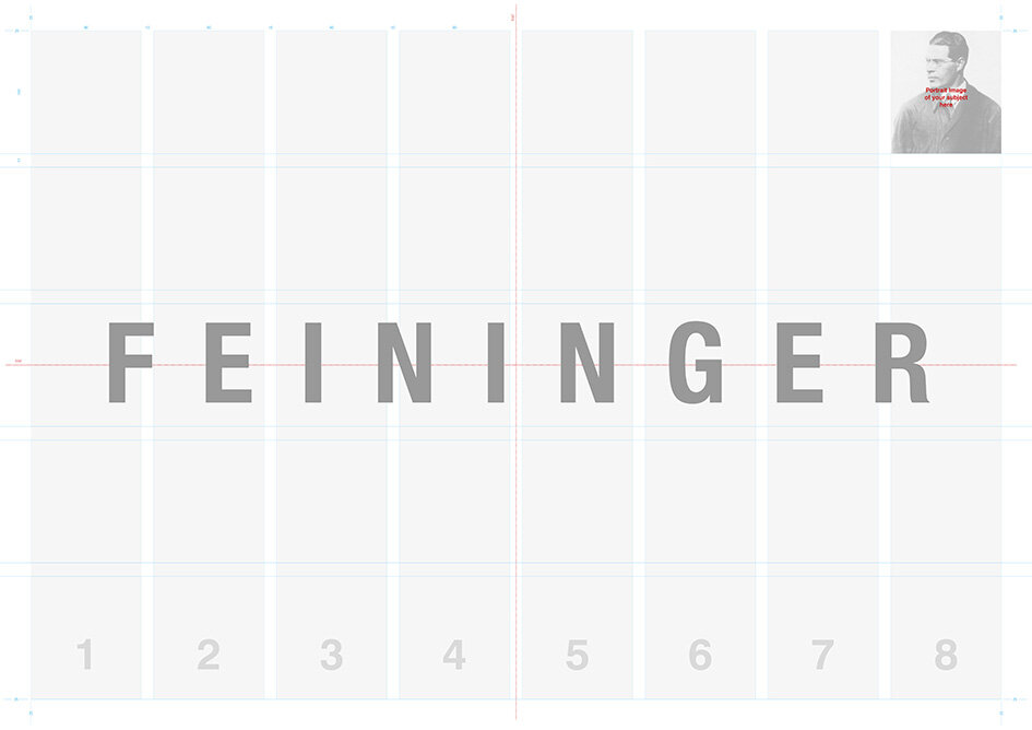
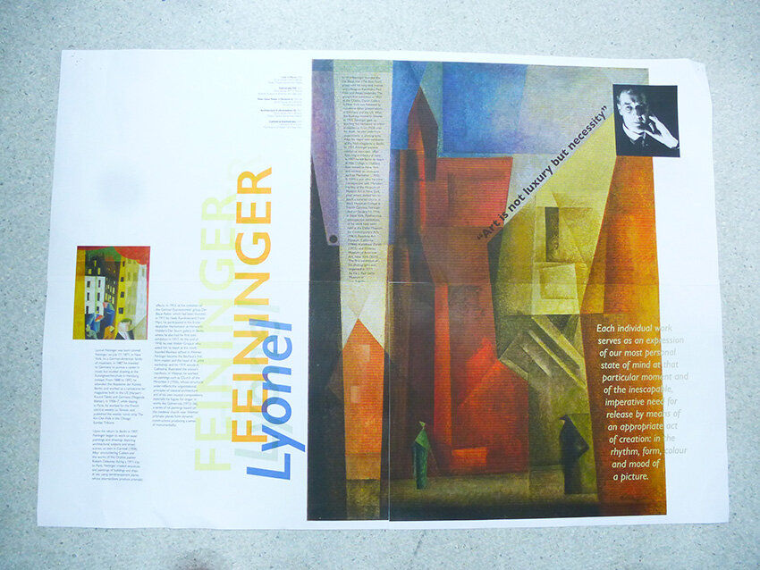
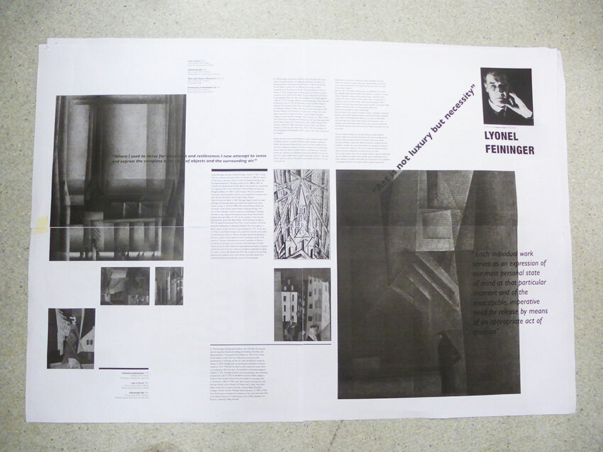
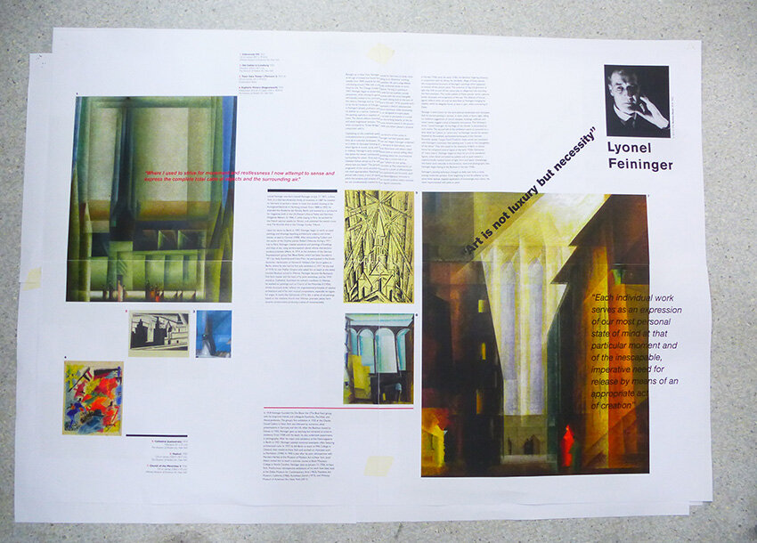
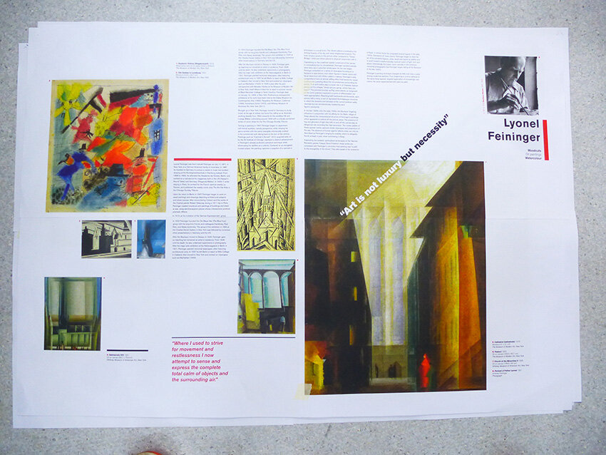
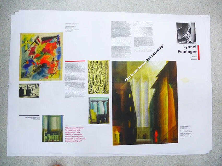
Here we feature a few of the design developments from our 2nd year graphics students who are currently producing a series of posters based on key Bauhaus practitioners. These will then form part of a limited edition box set/coffee table book.
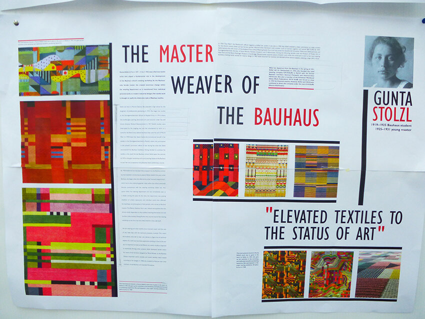
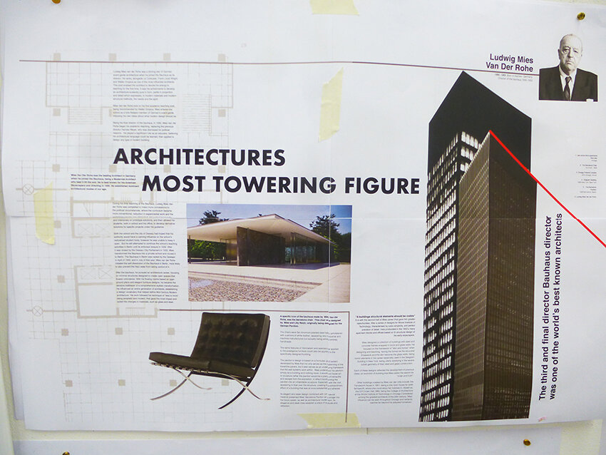
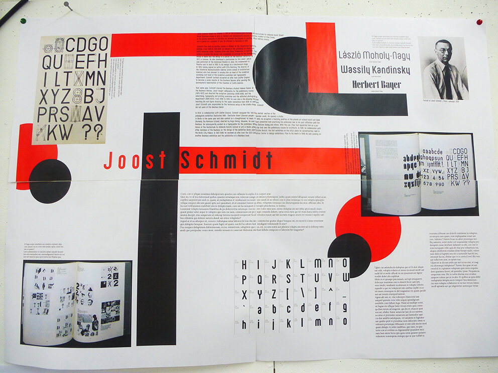
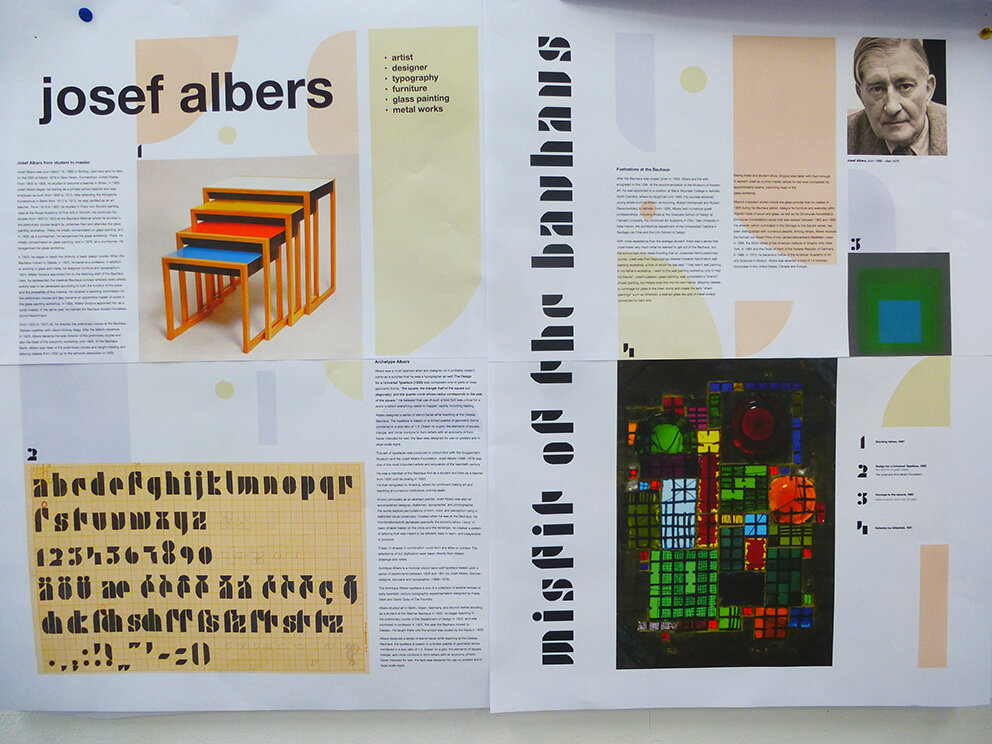
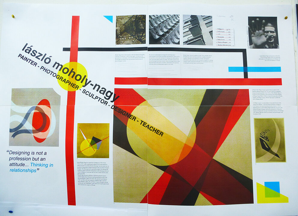
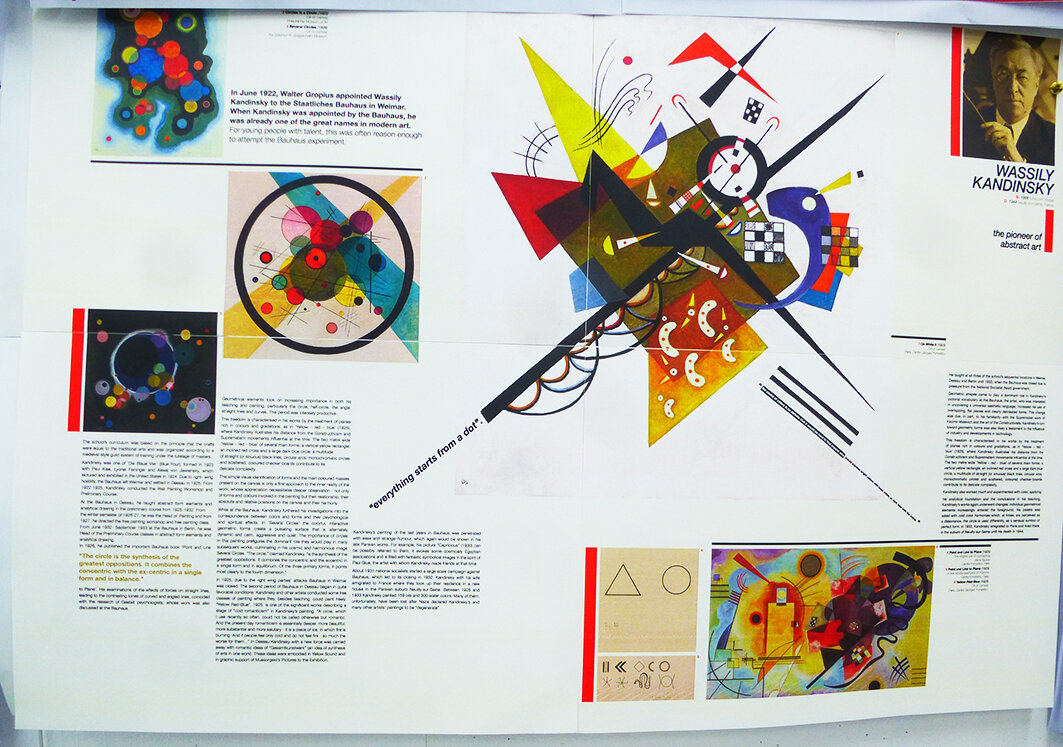
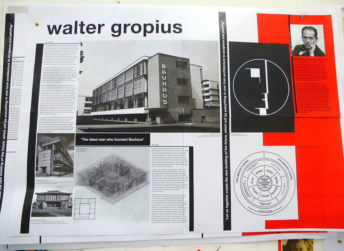
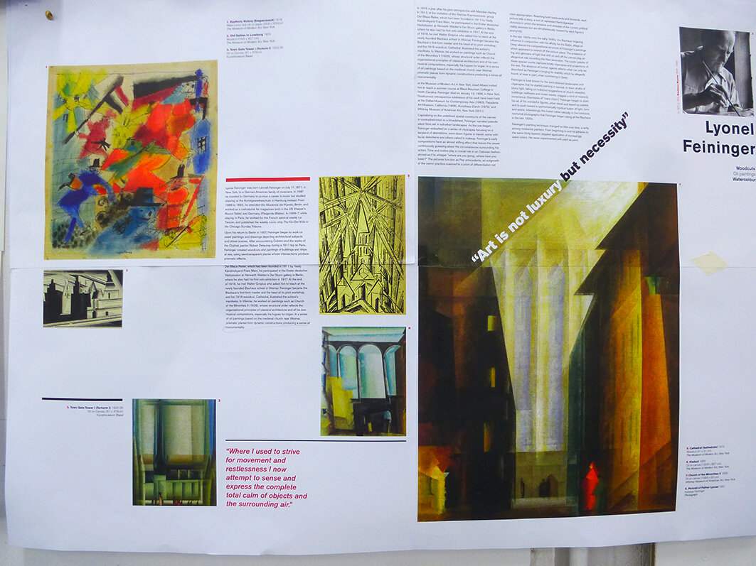
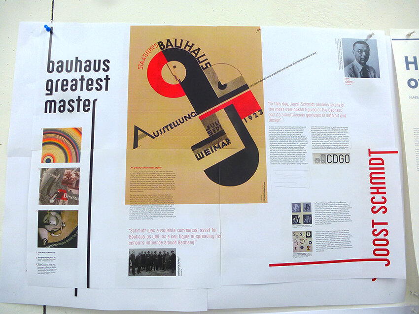
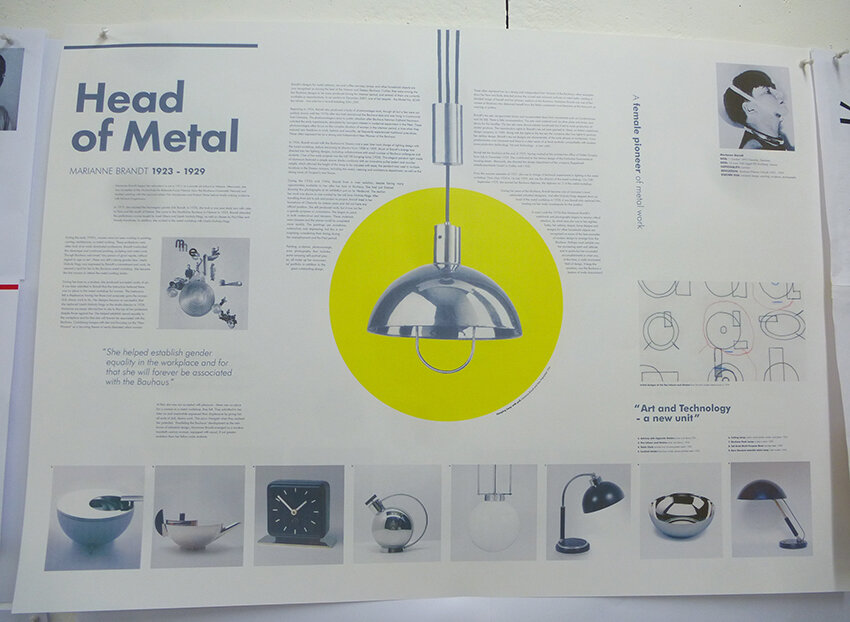
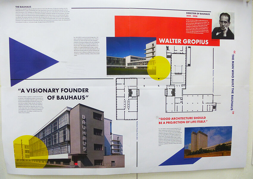
Final crit tomorrow so we will post the finished articles soon after.
As our second years grapple with their first project back after the long summer break we thought it would be timely to lead by example and help them along with this instructive post.
They have all been given just over 2 weeks to produce an appropriate typographic poster for a range of UK festivals with topics such as cheese, kites and horror to name but a few .
The sketches, development and design concepts below are for the UK Dry Stone Walling Championships.

This solution focuses mainly on a short bold title ‘The Uk Drystone Walling Championships’ rendered in an appropriate typographic style.

Sketches and experiments with a free style interlocking typeface which is designed to reflect the basics of the art of dry stone walling.

This project is all about choosing and creating an appropriate typeface and the technique you choose can be the idea. In this case once the style was developed, through a series of drawings and sketches, the finalised render was spray mounted to black paper and carefully cut out by hand with a scalpel. This hands on analogue approach was also a nice reflection of the subject matter itself

This was then digitised, re drawn out and refined.

Once the composition was finalised in black & white colour could be considered. In this case a pallet of greys was explored to reflect a stone like quality.
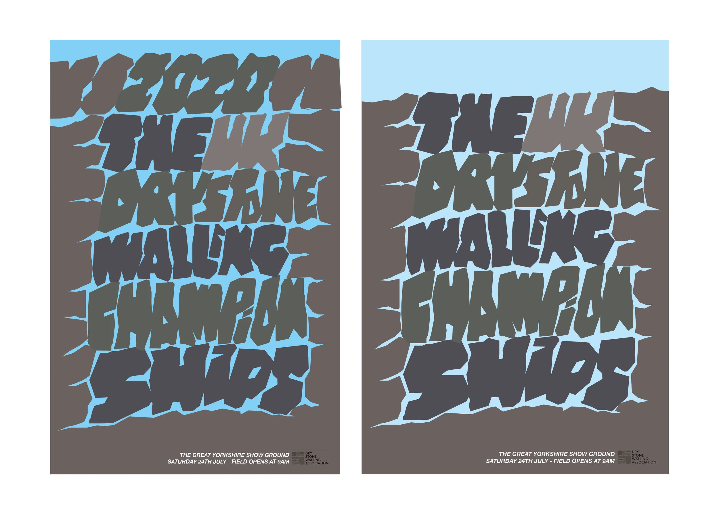
Further colour iterations with a small amount of typeset text added, with dates times and location of the event. Plus an appropriate sponsors logotype.


We hope this post helps everyone along a little in their own particular subject areas. So in summary; 1. Keep it simple. 2. Remember to keep the typography appropriate. 3. Sketch and draw your idea down before going to the computer and 4. Understand that the technique can be the idea.
5. Please do not over think and complicate your poster…that is not the aim of this project.
Rev J. Whitehead (Esq)
Here we feature a selection of solutions to the second year brand extension brief. Students were presented with a list of well known brands and had to somehow come up with a way of extending them. This was achieved by partnerships, special dates, occasions in the calendar or by finding out an interesting fact from the brand’s history. All the examples shown here made it into their respective students placement folders.
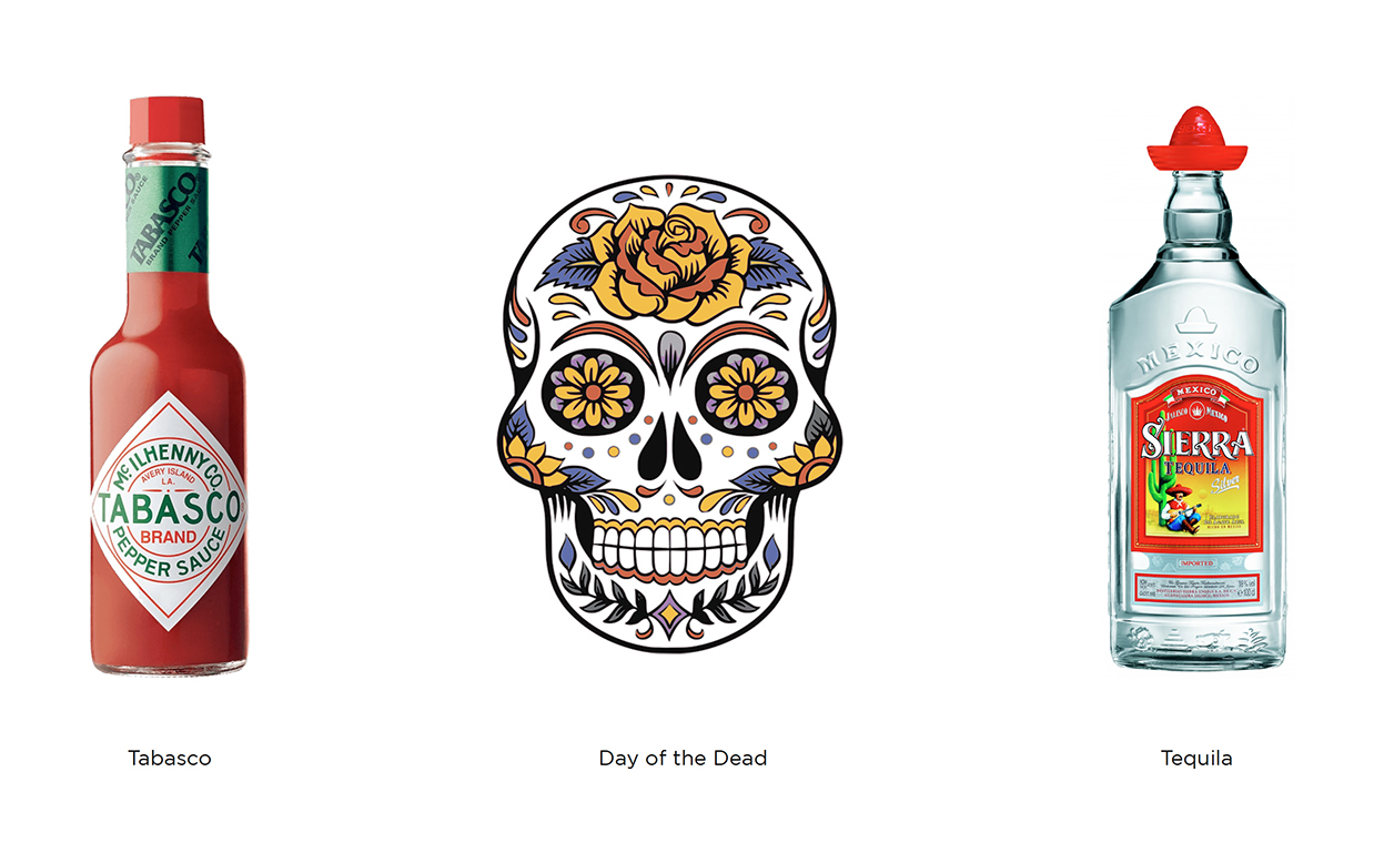
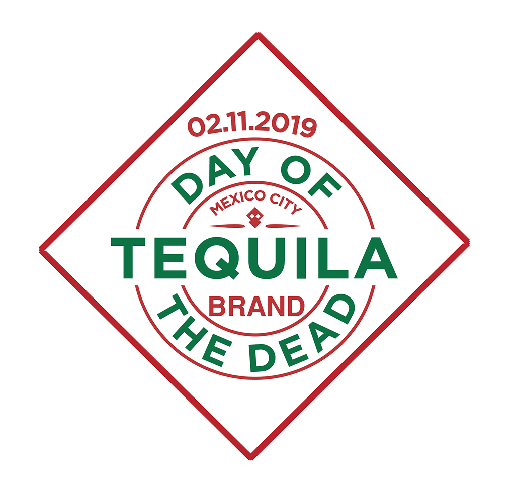

Mexican flag and skull motif made out of the iconic Tabasco diamond label

Poster concepts

Bottle design plus coasters

Mexican moustache coaster concept

Social

Highland Spring Water brand extension. This concept was based around the highland games and the heritage of the Scottish clans.

The seven clans
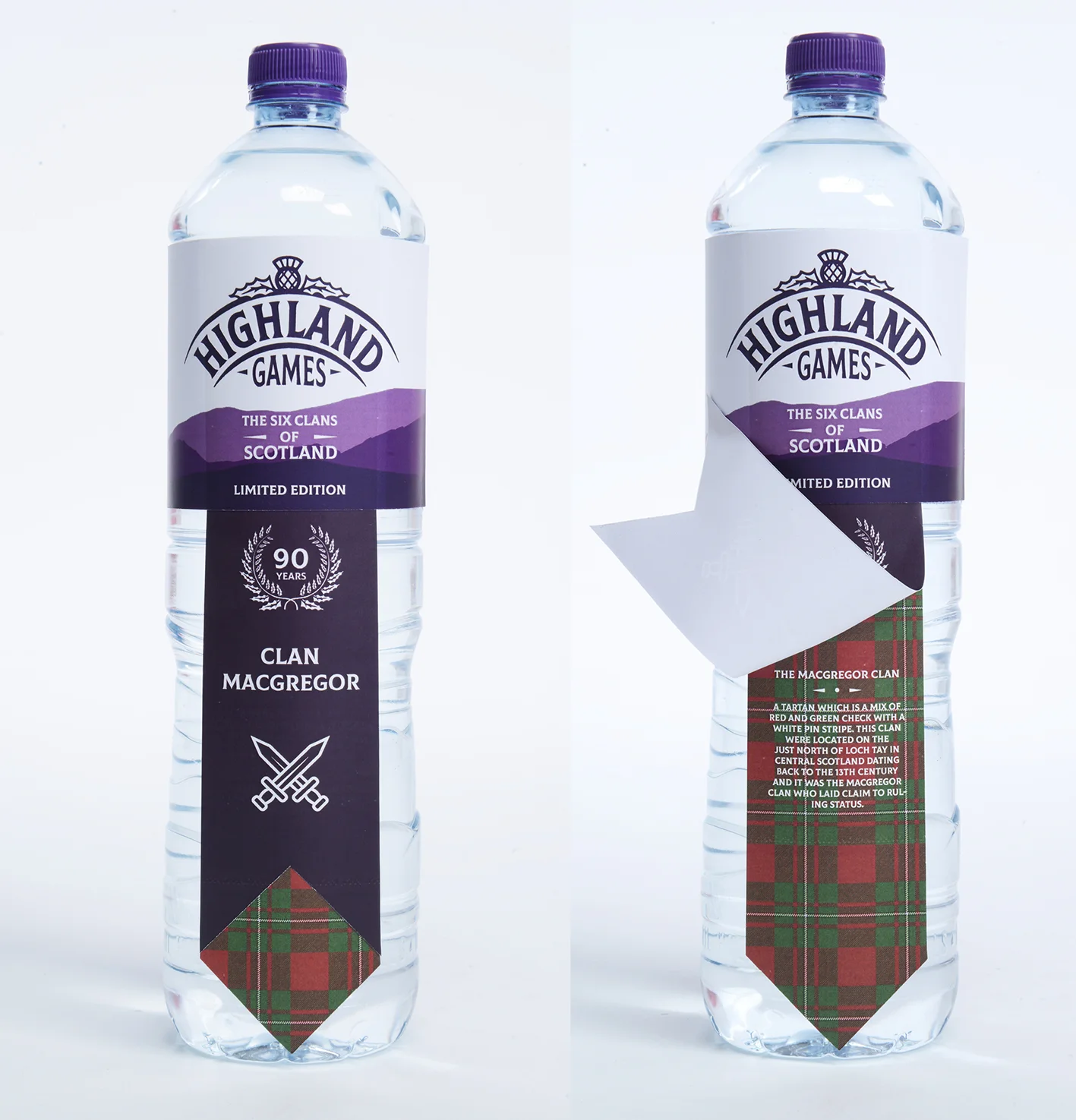
Lift the label to reveal each individual clan history

Individual posters featuring famous clansmen

Brand partnership concept between Twinings Tea and the Royal & Ancient Golf Club of St Andrews.

Box designs based on traditional golf attire.
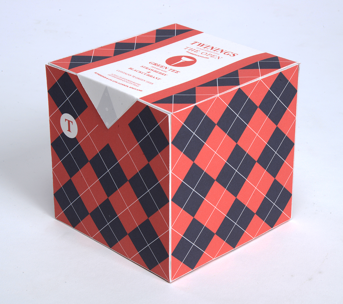

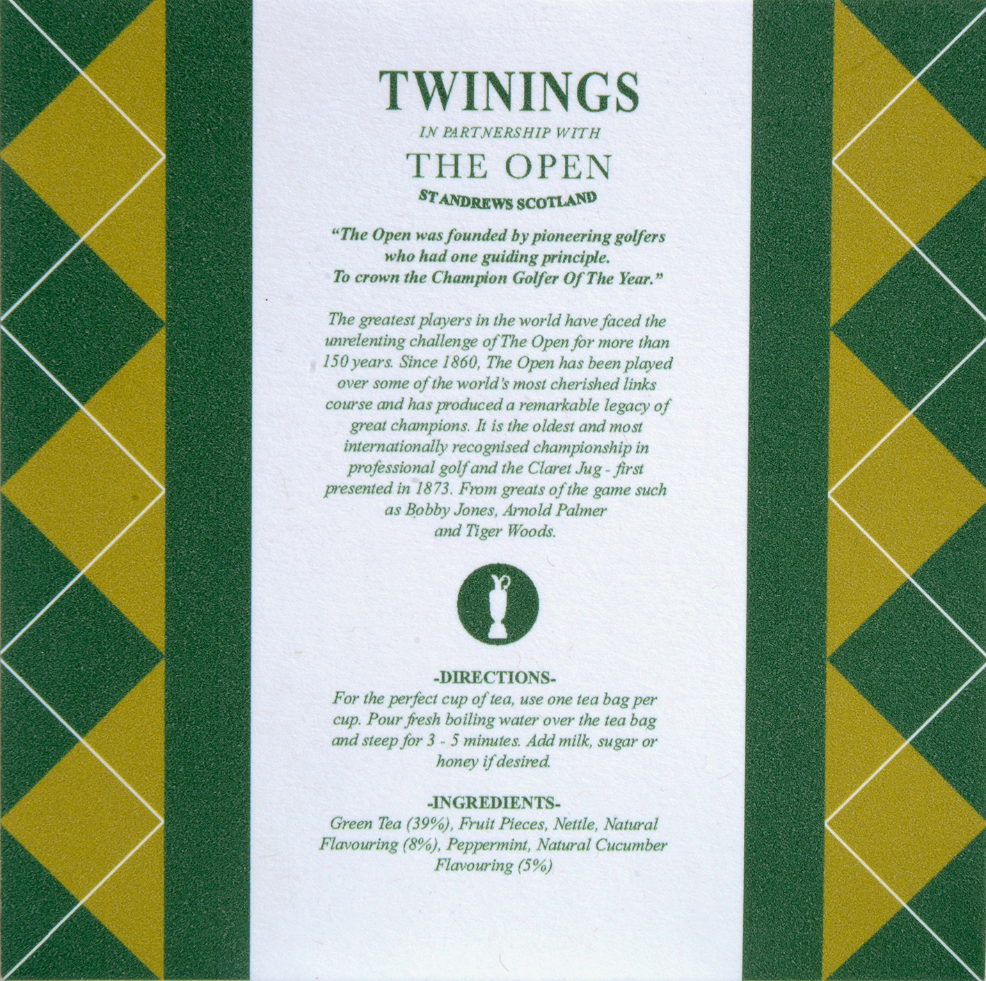
History on the reverse

Statistically children consume more sweets at Halloween than at any other time of the year. This design concept for the Colgate toothpaste brand is based around this fact. Fun, engaging and appropriate pack designs that would be timed to be on supermarket shelves for the the Halloween celebrations.

Set of 3 designs: The wolf, The Vampire & The Witch

Each pack has a short, fun poem on the reverse highlighting the importance of brushing your teeth.
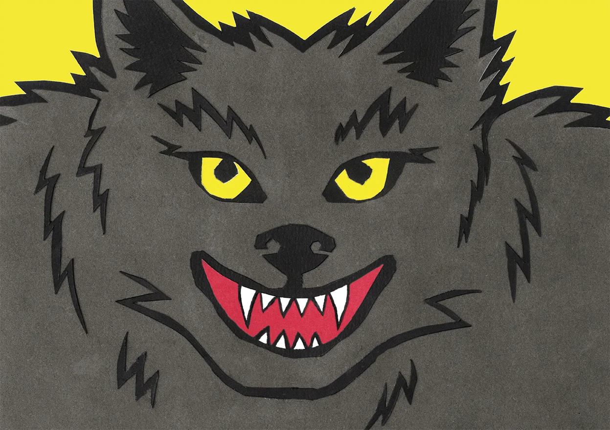

Art directed shot showing the 3 sides

A scarily cool idea!


This brand partnership concept between the Woodland Trust & Graham & Brown Wallpapers utilises a series of appropriate pattern designs on ecofriendly wallpaper. As well as being aesthetically pleasing, the idea also informs the consumer about the work of the Woodland Trust.

Typographic detail from the wallpaper box packaging

Raise & reveal the mission statement on each wallpaper roll pack design

Box and contents shot
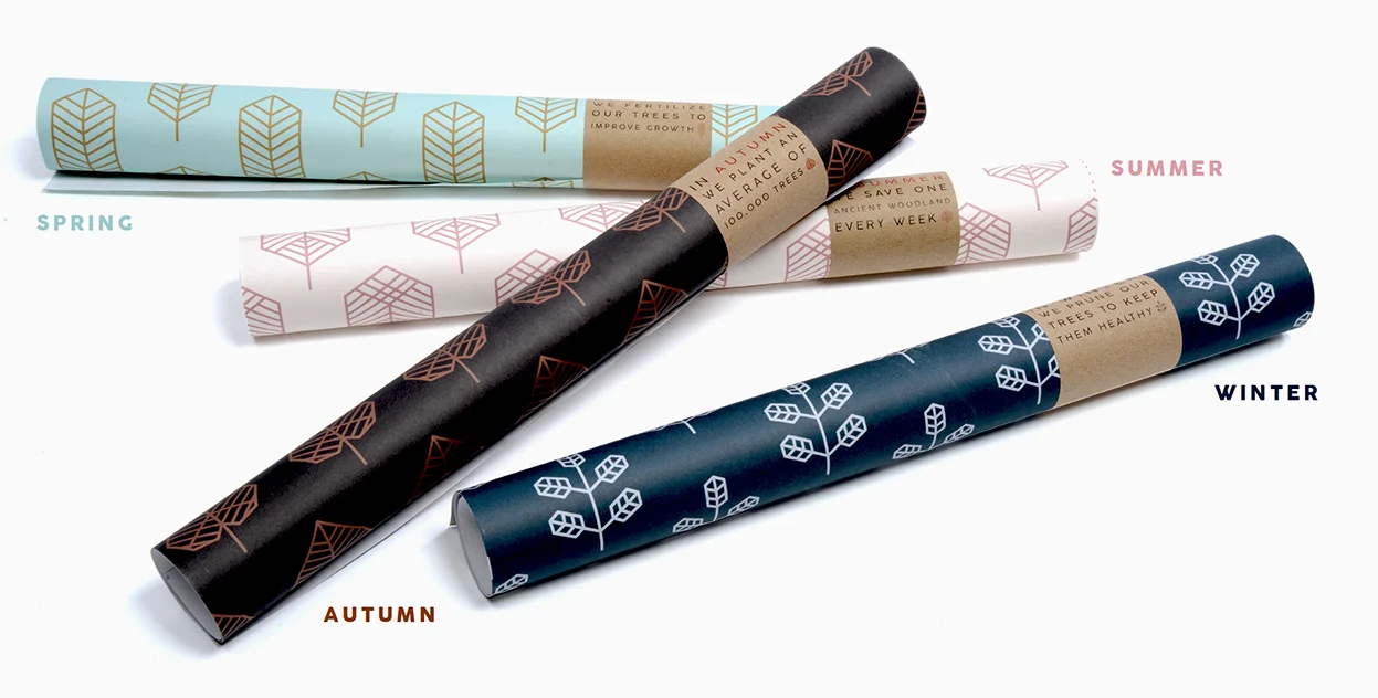
The 4 seasonal patterns available.
Please click the above image to play the film.
Another Twinings tea brand extension with a visual twist. The core of this brand extension concept stems from research into the birth of the suffrage movement and the fact that much of the direct action was often planned and formulated in the tea rooms of Edwardian England.

Front & Back of the tin packaging

The sides of the tin tell the story of the suffrage movement and its connection to tea.


Each tea bag is individually wrapped and the packaging has a reproduction of a political cartoon from the time with a short poem about the suffrage movement.

A selection of some of the poems and cartoons applied to the teabag packaging.

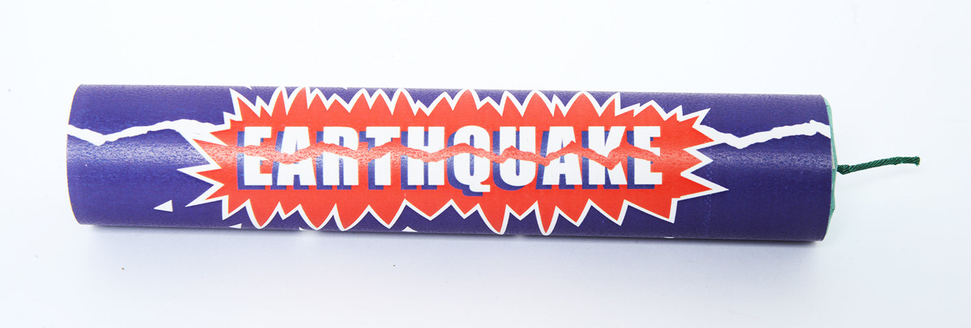
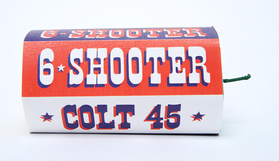
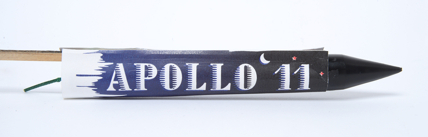
This brand extension is based around America’s annual 4th of July Independence Day celebrations. Taking a classic American brand with an explosive flavour, this student produced a limited edition set of fireworks based on American landmarks, inventions and achievements.


Copywriting

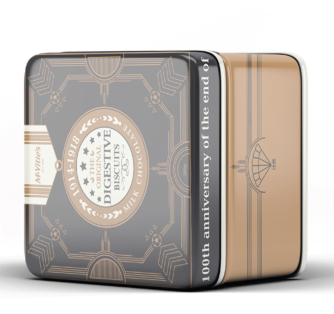
McVitie’s supplied biscuits to the troops in the trenches during the 1st World War. This fact coupled with the centenary celebrations provided an obvious route to extending the brand. This student created a limited edition tin of biscuits. The design and pattern on the box contained a variety of military motifs…can you spot them all?

The main label design was based on a medal, with various military insignia providing the background pattern.


A great selection of solutions that demonstrate not only a high standard of design aesthetic but also some clear thinking and some simple effective ideas based on good solid research. It’s all about making those connections and building on a brand story that is believable.
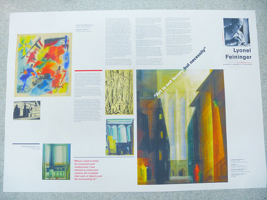
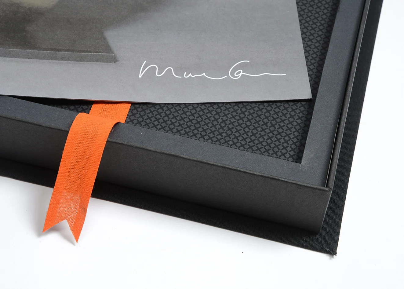
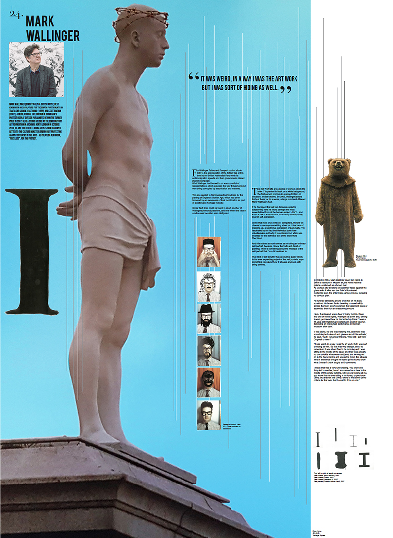
Here we feature a selection of posters designed by our second year Graphics students, as part of their type & image brief back in 2018. Each student was given a fine artist from the now infamous 1997 Sensation Exhibition, and had to research and then design a poster based on their work. These posters then became part of a special 30 year coffee table artefact in the form of a limited edition box set of posters. Retailing at £400.


Here we again feature another Heinz D&AD solution from 2nd year student Sara Esat, based on the speed that Heinz flows from the bottle.
Please click the image to play the film
Here we feature 2nd year student Holly McNicholas’ Heinz D&AD entry that again didn’t quite make the grade.
Click on image to play film.

The Disciples Of Design are a global collective of design academics, practitioners, artists and students. We have one common thread – University of Lancashire in Preston, UK; and one common aim – the creation of an ever evolving visual hub for the sharing of ideas and thoughts.