Typographic Poster - A case study
/As our second years grapple with their first project back after the long summer break we thought it would be timely to lead by example and help them along with this instructive post.
They have all been given just over 2 weeks to produce an appropriate typographic poster for a range of UK festivals with topics such as cheese, kites and horror to name but a few .
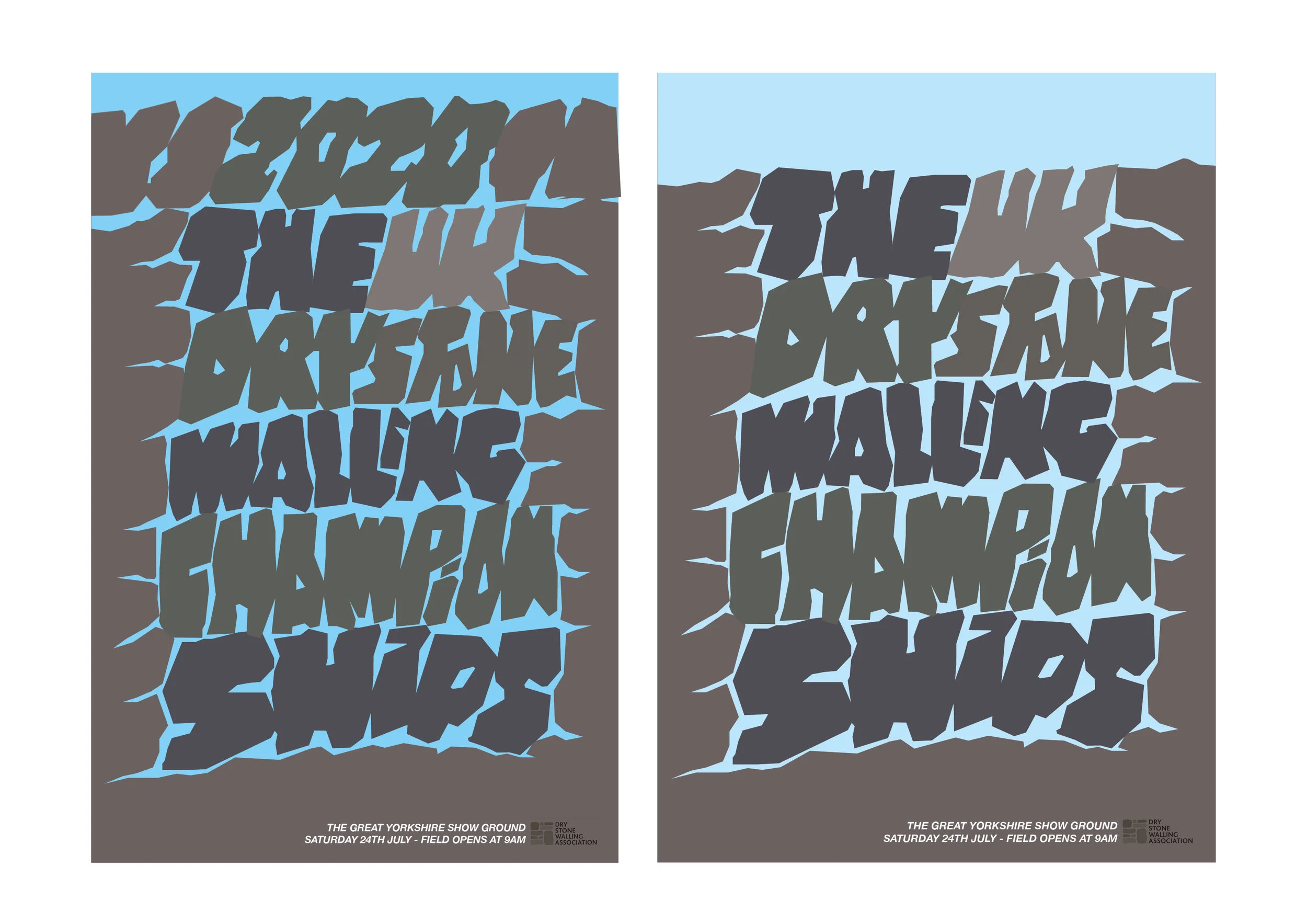
The sketches, development and design concepts below are for the UK Dry Stone Walling Championships.
This solution focuses mainly on a short bold title ‘The Uk Drystone Walling Championships’ rendered in an appropriate typographic style.
Sketches and experiments with a free style interlocking typeface which is designed to reflect the basics of the art of dry stone walling.
This project is all about choosing and creating an appropriate typeface and the technique you choose can be the idea. In this case once the style was developed, through a series of drawings and sketches, the finalised render was spray mounted to black paper and carefully cut out by hand with a scalpel. This hands on analogue approach was also a nice reflection of the subject matter itself
This was then digitised, re drawn out and refined.
Once the composition was finalised in black & white colour could be considered. In this case a pallet of greys was explored to reflect a stone like quality.
Further colour iterations with a small amount of typeset text added, with dates times and location of the event. Plus an appropriate sponsors logotype.
We hope this post helps everyone along a little in their own particular subject areas. So in summary; 1. Keep it simple. 2. Remember to keep the typography appropriate. 3. Sketch and draw your idea down before going to the computer and 4. Understand that the technique can be the idea.
5. Please do not over think and complicate your poster…that is not the aim of this project.
Rev J. Whitehead (Esq)


