Year 2 Brand Extension Solutions
/Here we feature a selection of solutions to the second year brand extension brief. Students were presented with a list of well known brands and had to somehow come up with a way of extending them. This was achieved by partnerships, special dates, occasions in the calendar or by finding out an interesting fact from the brand’s history. All the examples shown here made it into their respective students placement folders.
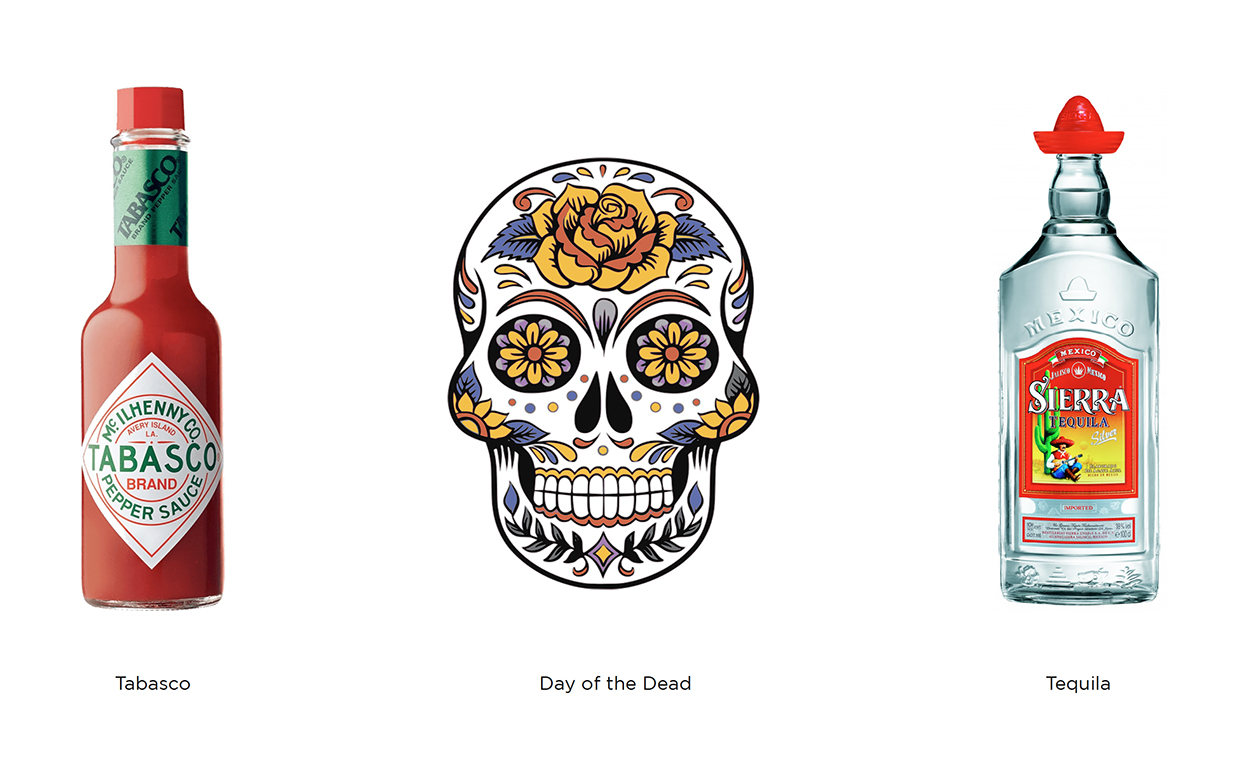
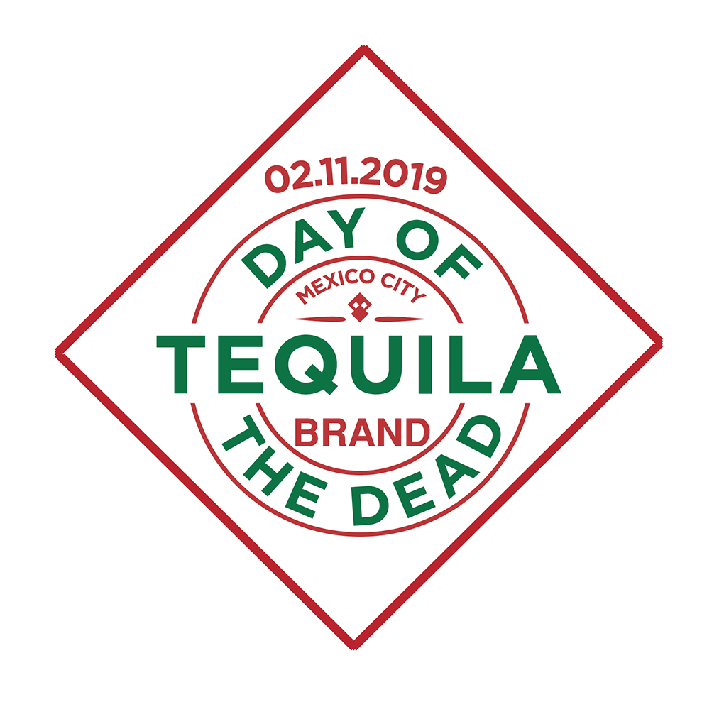

Mexican flag and skull motif made out of the iconic Tabasco diamond label

Poster concepts

Bottle design plus coasters

Mexican moustache coaster concept

Social

Highland Spring Water brand extension. This concept was based around the highland games and the heritage of the Scottish clans.

The seven clans
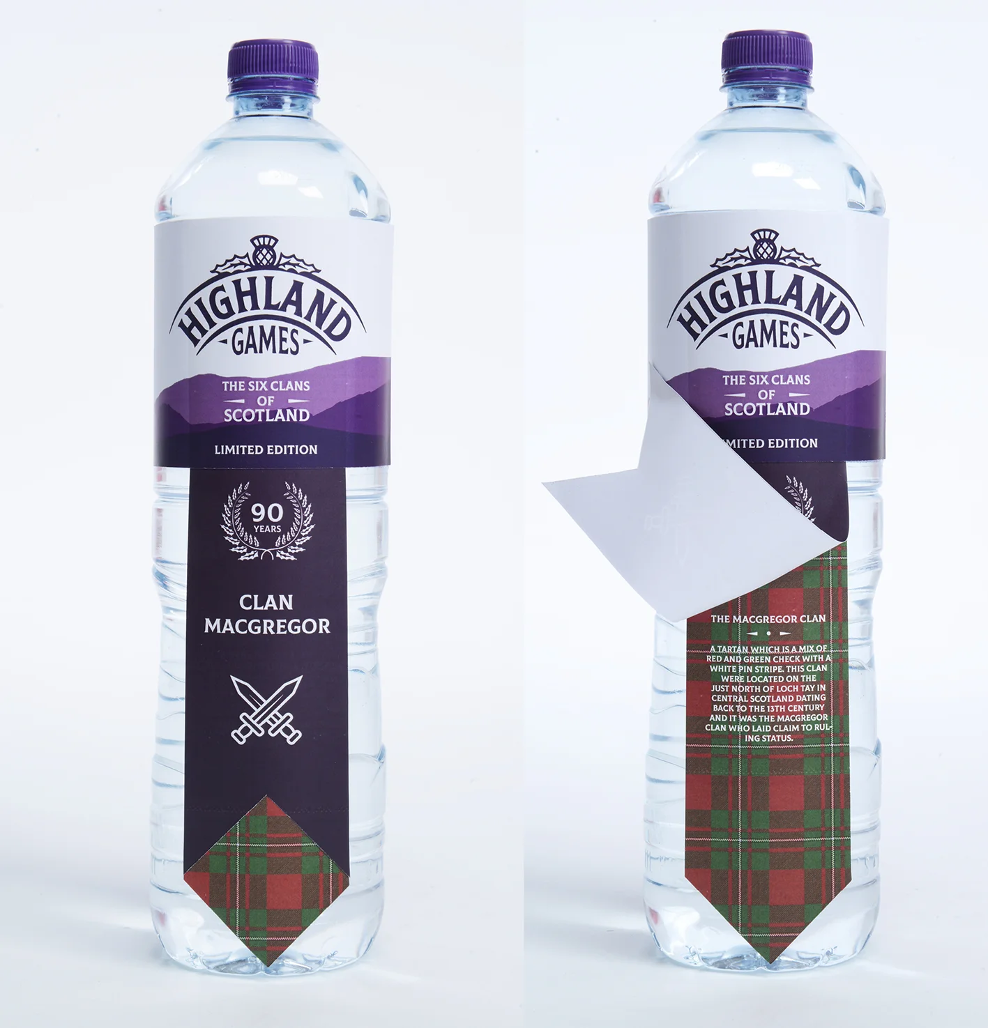
Lift the label to reveal each individual clan history

Individual posters featuring famous clansmen

Brand partnership concept between Twinings Tea and the Royal & Ancient Golf Club of St Andrews.

Box designs based on traditional golf attire.
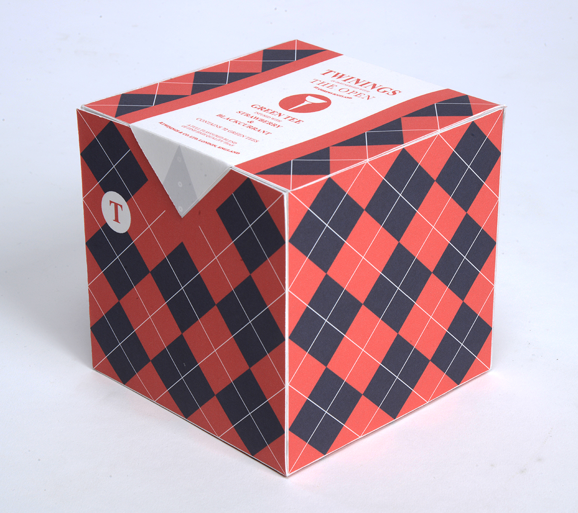

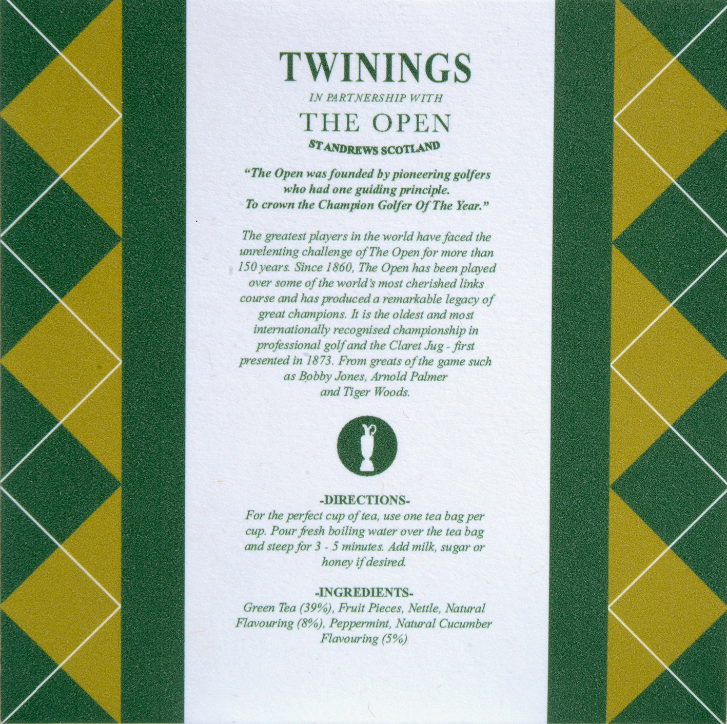
History on the reverse

Statistically children consume more sweets at Halloween than at any other time of the year. This design concept for the Colgate toothpaste brand is based around this fact. Fun, engaging and appropriate pack designs that would be timed to be on supermarket shelves for the the Halloween celebrations.

Set of 3 designs: The wolf, The Vampire & The Witch

Each pack has a short, fun poem on the reverse highlighting the importance of brushing your teeth.
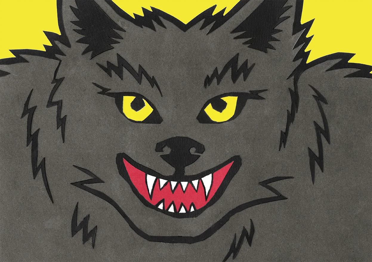

Art directed shot showing the 3 sides

A scarily cool idea!


This brand partnership concept between the Woodland Trust & Graham & Brown Wallpapers utilises a series of appropriate pattern designs on ecofriendly wallpaper. As well as being aesthetically pleasing, the idea also informs the consumer about the work of the Woodland Trust.

Typographic detail from the wallpaper box packaging

Raise & reveal the mission statement on each wallpaper roll pack design

Box and contents shot
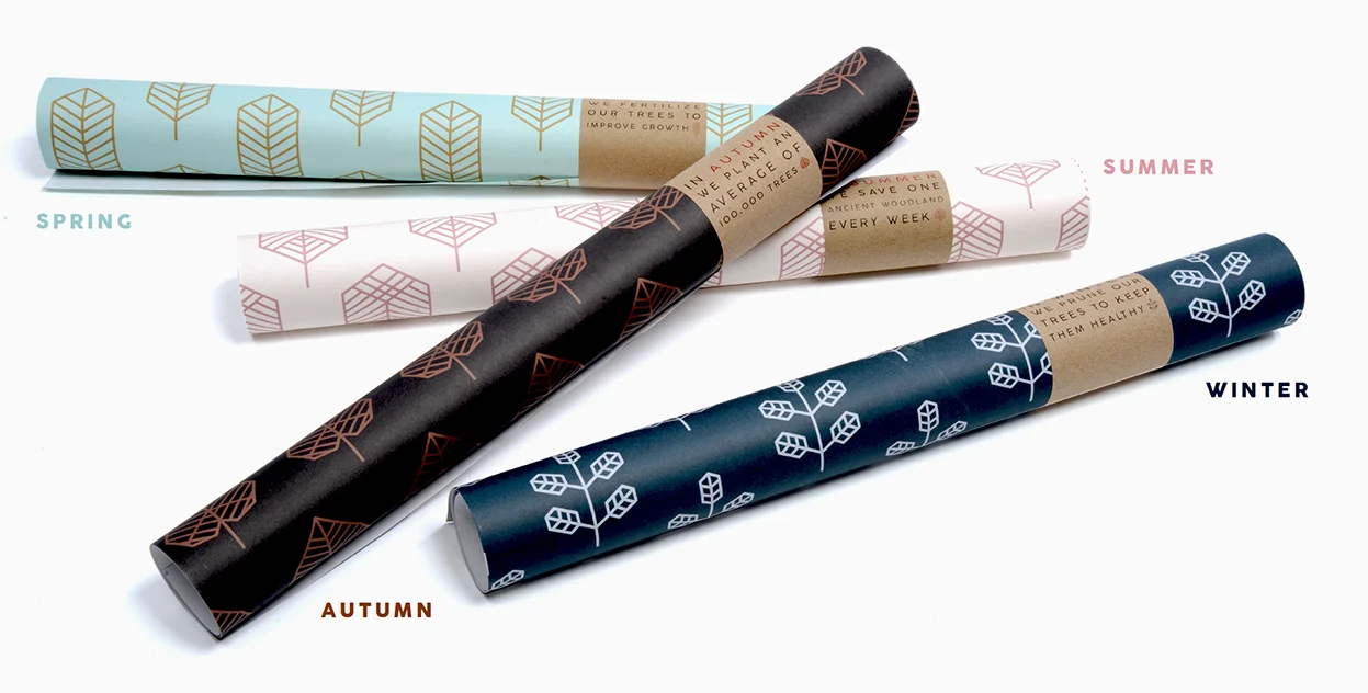
The 4 seasonal patterns available.

Please click the above image to play the film.
Another Twinings tea brand extension with a visual twist. The core of this brand extension concept stems from research into the birth of the suffrage movement and the fact that much of the direct action was often planned and formulated in the tea rooms of Edwardian England.

Front & Back of the tin packaging

The sides of the tin tell the story of the suffrage movement and its connection to tea.


Each tea bag is individually wrapped and the packaging has a reproduction of a political cartoon from the time with a short poem about the suffrage movement.

A selection of some of the poems and cartoons applied to the teabag packaging.

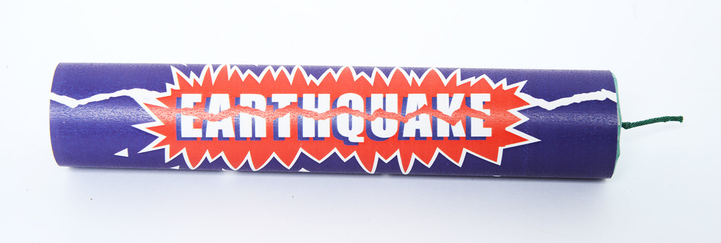
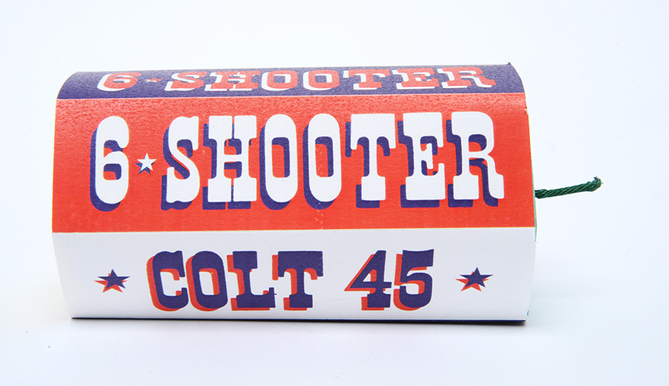
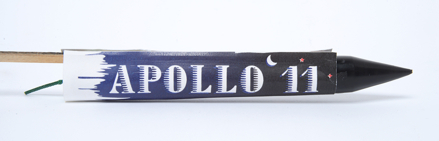
This brand extension is based around America’s annual 4th of July Independence Day celebrations. Taking a classic American brand with an explosive flavour, this student produced a limited edition set of fireworks based on American landmarks, inventions and achievements.


Copywriting

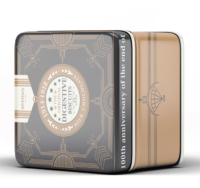
McVitie’s supplied biscuits to the troops in the trenches during the 1st World War. This fact coupled with the centenary celebrations provided an obvious route to extending the brand. This student created a limited edition tin of biscuits. The design and pattern on the box contained a variety of military motifs…can you spot them all?

The main label design was based on a medal, with various military insignia providing the background pattern.


A great selection of solutions that demonstrate not only a high standard of design aesthetic but also some clear thinking and some simple effective ideas based on good solid research. It’s all about making those connections and building on a brand story that is believable.
