Hellmann's D&AD 2018 – Rejuice

Here we feature Tom Buckley’s entry for the Hellmann’s D&AD brief back in 2018. The brief asked for the creation of a Hellmann’s branded device, publication or service that addresses the issue of food wastage.

Please click on image above to play film

Brand Assets

Brand Assets

Word mark

Word mark

Packaging 1

Packaging 1

Packaging 2

Packaging 2

Packaging 3

Packaging 3

Overview

Overview

In store 1

In store 1

In store 2

In store 2

In Store 3

In Store 3

A well thought through concept with a distinct look and feel, from colour to copy and through to tone of voice.

face .jpg

Chelsea Flower Show Branding – 2103

Here we feature Gina Chamberlin’s Chelsea Flower show Centenary Identity from the 2013 degree show.

C for Centenary & Chelsea

C for Centenary & Chelsea

Chelsea logo 2.jpg

Click the image above to play clip

Poster 1

Poster 1

Poster 2

Poster 2

Poster 3

Poster 3

Time line stem

Time line stem

time line.jpg

Nicely crafted, appropriate and considered typography. Blooming marvellous and yes, again, a nice idea that will always remain so, year in year out.

Iconically British – D&AD 2013

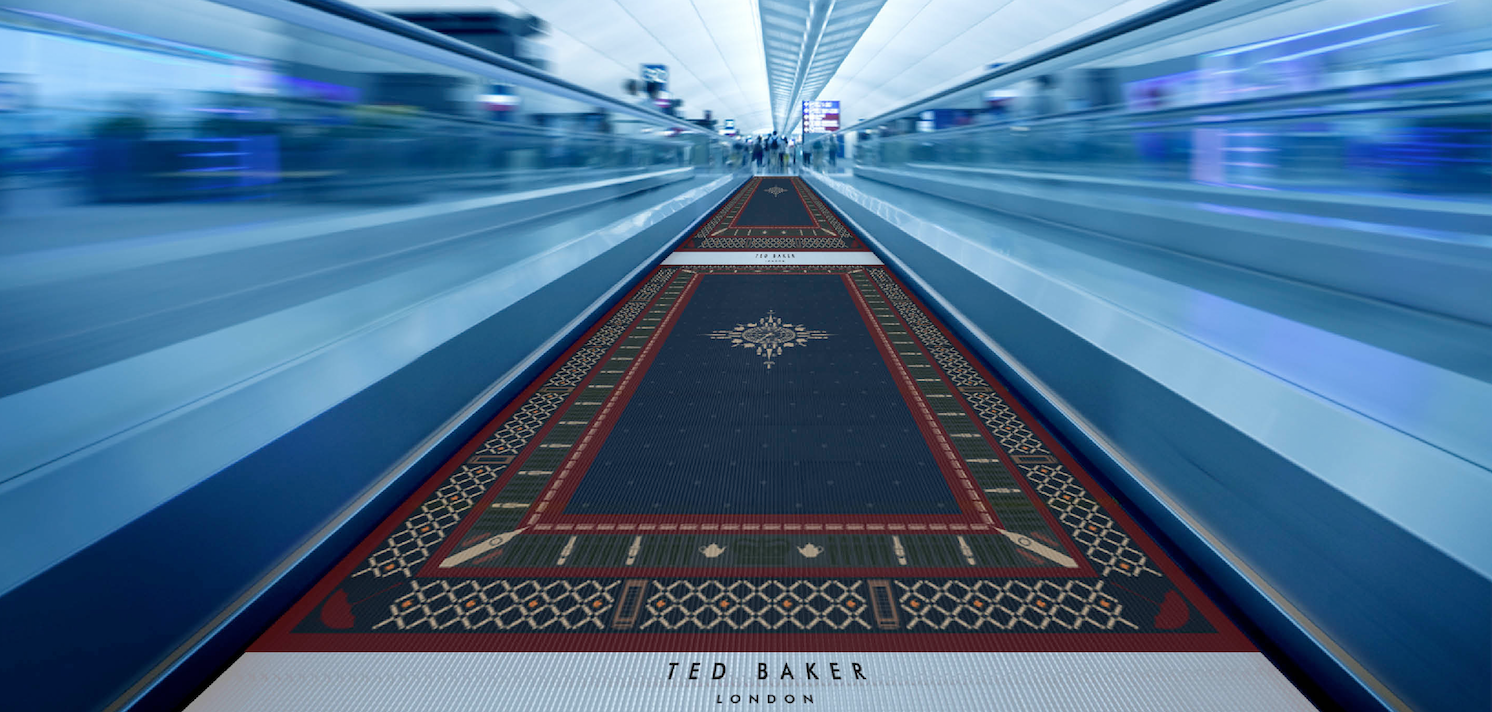
Here we feature Naeem Mitha’s D&AD entry for the Ted Baker brief from 2013. The brief was to imagine Ted Baker opening a store in a country and capitol of your choice and then create a roll out campaign to advertise the opening. Naeem chose Dubai and here is his creative twist.

Classic British Icons

Classic British Icons

Creatively applied to iconic Arabian Keffiyeh Head Scarf

Creatively applied to iconic Arabian Keffiyeh Head Scarf

Keffiyeh Head Scarf - Detail

Keffiyeh Head Scarf - Detail

Magazine Advertisement

Magazine Advertisement

Concept applied to a Persian Rug to create a Billboard Advertisement

Concept applied to a Persian Rug to create a Billboard Advertisement

Detail 1

Detail 1

Detail 2

Detail 2

In context

In context

Design applied to airport travelator

Design applied to airport travelator

Pattern applied to a range of in store bags

Pattern applied to a range of in store bags

Digital touchpoints

Digital touchpoints

Store frontage - Design concept

Store frontage - Design concept

A great example applied pattern. A great example of a connection made. A great example of crafting to the highest degree and then a great example of how to apply an idea to a series of relevant touch points that bring the concept to life. Unfortunately it was not shortlisted for D&AD…but it deserved more in our humble opinion. A good idea is always a good idea!

Hustle Underwear

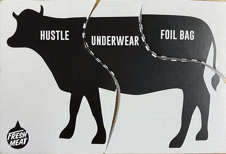
Congratulations to Year 2 Graphics student Tom Culton who has just won an industry led competition set by Bulletproof Design - London. The brief was titled ‘Fresh Meat’ and students were asked to think outside the box and break away from the expected rules of branding.

1 Hustle cow.jpg

There were 3 parts of a cow representing the brand name, product and format. The students were asked to pick one card for each from lists of options to create a brand identity and a piece of packaging.

Tom got brand name ‘Hustle’, the product being underwear, in a foil bag format.


2 Hustle logo.jpg


3 Hustle pants.jpg


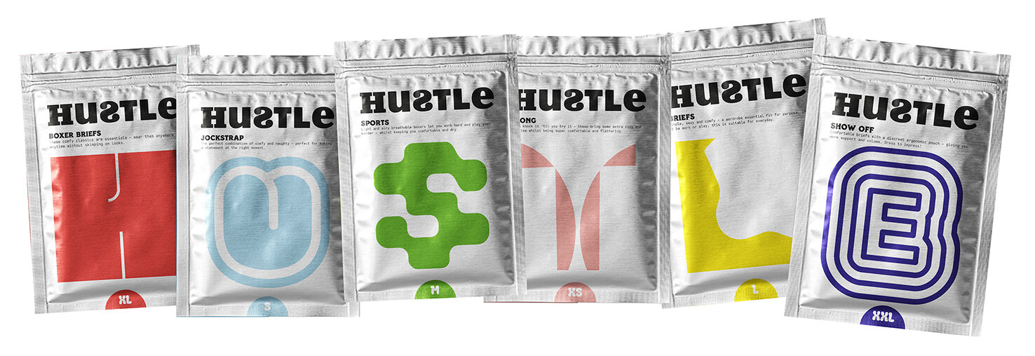
The proposition was ‘a brand that doesn’t try too hard to be sexy and is instead fun, cheeky and loud - relating to the ‘hustle’ name, celebrating diversity in body image’.

There are 6 styles of underwear in the Hustle range. They have cheeky typographical personalities with a nod to the type of underwear (ie. The ‘H’ resembles boxer shorts) which spell out Hustle when displayed in the shop.

4 Hustle packaging.jpg
 
5 Hustle logo for moving image.jpg
 

His winning entry has won him a 2-week placement at Bulletproof in London.

Paper Samples - D&AD 2017

Here we feature Harriet Richardsons commended D&AD entry for the Arjo Wiggins paper brief 2017.

'Samples' by Sony is a revolutionary way of creating new experimental sounds like never before, combining the tactile medium of paper with digital sound technology. 'Samples' allows both music artists and Sony customers to turn paper samples into audio samples, whilst also exploring the unique and beautiful medium of paper.

Concept

Concept

mailer.jpg
phones web.jpg
rip sanples web.jpg
sample book web.jpg
various artists web.jpg

Click the arrow to play the film

ambient.jpg
launch web.jpg

A great example of a project built upon a clever verbal connection which combines both the digital and physical to create a unique concept.- Paper Samples & Music Samples or BPM meets GSM.

Bacardi Ultra Sound - D&AD 2018

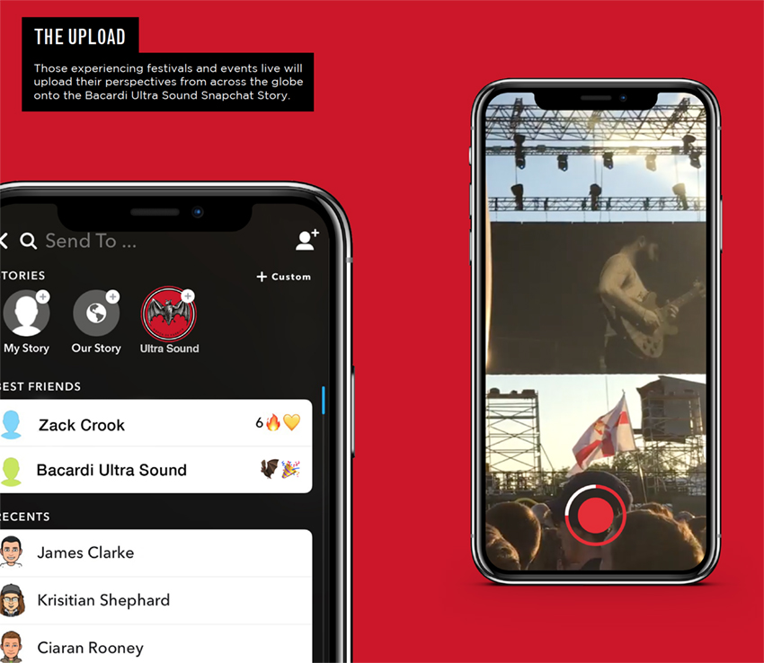
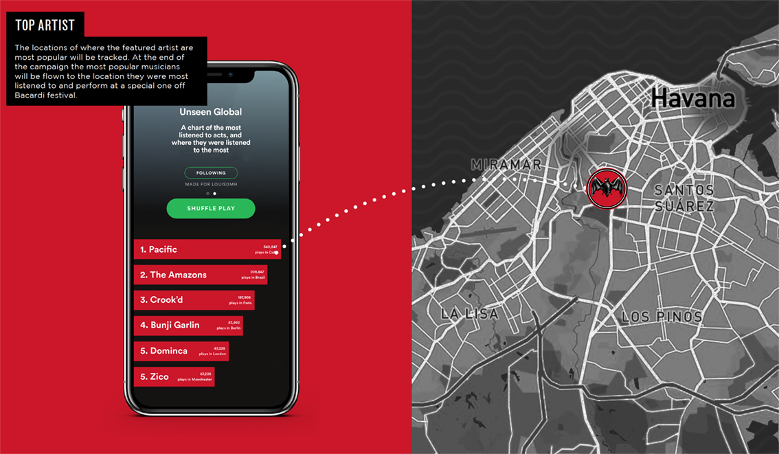
Here we feature Louis Hancock & James Clarke’s D&AD entry from 2018.

idea.jpg
ultran sound logo.jpg
how.jpg
upload.jpg
ultra sound.jpg
discover.jpg
spotify.jpg
location.jpg

Click white arrow to play

event.jpg
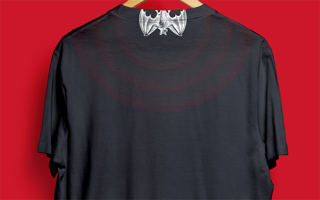
Merchandise - T Shirt

Merchandise - T Shirt

Glow in the dark entry stamps

Glow in the dark entry stamps

Ultra Violet bottle concept

Ultra Violet bottle concept

A strong and simple connection between a bats natural senses and the Bacardi brand bought to life with some great connected thinking. Deserved to get further than it did in the competition?