One week project: Image

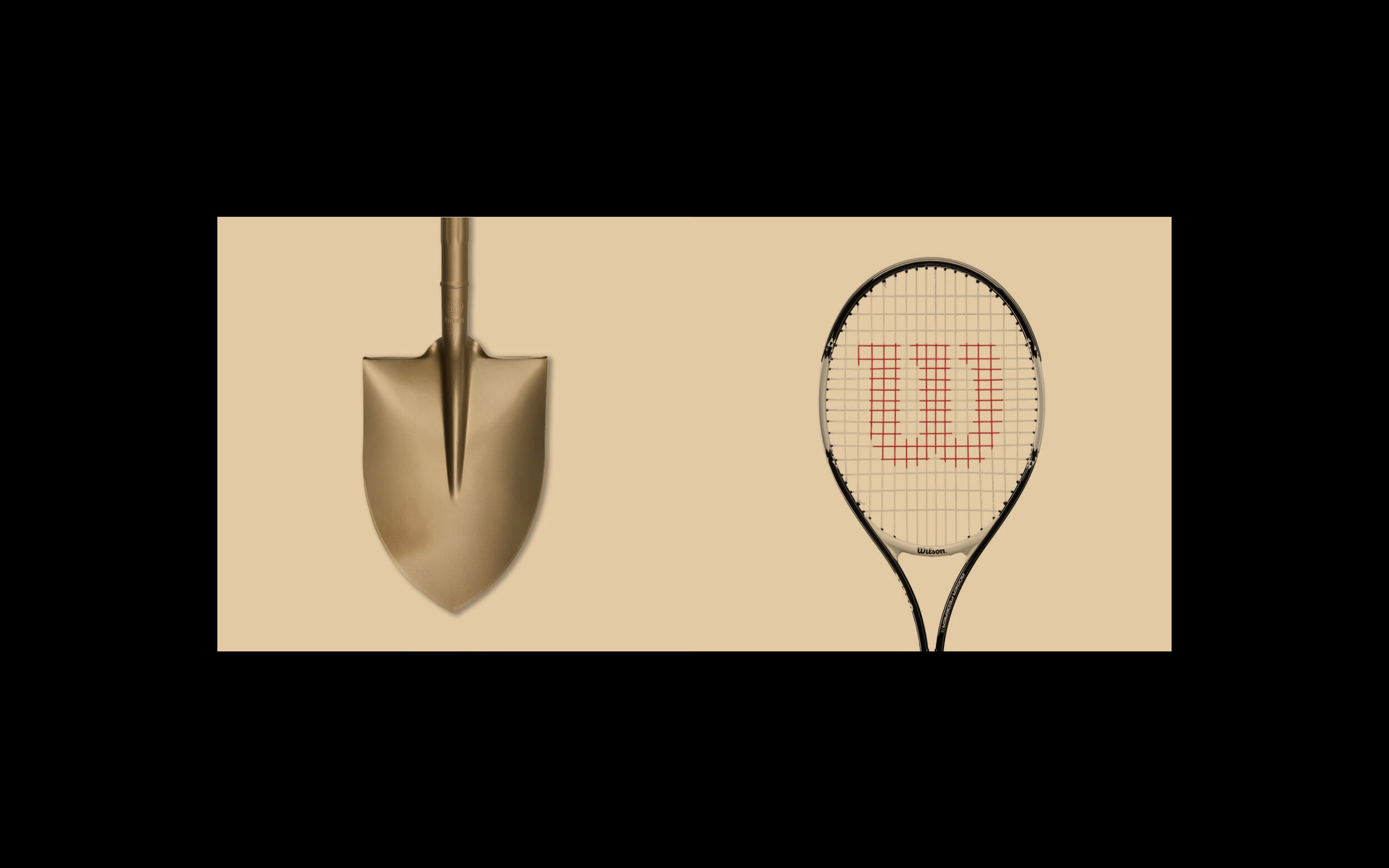
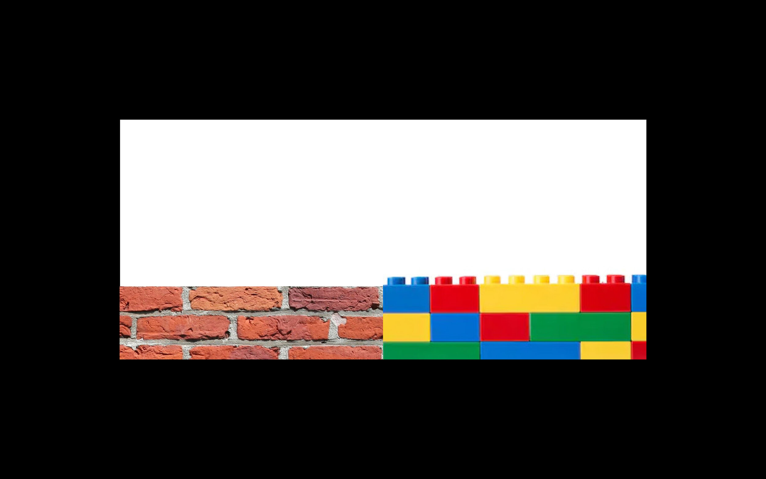
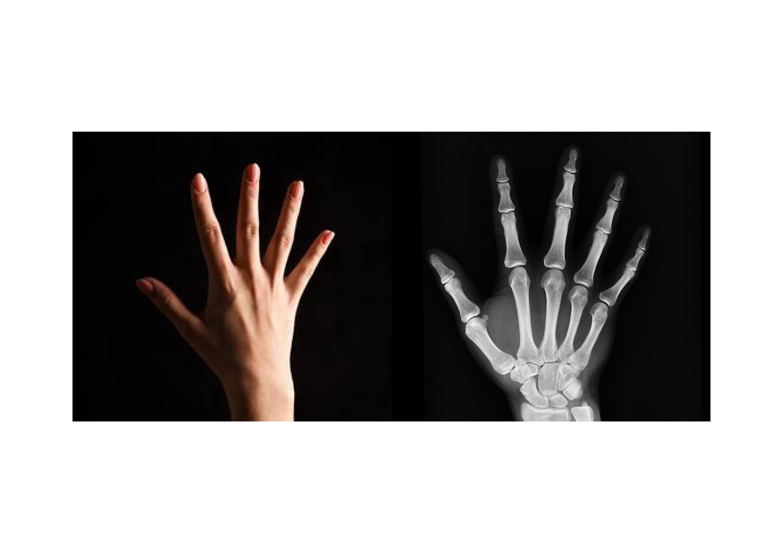
First years have recently finished their one week image brief, with the seemingly simple task of juxtaposing two images to communicate a theme of contrast.

This project develops the research phase, then requires making connections first and finding imagery later. Thus: think first, design second. It is not an easy brief, to achieve one good solution is a task but a week offers enough time to do so.

Though given themes vary in depth of meaning, they can only be communicated by the selection of clear, concise imagery which is then appropriately cropped.

Visual layering and complexity is the antithesis of the task. A designer’s job is to communicate clearly and effectively, and use wit to their advantage.

We look forward to seeing how these juxtapositions develop for final assessment.

visible & invisible

visible & invisible

near & far

near & far

work & play

work & play

work & play

work & play

work & play

work & play

work & play

work & play

freedom & restraint

freedom & restraint

sweet & sour

sweet & sour

careless & cautious

careless & cautious

Type Foundries

Among the many behind-the-scenes / below-the-water-line / beneath-the-surface activities undertaken as part of The Disciples; we are continuously adding, editing and refining our links to external resources.

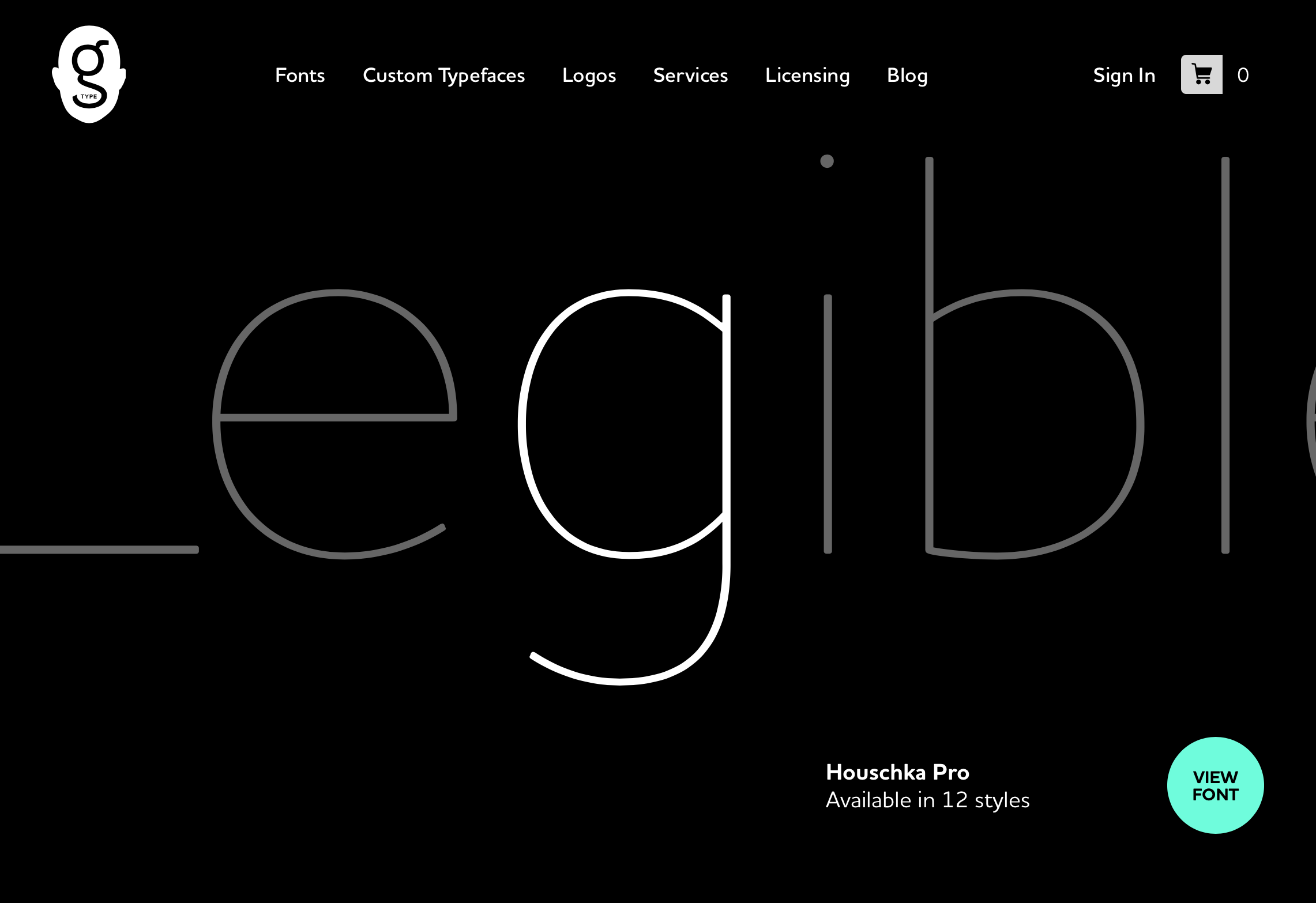
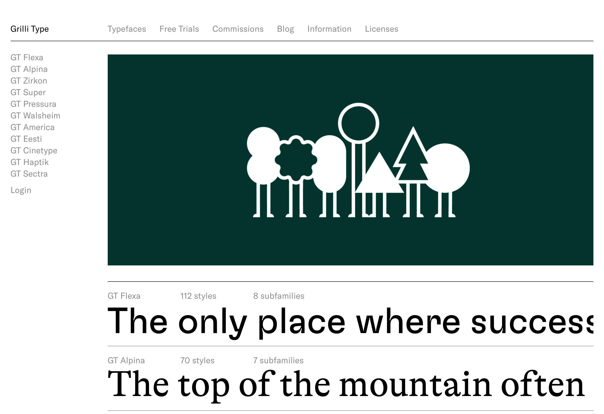
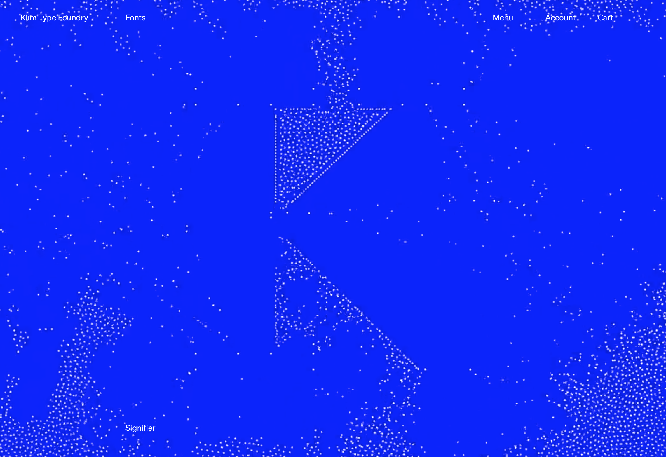
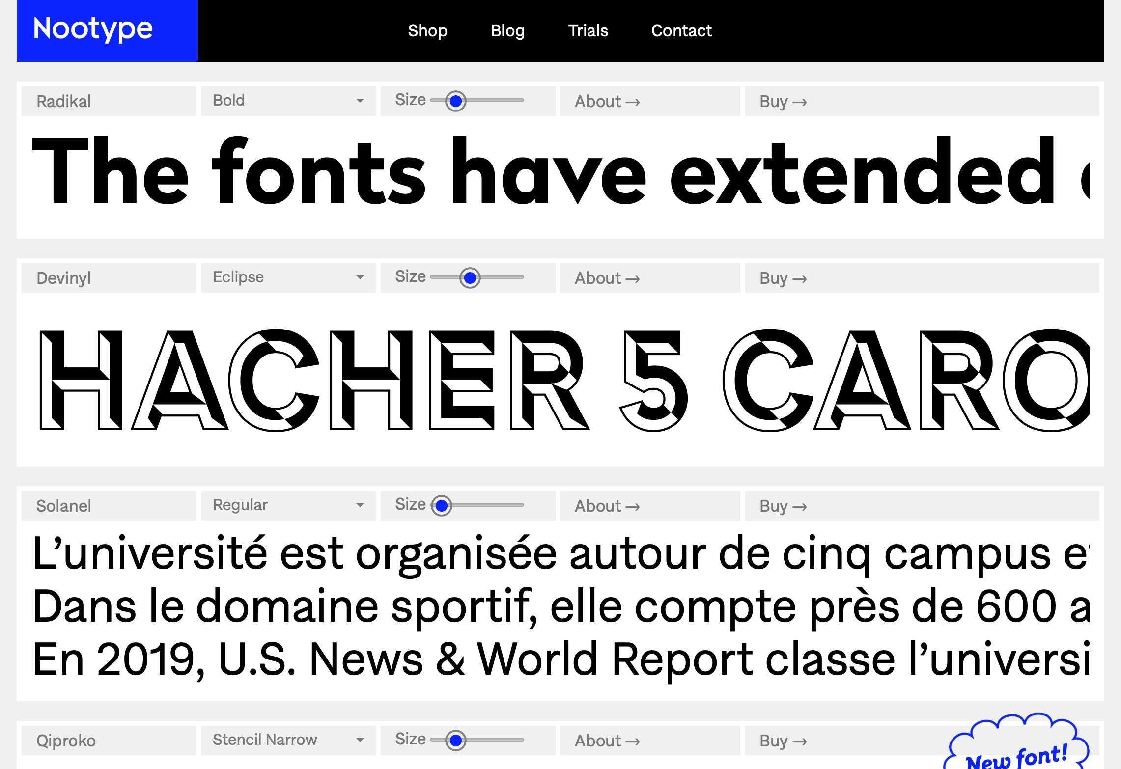
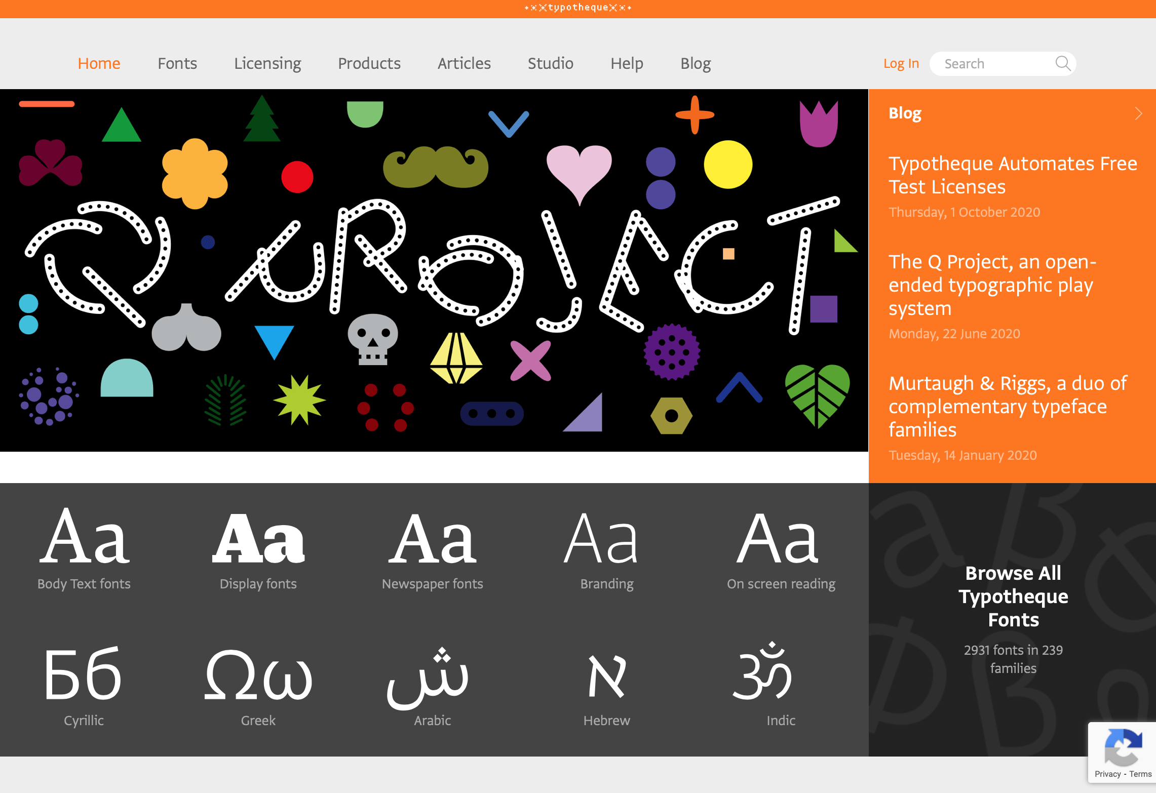
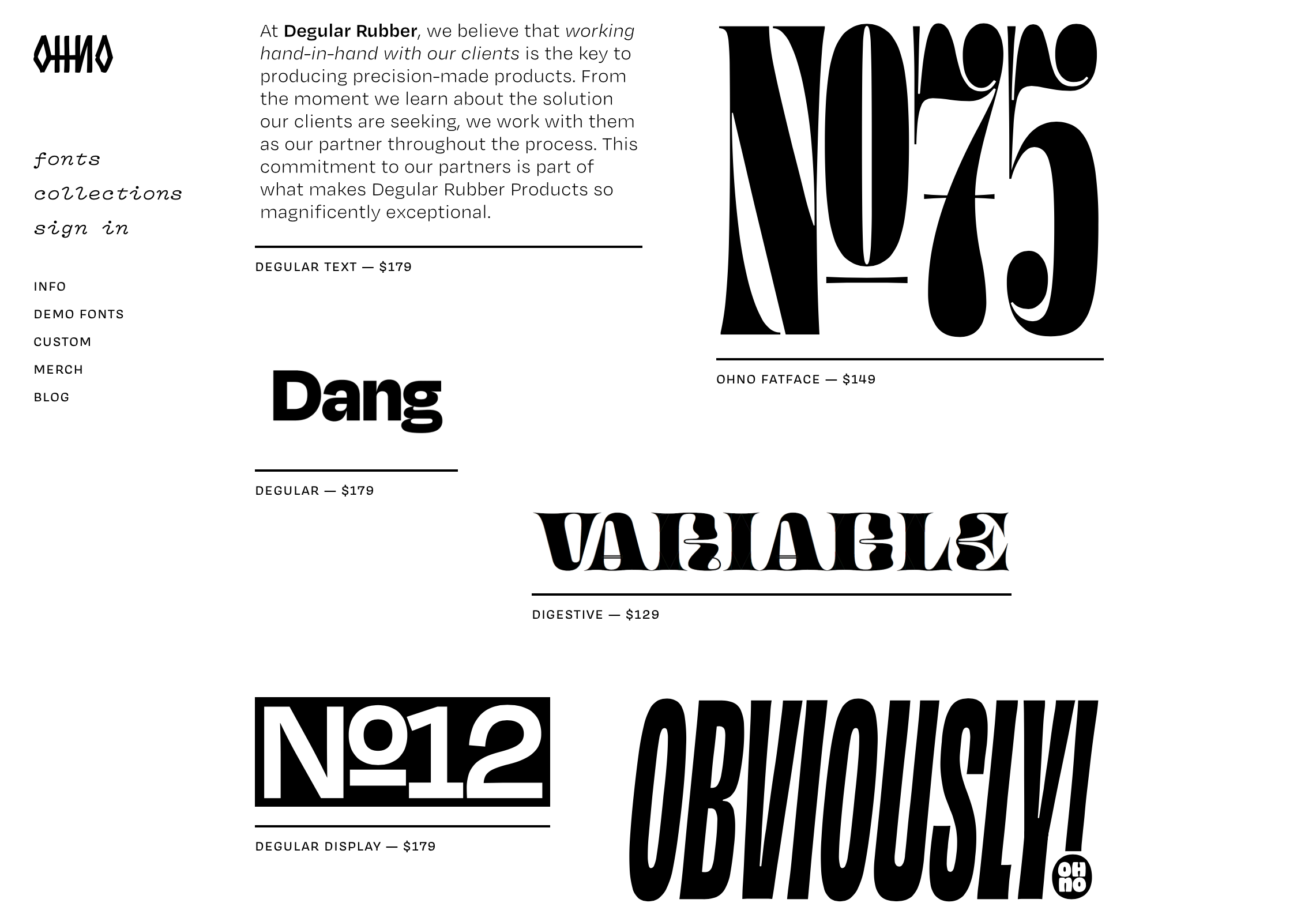
Having been recently contacted by Fontwerk, about the launch of their new type foundry in Berlin; we thought we’d re-share the list of independent type foundries we’ve built up over the years below.

Type specimen of fontwerk’s NIKOLAI

Type specimen of fontwerk’s NIKOLAI

Think of these foundries as the equivalent of the best branding or packaging studios. Absolute masters of their art. They might not all have free trials (who’d work for free?), but you can at least take influence from them and feed it into your own practice. Can you defy Helvetica?

And a final note, Dafont and the like are absolutely not included.

>>> Here’s the list, a veritable rabbit hole of typographic treats <<<


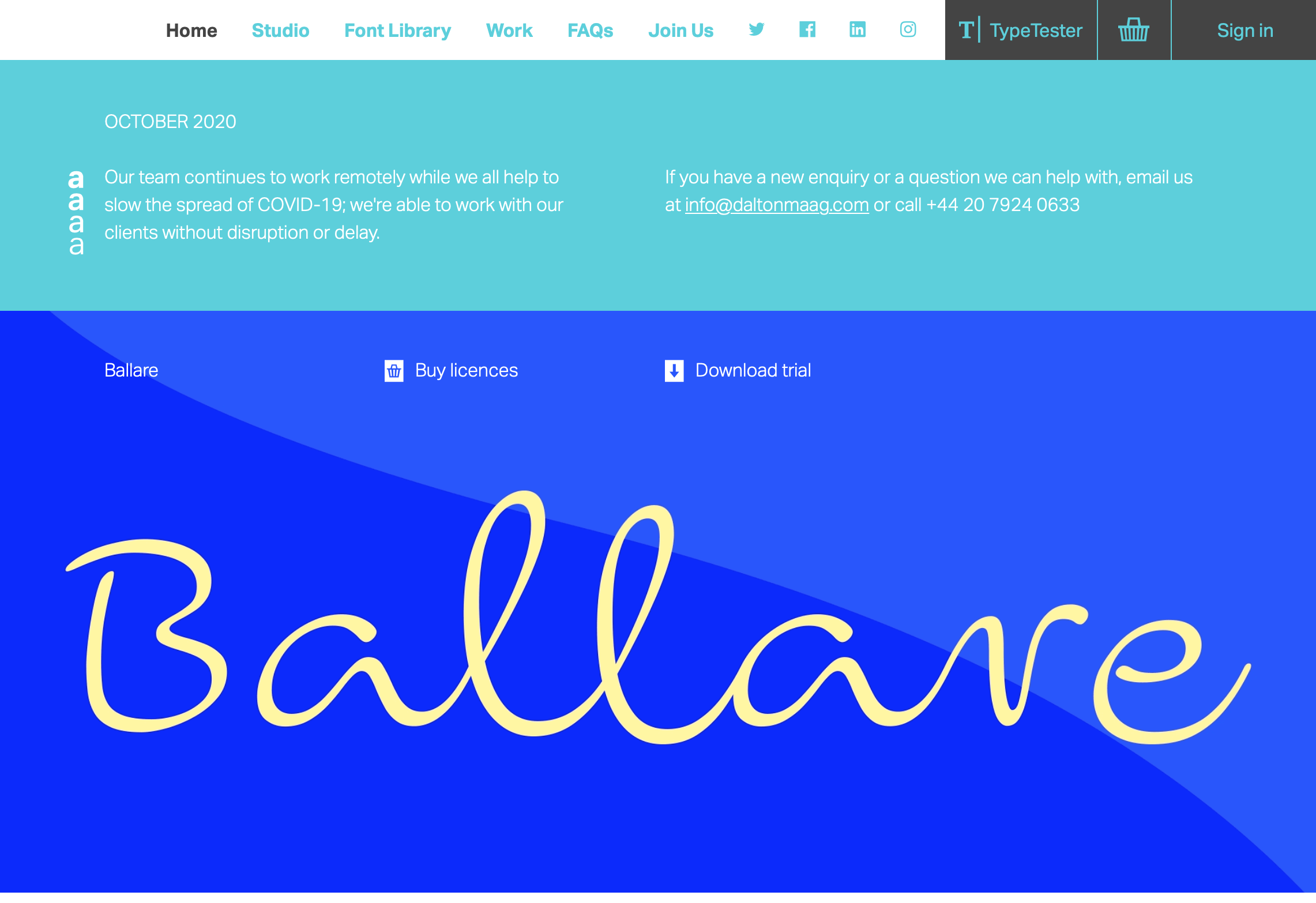
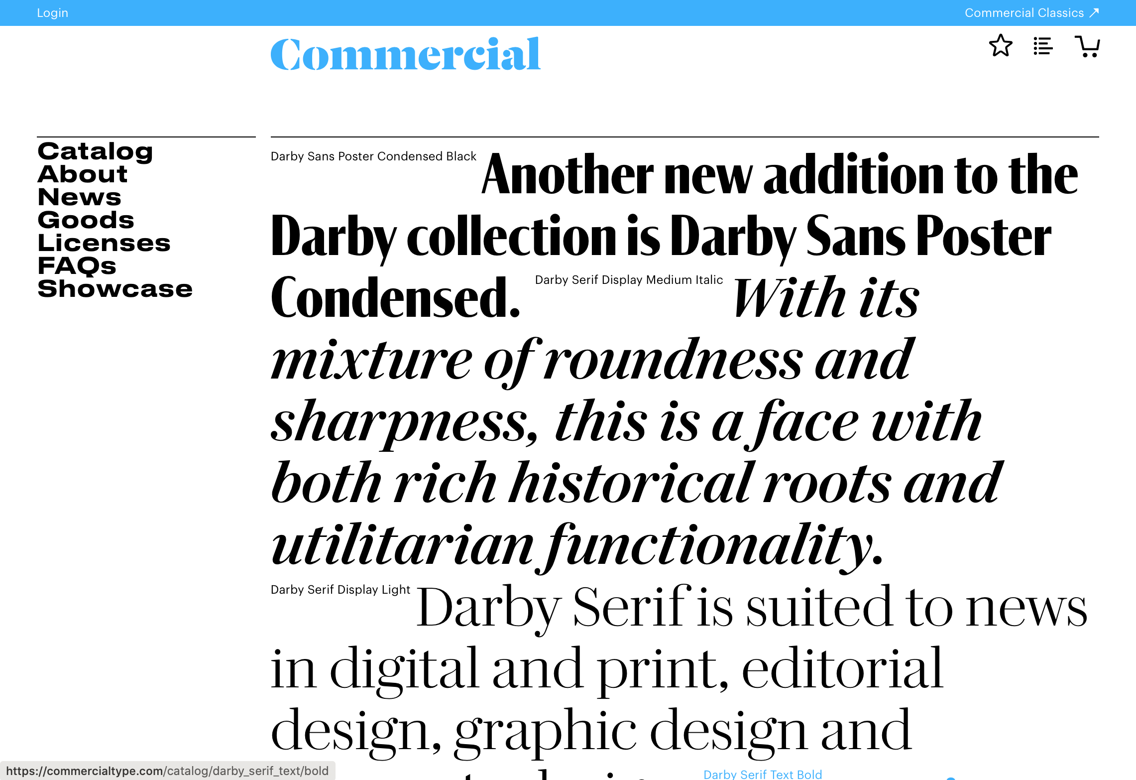
may these screenshots whet your appetite

One week project: Typography

After the stumbling start with Research, the second project for Year 1 centred around typography and yielded stronger (and simpler) solutions. A renewed focus was placed on drawing, analysis of type and placing the idea at the centre; pen on paper communicates just as well as toner proofs.

Students were directed to the fundamental work of Robert Brownjohn for the blueprint of how to extract maximum meaning with minimum means.

Conception (spot the swimmer)

Conception (spot the swimmer)

Innocence

Innocence

Exaggerate…

Exaggerate…

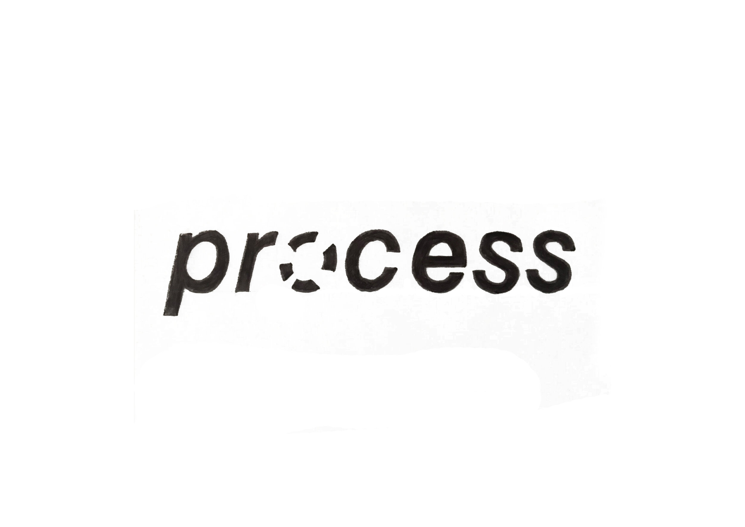
Process

Process

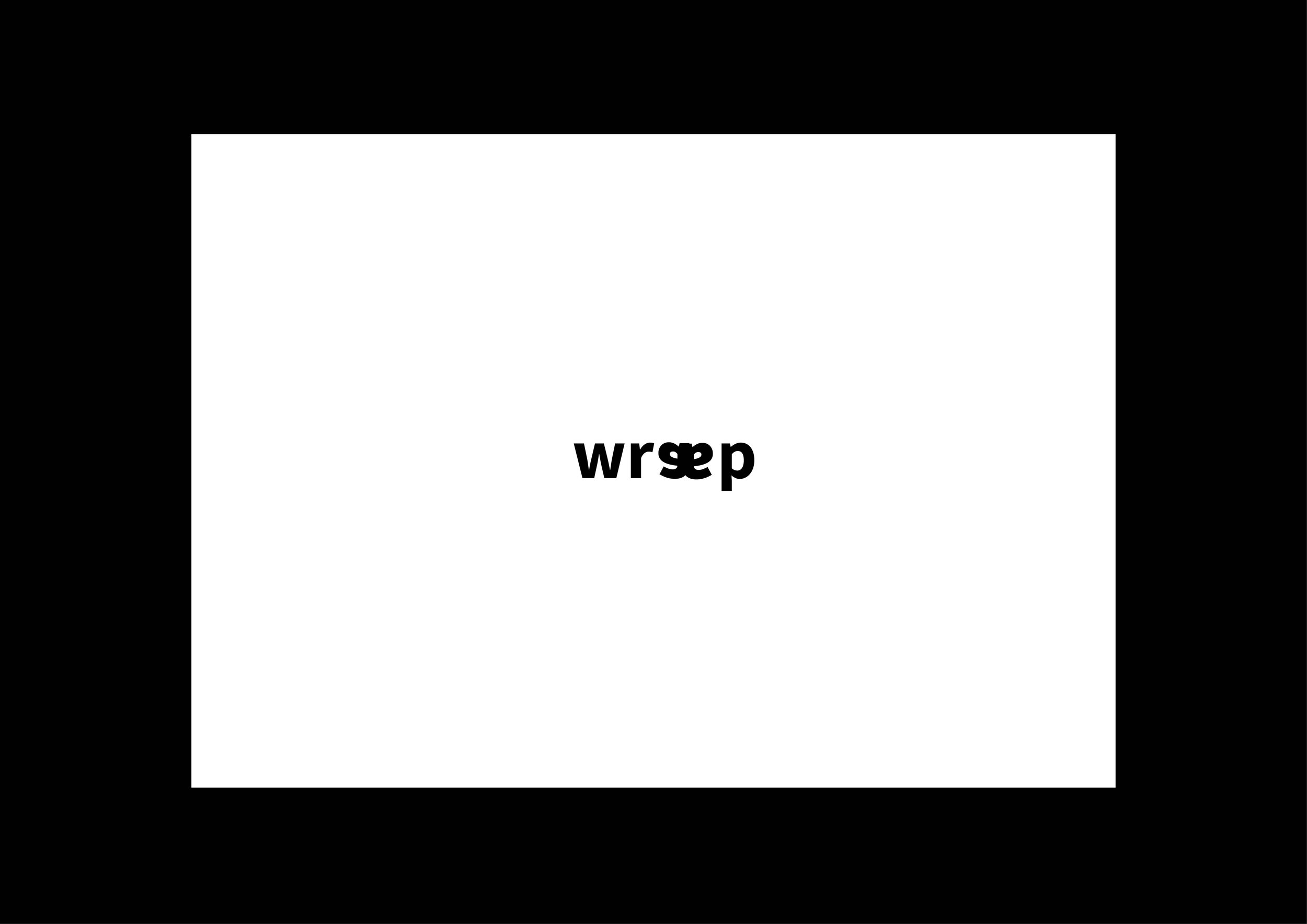
Wrap

Wrap

Awkward

Awkward

Stumbled

Stumbled

Confused

Confused

10 Years After

Here we feature a reflective post on the building of the stone circle that adorns the frontage of the Victoria Arts Building on the Preston Campus. Initially conceived and realised just over a decade ago, we thought it timely to post a short filmed retrospective.

Original sketches of the typography that sits on the top of the circle.

Original sketches of the typography that sits on the top of the circle.

Please click on the image above - 30 minute film ‘the making of’


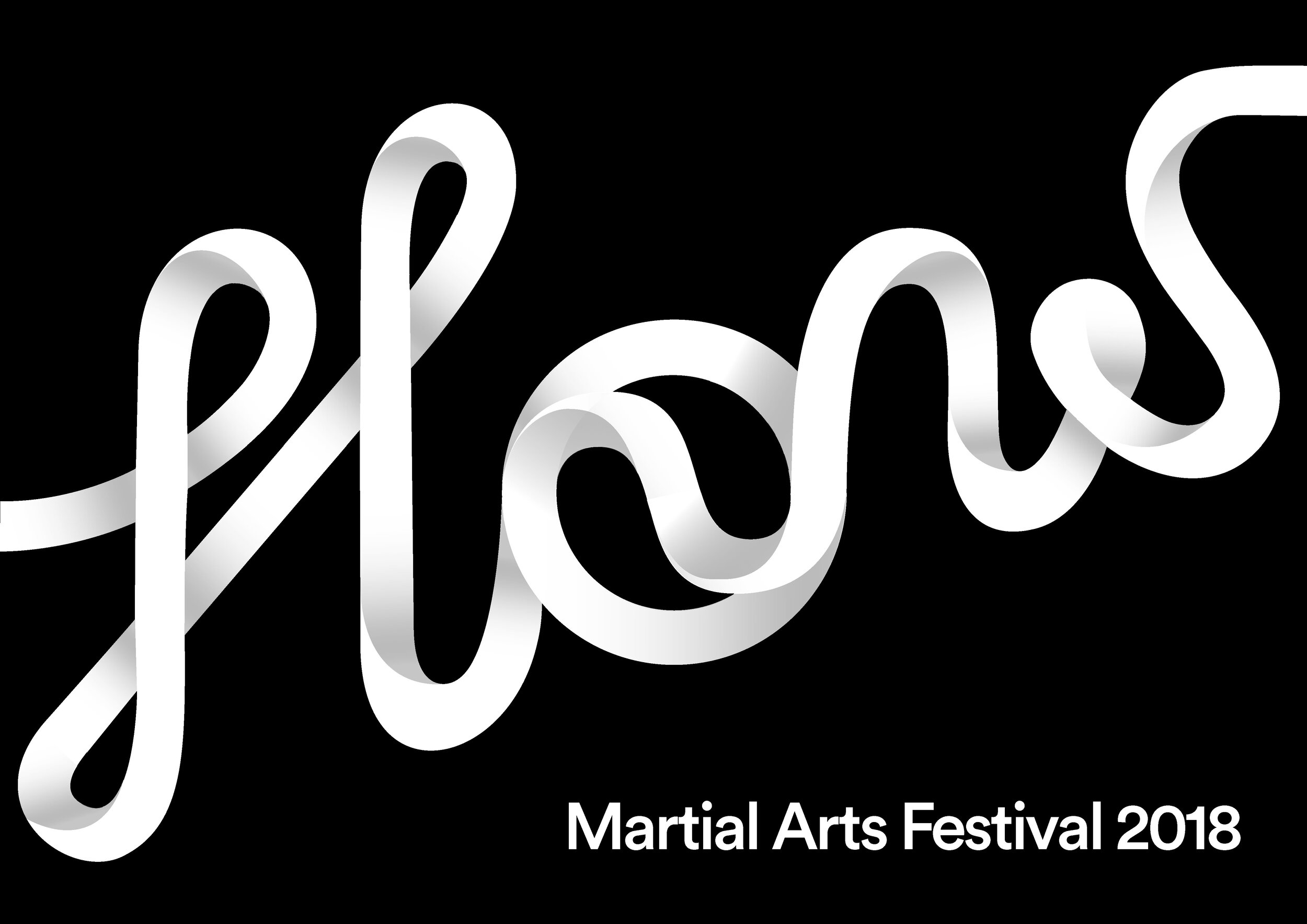
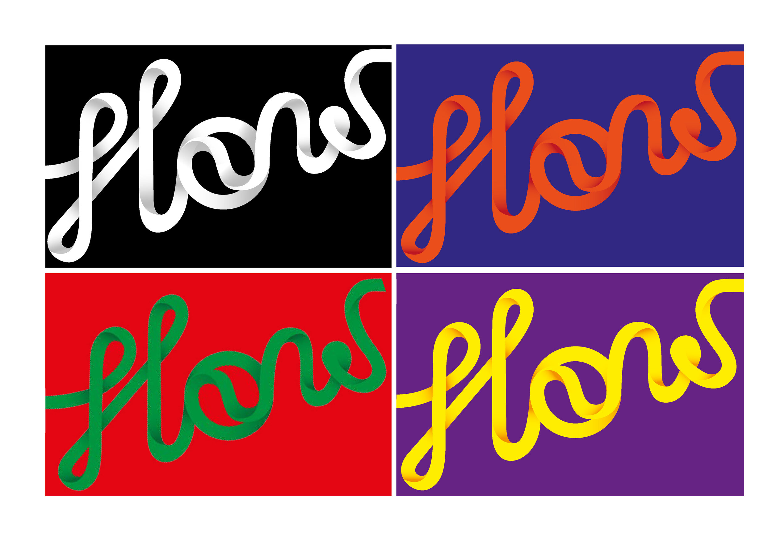
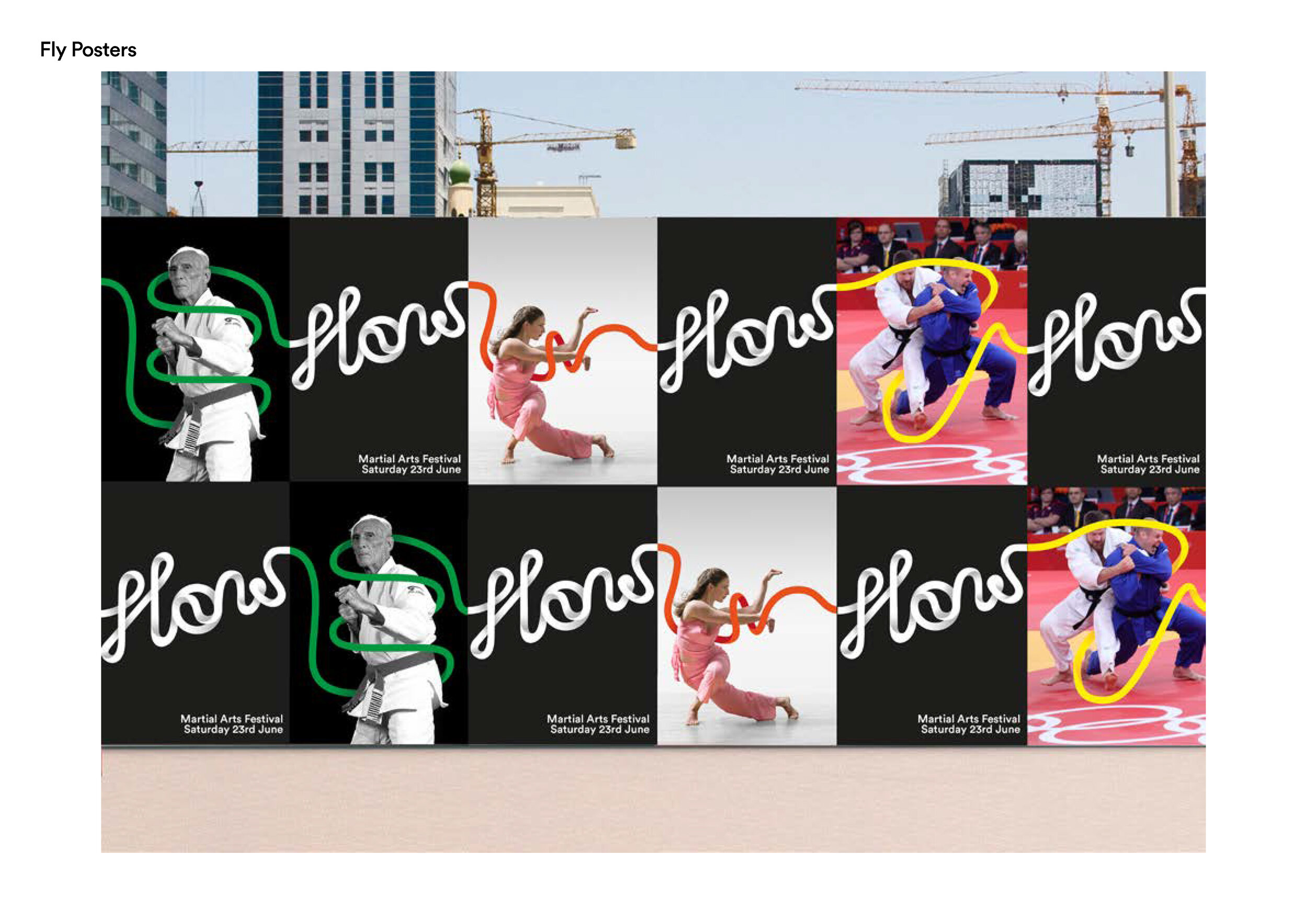
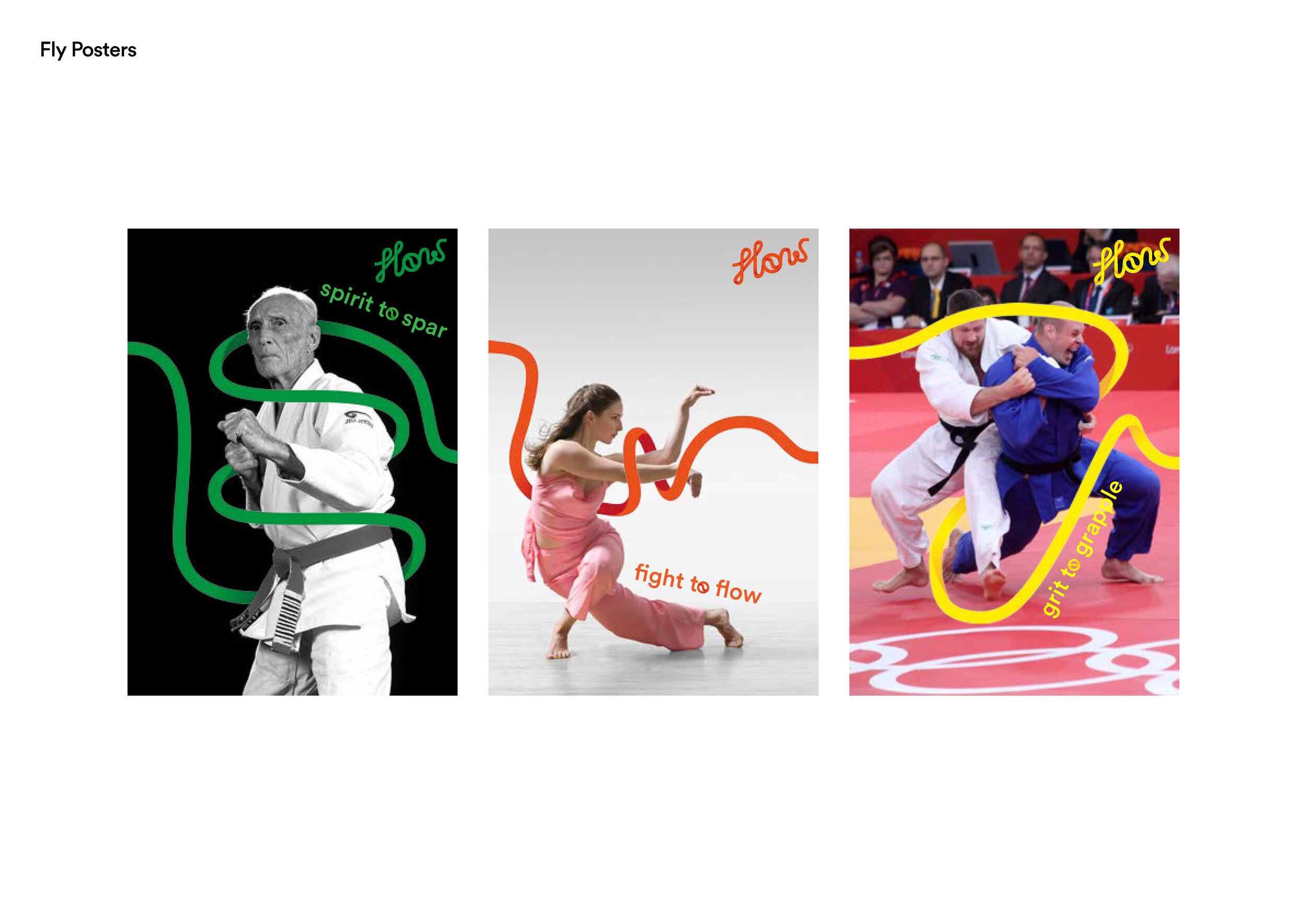
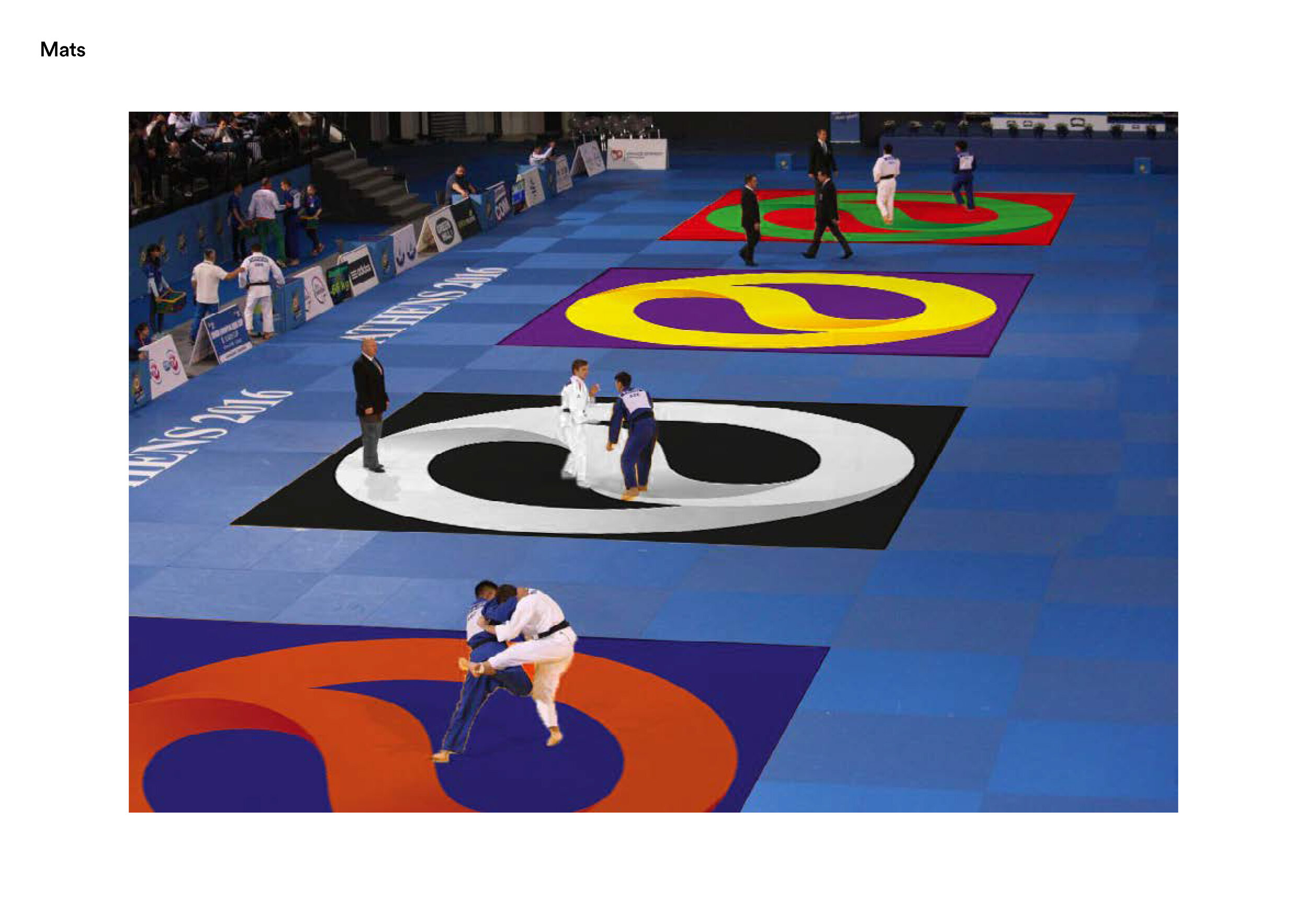
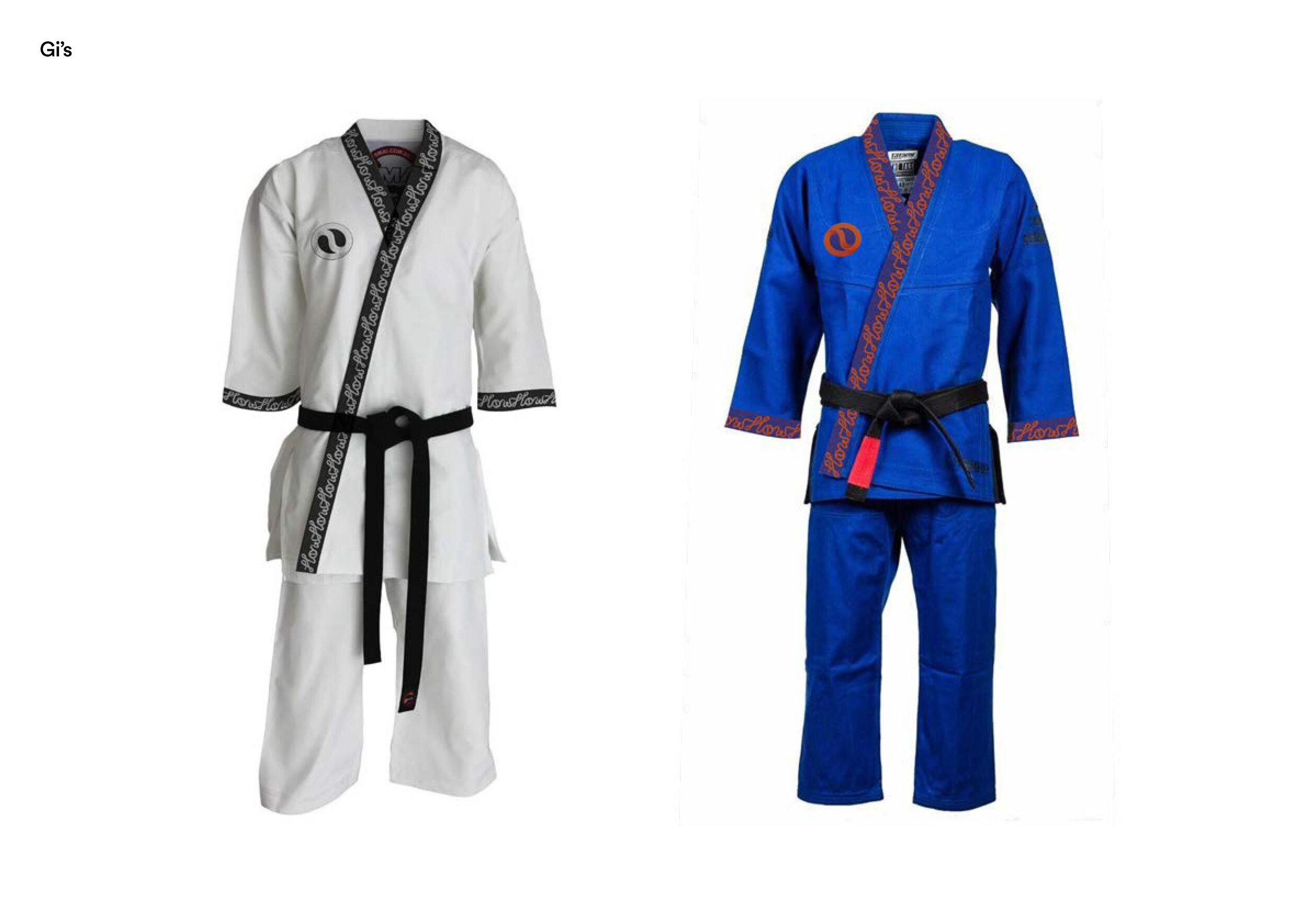
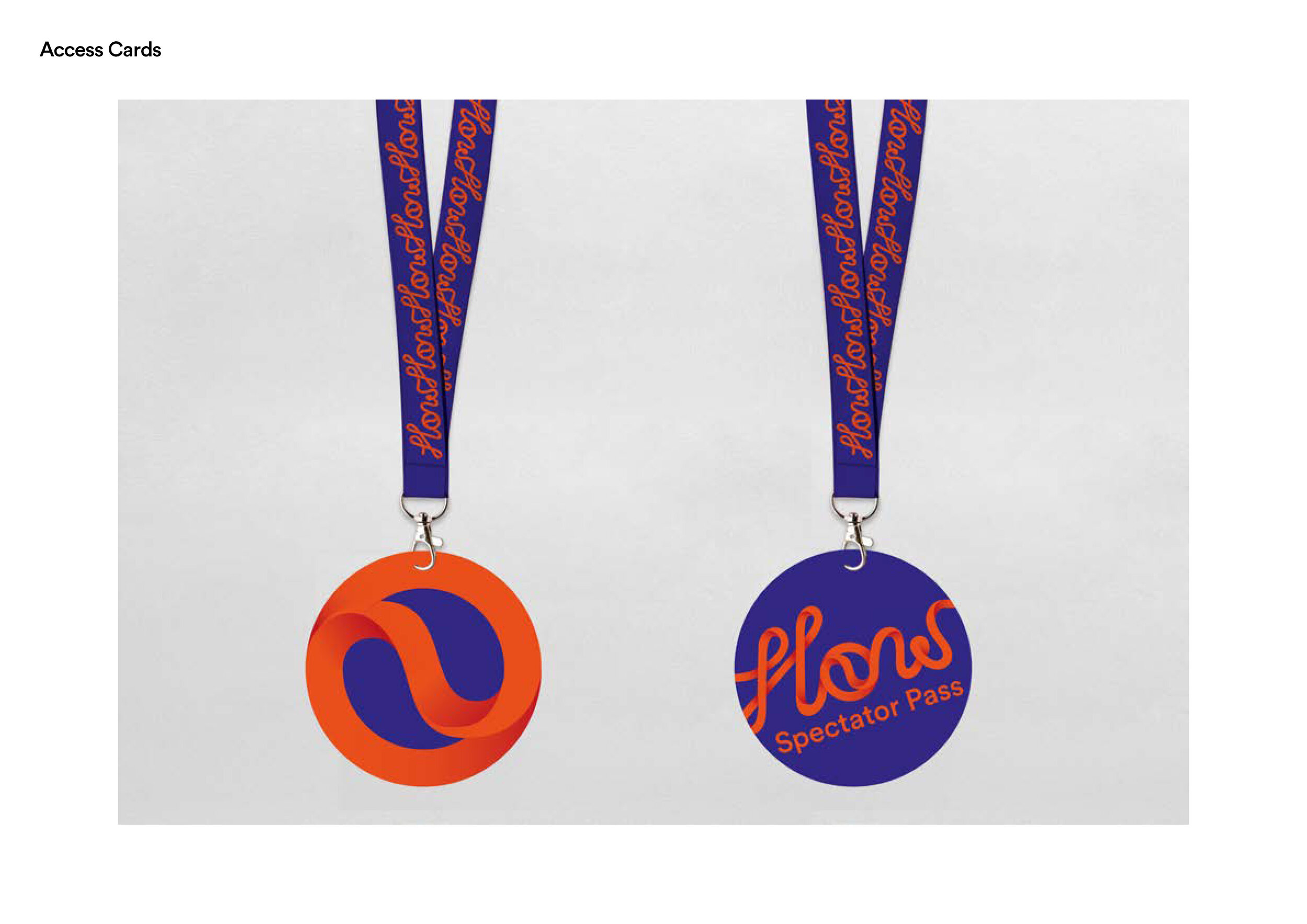
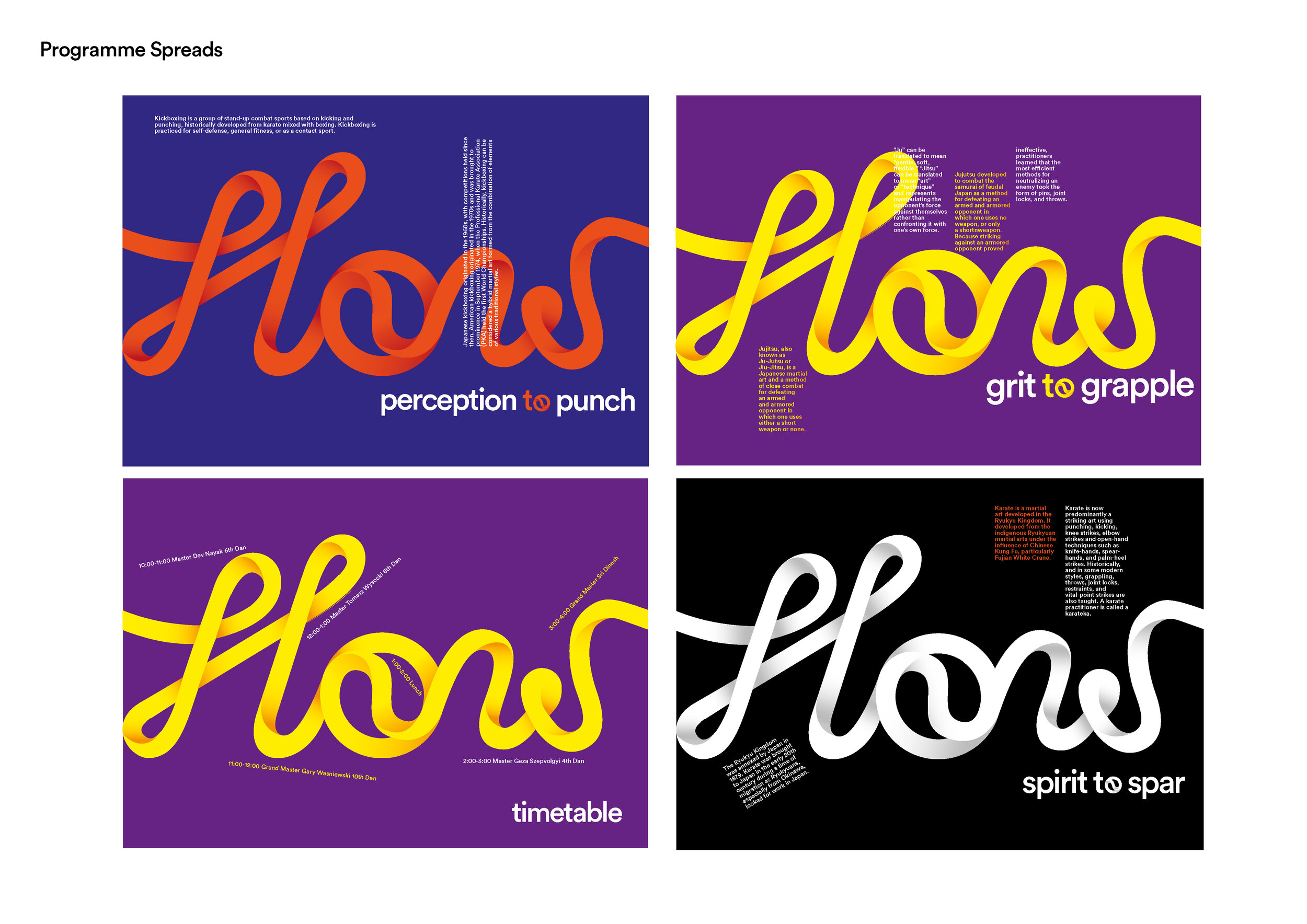
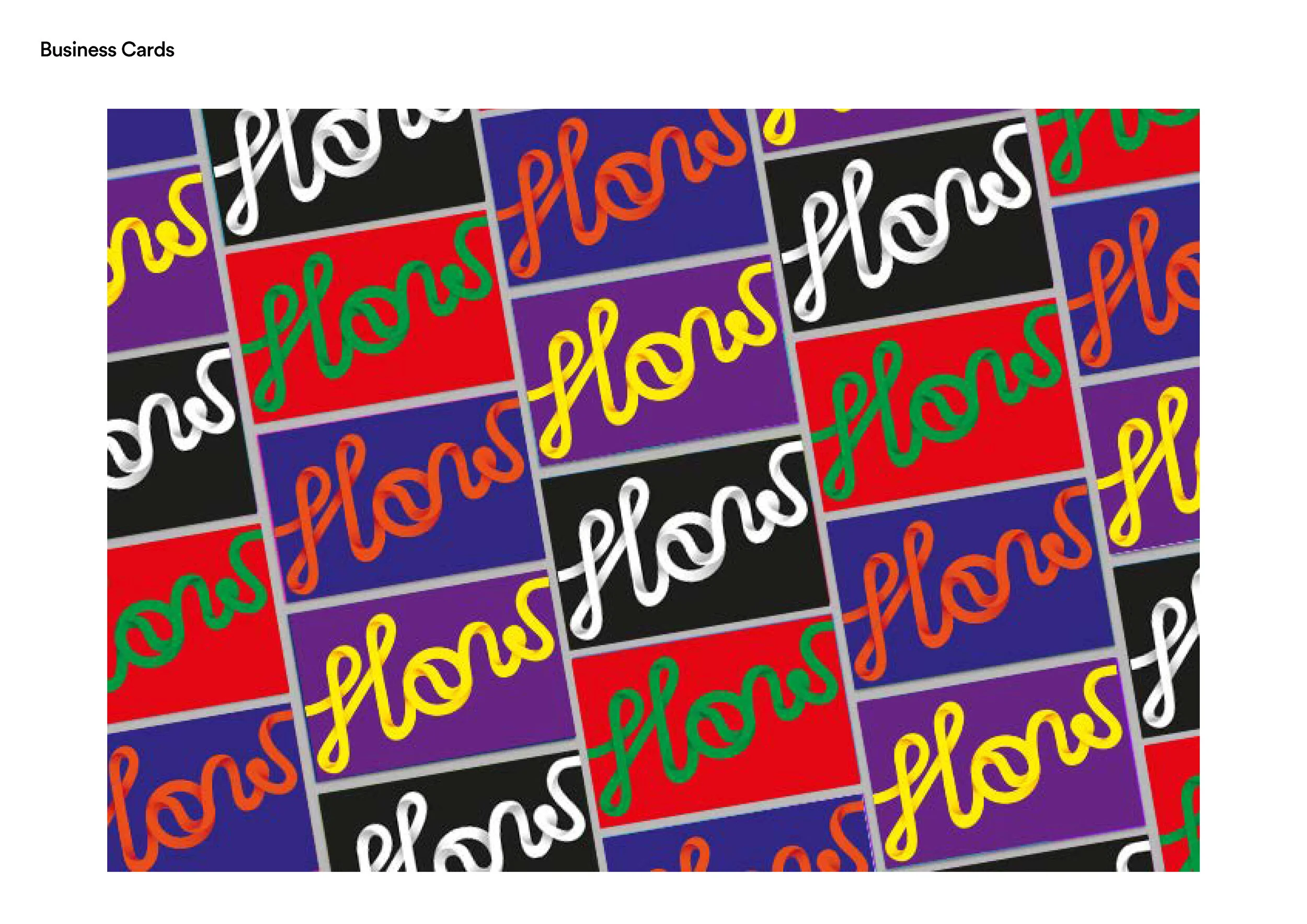
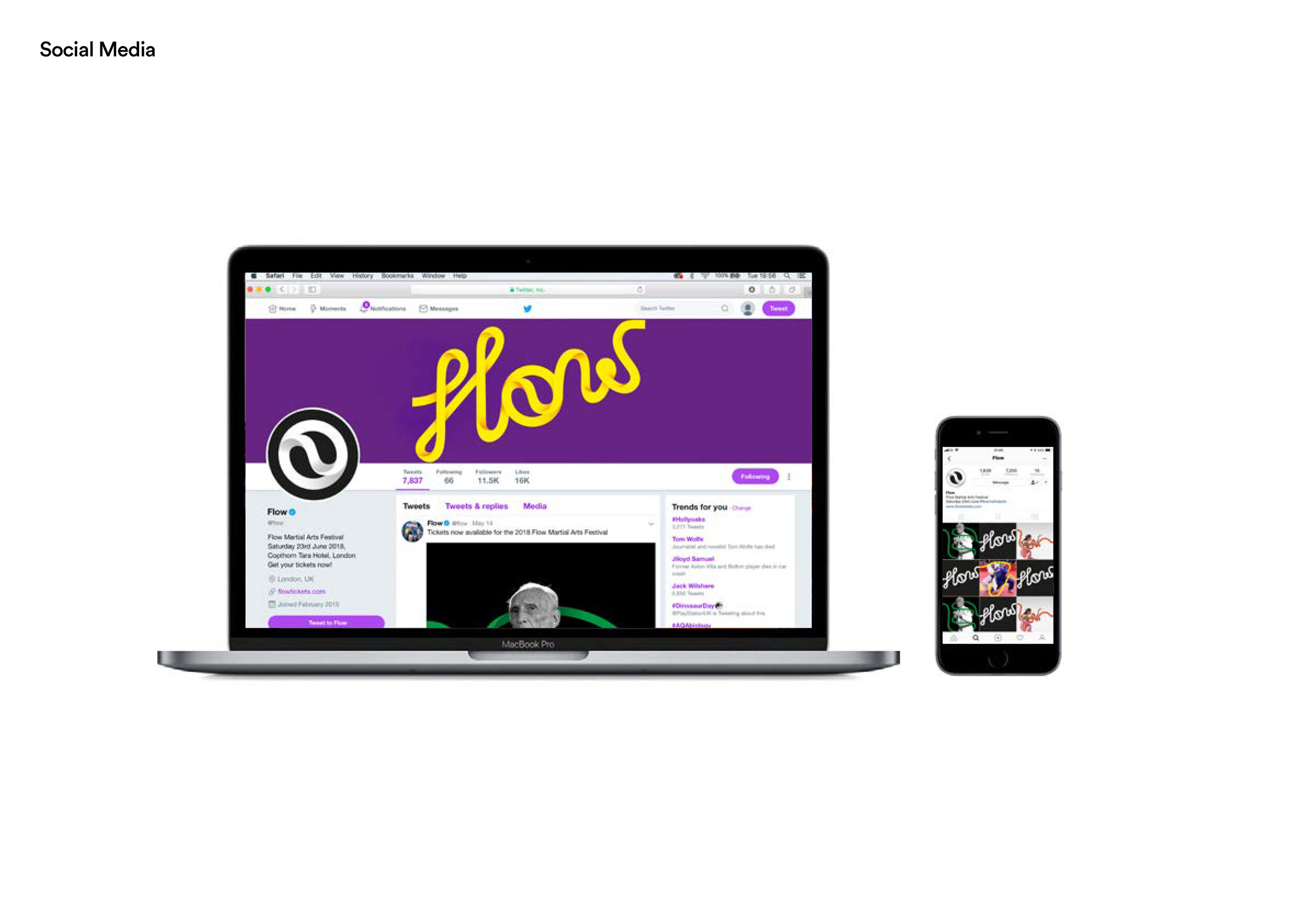
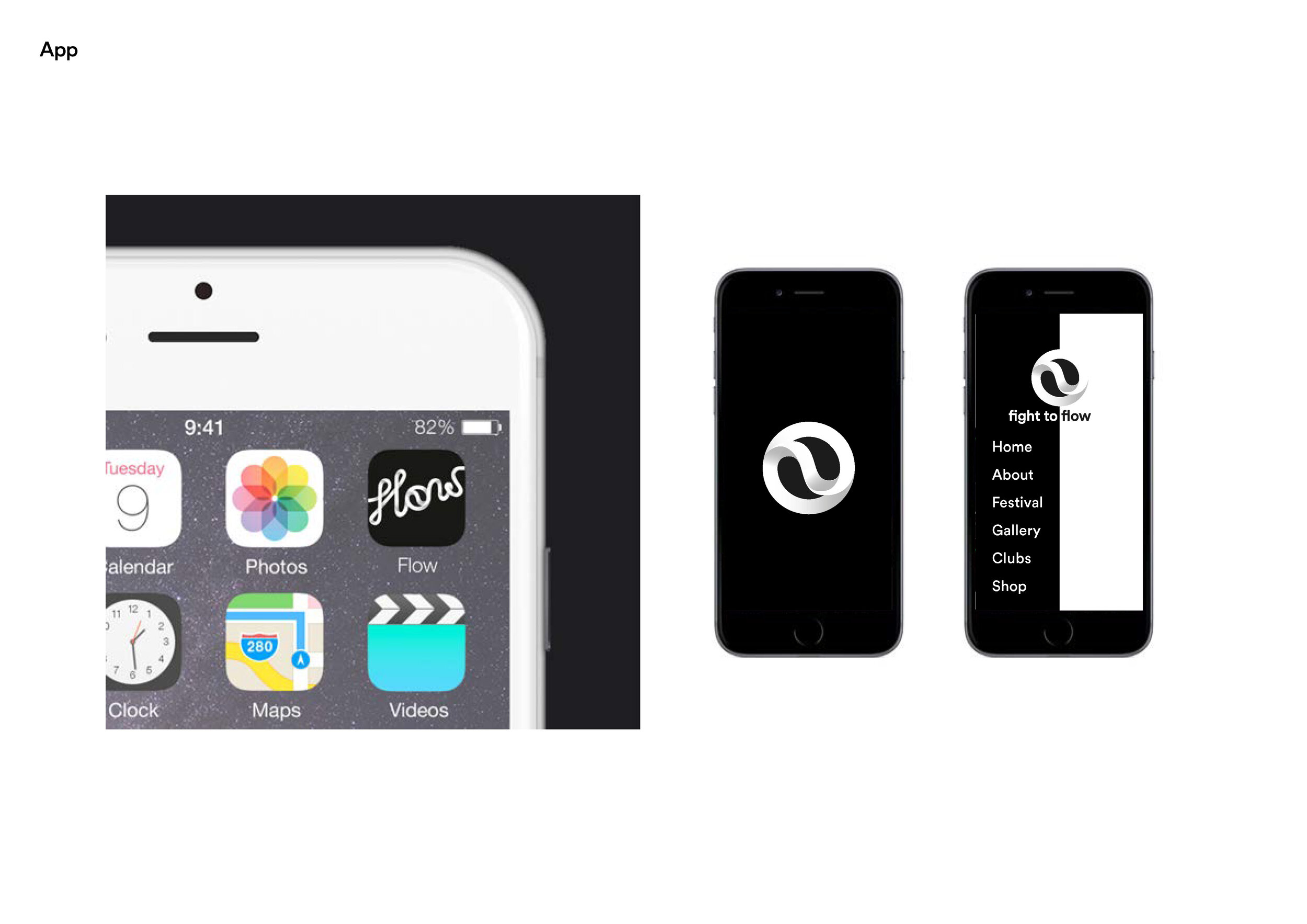
Flow – Martial Arts Festival

As ever, we are constantly reviewing the archives and adding projects.

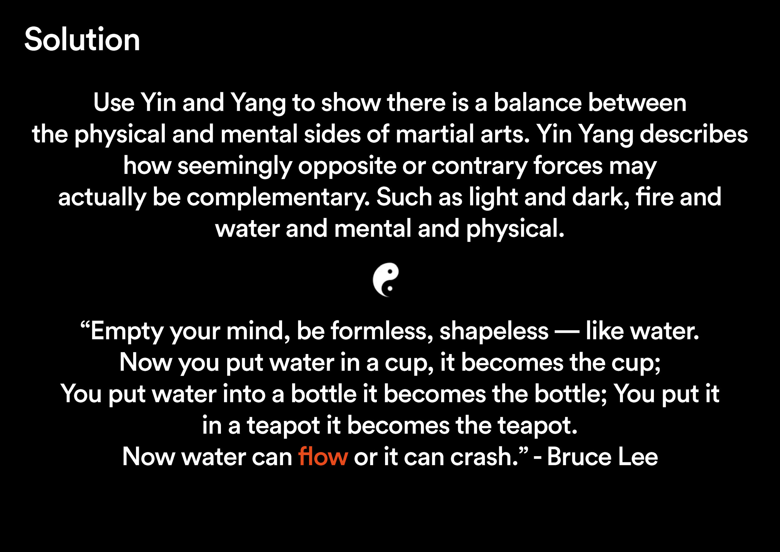
Matt Kovacs produced the following brand for his Honours project. The brief he set himself was to create a brand for a martial arts festival, and change the public’s perception of what the martial arts really are. Society has a negative opinion of martial arts, believing it is a purely physical pursuit, whereas the mind plays a much bigger role than expected.

Creative Conscience – Winners 2020

Our congratulations to recent graduates Ellie and Bella, and particularly to current final year Sara Esat who entered a self-initiated project completed entirely in her own time. Ellie, Bella and Sara were all awarded at last night’s Creative Conscience awards.

Well done to all!

Ellie won Gold for Parliament re-brand.

Bella won Bronze for Destruction Workers.

Sara won Bronze for 말해봐 (Tell Me).

One week project: Research

Here we share some examples of the first Year 1 creative thinking project – research. A change in this year’s studio practice means students now have extra time to work with up until the crit as they are presenting digitally. So the time-demanding printing, trimming and mounting processes could be swapped for further image searching. However, this extra time was handed over to Google Images in the main, consequently reducing the quality and impact of ideas through the selection of inappropriate and misleading imagery.

The internet is a powerful tool, but must be viewed as that; not a visually literate interpreter.

SQUARE

SQUARE

The above example forms a pleasing set, but requires development, simplification and sourcing of new images.

Yellow

Yellow

Another visually appealing set. All images have been manipulated to enhance the meaning. But do all selections convey the idea of yellow? This set is on the right tracks but again requires development.

Language

Language

Staff agreed the ideas for language shown above were interesting: bad language, ancient language, foreign language, comic language, tactile language, computer language, sign language and musical language. Eight strong ideas that with further exploration can be improved as a set visually.

Bear

Bear

Another good set of ideas: chocolate bear, cartoon bear, teddy bear, financial bear, celestial bear, military bear, rare bear and human bear. But another set of ideas which can be much improved with choice and sourcing of imagery.

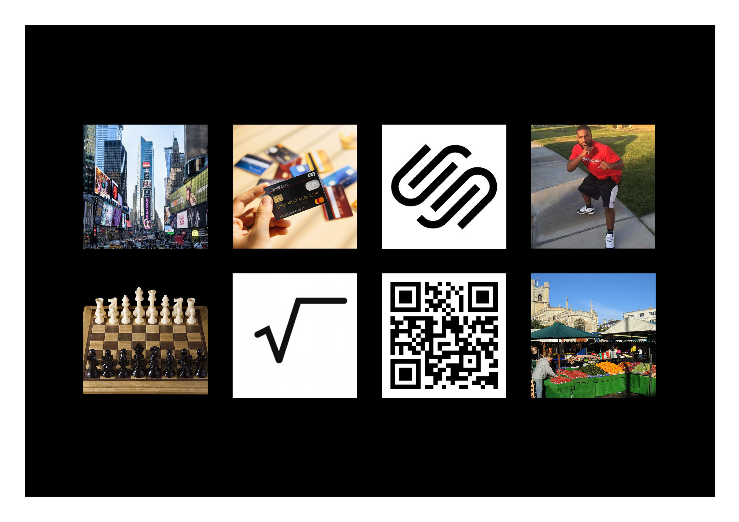
Square

Square

Finally, a mention for the above response to square. Staff thought the use of a QR code (or eight in fact) could take the viewer to each individual response.

How It Works & What We Expect

Words by &y, typeset by Ted.

Pertinent for us all as we embrace the new academic year.

Typefaces: Font Bureau’s Farnham and Monotype’s Masqualero

Colours: Yellow, Magenta and Black. (Cyan is self-isolating.)


Welcome_Week-Poster.jpg

We will set you a series of problems to solve

We will interrogate your ideas and thinking

We want you to be open minded – about everything

We want you to be interested in everything: – film, music, art, architecture, exhibitions, books, magazines, design, advertising, marketing, radio, internet, podcasts, blogs, social behaviour and wider culture

We want you to embrace research and understand the importance of research

We want you to draw, sketch, collect and start compiling your ideas & thoughts

We want you to use technology to your ends and not let it use you

We want you to take risks, and not to be afraid of taking risks

We will point you in relevant directions

We want you to realise you are not at school

We will teach you how to learn 

We want you to learn off and from each other

We want you to bond as a group

We want you to be competitive as a group

We want you to be proud of the course you are on

We want you to socialise as a group 

We want you to get to know the other years above

We want you to consider the bigger picture as well as the minute details

We want you to embrace and understand the subject area

We want you to look at things from all angles, both literally and laterally

We want you to be ‘on the ball’

We want you to read and understand – all forms of media

We want you to rationalise and contextualise

We want you to push yourself 

We want to see your personality develop through your work

We want you to win awards

We want you to embrace self-initiated study

We want you to be focused while in the studio and not distracted

We want you to listen

We want you to be punctual

We want you to be organises

We want you to question and debate

We want you to be vocal

We want you to argue

We want you to surprise us

We want you to have an opinion and to form opinions

We want you to be interested and inquisitive

We want you to be obsessed by detail, craft and presentation

We want you to measure things

We want you to enjoy it and have fun 

We want you to be the future

We want you to leave us with an excellent folder of work

We want you to get a job

We don’t want a lot do we!
Wise Words from a Wise Man

It was sad to hear of the passing of Sir Ken Robinson recently, his Ted Talk on creativity and education in our schools were an inspiration and voted some of the greatest Ted Talks of all time.

“Perceptive, profound and beguiling talks delivered with more than a modicum of wit and gentle humour.”

Please click to play the film.

For all those who are unfamiliar with Ted Talks…welcome!