A study in needles
/Here we feature a selection of needle image experiments. All based around one single image of a needle, they are digital sketches and ideas that were produced in response to a fashion invite brief set in 2011.
Here we feature a selection of needle image experiments. All based around one single image of a needle, they are digital sketches and ideas that were produced in response to a fashion invite brief set in 2011.
Here we take the classic Johnnie Walker whisky identity for a walk. The brand deconstruction was done after imbibing a bottle of Red Label! (Circa 2013). Concept taken from the forthcoming ‘Play Time’ publication by A.W. Bainbridge
Here we feature Cod Apocalypse (Disciples of Design issue 4 -2006). Which was an old school cut & paste job. Skyline photocopied from a stock shot book pasted over a cutting from The Guardian newspaper article on the Cod shortages.
No photoshop, just a scalpel, spray mount and a keen eye.
The Rorschach Test has become a classic visual cliche that has been widely used over the years by graphic designers as a visual device. Here we feature an example from an early printed issue of the Disciples of Design (circa 2004) where the creator becomes the test.
Incidental observation
Here we feature a selection of past examples of our 2nd year brand extension brief. We have just briefed the project into this years current 2nd years and are looking forward to some more creative responses.
Our Year 2 (First Years) in China are entering the mid-point of Semester 1, and we are very happy to see a strong group developing their creativity under the guidance of module tutor Syed Gowhar. Unlike the previous year we have adjusted the course to mirror Preston, with two 4 hour sessions per week. Year 2 students are sharpening their lateral thinking in a more compact way. It is crucial to get this stage right, in Semester 2 Introduction to Graphics Communication we will see the application of ideas.
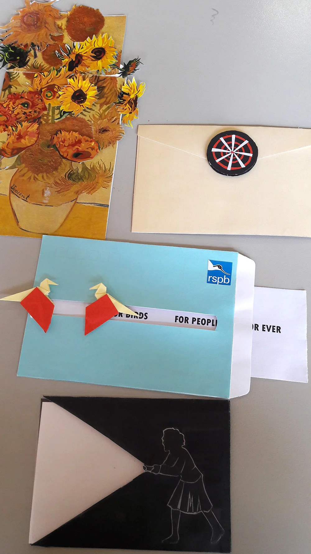
We are currently inbetween Typography and 3Dimensional (envelope brief), and as you can see from our 'Great Wall of Ideas', there are some clever execution of words. One thing to note; English is not the first language and everyone had to refer to the Merriam-Webster dictionary, and the exploration of different contexts was interesting to see. It adds another dimension to the way we teach, how do we explore ideas with a restricted set of vocabulary? True to the Preston ethos - we simplify.
The envelopes on the wall is a warm-up exercise for the 3Dimensional brief where the students are asked to convey love through an envelope. The results were creative paper folds, pulley mechanisms and cute pop-ups. They are currently working on their personality/organisation/museums. We are expecting to see a similar range of executions. However, we will utilise their impressive crafting skills after they have strengthened their core concept.
We are very excited for this group, and it's important that we improve on each year and bring HBU-UCLan to the level of Preston.
So far, so good!
Three good examples of presentations from final year graphic design students, branding the British Obscure Olympics as required in the brief set by Forepoint.
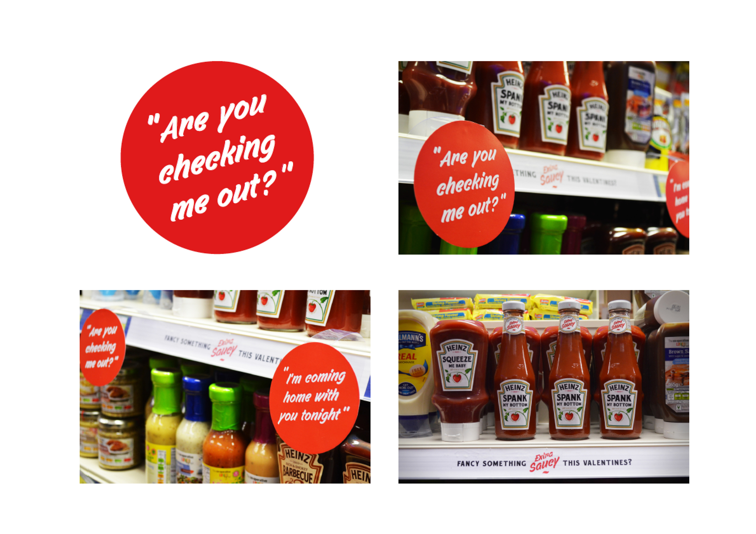
We have been having a little fun playing around with a few Heinz 150 year celebration ideas, whilst also trying to get a rise out of our American cousins and the current pickle they seem to have gotten themselves into.
A throw away idea for a throw away president
A cunning idea for a gullible America
A predictable idea for a future America
What a bunch of Muppets!
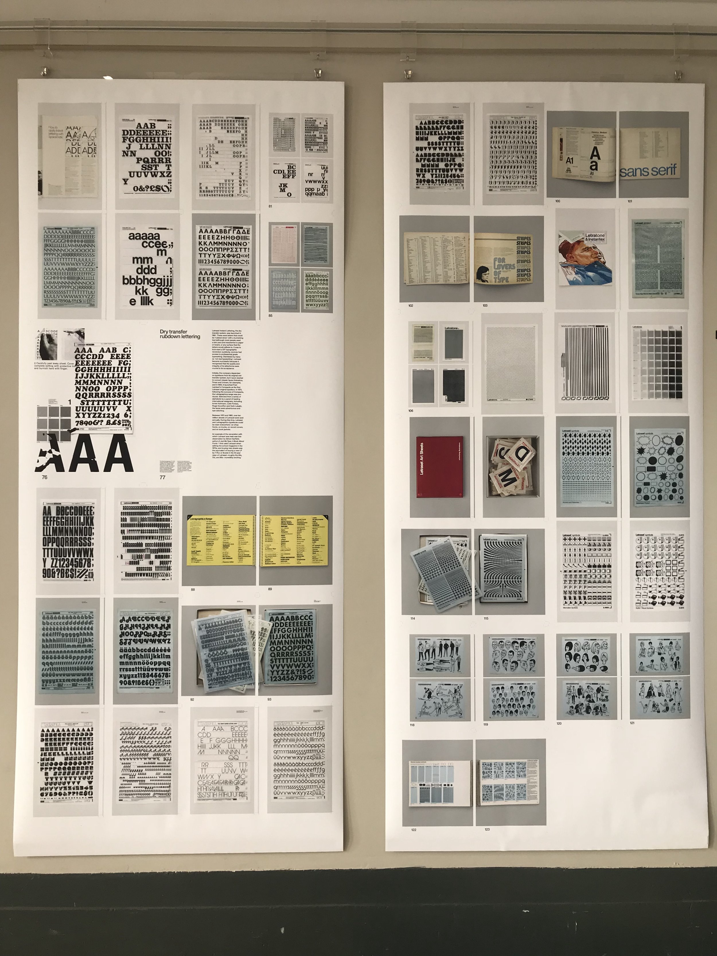
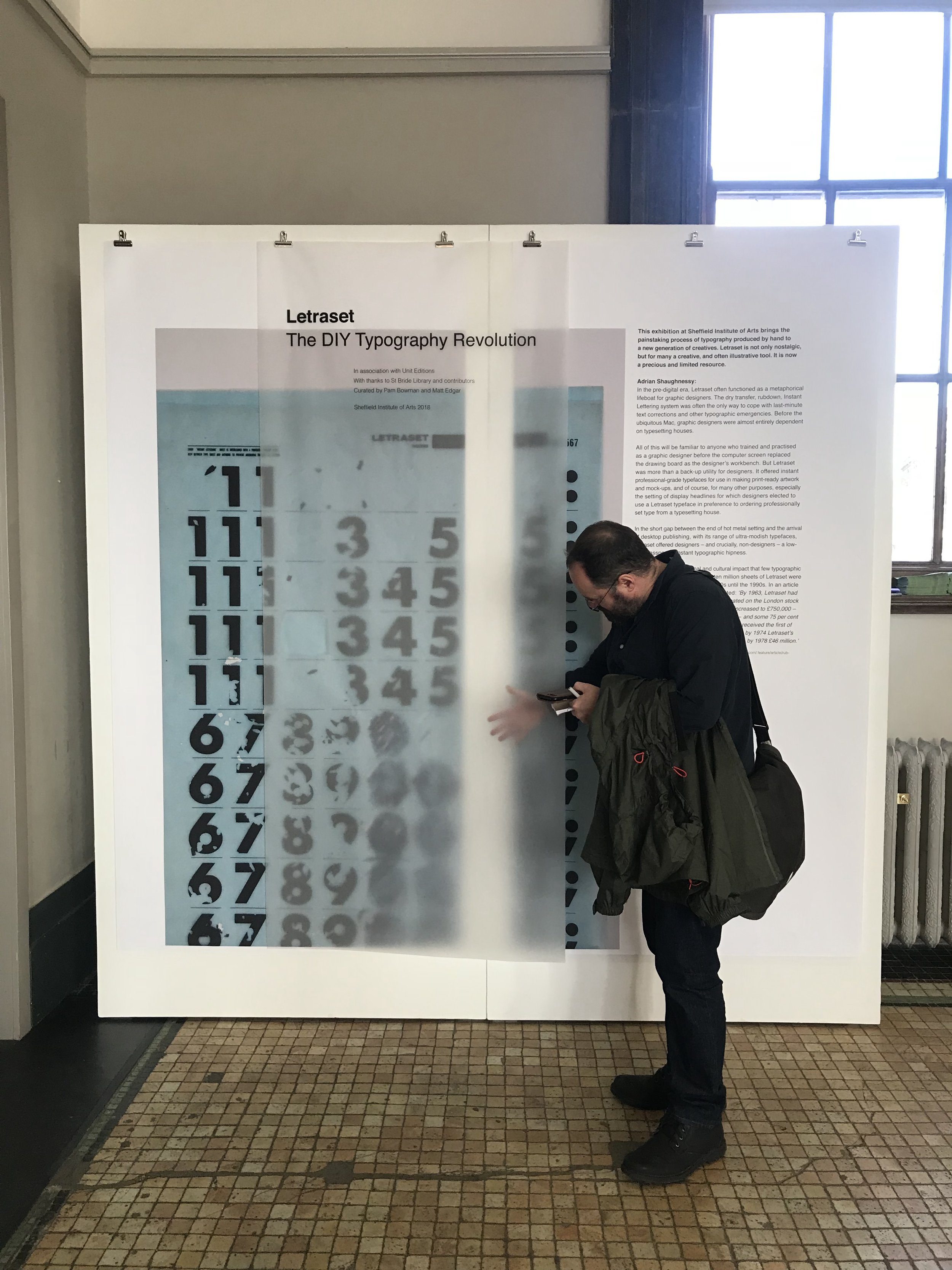
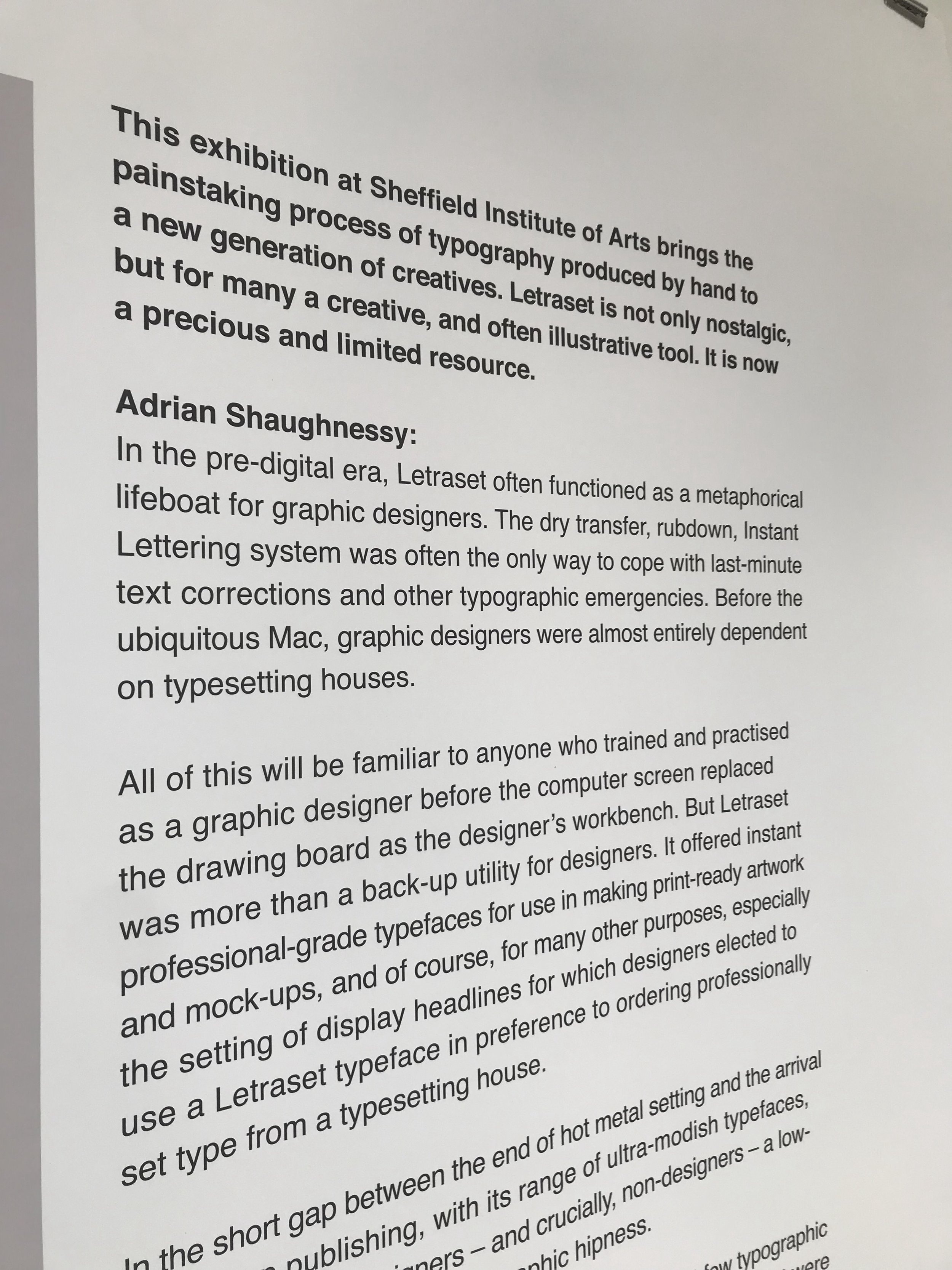
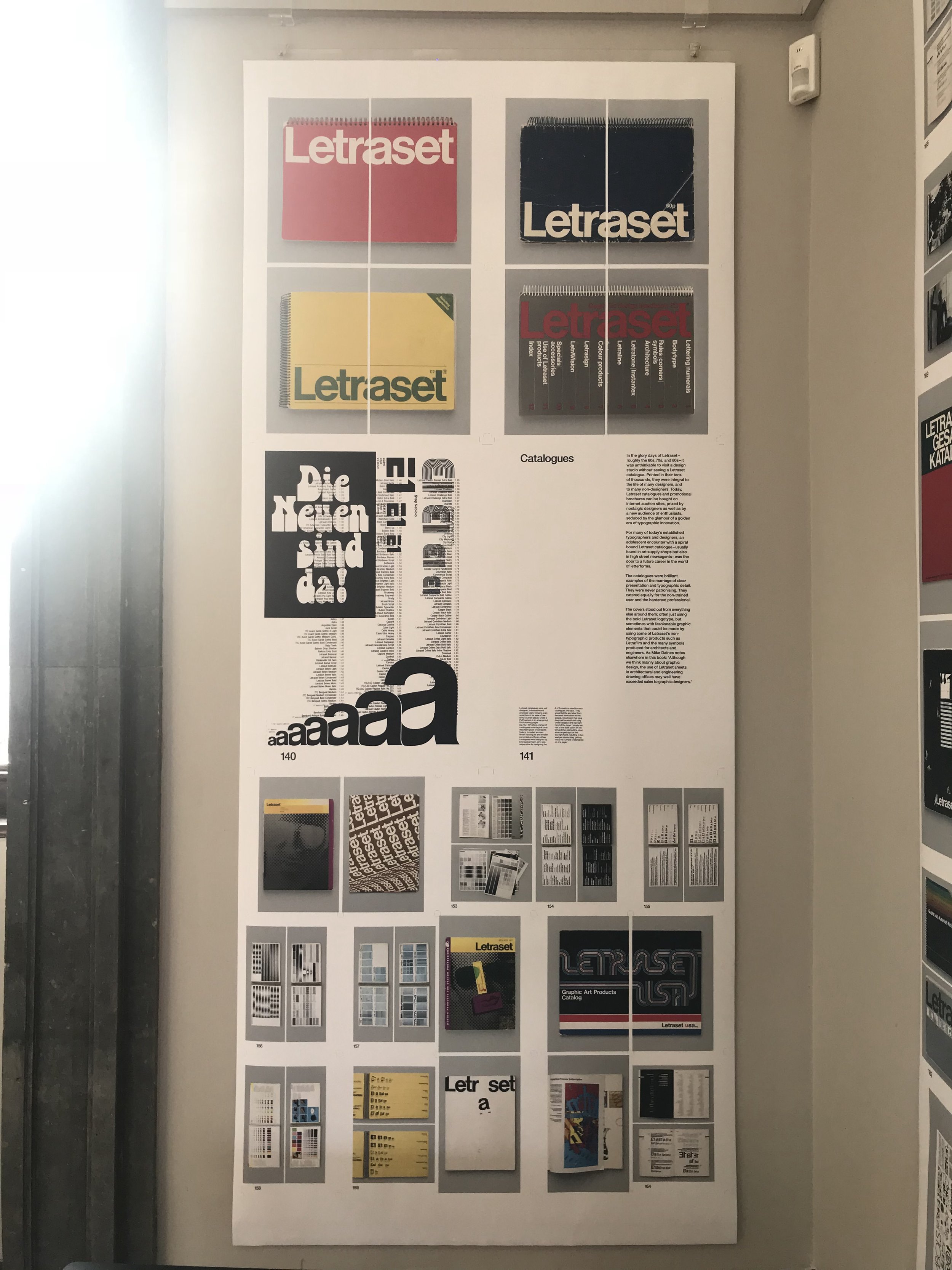
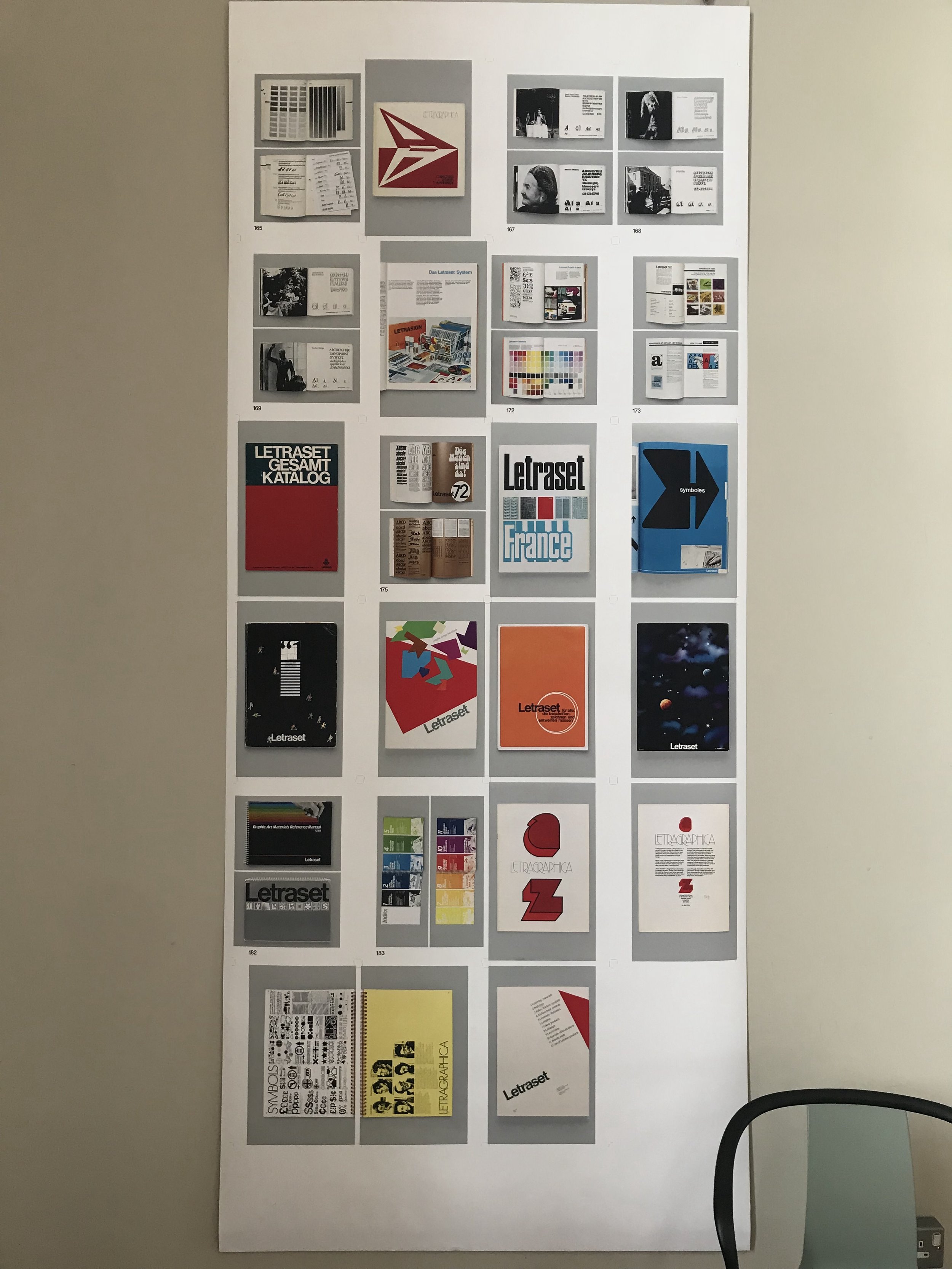
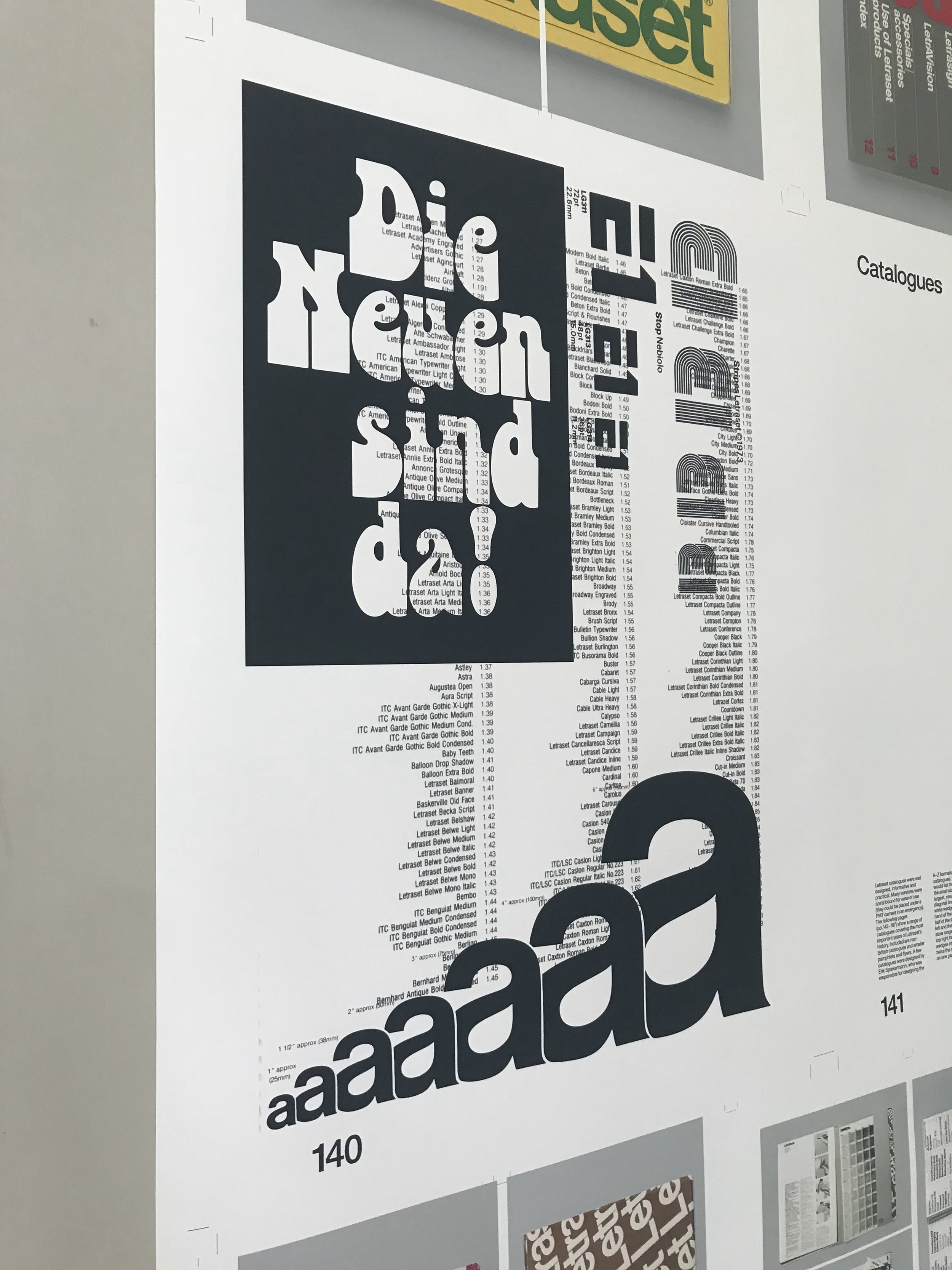
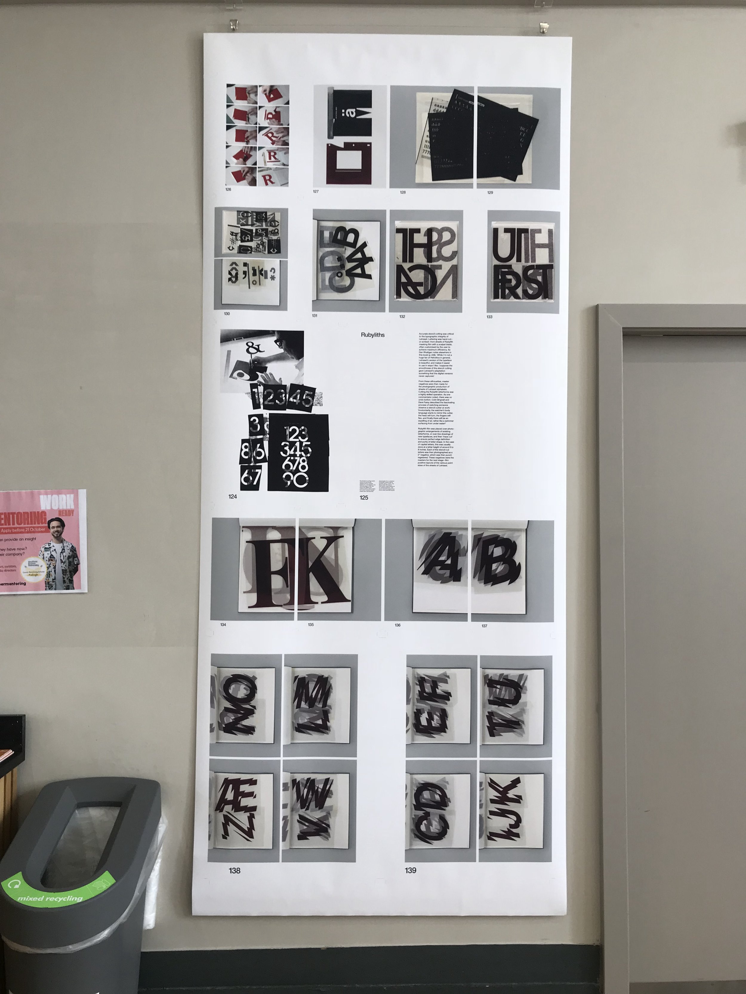
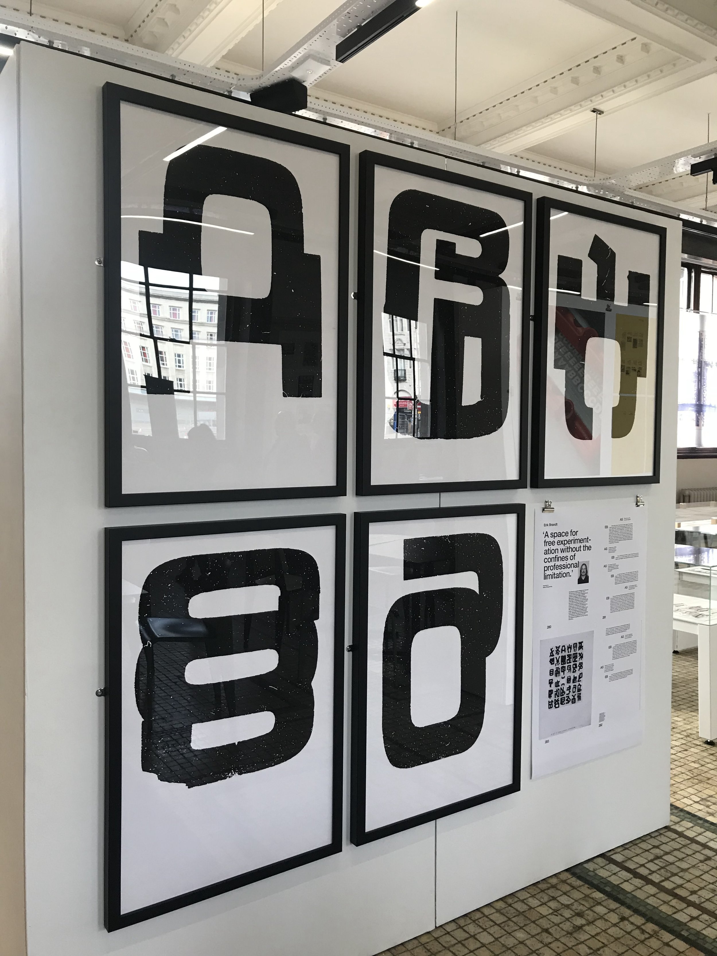
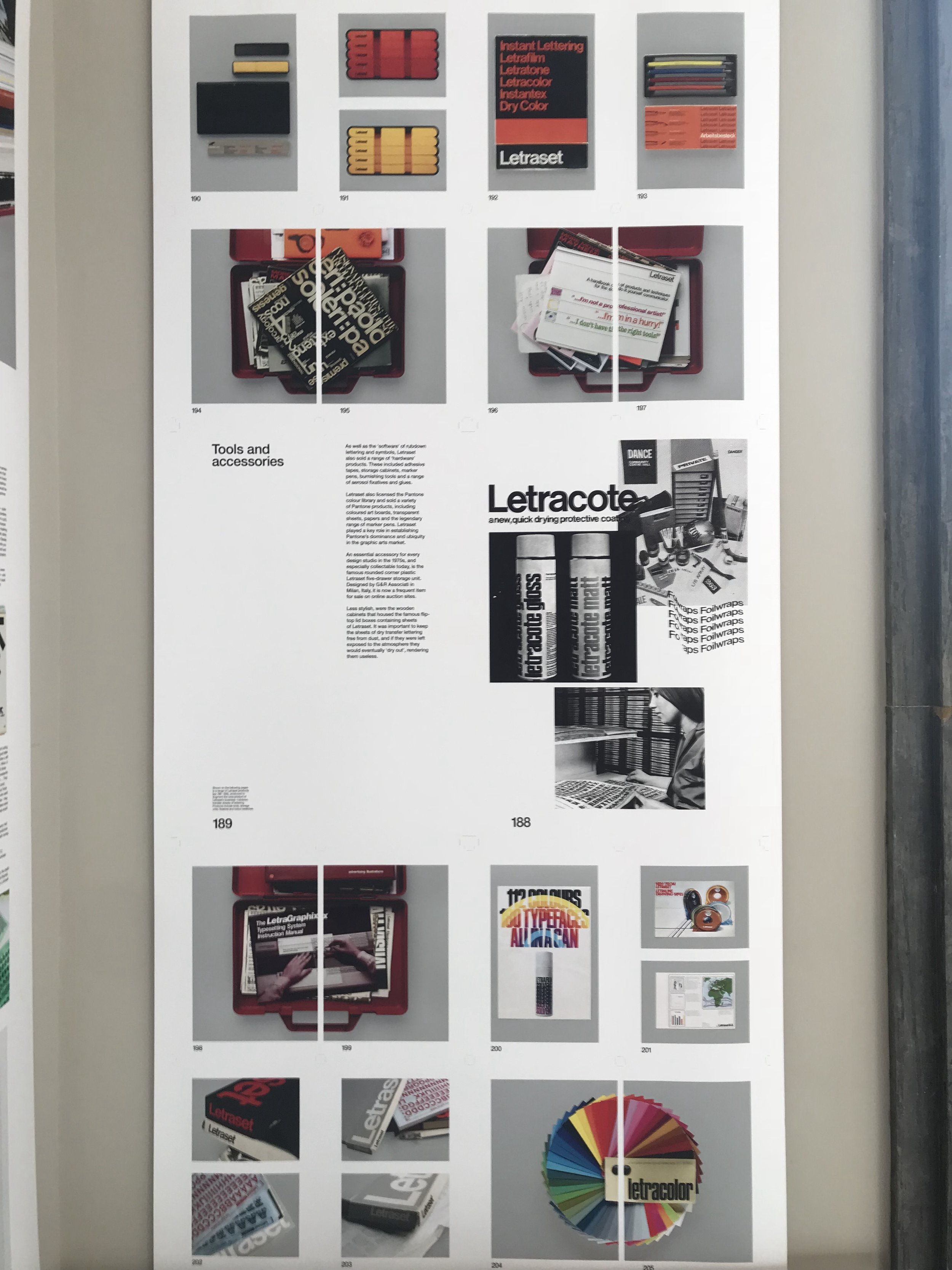
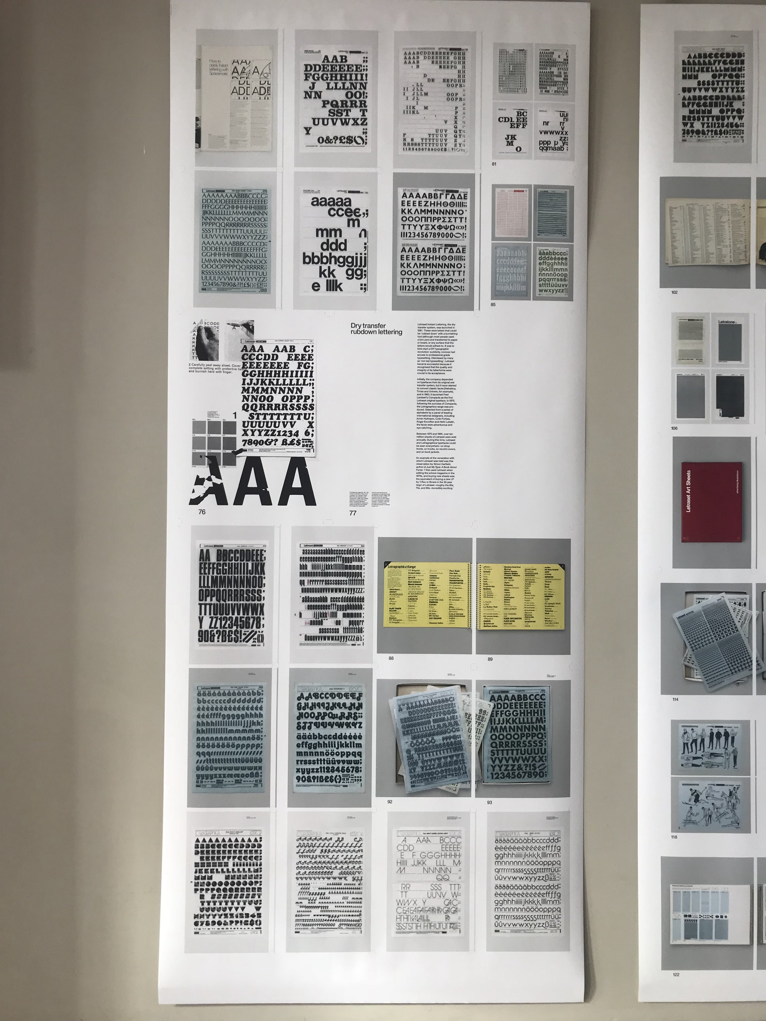
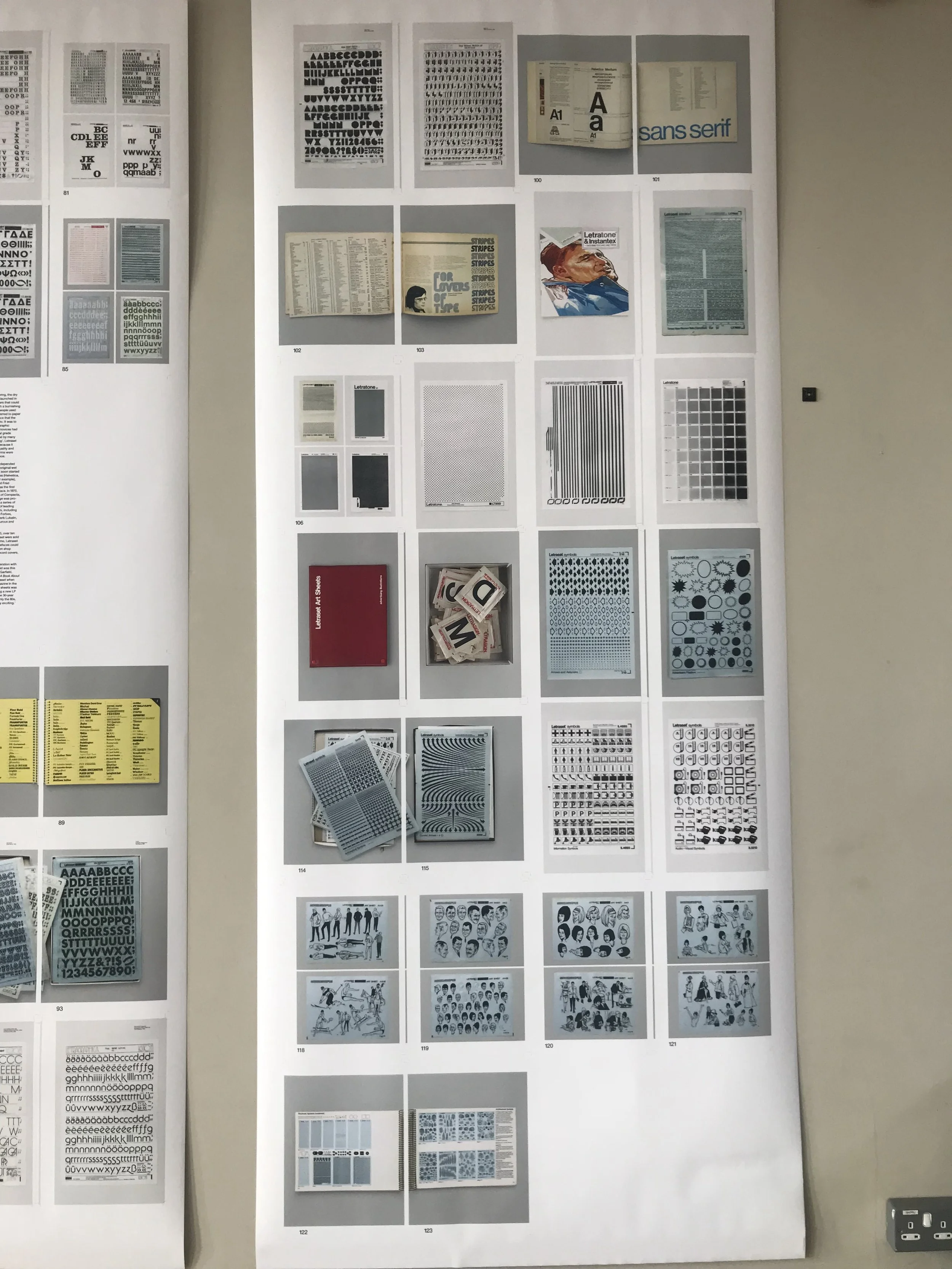
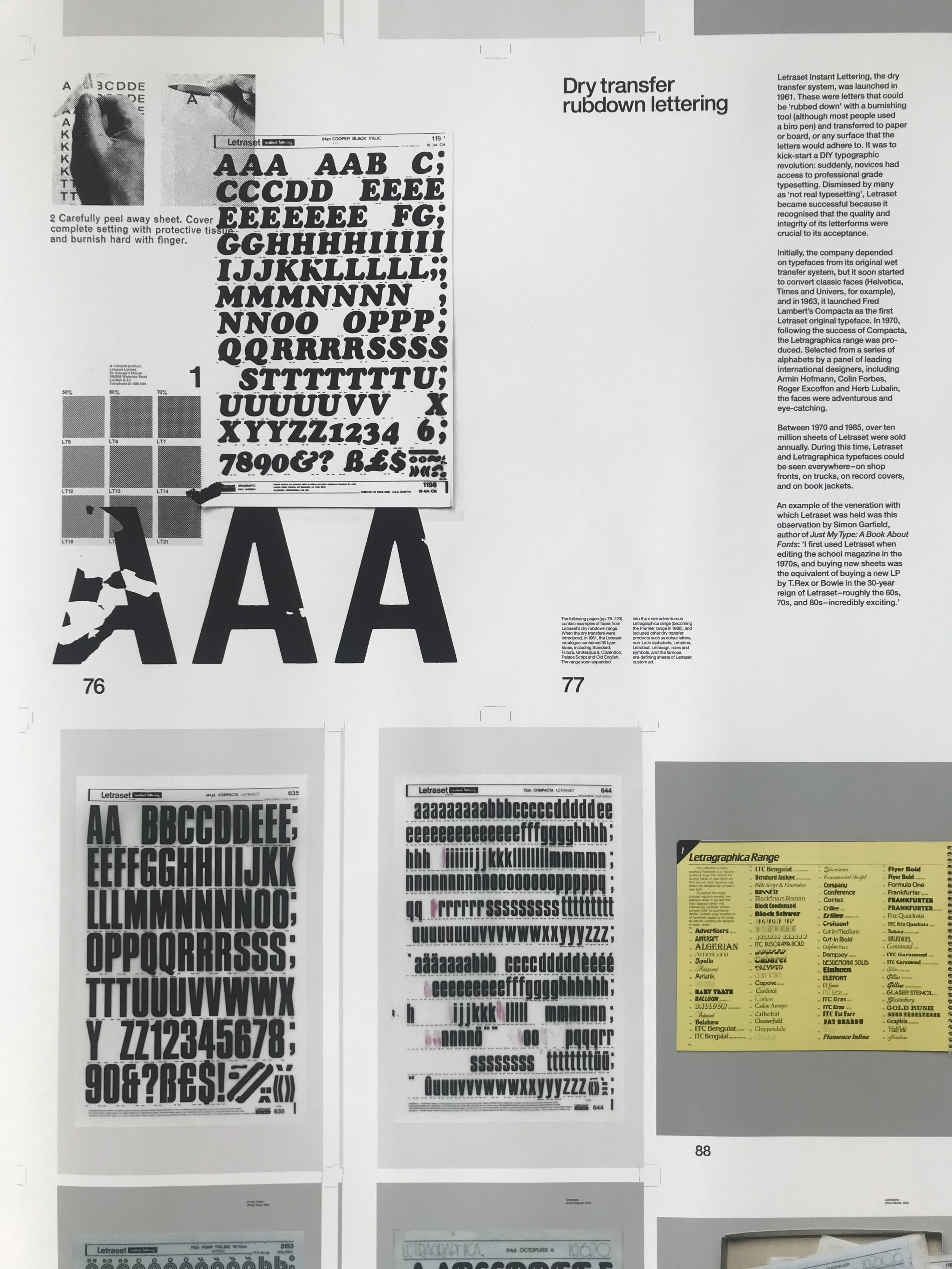
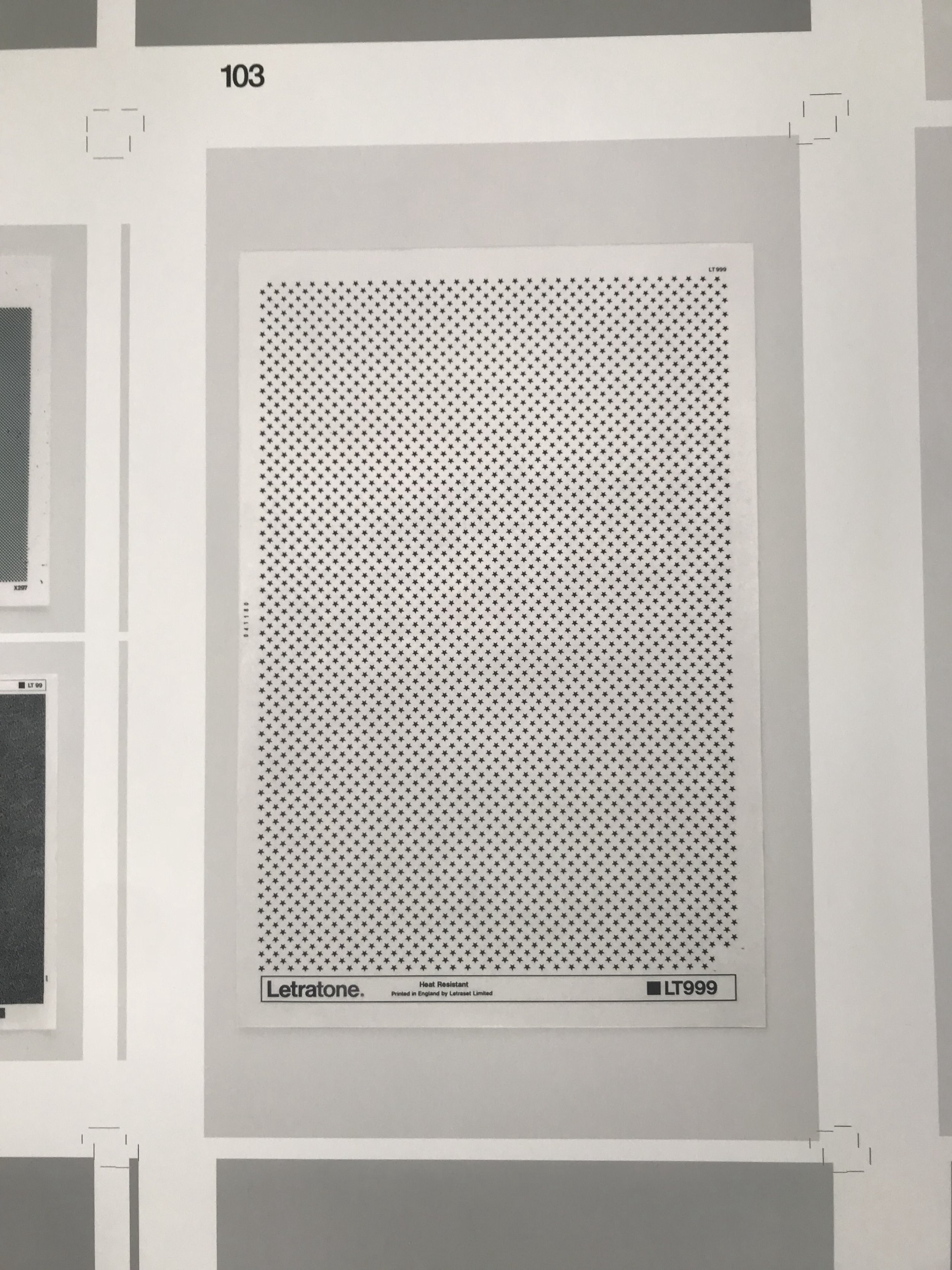
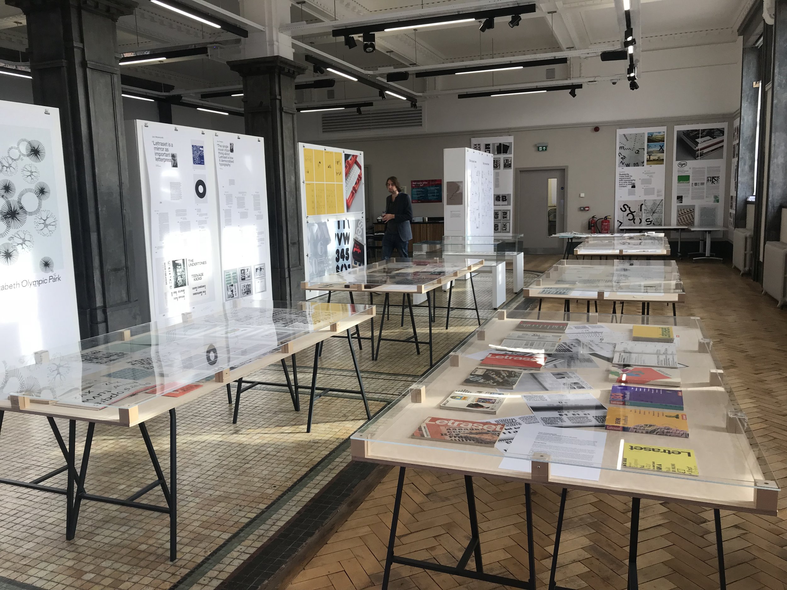
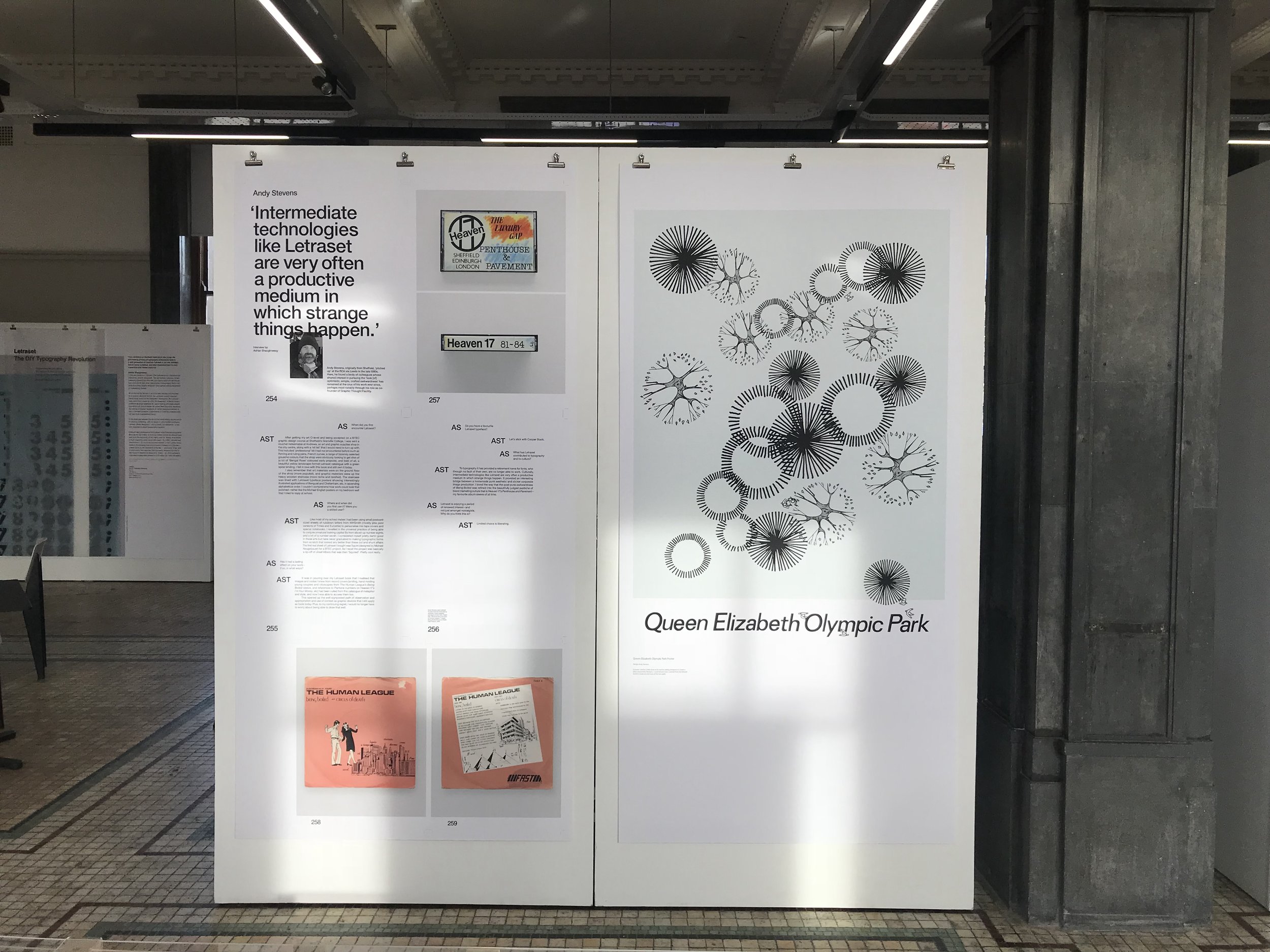
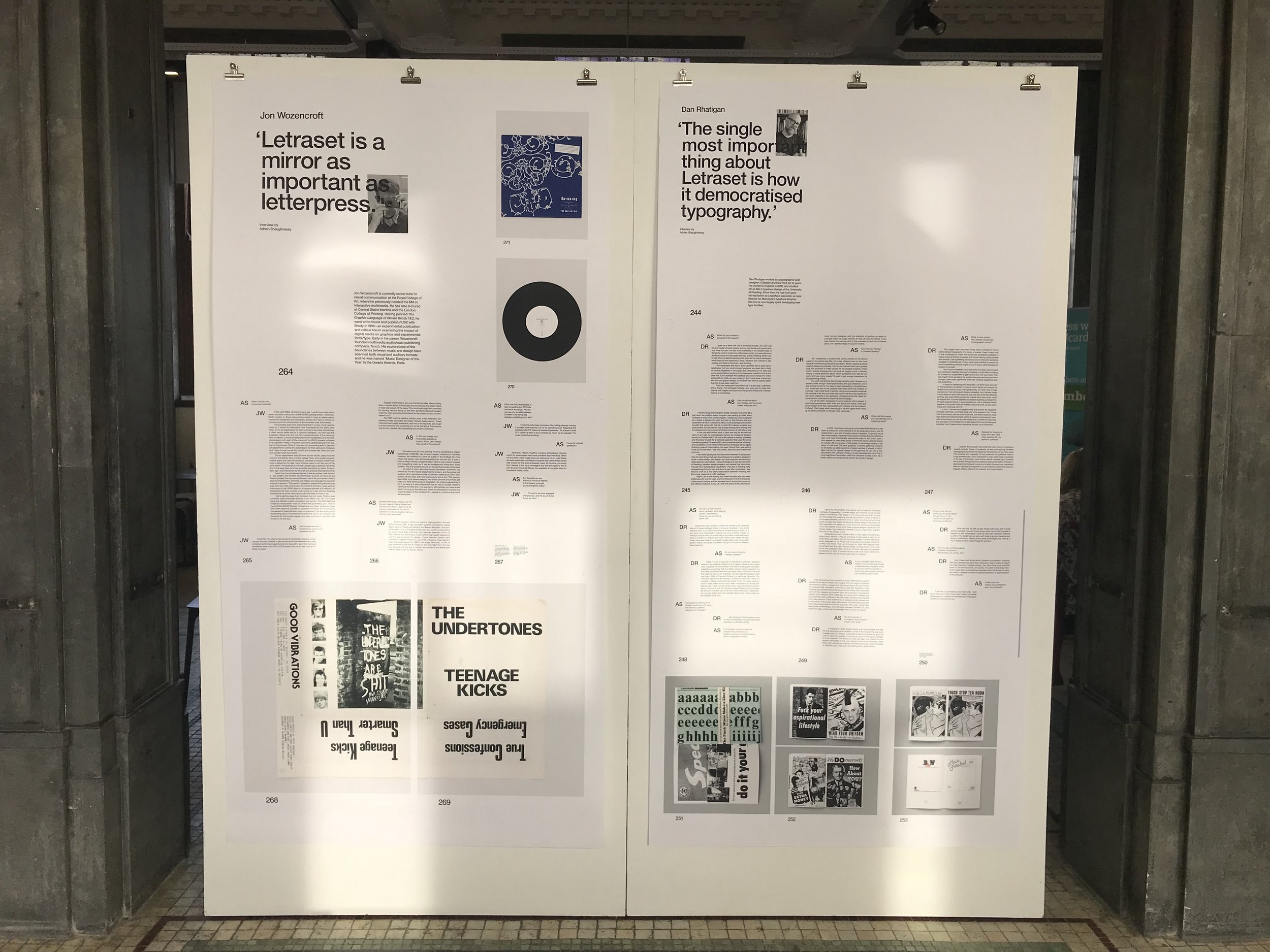
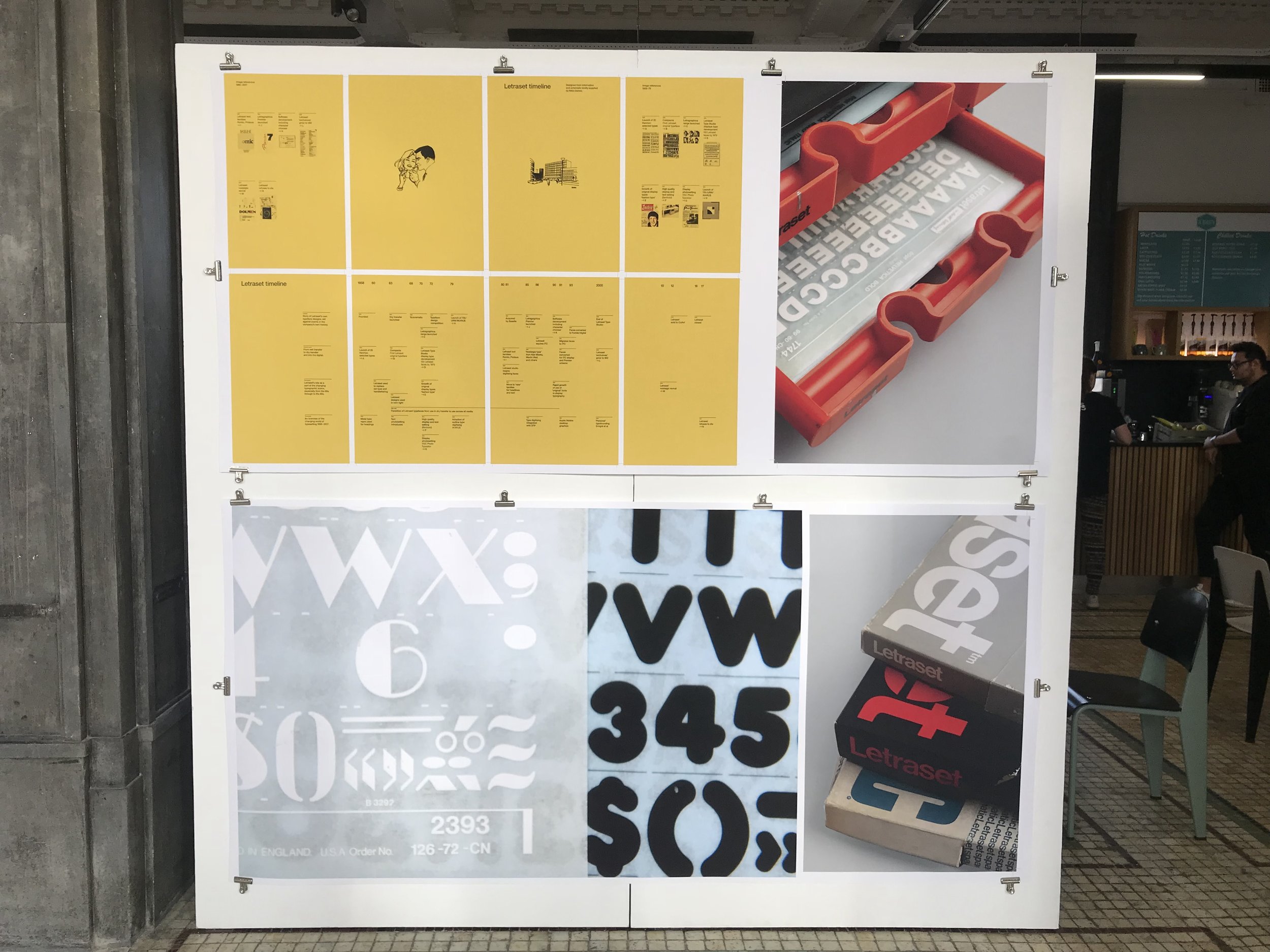
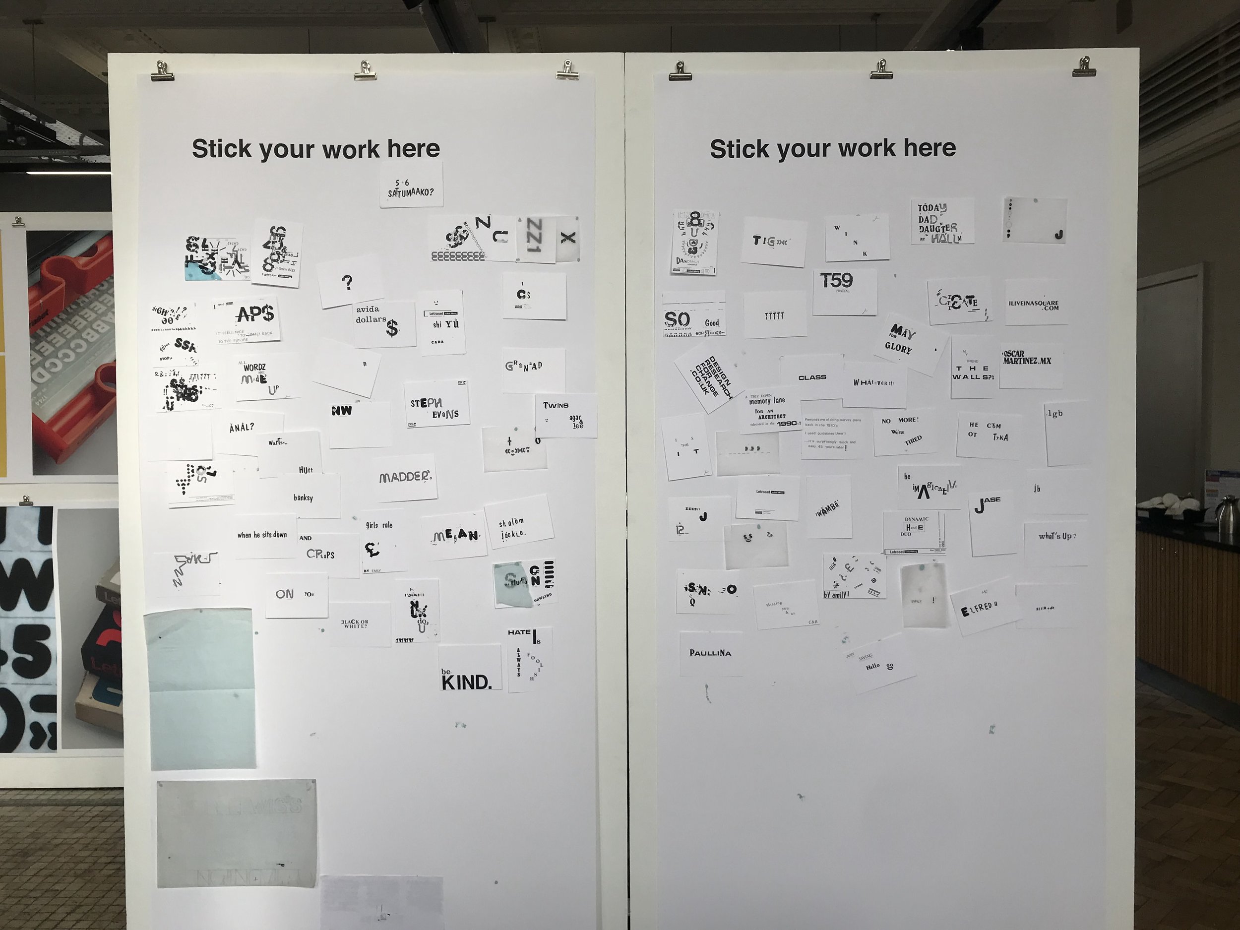
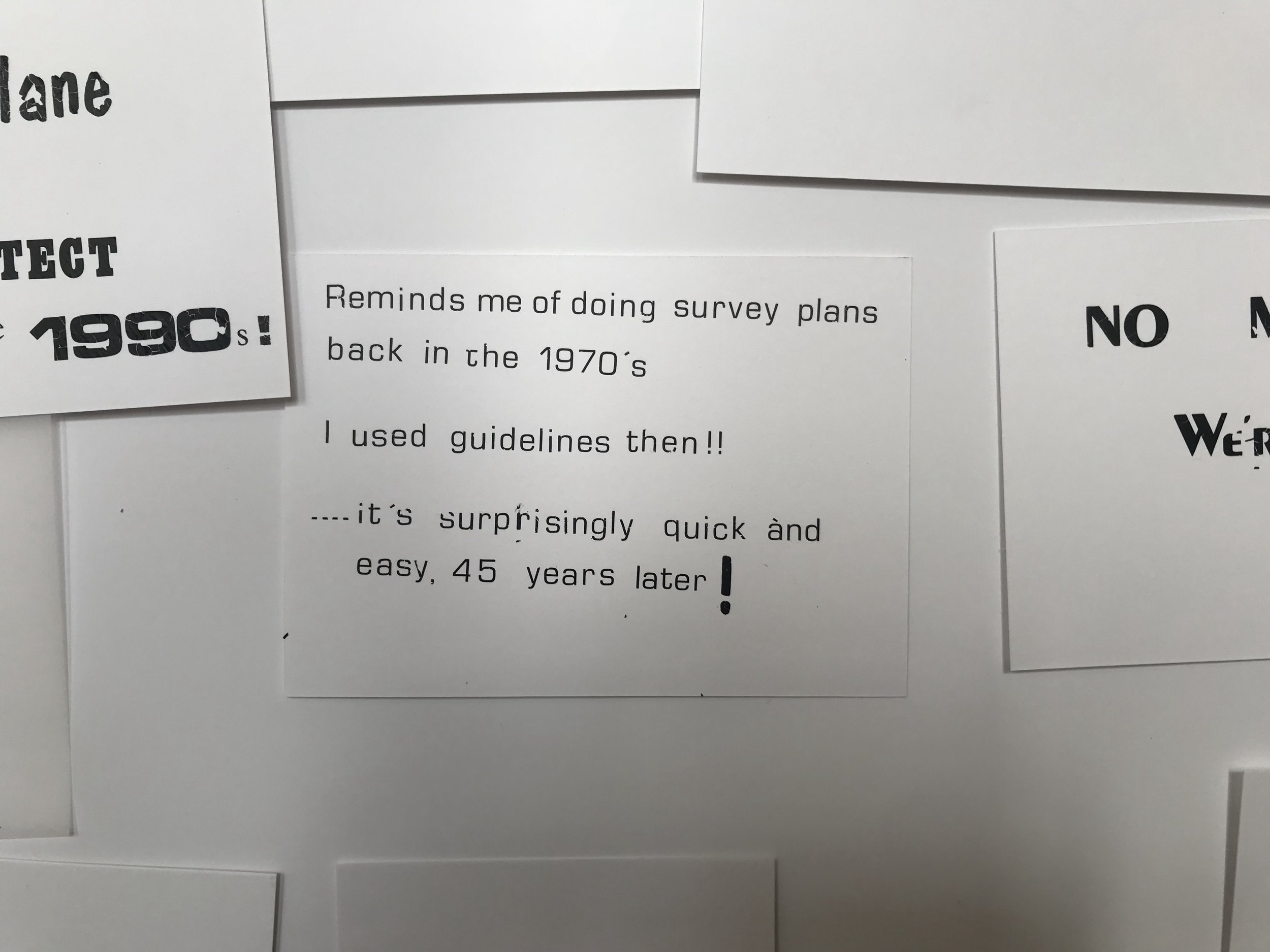
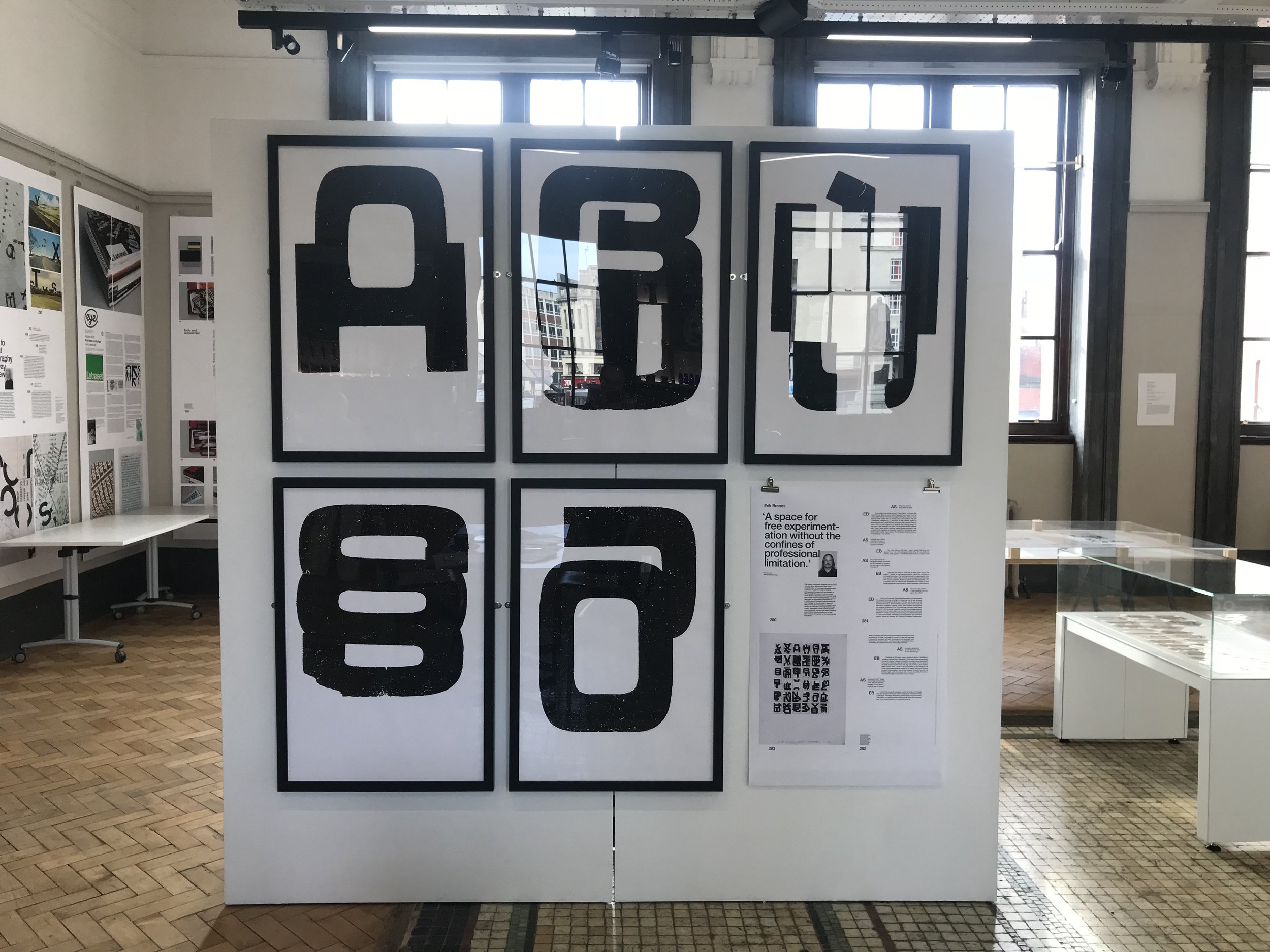
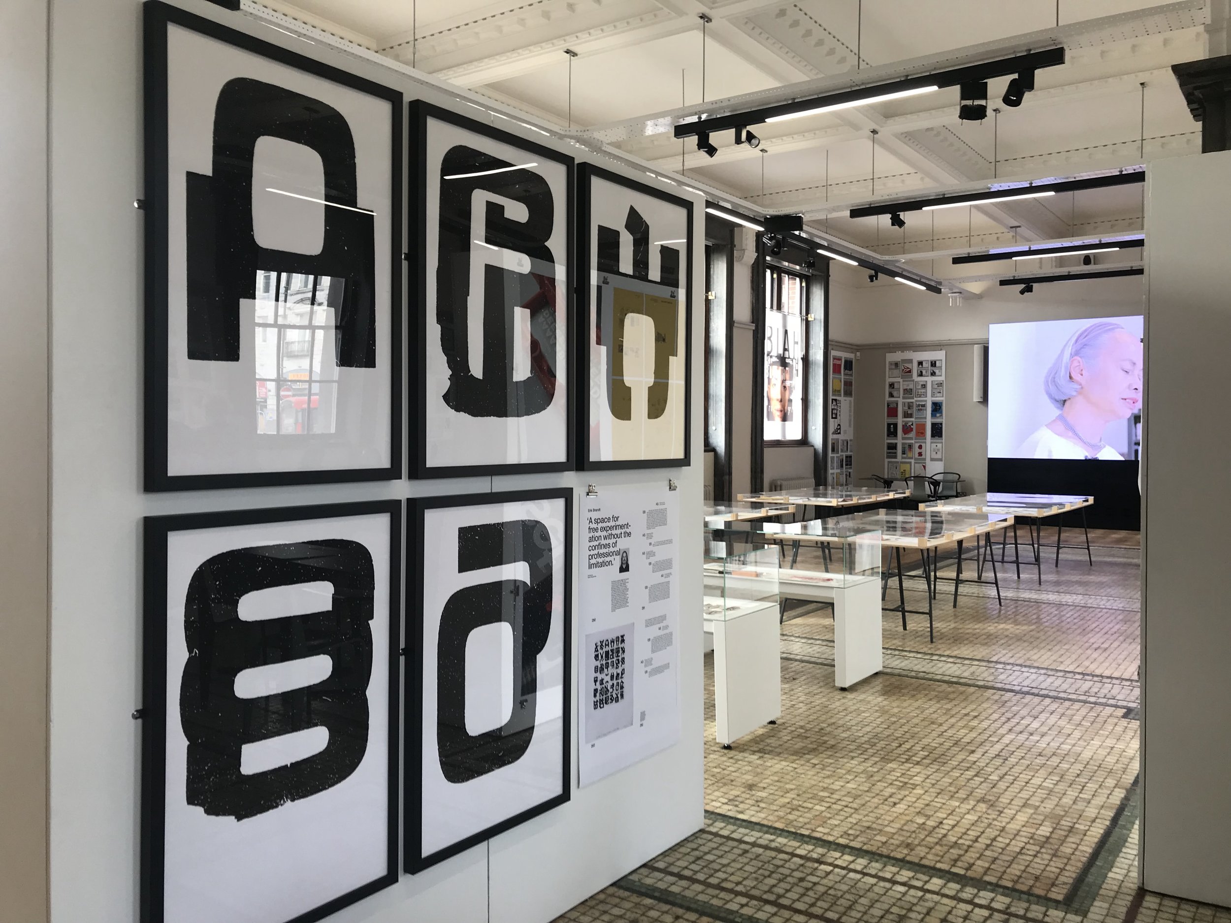
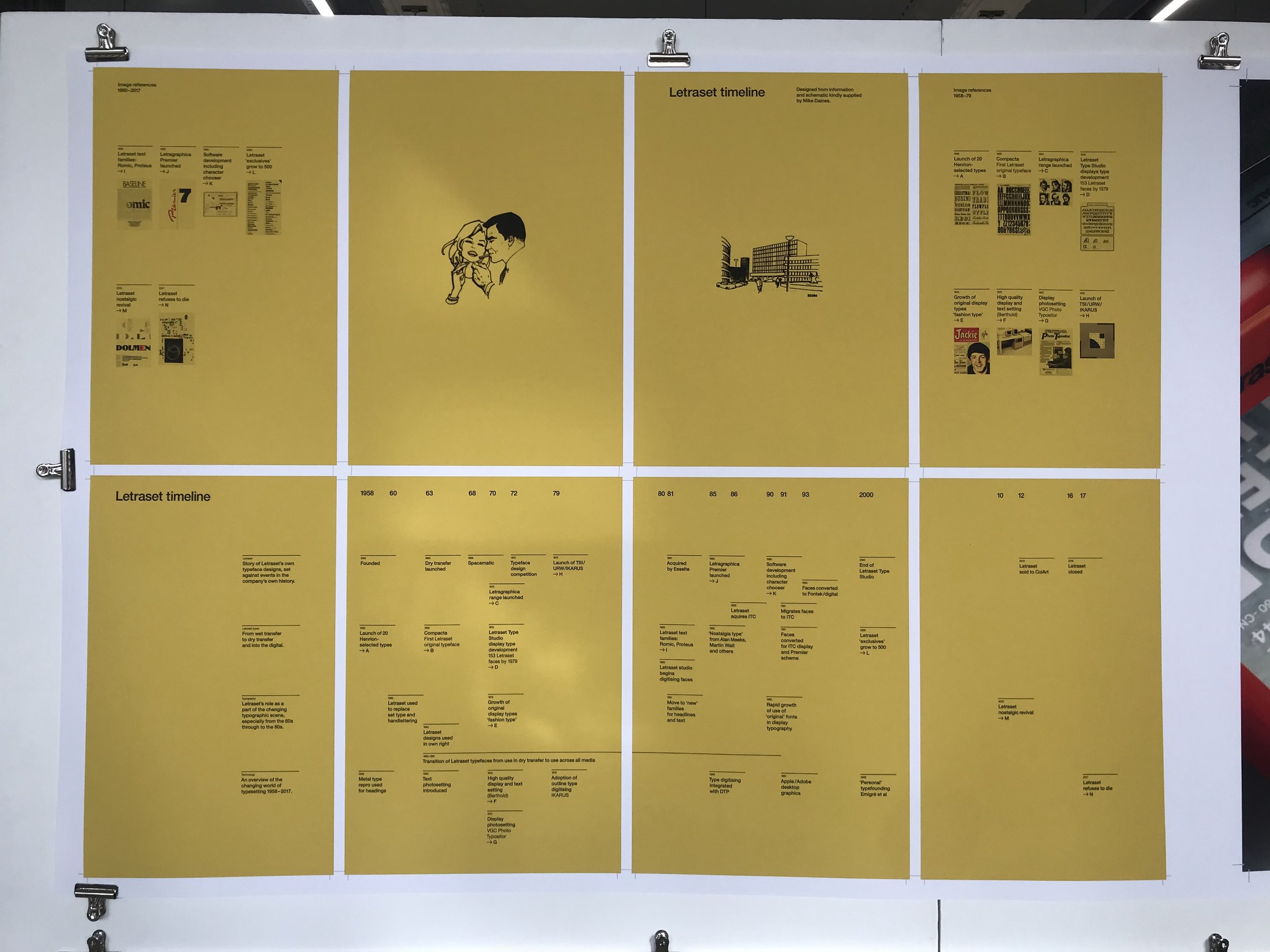
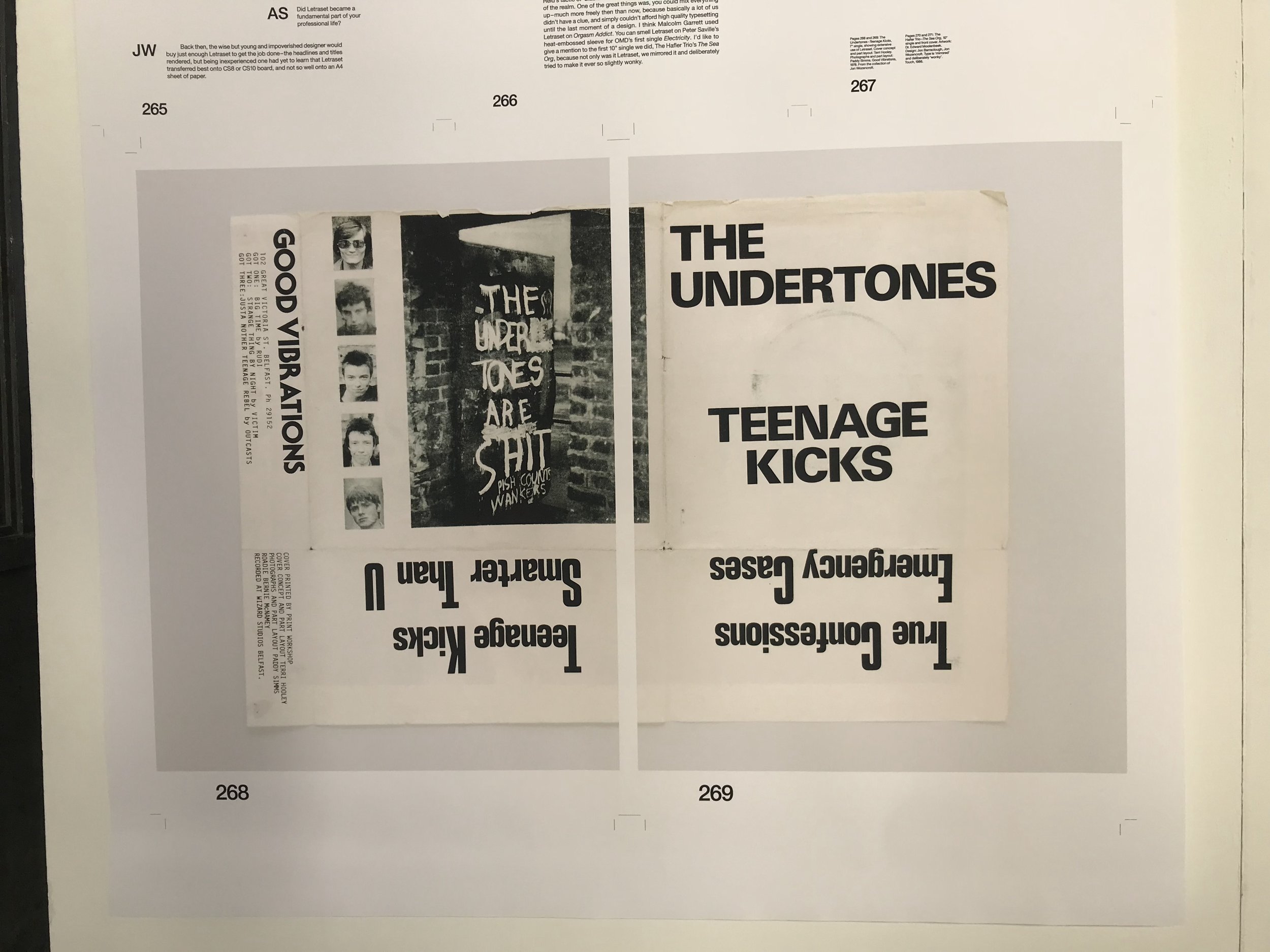
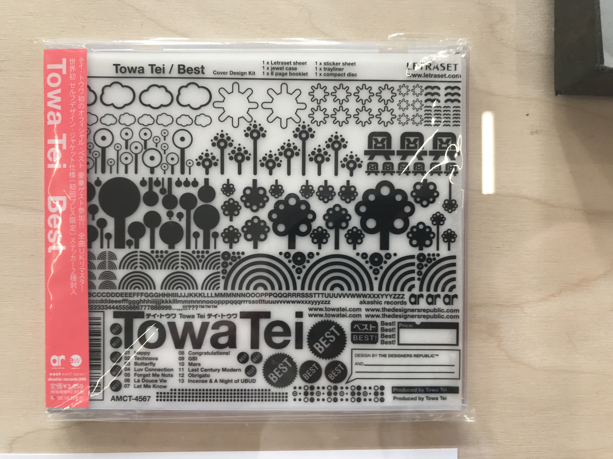
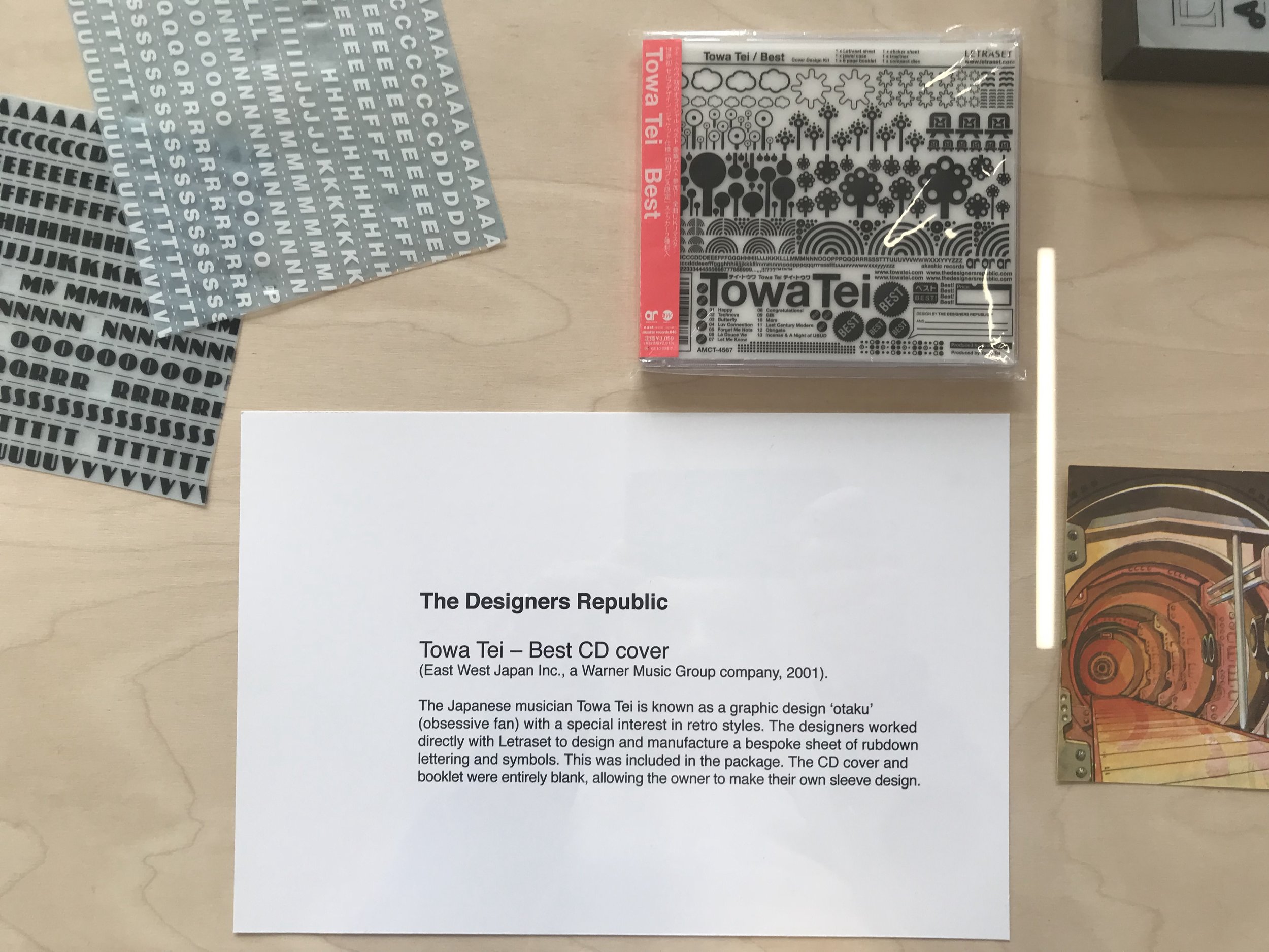
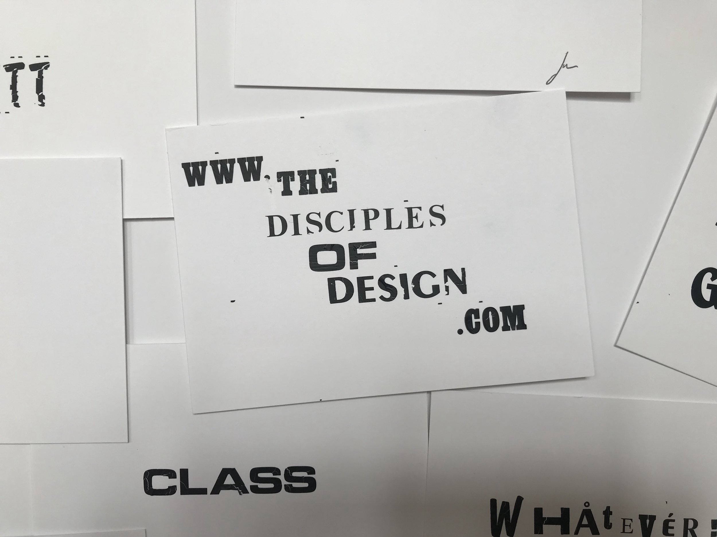
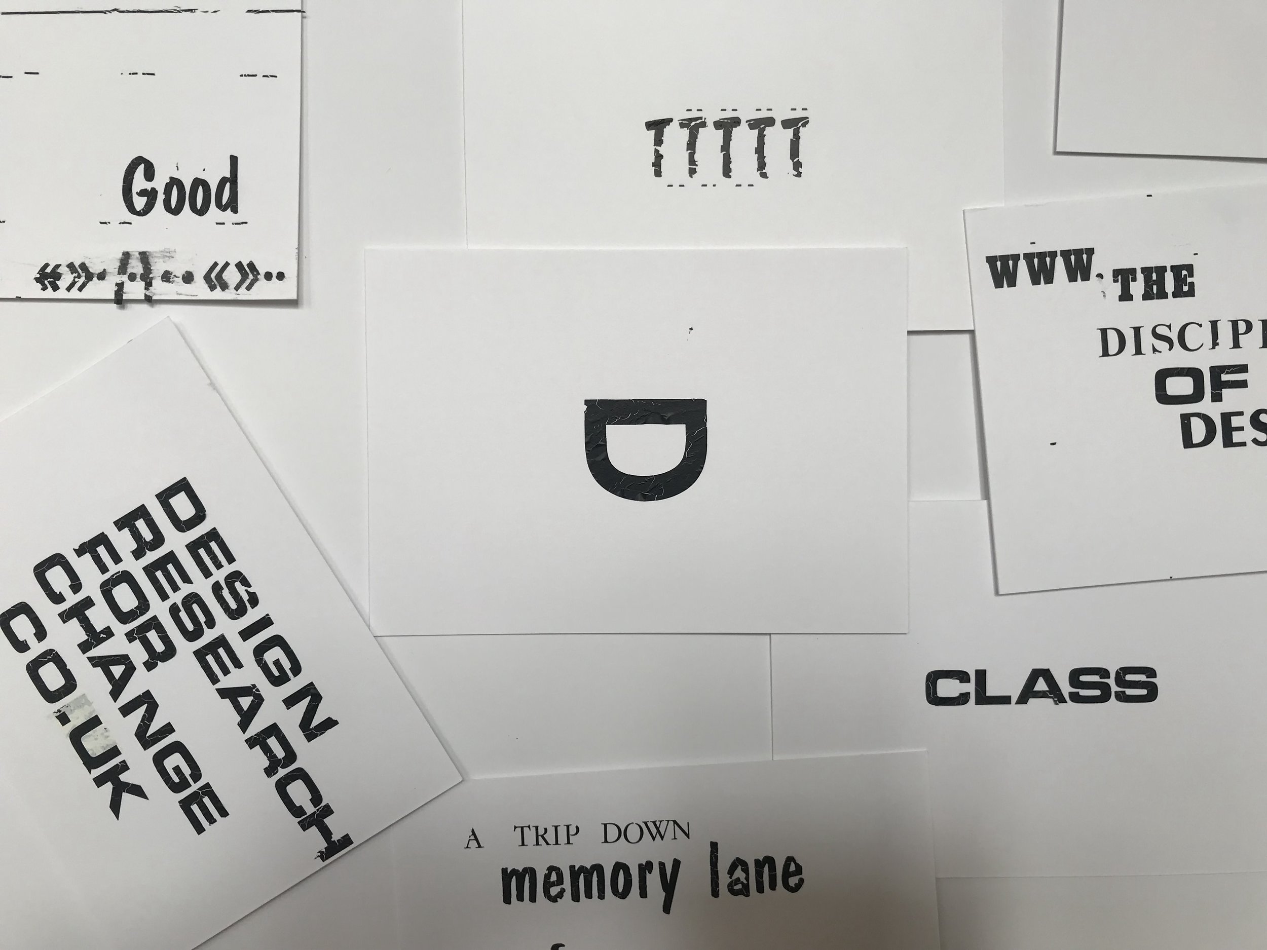
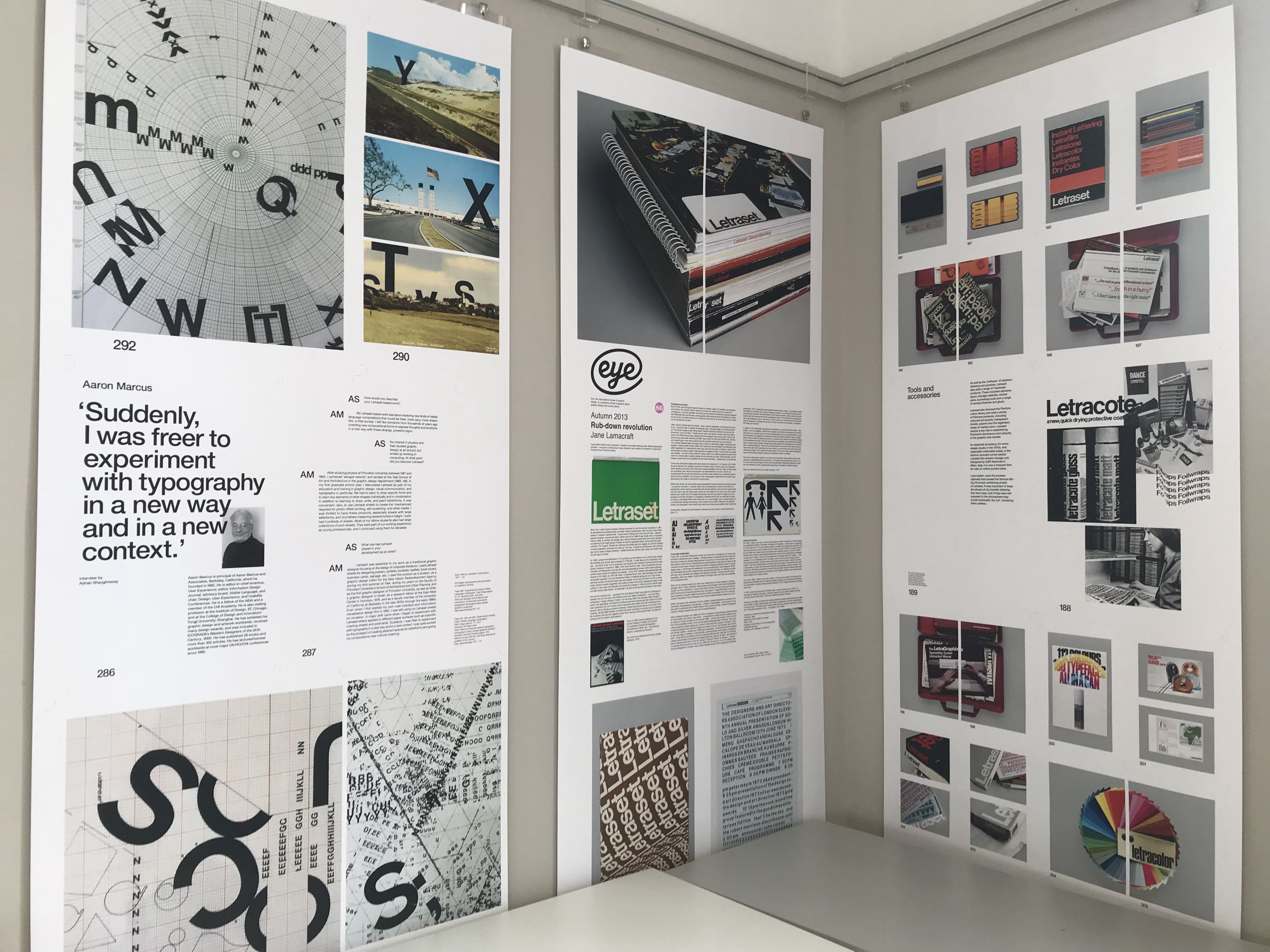
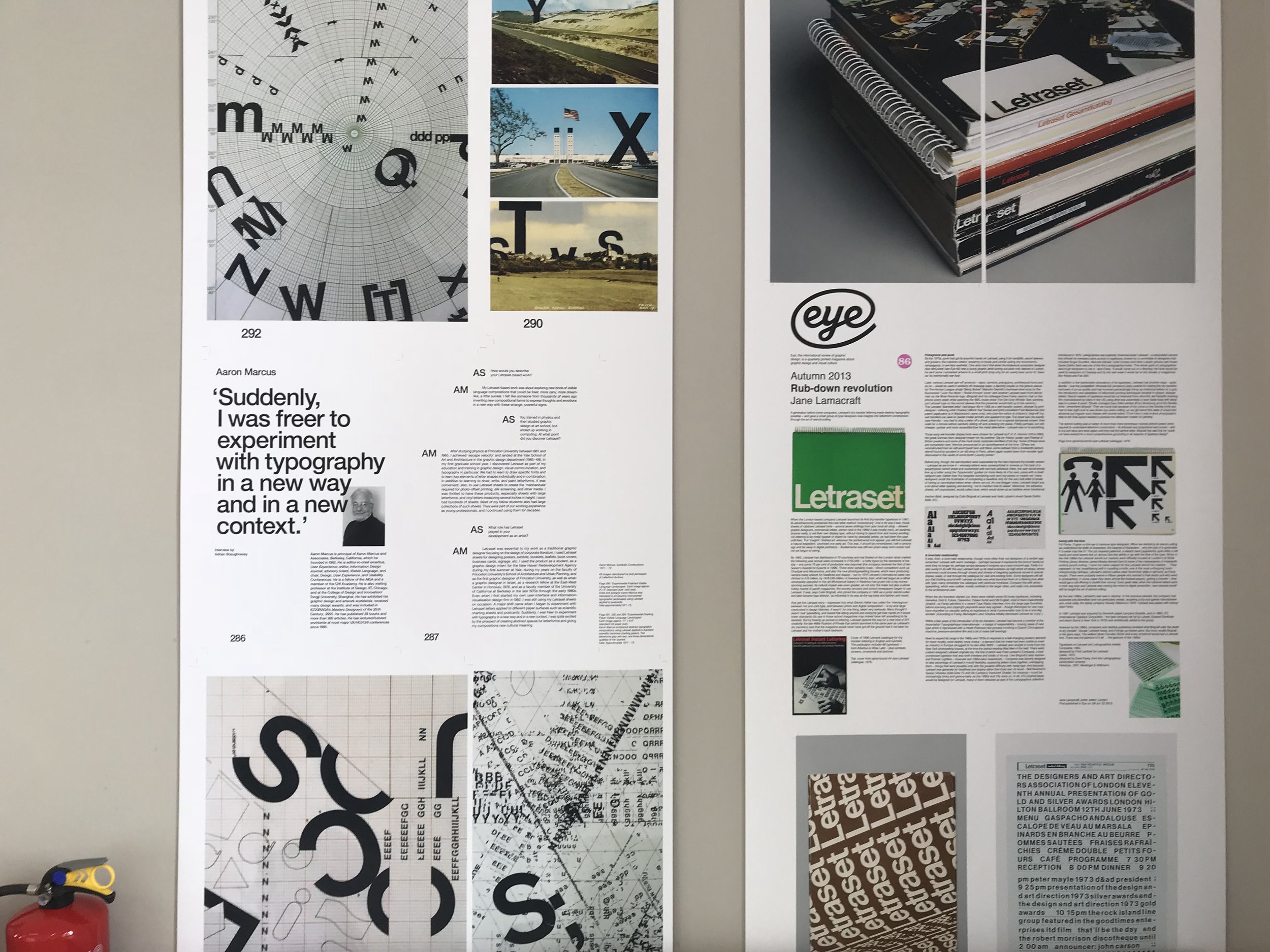
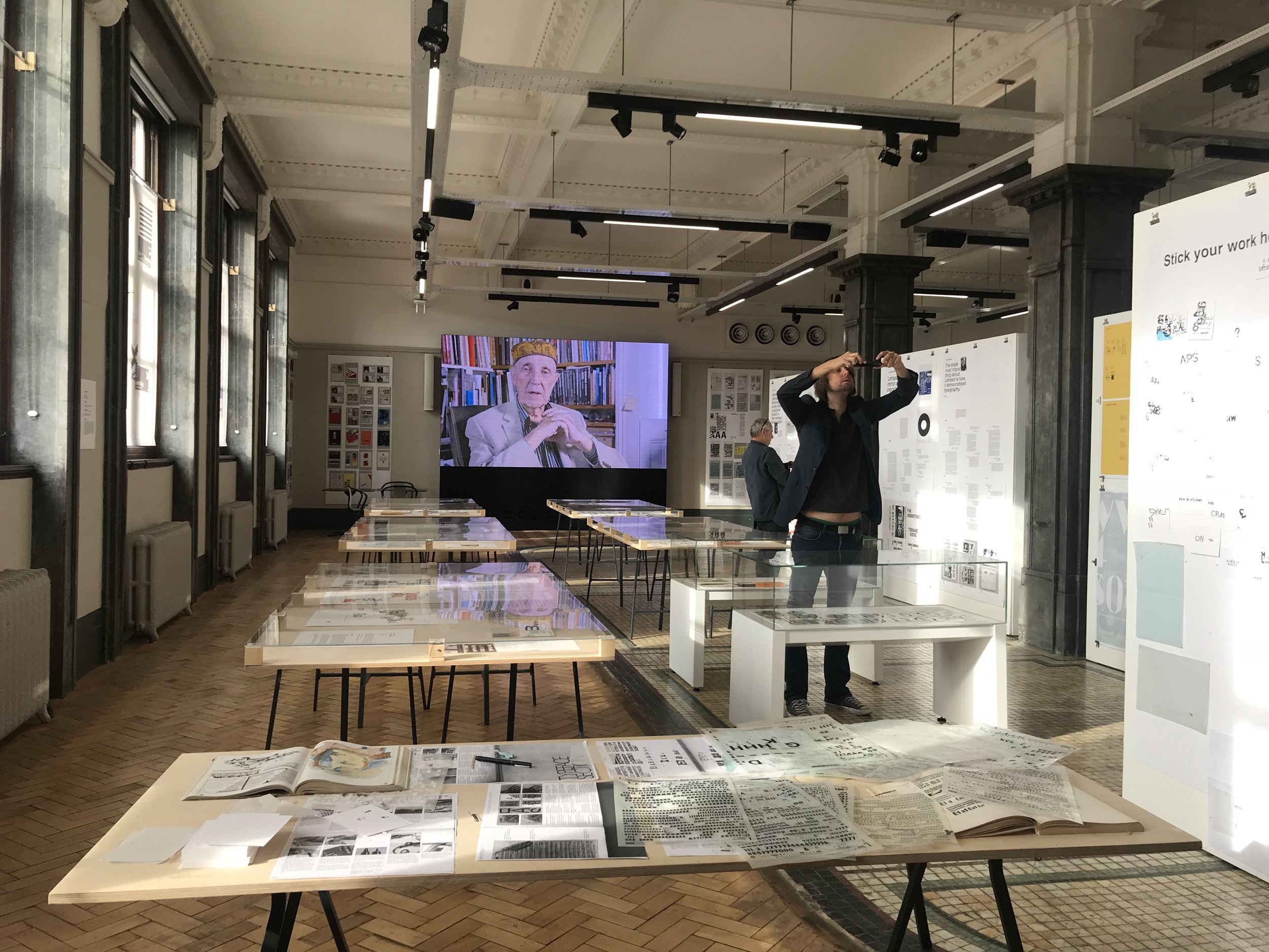
Last week, Pete, Kev & Ted headed over the Pennines to visit the Letraset exhibiton at Sheffield Hallam University.
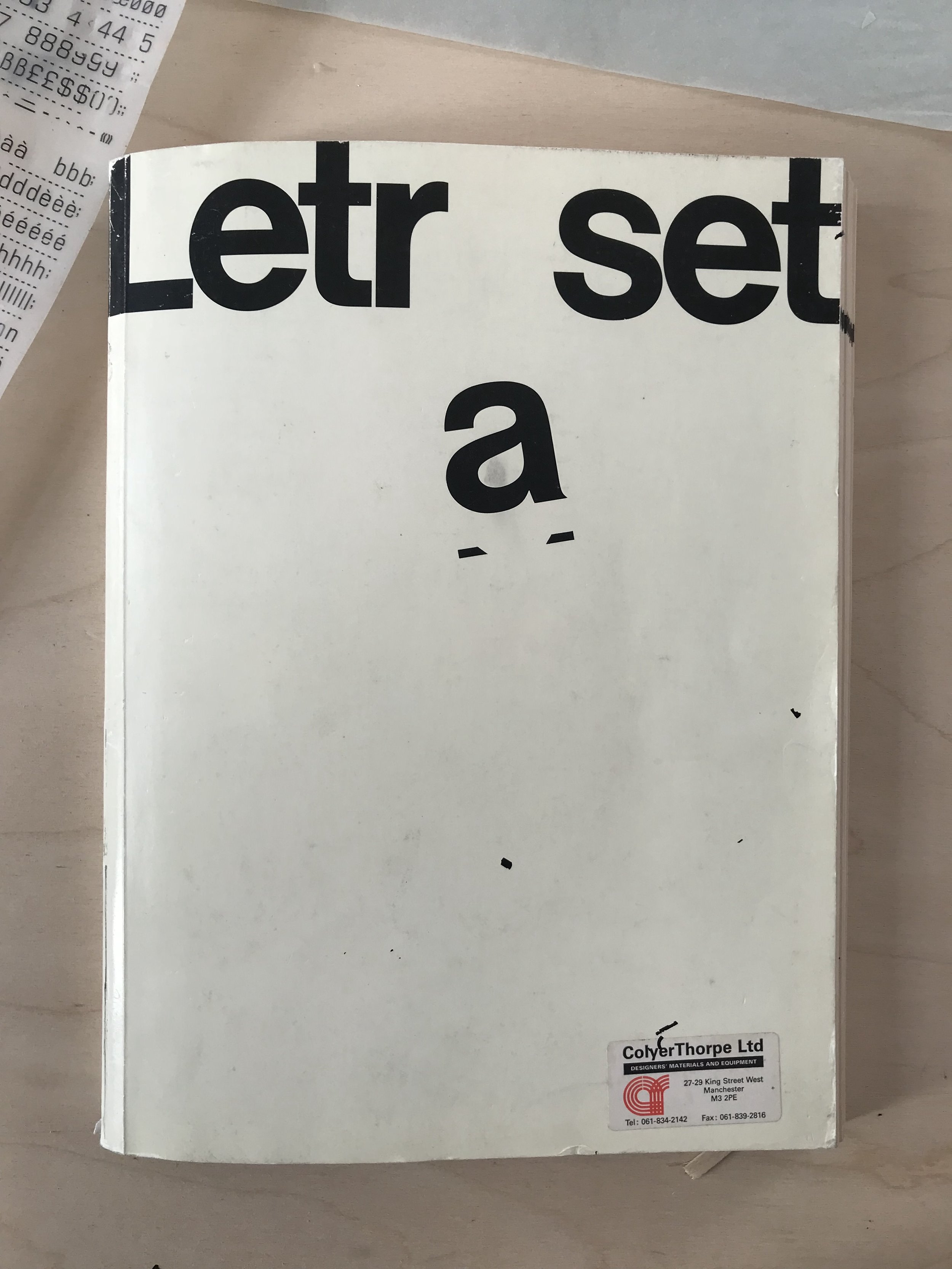
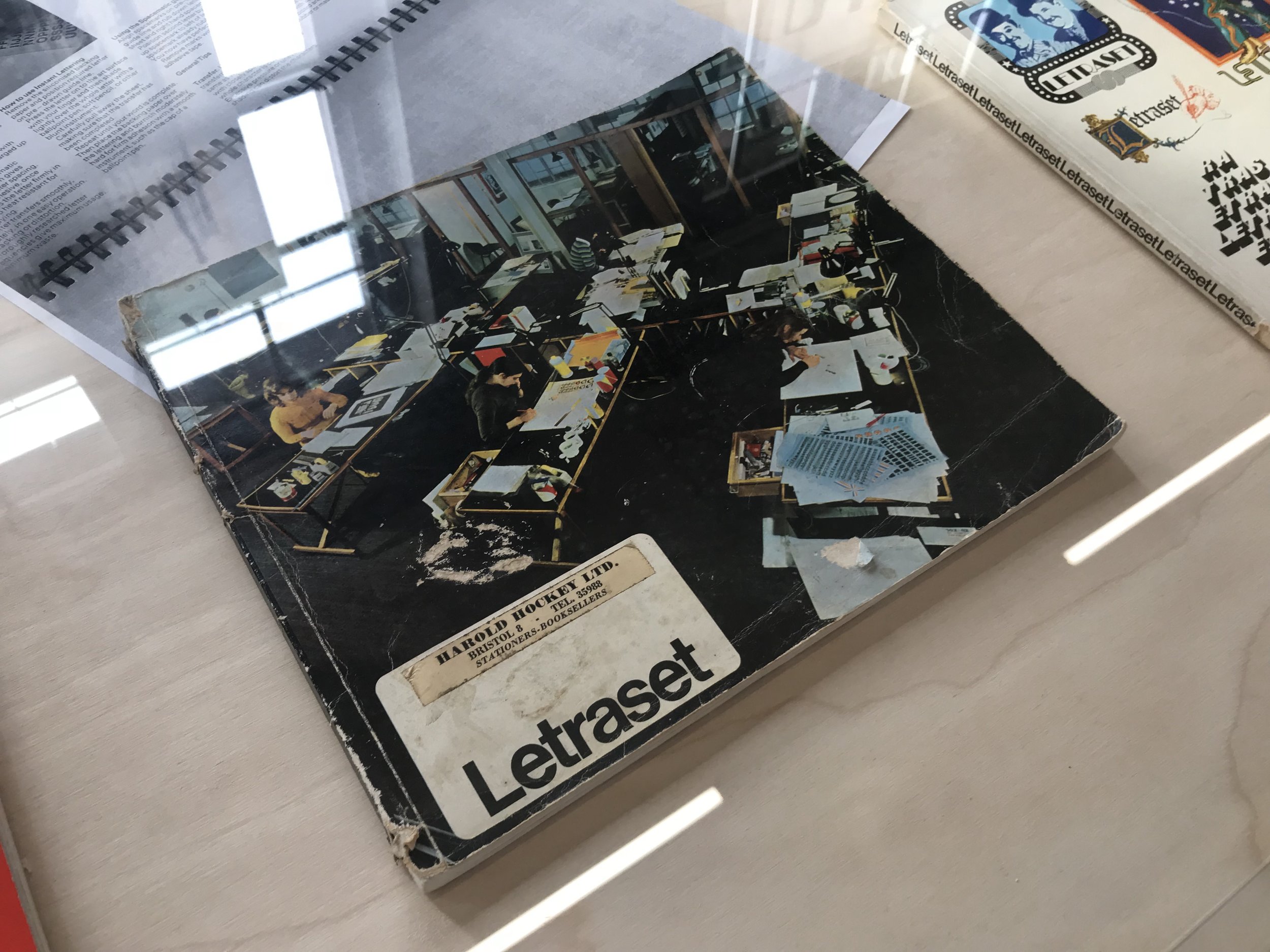
Before being a student of design, before even knowing what design was in fact, I was fascinated by Letraset. My dad was a typesetter, and as such used to bring home abandoned type ephemera from work as the industry became gradually more and more affected by technological advances, on the way to its complete digitisation which we know today. Mind boggling though it now is, there was a time when skips across Trafford Park and beyond were full of metal type, presses, furniture and Letraset. On receipt of the Letraset I would take great care in rubbing down its letters from the blue sheet to a page, not creatively in memory, but mainly in the challenge of getting the letters down both straight and intact. (Top tip: draw a baseline.)
There is a beautiful (as ever) Unit Editions book available, and the exhibition itself is on until 28th October, and well worth a train ride during reflection week.
The exhibition tells the Letraset story from its early days as a difficult-to-use wet system, to its glory years as the first truly democratic alternative to professional typesetting.
Celebrating the launch of the Unit Editions book Letraset: The DIY Typography Revolution this exhibition is a comprehensive history of Letraset, the rubdown lettering system that revolutionised typographic expression.
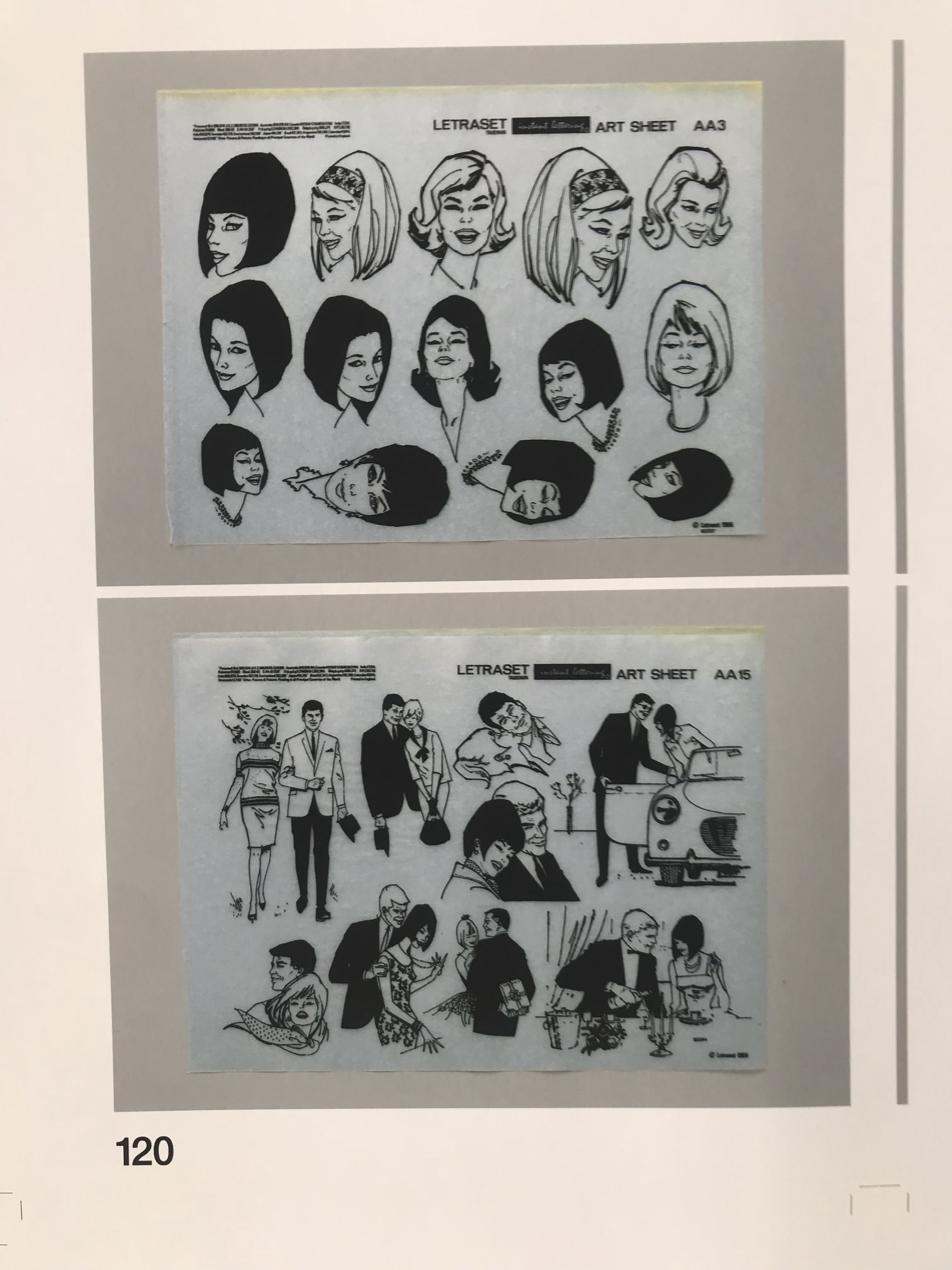
The exhibition also celebrates Letraset’s present-day revival amongst a new set of admirers who recognise the typographic excellence of the system’s typefaces.
The Disciples Of Design are a global collective of design academics, practitioners, artists and students. We have one common thread – UCLan in Preston, UK; and one common aim – the creation of an ever evolving visual hub for the sharing of ideas and thoughts.