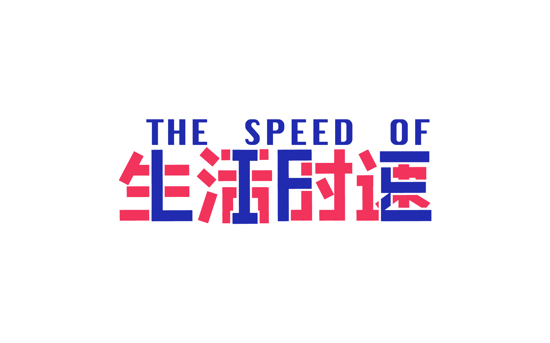
China Study Trip

By Sara Esat.

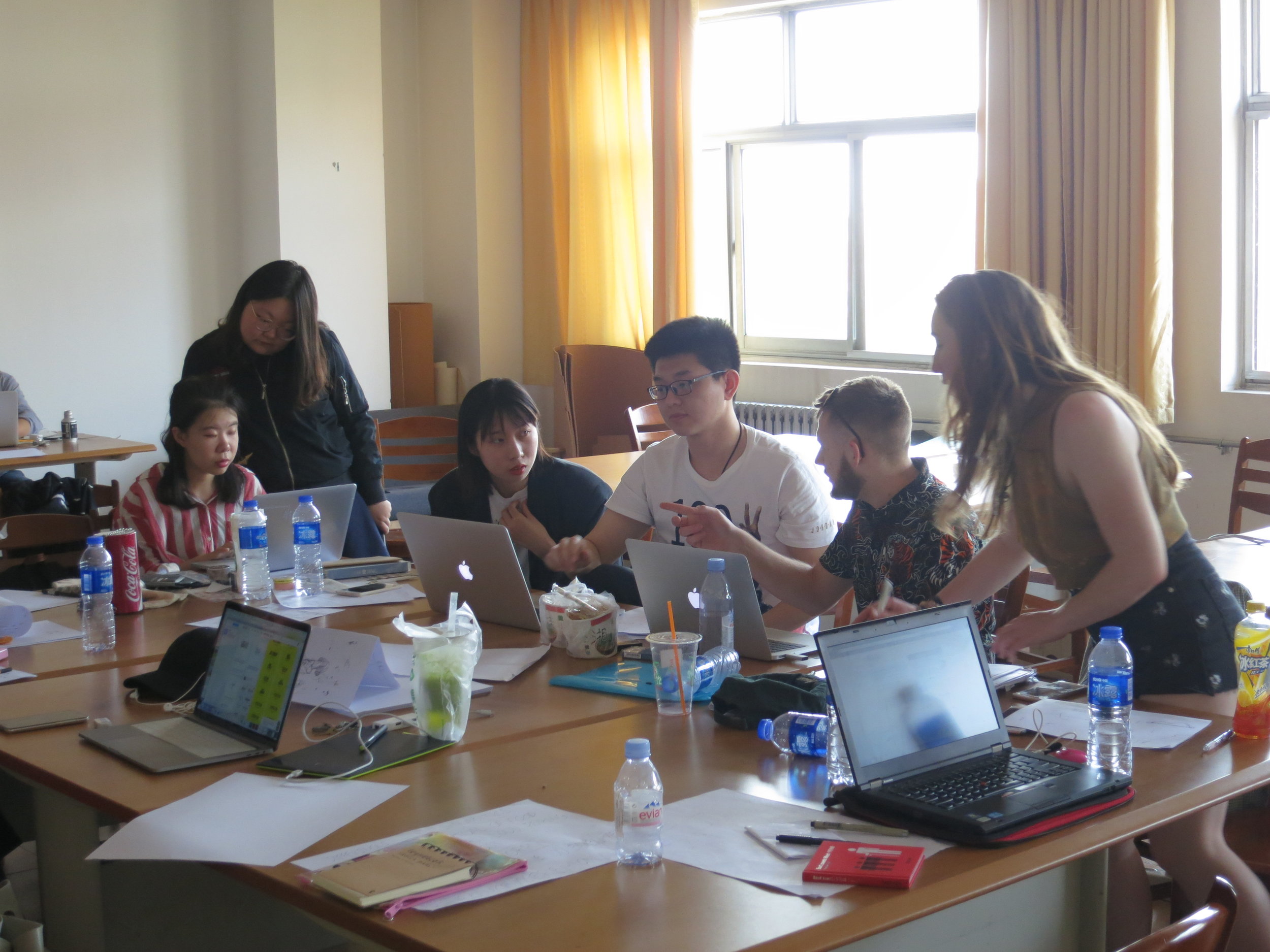
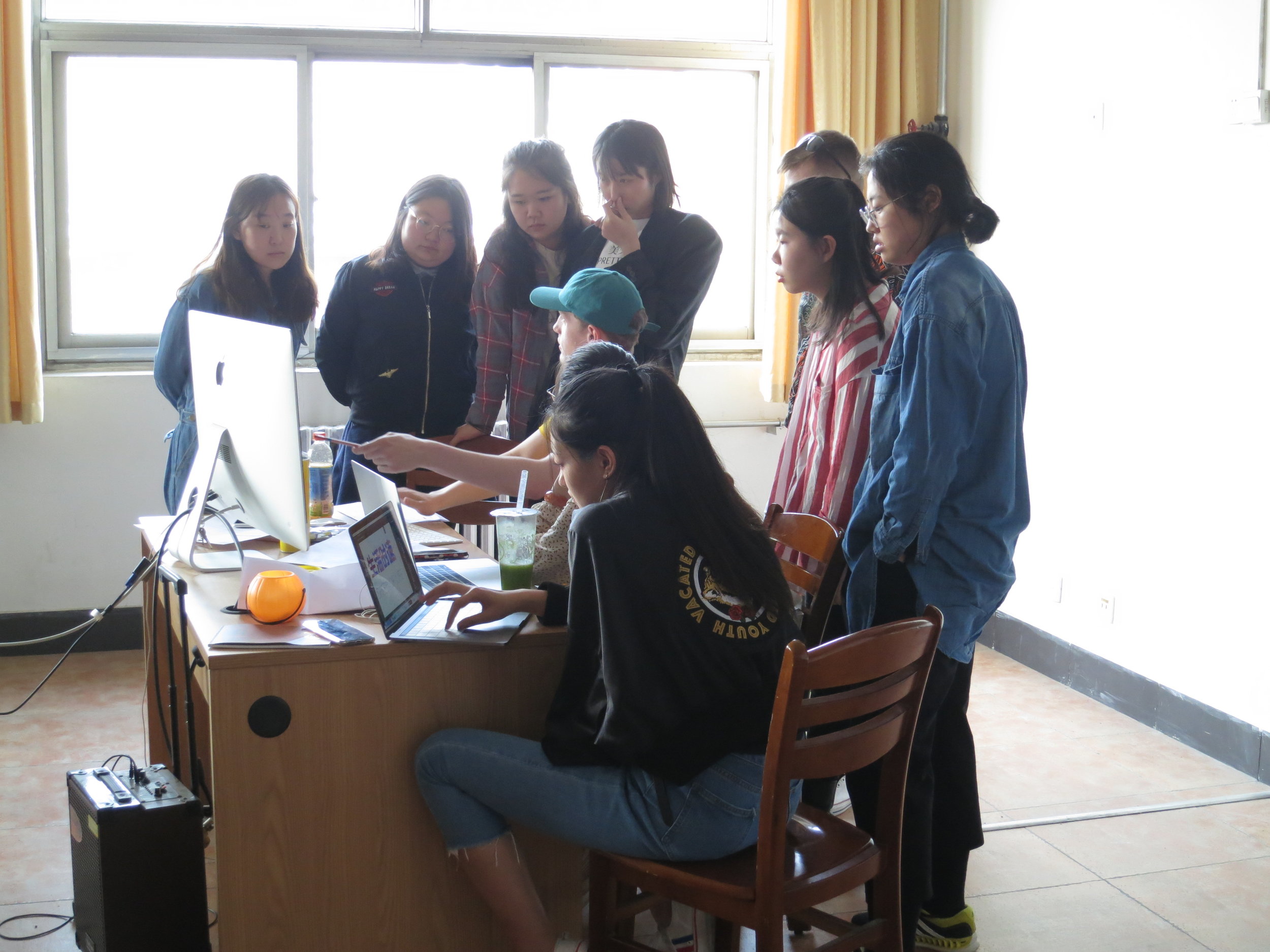
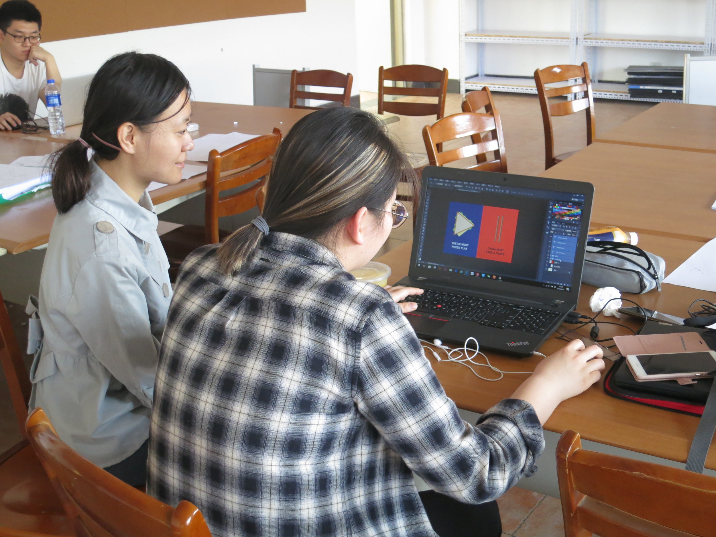
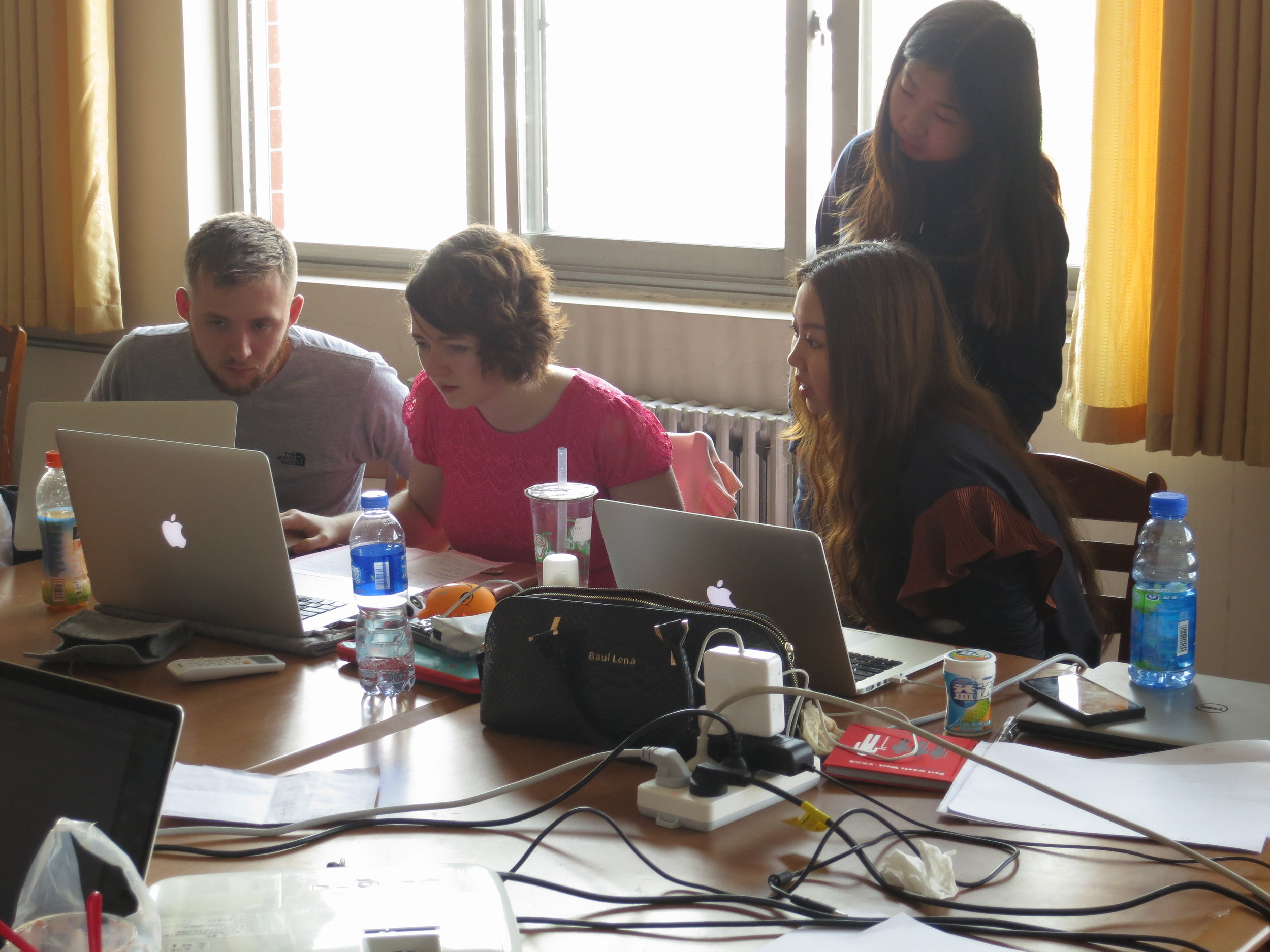
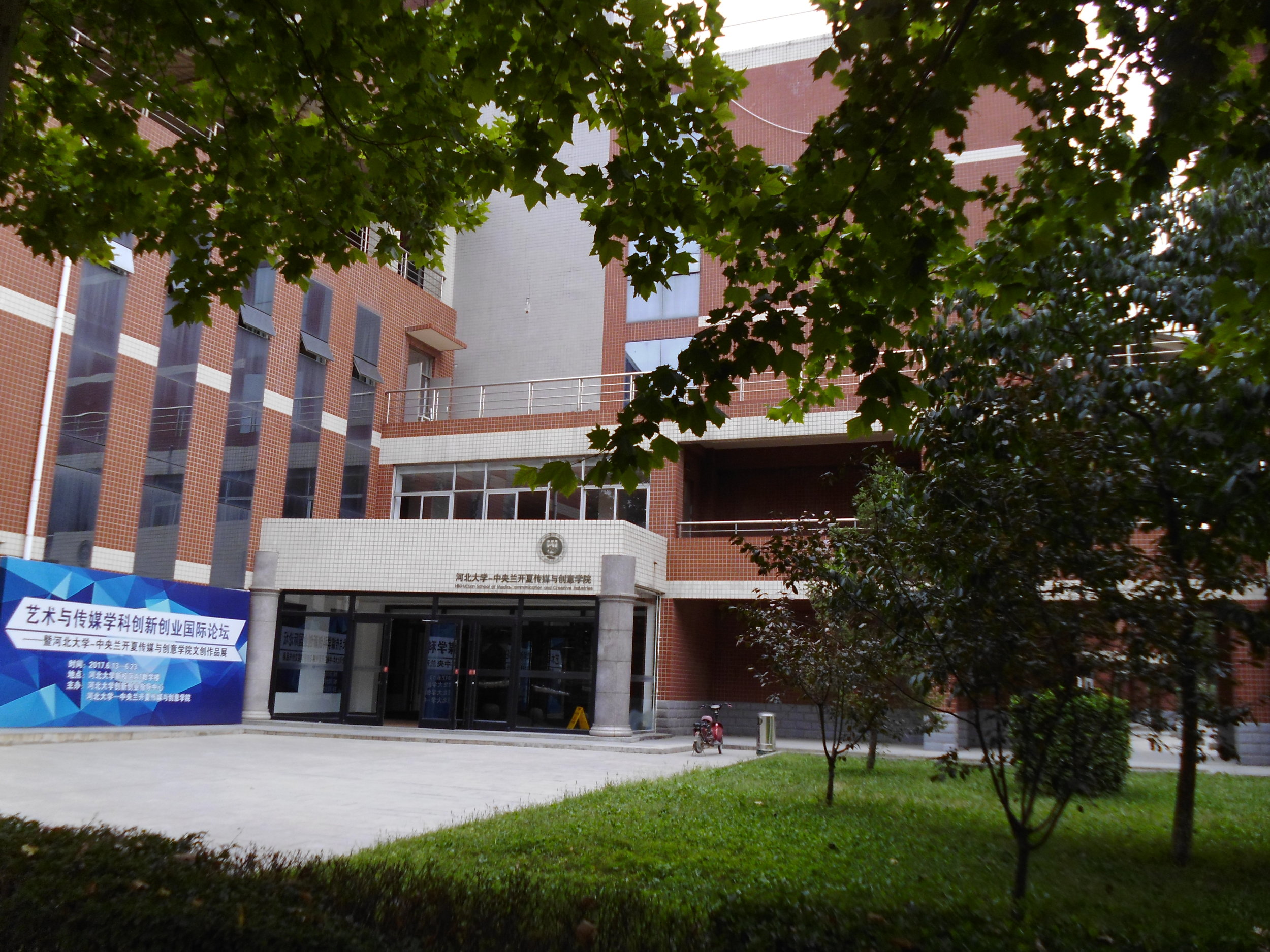
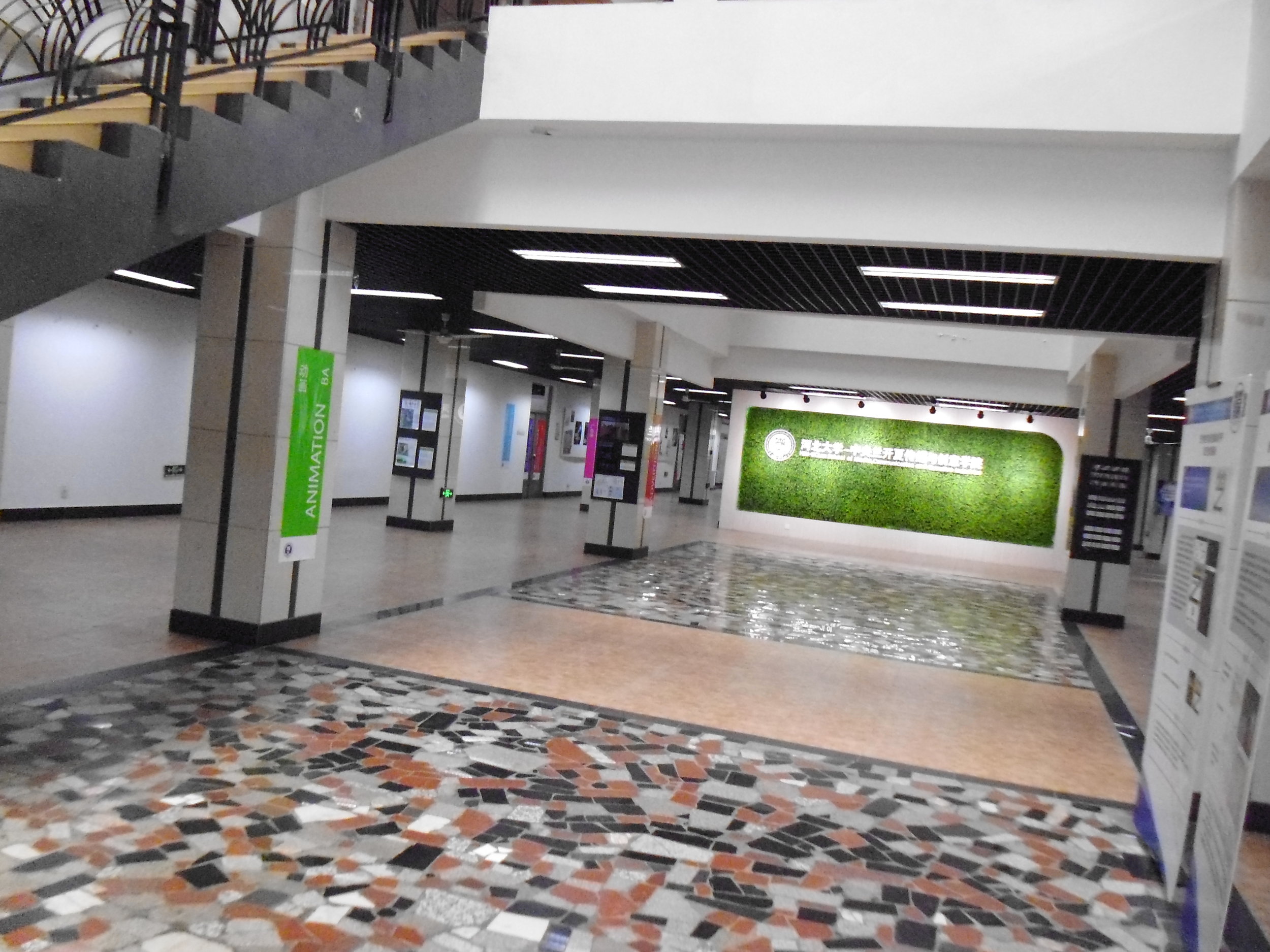
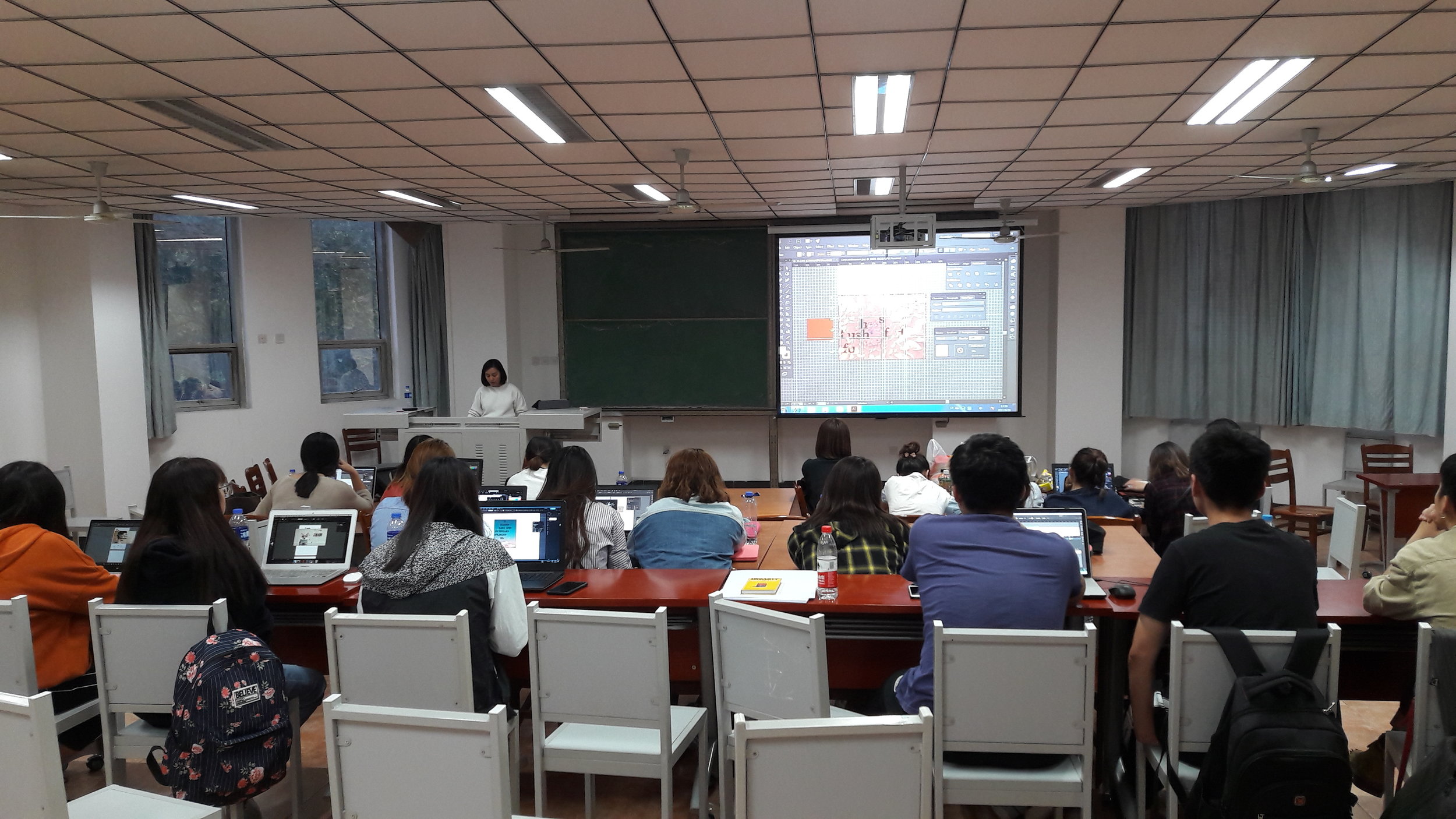
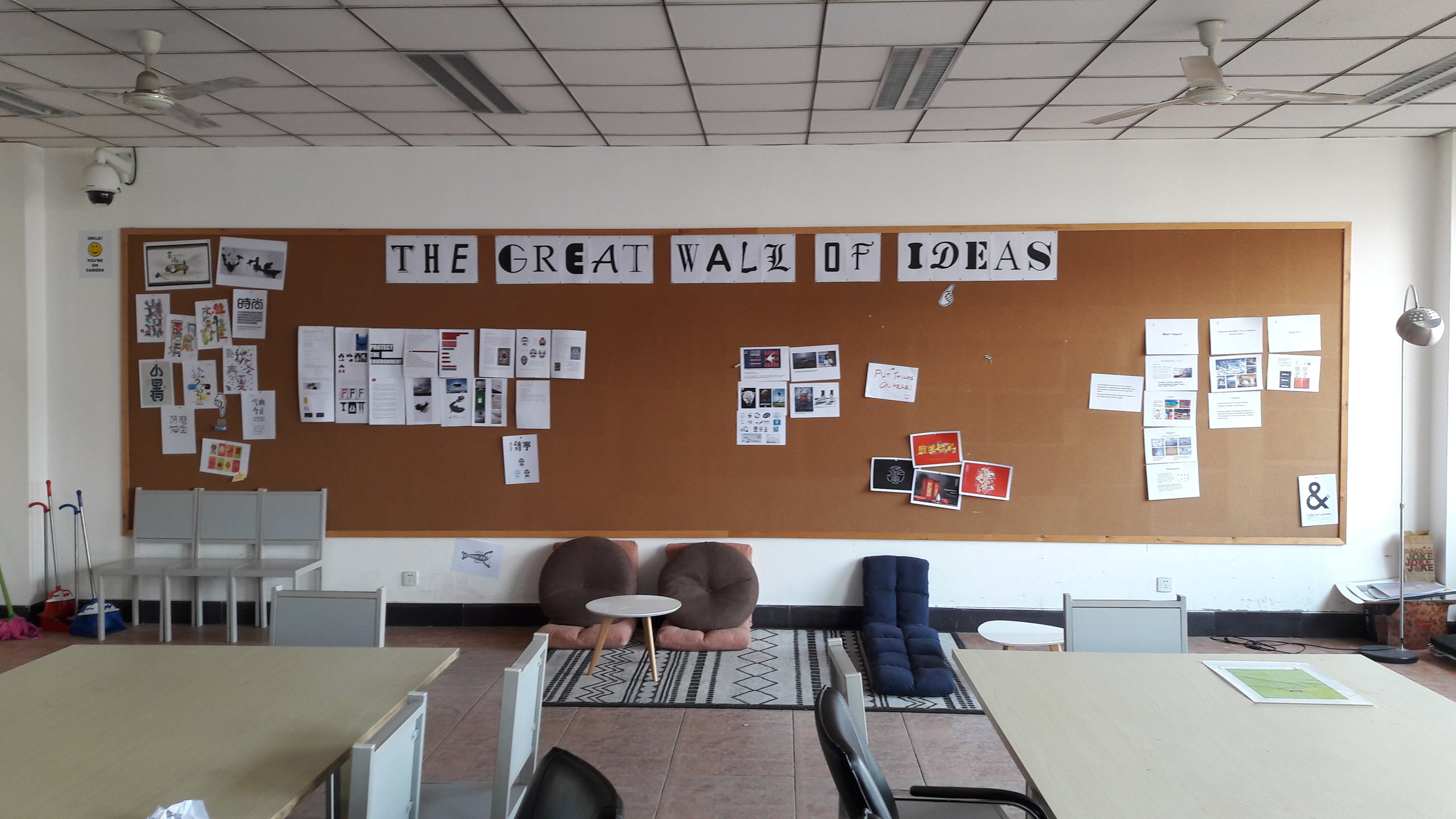
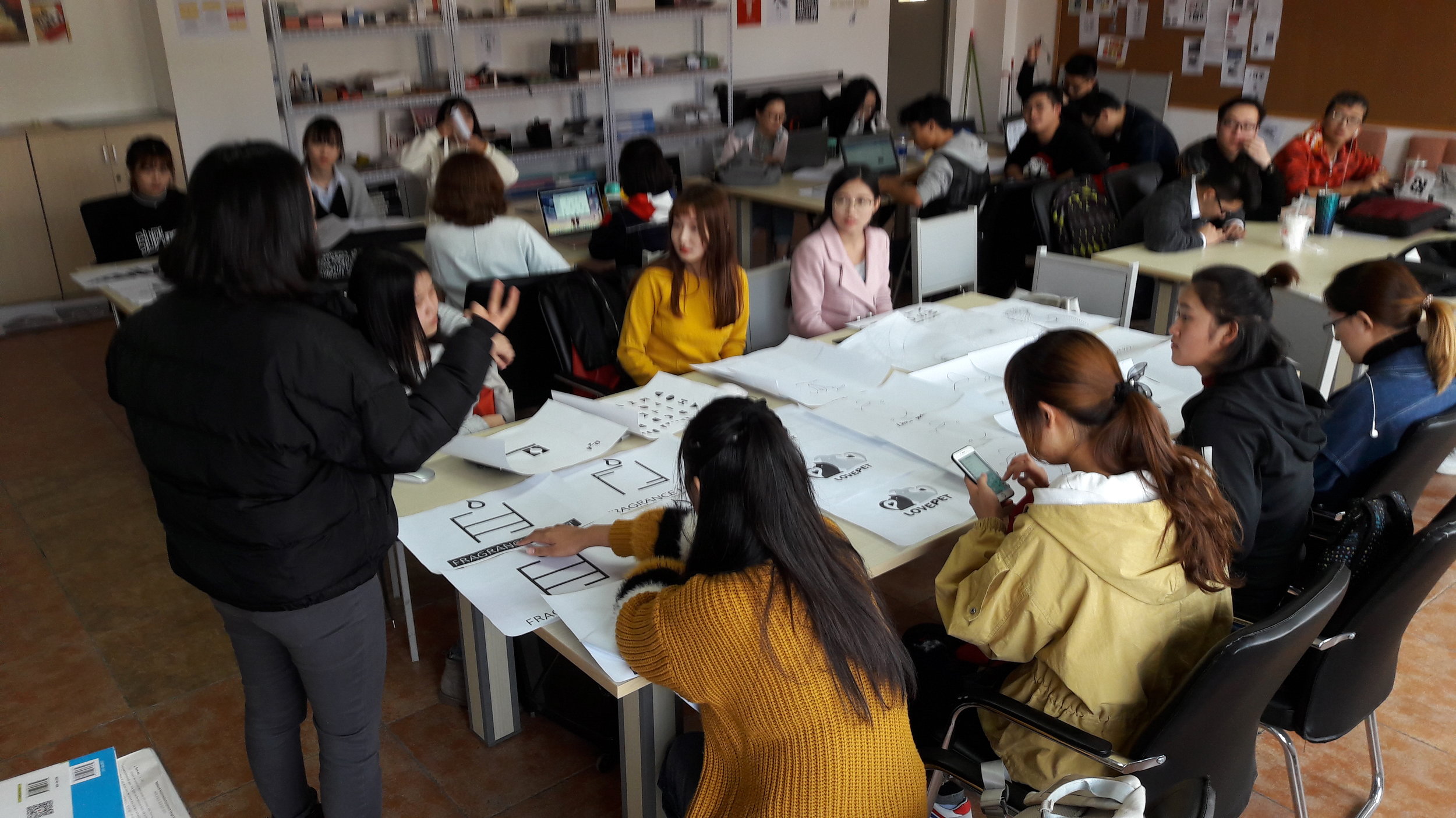
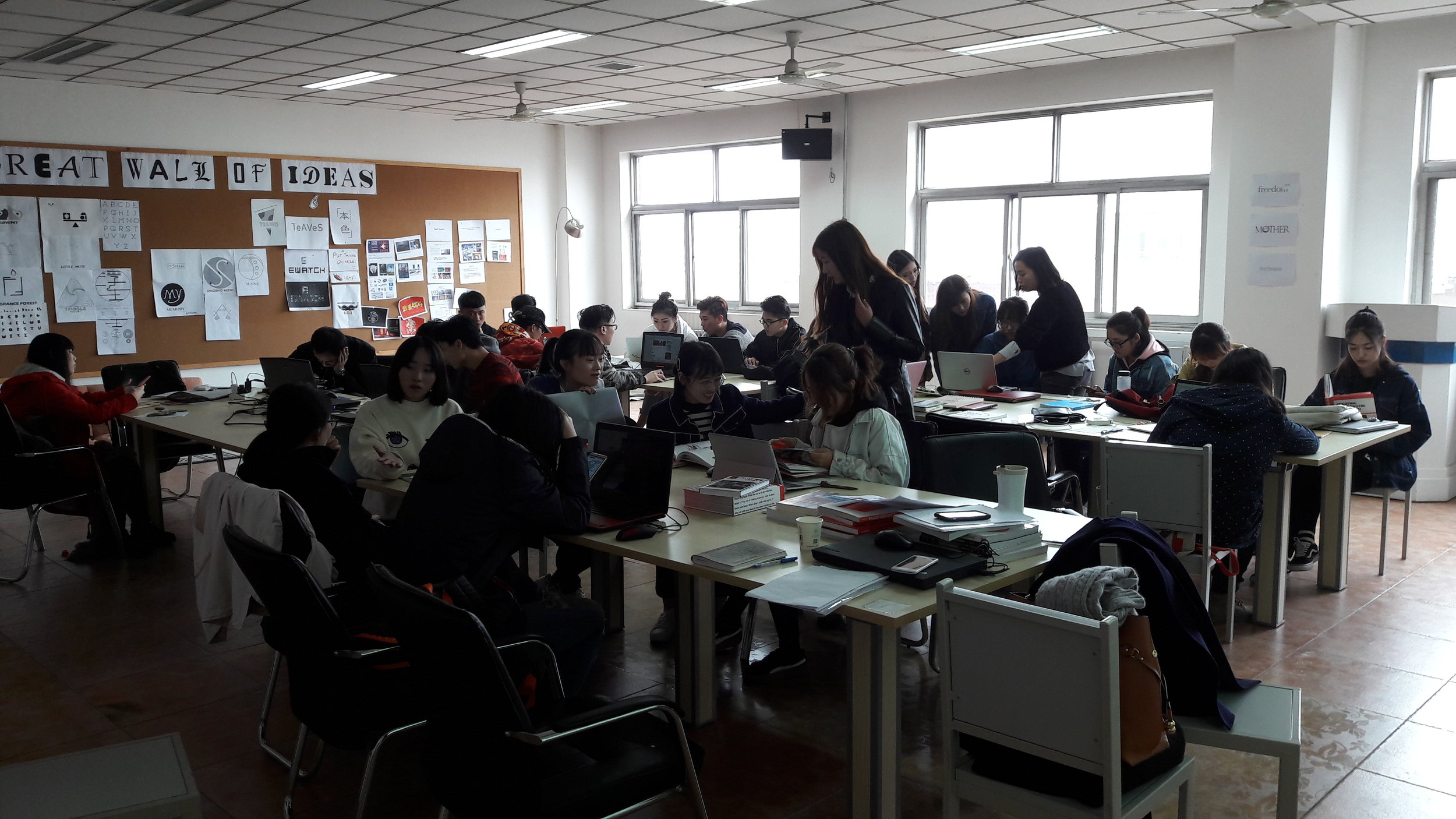
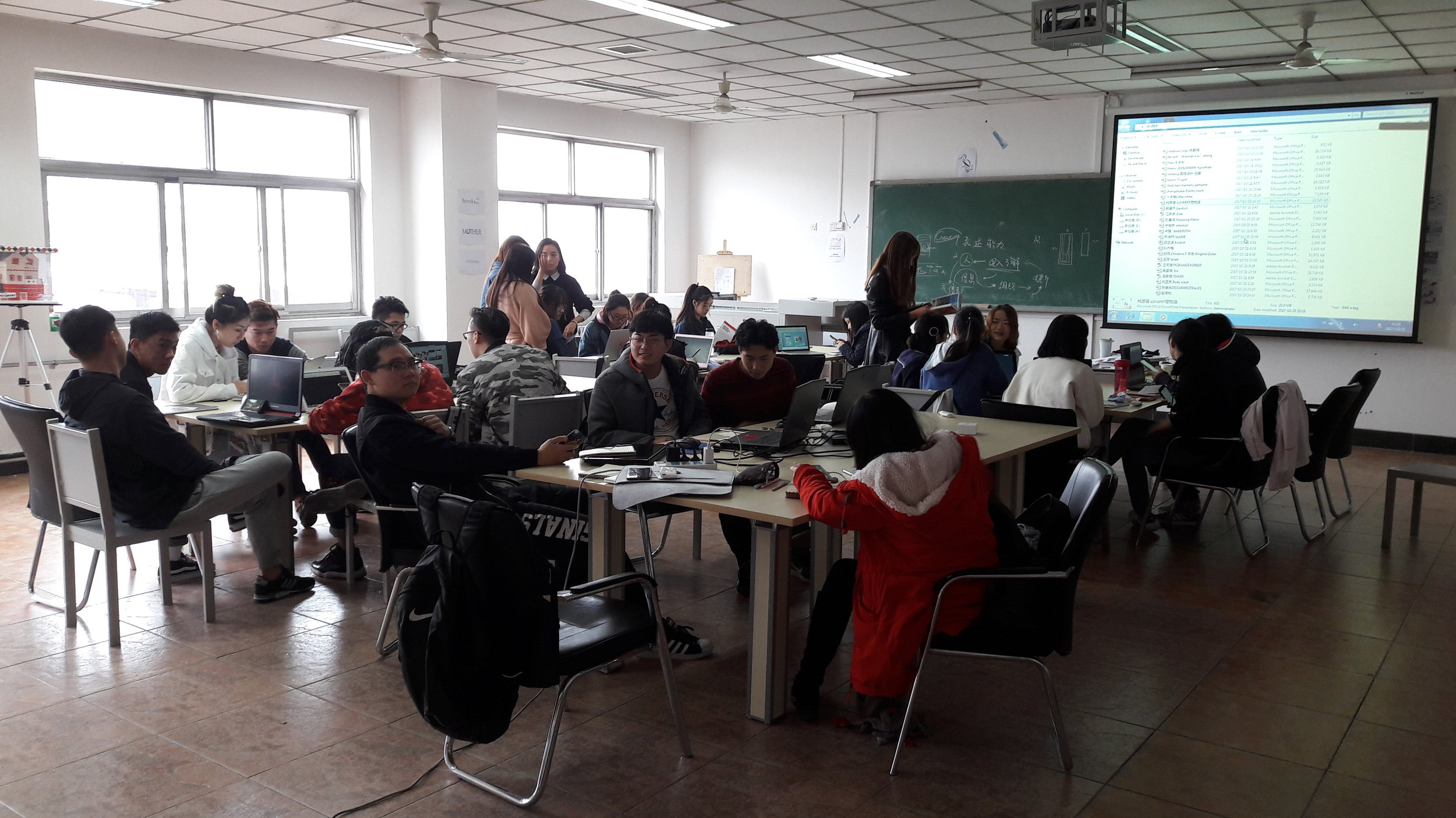
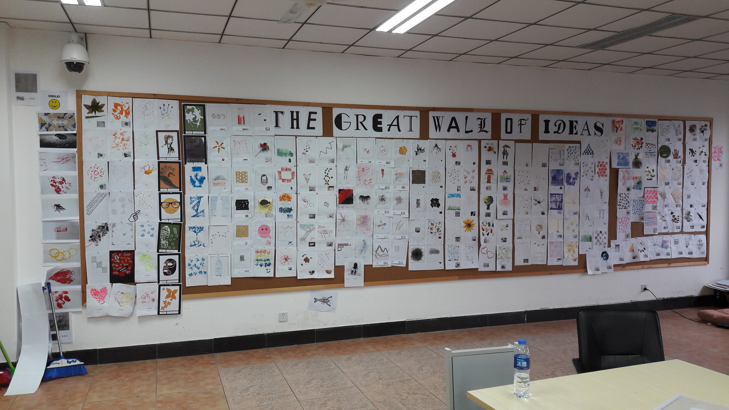
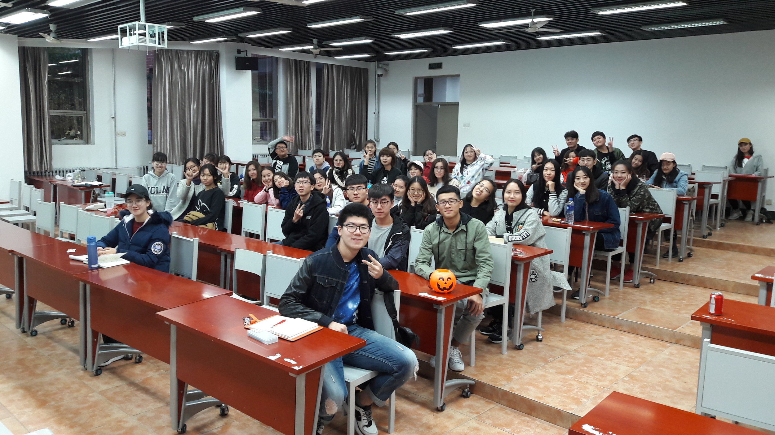
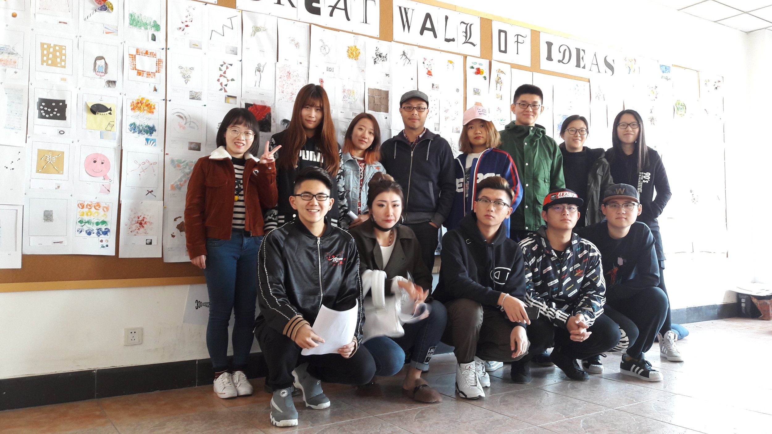
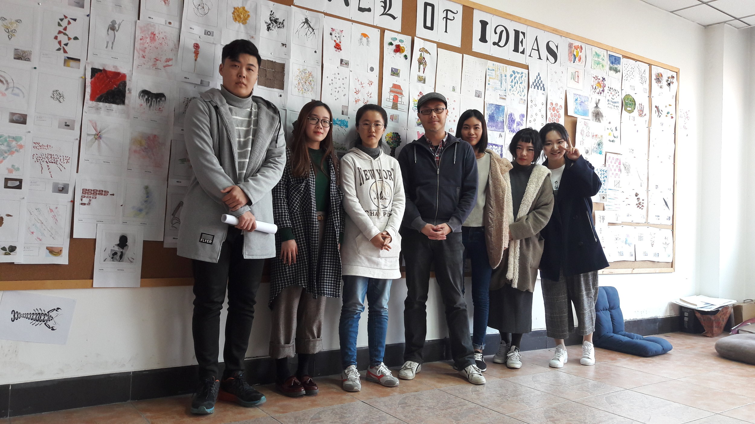
Recently second year Graphic Design, Advertising and Interior Design students attended a trip to the Hebei University in Baoding (HBU), China. UCLan students collaborated with their Chinese peers (within the same disciplines) and worked on a project to represent the city of Baoding, using any form of art to create typography.


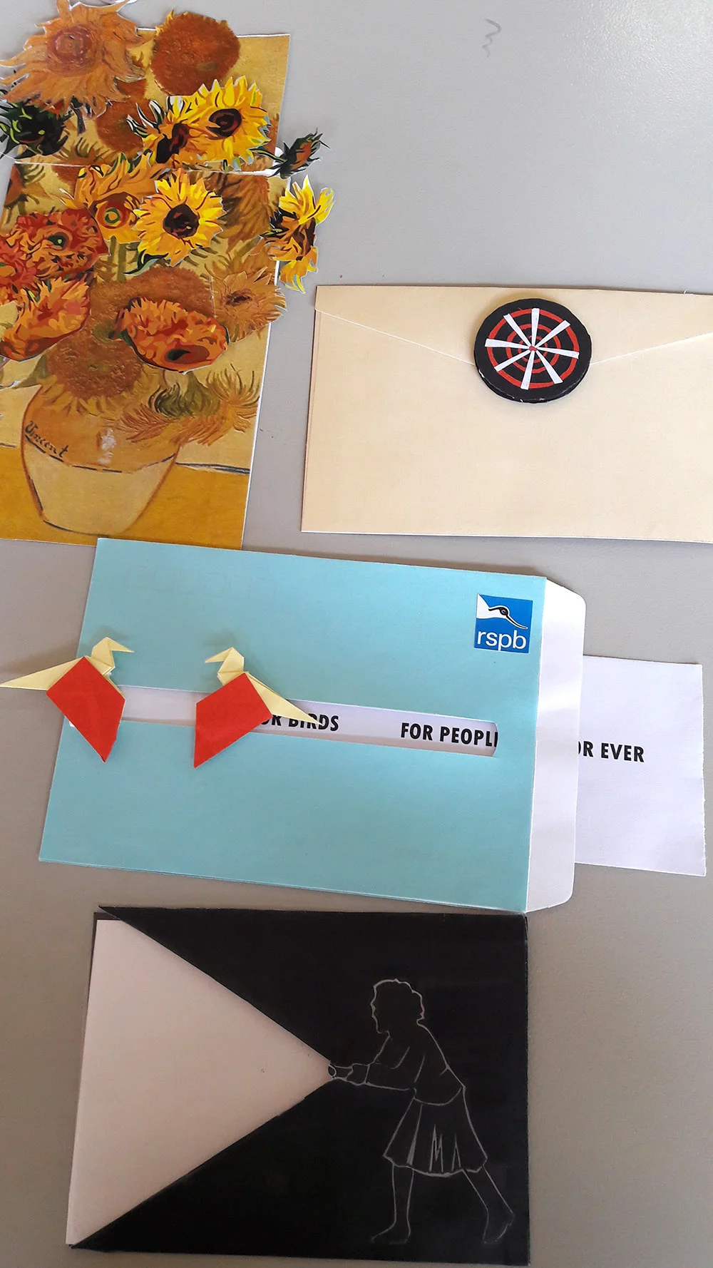
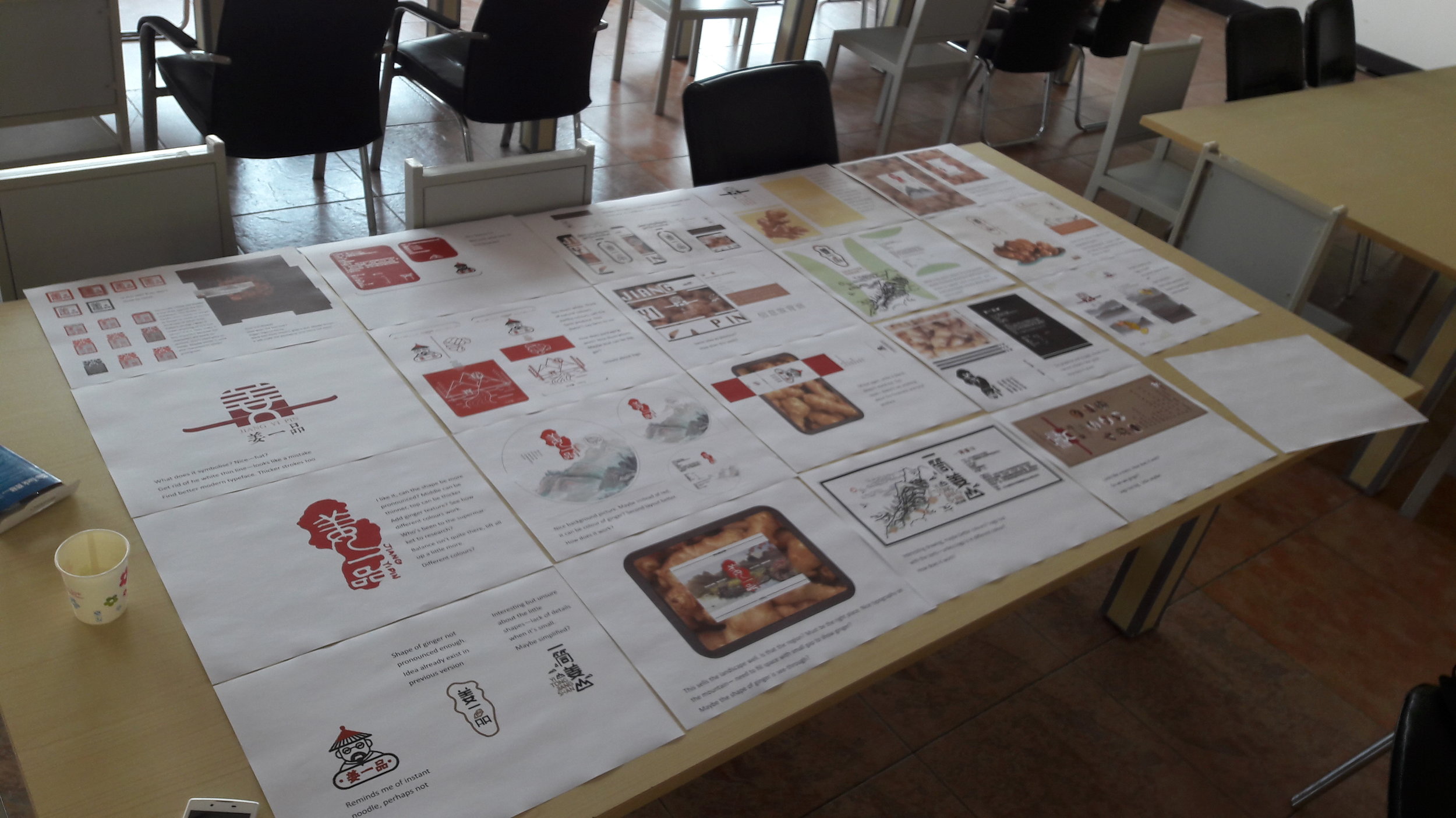
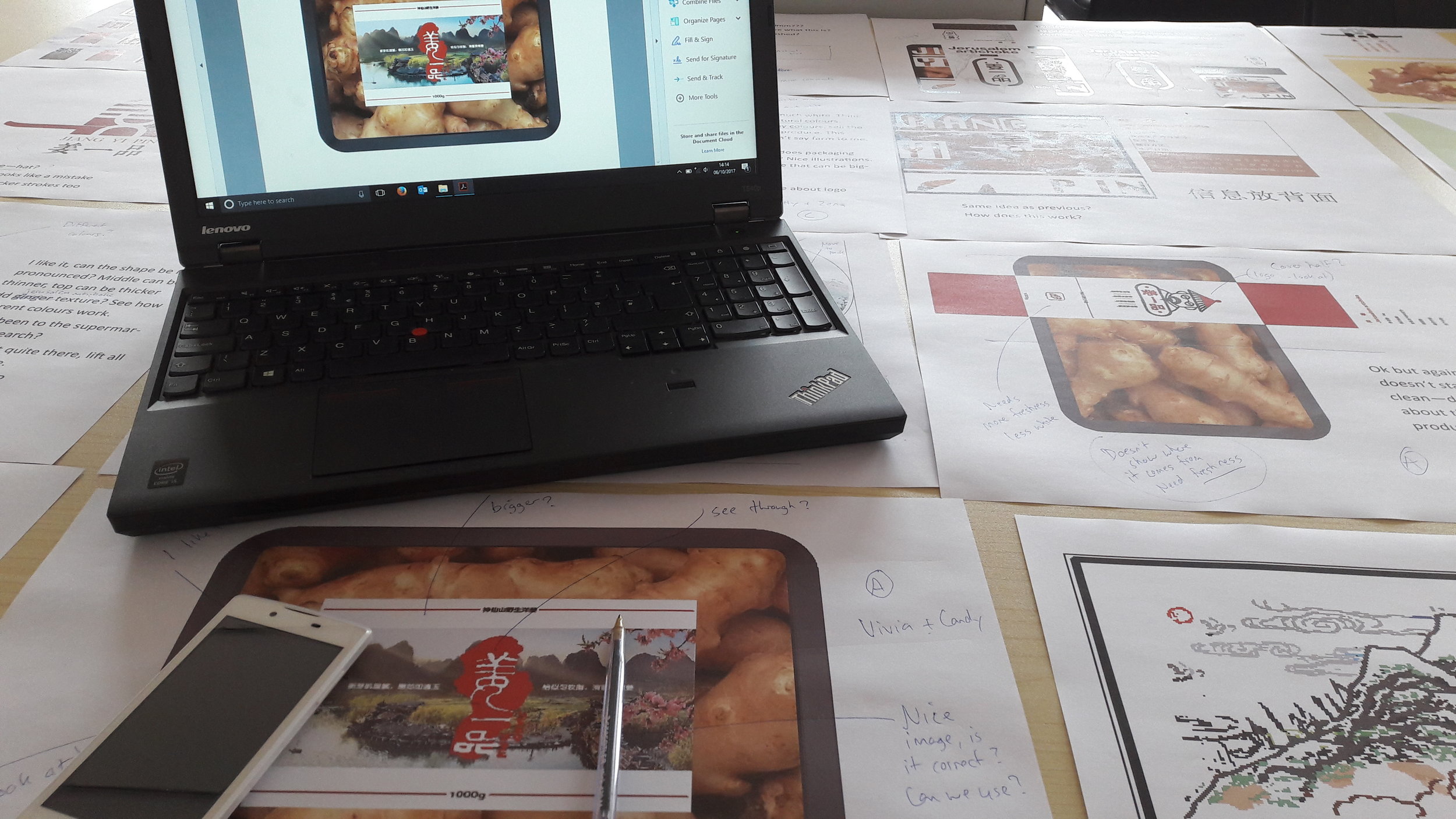
The Graphic Design students were allocated with eight letters — M to T — and below are the solutions along with how they link to the city of Baoding:

M - Monument

In Baoding there is a famous mountain named Mount Langya, where there is a monument that commemorates five brave heroes who died in battle on the mountain. Using the five stars from the Chinese flag, this logo was made. 
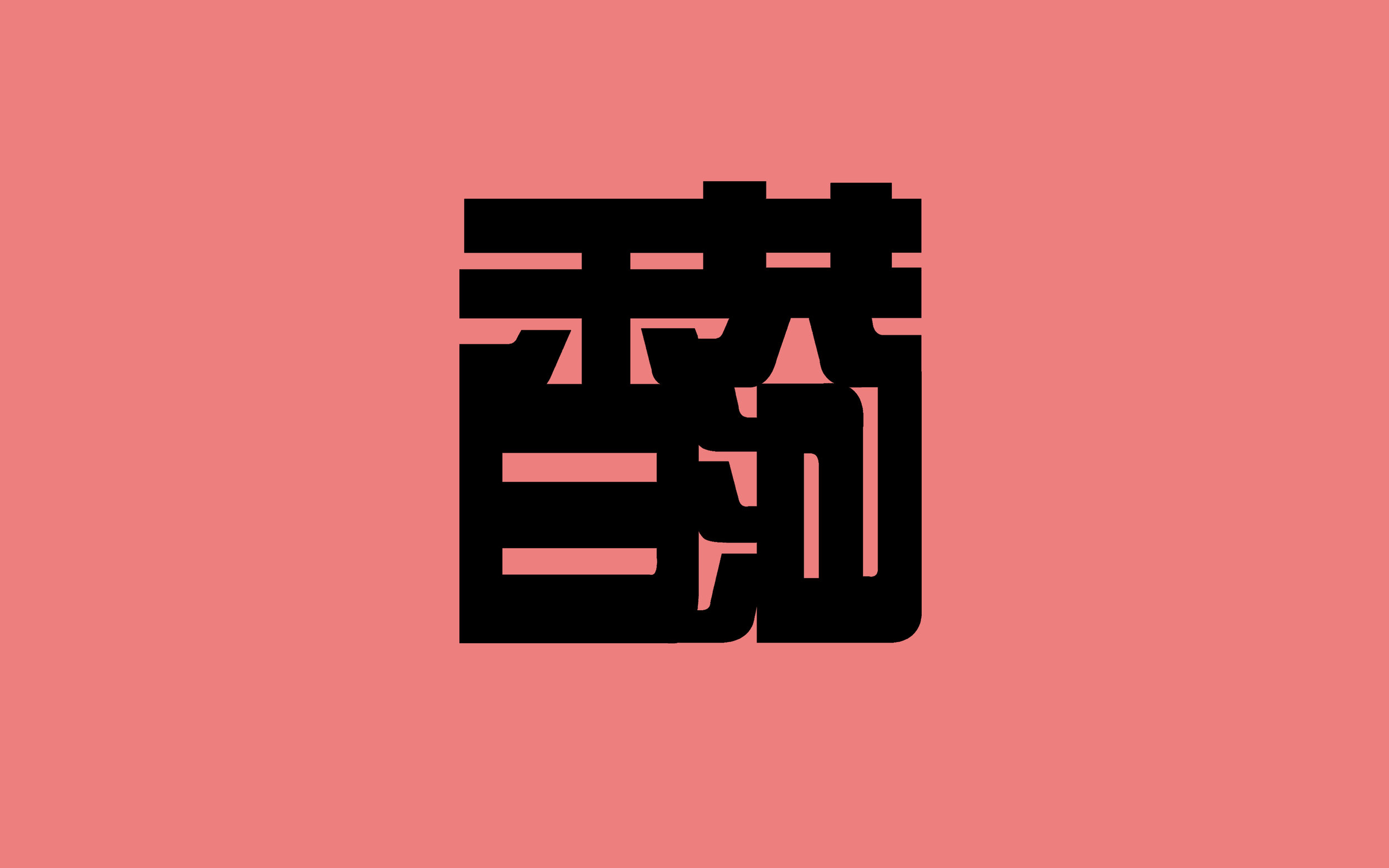
M.png

N - Nature

At the heart of Baoding, there sits a Lotus Garden, where serenity and nature can be observed. This solution uses copywriting to describe what can be seen in those gardens.

N.png

O - Shape of Window

The solution for this idea was a visual one rather than the word itself. There were various different shapes of windows that can be seen all over the historical Chinese buildings, and this octagonal window was one of many that were seen.
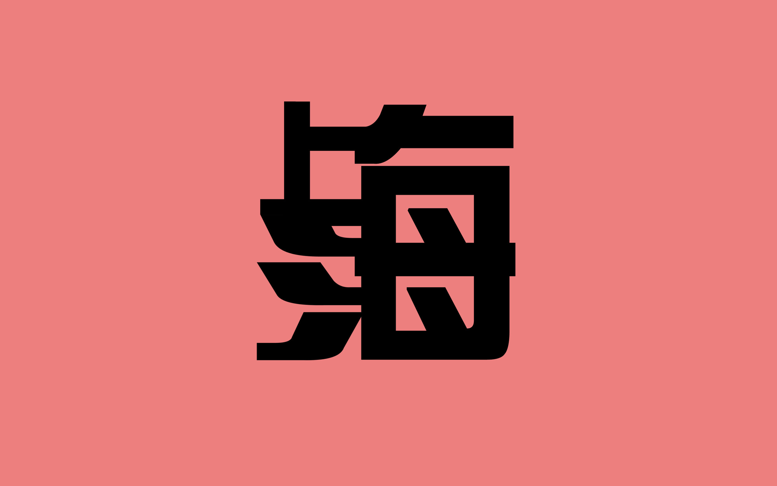
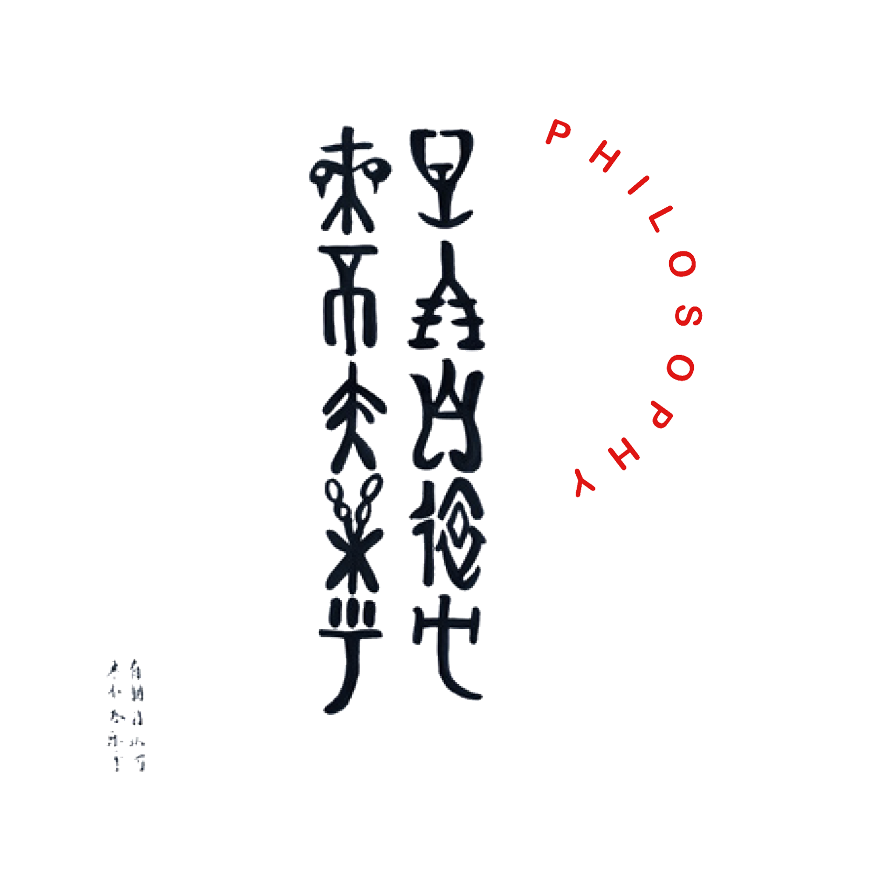
P - Philosopher

Kong Zi also known as Confucius is one of the most well known philosophers of all time. On the University campus a statue of him is placed as a symbol of knowledge. This famous saying of his means that, friends with like-mindedness come from afar and we are very happy and honoured.

P.png

Q - Qu-Yang Stone Carving

Qu-Yang Stone Carving is a form of Chinese Folk Carving art. It represents the form of stone carving that was practiced during the Han Dynasty and was also originated from Baoding.

Q.png

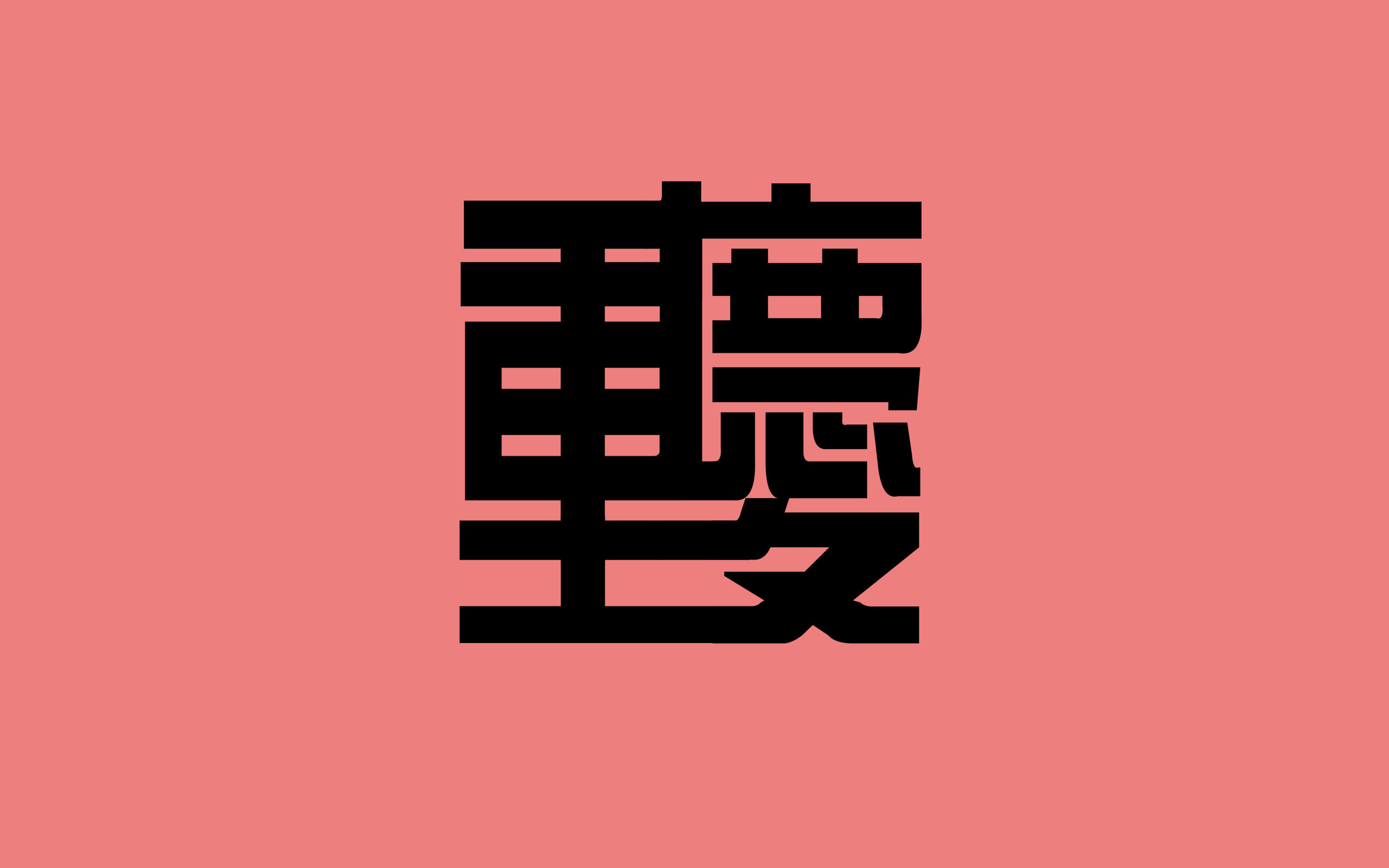
R - Reconstruct, Rebuild, Revisit

These three words best represent the Hui Garden’s in Baoding. These gardens are an accurate reconstruction of old Southern China, and help depict what life would have been like hundreds of years ago in China.
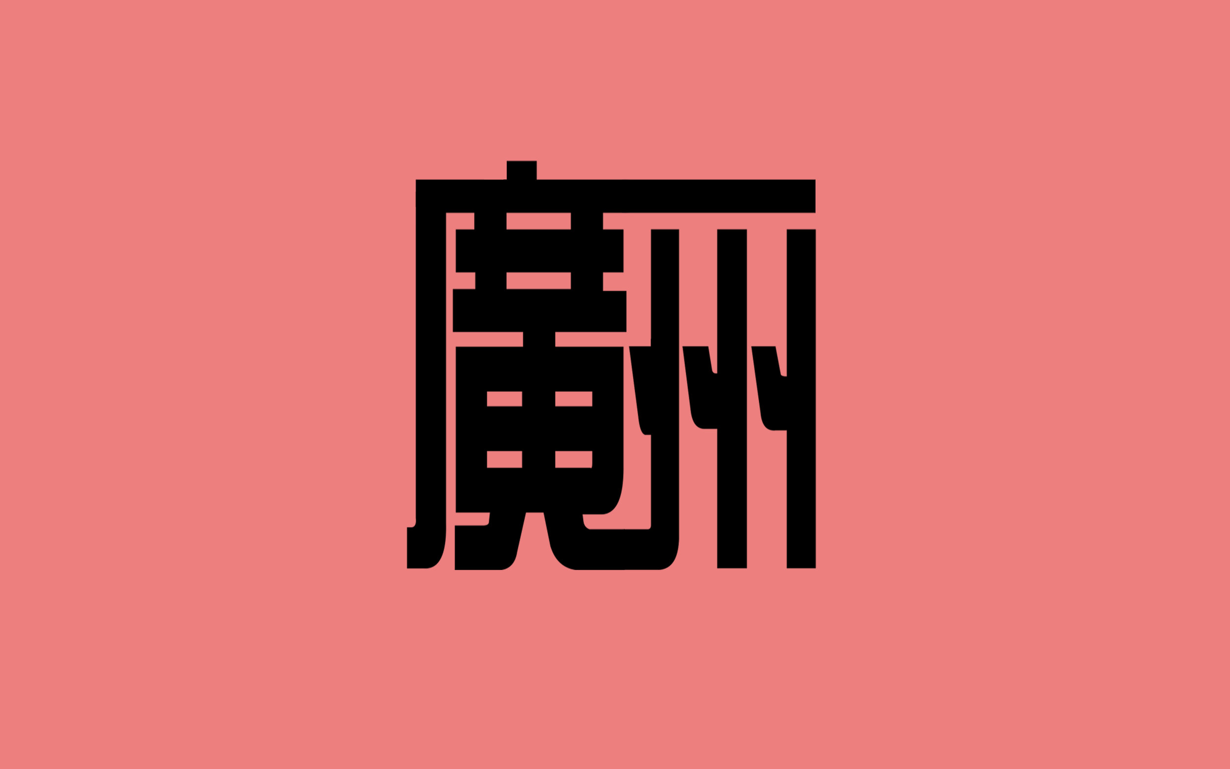
S - Soldier

The first Chinese Military school was set up in Baoding and still sits there today. Named HuangPu Military Academy, it is one of the national cultural relics protection units. The calligraphy reads out the name of the academy in Chinese, and is written downwards as was how the traditional language was like.
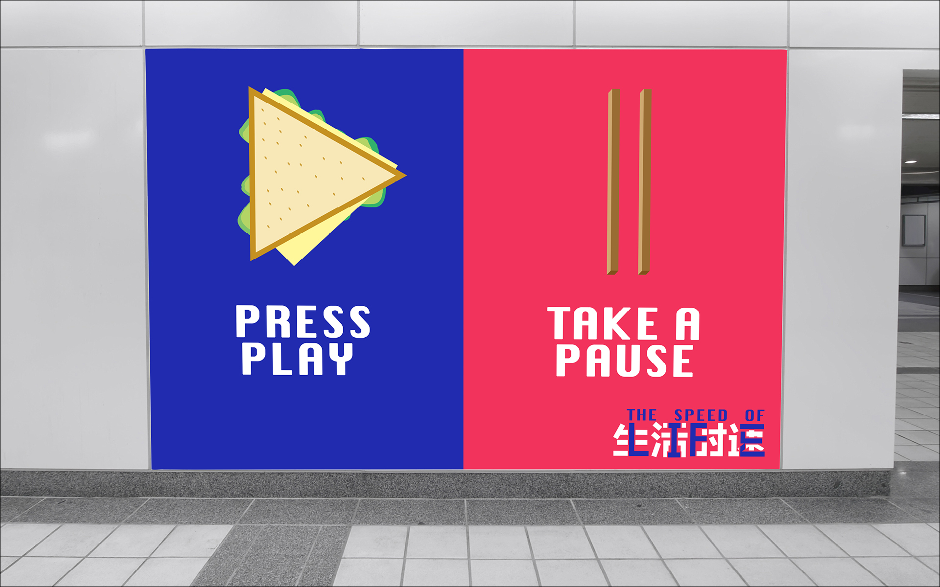
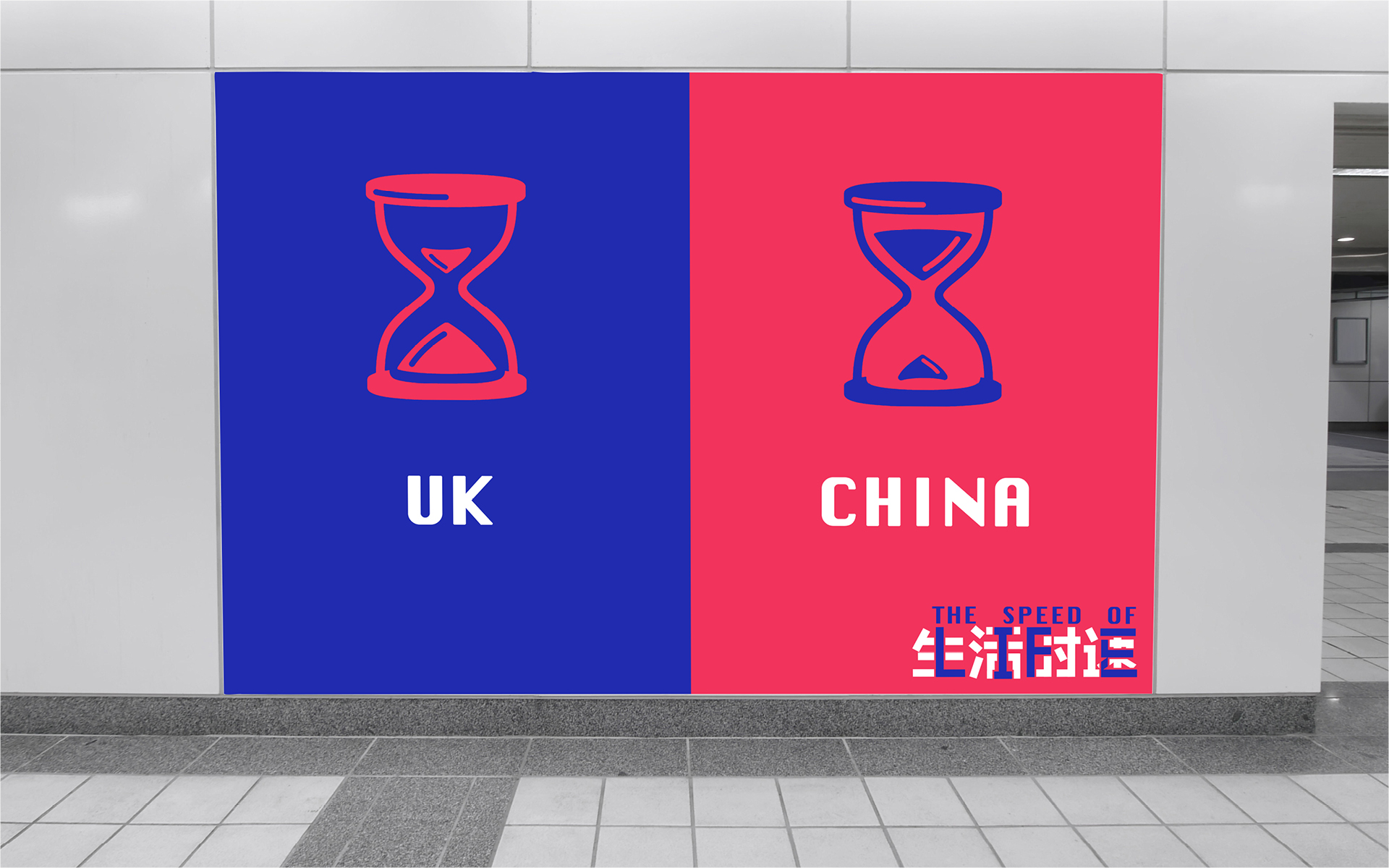
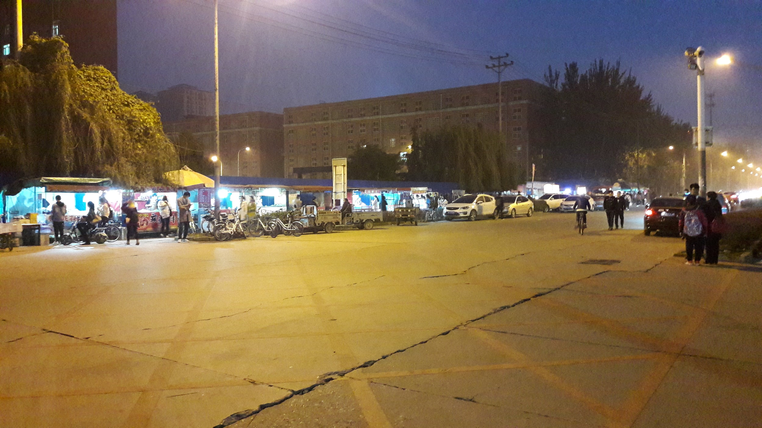
S.png

T - Traffic

All day, every day there is constant traffic in Baoding. It heavily contrasts the traffic that we have in England that may only be during rush hours. This simple response is a form of moving image thats gives a little insight to the situation of roads in China. 


Conclusion

Apart from the project, we were able to enjoy the city as well as bond with fellow Chinese students. Later we all ventured out to the capital, Beijing, where we absorbed many interesting pieces of art and visited the sites of many famous landmarks. 

PHOTOS COLLAGE.png

Overall the trip was very meaningful as we got to explore a place so far away, and so different to England. The country was beautiful in itself, but the people there made it all the more memorable.

HBU-UCLan visit

Advertising lecturer Guy Lawrence visited HBU-UCLan this week. A frequent visitor to Baoding as Quality Lead, he ensures the module output meets the high standard expected in Preston. The joint-school partnership has only been running for four years and it will take time to find our own identity, Guy is here to keep us on the right track. We are confident in becoming the creative hub within a province in a strategic location in China.

Visiting Year 2 Graphic Design studio

Visiting Year 2 Graphic Design studio

Our new building C5 is nearing completion for 2019/20, and with luck we will be there for next Academic Year. The purpose-built C5 will be an improvement over our current facilities; bigger classrooms, workshops, media and sound studios, interior design and animation space and much more. Our current A1 building is leased from the HBU Language school, we have grown from under 100 students to around 850, so it is time to move out! (Scroll photos below)

Part of Guy's visit was the promotion of courses from the School of Art, Design and Fashion at UCLan. This includes Advertising, Graphic Design and Interior Design. Students in China are afforded the opportunity to live and study at Preston and to learn creative thinking as well as UK culture. Guy has also been in the studio with Advertising and Graphic Design staff and students to ensure parity of work across our two schools.

Presentation of the Advertising course to Foundation Year students (Year 1)

Presentation of the Advertising course to Foundation Year students (Year 1)

Of course, the discussion of single malt whiskey was also high on the agenda and it's been a pleasure to have his company for a week. Our students here are looking forward to the UCLan study trip in April, which is a fantastic opportunity for Preston students to form new friendships and experience the real China. UK staff and students are always warmly received by our hosts.

We are confident in our yearly improvements at HBU-UCLan and with continuous engagement with Preston, I'm sure our partnership will bring new opportunities and benefits in the years to come.

Hello from Graphic Design Year 2

Hello from Graphic Design Year 2

HBU/UCLan - DD1101 Creative Thinking

Our Year 2 (First Years) in China are entering the mid-point of Semester 1, and we are very happy to see a strong group developing their creativity under the guidance of module tutor Syed Gowhar. Unlike the previous year we have adjusted the course to mirror Preston, with two 4 hour sessions per week. Year 2 students are sharpening their lateral thinking in a more compact way. It is crucial to get this stage right, in Semester 2 Introduction to Graphics Communication we will see the application of ideas.

20181101_111943v2.jpg

We are currently inbetween Typography and 3Dimensional (envelope brief), and as you can see from our 'Great Wall of Ideas', there are some clever execution of words. One thing to note; English is not the first language and everyone had to refer to the Merriam-Webster dictionary, and the exploration of different contexts was interesting to see. It adds another dimension to the way we teach, how do we explore ideas with a restricted set of vocabulary? True to the Preston ethos - we simplify.

The envelopes on the wall is a warm-up exercise for the 3Dimensional brief where the students are asked to convey love through an envelope. The results were creative paper folds, pulley mechanisms and cute pop-ups. They are currently working on their personality/organisation/museums. We are expecting to see a similar range of executions. However, we will utilise their impressive crafting skills after they have strengthened their core concept.

We are very excited for this group, and it's important that we improve on each year and bring HBU-UCLan to the level of Preston.

So far, so good!

Half Rice / Half Chips continued

Here we feature the other projects completed during the China study trip to HBU-UCLan. The projects were a creative response to Half Rice / Half Chips, with four groups of students creating a response to the similarities and differences between the cultures of the UK and China. Continuing from the previous article, there were two animations and an educational app also prototyped.

Group 1

Group 3

Group 4

Half Rice / Half Chips

Capture.PNG

A HBU-UCLan project.

Last week 16 UCLan students from Animation, Advertising, Graphic Design and Interior Design headed over to China to visit our joint school HBU-UCLan.

This joint project has been running during the years of our partnership, yielding some fascinating creative outcomes to varying briefs. UCLan's 16 students were paired up with nearly 100 of their Chinese peers, and divided up into four separate groups.

The brief was simply titled Half Rice / Half Chips. Creatively open, it required the four groups of students to create a response to the similarities and differences between the cultures of the UK and China. The soul requirement of the brief was to produce a digital presentation, the content of which could be absolutely anything.

After initial meet and greets on the Monday morning, the students set about discussing the many themes that could be explored, but most importantly talking to each other and working out the gaps between their perceived views, and the actual realities of our two cultures. With five days to go from start to finish, there was a requirement to get going, but also a need to figure out what was actually going to happen. The ideas were cemented in place by the Wednesday morning, after which production mode was engaged!

IMG_8828.JPG
IMG_8711.JPG

Group 2 (pictured above) were fascinated by the difference in pace of the UK versus China. In China, if something needs doing, it gets done. If something needs building, it'll be built next the time you look. China has the bullet train, the UK has Transpennine Express. On a deeper level, the Chinese students told of their lives growing up. School started before most people have woken up, often not getting home until 10.30pm at night. Each and every hour is precious and the maximum is gleaned from the resource that is time.

THE IDEA

Group 2 married the concept of the pace of life and named their project The Speed of Life. Working together creatively, the Chinese students were able to translate The Speed of Life into four Chinese characters.

the speed of life, in chinese

the speed of life, in chinese

The UK students then saw an opportunity to merge the Chinese characters with the Roman alphabet.

the speed of life, in english

the speed of life, in english

Before fusing the two pieces of typography together to create one identity.

In China, Piano Tiles has become a super popular game for smartphones. The game was shown to us by Ruby (advertising); as it is played the game gets quicker and quicker - thus harder and harder. It formed a neat metaphor for communicating the pace of life.

With the game in place as inspiration, MA animator extraordinaire Rosie took on the task of creating a demo of The Speed of Life game. In essence, the concept had a UK version of the game which was at a pace you could cope with, and had infinite lives to complete. The Chinese juxtapostion being much more intense, and also the lives tick away as it gets harder and harder.

The students also created advertising concepts, tackling the contrast in pace and cultures, chop sticks juxtaposed with a cucumber sandwich for example. The identity was also applied to various mockups.

This was just one of four projects completed during the week. We will post the others here when we can as some beautiful, witty and thought-provoking work was created.

Big thanks to Guy and Steve for organising a great trip, and our man in China, Nathan, for taking us round.  

The curious case of QR codes

Remember when QR codes tried to be a thing in England? I think the main reasons they never took off was because they required you to have your own scanning app and just didn't seem to scan quick enough. It was far more easy to just use Google.

Now ask yourself, how many times have you ever scanned a QR code? A few? A lot? I’m guessing the answer for a lot of people will be a big fat zero. If this is the case you can change that right here, right now. Scan the image below, and it'll take you to a mobile version...of my blog. How meta.

code.png

I certainly can’t remember ever scanning a single QR code. I always thought they were useless and a bit of a gimmick. Not anymore.

In China, QR codes are everywhere. They’ve moved away from being a joke and are an integral part of everyday life. Major retailers, street markets, restaurants, transport services, even beggars, and buskers. They all have and use QR codes. You can use these codes as ID badges. You can connect to Wi-Fi hotspots with them. You can use them to send parcels, reply to job adverts, you can even have them as tattoos.

The main reason why QR codes are so popular in China is down to an app called WeChat. It’s a multi-purpose app that has nearly 1 billion daily users and has been described as China’s “app for everything”. One of WeChat’s main features is WeChat pay. It’s basically the same thing as contactless or Apple payment. And because WeChat has a built-in QR scanner, it makes paying for things effortless. You take your items to the till, scan the code, type in what everything costs, show the receipt to the cashier and away you go. 

Because QR codes are used so much, they work so much better than what I remember. They’re quicker, more accurate and don’t require you to stand directly in front of one for it to work. I once saw someone scan a code from about 5 feet away.

The Chinese have also managed to implement QR codes into their advertising. I’ve seen QR codes on leaflets, press ads, billboards, TV commercials, even 20-foot ones on the sides of buildings. The codes on the adverts work the same way as they do anywhere else. Scan it and get taken to a web page. I’m yet to find any that have done something a bit more creative, but I’m definitely going to keep looking. Can you imagine seeing a QR code appear on an ad in the UK now? There’d probably be a social media frenzy with people ripping it apart and saying things like ‘creativity is going backward.’ 

I don't think QR codes will ever be as important as they are in China, but it’s nice to know that if they did make a comeback, they might have a bit more use.

This post also appears on Nathan Harper's blog.

HBU/UCLan

Hebei University in Baoding, China are running the same modules as UCLan across Graphic Design, Advertising, Animation, Interior Design and Film and Media. I’ve been a visiting lecturer for two months delivering Contextual Studies and Graphic Design. This is an exciting year because they will produce the first batch of graduates from the partnership. The Year 4 (3rd years) students are on course with their Honours Project, the Year 3 (2nd years) are showing potential with their branding exercise and Year 2 (1st years) are developing lateral thinking. (Click above image to scroll for more)

HBU-UCLan School of Media, Communication and Creative Industries located in A1 building on far left of the six blocks.

HBU-UCLan School of Media, Communication and Creative Industries located in A1 building on far left of the six blocks.

Their cultural input excites me, they are producing ideas of Chinese origin with Western influence. Not surprisingly they can struggle with Typography, but considering there are over 50,000 Chinese characters, our 26 letters are almost dull in comparison. You will find many Chinese design dominated by a single character (a meaning), either incorporating an idea or assembled with other characters to evolve the meaning (like creating a new letter by combination - see below, Honours Project by Ellis, a final Year Graphics student). That is their equivalent of Smile In The Mind wit. I had my preconceived view of what a ‘good idea’ is but that’s based on domestic influence, it’s made clear that universally, a ‘good idea’ must also consider the cultural and societal influence.

There are recurring themes in their conceptual work across all courses. We have to be conscious of the materials they have access to. China exists in an information bubble, what we take for granted are not accessible (Google, Wikipedia, Twitter etc). The population derive information from limited sources and without the freedom we enjoy, they are unfairly portrayed as unimaginative. I was fortunate to work with two brilliant Graphic Design lecturers from Beijing, they enhanced their creative thinking by studying abroad. It’s easy to be dismissive of weak ideas drawn from limitation, but the challenge to think within the limitation can breed creativity. If we collaborate by recognising their challenge and by applying our knowledge, maybe something will blossom.

The Chinese market is vast, the demand for creativity will only increase. However, it isn’t a case of transplanting our methodology over theirs. The future is convergence because we can’t have a conversation in our tone, we have to use a tone their population would understand. I believe a holistic approach can bridge our creative differences, but it will demand patience and a lot of effort. This is why I wholly support the partnership between both Universities, in time we will see the best of both worlds. (Click above image to scroll for more)
 

Irene, Year 3 - Toy store branding solution first draft

Irene, Year 3 - Toy store branding solution first draft

Jim, Year 3 - Branding typeface draft

Jim, Year 3 - Branding typeface draft

Year 3 Branding by Polly, Steven and Alysha (Spot the word Iris).

Year 3 Branding by Polly, Steven and Alysha (Spot the word Iris).