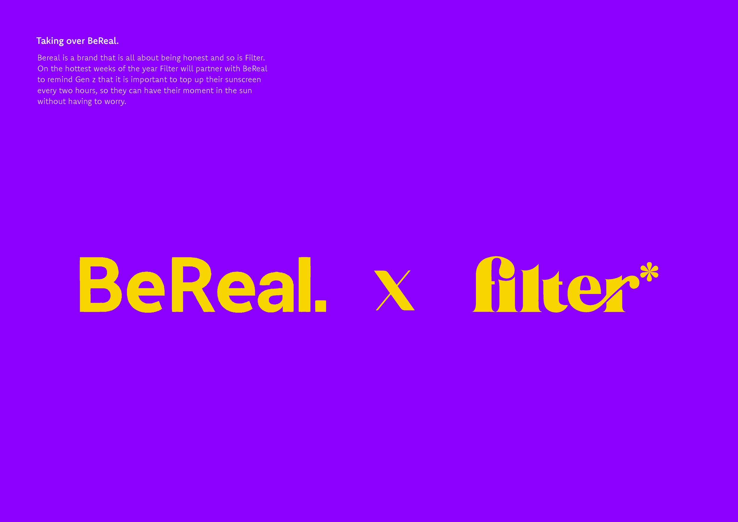
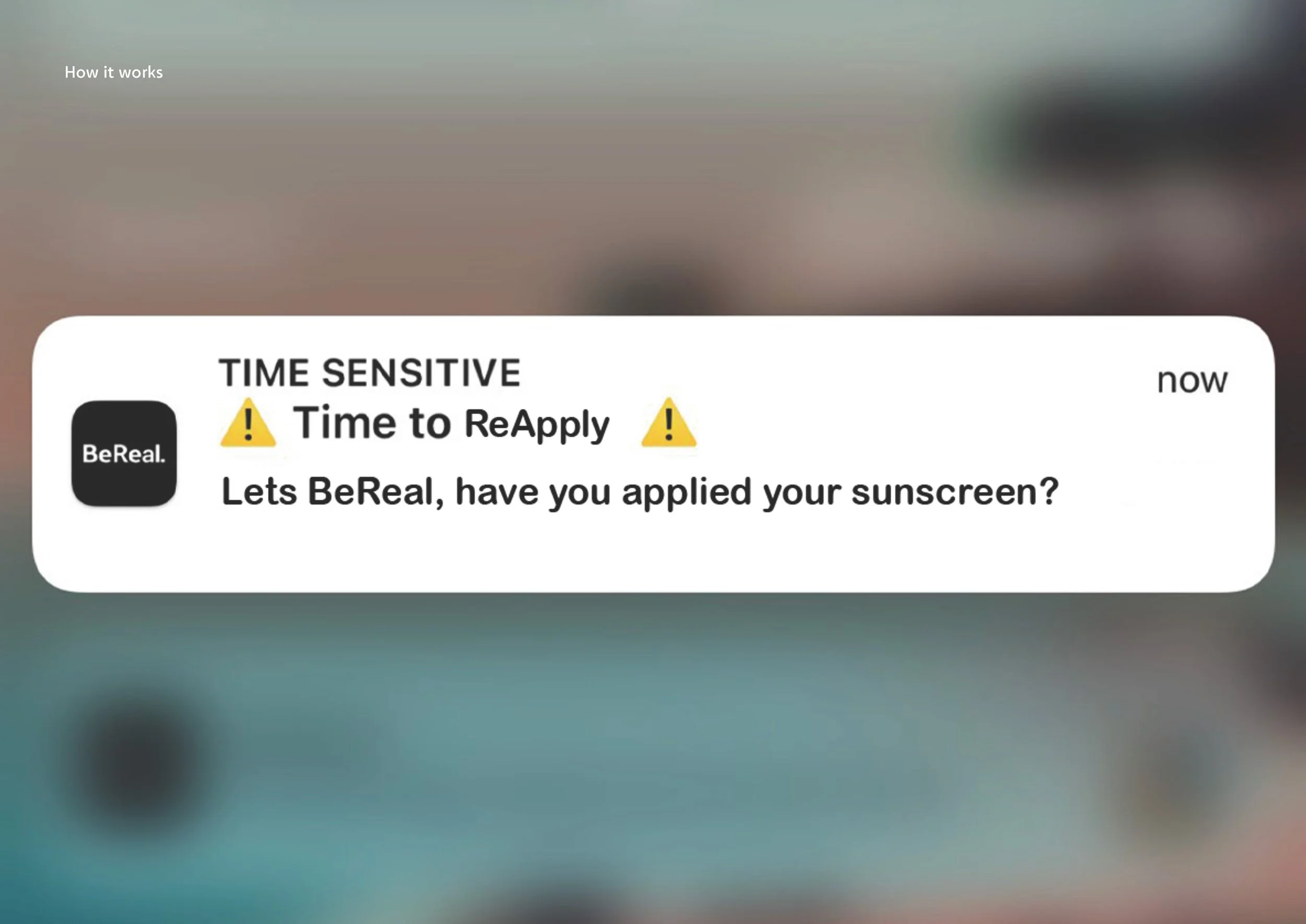
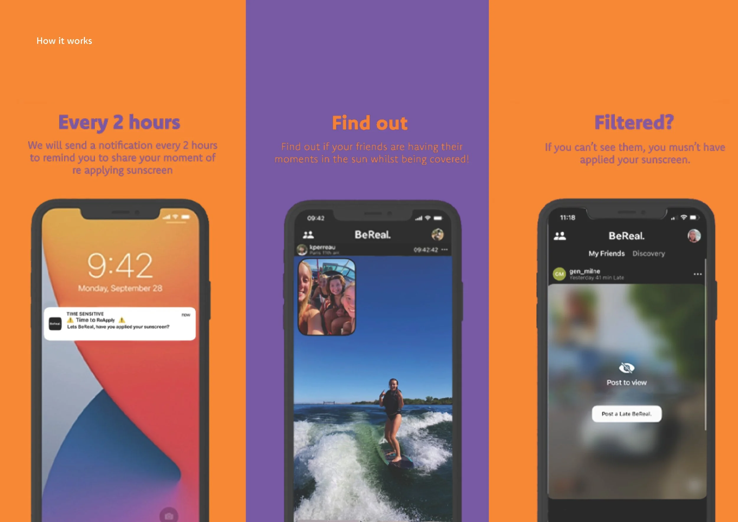
filter*
/A branding and packaging project created by Sophie Robinson, in response to a brief written by LOVE to create a new sun care range targeted at Gen Z.
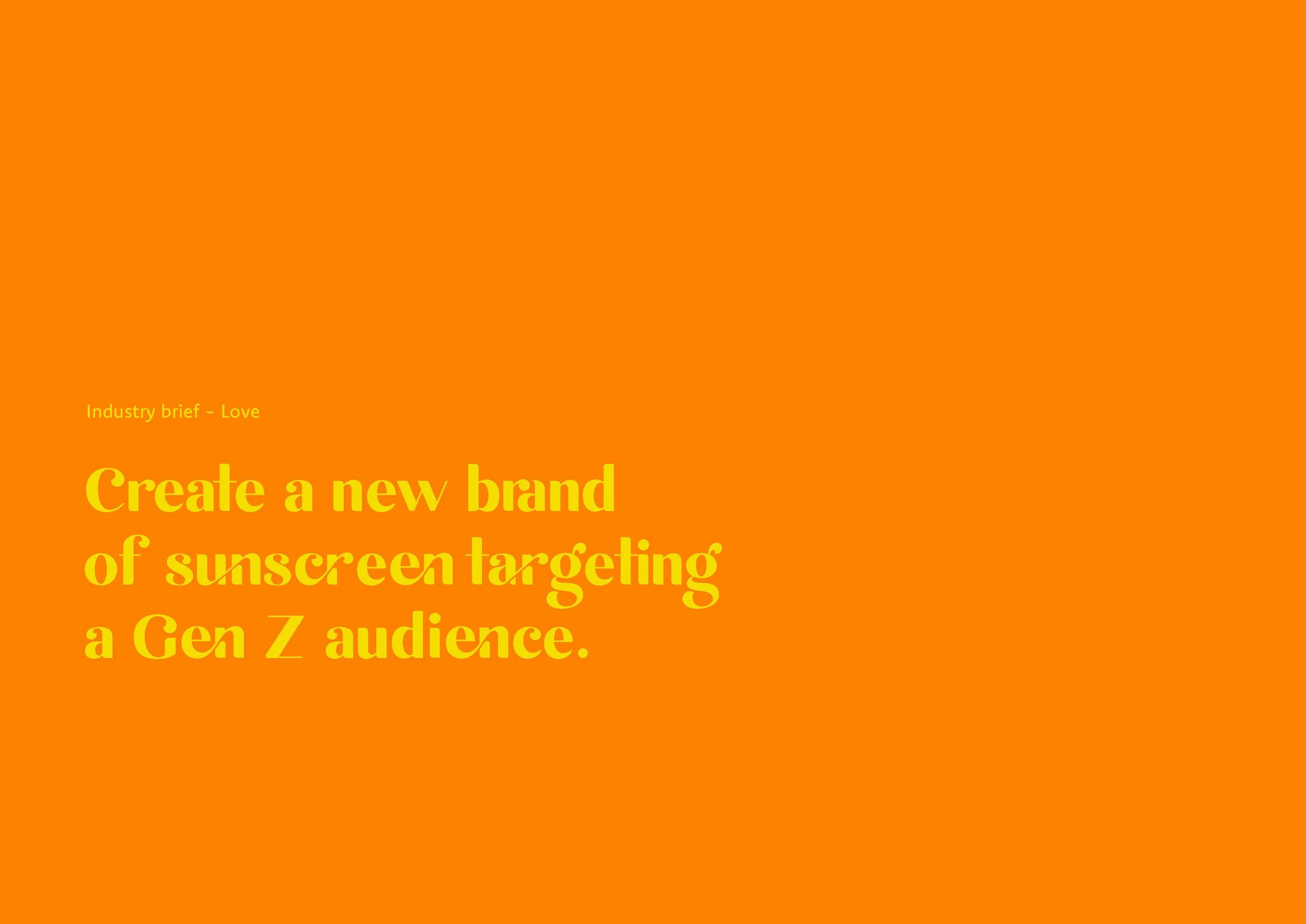
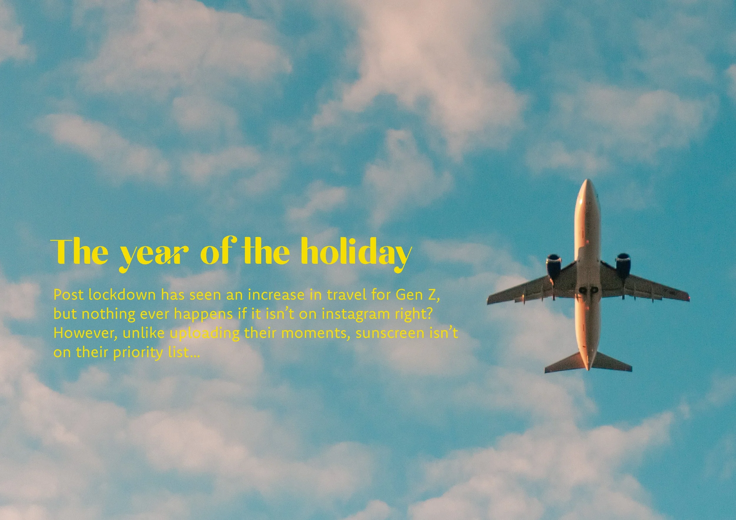
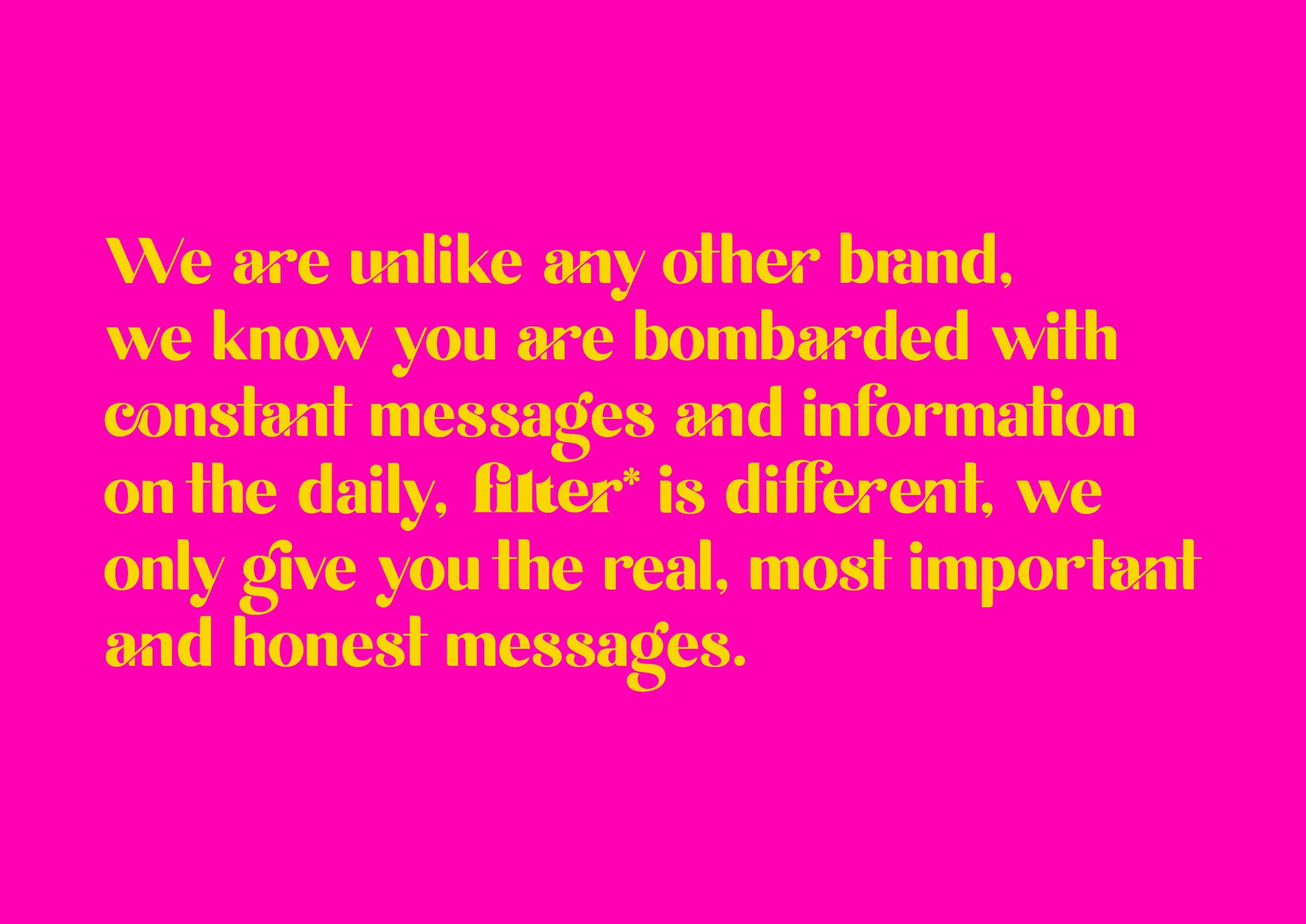
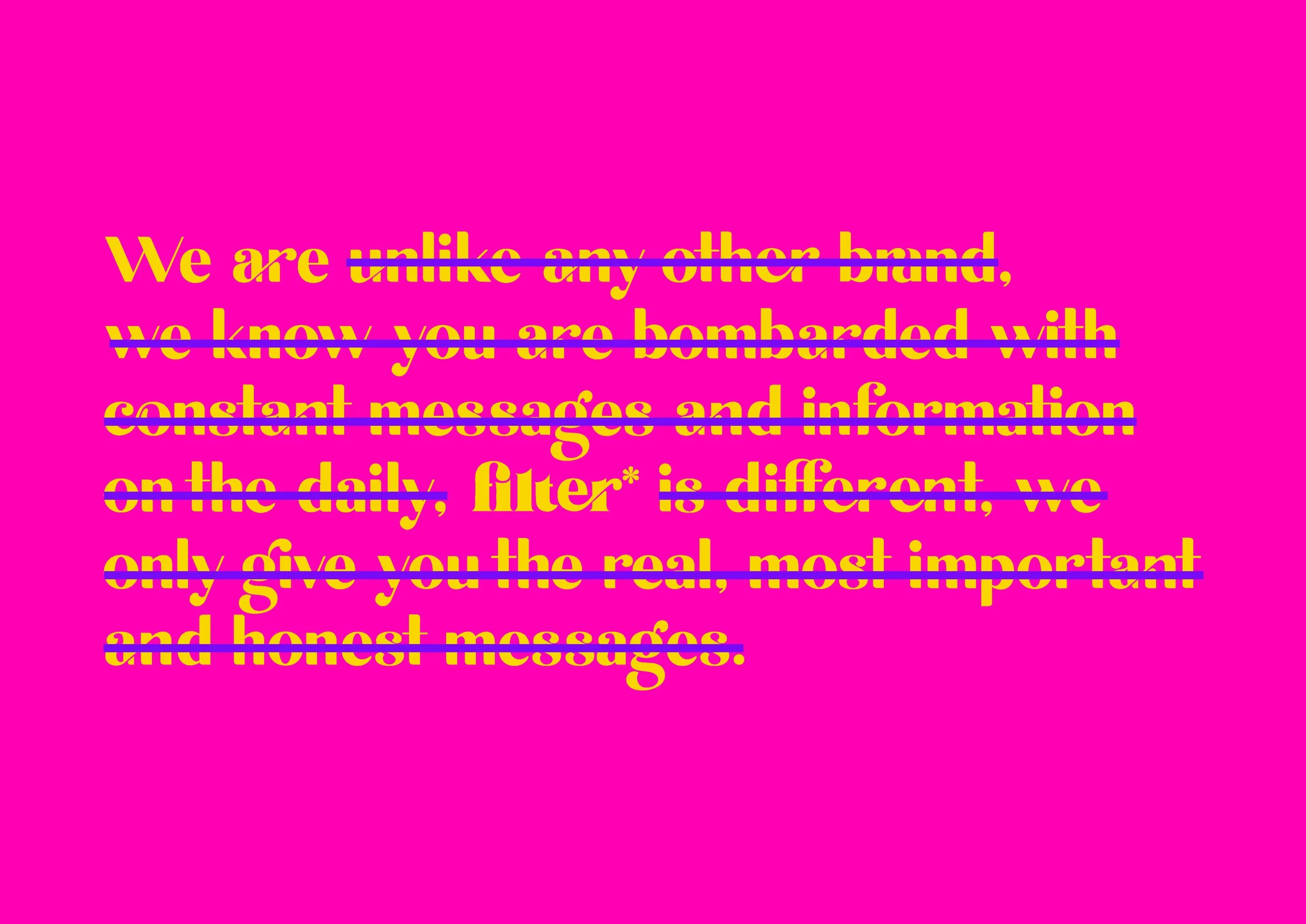
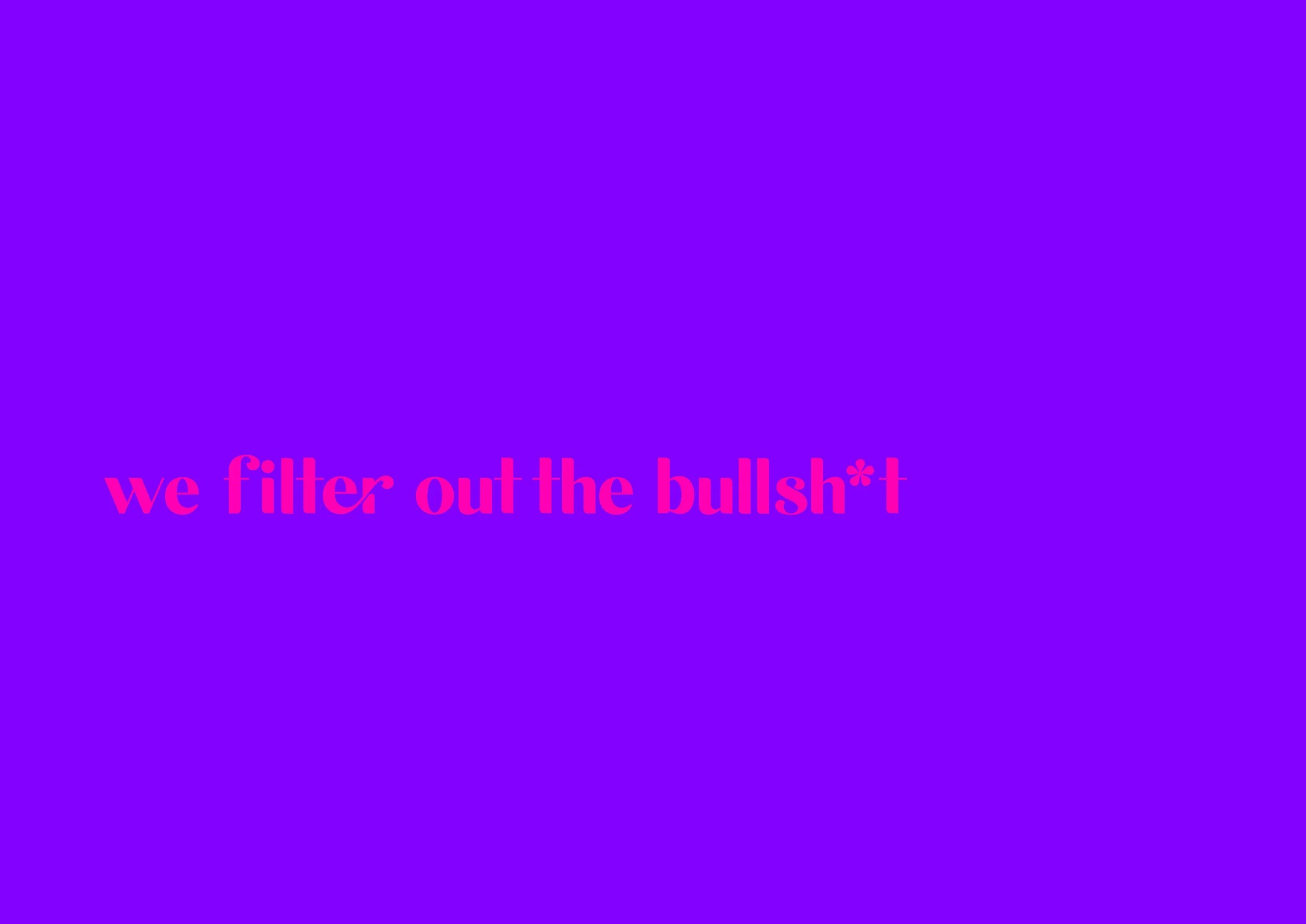
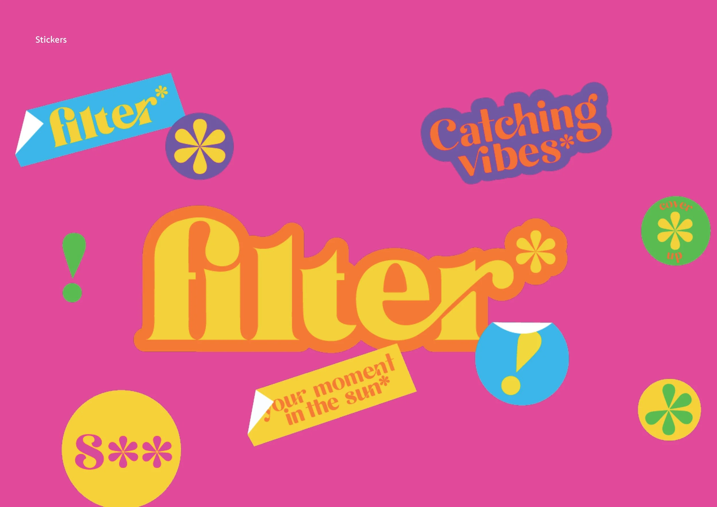
A branding and packaging project created by Sophie Robinson, in response to a brief written by LOVE to create a new sun care range targeted at Gen Z.
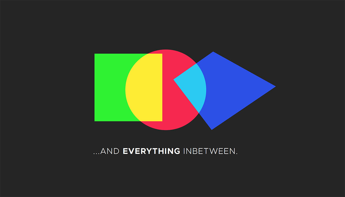
Here we feature a solution to the recent industry brief set by Ric Bixter of The Chase Manchester


Colour & Type toolkit


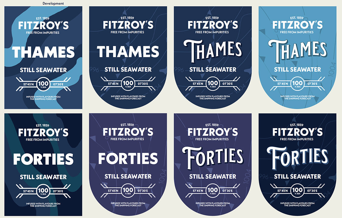
Development
Please click on the image above to play the film

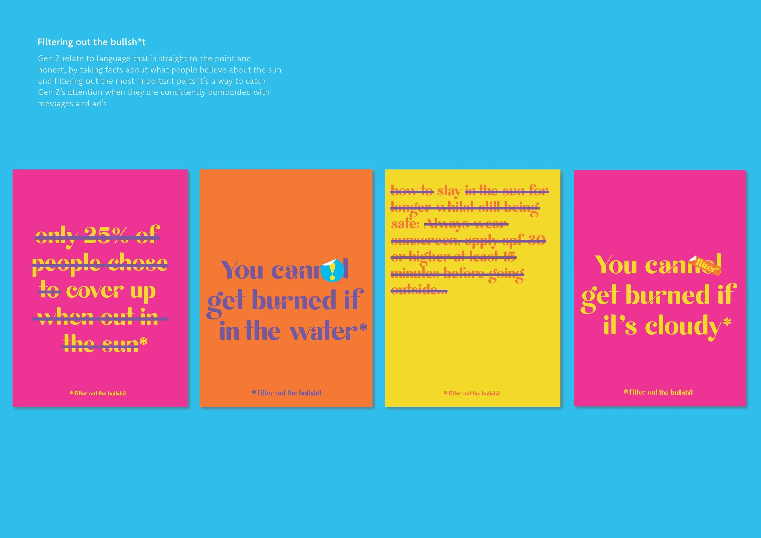
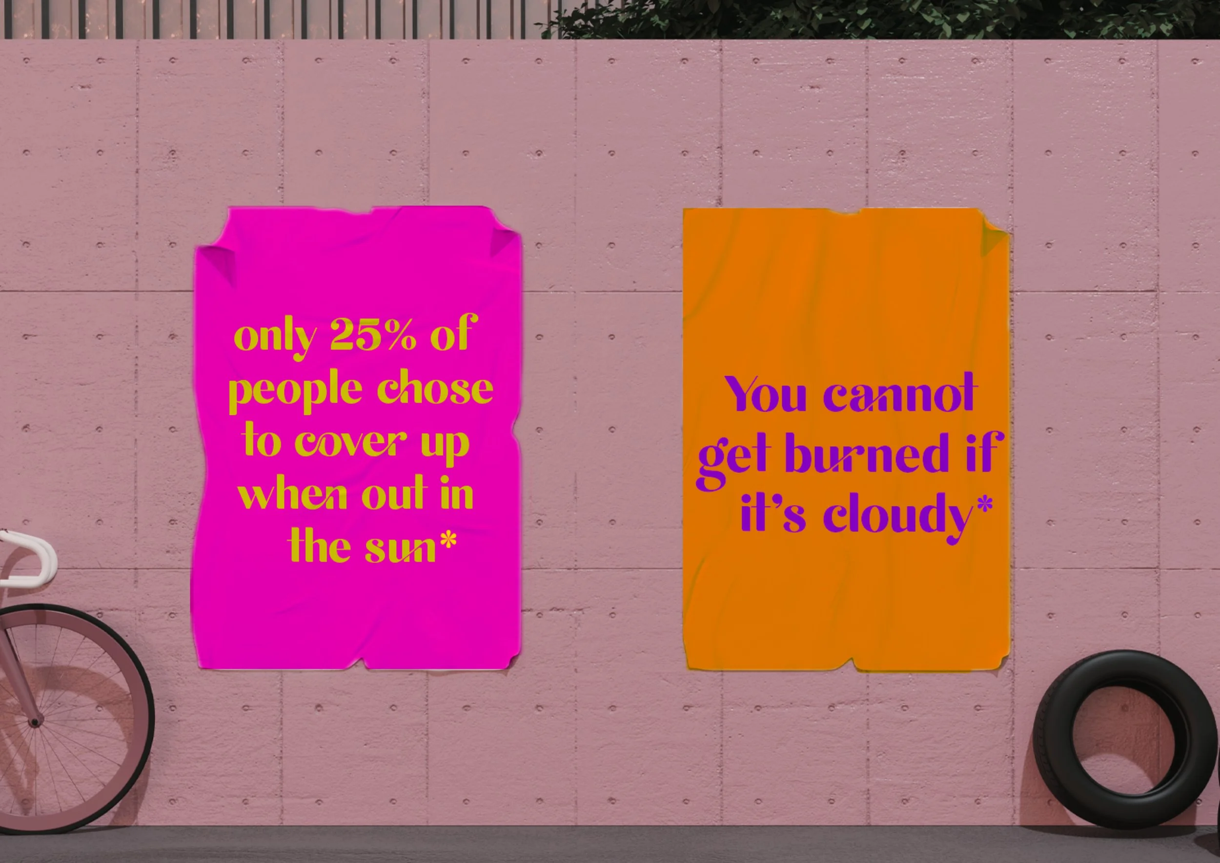
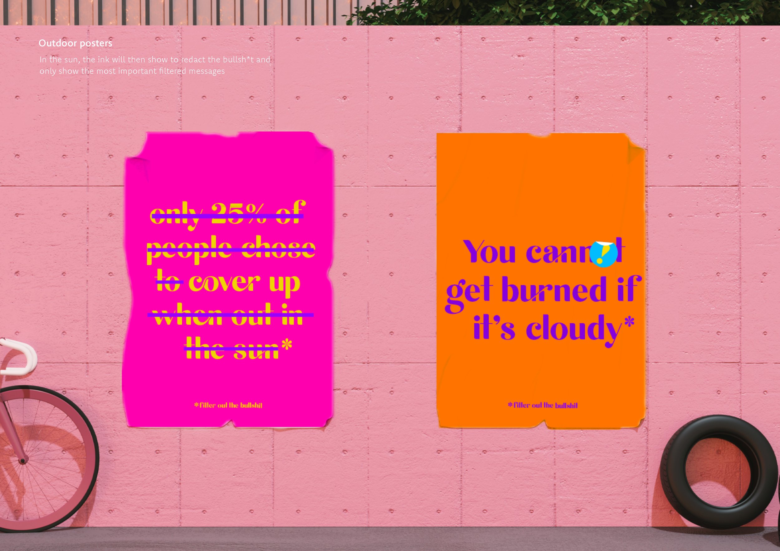
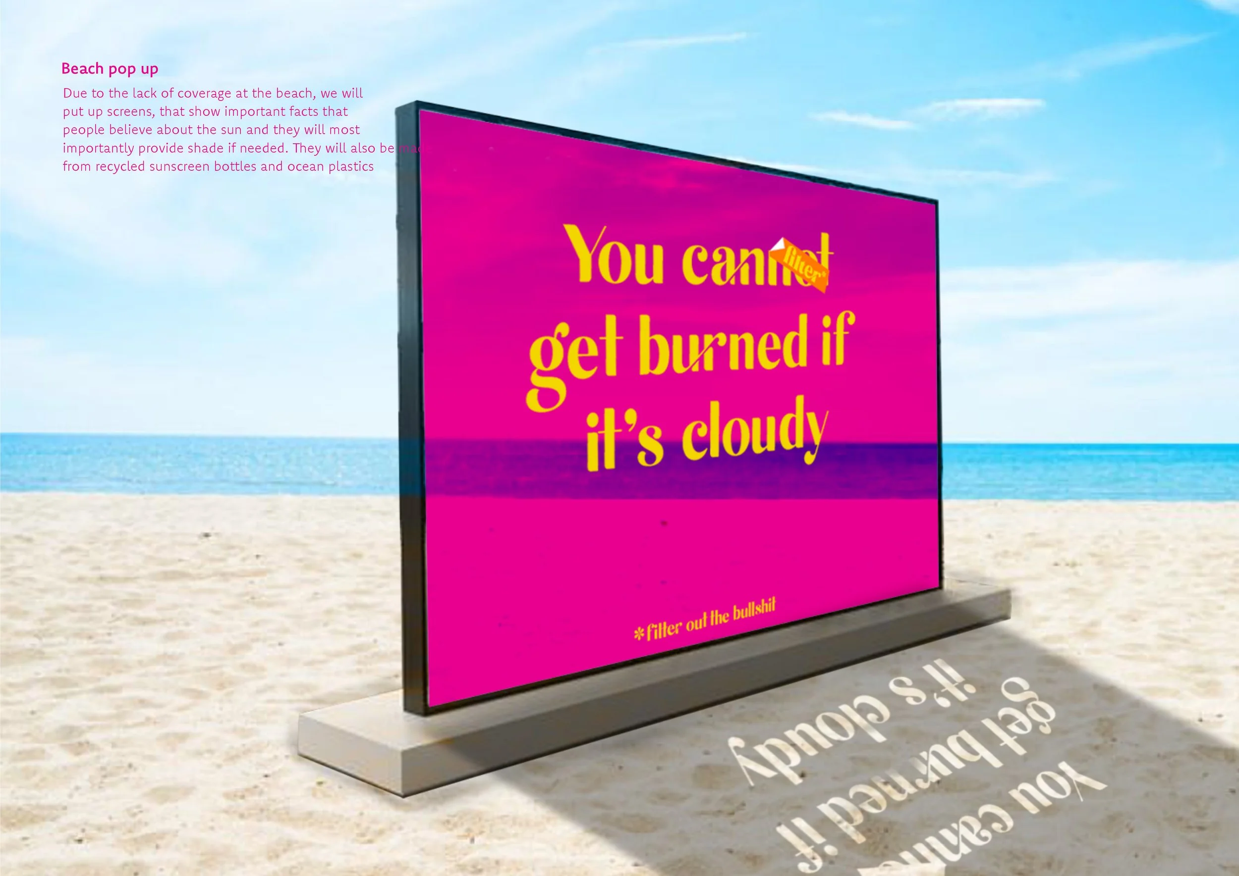
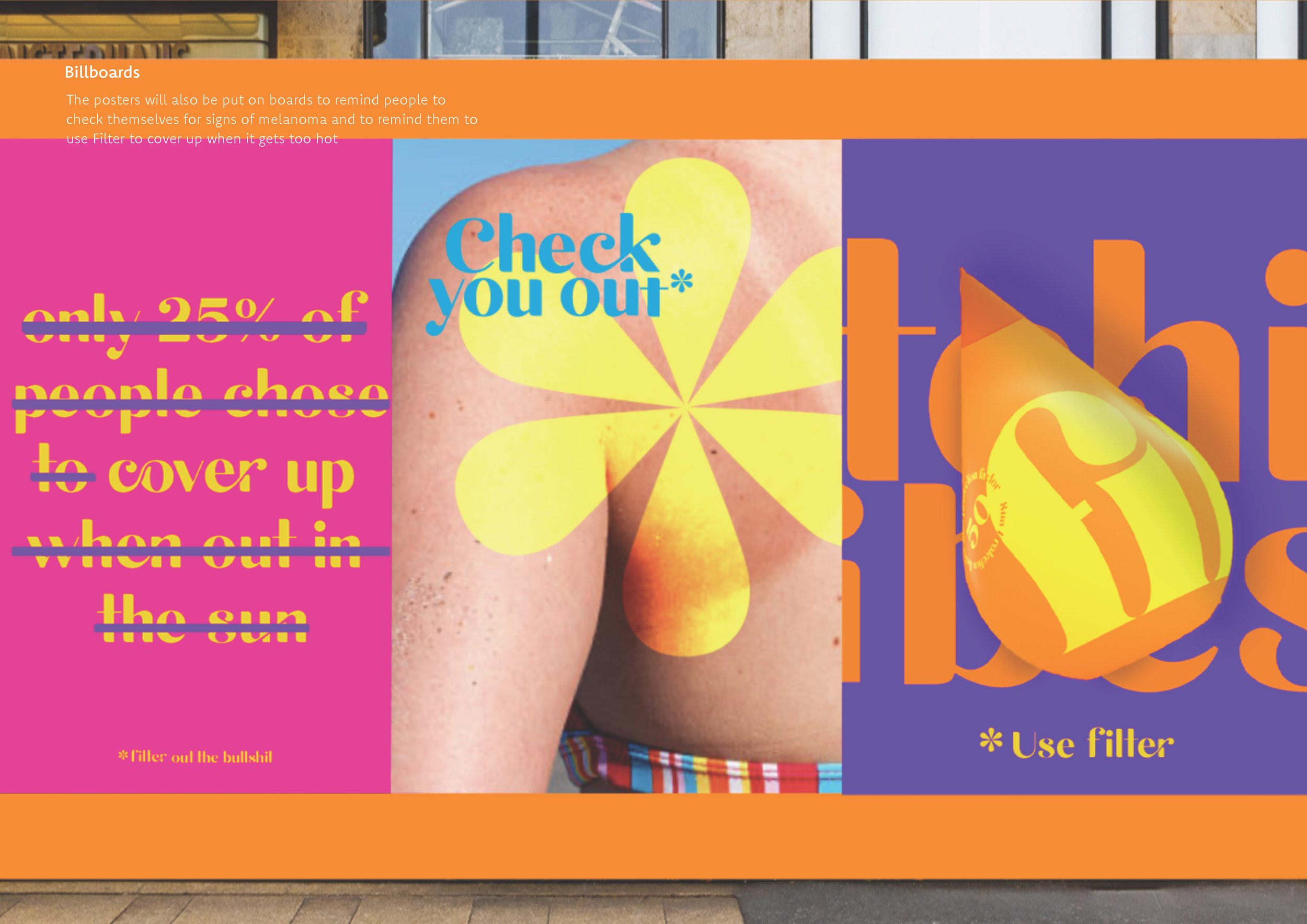
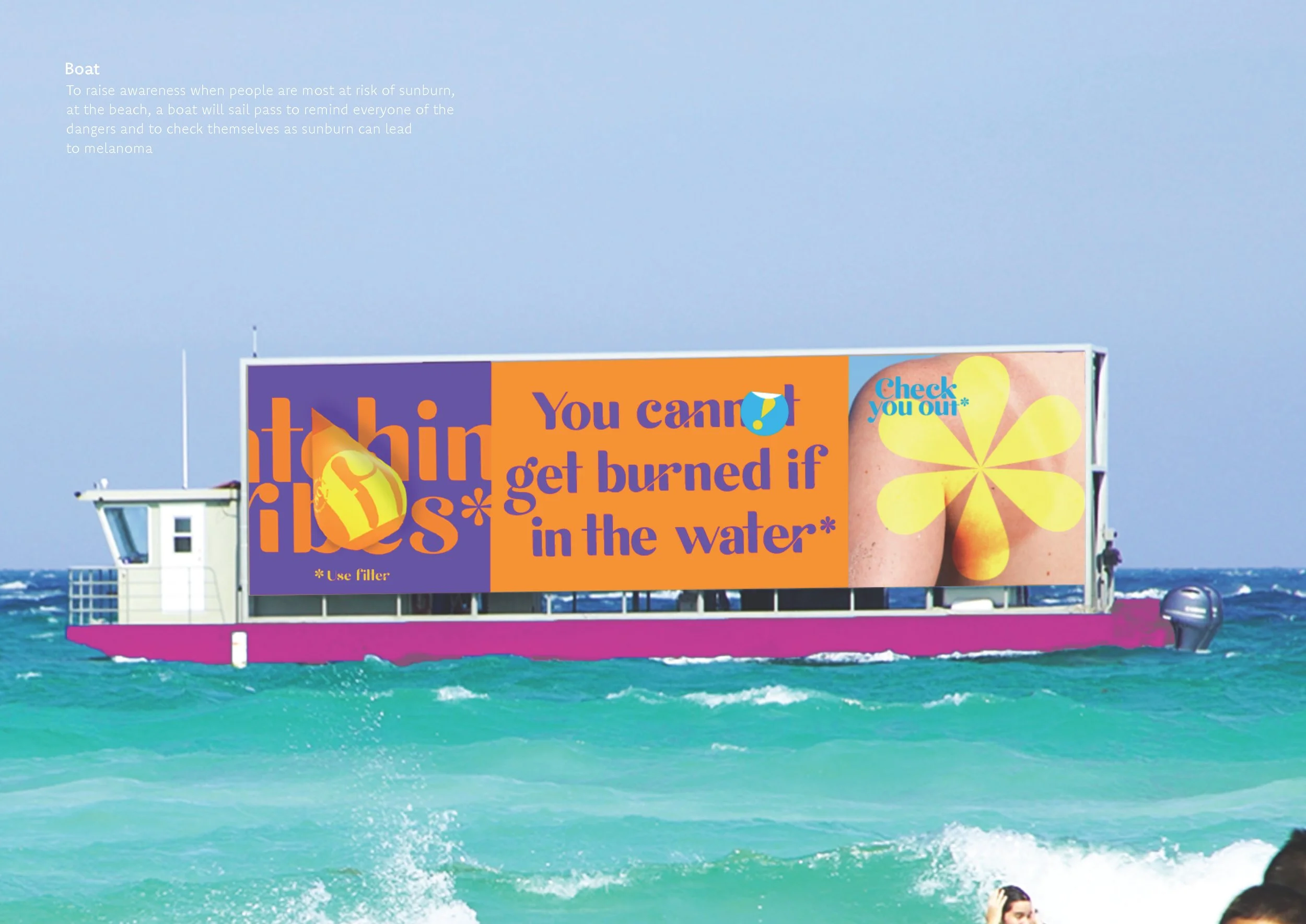
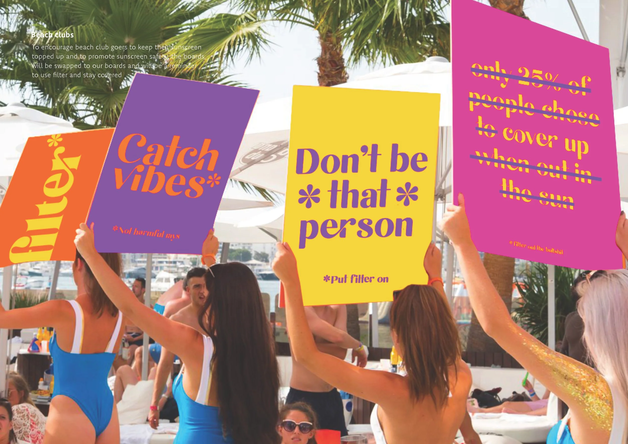
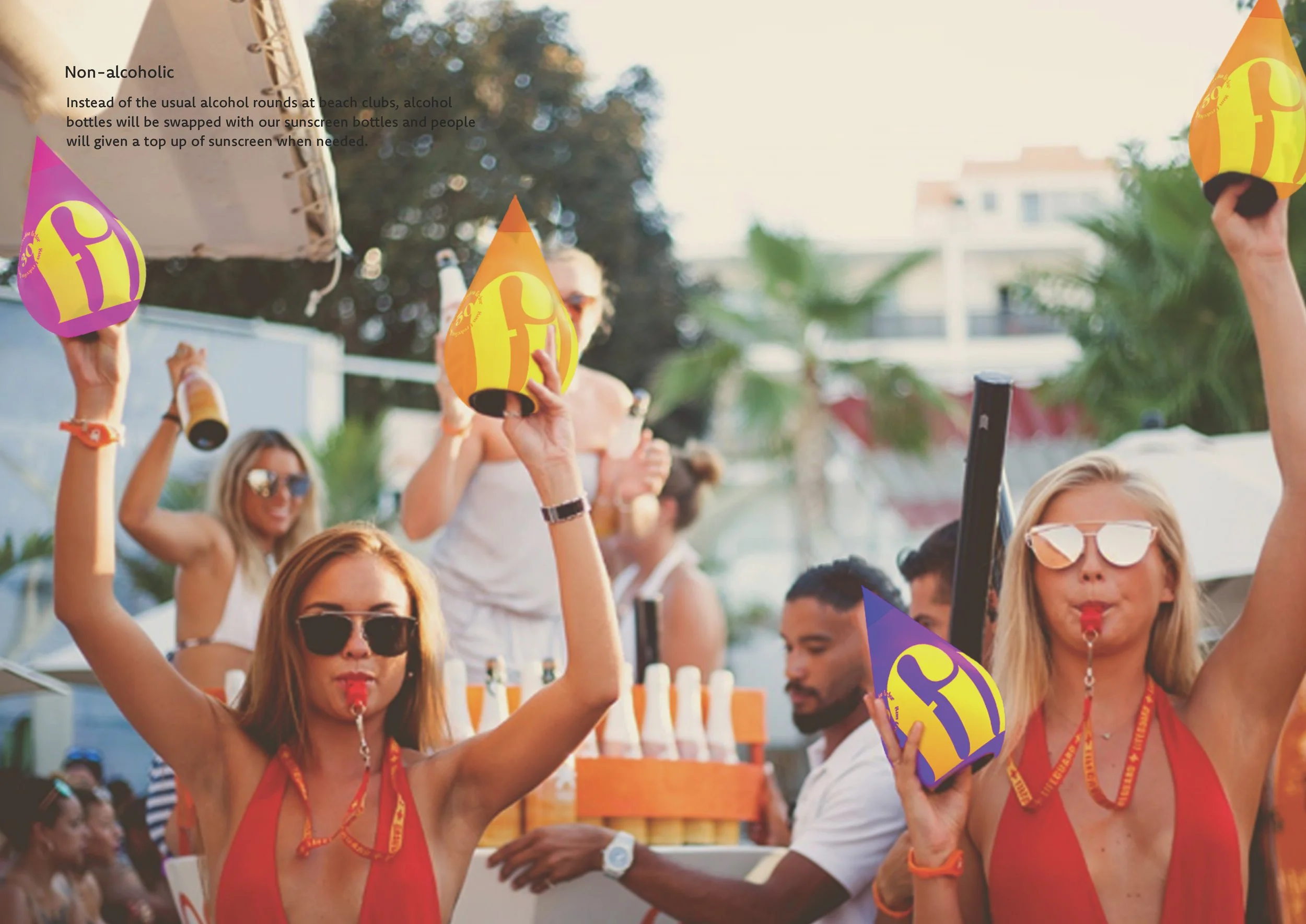
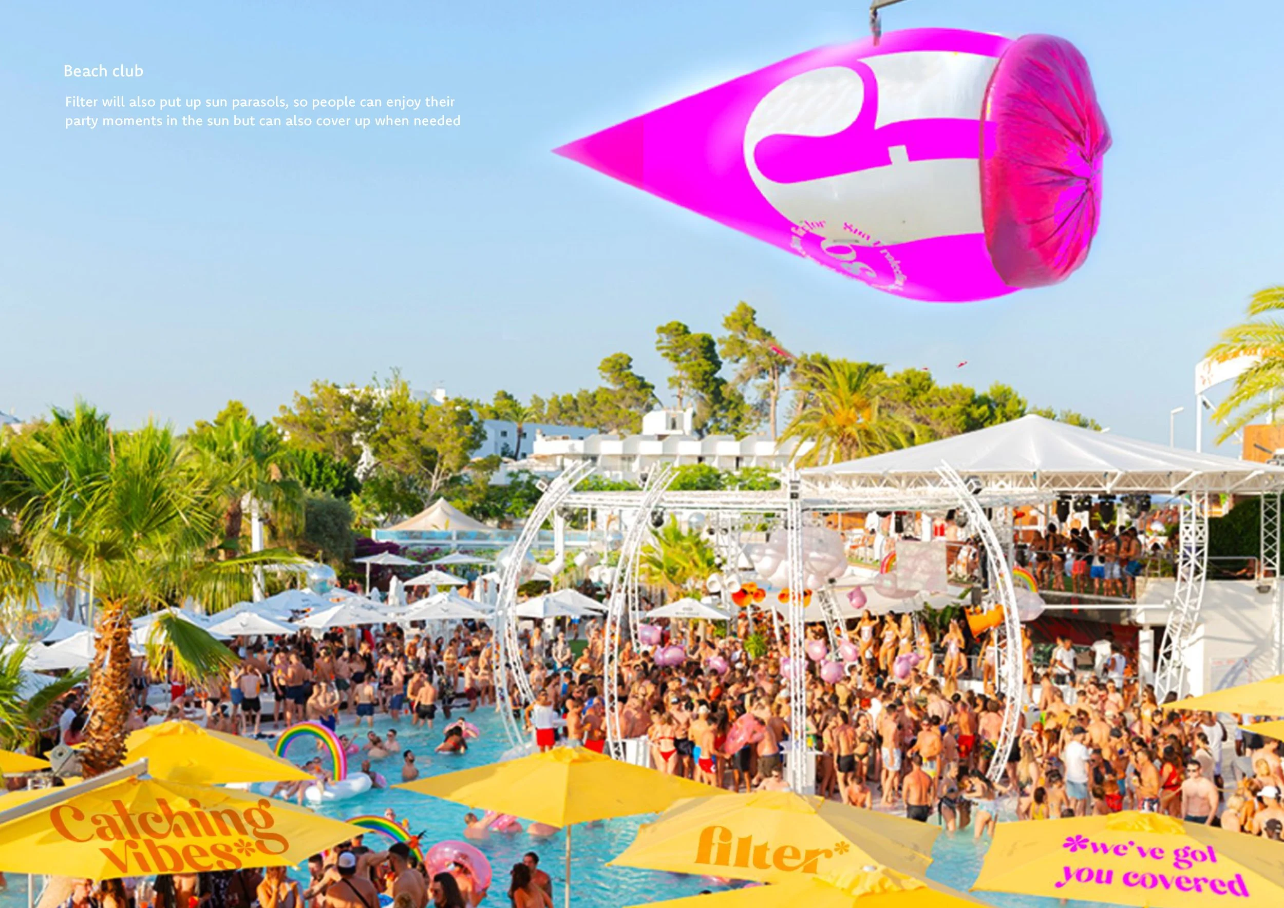
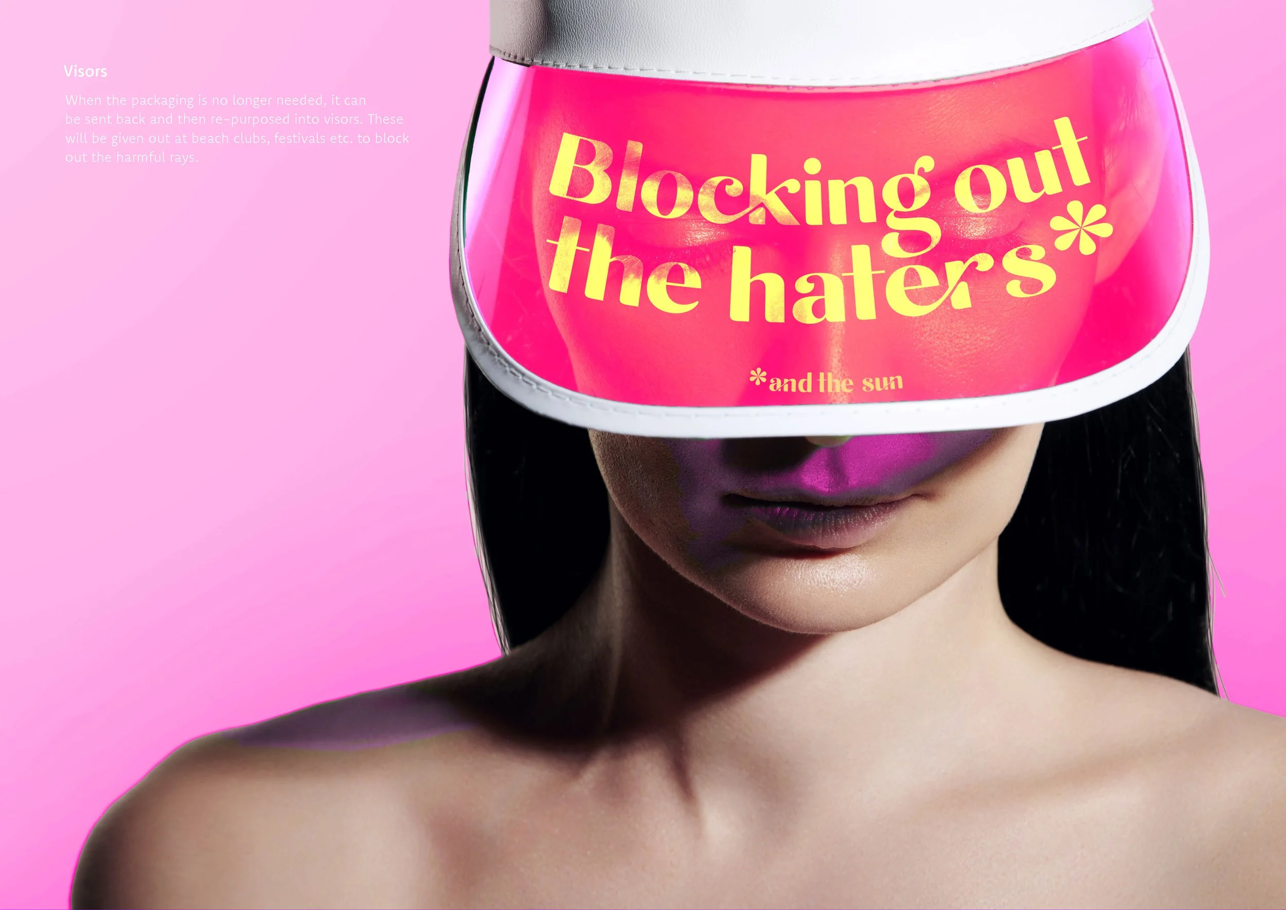
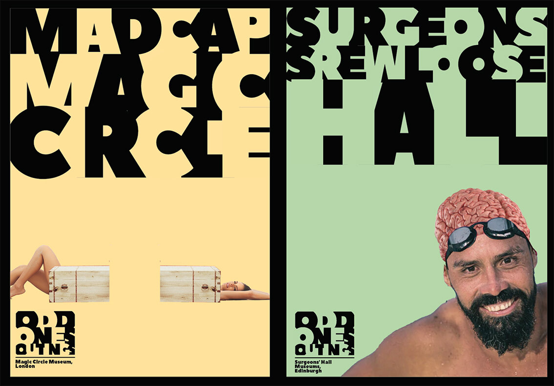
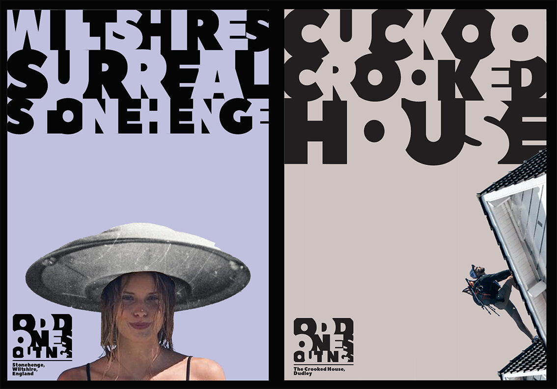
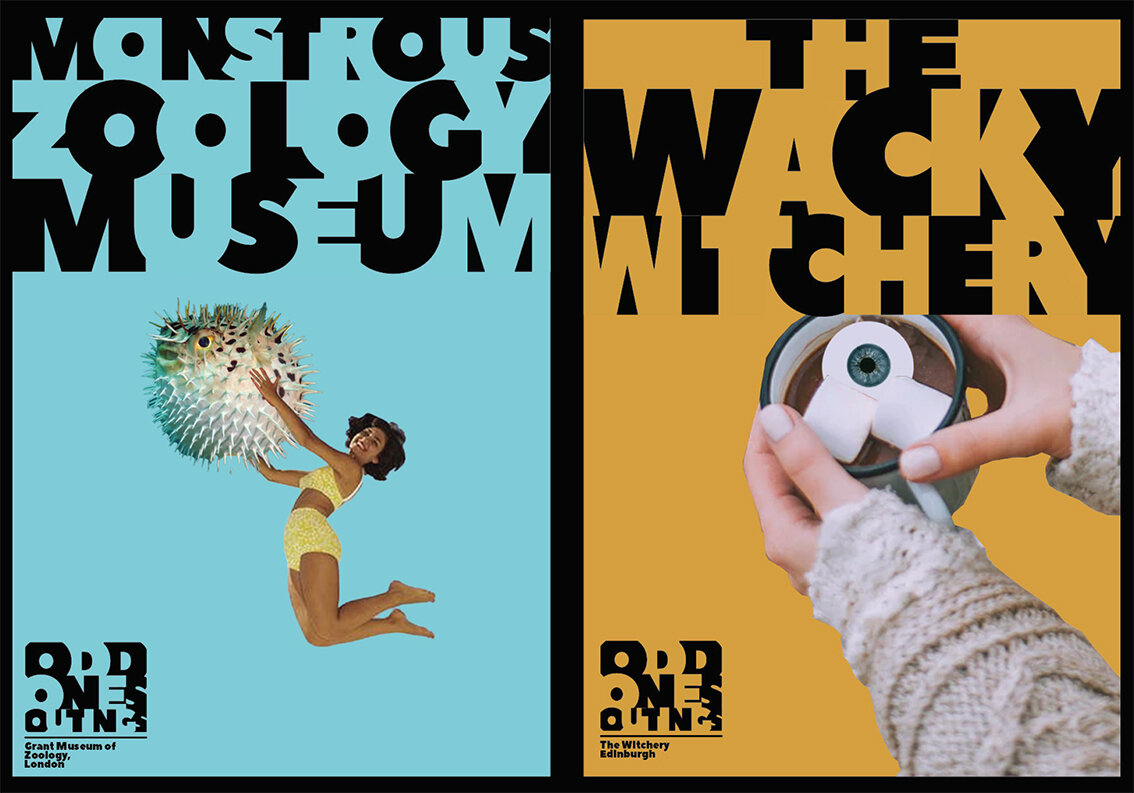
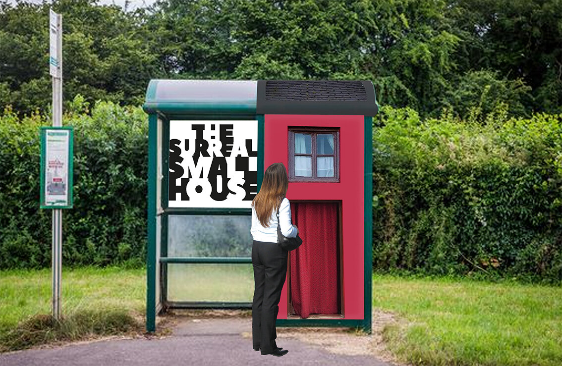
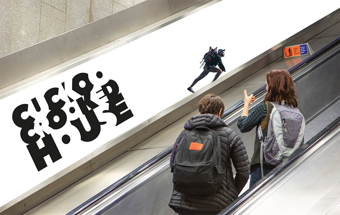
Outdoor - Posters
Please click on image above to play film

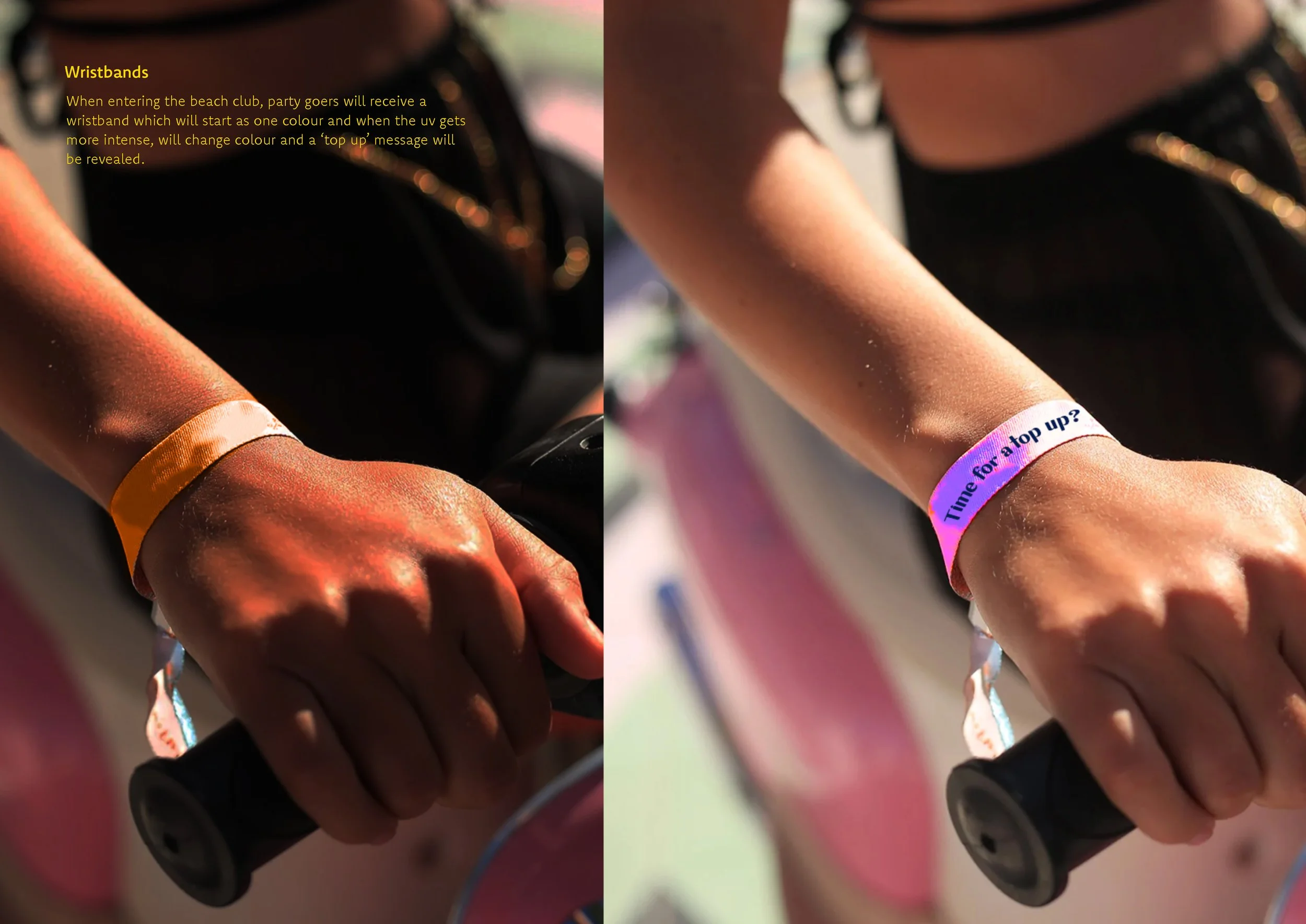
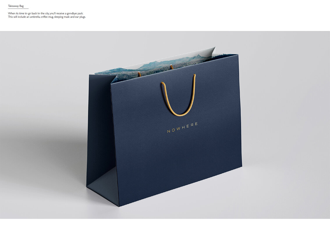
Lanyards

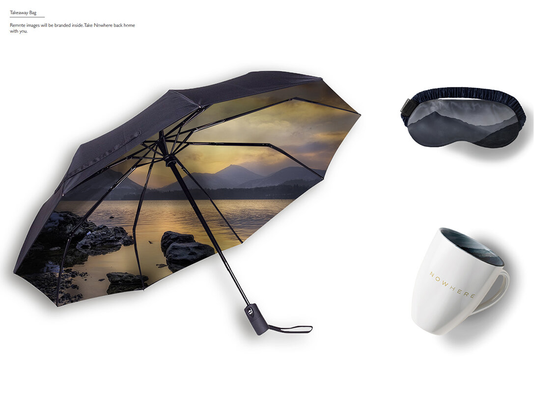
Tote Bags

Way finding Signage
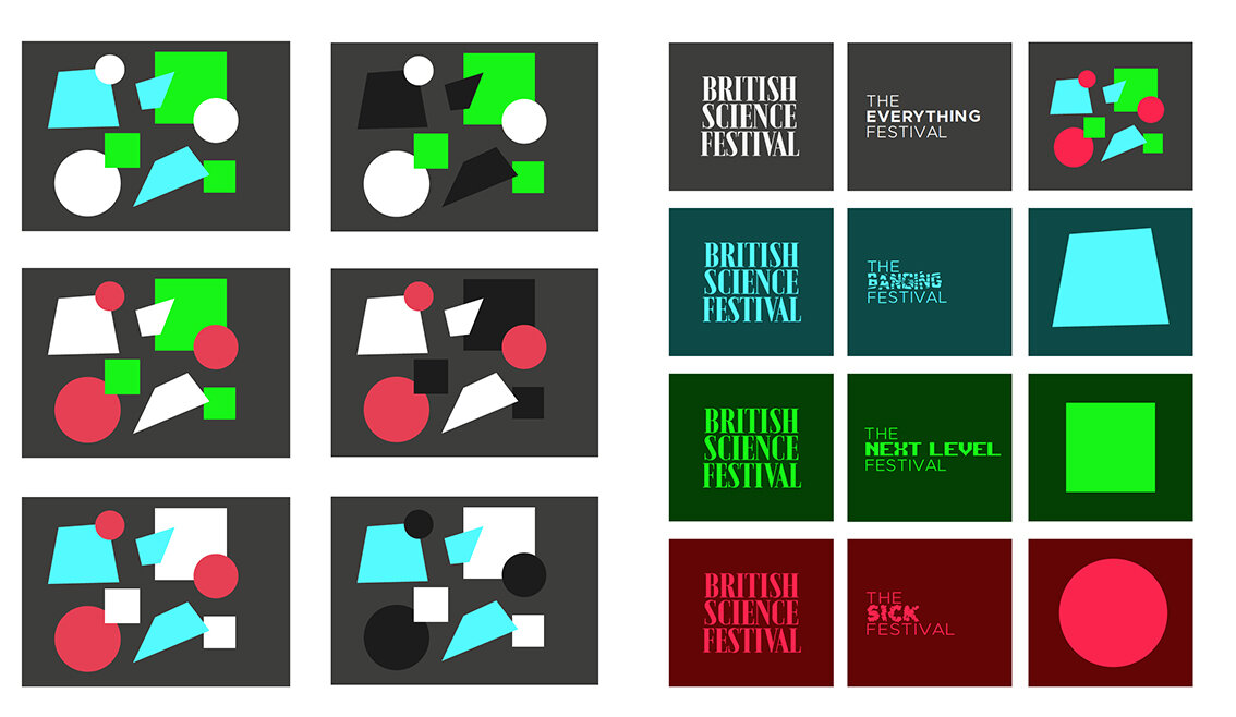
Here we feature a couple of final year response to recent the industry set brief by Edit Brand studios


Wordmark


Language
Click on the image above to play film

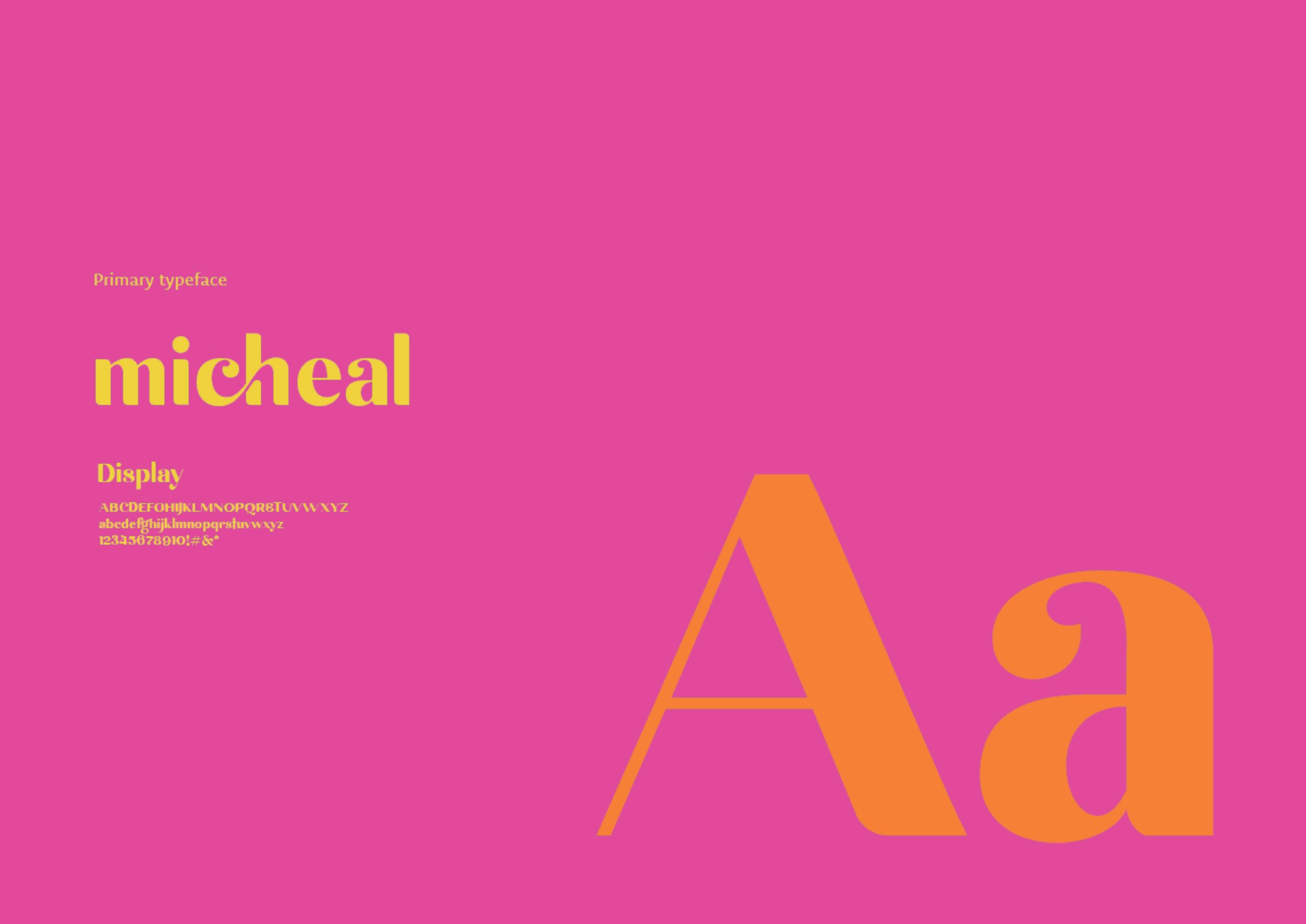
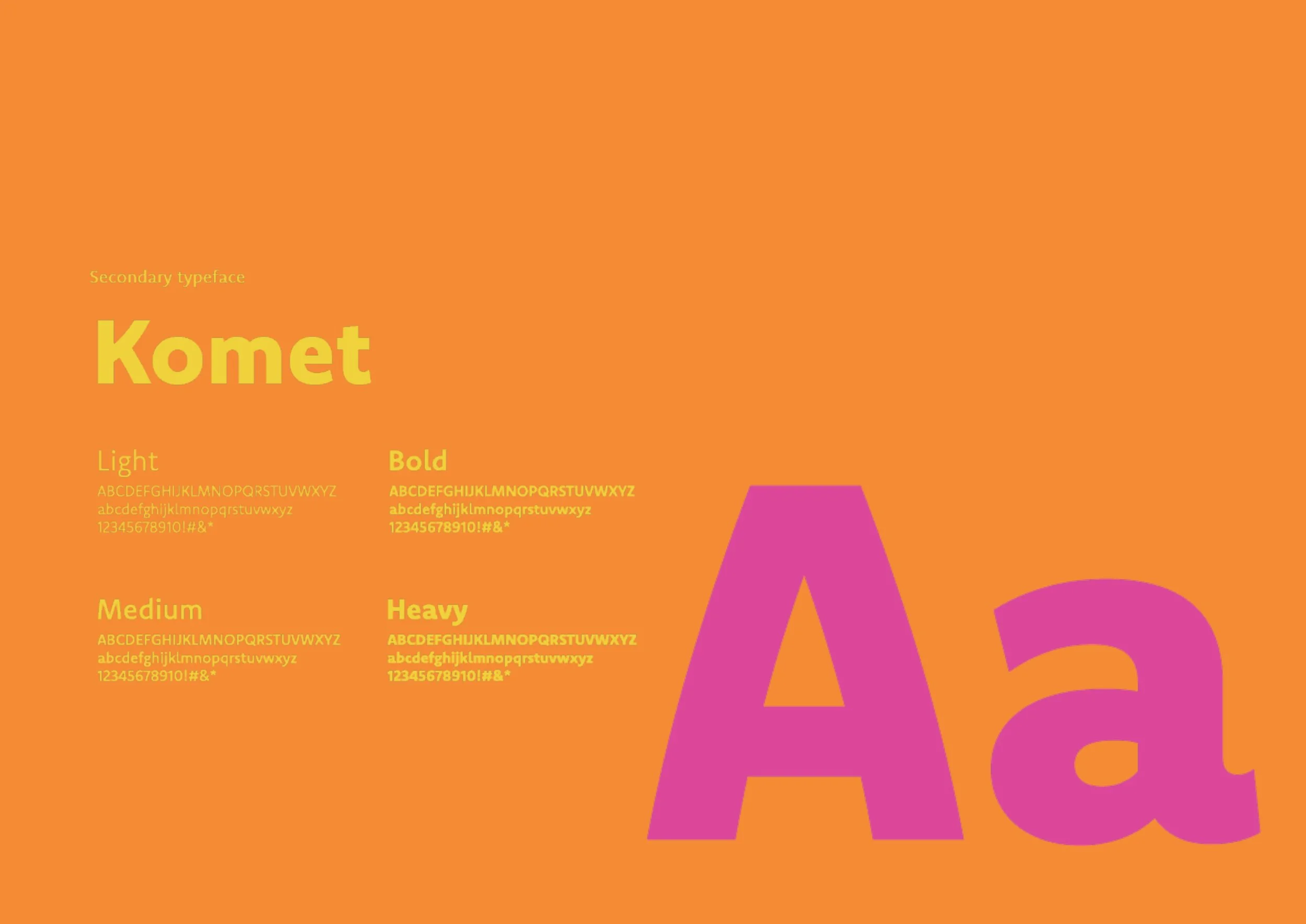
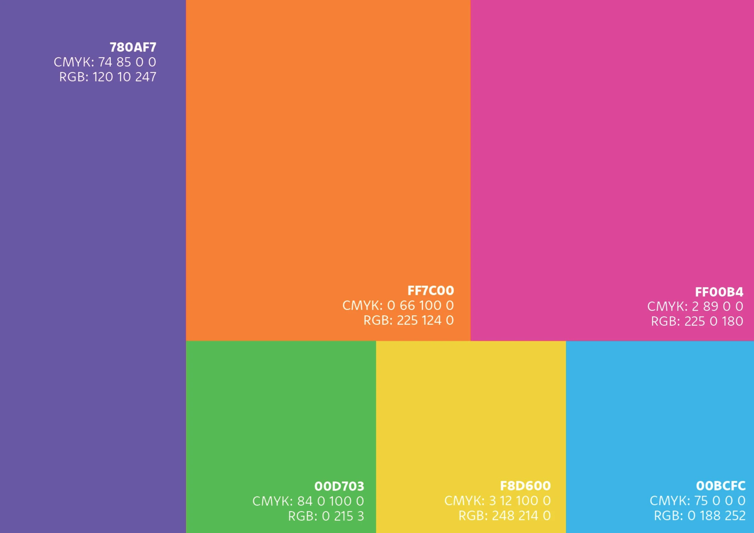
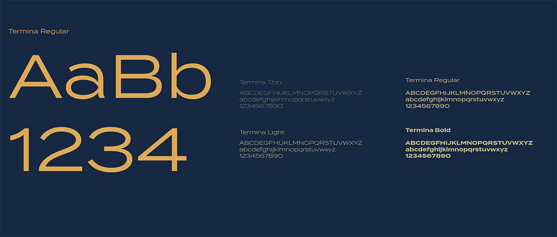
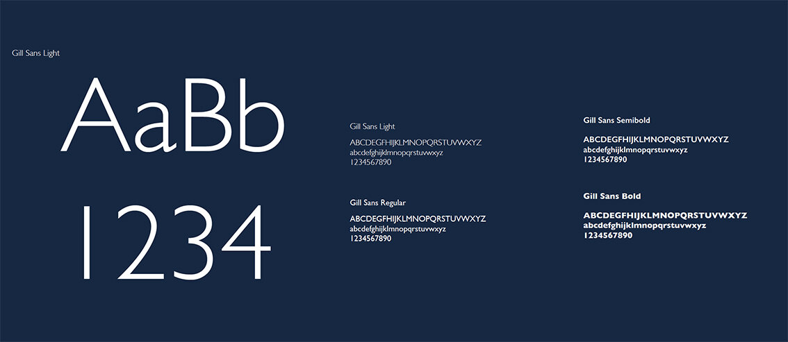
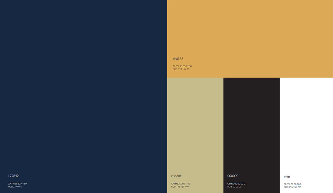
Typeface & colours

Photography style & feel
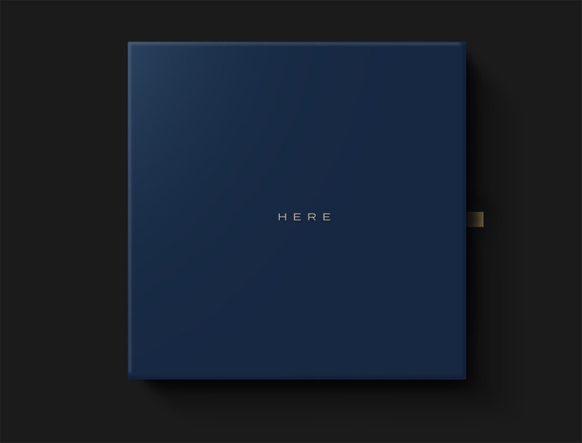
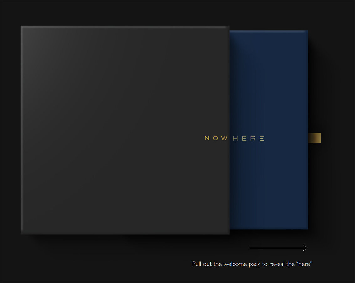
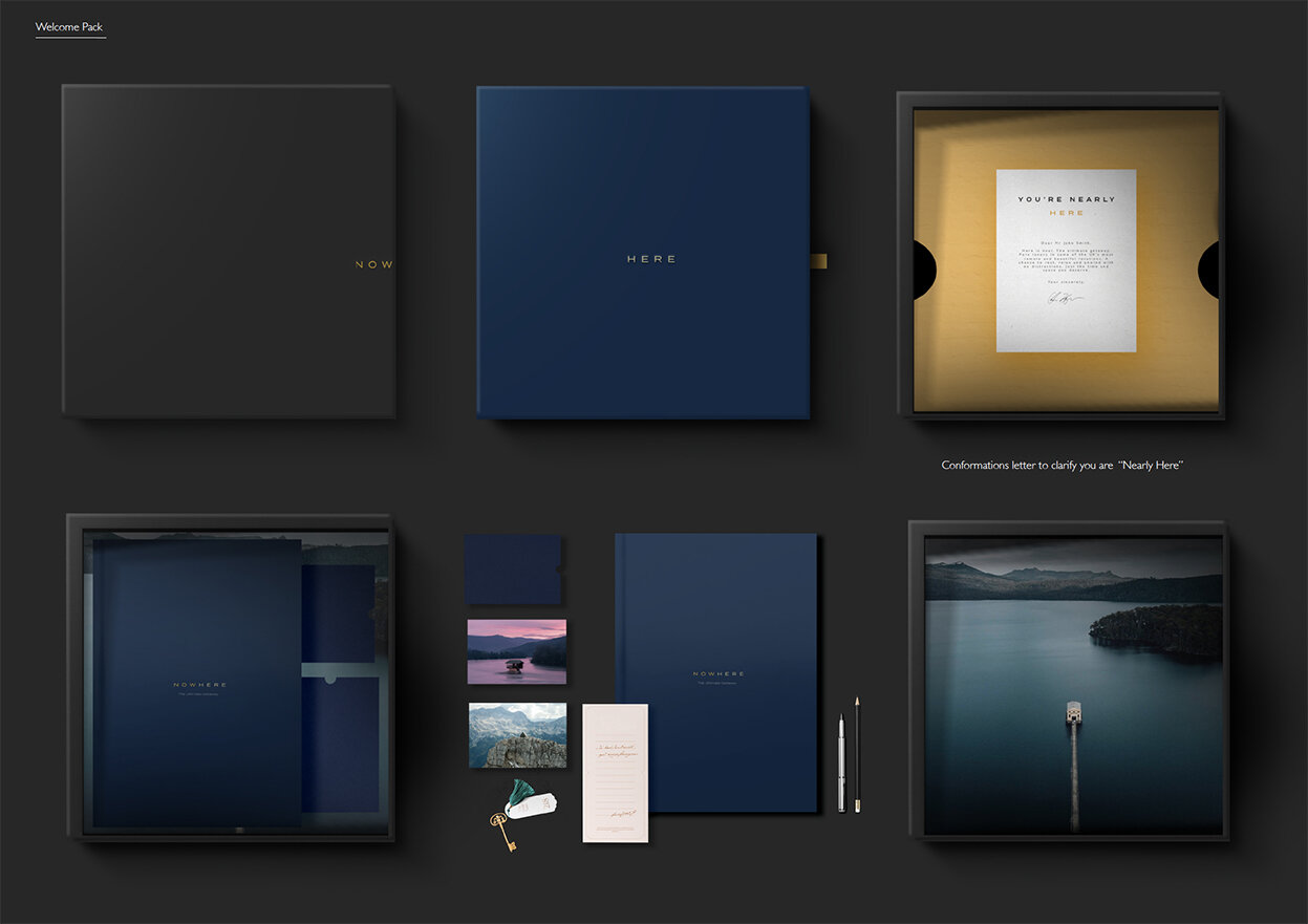

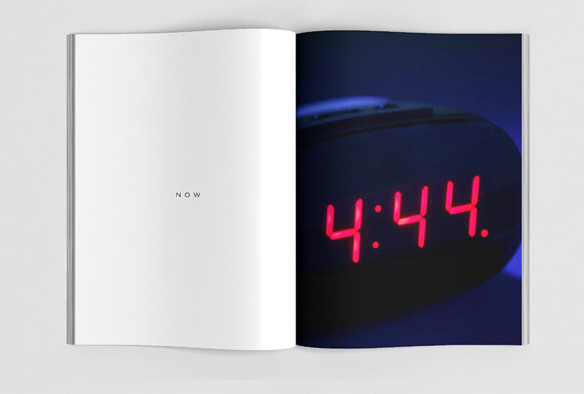
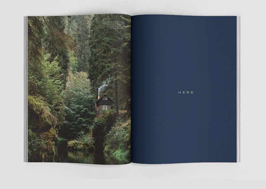
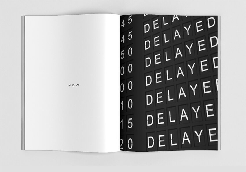
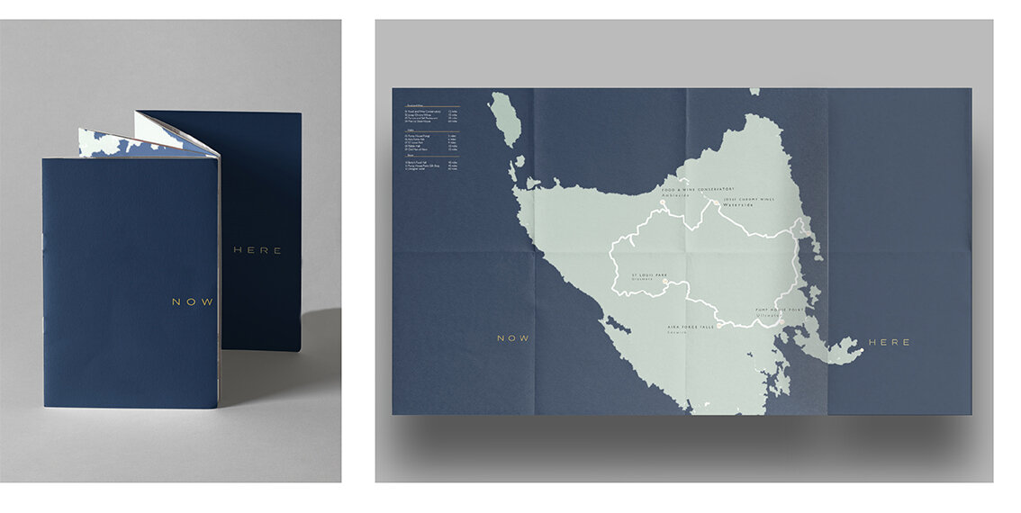
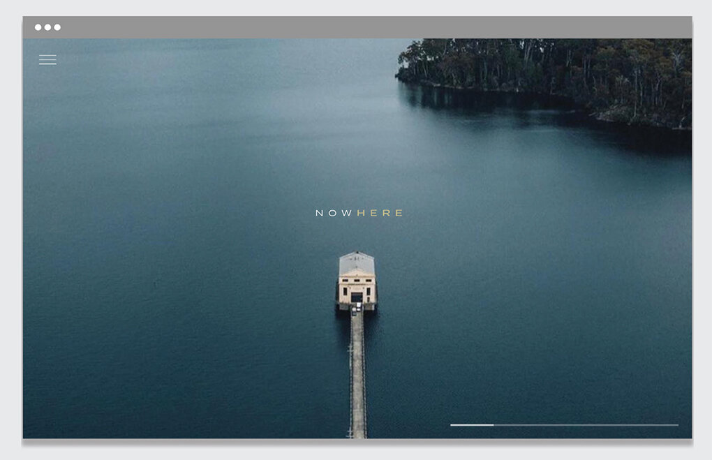
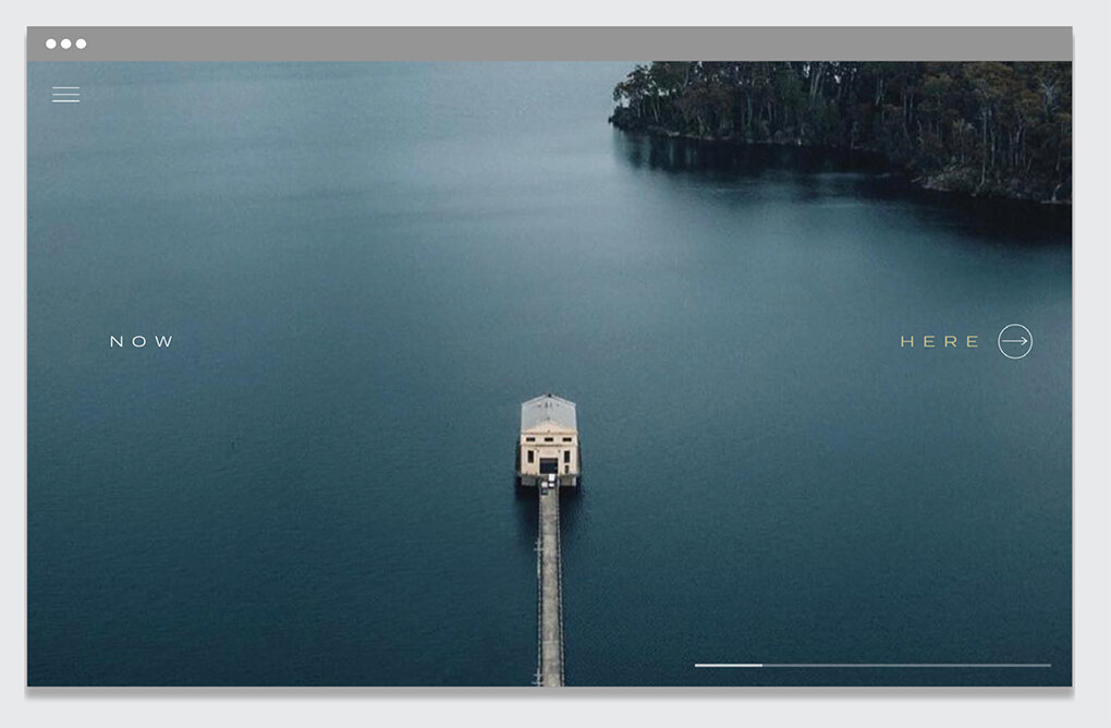
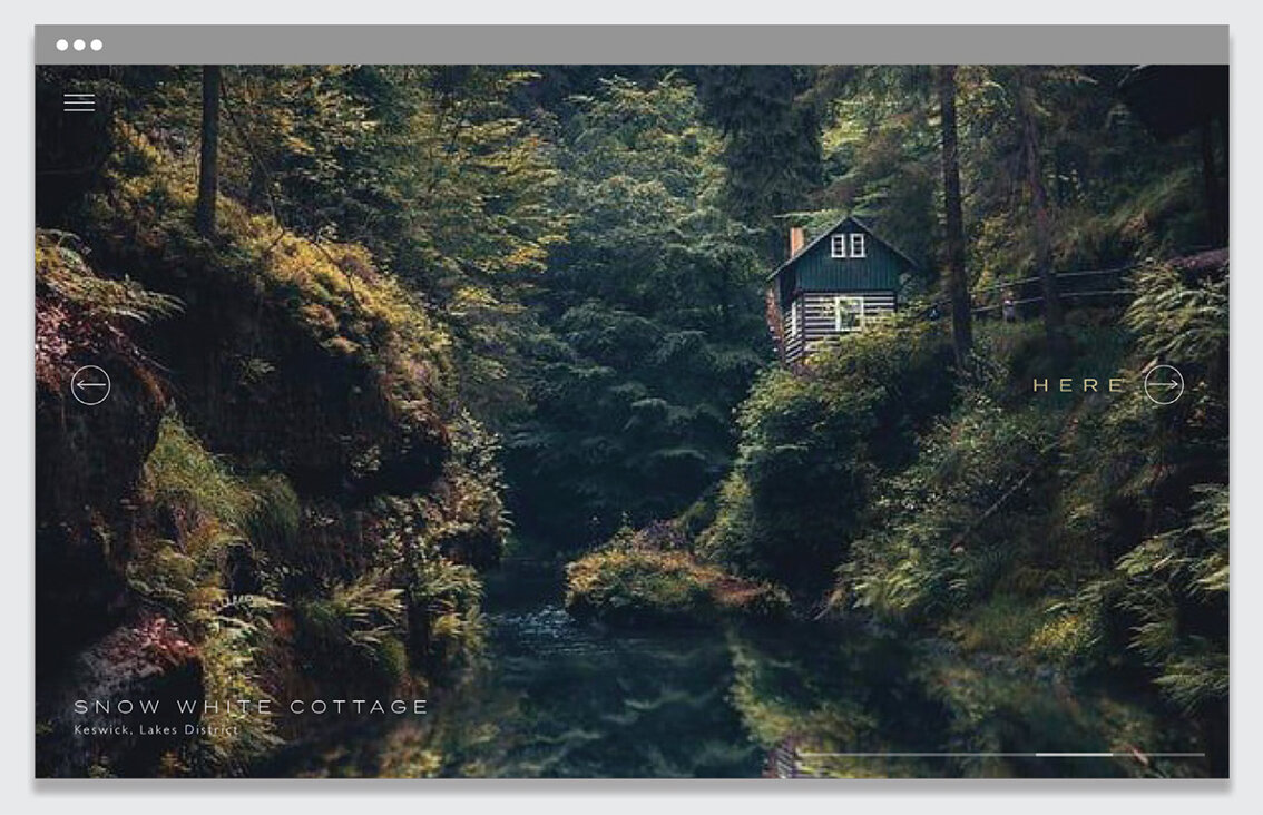
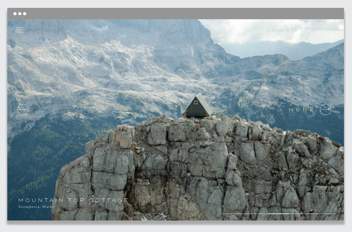
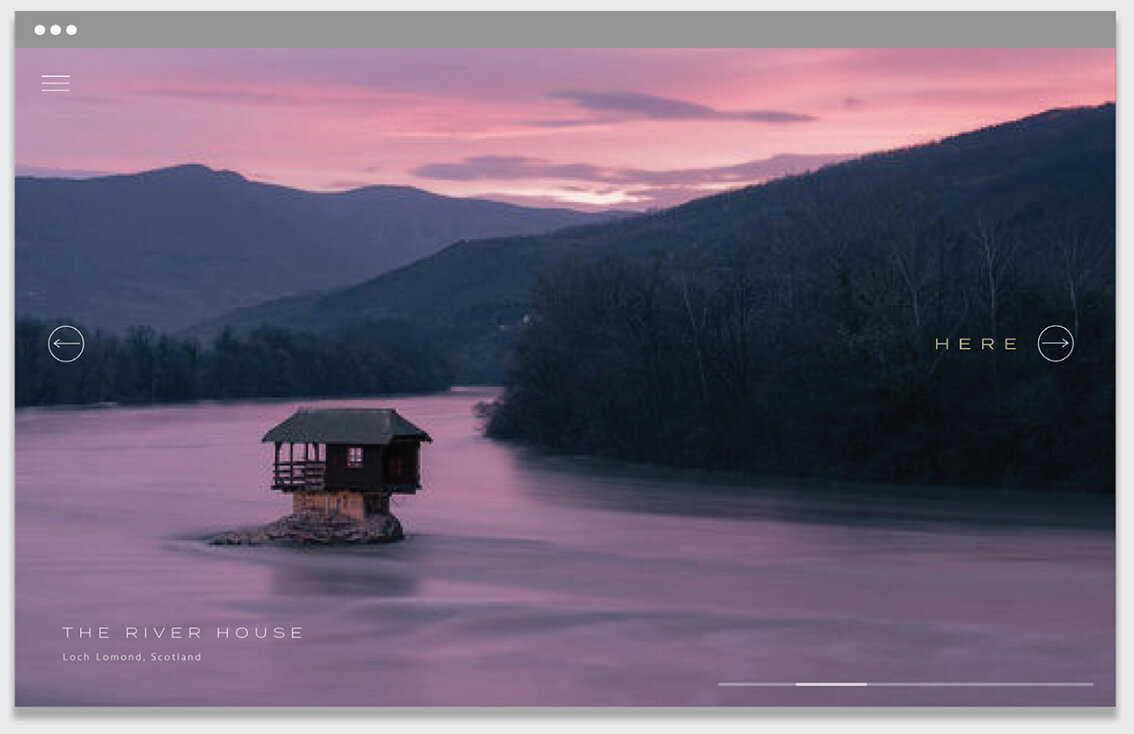
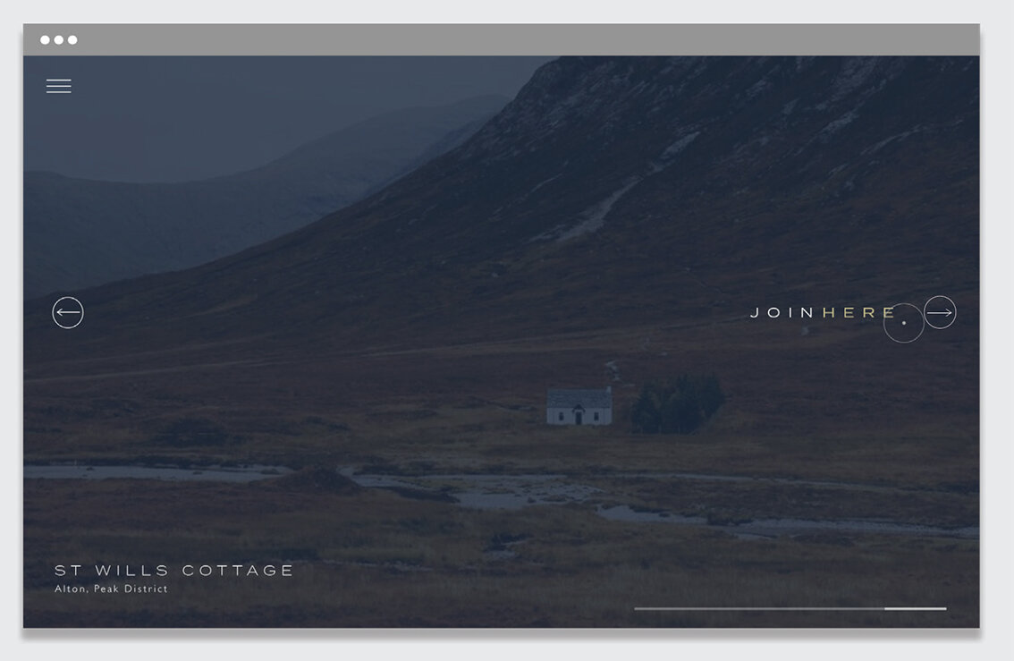
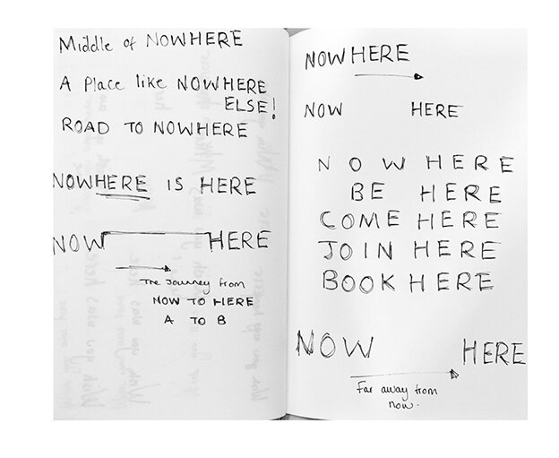
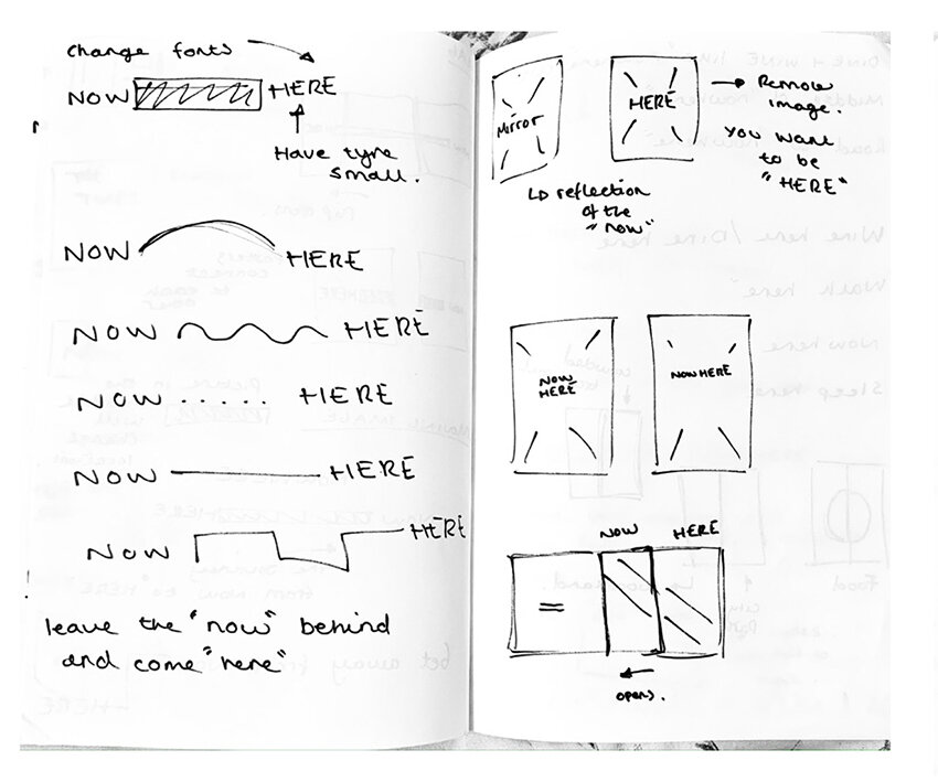
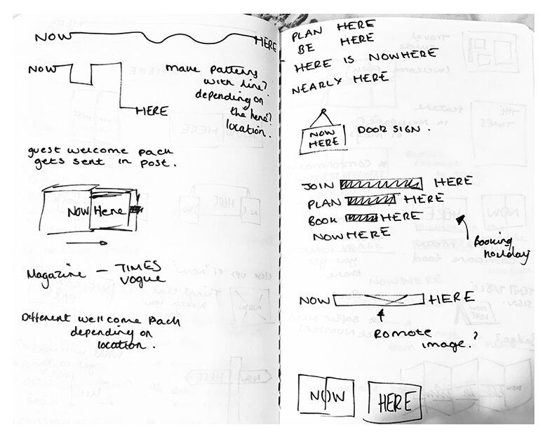
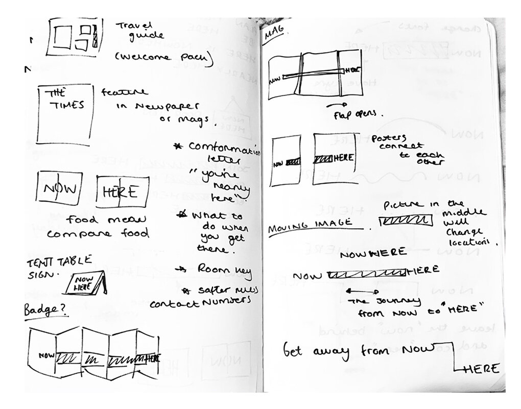
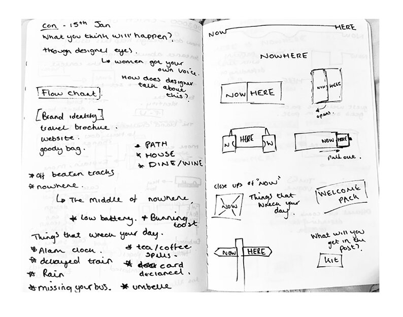
Turn the now over to reveal the here


Post cards

Post card slip case


Stationary & keys

Toiletries

Menues

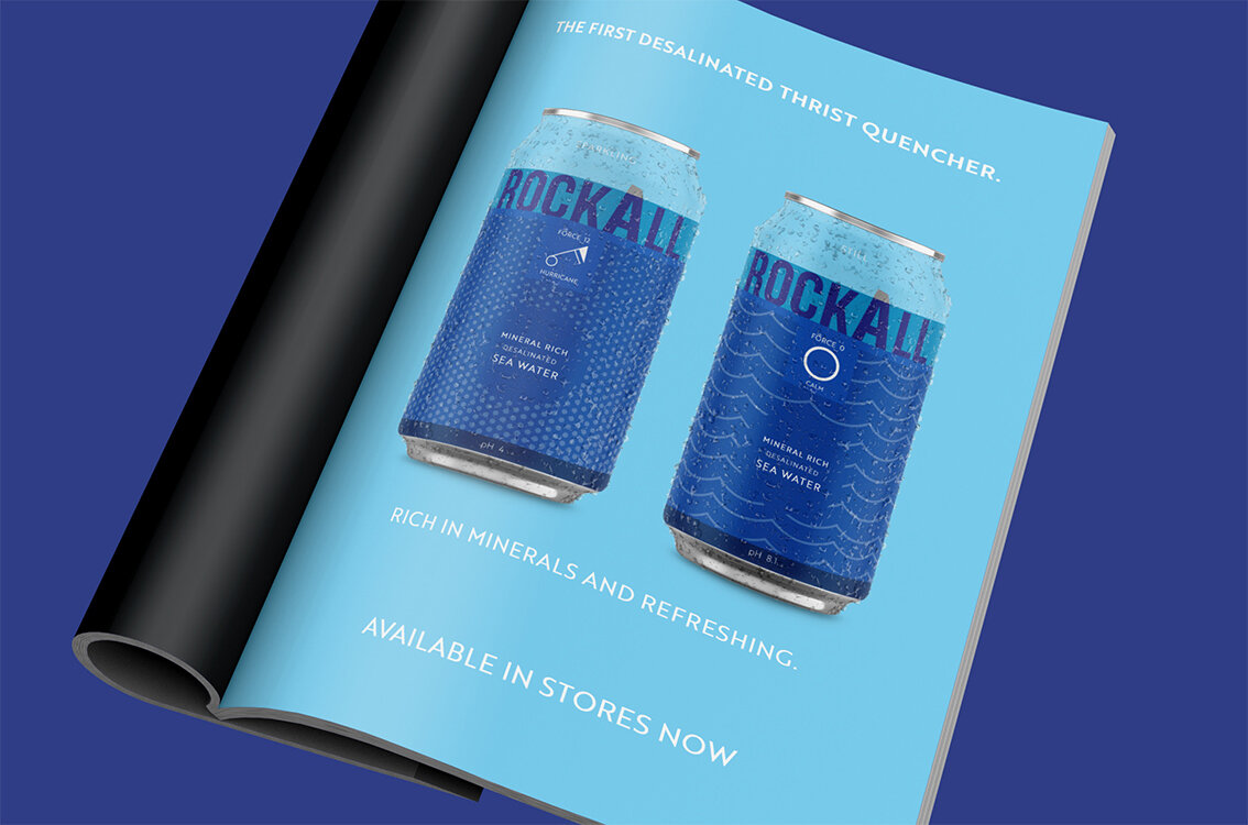
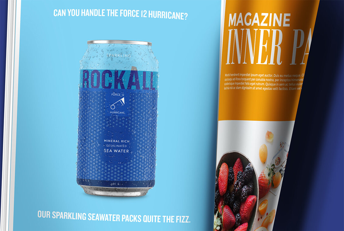
Editorial Advertisements

Please click on the image above to play the film

Simply Scan

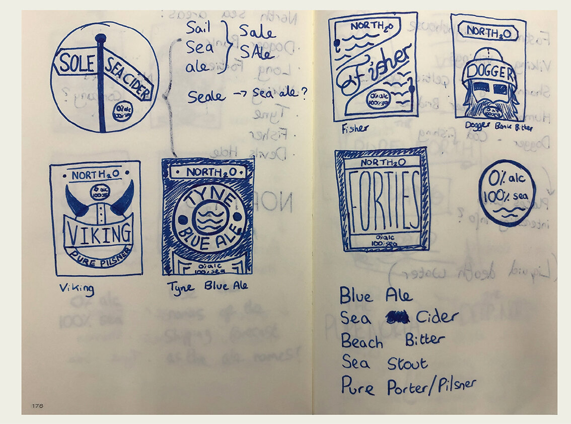
The thinking - Sketch book


The rational

Words, copy & Language

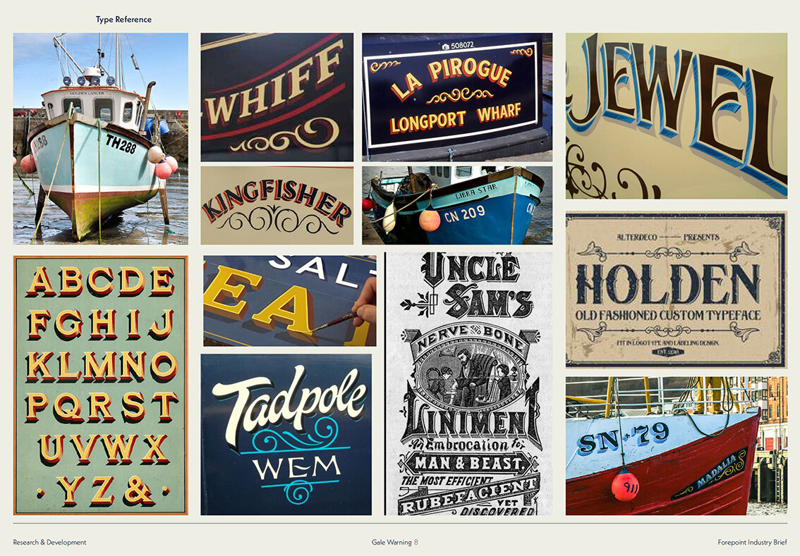
Type Style reference

Odd image style reference

Preferred type styling
The word mark
Please click the image above to play the film
Odd outdoor advertising

Tour Guide Lanyards

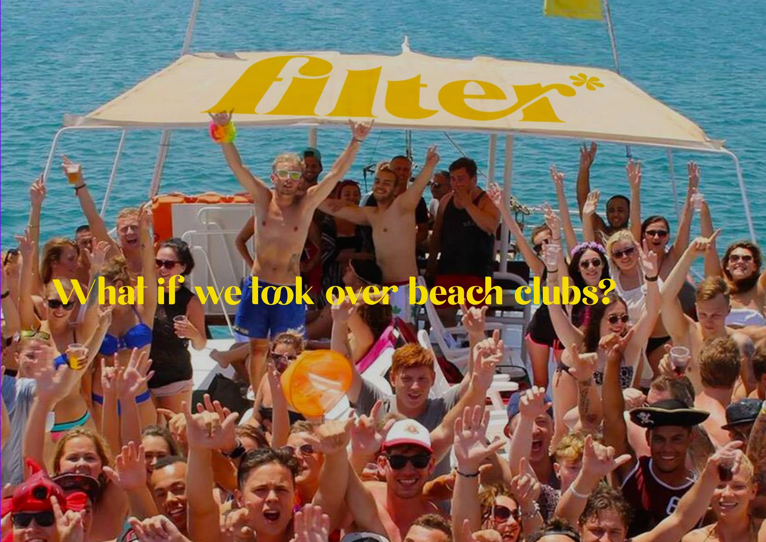
Merchandise

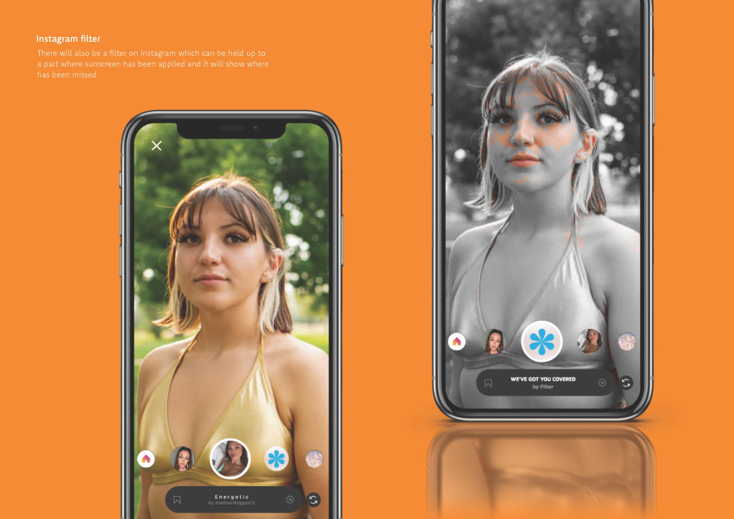
Mobile
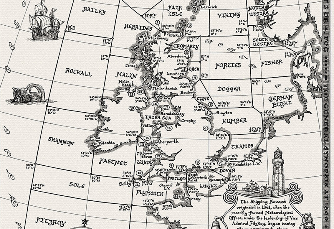
Here we feature a couple of final year solutions in response to the recent industry brief set by Forepoint.

Background

Brand - Wordmark

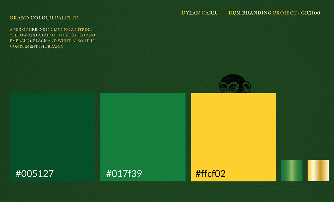
typeface & colour ways

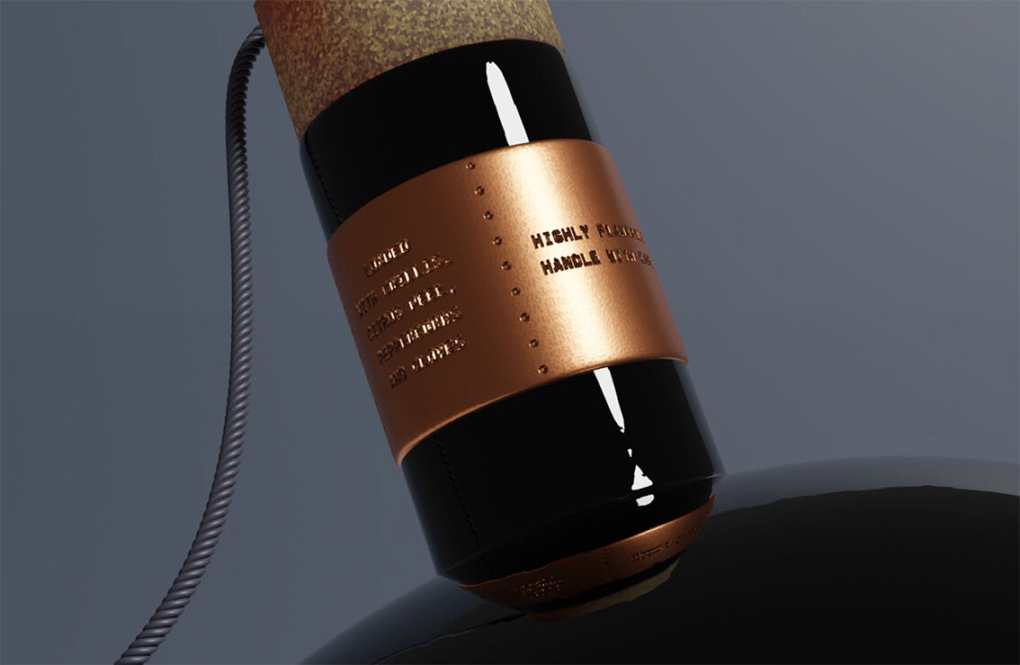
The can

Please click the image above to play film

Point of sale & dispensers


The brand wordmark


Typefaces

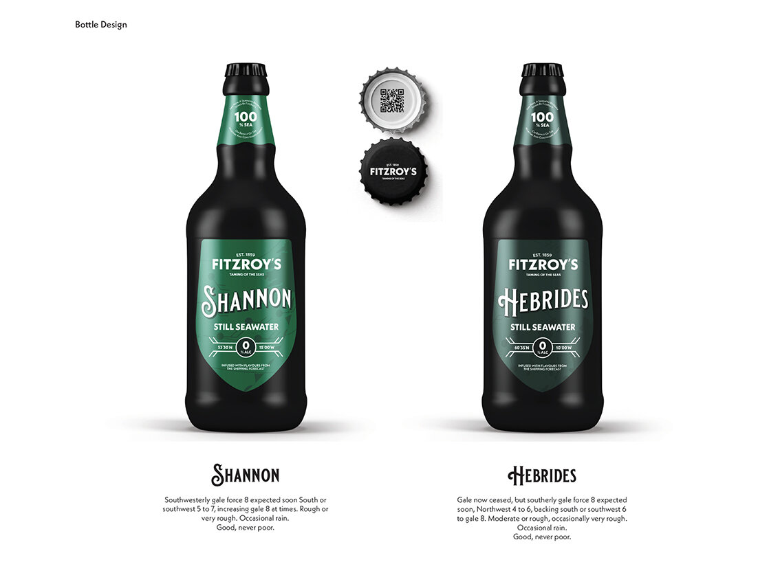
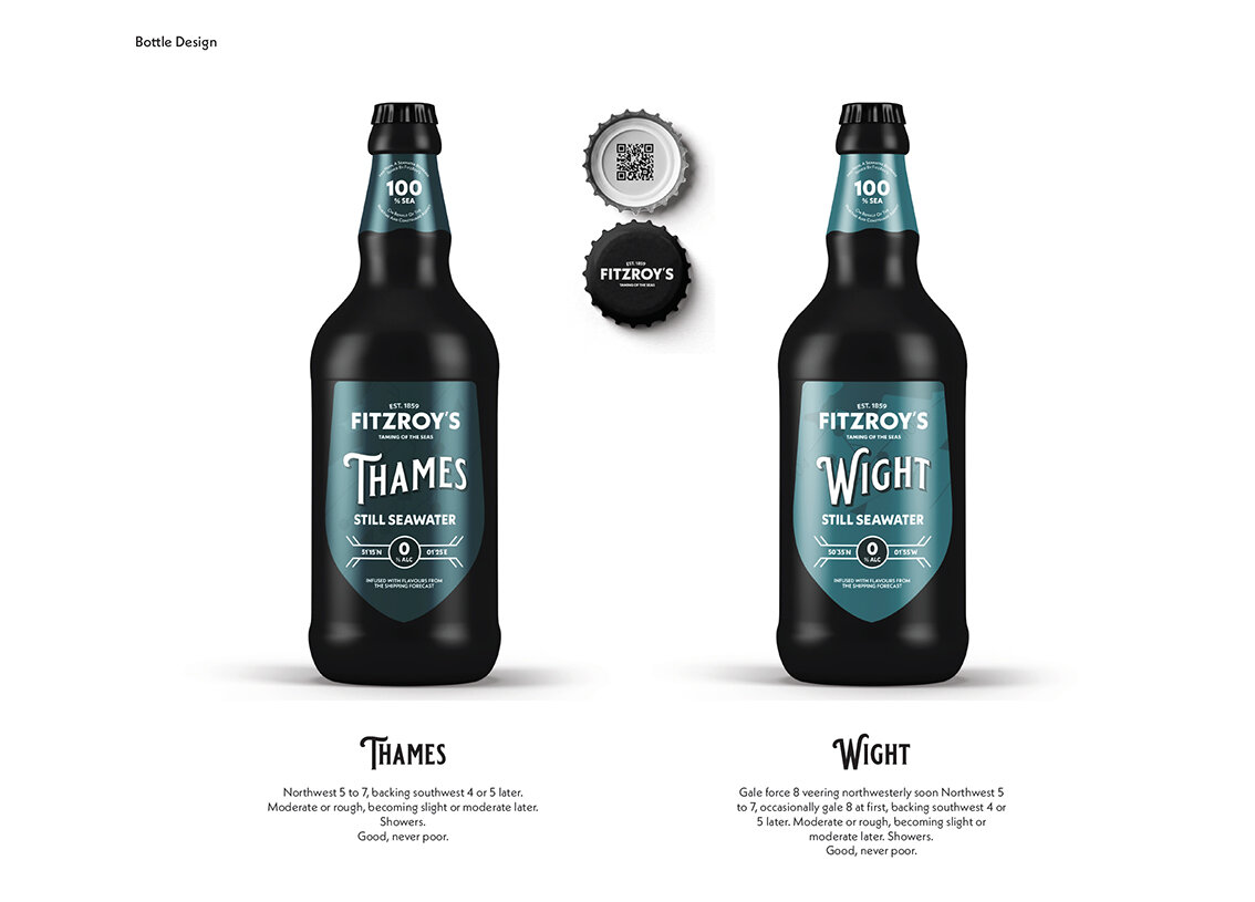
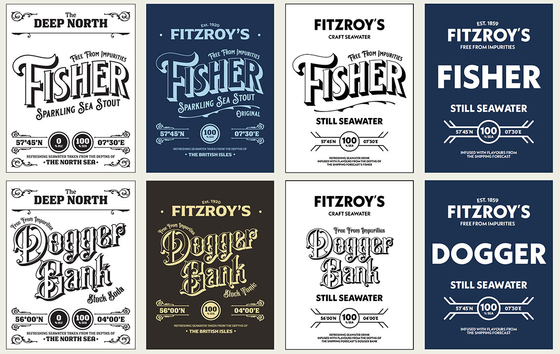
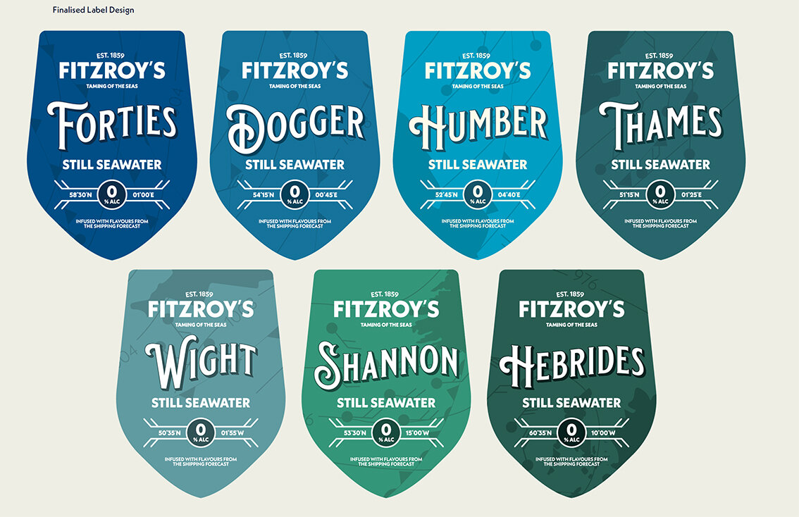
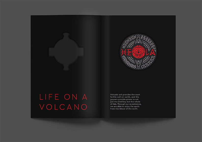
The offshore regions
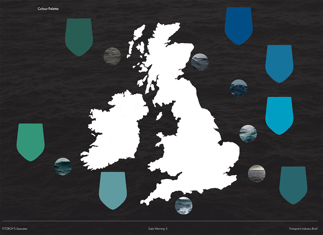

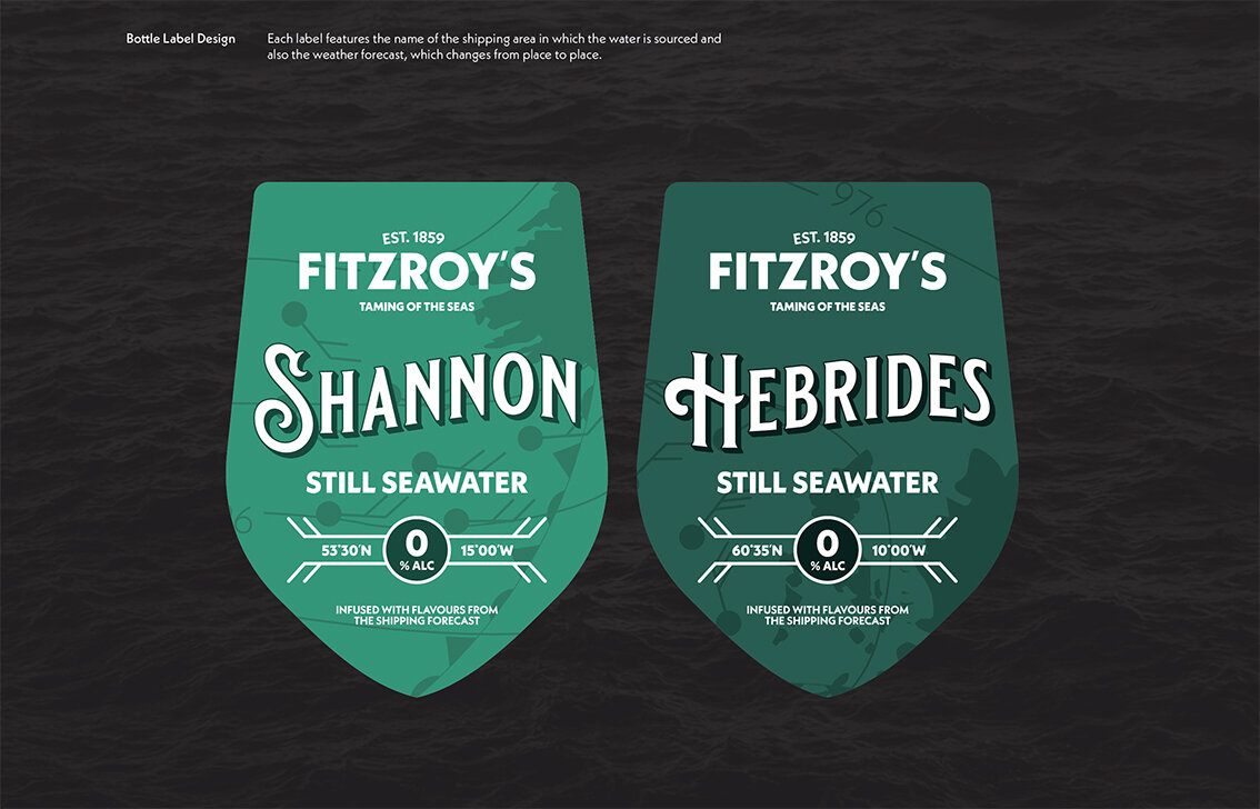
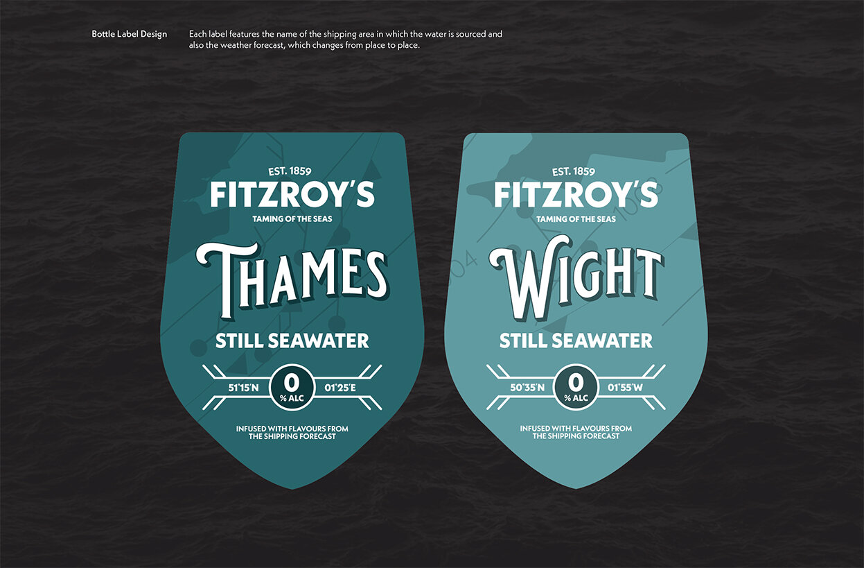
The label designs

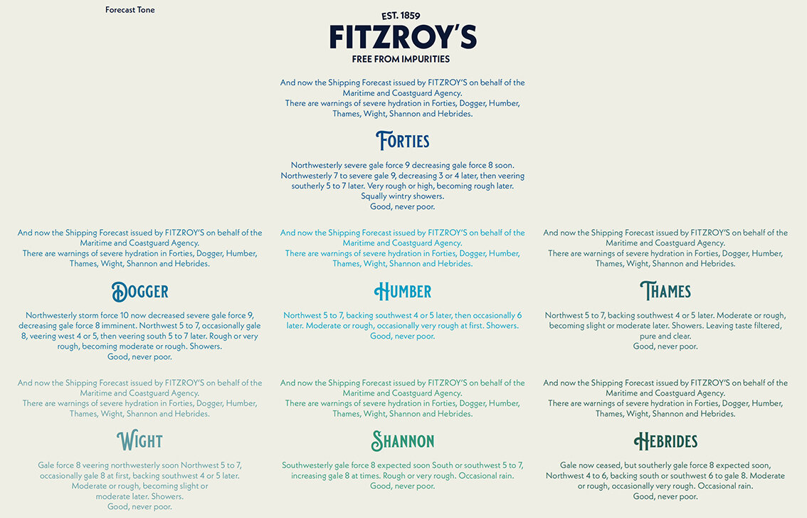
The full forecast

Multipack box


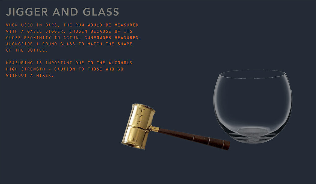
Pump Handles

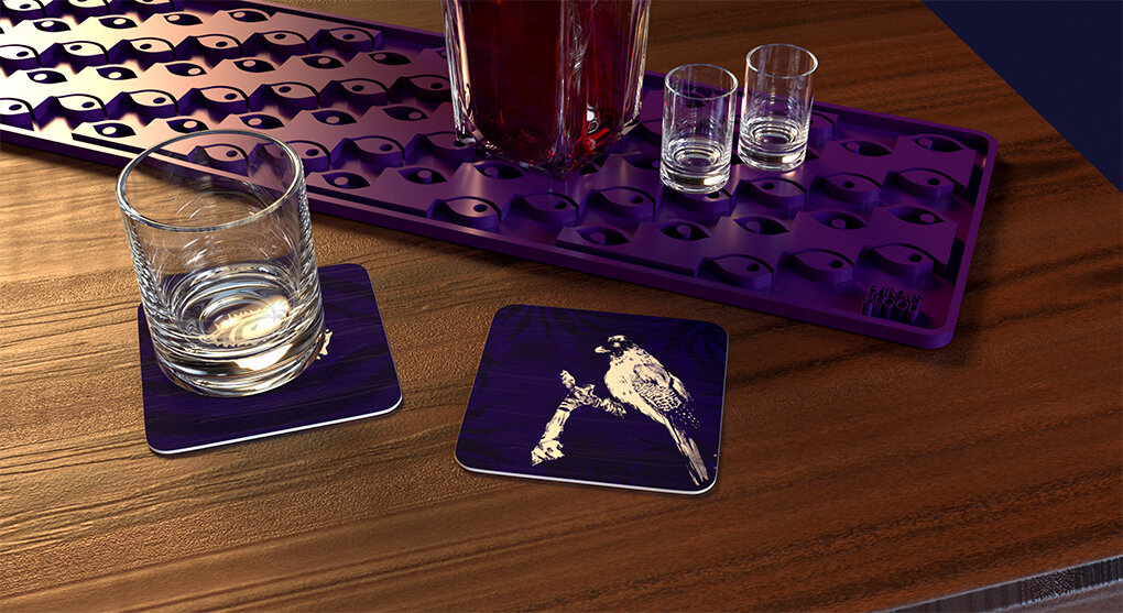
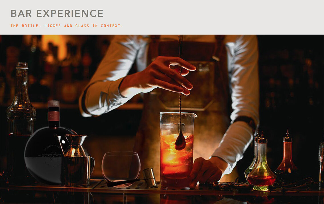
The bar
Please click on image above to play film.

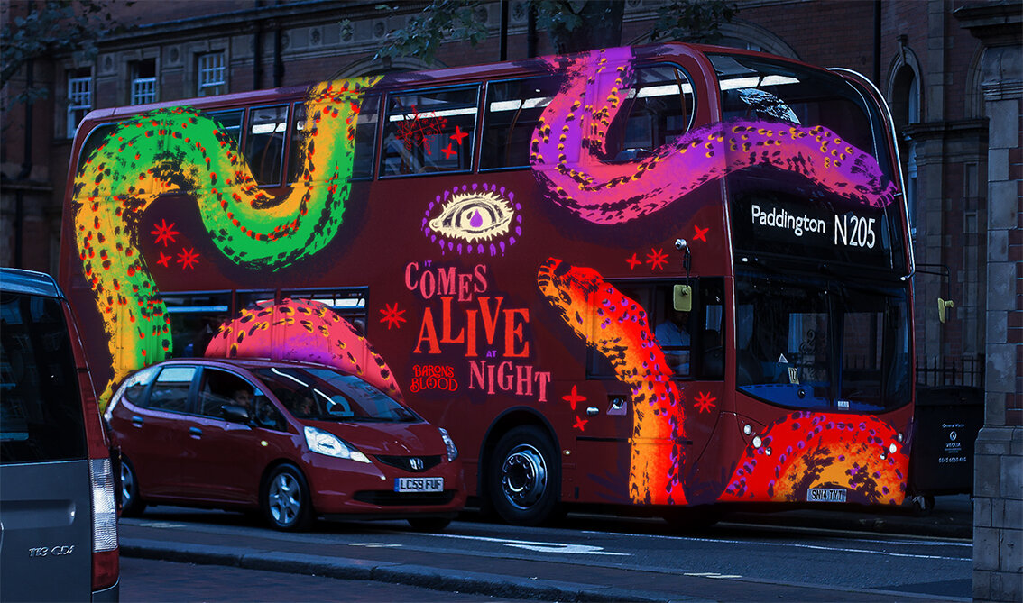
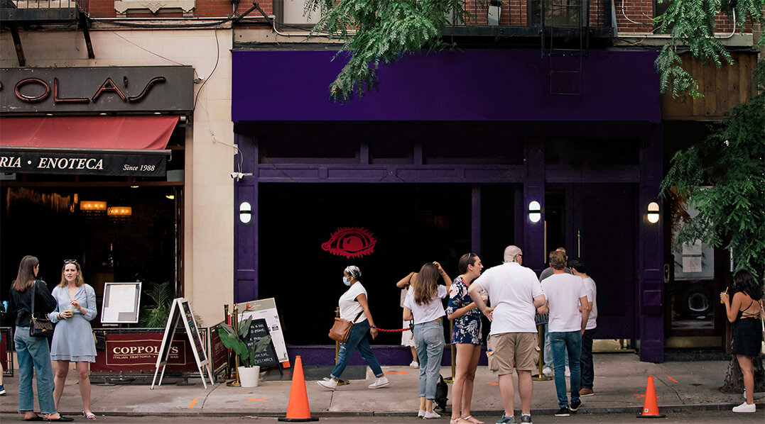
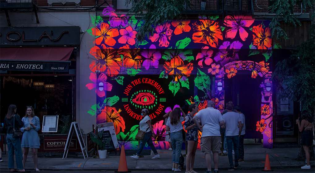
Here we feature Emma Barber’s solution to the recent industry brief set by Chris Mason .

The back story

Please click on the image above to play film

The brand mark
Please click on the image above to play film
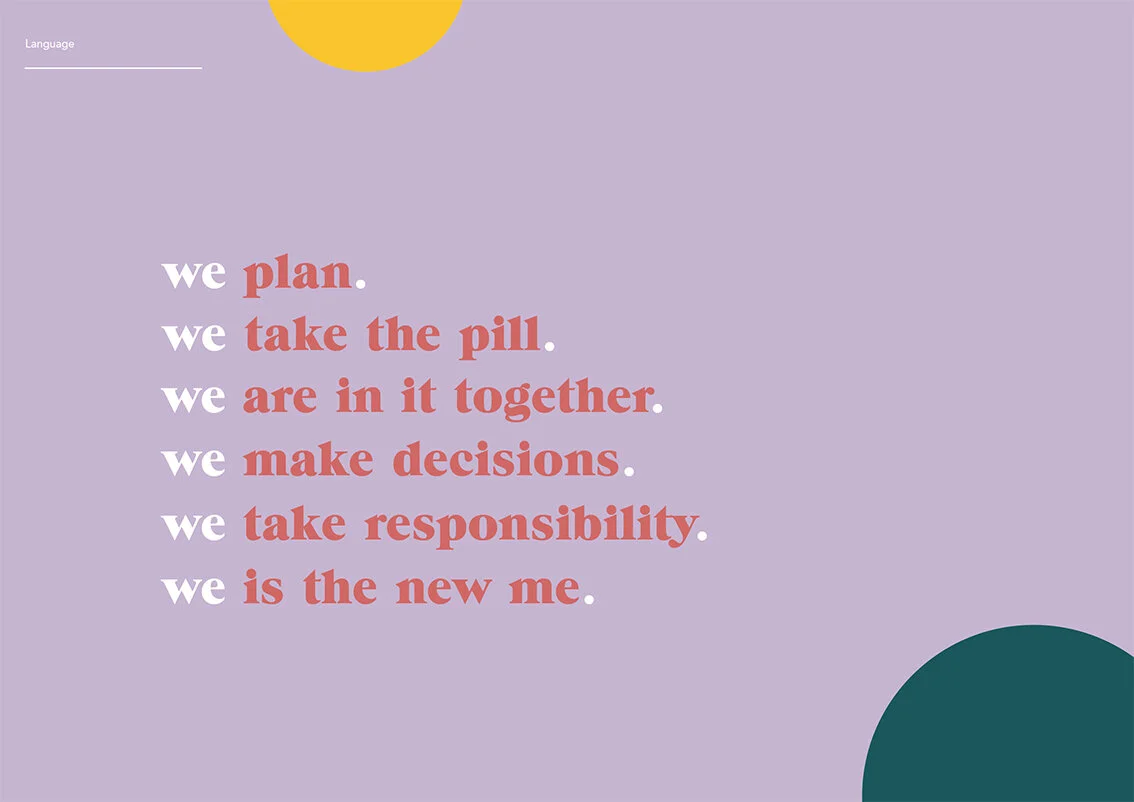
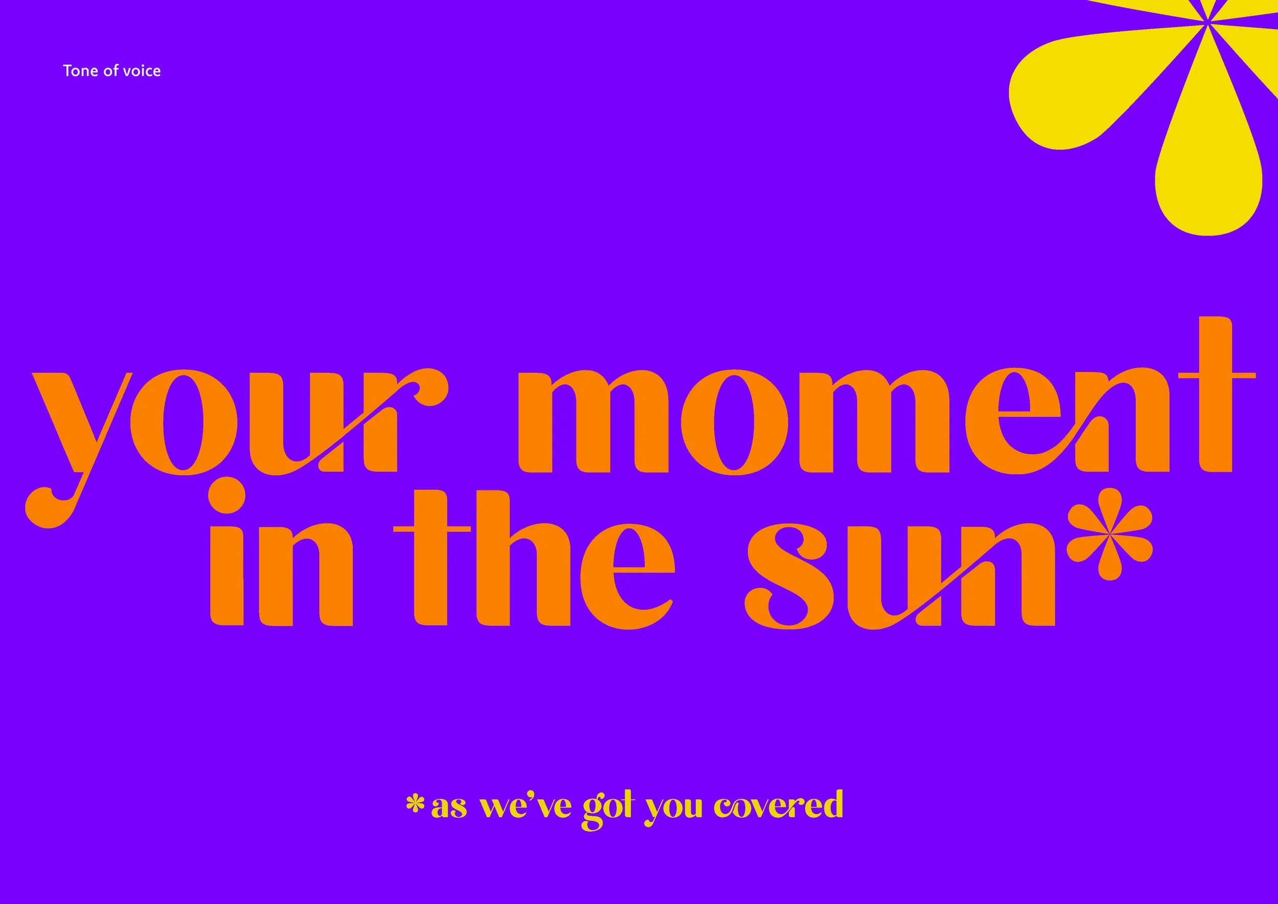
The Language & tone of voice

Copywriting

Alternative copy styling

Assets - Shapes and photography styles
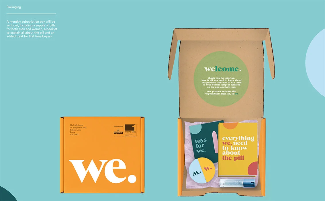
The outer packaging & content designs

The pill packaging

Outdoor - Posters

Print - Brochure

Digital - Mobile look & feel
Please click on the image above to play the film.

App designs

A very strong, well thought through and deceptively simple design solution to what was a sensitive and challenging subject and brief.
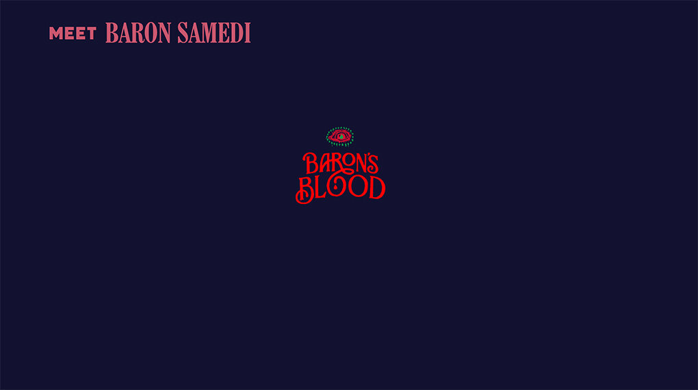
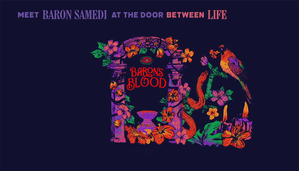
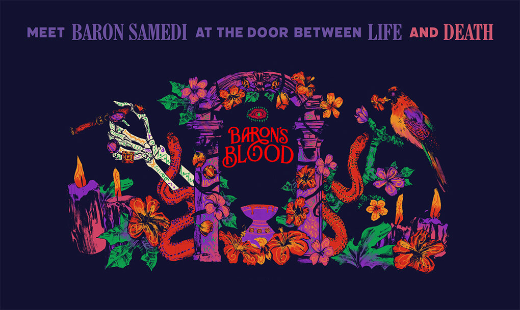
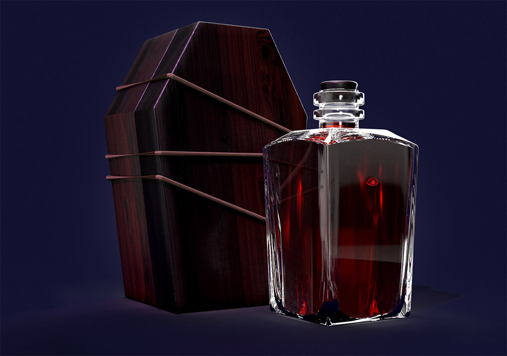
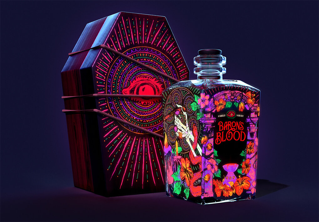
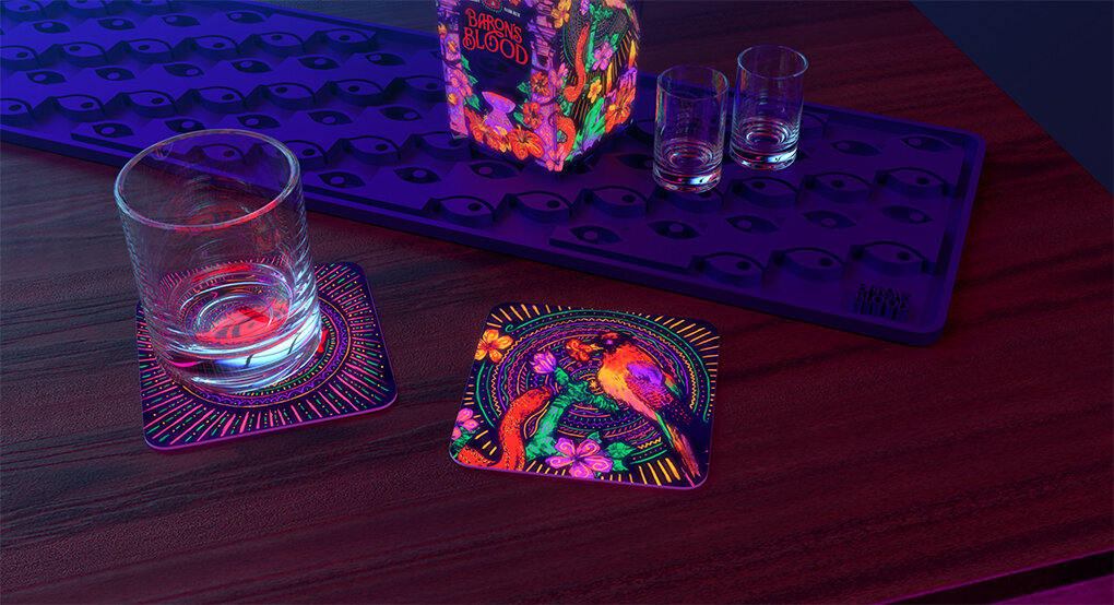
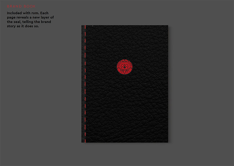
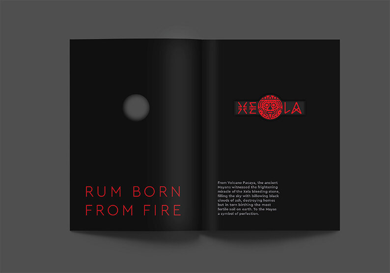
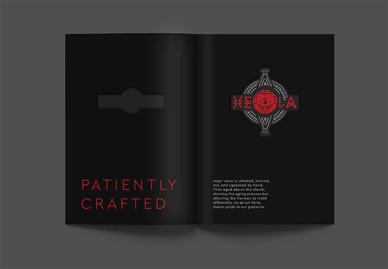
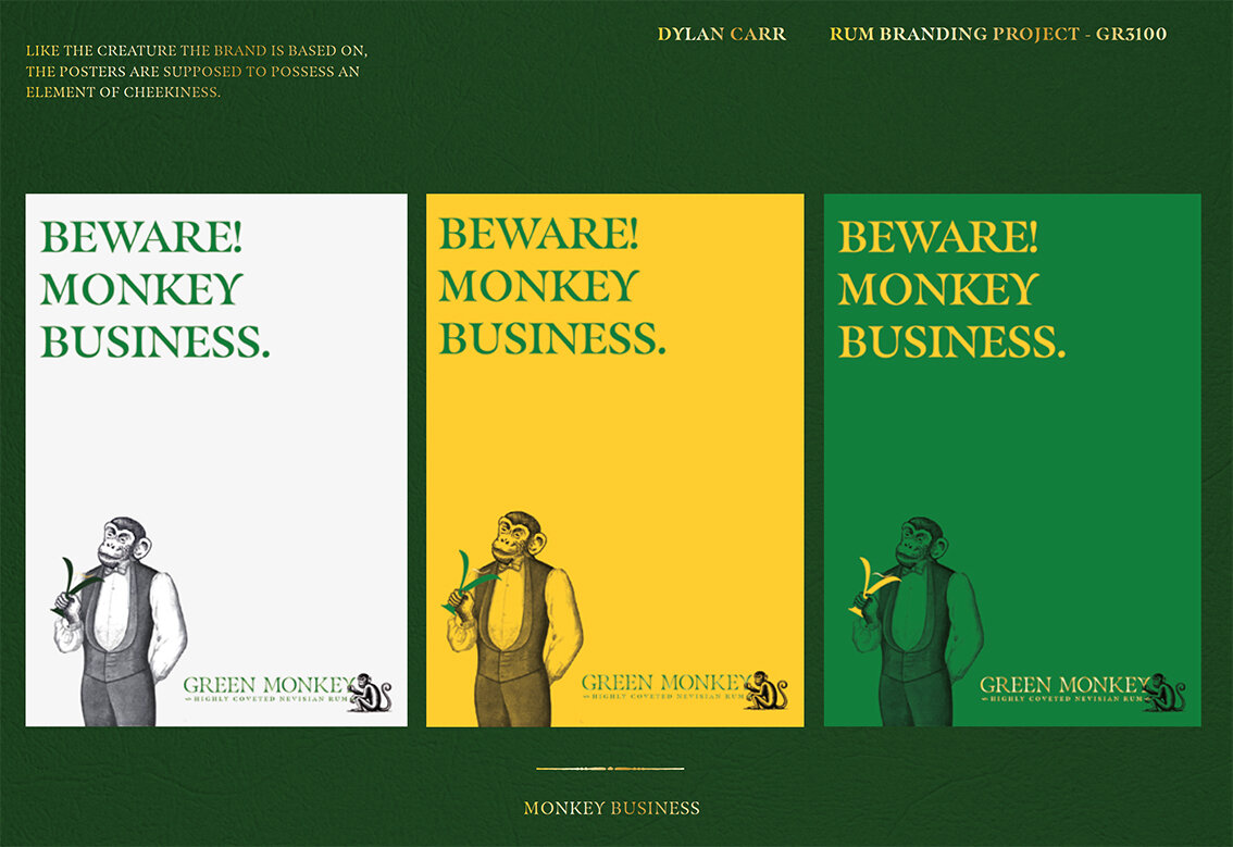
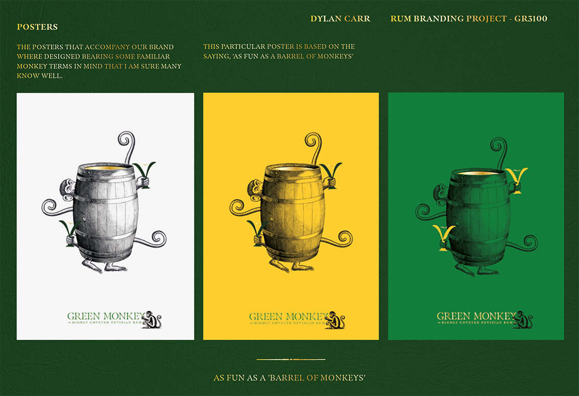
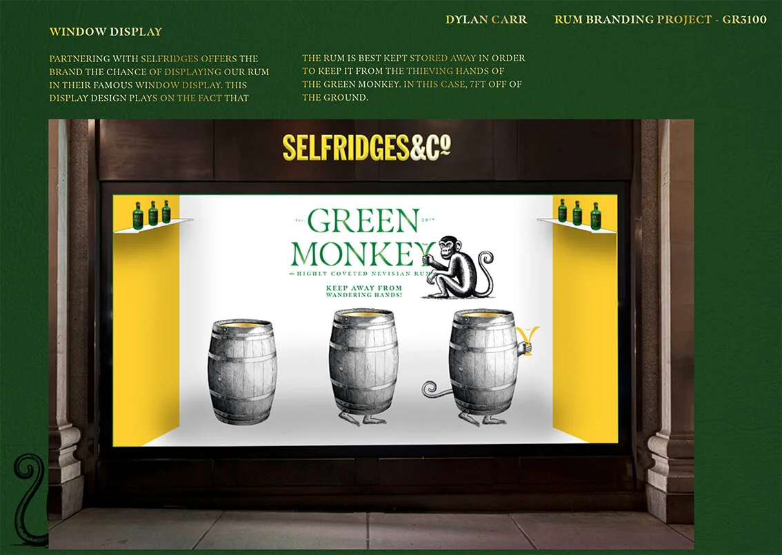
Here we feature a selection of final year students response to the recent industry brief set by Brandon Manchester. Brief - Create a fresh new rum brand.
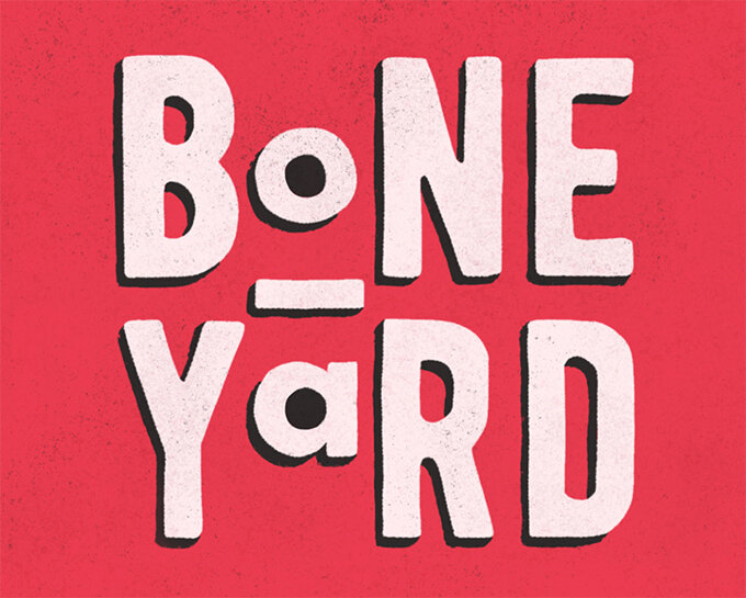
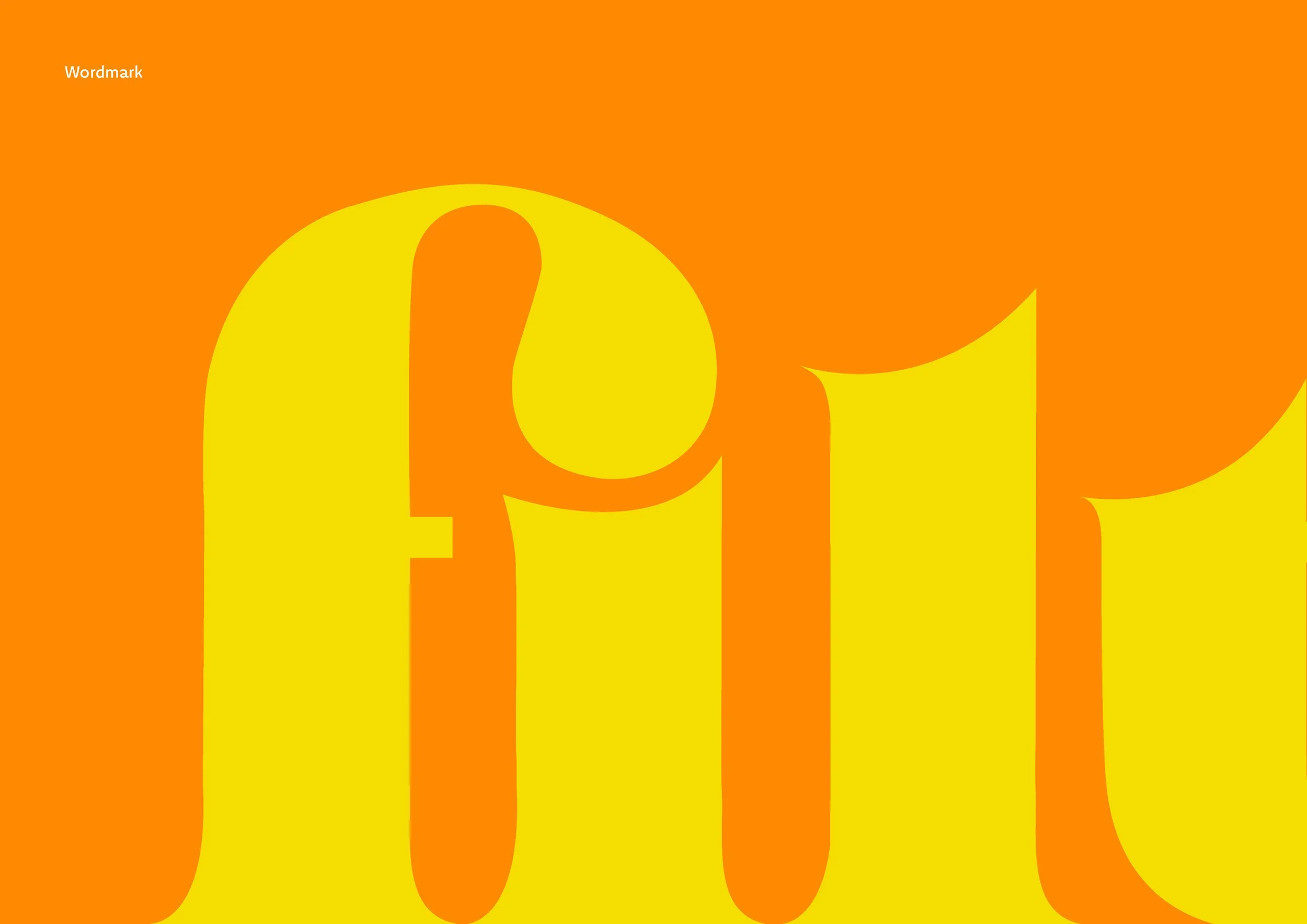
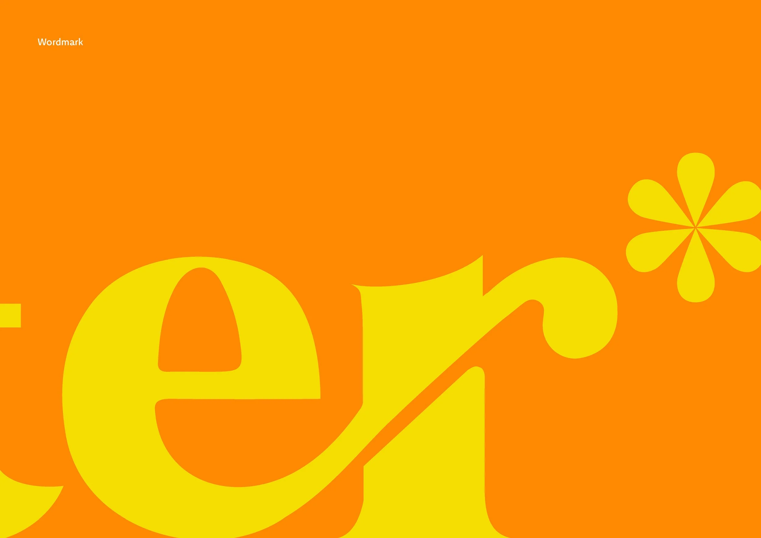
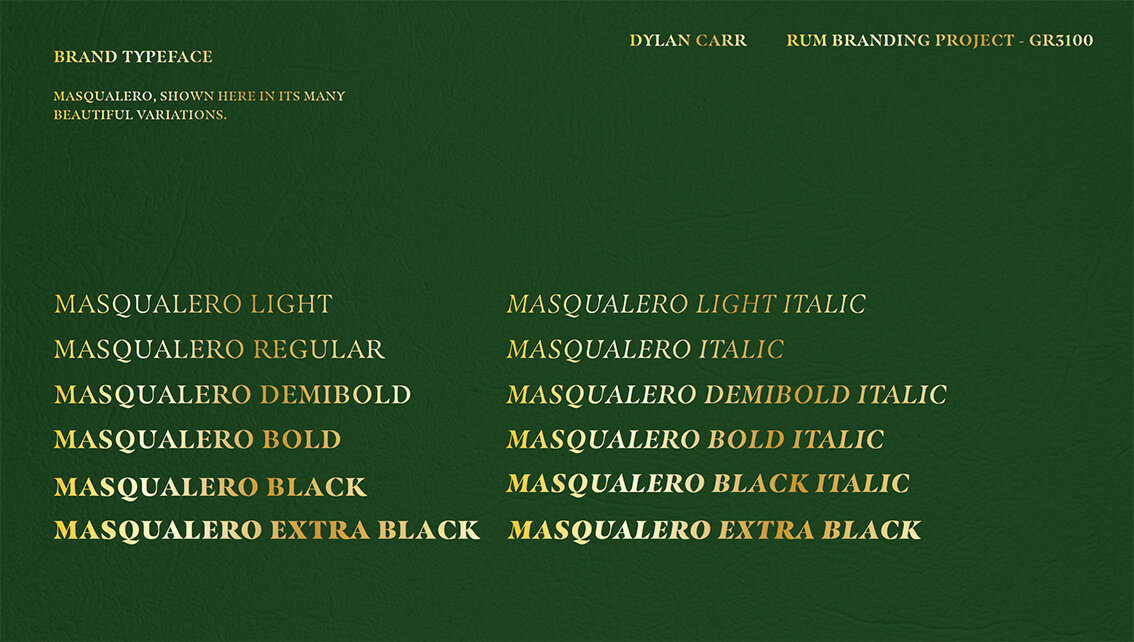
Wordmark

Rational

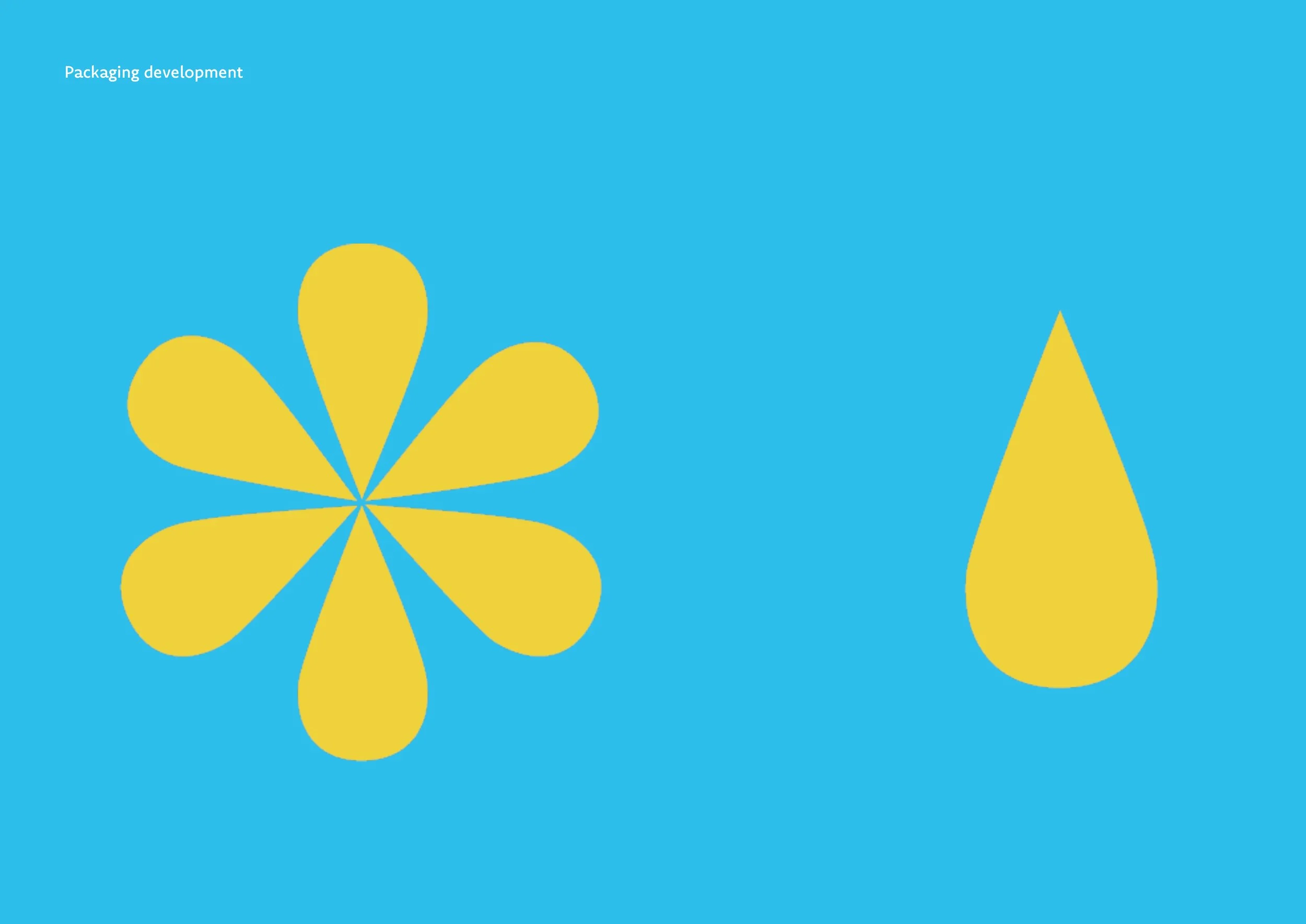
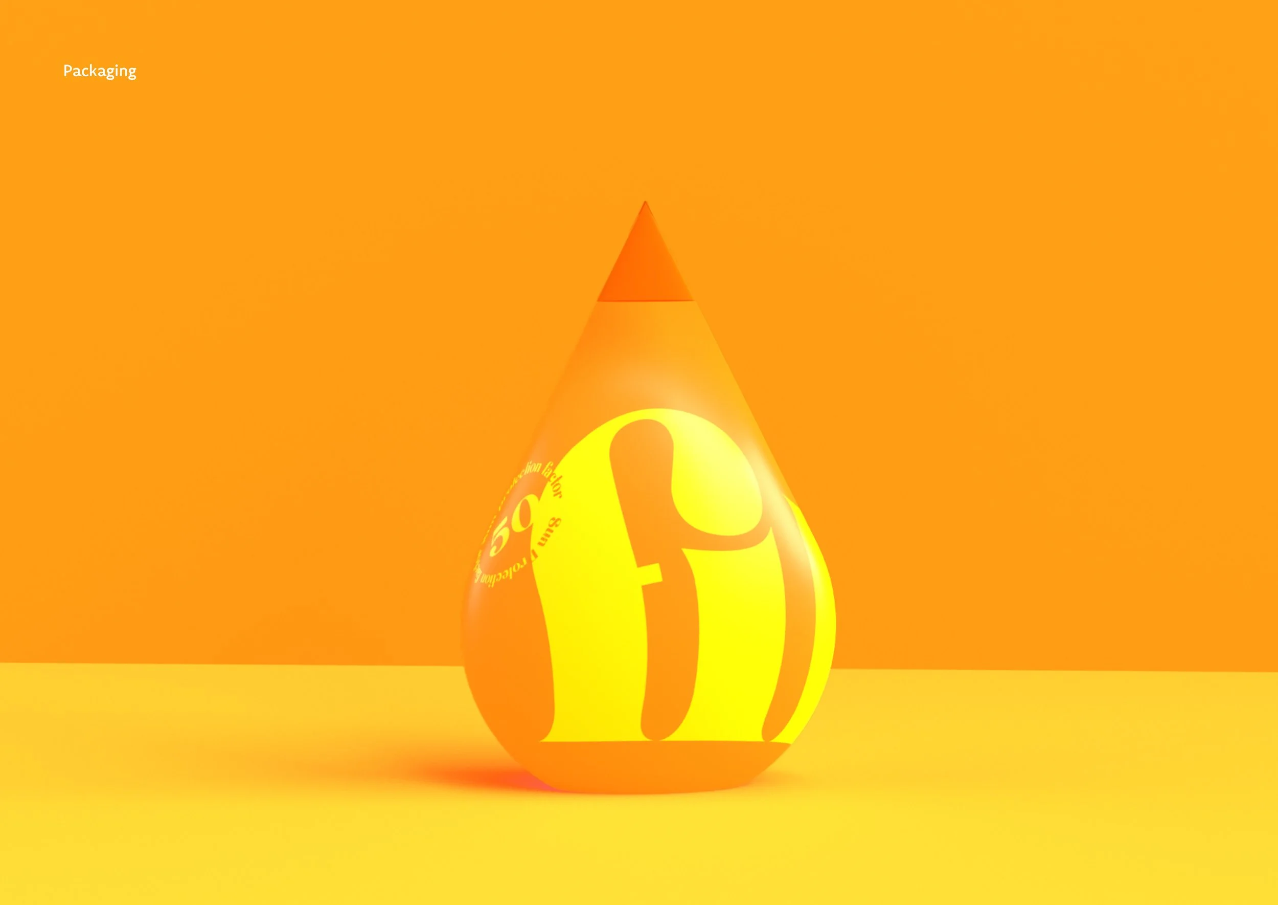
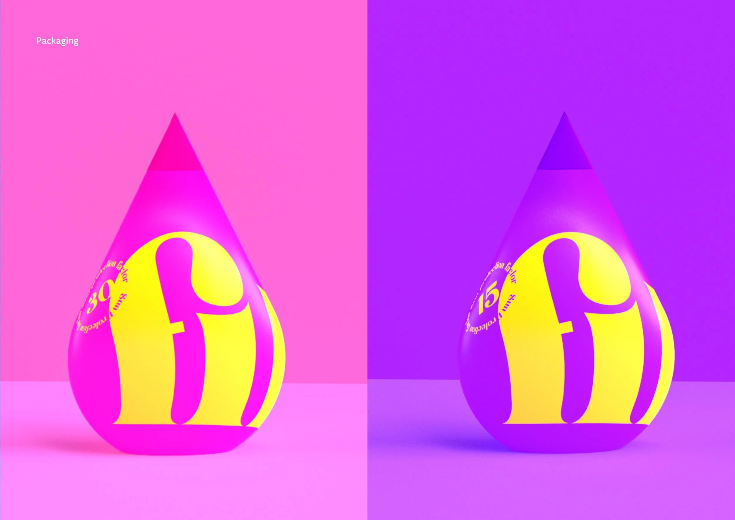
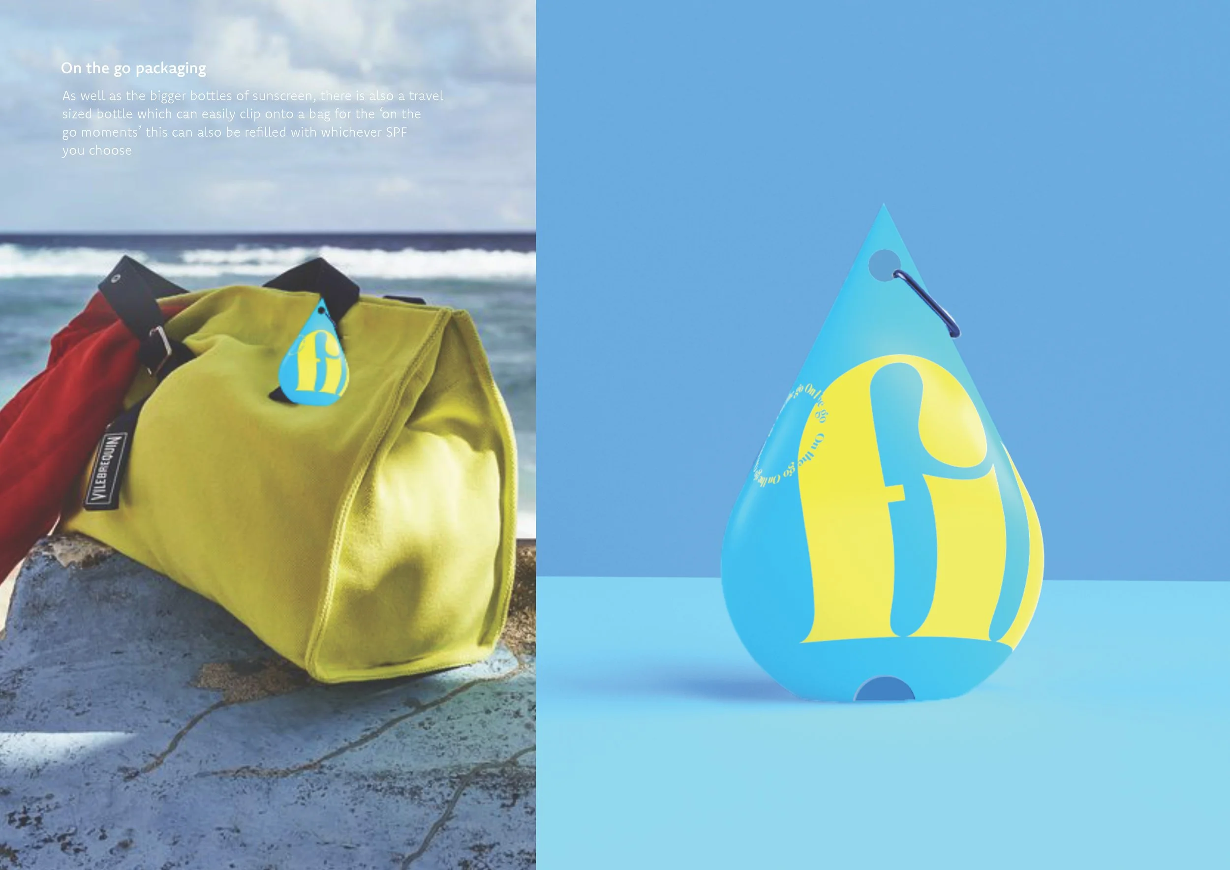
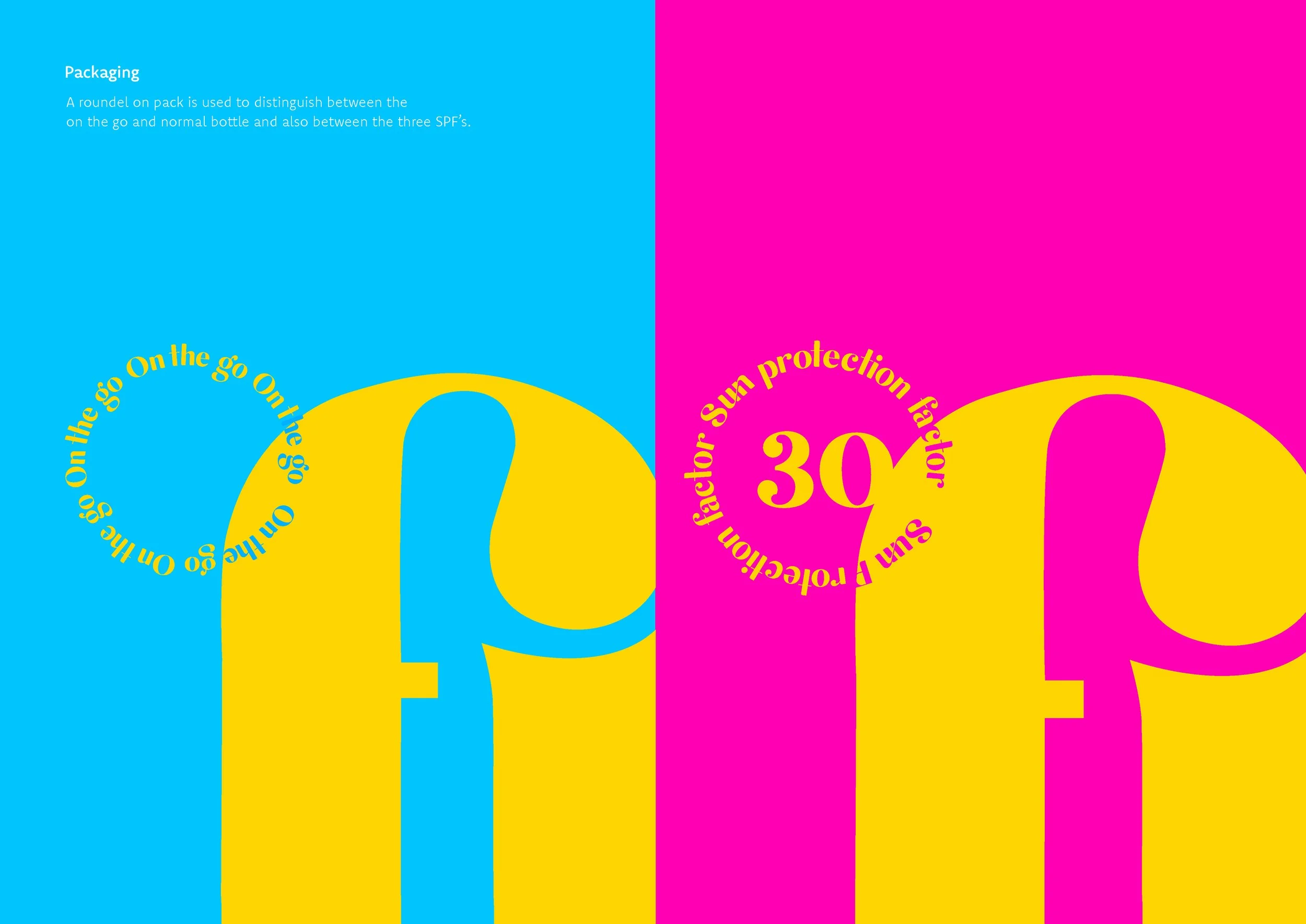
Packaging

Brand Values

Unwrap the Party


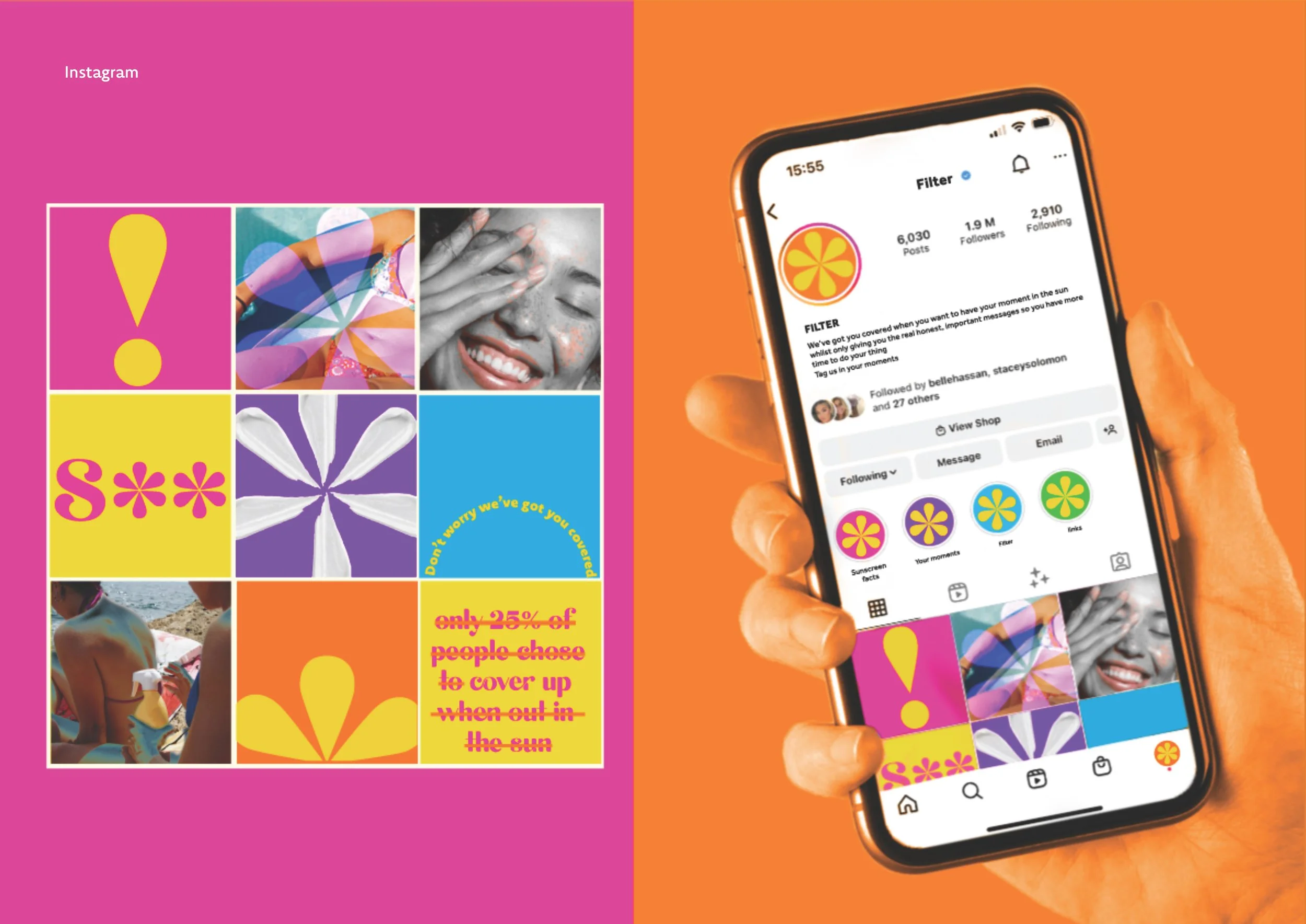
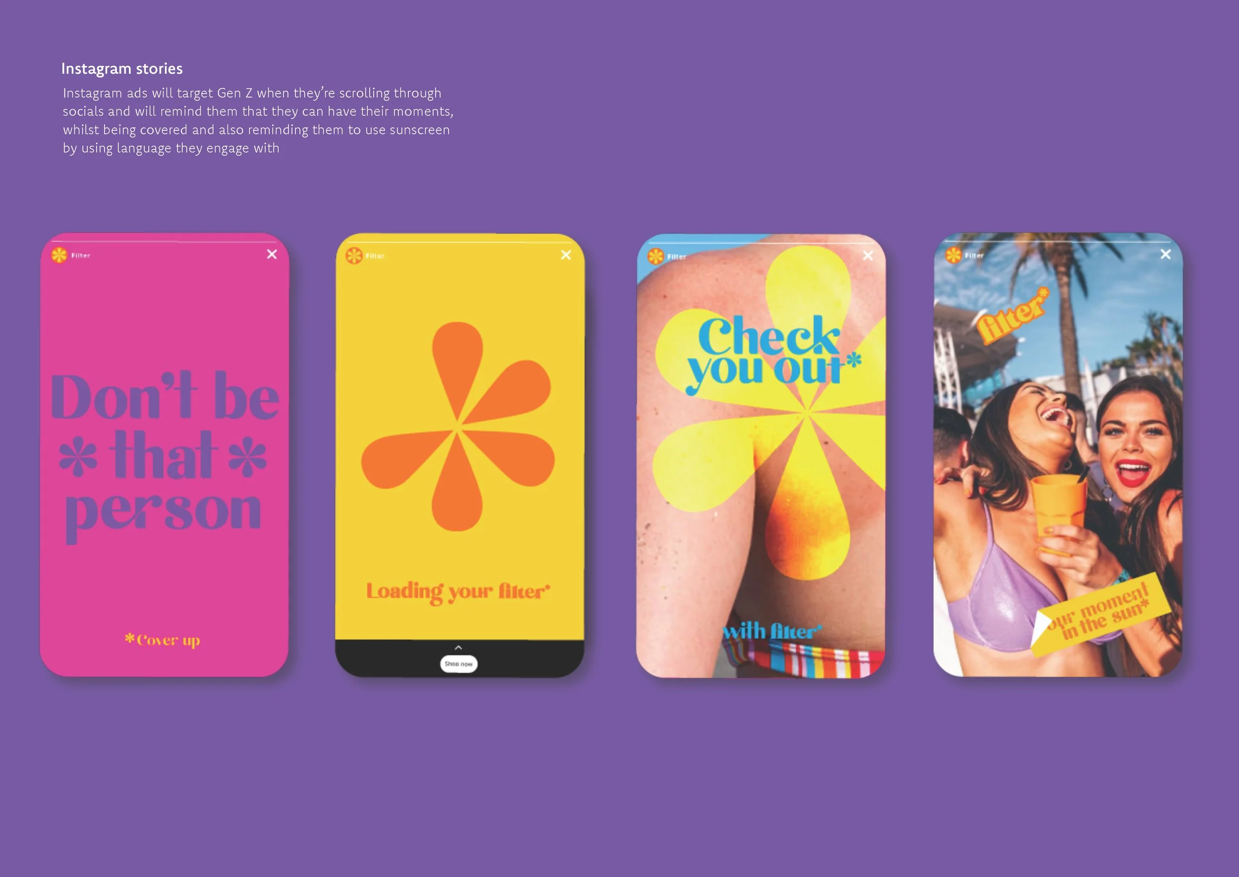
Instagram - look & feel

Social Media Stickers

Promotional Domino Set
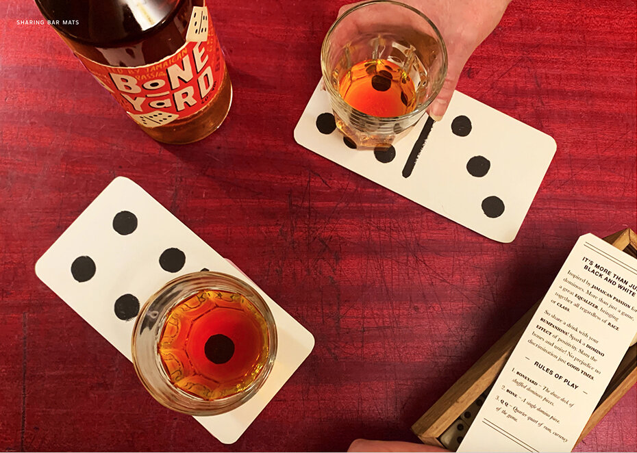
Sharing Bar Mats

Outdoor - Posters

Brand Name

Rational

Target audience

Copy

In the round


Detail

Brand Toolkit 1 - Symbols

Brand Toolkit 2 - Colour & Typography
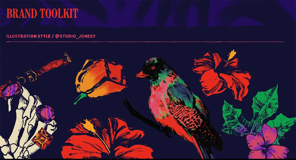
Brand Toolkit 3 - Illustration
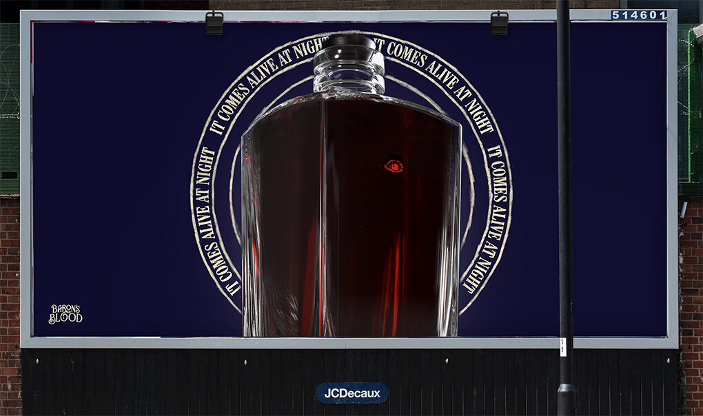
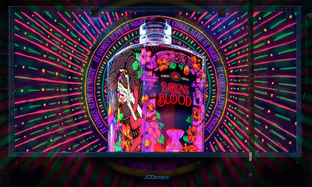

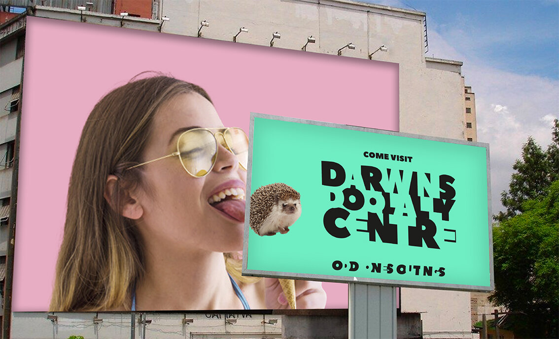
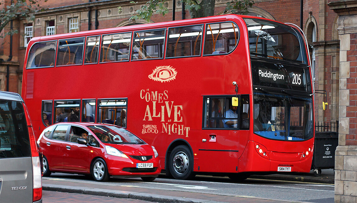
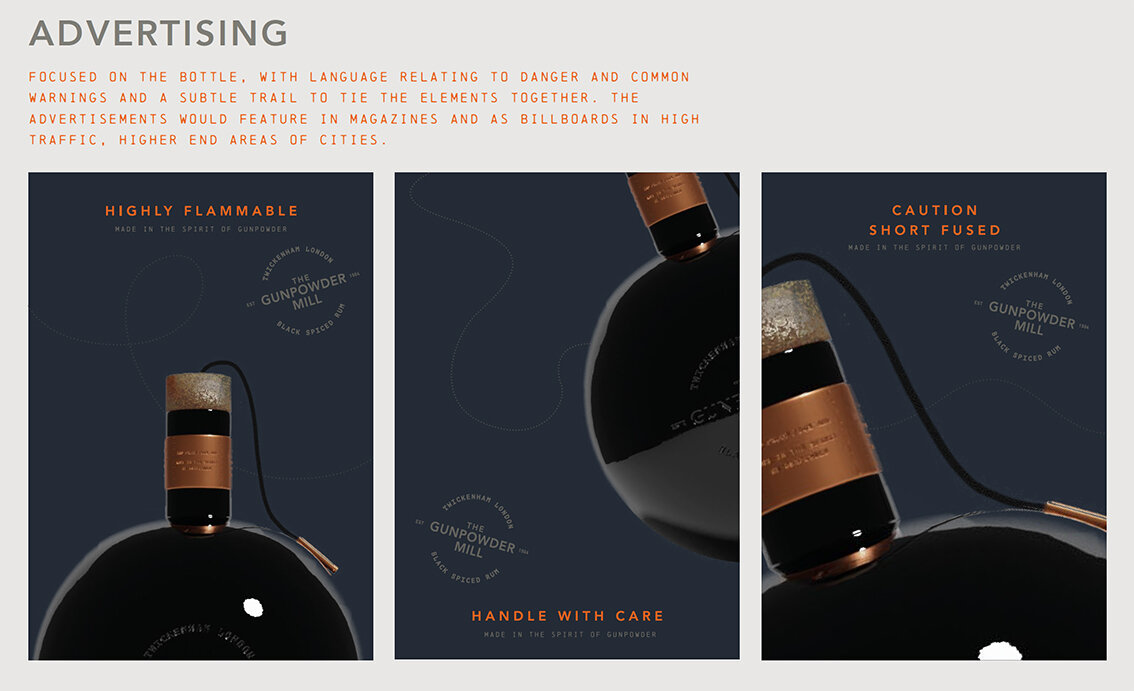
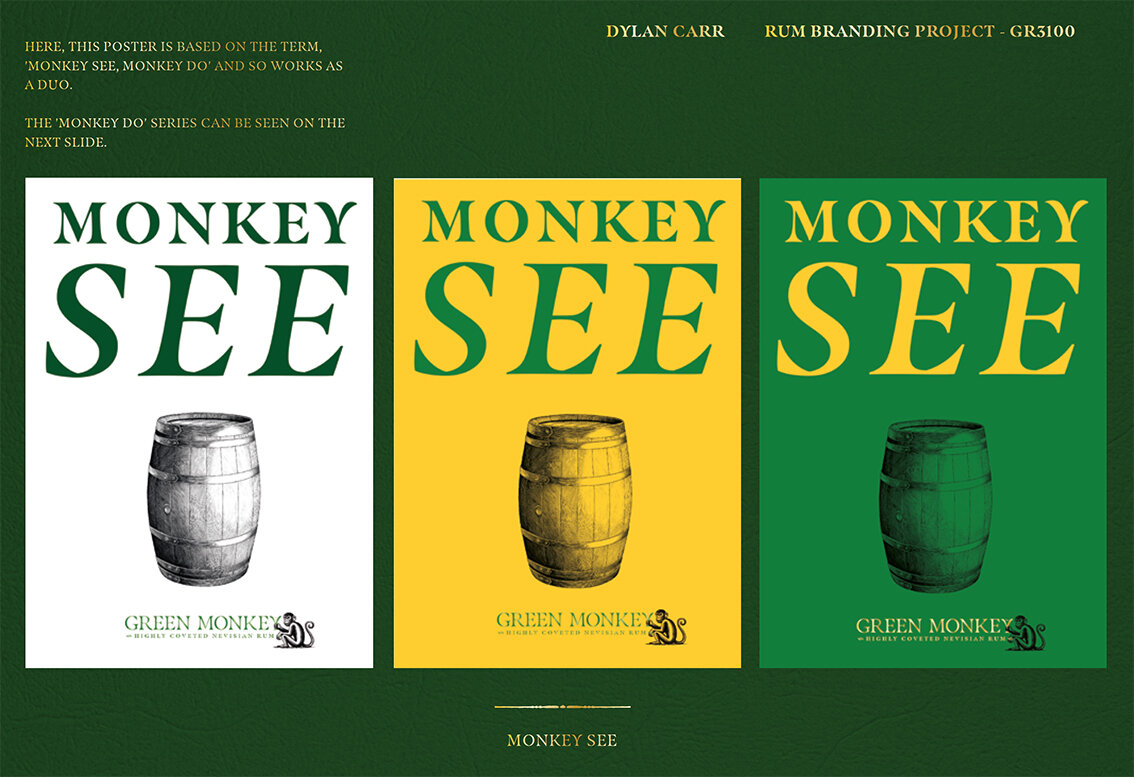
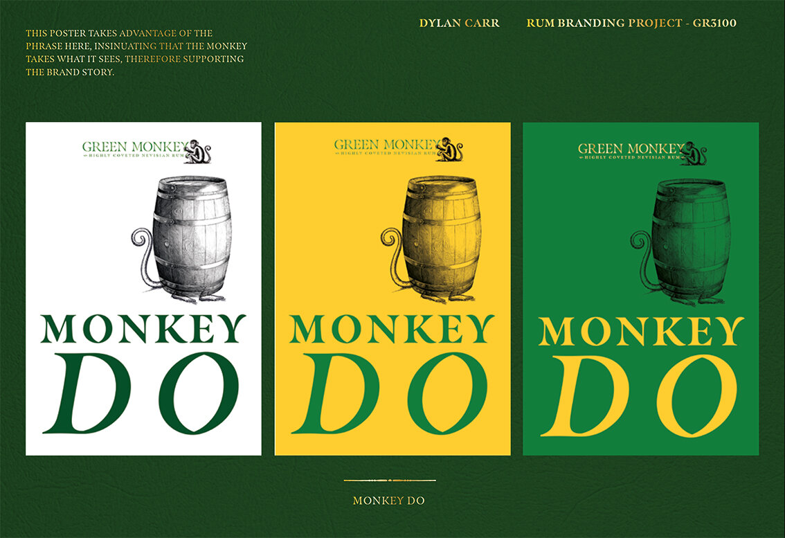
Outdoor - Posters

Splash screen
Please click on image above to play film

Setting the scene

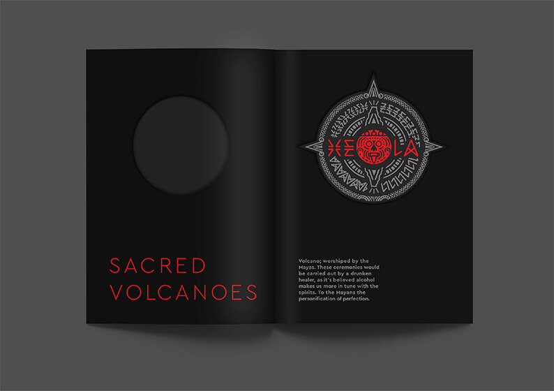
The Story

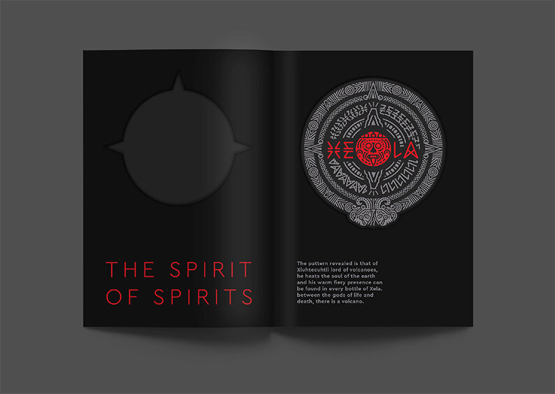
The Mark Explained
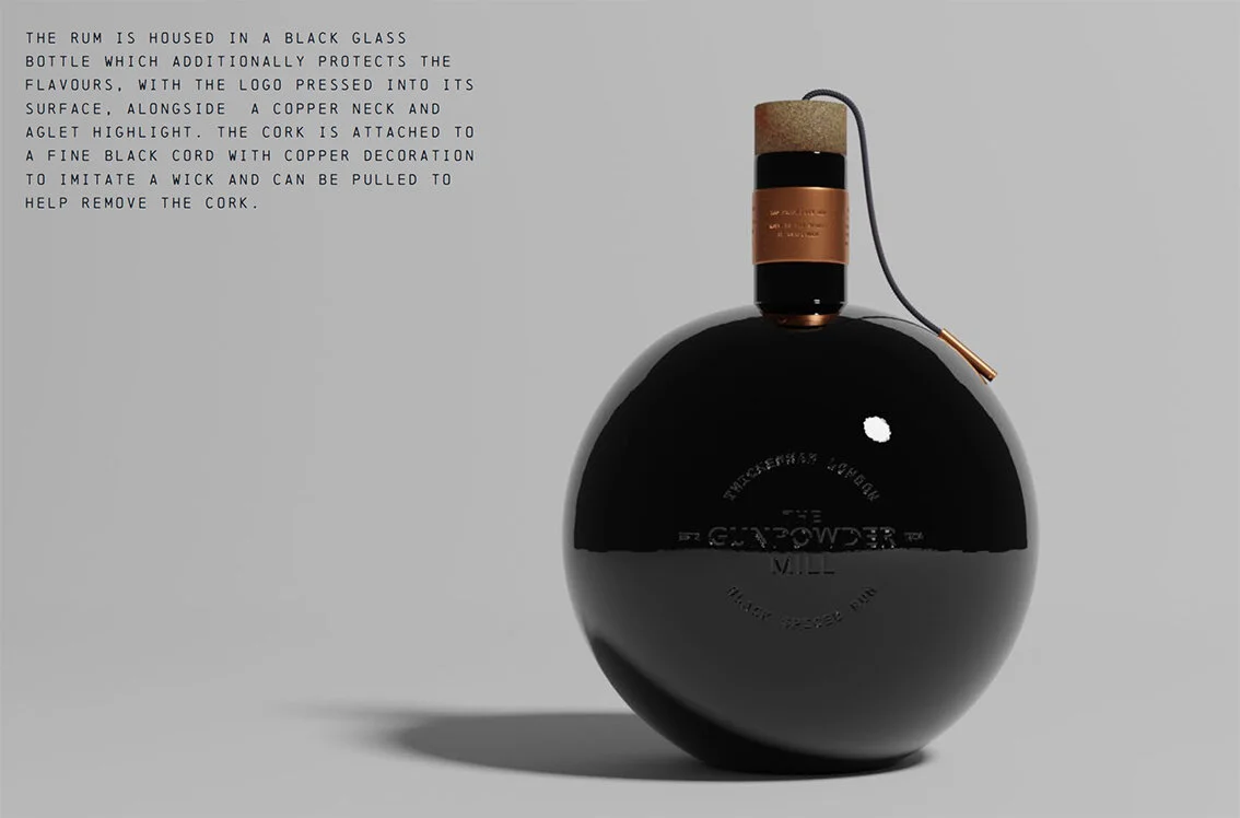
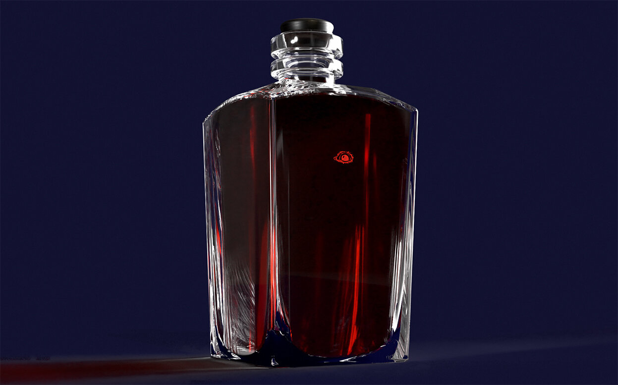
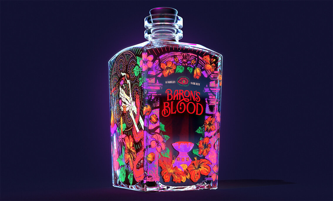
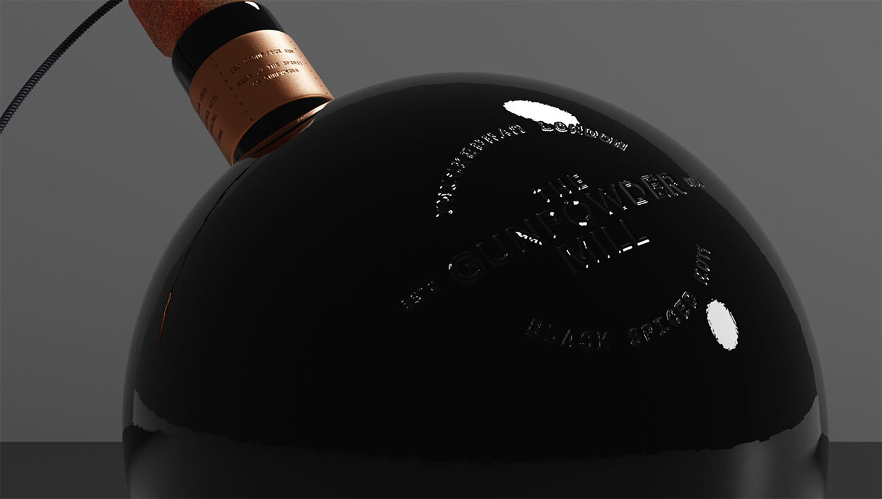
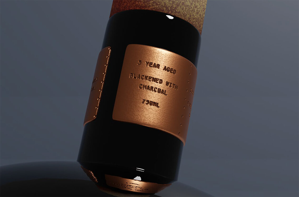
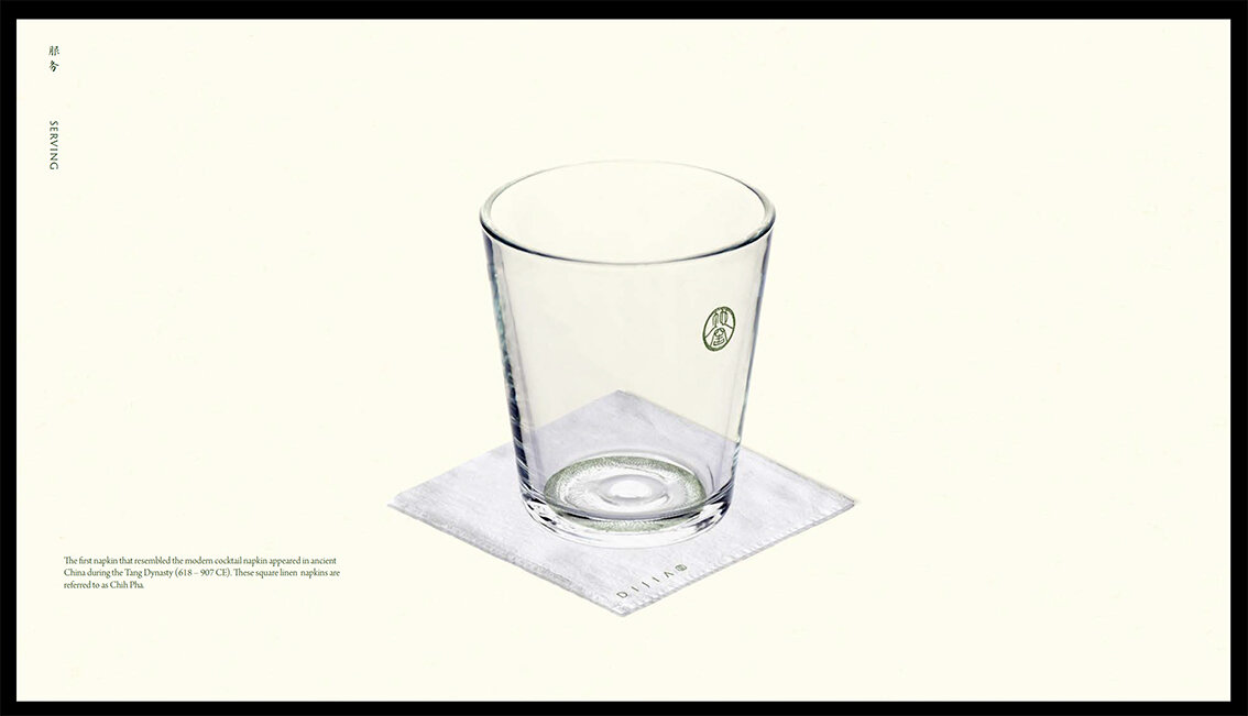
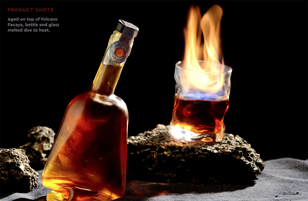
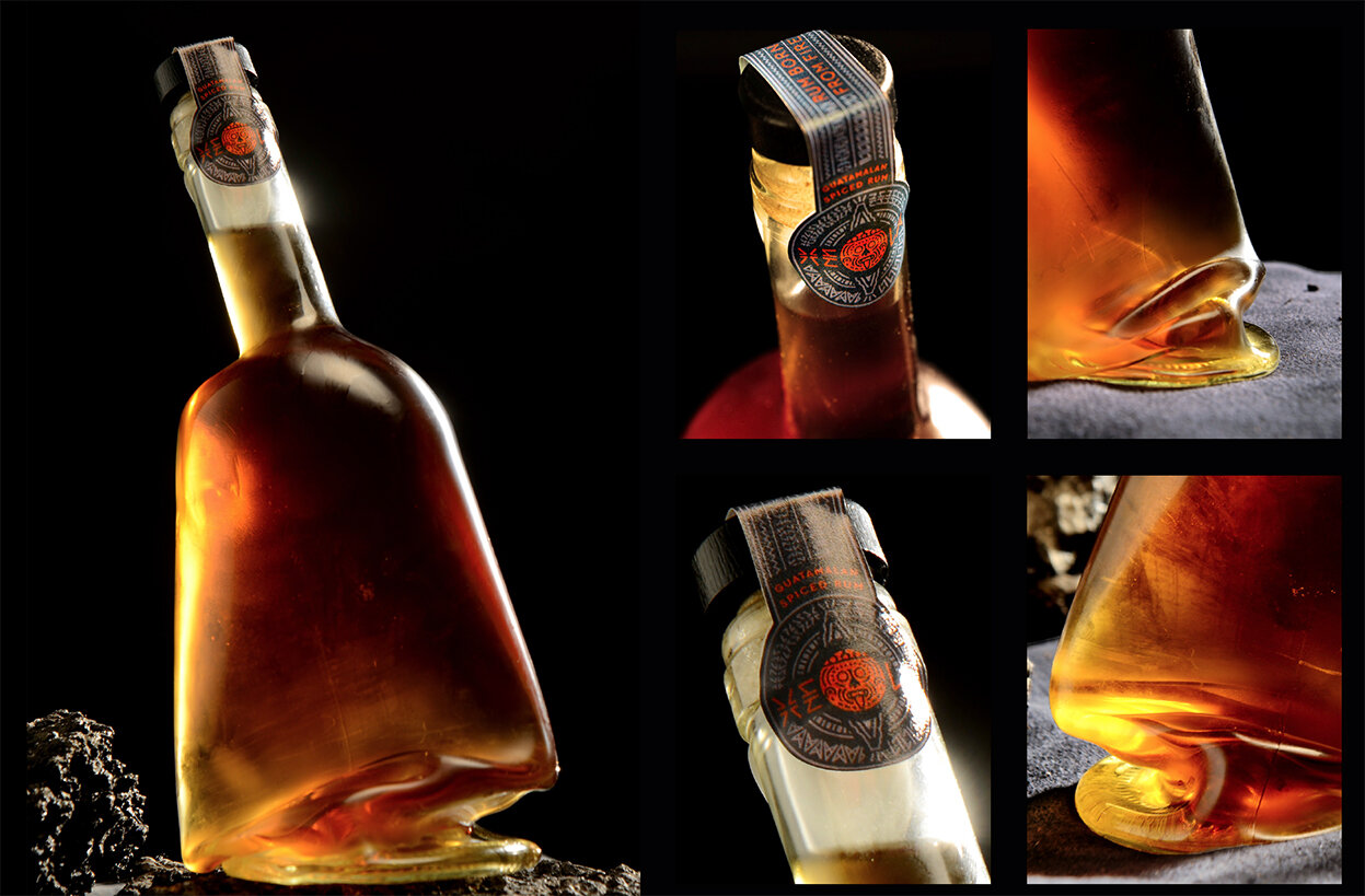
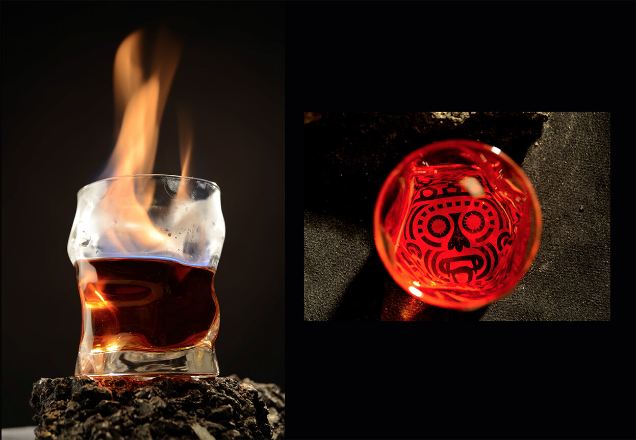
The Bottle

Posters


Please click on the image above to play the film
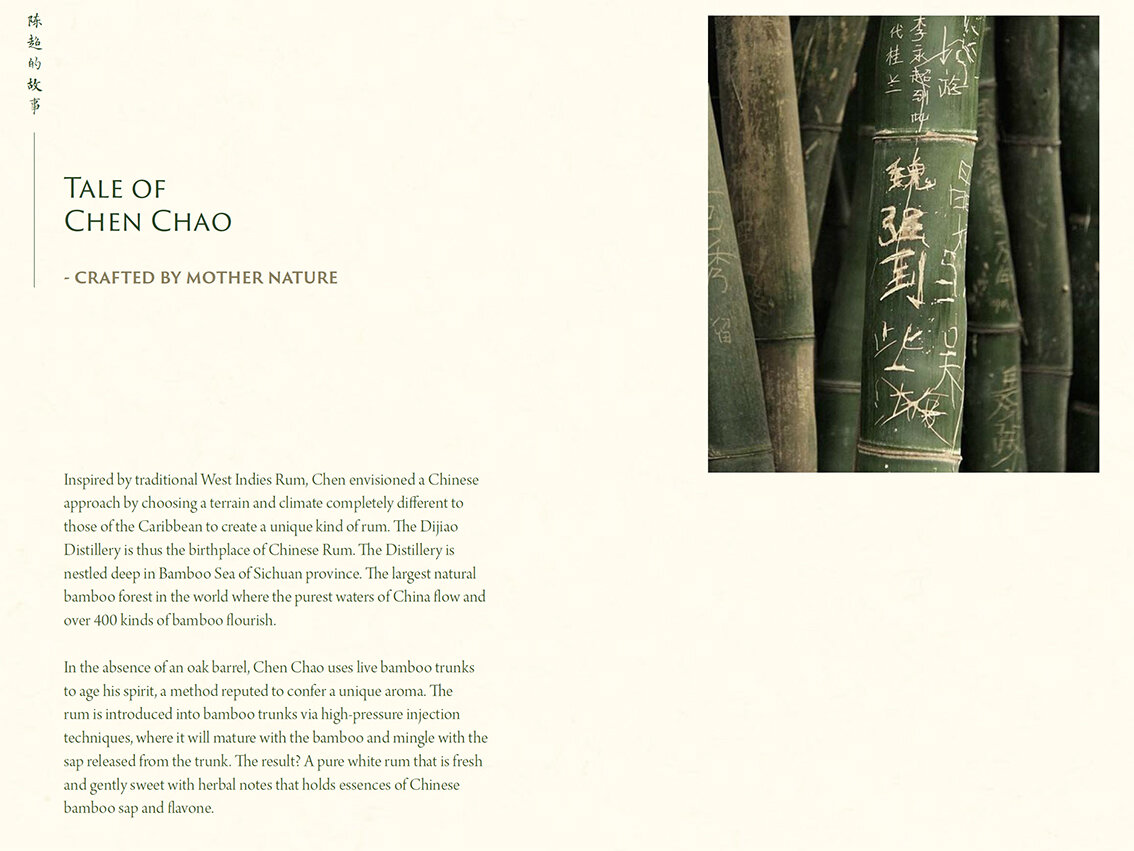
The Brand Story


The Seal of Dijiao

The Mark

The Adaptation

The Typeface

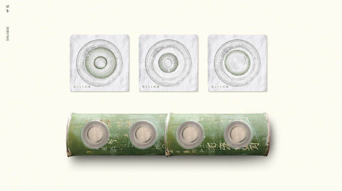
Bamboo Print
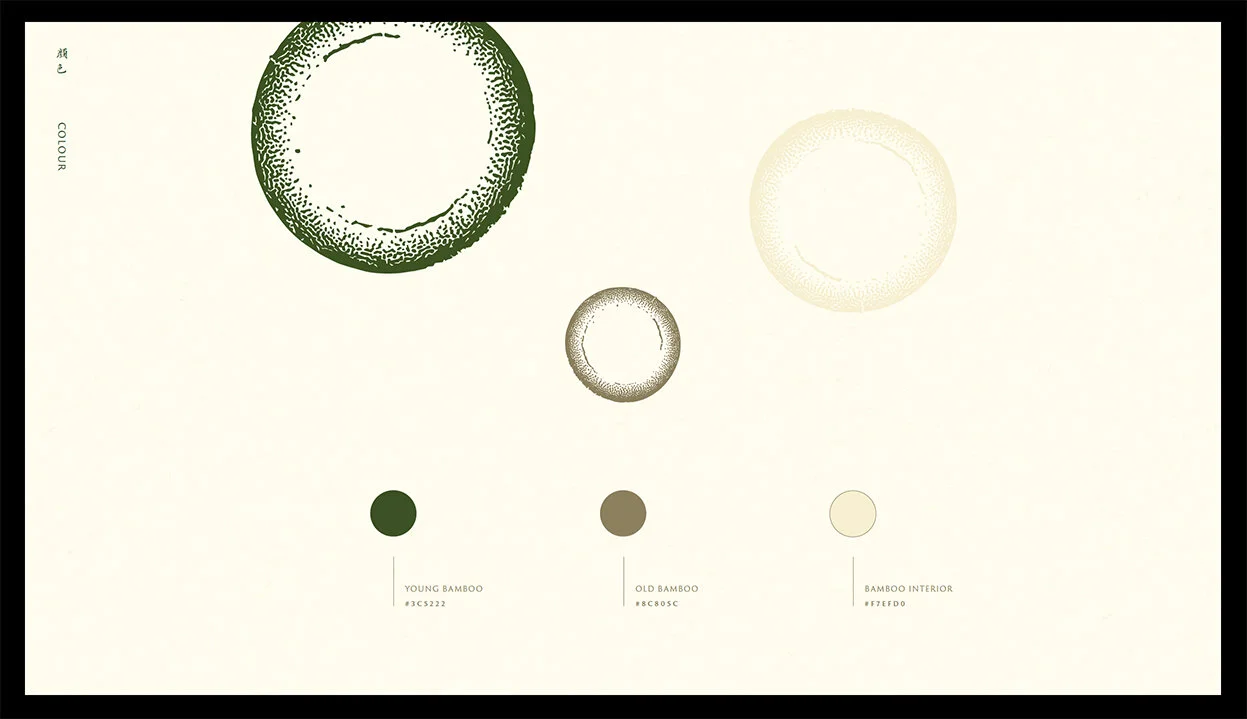
Colour ways

Outer Packaging

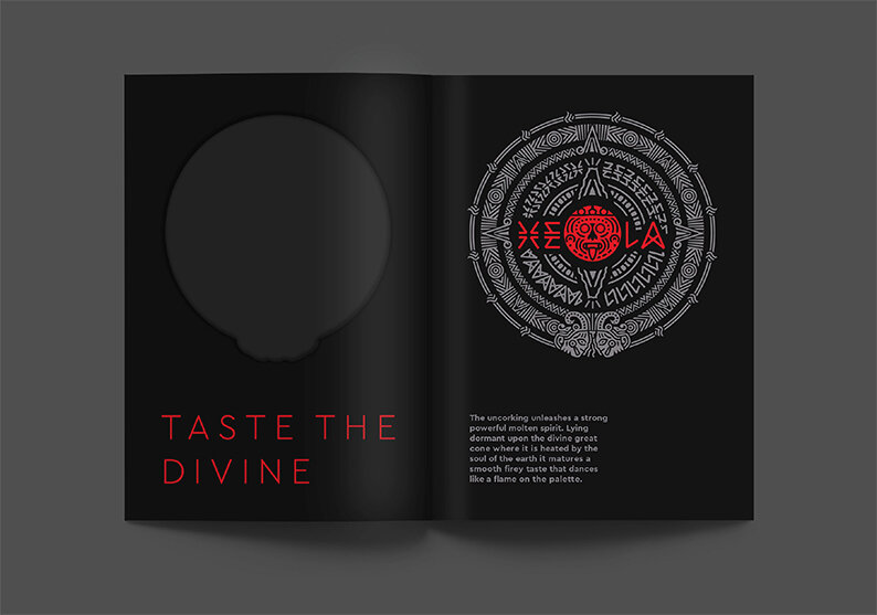
Opening and reveal

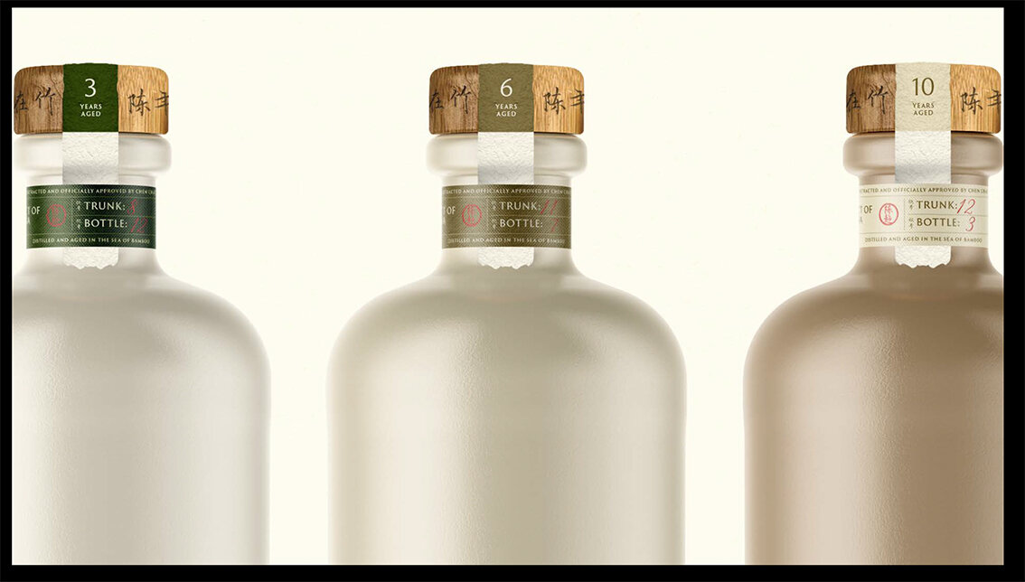
The Bottles
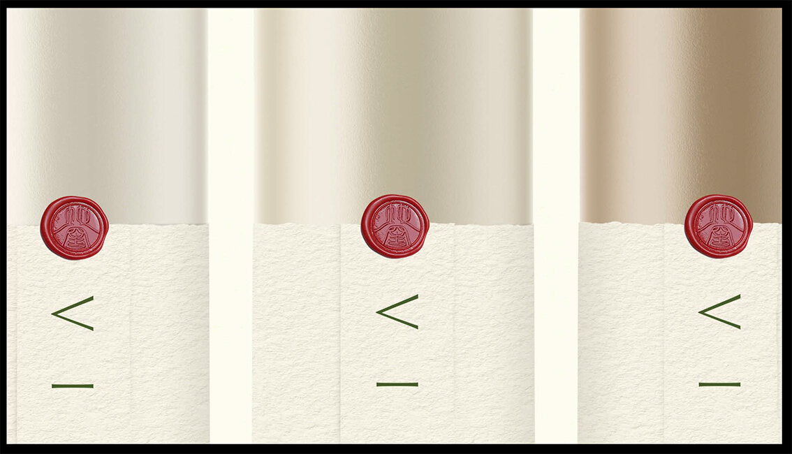
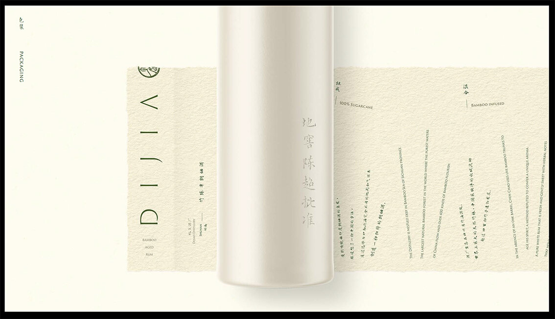
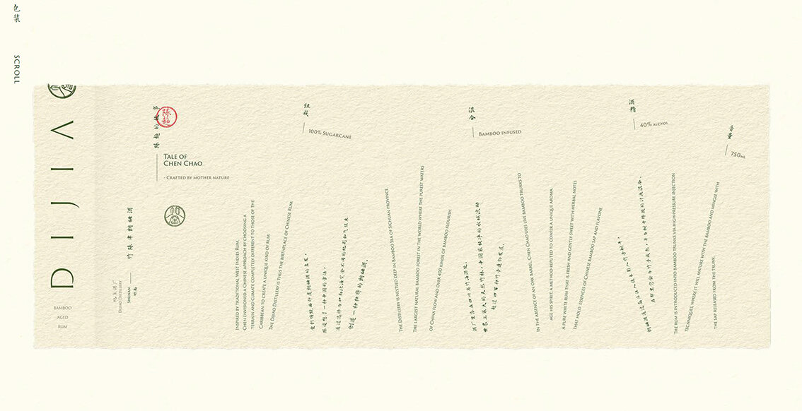
Hand made paper wrap around

Print Advertisement - Newspaper

Instagram Look & Feel

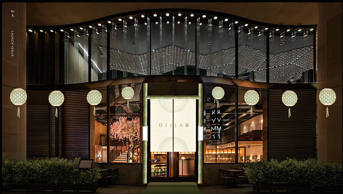
Launch event invite concept
Please click on the image above to play the film

The back story


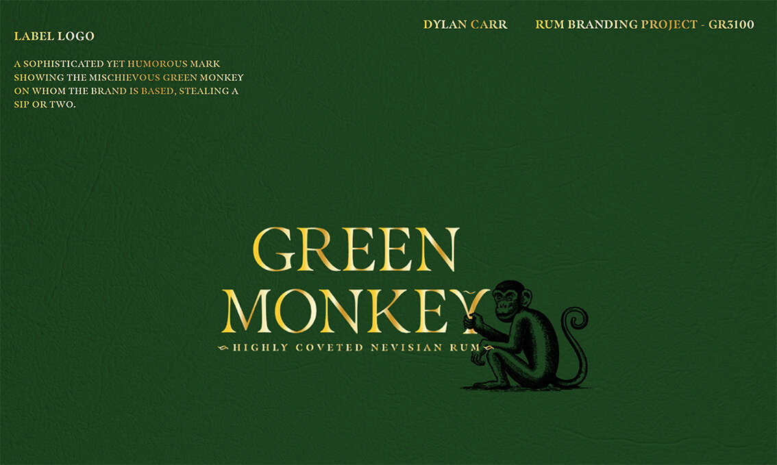
Symbol Logotype

Wordmark


Detail

The reference

Outer wrap

The Seal Detail

Please click on the image above to play film

Brand Story


Brand wordmark

Brand Story & Background

Typeface rational

Type effect rational

Bottle design


Asset - Contour lines

Contour line tissue wrap
Please click on the image above to play film.
Some excellent work and benchmarks for years 1 & 2 to analyse, absorb and ultimately learn from. Nice!
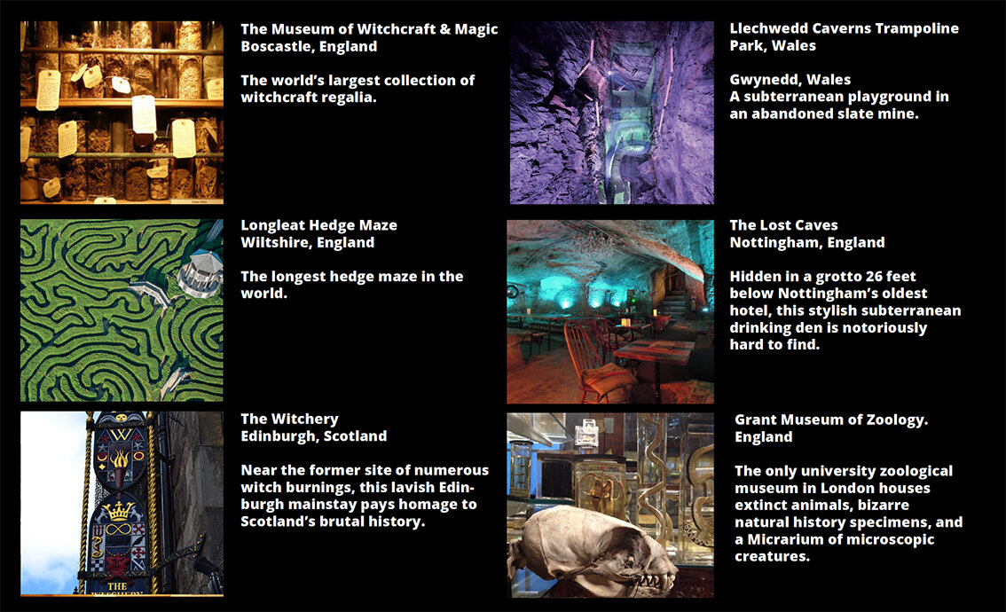
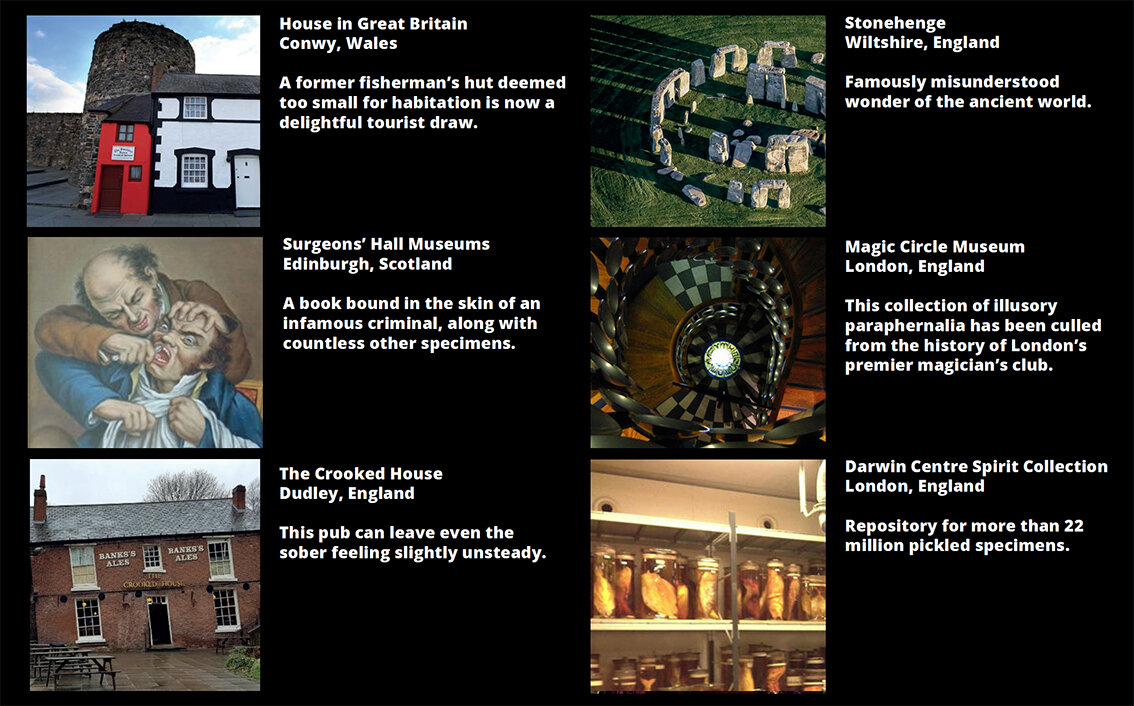
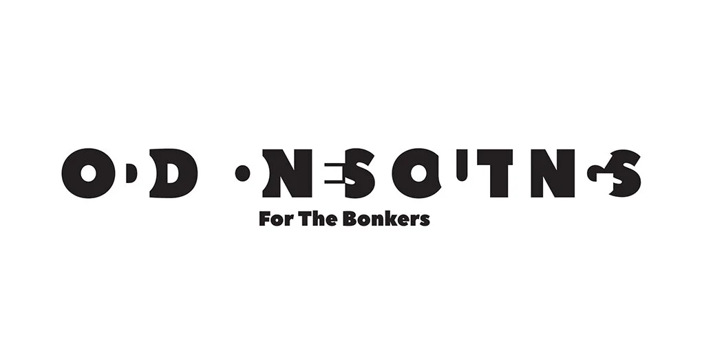
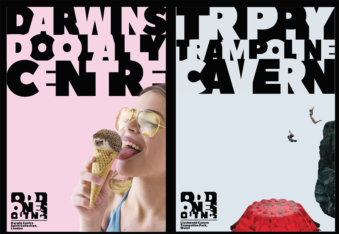
Here we feature Angus Meikle’s response to the industry brief set by Edit Brand studios.

Please click on the image above to play the film.
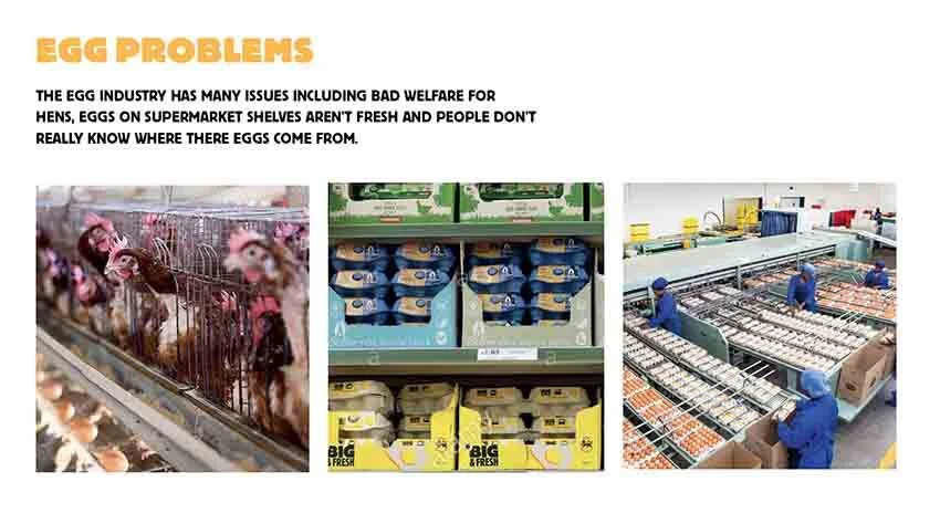
The Problem

The Mission Statement

The Word Mark

The Colour Pallet
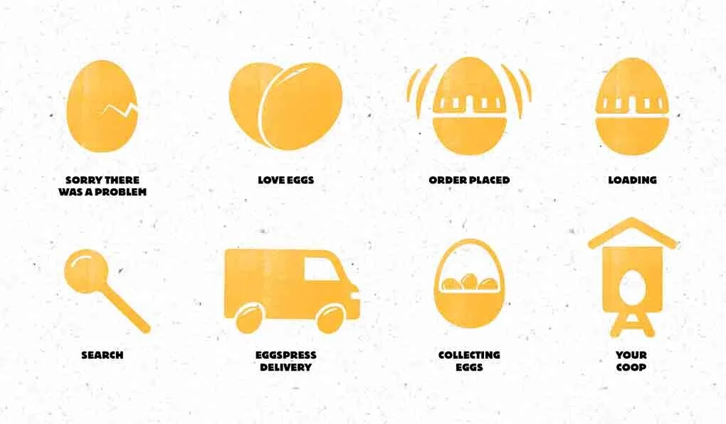
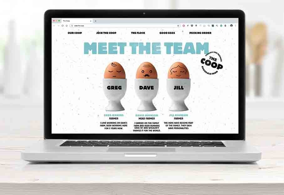
Egg Icon Designs

The System - How it works

How it works in context

The Outer Packaging Design

Information printed on the inside of the packaging

A Sample of box designs with simple stamped logotype.

Click & Collect option

Cluck & Collect pick up coop’s

Van Livery & Uniform designs
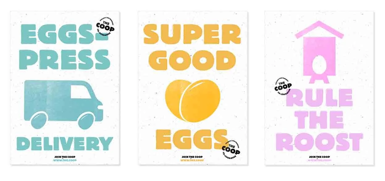
Poster Designs

Direct Mail Concept

Merchandise Designs
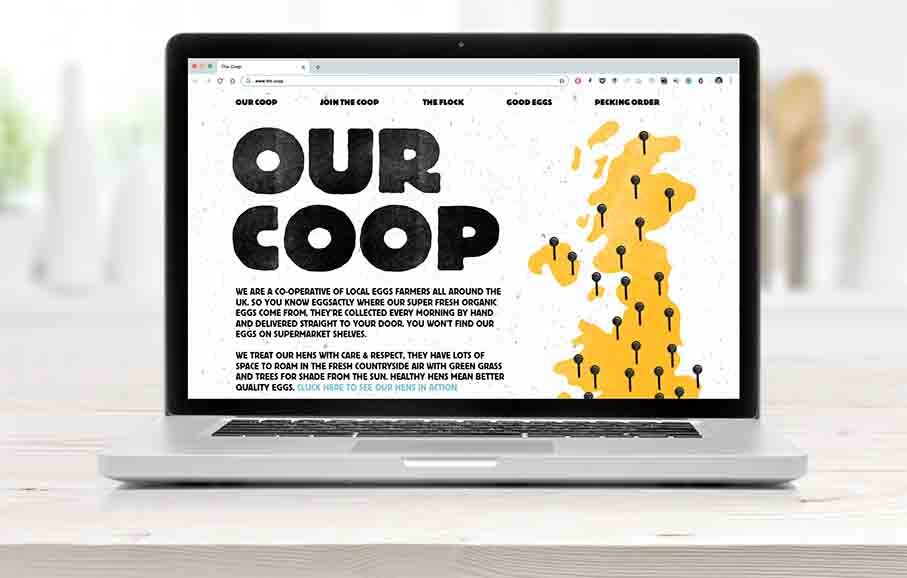
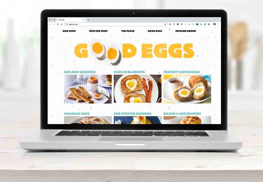
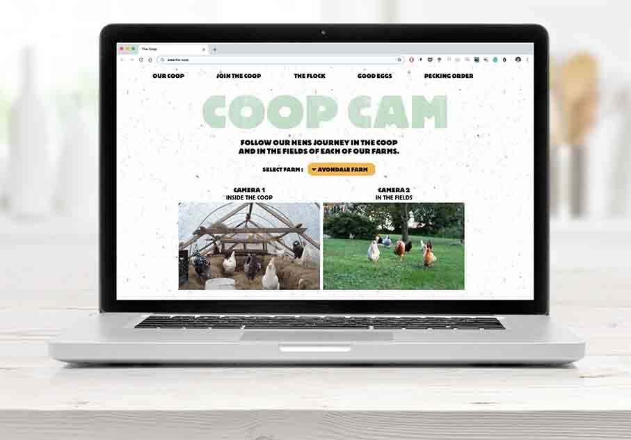
The short slide show above indicates some of the website content.

Instagram Feed

Copywriting
A great example of a thoroughly thought through branding exercise that combines all the basic elements.
An understanding of the problem, a creative overarching idea, demonstrated over an appropriate range of touch points. Considered typography, colour ways, iconography, materials as well as great copy writing all build to tell the story of ‘the coop’ brand and what they do.
This is also a great example for all year 1 students who are getting to grips with a branding exercise and has been specifically posted here in order for you to study, analyse, understand and learn from.
Here we feature one of the most comprehensive branding projects produced in recent years by Jonathan Mount in 2019 as part of his final year submission. The brief was an industry set project by Forepoint Preston.
Students were asked to brand the Alternative Olympics, the UK’s premier sporting celebration for the obscure and traditional heritage events found in the UK. Events included Nettle Eating, Shin Kicking, Worm Charming, Conker fighting, Bog Snorkeling and Black Pudding Hurling. The aim was to create a new vision for the Alternative Games using iconography, type and a strong visual identity. To modernise a long established event with a fresh new look for the 21st century.

Rationale – The County Games is one of the UK’s longest established sporting events dating back to the middle ages. It’s first revival during the 1850s brought five of Britain’s counties together in a celebration of the unusual and obscure.
Many of the sporting disciplines are no longer considered “mainstream” but at the heart of every modern sport is a traditional event pre-dating it. This bringing together of county teams to the centre of Britain was at the core of the games with events being held at the Forest of Bowland up until its decline at the turn of the 20th century.
It was rumoured that Pierre de Frédy, the Baron de Coubertin himself witnessed the games during the late 1800s and inspired him to establish what we now know as the modern olympics. The modern county games now includes eight teams with competitors vying for victory across eight events.
The games are no longer exclusively held in Bowland with competing counties now hosting each games on an alternate basis but for 2020, the games return to the heart of Britain, to the ancient royal hunting grounds of Bowland and the ancient home of the games, Dunsop Bridge.

The Brand Mark
Using the basic shield shape and arranging in a circle with the workmark underneath completes our logomark. Much like the interlocking rings of Olympic tradition, the county shields arranged facing toward each other really brings a sense of community and oneness for the games.
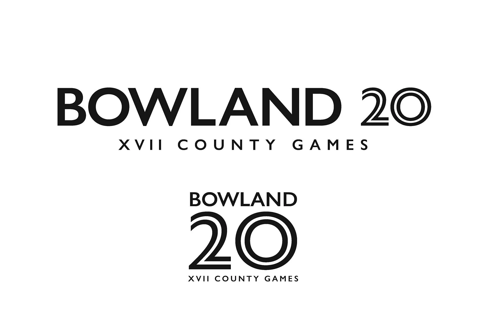
The two primary wordmarks using both standard and inline Gill variants

The basic Heraldic shape at the core of the logo, developed & simplified

The colour palette is taken from the respective county flags of each competing team

Complimentary type families

The Rationale for the Games


The team colours slide show


The arena signage for the different events

The competitors Tabards
Event participants can wear squad tabards in the appropriate colour of their team be it a 2 or 3 colour pattern. From left to right, the teams are the Rossendale Hurlers, Egremont Grimacers and Gawthorpe Haulers.

Wayfinding

The Medals
Event participants compete to win the coveted shield medals. The event for which the medal is awarded appears on the obverse of each below the shield circle. In the examples here, the events are coal carrying, bog snorkelling and shin kicking for 1st, 2nd and 3rd respectively.

Mockups showing obverse and reverse with ribbon colours for winning team

Advertisements
A campaign to get people intersted in attending. Each poster shows a competitor at rest and composed. The passion for the events they compete in is shown through the copy and tattoo.

In context

App 1

App 2

A tour de force in every sense. A great example of how a project can be carried through with great copy writing, imagination and belief. As a student of Graphic Communication this project should be considered a touchstone…the closer you analyse the symbolism the better it gets…and it doesn’t get much better that this project. Enjoy!
Three good examples of presentations from final year graphic design students, branding the British Obscure Olympics as required in the brief set by Forepoint.

The Disciples Of Design are a global collective of design academics, practitioners, artists and students. We have one common thread – University of Lancashire in Preston, UK; and one common aim – the creation of an ever evolving visual hub for the sharing of ideas and thoughts.


