Words within Words
/
Here we explore a visual communication technique
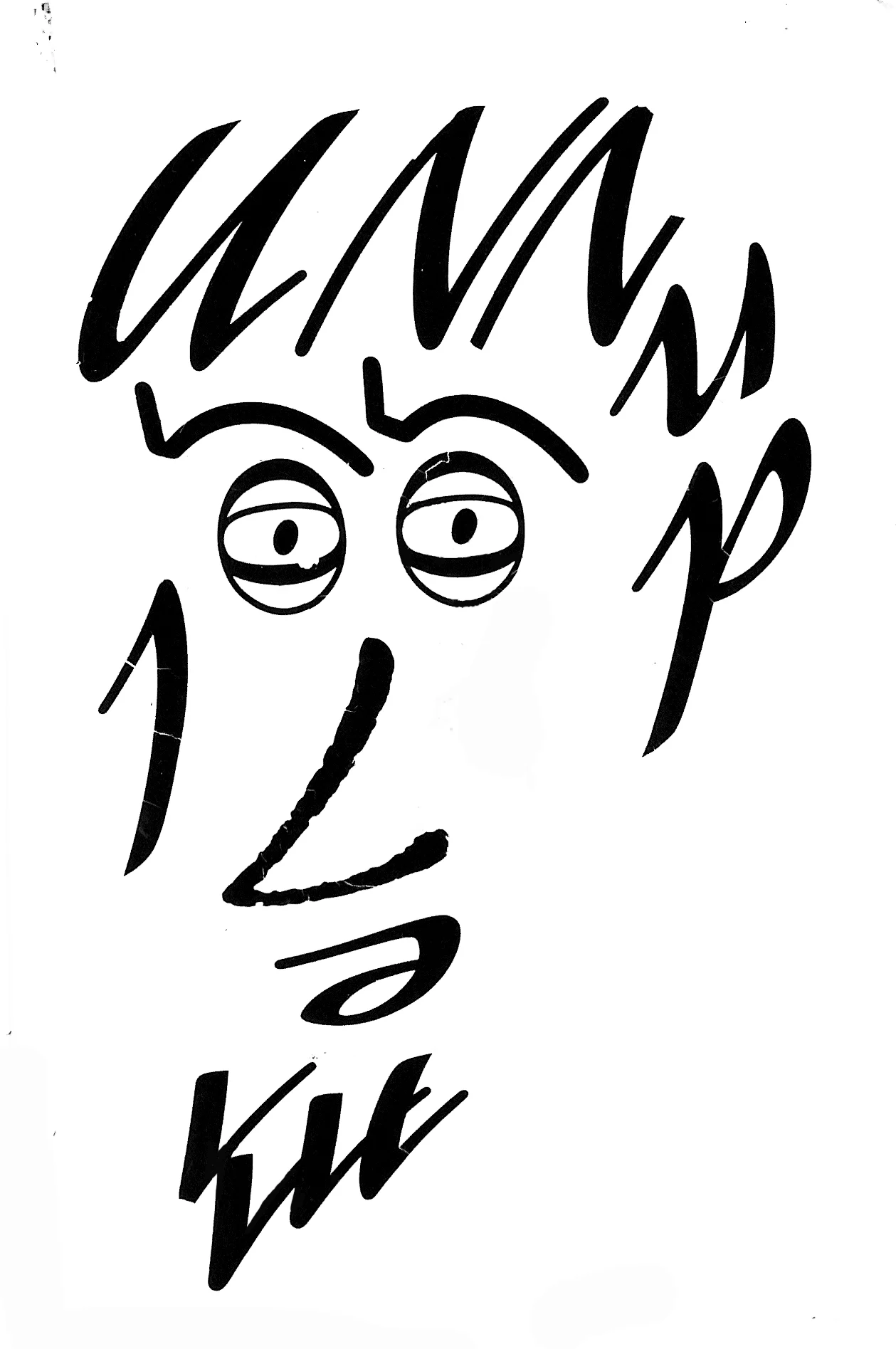
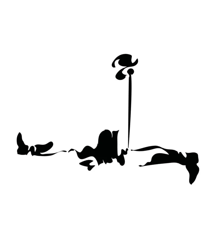
The following presentation highlights examples of how the designer has primarily used the written word to illustrate an idea or concept. What sets the following examples apart is the economy and restraint that has been employed by the designer. By merely finding a solution within the word(s) or language that surround each subject.
There also appears to be an effortless feel to these design solutions that belies the fact that each and every designer has had to work hard, striving to find that solution. However at some point on their creative journey they have had a ‘eureka moment'! They have made a creative connection or series of connections and when analysed, in order to achieve this, they have employed one or more of the following techniques:-
They have consistently kept an open mind.
They have visually interrogating the surrounding word(s) & language.
They have exploited the incidental.
They have embraced serendipity (a happy accident) and happen-stance (chance occurrence).
They have approached the problem both laterally & from 360 degrees.
They have applied a relevant or appropriate technique to enhances the concept...
...but most importantly they have looked and looked, and looked again.
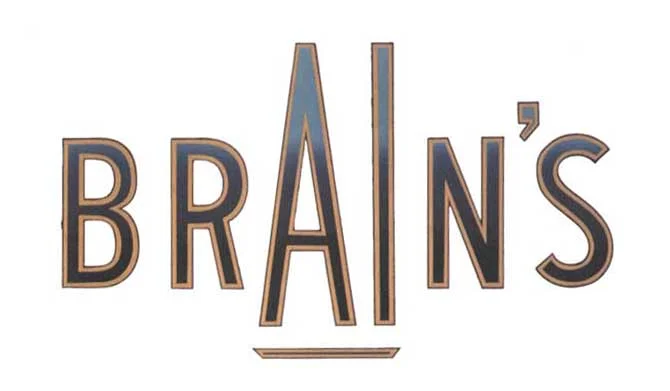
“Brains A one Ale” - Brewing cask ale in Cardiff for over 125 years.
Logotype for the Earth Art Institute - 1992.
One powerful word is hidden within another.
Vidal Sassoon 50th Anniversary Logotype - 1992.
Stylishly combines both name & number.
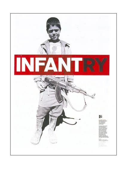
Apartheid succinctly illustrated - Designer - Bryn Jones
The designers actually found four directions.
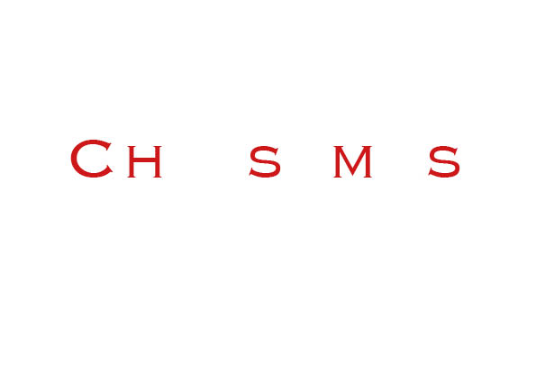
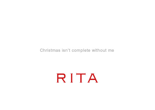
Personal Christmas card - Designed by Rita Kinsella - 1995
Poster for New York based human rights charity Witness.
Designed by Lippa Pearce Design
Claire is marrying Dave - Wedding invite
Designed by The Chase Creative Consultants
Great use of an anagram amongst Friends!
Course language.
Book cover for a Pan Paperbacks on the ultimate diet.
When given the word fasting as the title the designer saw greater possibilities.
From - Smile in the mind 1.
The co-operative Bank Calendar - 1991.
Designed to raise money for 6 special niche charities.
The introduction above contains a hidden message.
Manchester Evening News are expanding & moving office
Designed by The Chase
Is Ikea a good Idea...discus.
Year 1 creative thinking type solution.
Designed by Jennie Potts
Designed by Matt Johnson - 2007
Advertising Standards Authority press campaign.
D&AD runner up 2002
‘The difference a letter can make’
Advertising Standards Authority press campaign - D&AD winner 2002
Fine Art Degree show Poster - 1994 - Designed by Mark Hurst.
University of Central Lancashire
French Connection UK - Trevor Beattie in 1997.
French Connection used the abbreviation FCUK on an internal memo.
The idea evolved into one of the highest profile and most controversial
British ad campaigns of the 90's.
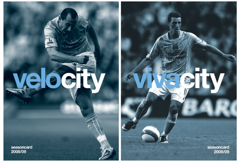
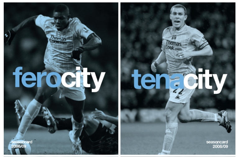
Brand marketing campaign for Manchester City.
2008/09 season - by Mark Studio
Proposed identity for The Mitchell & Kenyon Cinema - by The Chase - 2006
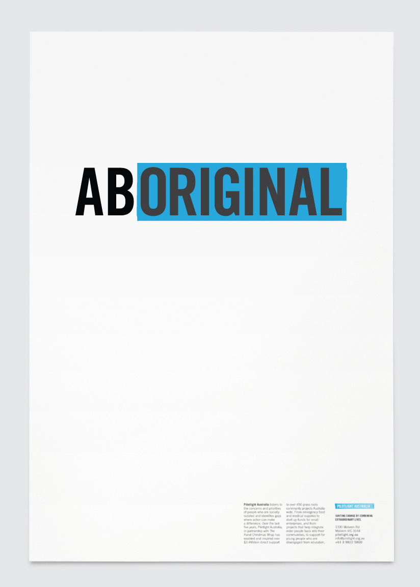
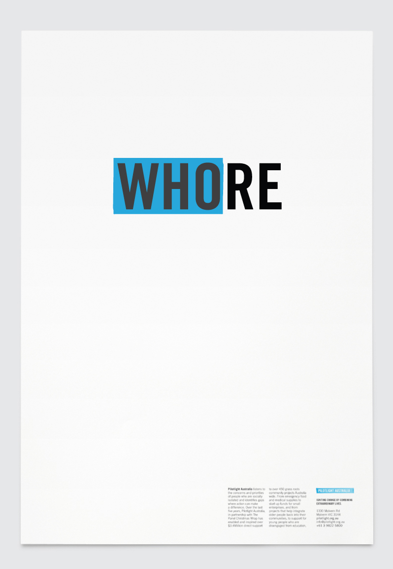
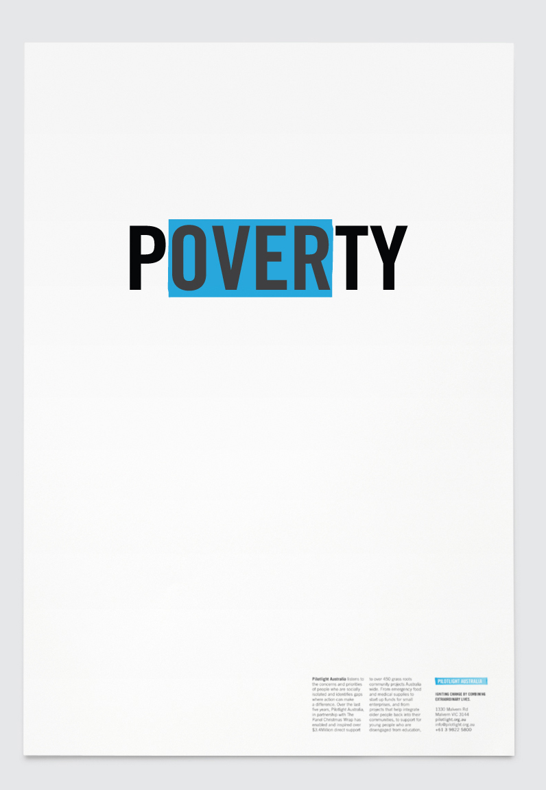
Pilotlight Australia
Pilotlight’s aim was to spark ideas, turn heads & make people think.
Seeing something good or unexpected, in something bad.
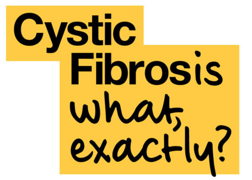
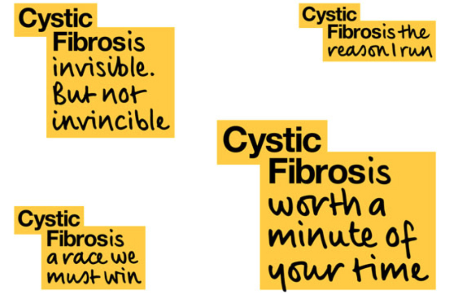
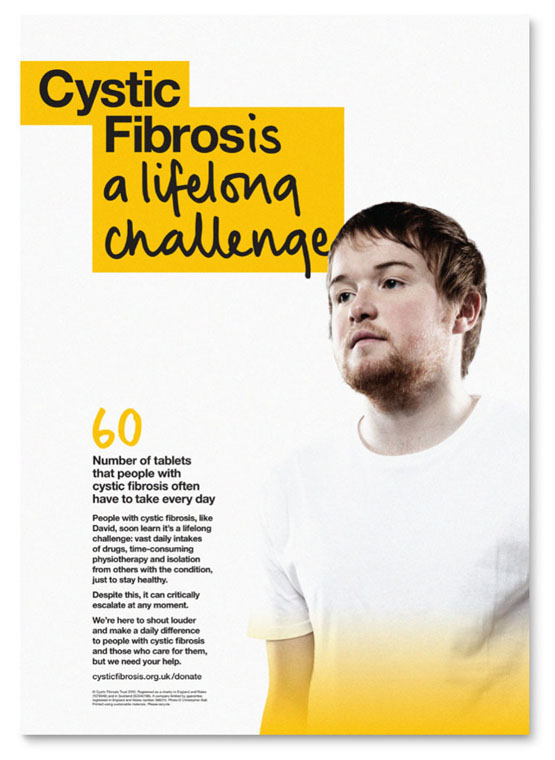
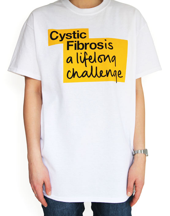
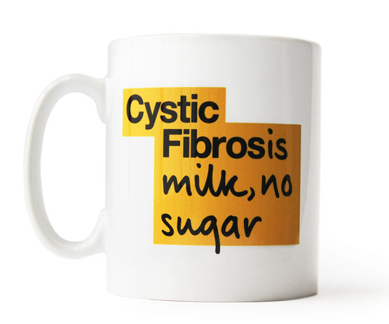
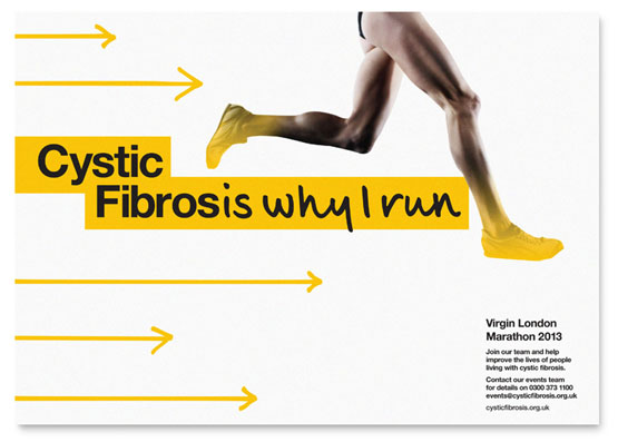
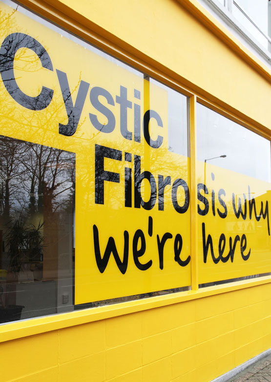
Cystic Fibrosis - Johnson Banks
“In discussions and research, it became apparent pretty quickly
that the condition is widely misunderstood.
Most people don’t understand what it is, or what it does,
until someone close to them is affected by it”.
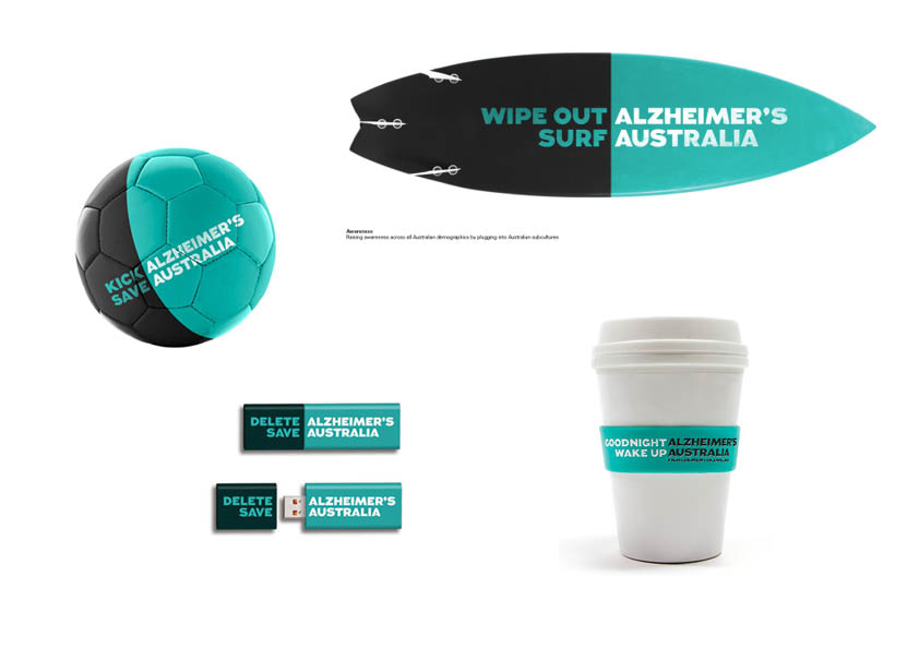
Alzheimer’s Australia - Interbrand Australia - 2012
The following brand features a flexible logo that changes & evolves
to communicate different messages.
Using two colours and often just four words the idea communicates
the name of the organisation, highlights a problem and features
a strong call to action.
A great little book, highly recommended.
...and finally the Scunthorpe problem
The Scunthorpe problem is the blocking of e-mails,
forum posts or search results by a spam filter or search
engine because their text contains a string of letters
that are shared with an obscene word.
While computers can easily identify strings of text
within a document, broad blocking rules may result
in false positives, causing innocent
phrases to be blocked.
