The Sainbury's Design Archive
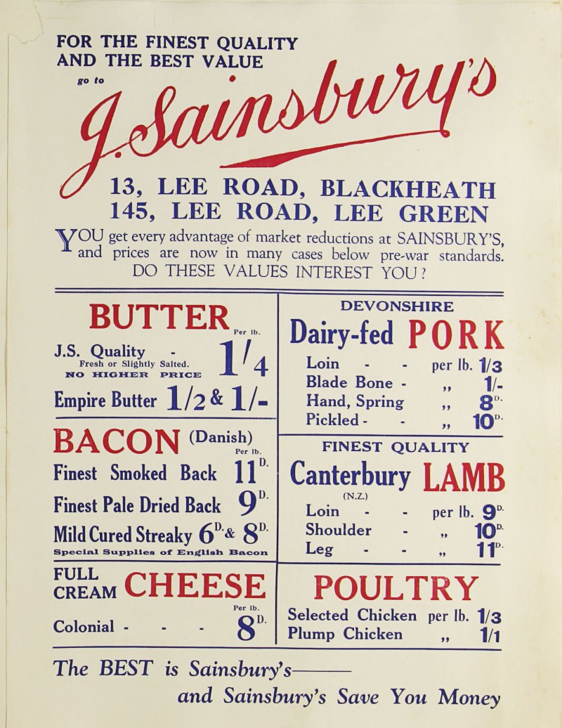
/The Sainsbury Archive is an online repository of the supermarket chain’s history containing everything from photographs to examples of advertising from the company’s 100+ years. Particularly fascinating for designers is the wealth of packaging material on here, with hundreds of examples of Sainsbury’s own brand designs.
What we have here is no less than the story of UK consumer communication, where the timeline interface can be used to discover the changing design trends and impact of new production process right through the 20th century. The work of Peter Dixon’s in-house team is particularly fascinating, each 1000’s of new product packaging was introduced or re-designed, each with their own distinct graphic approach. As well as pictures, much of the packaging is shown as flat artwork proofs which will be of interests to students of 3D design. Aside from packaging, the photographs of store fronts, press and poster ads an even old editions of the Sainbury’s in-house packaging allow from the trace the evolution of how one of the countries biggest retail brands have communicated with it’s audience. This is a fantastic resource for research into any design project.


