How big is small?

Below we feature an article penned by T. Dodd, originally published in 2006, in The Disciples of Design - Issue V.

Recent observations on the students' grasp of spacial awareness.

Size, shape, volume, weight, balance, scale, perspective, scope, composition and aesthetics, are fundamentals to every design discipline and are an ongoing voyage of development for all. Even the most experienced designer or artist is constantly in a state of reevaluation when it comes to the above.

Students of art and design, especially those who increasingly work and rely on the computer for their designs are often in danger of misinterpreting these cornerstones. In my experience as a tutor, in the area of visual communications, I am constantly reminding and pointing out to students the basics fact that they are working in miniature (most of the time). The constraints of a computer screen make it inevitably so.

“I didn’t expect it to look like that”, “it’s too big”, “I thought it would be smaller” and “it’s not the same”, are all comments from students on finally seeing their designs in the flesh.

Living in an increasingly introverted, distorted, artificial, virtual, miniature world, has now become the norm for most 19 year old’s. Yet the paradox is they wander around in the real world, where a bus is big and water is wet. It is only when they start to realise their designs that this dichotomy becomes evident and always proves a constant source of surprise to them and amusement to myself.

It is a learning curve, no doubt, but the constraints of living in the world of A4 and A3 need to be broken at some point, if they are ever to stand a chance of ‘thinking’ or indeed designing ‘outside the box’.

Spacial awareness or mental measuring would appear to be an inherent trait, nurtured in our early years with three dimensional childhood games and puzzles. From the simple round peg and square hole aptitude tests to the more complicated puzzles, like jigsaws and the Rubik’s cube.

However in our “brave new world” of the internet, the PlayStation, the mobile phone, and the laptop computer; there would also appear to be an increasing lack of basic perspective.

Miscalculation of dimensions is nothing new. NASA boffins have wasted millions by confusing imperial and metric measurements. Legend has it that when Henry Ford completed the prototype Model T he had to knock 6 inches (that’s 152.4mm) off of his garage door frame to extricate the vehicle. Errors such as these provide amusing anecdotes and are hilariously encapsulated in the Stonehenge scene from the film Spinal Tap.

But there is a serious side to all this and it manifests itself in the simple fact that today’s design student has, or is, losing their ability to engage with the real world on a basic level. i.e. A ruler. In my limited experience, assumption is now the student’s closest friend.

Two dimensional screen based learning has been part of design education for a relatively short period. In the past 15 to 20 years technology and related software has advanced at an alarming rate and has revolutionised many disciplines. But what are the long term effects?

Whether we like or not, we are all now part of an ever faster and an ever more complicated, global, social experiment, with the virtual environment in the ascendancy. Fortunately or unfortunately we will never be privy to the outcome of said experiment but in my humble opinion we could well be on the way to a not too distant vanishing point.

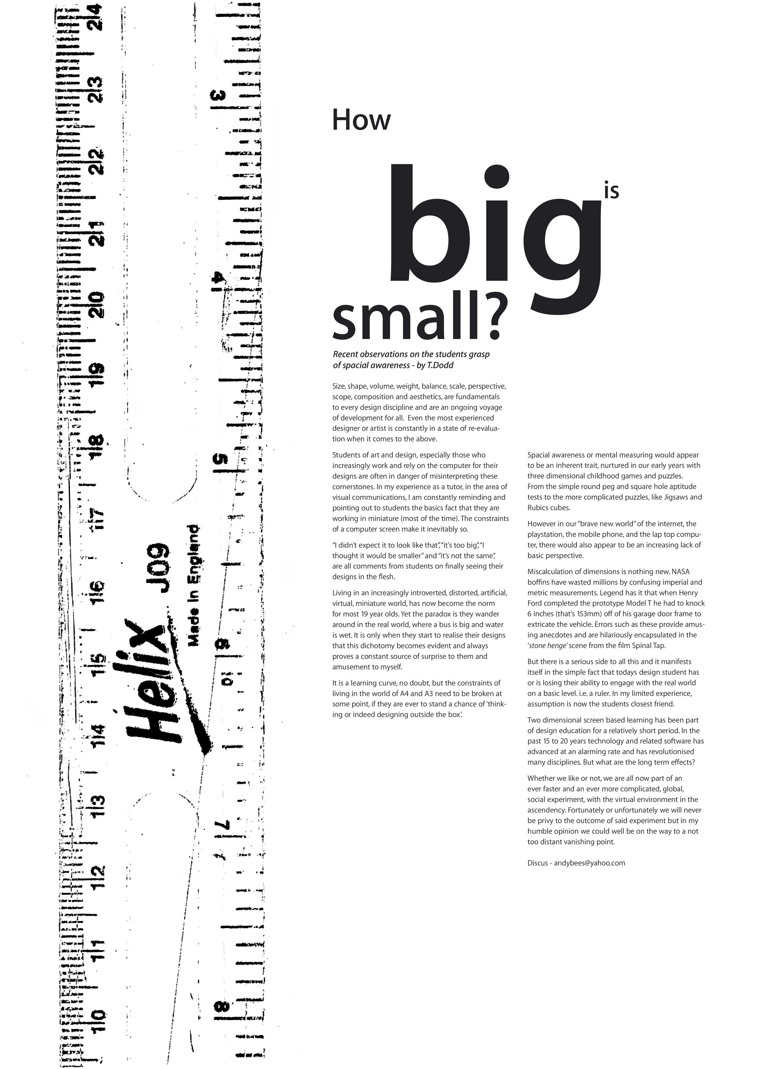
the original article (not to scale)

the original article (not to scale)

Letterform Archive

A fantastic resource discovered by Pete, Letterform Archive is a nonprofit center for inspiration, education, publishing, and community. Basically, an online archive of type, with a search function as simple (and powerful) as sites we know like designspiration.

search functionality

search functionality

It requires a membership, but priced at $2.50/month for students is well worth it for the vast archives that can be accessed.


We hold physical and digital artifacts in a variety of formats, including books, periodicals, posters, sketches, original art for reproduction, and related ephemera, as well as a robust reference library. Together, these works chronicle the history of written communication, from the invention of writing and medieval manuscripts to modernism, the age of print to the present explosion of digital type. See a sampling.

The Archive doubled its holdings in 2015 by acquiring the typeface specimen collection of the late Dutch publisher Jan Tholenaar. Recently donated archives include Emigre, pioneers of experimental digital design; Ross F. George, author of the Speedball textbooks; and Aaron Marcus, a seminal figure in computer graphics. Also featured prominently in the collection are Rudolf Koch, Jack Stauffacher, Irma Boom, and Piet Zwart.

 
Type books, lots of lovely type books

Type books, lots of lovely type books

Conference week 8 - Line up officially announced

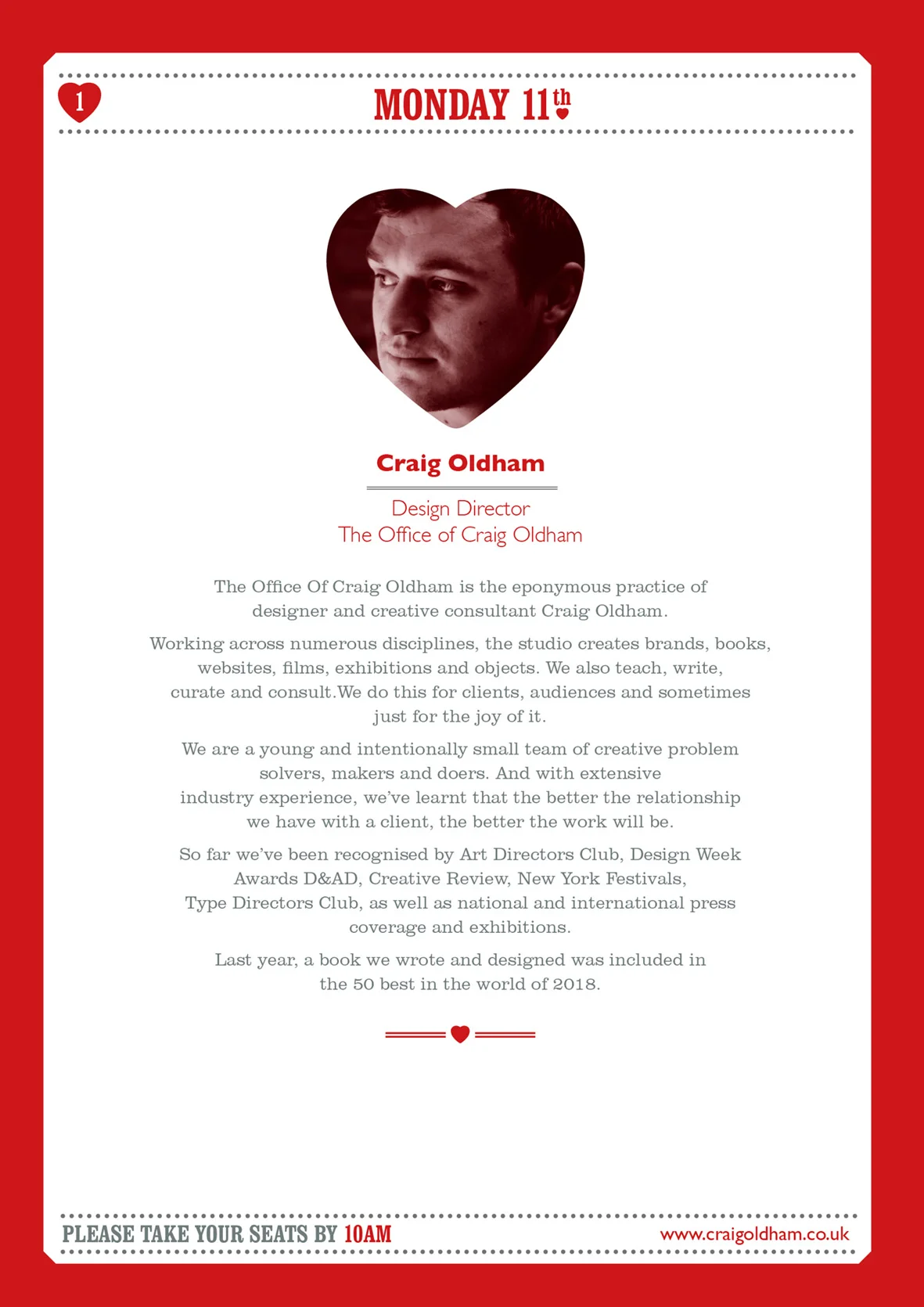
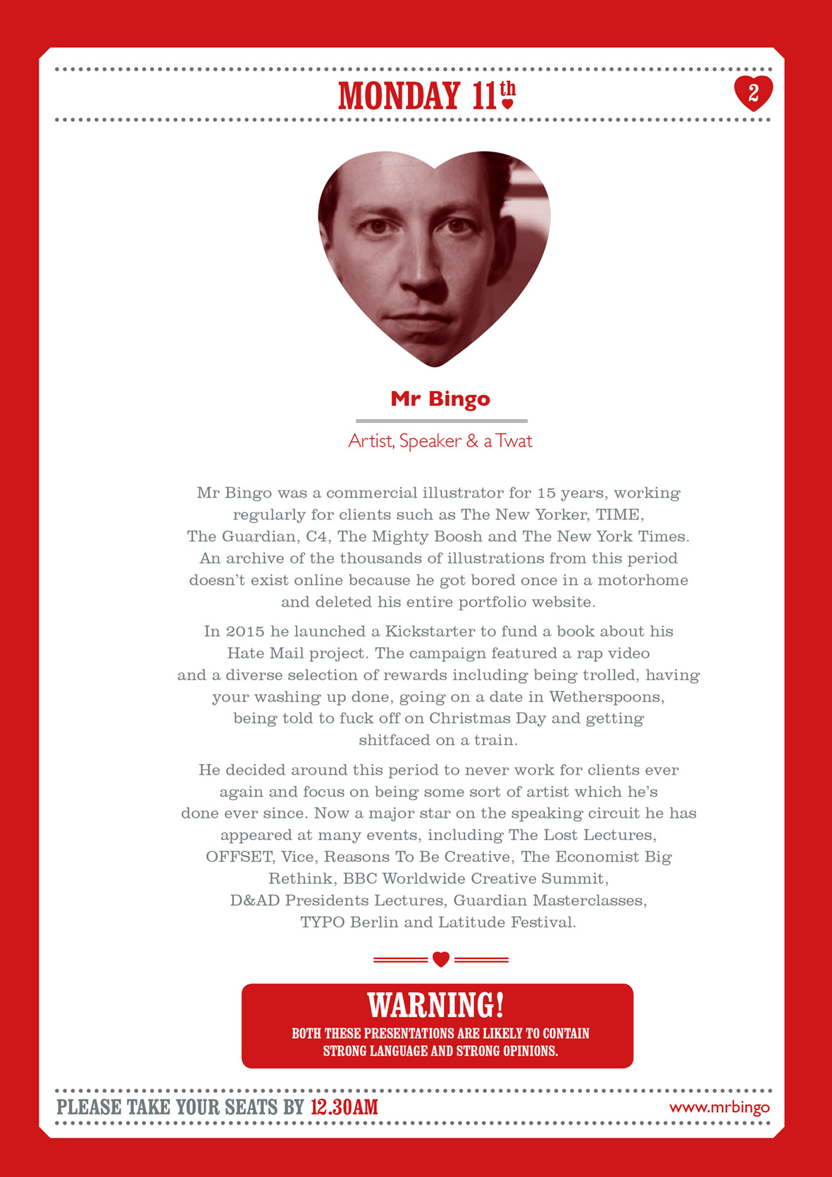
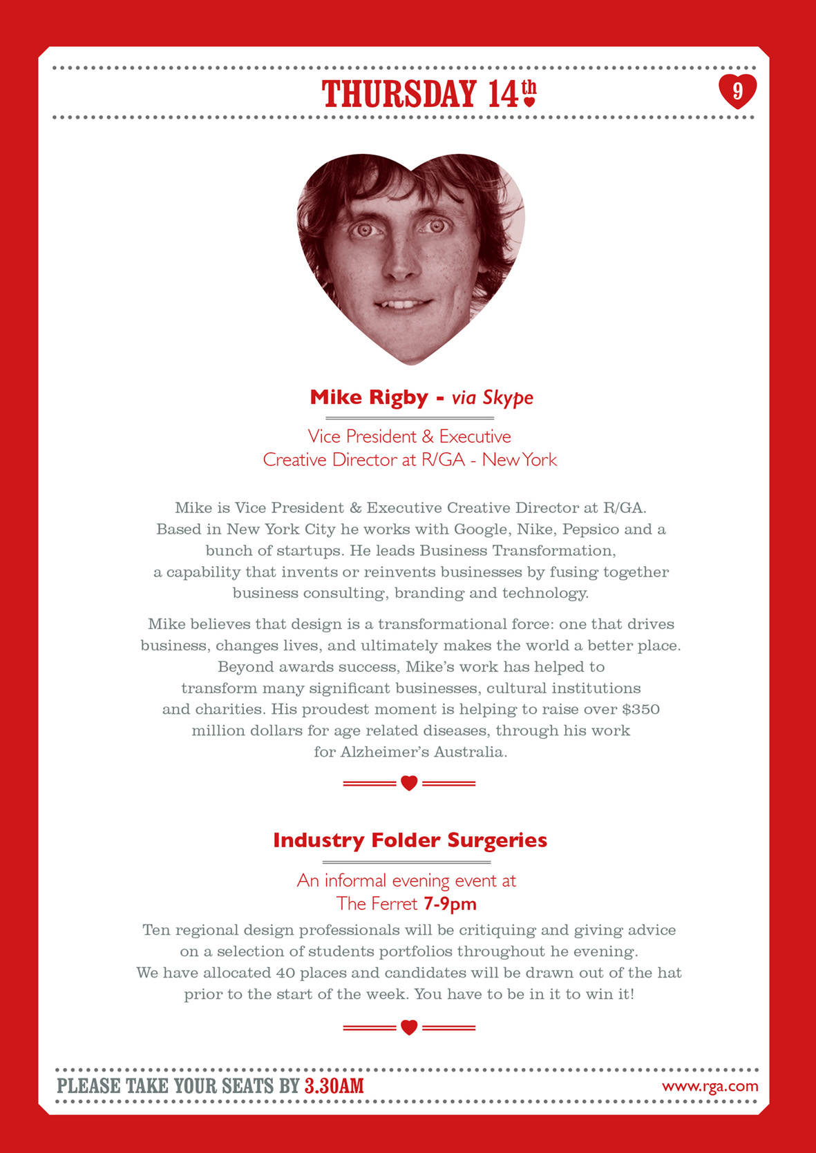
With 5 months of planning, 573 emails sent, 342 received, 58 attempted phone calls with 32 eventually getting through, plus a handful of face to face chats thrown in….we can now with a reasonable amount of confidence and pride, announce the official 2018 conference week 8 line up…in order…as follows.

oldham.jpg
bingo.jpg
richards.jpg
gowdy.jpg
downng.jpg
cowley.jpg
wharton.jpg
lawley.jpg
rigby.jpg
taxi.jpg
johnson.jpg

Please click the arrow to play the sting.

All the students and staff are looking forward to a very special week of enlightening talks, insights and opinions, as well as some top class creativity thrown in!

'May the sun always shine on you'

As we approach the winter equinox and the shortest day of the year and with the sun now at its furthest from our shores, we thought it apt and timely to feature a very personal project by one of our more senior members of staff.

Original art work

Original art work

The above image was originally designed in the hedonistic summer of 1995 and committed to skin by Louis Malloy.

Images by Steve ‘Ted’ Finch - 1995

Images by Steve ‘Ted’ Finch - 1995

double.jpg

After coming across the artwork in an old folder during an office clear out, the designer has scanned the original and had it laser etched, in order to create a series of limited edition prints.

Detail 1 - Lazer etch onto plywood

Detail 1 - Lazer etch onto plywood

Detail 2

Detail 2

Inked up woodblock

Inked up woodblock

Final Print - White Sun

Final Print - White Sun

Final Print - Red Sun

Final Print - Red Sun

Detail

Detail

Original photographic print next to etched wood plate - 23 years apart

Original photographic print next to etched wood plate - 23 years apart

Embossed version

Embossed version

Detail of embossed version

Detail of embossed version

Please click the arrow above to see film

drying.jpg

We intend to have a 100 limited edition prints completed by early 2019 and they will be available to purchase from new online Disciples shop.

HBU-UCLan visit

Advertising lecturer Guy Lawrence visited HBU-UCLan this week. A frequent visitor to Baoding as Quality Lead, he ensures the module output meets the high standard expected in Preston. The joint-school partnership has only been running for four years and it will take time to find our own identity, Guy is here to keep us on the right track. We are confident in becoming the creative hub within a province in a strategic location in China.

Visiting Year 2 Graphic Design studio

Visiting Year 2 Graphic Design studio

Our new building C5 is nearing completion for 2019/20, and with luck we will be there for next Academic Year. The purpose-built C5 will be an improvement over our current facilities; bigger classrooms, workshops, media and sound studios, interior design and animation space and much more. Our current A1 building is leased from the HBU Language school, we have grown from under 100 students to around 850, so it is time to move out! (Scroll photos below)

Part of Guy's visit was the promotion of courses from the School of Art, Design and Fashion at UCLan. This includes Advertising, Graphic Design and Interior Design. Students in China are afforded the opportunity to live and study at Preston and to learn creative thinking as well as UK culture. Guy has also been in the studio with Advertising and Graphic Design staff and students to ensure parity of work across our two schools.

Presentation of the Advertising course to Foundation Year students (Year 1)

Presentation of the Advertising course to Foundation Year students (Year 1)

Of course, the discussion of single malt whiskey was also high on the agenda and it's been a pleasure to have his company for a week. Our students here are looking forward to the UCLan study trip in April, which is a fantastic opportunity for Preston students to form new friendships and experience the real China. UK staff and students are always warmly received by our hosts.

We are confident in our yearly improvements at HBU-UCLan and with continuous engagement with Preston, I'm sure our partnership will bring new opportunities and benefits in the years to come.

Hello from Graphic Design Year 2

Hello from Graphic Design Year 2

Paper Samples - D&AD 2017

Here we feature Harriet Richardsons commended D&AD entry for the Arjo Wiggins paper brief 2017.

'Samples' by Sony is a revolutionary way of creating new experimental sounds like never before, combining the tactile medium of paper with digital sound technology. 'Samples' allows both music artists and Sony customers to turn paper samples into audio samples, whilst also exploring the unique and beautiful medium of paper.

Concept

Concept

mailer.jpg
phones web.jpg
rip sanples web.jpg
sample book web.jpg
various artists web.jpg

Click the arrow to play the film

ambient.jpg
launch web.jpg

A great example of a project built upon a clever verbal connection which combines both the digital and physical to create a unique concept.- Paper Samples & Music Samples or BPM meets GSM.

John Lewis 'Saves the Day' - D&AD 2017

Here we feature Ashton Hoban’s D&AD shortlisted entry from 2017.

Background. The outdoor summer festival scene is growing. There are now more than over 250 festivals taking place every year across the UK, catering for a whole variety of tastes and demographics.

mud 1.jpg


With this in mind John Lewis has decided go beyond its stores and out into the great outdoors by teaming up with one of the UK's leading festivals, Glastonbury. From ponchos to sun cream, come rain or shine 'John Lewis Saves The Day'.

Proposition

Proposition

Saves the day - John lewis product range

Saves the day - John lewis product range

From Sunshine

From Sunshine

To rain

To rain

Hammocks

Hammocks

Sleeping bags

Sleeping bags

Torches

Torches

Pre-order your last minute essentials via your phone

Pre-order your last minute essentials via your phone

wellies.jpg
John Lewis festival locator app

John Lewis festival locator app

Use your phone to go Glamping

Use your phone to go Glamping

Pre-order a special pamper pack to be delivered on your return home

Pre-order a special pamper pack to be delivered on your return home

Click the arrow to play the film.

A well thought through solution with a great proposition and a great example of how to tell a story through appropriate image and text. When it comes to all those festival essentials John lewis ‘Saves the day’.

Amazon Fresh - D&AD 2017

Here we feature Amy Wooding’s D&AD shortlisted entry from 2017 which was in response to the Amazon Fresh brief. Highly commended.

Basic premise

Basic premise

Landing Page

Landing Page

Examples of wordplay & image

Examples of wordplay & image

Traditional billboard advertisement

Traditional billboard advertisement

Digital Adshells

Digital Adshells

Underground advertisements

Underground advertisements

Delivery vans

Delivery vans

Bags

Bags

Feedback cards

Feedback cards

Amazon cookbook

Amazon cookbook

Click to play film

A very professional well crafted and logical solution demonstrated across a range of touchpoints. A classic example of word & image working effectively to communicate the core offering of Amazon Fresh within the capitol.

Back to School

stamp.jpg

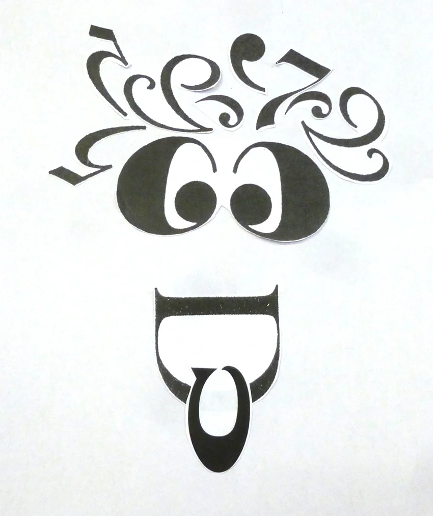
I was lucky enough to be invited back to my old primary school in Orton Cumbria this week to run a typefaces project with all the pupils. We had a great day creating a range of animals and characters made up out of a variety of type. The children were very responsive and creative as you can see below.

wall.jpg
hero22.jpg
good eyes.jpg
hedge.jpg
guffy.jpg
scream.jpg

Slide show of some more examples

table.jpg
mess.jpg

Well done everyone and Happy Christmas to all the staff & pupils!