Year 2 Graphics - restaurant branding

Year 2 Graphics were briefed to design the branding for a restaurant, café or street food stall. The students were all given different countries to research and find a unique selling point or type of food specific to the country.

As well as an identity and appropriate application of the branding, they also visualized the layout and navigation of a website.


Escargo

The concept was ‘Slow Food, Fast’ for a French snail café.

BRAND APPLICATIONS

BRAND APPLICATIONS

website

website


Wurst

A play on words for ‘The Wurst’ German sausage stall.

brand applications

brand applications

website

website


bang

The concept for a Bang’ladesh street food restaurant. This was also changed to Bang’ladash for takeaway food.

brand applications

brand applications

website

website

Conversations in Creativity: Design Disruptors - Film Screening

DD_cover2.jpg

Join Forepoint for an exclusive screening of the InVision-produced documentary DESIGN DISRUPTORS, brought to you as part of Conference Week in association with Creative Lancashire & Forepoint and supported by UCLAN Innovation Zone.

DESIGN DISRUPTORS reveals a never-before-seen perspective on the design approaches of 15+ industry-shaking companies, and how they’re using the power of design to disrupt billion dollar industries.

Grab a drink, some movie treats, and be first to see the film. Then take part in the Q&A discussion with our expert panel representing Forepoint, Creative Lancashire and UCLan, plus a special marketing guest from an internationally renowned business.

18:00 – 21:30 Thursday 15th February, The Continental, South Meadow Lane, Preston PR1 8JP

Seating is limited so reserve yours now!

Conference week 7 - Luck

This year heralds our 7th annual conference week event and we have an outstanding selection of guest speakers from the world of Graphic Design, Illustration & Advertising who have all kindly agreed to come into our studios here in Preston.

With it being our 7th annual event, this years theme is based around the 'role of chance & luck within the design process'. The week commences Monday the 12th of February running through until Friday the 16th.

The week is kicked off by Gary Holt, founder & creative director of Someone - London followed by Mark Elwood, executive creative director of Mullenlowe - London.

On the Tuesday we have Karen Hughes, founder & creative director of Edit Brand Studio - Manchester who will be teaming up with Rachel Simpson, founder & creative director of Bird - Preston. Then in the afternoon we welcome artist, illustrator & writer Paul Davis.

Wednesday sees the traditional visit of Paul Crowley and the BBC UX&D team from Salford. This will be their fifth year at conference week. They will be running a series of workshops that give our students an insight into how they approach idea generation.

Thursday is somewhat of a show stopper as we have two double-headers. In the morning we have Garry Blackburn & Simon Elliott, co-founders & creative directors of Rose Design - London. Followed by Jim Sutherland founder of Studio Sutherl& as well as copywriter and poet Nick Asbury, partner at Asbury & Asbury.

Also, in the evening we have a special screening of Design Disruptors at The Continental public house hosted in conjunction with Forepoint, Creative Lancashire & UCLan.

Then if that were not enough we round the week off with Ben Tallon, illustrator, art-director and host of the podcast series Arrest All Mimics, followed by Jack Renwick, founder & creative director of Jack Renwick Studio - London.

All talks will start at either 11am or 2pm daily, but we advise you to take your seats early to avoid disappointment. It just remains for us to say watch this space for more information as and when we get it.

You lucky people!

Type & Grids Project Preparation

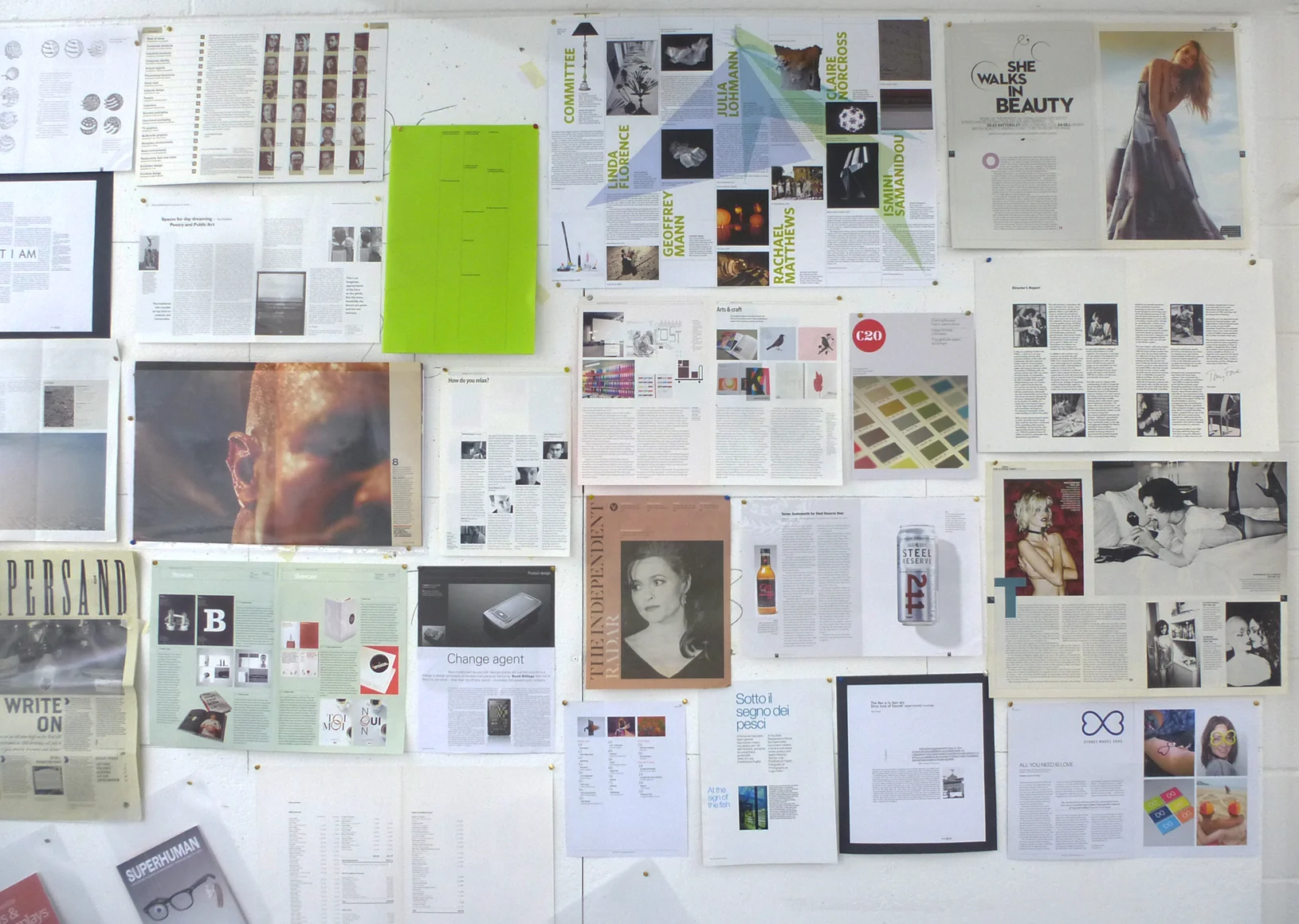
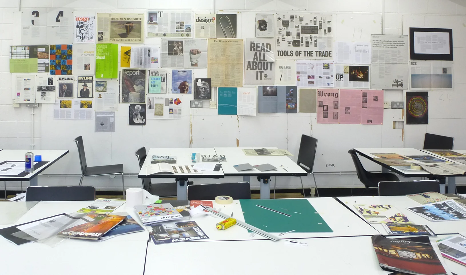
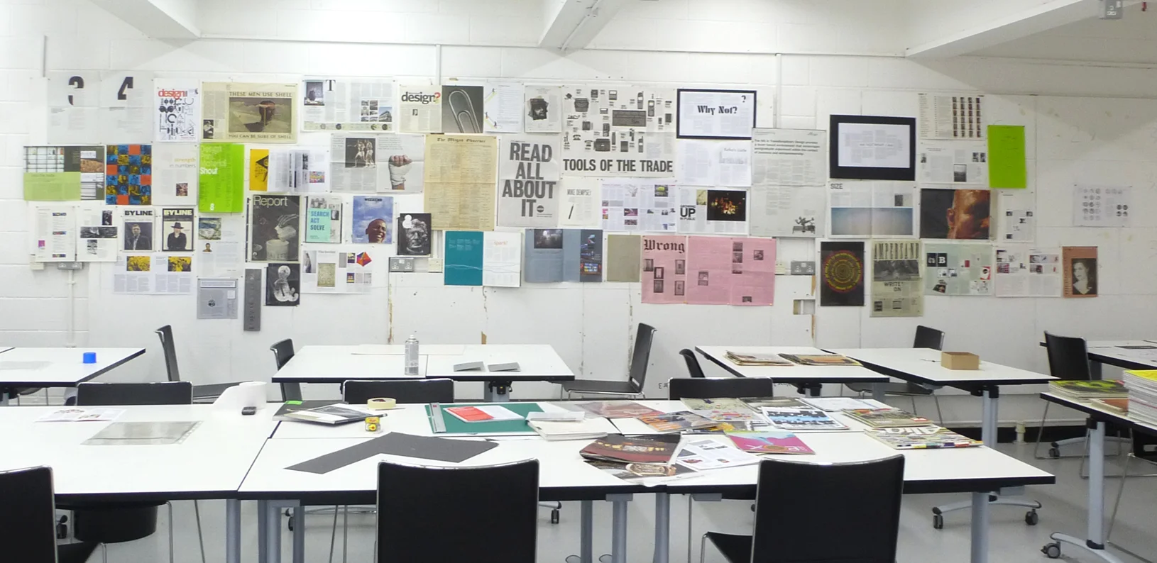
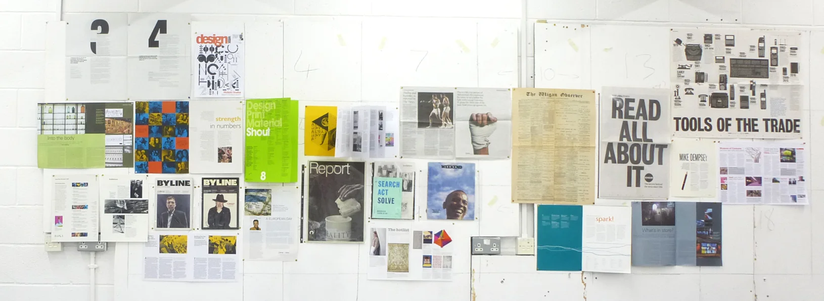
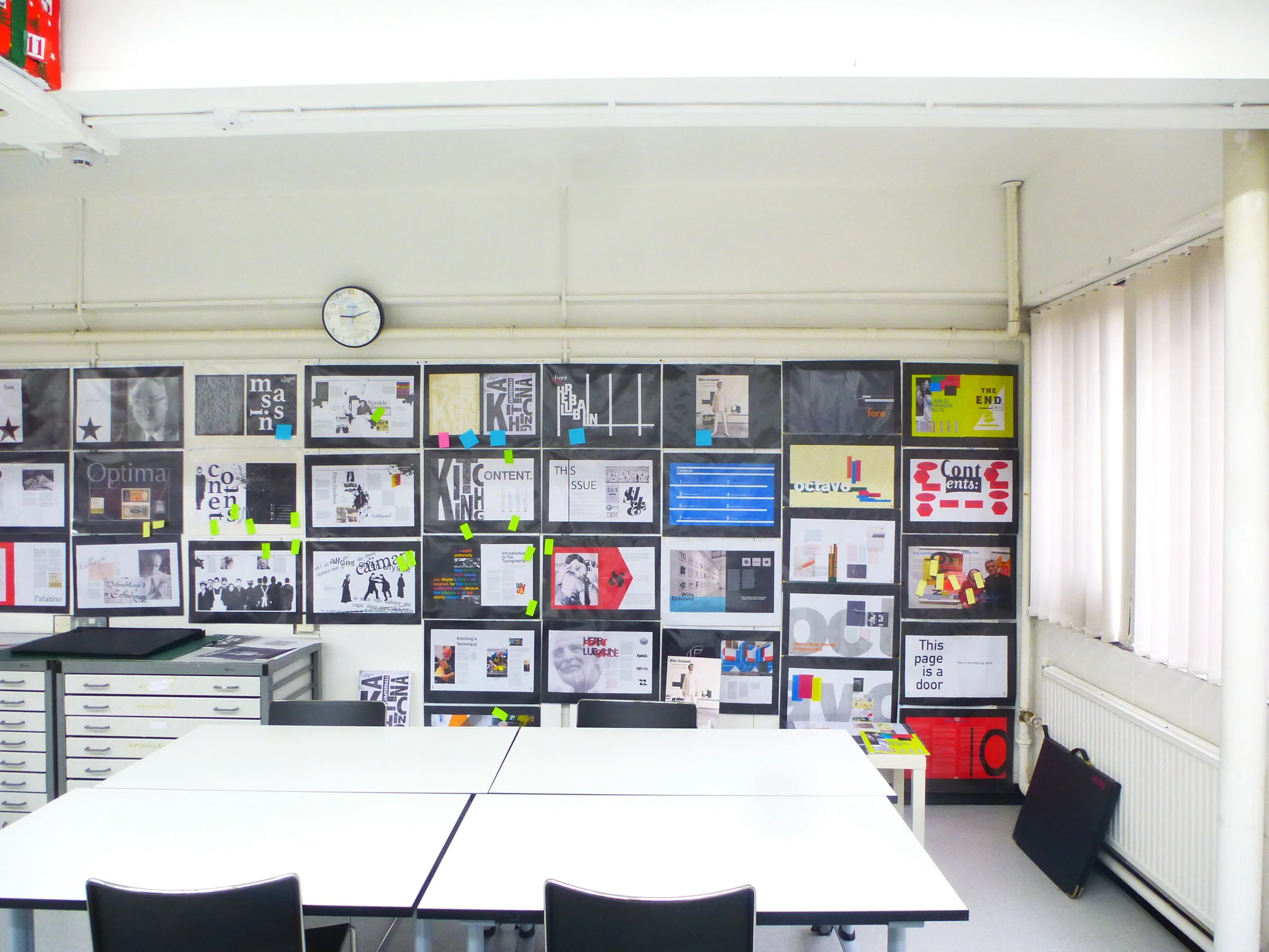
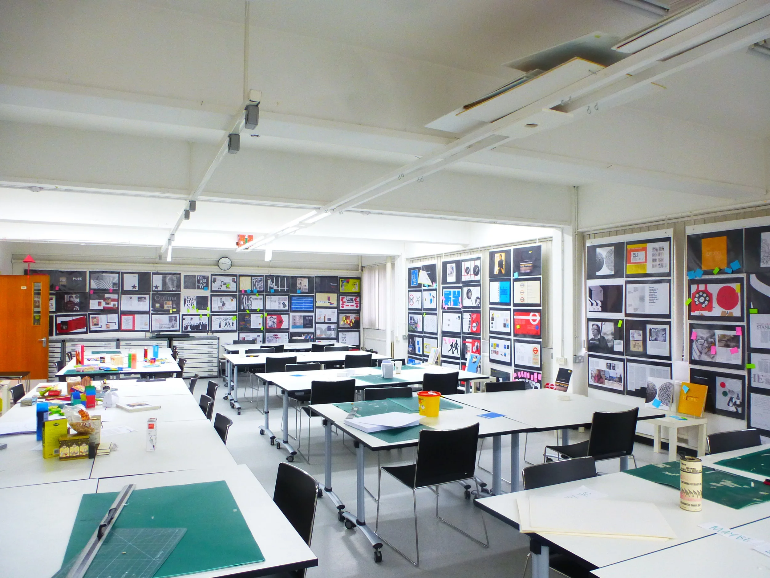
A new year and a new start. Today we sorted and sifted through our extensive printed ephemera archive in search of inspirational layout examples. Five hours later we had a wall of interesting compositions that was a composition in itself.

wall 4.jpg

Staff chose a variety of layouts that demonstrated some of the basic rules of page layout and composition. 

close up 6.jpg

The wall of visual inspiration will remain up for the first week of the project for all our Year 1 students to study closely and use as a 'touchstone' for their page layouts.

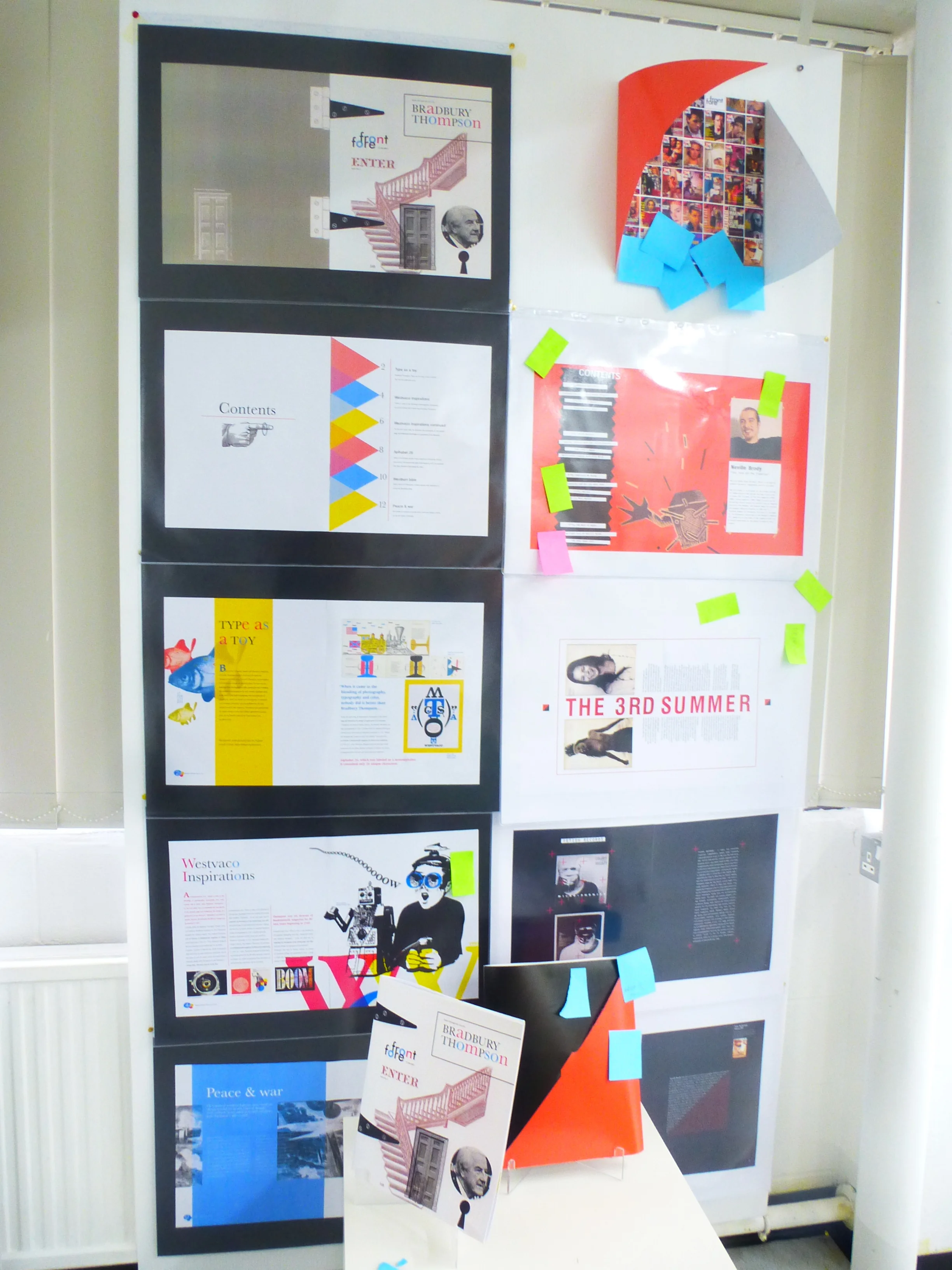
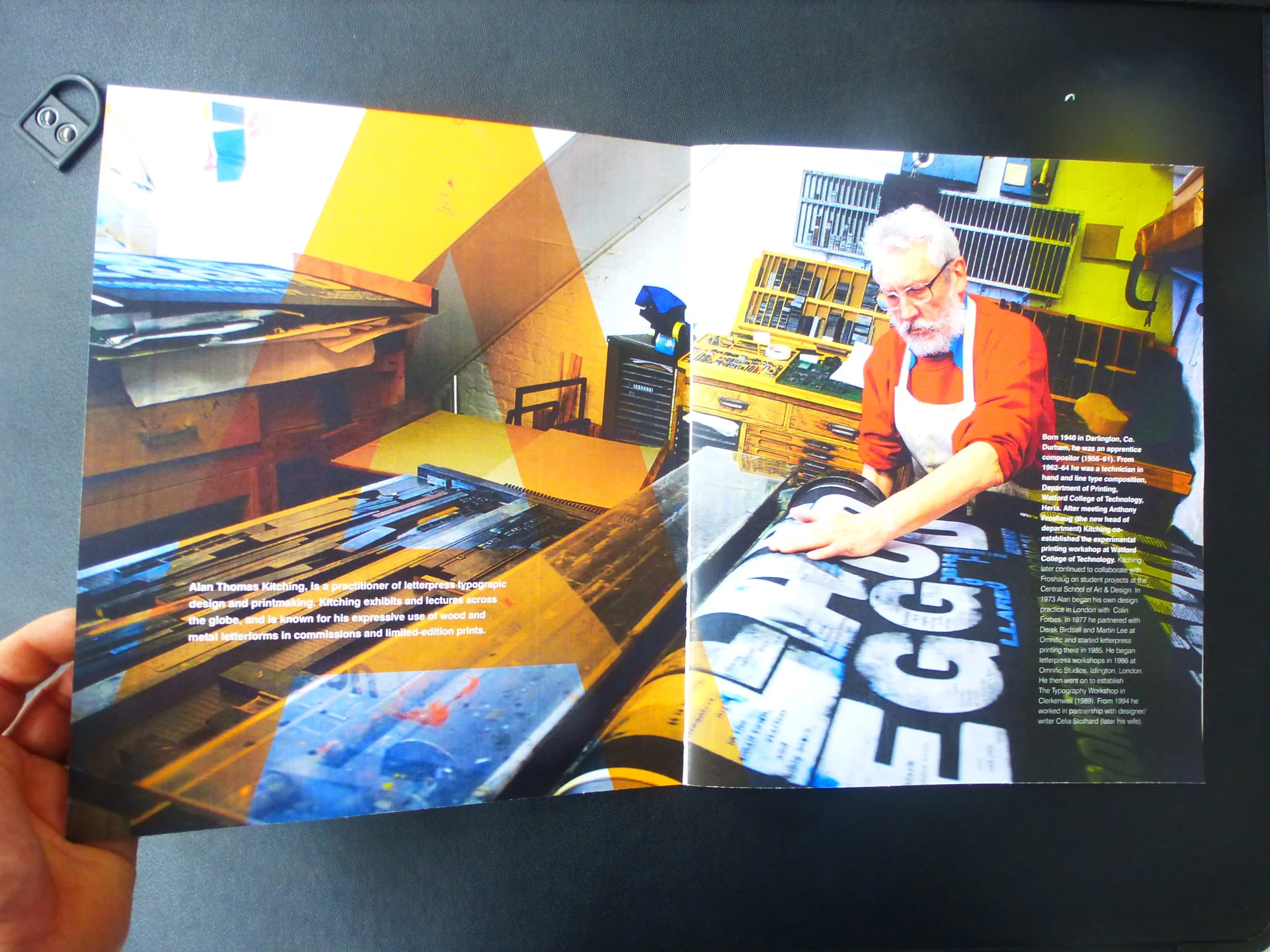
This project is the Year 1 students first chance to really get to grips with the basics of typography and also InDesign (not Photoshop). Each student has been given a well known designer or typographer to research over the Christmas break and on their return they will be producing a series of DPS's, a front cover design and a contents page, as well as an actual physical mockup.

Here are a few shots of last years final critique session

Here are a few shots of last years final critique session

Here are a few examples of their designs:

P1150340.JPG

DesignBridge Sinterklass Horse

In early September I was approached by DesignBridge Amsterdam who wanted to commission a typographic illustration of a white horse, as a way of a seasonal thank you and gift to all their clients & staff.

Sinterklaas is based on the historical figure of Saint Nicholas who traditionally rides a white horse called Amerigo. You can check out the story on the DesignBridge blog here.

amerigo.jpg

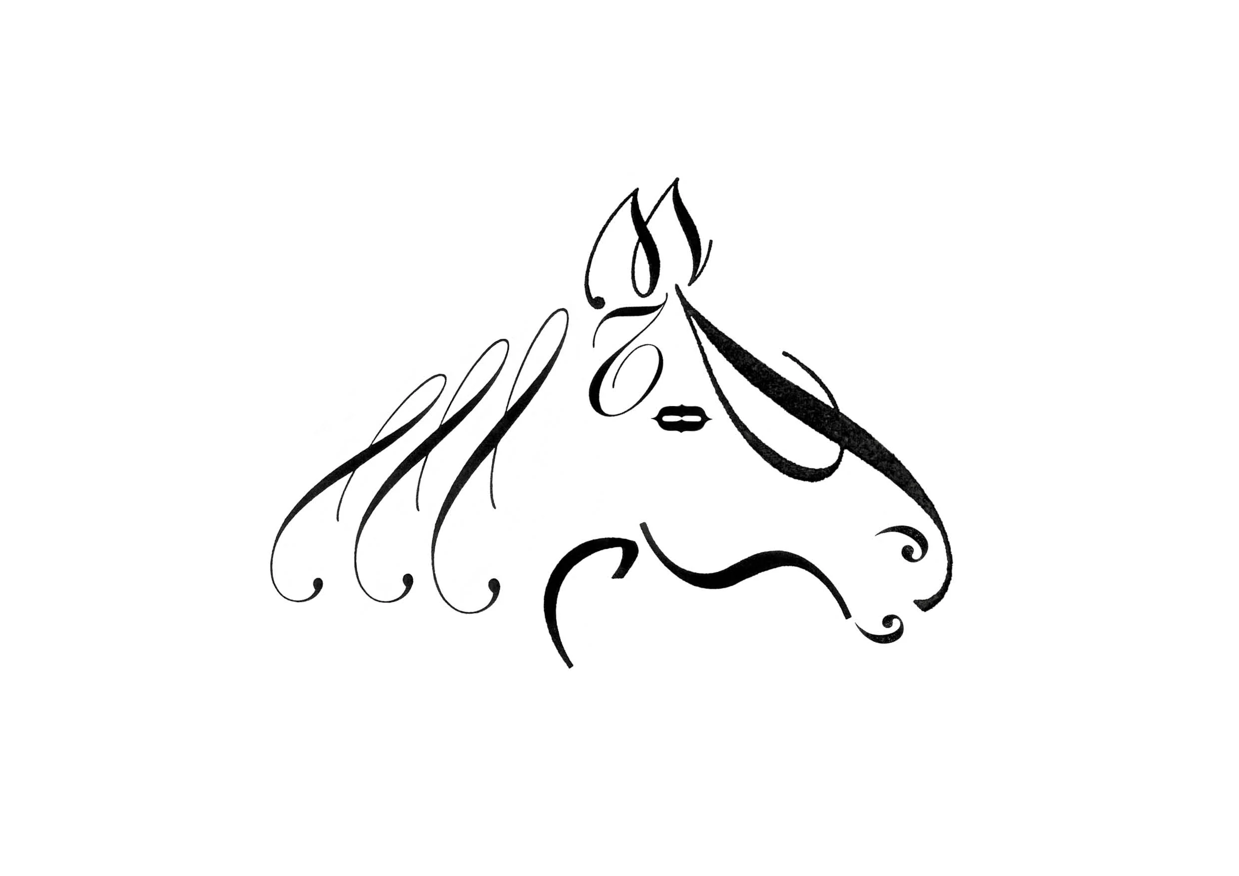
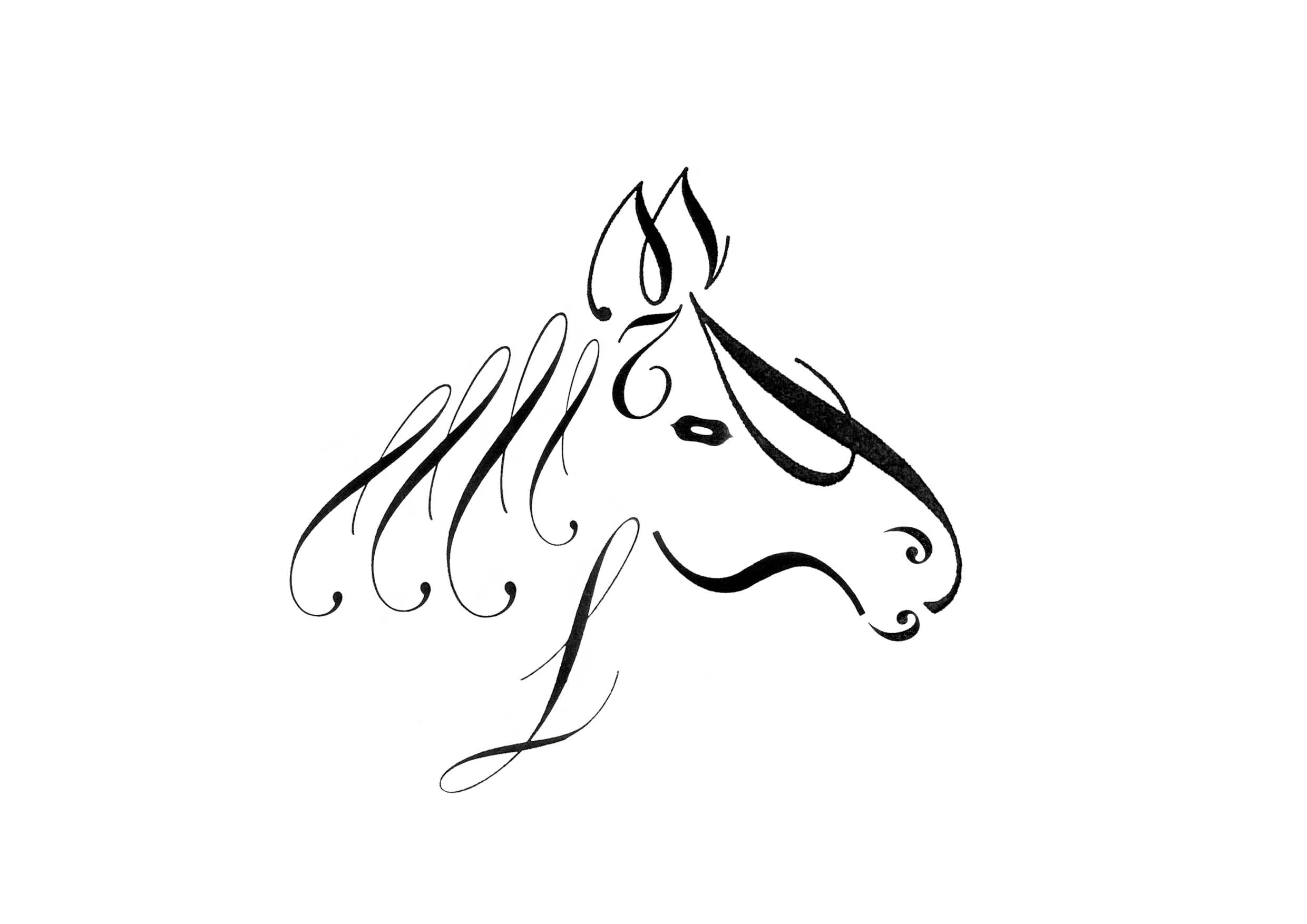
The following images show the design development of the horse.

Once the final design was approved 3 separate woodblocks were laser etched.

Once the blocks were etched the process moved on into the Print workshops.

set up on work surface.jpg

There were 3 separate colours used Red, Blue & Black

Here we have a short clip of the Red one being printed.

In total there were 150 original prints of each colour.

Blue

Blue

Black

Black

Red

Red

There were also a small run of embossed horses.

There were also a small run of embossed horses.

My personal favourite was the Black & White version

My personal favourite was the Black & White version