Brain Pickings: a really good website

Brain Pickings is a site I’ve recently come across. It requires time and inclination, but it has a depth which is necessary to discuss some topics that are in and around what we do. These include art, writing and illustration but also self-critique, responsibility and beyond. The articles are interesting, accessible and well researched. It’s a great place to go on the internet that is thoughtful, calm and ultimately useful.

My name is Maria Popova. I am a reader and writer, and I write about what I read here on Brain Pickings — my one-woman labor of love. Drawn from my extended marginalia on the search for meaning across literature, science, art, philosophy, and the various other tentacles of human thought is a record of my own becoming as a person — intellectually, creatively, spiritually — and an inquiry into what it means to live a good life.

I have previously thought in words for The New York TimesWired UK, The Atlantic, and Harvard’s Nieman Reports, among others, and am the author of a very long book titled Figuring.

Founded in 2006 as a weekly email that went out to seven friends and eventually brought online, the site was included in the Library of Congress permanent web archive in 2012. Here are some reflections on my most important learnings from the first decade of Brain Pickings.

Good book, great advice

wise words.jpg

With record numbers of design and advertising students graduating into the job market each year, it makes more sense now than ever before to be fully armed to succeed. This book helps new designers make the transition from design school to work, giving them the ammunition they need for a successful start.


Here the reader will learn how to get that all-important first job, and how to impress their new employer. They will also have at their fingertips plenty of useful, practical information essential to know in the design studio and when working for clients. Enriched with quotes and advice from some of the best and brightest in the industry, this book is where you will find out what they didn't teach you in design school.

LogoArchive

A snapshot of the delights within

A snapshot of the delights within

A fantastic resource for all students of graphic design. LogoArchive has been created by designer and design-reviewer Richard Baird who also runs the excellent website BP&O (Branding, Packaging & Opinion). He describes the LogoArchive as: A study of form language in logo design. A recovery, research & restoration project by Rich Baird, BP&O.

Follow him on Instagram.

And on twitter.

Lost & Foundry

A very interesting type project, preserving the characteristics of typefaces which could be forever forgotten.

But the most important project is that all proceeds go to The House of St. Barnabas, a social enterprise and members club in Soho, London. They are a charity who work to lift people out of homeless and into employment.

The fonts can be purchased from from their website lostandfoundry.org.uk or directly via Fontsmith.com.

Many thanks to Simon Warden & Jason Smith, Creative Directors of Lost & Foundry who have been in touch to update our original post.


Lost & Foundry is a unique collection of 7 typefaces based on the disappearing signs of Soho, these are at risk of being lost forever due to the ever changing landscape of the area. By re-imaging the signage as complete fonts, we have rescued this rich visual history from the streets and present the typefaces into a contemporary context for a bright optimistic future.

 
james.PNG

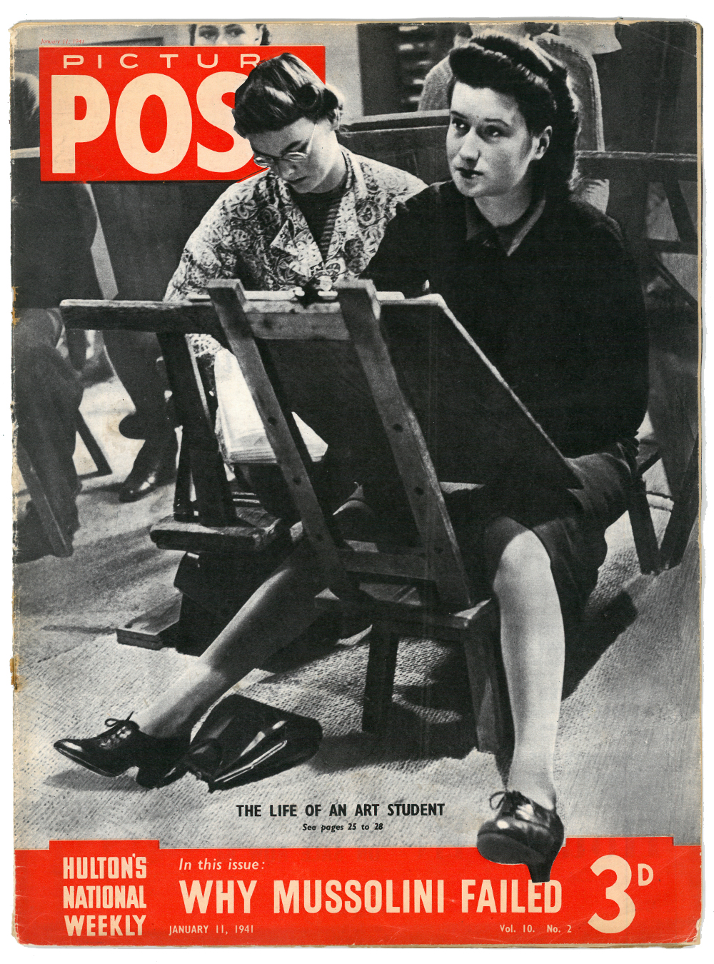
The life of an art student

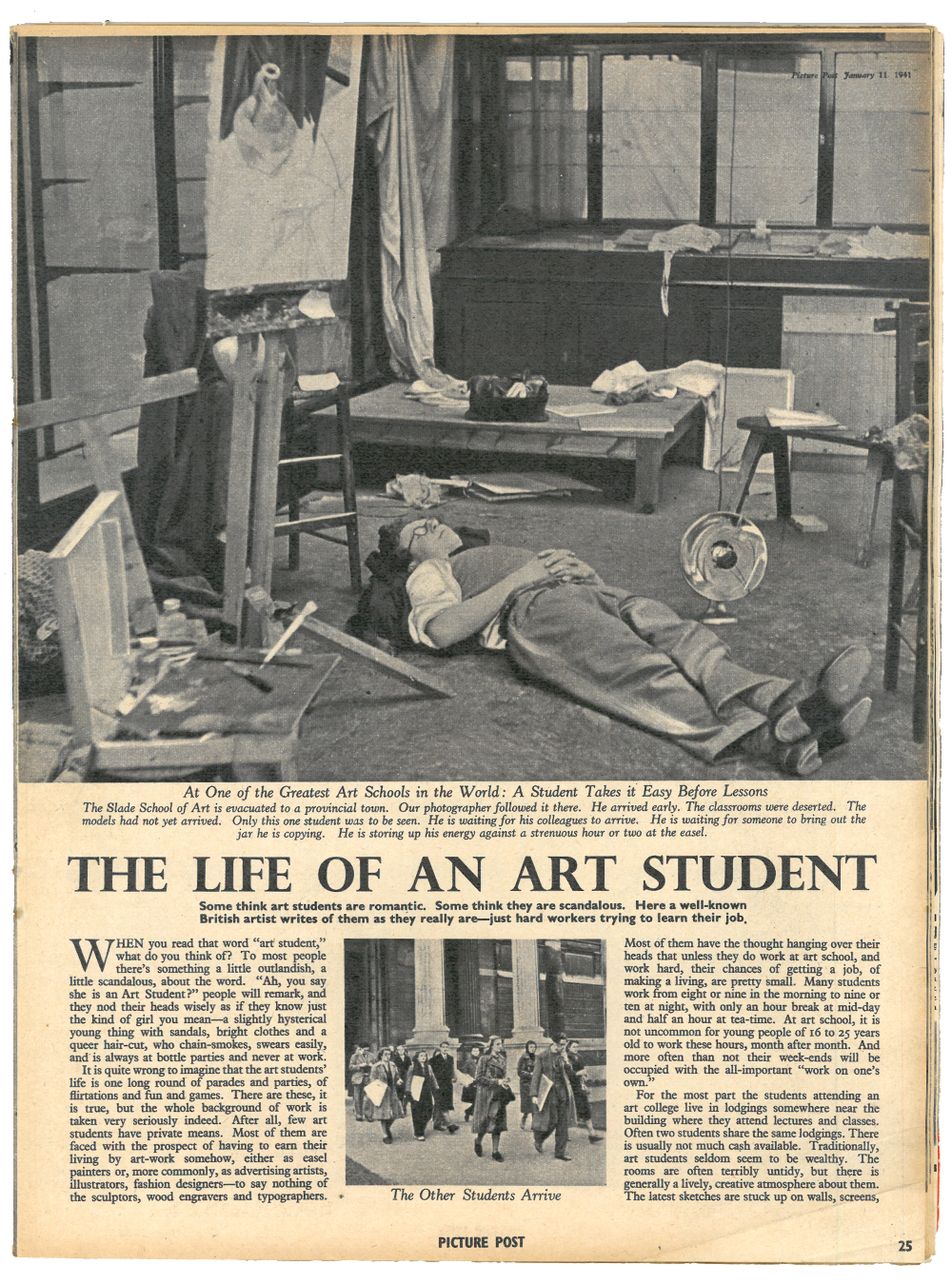
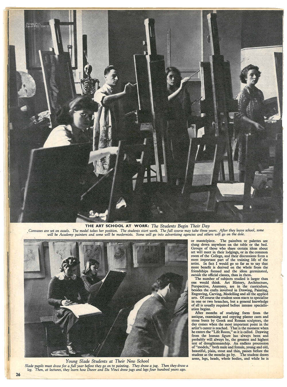
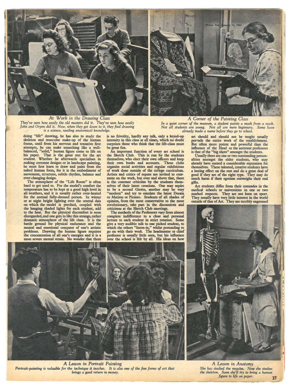
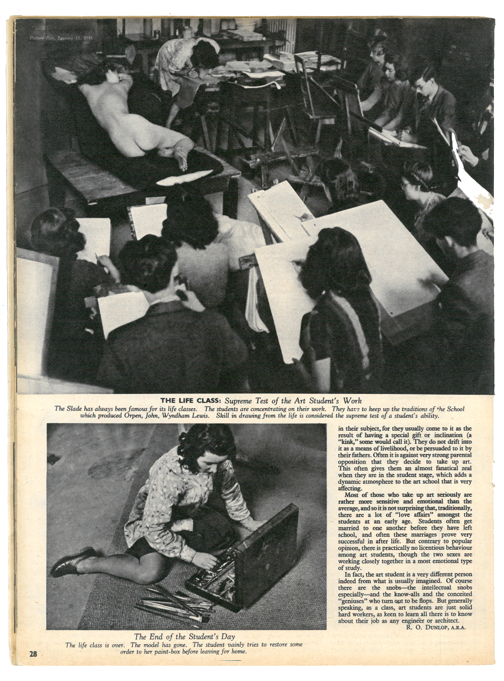
Illustration course leader Steve Wilkin recently alighted upon a copy of Picture Post published in 1941 at a sale of second hand objets. With a keen eye and being a well practised collector of visual ephemera (as we all are), Steve purchased the printed publication and happened upon a most interesting article: The life of an art student.

Skm-vb200-c18040409220.jpg

Here follows an extract:

 
When you read that word "art student", what do you think of? To most people there's something a little outlandish, a little scandalous, about the word. "Ah, you say she is an Art Student?" people will remark, and they nod their heads wisely as if they know just the kind of girl you mean — a slightly hysterical young thing with sandals, bright clothes and a queer hair-cut, who chain-smokes, swears easily, and is always at bottle parties and never at work.
Most of them are faced with the prospect of having to earn their living by art-work somehow, either as easel painters or, more commonly, as advertising artists, illustrators, fashion designers — to say nothing of the sculptors, wood engravers and typographers.
 

Joshing aside, the article moves on to demonstrate an alignment with today's cohort:

 
Most of them have the thought hanging over their heads that unless they do work at art school, and work hard, their chances of getting a job, and making a living, are pretty small. Many students work from eight or nine in the morning to nine or ten at night...
 

Before concluding:

 
In fact, the art student is a very different person indeed from what is usually imagined. Of course there are the snobs — the intellectual snobs especially — and the know-alls and the conceited "geniuses" who turn out to be flops. But generally speaking, as a class, art students are just solid hard workers, as keen to learn all there is to know about their job as any engineer or architect.
 

What kind of designer are you?

Capture.PNG

Have a look at this website created by Manchester's Code Computerlove. They are renown as one of the UK's best digital agencies, so have a look at them.

Their What kind of designer are you? website is for fun, but as they say, it might just help you clarify what kind of designer you are, and what path you may then take...

As an aside it also has an excellent reading list. Always a bonus.