You can never put a good idea down
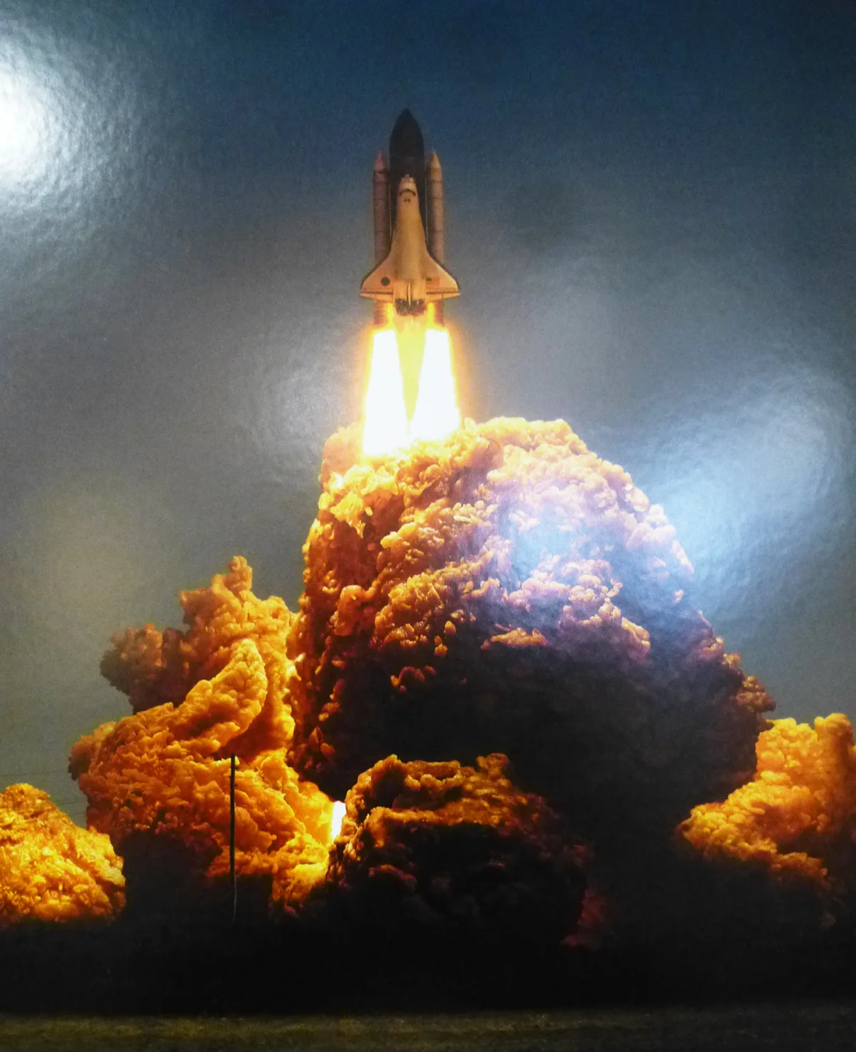
/Mooching around this year's D&AD shortlisted entires we came across these visually witty KFC print advertisments.
They immediately brought to mind the 'Cod Apocalypse' montage we did in 2006. Created out of a close up of some battered cod from a national newspaper article on the depletion of fish stocks from our seas, and then placed behind a skyscraper scene. Creating a visually intriguing second take image with echoes of 9/11.
It just goes to show, to those students of visual culture and design, that similar themes of visual perception often run through design. Nothing is truly original and the majority of visual culture is derivative. It's just how and to what you apply it that differs. In this case it was initially in response to an iconic historical moment and then 11 years later an advertisement for a deep fired chicken franchise.
Here was another one from the 2006 series - 'Mushboom' by Chris Challenor
'Ice cream Armageddon' by Mike Rigby to follow when I can get it off my old hard drive!


